Cernuda Arte Celebrates a Surrealist Century
Cernuda Arte Celebrates a Surrealist Century
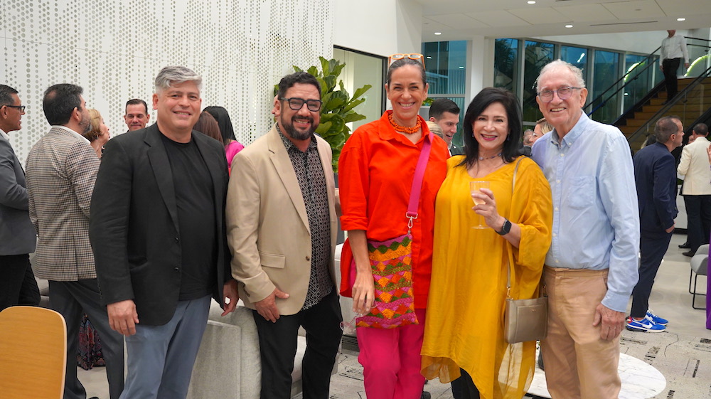
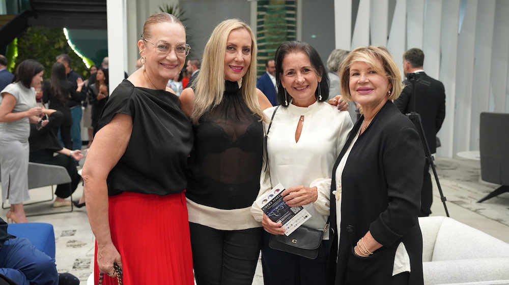
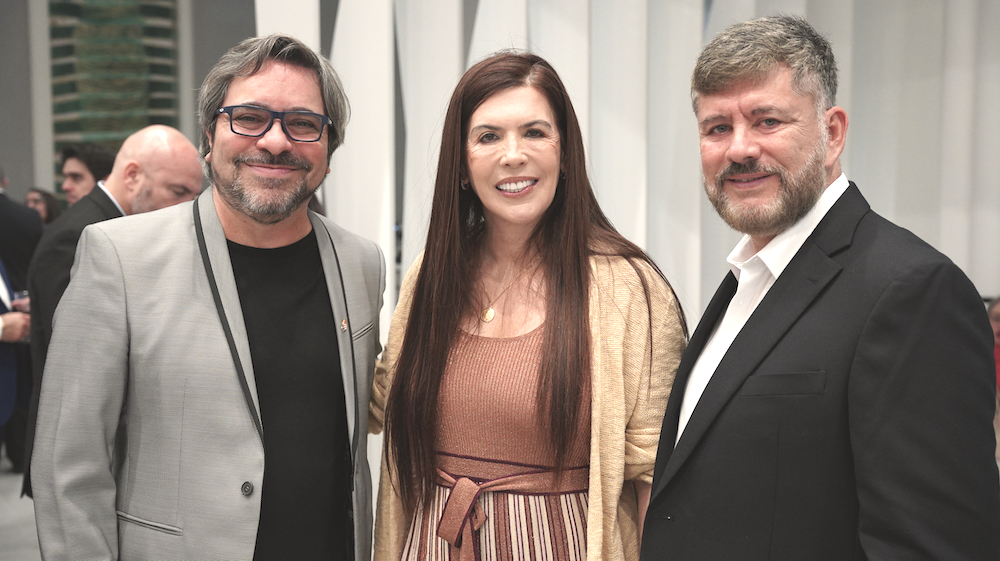
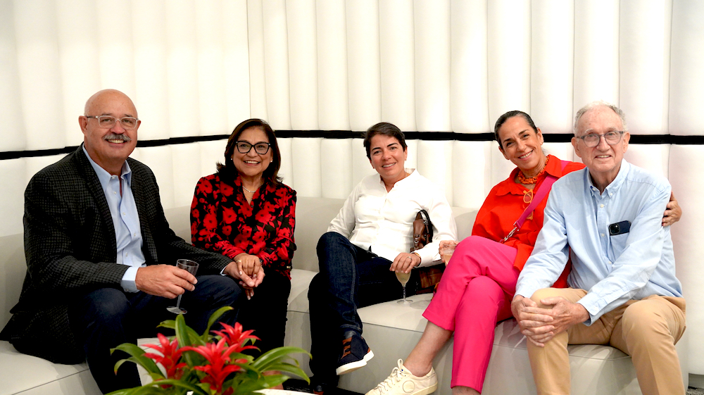
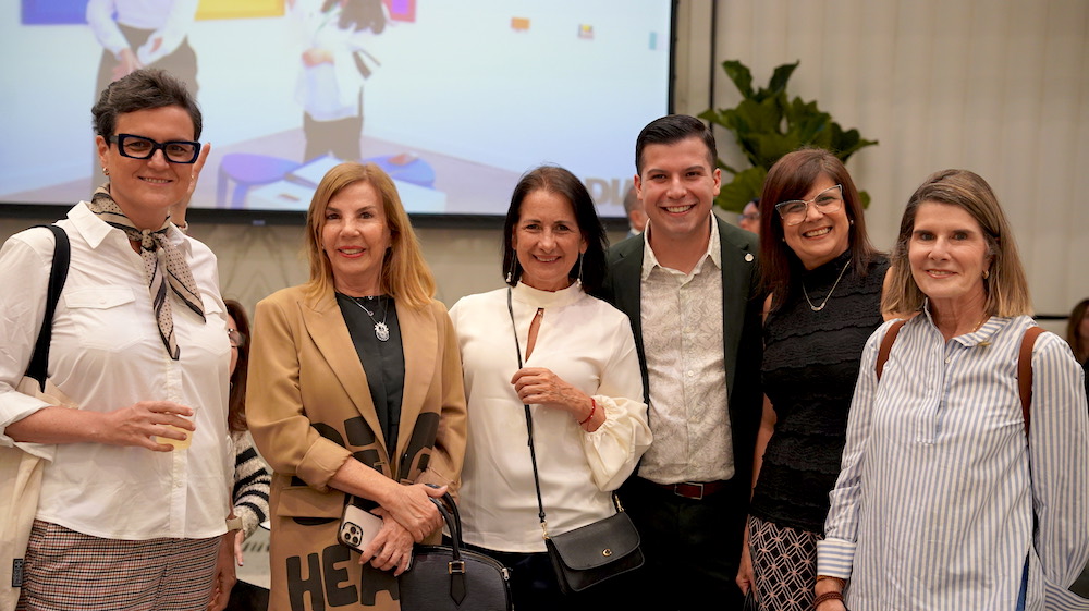
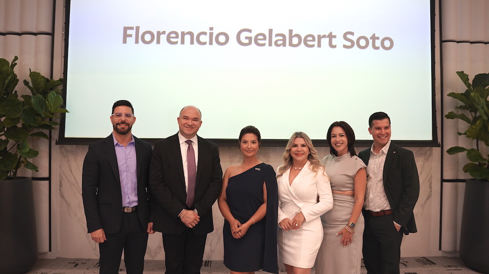
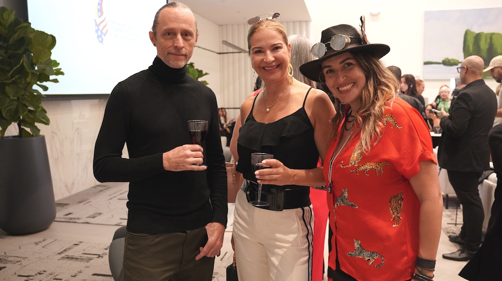
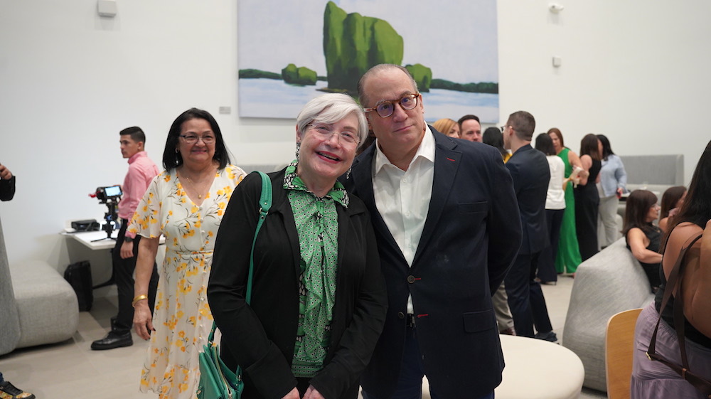
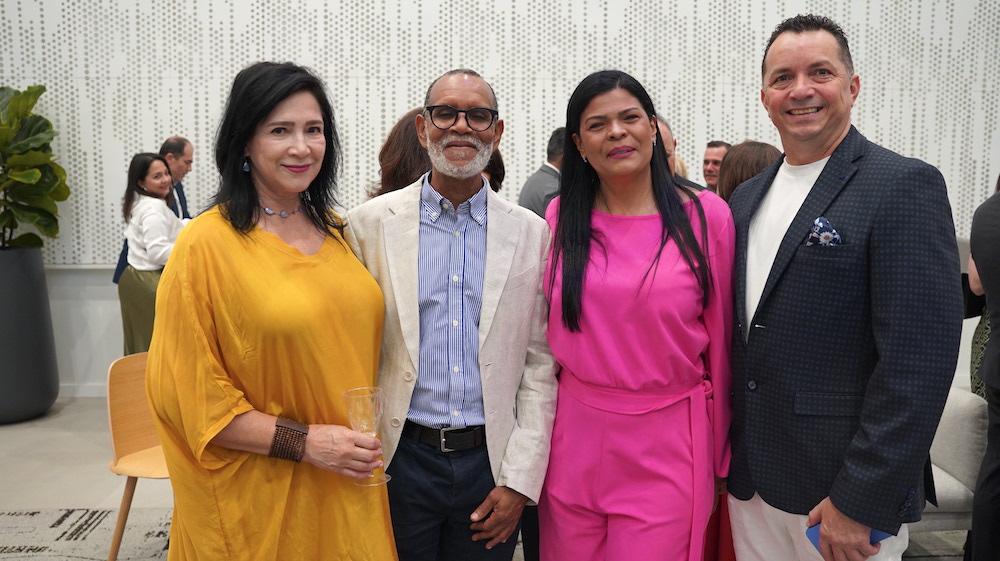
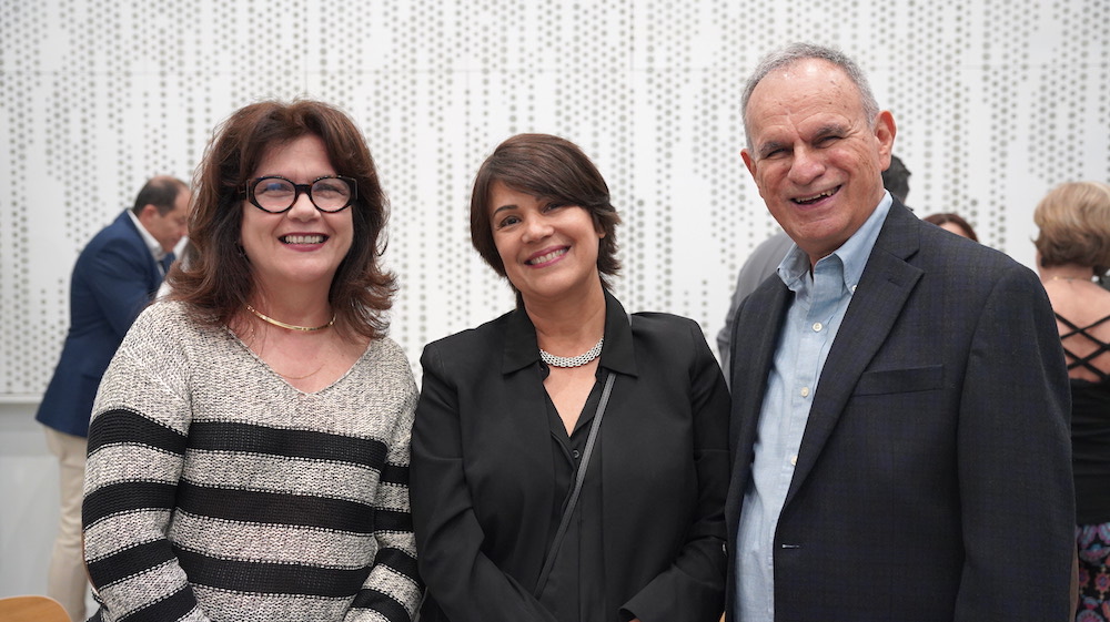
Cernuda Arte is thrilled to announce the opening of A Surrealist Century: 100 Years of Surrealism on Friday, November 1st, from 6 to 9 PM. This captivating exhibition delves into the profound influence of the Surrealist movement on Cuban and Latin American art.
A Century of Artistic Innovation
Marking the 100th anniversary of the Surrealist Manifesto, this comprehensive showcase features over 100 artworks by more than 20 renowned Cuban artists. Visitors will have the opportunity to explore the evolution of Surrealism, from its European origins to its unique expression in the Caribbean and Latin American context.
Highlights of the Exhibition:
- Masterworks by Wifredo Lam: Experience the visionary works of this iconic Afro-Cuban artist.
- Contemporary Surrealism: Discover the innovative approaches of contemporary artists like Tomás Sánchez and Roberto Fabelo.
- A Global Perspective: Explore the diverse interpretations of Surrealism by Cuban artists.
The gallery is honored to present new additions to its shows by some of the top names in Latin American art, including:
- Wifredo Lam
- René Portocarrero
- Hermanas Scull
- Manuel Mendive
- Gina Pellón,
- Juan Roberto Diago
- Lilian Garcia-Roig
- Irina Elén Gonzàlez
- Danuel Méndez
- Vicente Hernàndez
Join us for First Friday Gallery Night
Cernuda Arte invites you to attend the opening reception on November 2nd. Enjoy an evening of art, culture, and conversation with fellow art enthusiasts.
Exhibition Dates: November 2, 2024 – January 31, 2025
Gallery Address: 3155 Ponce de Leon Blvd. Coral Gables, FL 33134
About Cernuda Arte:
Cernuda Arte is a premier art gallery specializing in Latin American art. With a focus on modern and contemporary art, the gallery showcases a diverse range of works by renowned and emerging artists.
For more information, please contact:
3155 Ponce de Leon Blvd
Coral Gables, Florida 33134
Telephone: 305-461-1050
Fax: 305-461-1063
Email: [email protected]
About Cernuda Gallery
On behalf of our staff, we welcome you to our gallery and thank you for visiting our website. We hope that your visit will be a pleasant one. It is with great pleasure that we present to the public our selection of Cuban paintings from our extensive and varied inventory of over one thousand artworks. The gallery specializes in the exhibition and sale of Colonial, Early Republic, Vanguardia, and Modern master Cuban paintings, as well as fine artworks by contemporary artists of unquestionable talent.
The complete spectrum of Cuban art has been, for more than twenty-five years, our field of expertise and with pleasure it will continue to be so. The gallery is recognized as a leading authority in Cuban art. We are frequently consulted by museums, art galleries, art collectors and auction houses regarding the authenticity of artworks. We also provide multiple services and assistance in art collecting. We offer you the accumulation of our experience backed by our integrity and honesty.
In our gallery we recognize that, in view of the broad and complex world of the plastic arts, which spans from the cave paintings of prehistory to today’s postmodern creations, it is unthinkable to claim critical capacity and expert knowledge over everything. Today, specialization in the different spheres of the arts has become a pressing necessity.
Cernuda Arte, dedicated to the finest examples of Cuban paintings and committed to excellence, offers the expertise that enriches the process of the acquisition of artworks, and also assists the collector in other important services including:
Cernuda Arte is located at 3155 Ponce de León Boulevard, in the heart of Coral Gables, an eminent center of the arts in Miami. The gallery is open to the public Monday to Friday from 10:30 to 6:30 p.m., Saturday from 12:00 to 6:30 and until 10:00 p.m. every first Friday of the month.
We aim to make your art acquisitions pleasant, easy and worry free. This is our promise to you.
CERNUDA ARTE’S TEAM
Cernuda Arte Ramón Cernuda – Director
Ramón Cernuda is a publisher, editor, writer, a Cuban art collector and gallerist. After 30 years pursuing a lifelong love of Cuban art as a private art collector and researcher, Mr. Cernuda established Cernuda Arte gallery in October 2000. He studied Humanities and Political Science at the Georgia Institute of Technology and at the University of Puerto Rico. He has been the publisher of La Gran Enciclopedia Martiana and a founding member and producer of the Enciclopedia de Cuba Publishing Group. He was a member of the board of directors of the Cuban Museum of Arts and Culture for 14 years, from 1980-1994, and served as Vice President from 1987-1990.
In 1989 Ramón Cernuda sued the United States Government in Federal Court on grounds of First Amendment violations by the U.S. District Attorneys Office in the home invasion and confiscation of Cernudas Cuban art collection by the U.S. Government. The landmark case No. 89-1265 was decided by the United States District Court in favor of the Plaintiff and the Cuban art collection was returned to the Cernuda family. From that judicial decision it has been established by the U.S. courts that art from any country is protected in the United States as informational material and not subject to embargo laws or other impediments to its free flow into or out of the country.
An internationally recognized expert on Cuban art, Mr. Cernuda advises private collectors on acquisitions and is frequently consulted on authenticity of Cuban artworks by major international auction houses such as: Christies New York, Sothebys, Bonhams and Butterfields, Doyle N.Y., and Dorotheum. He is also consulted by government entities, banks, art galleries and art insurers.
Ramón Cernuda has written for prestigious publications such as El Nuevo Herald, and has been interviewed and quoted on issues pertaining to Cuban art by The New York Times, The Wall Street Journal, The Washington Post, The Art Newspaper (London and Madrid), Fortune Magazine, Art and Auction, Art and Antiques, Travel and Leisure, Latino Leaders, and Sixty Minutes. He is the author of the scholarly catalogue One Hundred Years of Cuban Landscape: 1850 to 1950. He is a lecturer and author of catalogue essays and biographical writings on prominent Cuban painters of the past and present. In 2010, he edited and published a book on the life and work of Modern Cuban master Carlos Enríquez authored by Professor Juan Martínez entitled Carlos Enríquez: The Painter of Cuban Ballads. He is currently working on a book about the brothers Esteban, Augusto, and Philippe Chartrand, renowned 19th century landscape artists. He is the publisher of the series Important Cuban Artworks, of which seventeen volumes have been published since 2002.
Cernuda Arte Nercys Ganem – Vice-Director
Nercys Ganem was born in Pinar del Río, Cuba. She graduated from the University of Puerto Rico with a double major in Spanish and Latin American Literature. A former educator, she has authored various continuing education programs for adults. She has been collecting Cuban art together with her husband Ramón Cernuda for over 25 years and has conducted extensive personal studies on Cuban art and art appreciation.
Artists:\· Eduardo Abela
· Angel Acosta León
· Enrique Agramonte
· Carlos Alfonzo
· Anónimo
· Francisco Antigua
· José Arburu Morell
· Jorge Arche
· Pastor Argudín
· Miguel Arias
· Maria Ariza
· Belkis Ayón
· Gumersindo Barea
· R.C. Bears
· Dulce H. Beatriz
· José Bedia
· José A. Bencomo Mena
· Cundo Bermúdez
· Joel Besmar
· Gabriel Bodenehr
· Tania Bruguera
· Servando Cabrera Moreno
· Humberto Calzada
· Jorge Camacho
· José Campeche
· Hipólito Canal Ripoll
· Benjamín Cañas
· María Capdevila
· Enrique Caravia
· Agustín Cárdenas
· Agustín Cárdenas drawings
· Williams Carmona
· José Carol
· Mario Carreño
· Ramón Carulla
· Enrique Casas
· Humberto Castro
· Mirta Cerra
· Augusto Chartrand
· Esteban Chartrand
· Philippe Chartrand
· Henry Cleenewerck
· Guillermo Collazo
· Hugo Consuegra
· Enrique Crucet
· Miguel Cubiles
· José Cuchi Arnau
· Arturo Cuenca
· Sandú Darié
· José Nicolás De la Escalera
· Sandro De La Rosa
· Demi
· Juan Roberto Diago
· Roberto Diago
· Miguel Díaz Salinero
· Nelson Domínguez
· Li Domínguez Fong
· Elías Durnford
· Giosvany Echevarría
· Antonia Eiriz
· Yasiel Elizagaray
· Carlos Enríquez
· Gonzalo Escalante
· Vicente Escobar
· Eberto Escobedo
· Francisco Espinosa Dueñas
· Tomás Esson
· Roberto Estopiñán
· Roberto Fabelo
· Emilio Falero
· Agustín Fernández
· Aristides Fernández
· Oscar Fernández Morera
· Reynier Ferrer
· Miguel Florido
· Flora Fong
· Ever Fonseca
· Enrique Gay García
· Fernando García
· Víctor Manuel García
· Evelio García Mata
· Oscar García Rivera
· Lilian Garcia-Roig
· Antonio Gattorno
· Florencio Gelabert
· Juan Gil García
· Lourdes Gómez Franca
· Raciel Gómez Golpe
· Ismael Gómez Peralta
· Carmelo González
· Dayron González
· Irina Elén González
· Julio González
· Nicolás Guillén
· Noel Hernández
· Vicente Hernández
· Juan Emilio Hernández Giró
· J. Adolf Hoeffler
· Teodulo Jiménez
· Miguel Jorge
· Wifredo Lam
· Wifredo Lam (Lithographs)
· Víctor Patricio Landaluze
· Eduardo Laplante
· Julio Larraz
· Raquel Lázaro
· Guido Llinás
· Rolando López-Dirube
· Miguel A. Loredo
· Tiburcio Lorenzo
· Ramón Loy
· Alfredo Lozano
· Fernando Luis
· Federico Martínez
· Raúl Martínez
· Elvira Martínez de Melero
· Luis Martínez Pedro
· Aurelio Melero
· Miguel Melero
· Miguel A. Melero
· Danuel Méndez
· Ana Mendieta
· Manuel Mendive
· Armando Menocal
· Manuel Mesa Hermida
· Mariano Miguel
· José Mijares
· Raúl Milián
· Eduardo Morales
· Rafael Moreno
· Clara Morera
· Pedro Pablo Oliva
· Tomás Oliva
· Felipe Orlando
· Miguel Padura
· Amelia Peláez
· Rigoberto Peláez
· Gina Pellón
· Alberto Peña
· Umberto Peña
· Enoc Perez
· Fidelio Ponce de León
· J Pons
· René Portocarrero
· Domingo Ramos
· Teodoro Ramos Blanco
· Domingo Ravenet
· Jesse Ríos
· Teodoro Ríos
· Emilio Rivero Merlín
· Enrique Riverón
· Arnaldo Roche Rabell
· Arturo Rodríguez
· David Rodríguez
· Mariano Rodríguez
· Antonio Rodríguez Morey
· Leopoldo Romañach
· Baruj Salinas
· Emilio Sánchez
· Gabriel Sánchez
· Tomás Sánchez
· Antonio Sánchez Araujo
· César Santos
· Jorge Luis Santos
· Valentín Sanz Carta
· Hermanas Scull
· Dominique Serres
· Carlos Sobrino
· Loló Soldevilla
· Uver Solís
· Rafael Soriano
· Alfredo Sosabravo
· Juan Miguel Suárez
· Federico Sulroca
· Juan Tapia Ruano
· Fernando Tarazona
· José Joaquín Tejada
· Omar Torres
· Unknown
· Jaime Valls
· Ramón Vázquez
· Roberto Vázquez
· Manuel Vega
· Antonio Vidal
· Ed Willmann