OBJECT/SUBJECT | Pop-up at The Shop The Bass Museum, Miami Beach
On Sunday, March 1, The Bass Museum of Art in Miami Beach hosted OBJECT/SUBJECT, a one-day pop-up event that brought together contemporary artists to explore the intersection of design, jewelry, and fine art. Curated by Claudia Ariano and Angie Ferrer and presented by Ariano Design Studio and Studio AF, the event transformed The Shop at The Bass into a temporary exhibition space dedicated to wearable art.
The pop-up featured a curated collection of one-of-a-kind rings created or intervened by more than fifty invited artists. Each piece functioned as a miniature artwork, blurring the boundaries between jewelry, sculpture, and design object. The project encouraged artists to experiment with scale and material while maintaining the intimate relationship that jewelry establishes with the body.
Visitors were invited to explore the collection throughout the afternoon, encountering rings that ranged from delicate wearable designs to bold conceptual statements. While small in scale, the works reflected a wide spectrum of artistic practices, demonstrating how contemporary artists can translate their visual language into objects meant to be worn, collected, and experienced in everyday life.
All pieces were exhibited and made available for purchase during the event, offering collectors a rare opportunity to acquire unique artist-made objects. Selected works will continue to be available at The Shop at The Bass, extending the life of the project beyond the one-day presentation.
OBJECT/SUBJECT ultimately served as a celebration of craftsmanship, creativity, and artistic community in Miami, highlighting how collaboration between artists, designers, and cultural institutions can create new platforms for experimentation and collecting.
Participating artists included: Alette Simmons, Andres Michelena, Carola Bravo, Carolina Sardi, Carol Jazzar, Carri Skoczek, Carlos Rodriguez Cardenas, Claudia Ariano, Daniel Fiorda, Dimitry Said Chamy, Duane Brant, Emilio Adan Martinez, Evelyn Politzer, Freddy Jouwayed, Giannina Dwin, Glexis Nova, Gustavo Matamoros, Jeanne Jaffe, Julieta Pinedo, Julia Zurilla, Karelle Levy, Karla Kanto, Karla Kantorovich, Kerry Phillips, Kristen Thiele, Liliana Hernandez, LILI(ANA), Lisu Vega, Luis Crump, Marcotulli, Marina Font, Marina Gonella, Marisabella Telleria, Mary Larsen, Melissa Wallen, Mette Tommerup, Natalia Garcia Lee, Nick Gilmore, Pat Olesko, Patricia Rivera, Pip Brant, Ralph Provisero, Regina Jestrow, Rene Barge, Richard Garet, Robert Chambers, Roberto Montes de Oca, Robert Thiele, Silvana Soriano, and Terry Esguerra.
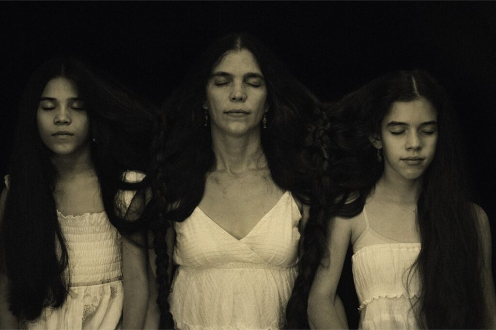
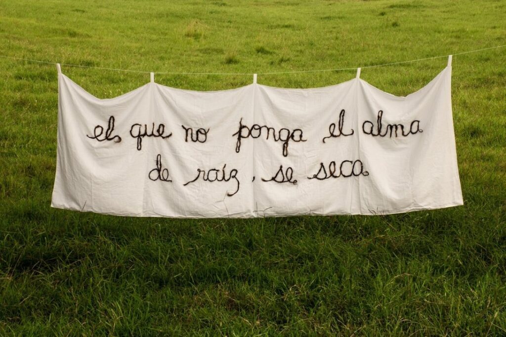
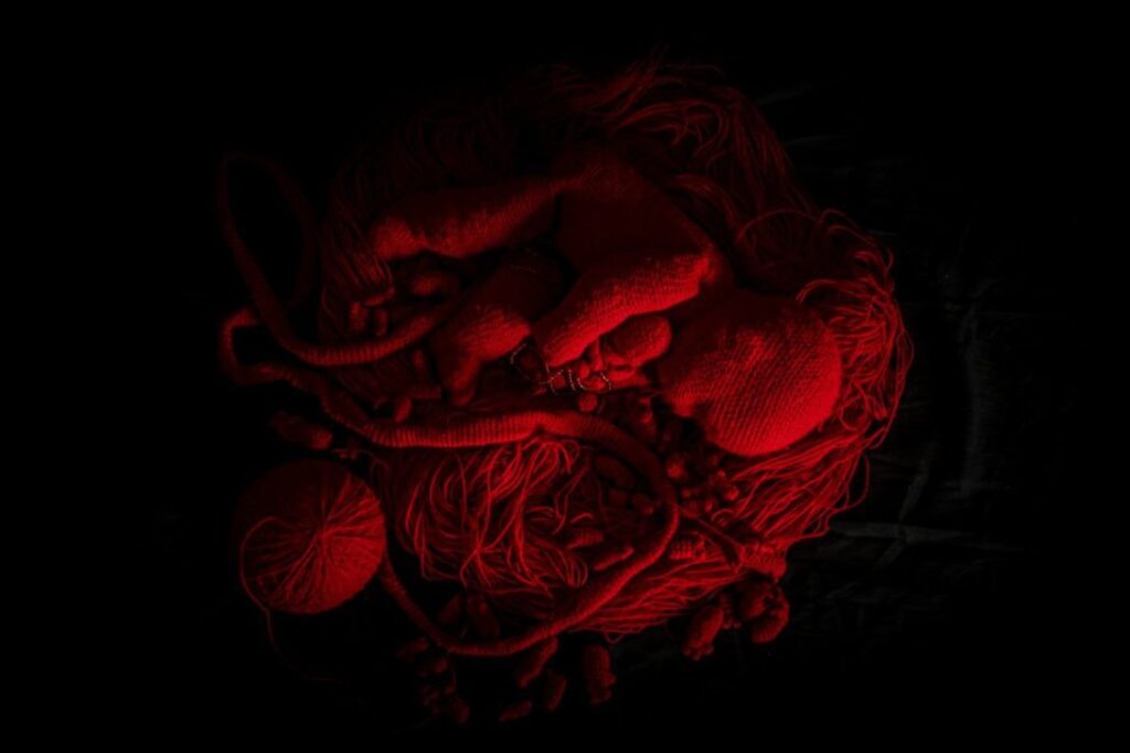
Obra de la artista Nadia Díaz Graverán, lavando la bandera cubana. | Imagen: Proyecto Sendero del Polen
Nadia Díaz: artista multidisciplinar cubana que explora la memoria, la feminidad y el poder
Nadia Díaz es una artista multidisciplinaria cubana cuya obra explora los territorios de la memoria, la feminidad y el poder a través de prácticas profundamente personales y procesuales. Su trabajo no solo se inserta en el contexto del arte contemporáneo, sino que se desarrolla como un acto de vida, donde la creación y la existencia se entrelazan. Díaz toma como punto de partida su experiencia directa como mujer, madre y habitante de la Cuba actual, y a partir de allí dialoga con tradiciones ancestrales, filosofías orientales y los materiales más cotidianos para construir obras que son a la vez testimonio, reflexión y ritual.
En esta entrevista, Díaz aborda la manera en que se aproxima a cosmovisiones indígenas —como la Navajo y la Wixárika (Huichol)— y cómo incorpora sus enseñanzas de belleza, equilibrio y espiritualidad sin caer en la apropiación superficial. También reflexiona sobre la tensión entre verdad y ficción en el arte contemporáneo, y sobre cómo su proceso creativo, profundamente orgánico y meditativo, se enfrenta a las limitaciones materiales y económicas de la Cuba contemporánea.
Obra de la artista Nadia Díaz Graverán. | Imagen: Proyecto Sendero del Polen
A lo largo de la conversación, Nadia nos invita a pensar el arte como un medio para la evolución personal y espiritual, más que como un fin en sí mismo, y nos recuerda que la belleza —entendida como armonía, presencia y atención— puede coexistir incluso en medio de la crisis, la sombra y la escasez. La entrevista revela no solo la obra de Díaz, sino también su ética, su filosofía de vida y su compromiso con la autenticidad y la verdad, ofreciendo una mirada única sobre la creación artística que trasciende lo visual para habitar lo profundamente humano.
AMM: Mencionas que Sendero del Polen proviene de un proverbio Navajo en el que la belleza se presenta como una filosofía de vida: la belleza de estar conectados con este hogar que es la Tierra. En la cosmovisión Navajo, el concepto de hózhǫ́ no se limita a la idea occidental de belleza estética; se refiere más bien a un estado de armonía, equilibrio y orden cósmico que se camina activamente a lo largo de la vida.
Por otro lado, también haces referencia al pueblo Wixárika (Huichol) y a su tradición artística de tablas de estambre y trabajo con cuentas, prácticas profundamente ligadas a su concepto de nierika: el portal espiritual, la capacidad de ver más allá de lo visible.
En ese sentido, ¿cómo has transitado el delicado proceso de beber de estas filosofías ancestrales —Navajo y Wixárika— sin caer en una apropiación cultural superficial? ¿Has tenido contacto directo con estas comunidades, o tu aproximación ha sido principalmente bibliográfica, intuitiva o mediada?
Además, ¿de qué manera tu contexto específico como mujer cubana, madre y artista que trabaja en Calabazar transforma y reinterpreta estas cosmogonías, en lugar de simplemente replicarlas? Finalmente, ¿cómo negocias el respeto por lo sagrado de estas tradiciones con la libertad propia de la creación artística contemporánea?
ND. Siempre me han fascinado las culturas que están conectadas a la naturaleza con respeto y admiración, no solo como supervivencia física sino como aprendices espirituales.
El concepto Navajo de belleza expresa mucho de lo que siento como persona, donde la belleza y el bienestar son un estado, no un factor externo, esto es algo que he comprendido con el paso de los años y que cada día intento dejarle a los míos como legado, sobre todo en una tierra ahora deshecha que puede quitarte los sueños con facilidad. El pueblo Wixarika es un maestro de vivir en su propio mundo y su arte es parte inseparable de su cultura, donde cada pequeño detalle es un mensaje simbólico cargado de poder. Beber de ellos no es algo forzado, somos hijos de la misma tierra Americana, es información que llevamos, solo hay que escucharla.
Obra de la artista Nadia Díaz Graverán. | Imagen: Proyecto Sendero del Polen
Me encantaría tener la experiencia directa de compartir con ellos, pero en este caso me apropio de una técnica que aprendí de libros y luego observando en los medios ya que me da libertad y velocidad de realización, en comparación con otras como el bordado o el tejido en telar. Dibujar con hilo sobre superficies es algo que disfruto tremendamente y que atesoro como poder personal. Me interesan las facilidades que me aporta como artista y los aprendizajes que me deja como persona, pues el tiempo invertido en cada obra me transforma. Reproducir su cultura no es mi objetivo, sino expresarme a través de métodos que siento propios, dándome el placer de activarlos y disfrutarlos mientras cuento el mensaje que me atraviesa, siempre desde el respeto a la tradición y la cultura de donde provienen.
AMM: Afirma vivir “en la búsqueda de un equilibrio constante que me permita, principalmente, evolucionar como ser humano, ser humilde, aprender cada día un poquito más y siempre trabajar con la verdad”. Este compromiso con la verdad aparece reiteradamente: “Como madre, cada momento es una oportunidad de enseñar y aprender… Es importante que cada cosa sea dicha de la manera correcta, que la verdad esté presente, aunque duela o se confunda”.
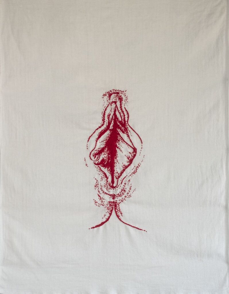
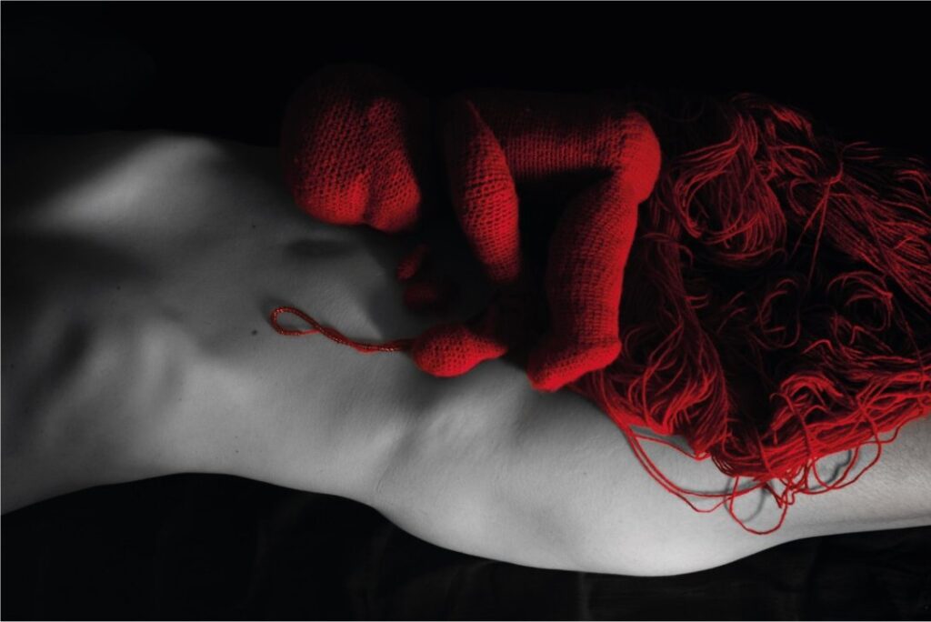
En el arte contemporáneo existe una tensión entre verdad (autenticidad, testimonio, experiencia vivida) y ficción (construcción, performance, representación). Tu obra opera claramente desde el testimonio —sangre real en pañales reales, tu cuerpo real, fetos tejidos durante un embarazo real.
¿Cómo defines “trabajar con la verdad” en tu práctica artística? ¿Existe algún límite en lo que estás dispuesta a exponer, alguna verdad demasiado íntima o dolorosa que decides proteger del escrutinio público?
¿Cómo proteges a tus hijos —esos “tres testigos invariables”— cuando gran parte de tu obra los incluye implícita o explícitamente? ¿Han tenido edad suficiente para consentir o comprender que su gestación, nacimiento y crianza son también material artístico público?
Describes tu trabajo como profundamente procesual: “Respeto los procesos de cada pieza, casi todas pasan por un estado de concepción, gestación y luego nacimiento, en el que empiezo con mucho furor, las dejo madurar, y después las termino”. Esta temporalidad orgánica —que puede tomar meses o años— contrasta violentamente con las demandas del mercado del arte contemporáneo, que exige producción constante, deadlines, obras terminadas para exposiciones con fechas fijas.
ND. Para mí, la obra y la vida se entrelazan, van juntas, no son eventos aislados o personajes ficticios, esto que lees, esto que ves, esto que sientes, soy yo. “Trabajar con la verdad” no es una opción, es un camino que se abre ante el cual no hay arma ni defensa, solo aceptación, no implica que sea fácil, solo es verdad. Hablo de mi experiencia como el territorio que más conozco, porque es allí donde aprendo en un proceso cíclico y creativo. Hay cosas que no se cuentan porque están hechas de silencio, y otras que no se callan porque su propósito es romper ese silencio…
Mis hijos son importantes en la misión de esta vida, una responsabilidad que asumo siempre desde el amor, con todos sus rostros. Ellos saben quién soy y cuanto les contengo, siempre desde el respeto, cada arquetipo que encarnan está en conexión con ellos, lo han disfrutado, comprendido e identificado. Son parte del material con el que construyo mi obra, que no es más que la propia vida.
Trabajar con un tiempo propio tiene sus riesgos, pero sobre todo satisfacciones, no busco un final en función de fechas o eventos, solo cuando la obra está lista se manifiesta y concluye. Es cierto que mi producción tiene un ritmo más pausado, orgánico o gestual guiado por el impulso creativo o el rigor de la técnica. Todo esto me lleva a intervalos en los que me aparto de las redes, las exhibiciones, las muchedumbres y el estar pendiente, es un estado en el que solo estamos ellas y yo, en medio de lo cotidiano y los deberes, siempre hay un momento de creación, imprescindible para mi equilibrio personal. He ahí su gran valor, el estado meditativo que propicia el aprendizaje y desarrollo, algo que disfruto tremendamente. Claro que hay un tiempo para cada cosa, de introspección y de compartir lo creado, de aplicar e impulsar propósitos más externos o económicos, pero esto, aunque importante, no puede ser el motor que mueve mi mundo. Creo que el arte es una necesidad visceral que no puede ser ignorada, no importa su discurso, solo debe ser real, auténtico y sincero. Doy gracias por la posibilidad de seguir haciendo aquí y ahora y aunque no siempre puedo alimentar con ello a los míos, si puedo seguir creciendo.
Obra de la artista Nadia Díaz Graverán. | Imagen: Proyecto Sendero del Polen
AMM: Vives en la Cuba actual, en Calabazar, donde mencionas “las constantes situaciones que conlleva este hacer en la Cuba de aquí y ahora”.
¿Cómo impacta la escasez material, las dificultades económicas y las limitaciones de infraestructura cultural en tu práctica procesual? ¿Es posible evolucionar espiritualmente como ser humano cuando hay urgencias materiales básicas?
Algunas filosofías orientales (budismo, yoga) que mencionas como influencias, proponen desapego material y contemplación, pero ¿cómo se vive eso en una economía de carencia?
¿Existe el privilegio de la lentitud contemplativa, o es también una forma de resistencia política trabajar a tu propio ritmo en un contexto que exige supervivencia inmediata?
ND. Esta pregunta es muy importante. Crear en un país desecho exige mucha entereza, implica estar convencido de que eso es lo que quieres y debes hacer. El impacto es directo, violento en ocaciones, brutal, despiadado, pero a la vez es poético e imprescindible. Hoy vivimos unas de las etapas literalmente más oscuras de la historia de la nación. Soy de los 80, nací en una familia militar en medio del fervor revolucionario, creí en ella hasta que poco a poco fue perdiendo el encanto, la magia y la luz. Como madre hoy me enfrento a situaciones que me sacan de mi centro, de mi paz, de mi estabilidad mental y emocional, sin embargo nada de eso puede ser suficiente para frenar el impulso de crear, porque ese acto me permite volver y encontrarme, si no fuera así estaría muy loca. Ahora mismo escribo en la oscuridad, y siento que he aprendido de todas esas filosofías lo mismo que me ha enseñado mi experiencia vital: el bienestar es un estado, no una situación externa, hay que encontrarlo y propiciarlo de todas todas. Es muy fácil estar en paz teniendo todo resuelto, es en la carencia en que se manifiesta la más cruda belleza. No estoy para nada conforme ni de acuerdo con nuestra situación, quiero una isla libre y limpia, solo busco la manera de seguir adelante entre carencias apremiantes, donde la realidad no deja de sorprenderte cada día y te exige más, y más, y más.
La escasez material golpea directamente en nuestras vidas y en la producción de la obra. Muchas veces he de pensar en función del material que tengo, del que puedo importar, transformar o reciclar, y esto no nos hace menos a mi o a mí obra, solo reales, auténticas, vivas. Creo que sí, que darme el derecho de trabajar a mi ritmo es un privilegio en estos tiempos, y tener el arte como resguardo o punta de flecha también.
AMM: Evolución como Ser Humano: Arte como medio, no como fin
Afirmas que vives “en la búsqueda de un equilibrio constante que me permita, principalmente, evolucionar como ser humano, ser humilde, aprender cada día un poquito más”.
Esta declaración sitúa tu evolución personal —no tus obras físicas— como el objetivo primordial de tu práctica. Es una inversión radical de prioridades: el arte no es el fin, sino el medio para tu transformación espiritual.
Esta visión conecta profundamente con filosofías orientales como el Karma Yoga (yoga de la acción correcta, donde el proceso importa más que el resultado) y con prácticas contemplativas donde la creación artística funciona como meditación activa. También resuena con el concepto alquímico occidental de la Magnum Opus —la Gran Obra— que no es producir oro material, sino transmutar al alquimista mismo.
¿Cómo mides tu evolución como ser humano? En un mundo obsesionado con métricas —ventas, seguidores, exposiciones, reconocimiento crítico— tú propones una métrica invisible e íntima.
¿Hay momentos en que sientes que has retrocedido espiritualmente pese a haber producido obras exitosas? ¿O momentos en que no has creado nada “visible” pero has evolucionado profundamente?
ND. Si, el proceso para mí es lo más importante, es donde aprendo, cambio, me deconstruyo y transformo, es mi maestro, todo ello enriquece la obra resultante. Realmente no he “medido” mi evolución personal, pero si contemplo resultados tangibles respecto a mi persona, familia y trabajo, principalmente en lo cotidiano, donde las pequeñas cosas son los grandes maestros. Amo esa intimidad donde nacen las ideas, donde se gestan las piezas y cada experiencia pasa a ser parte de ellas, porque están tejidas con el hilo de la vida, invisible pero real. A veces la presión externa entra, y una ve que todo afuera tiene un ritmo y una velocidad mayor, que hay exigencias que se deben cumplir y estándares que se deben seguir. Nada de ello puede ser primordial, no más que crecer como persona, ser sincero en lo que hablas y compartes y construir una obra que sea auténtica, porque dice de tí, de lo que crees, lo que eres, lo que te preocupa y completa. Intento ser siempre transparente (aunque cueste) no mentirme, ni a los míos, lo que cuento en mis piezas siempre viene de algo que me marcó, me atravesó o tocó dentro. No puedo hablar de lo que no conozco, ni defender lo que no entiendo, es así de simple. Hay momentos intensos, donde una puede pensar que ha retrocedido o se ha estancado, pero naturalmente es imposible, la evolución siempre es hacia adelante, quizás en ocasiones no se vea o se sienta como tal, pero siempre estamos evolucionando. Creo que el error más común es comparar tu experiencia con la de otros, ahí es donde te pierdes, cada viaje es personal y depende de las decisiones que tomamos en él, el regalo de nuestro libre albedrío, de ahí nace el merecimiento y por supuesto, cada uno es individual.
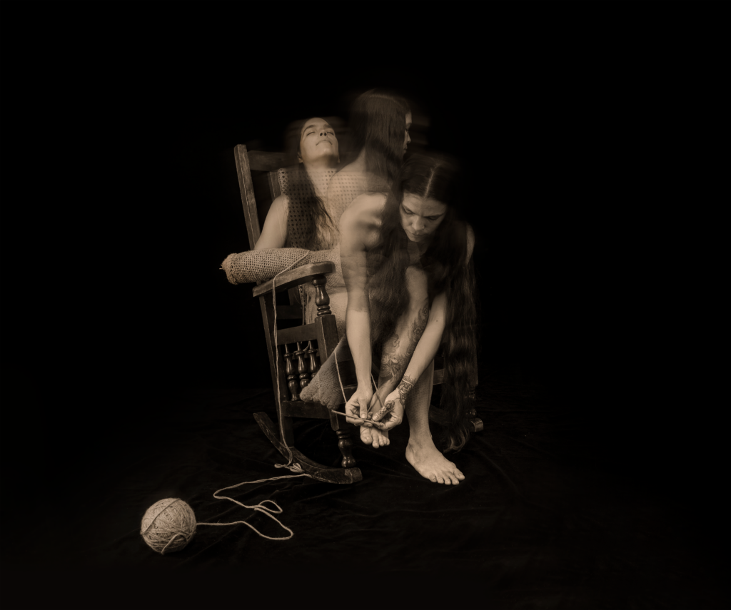
Obra “Mujer que se teje a sí misma”, de la artista Nadia Díaz Graverán. | Imagen: Proyecto Sendero del Polen
AMM: Crisis, sombra y belleza: Integrar lo no-armónico
¿Qué papel juegan el fracaso, la duda y la oscuridad en este proceso evolutivo?
Todas las tradiciones espirituales que mencionas reconocen que el crecimiento genuino a menudo ocurre en crisis, no en momentos de armonía. Hablas de “placeres, dolores, miedos, tabúes, rabias, perdones” en tu trabajo.
¿Cómo integras las partes de ti misma que no son “bellas” según el concepto Navajo de hózhǫ́?
¿Es posible caminar en belleza cuando estás atravesando la rabia, el miedo o la desesperación de la realidad cubana contemporánea?
ND. Si, es posible, de eso se trata, de encontrar belleza en todo, hasta en lo que nos repugna. Actualmente estamos en medio de un caos silencioso, que no sabemos cómo, cuándo, ni dónde va a eclosionar, no hay promesas de nada, solo especulaciones y espectativas. Todo esto se te agolpa en el alma, te estruja, sacude, desbarata y sale por la vía más fácil de escape, en mi caso: el arte. Tenerlo de aliado me ha sanado en muchas ocasiones, y lo seguirá haciendo hasta que me despida de este mundo, porque es mi naturaleza, soy creadora. Hablo no solo desde el arte visual, cuando sirvo la comida diaria y la presento hermosamente a pesar de las carencias, es arte, cuando explicas a un hijo una verdad de manera sencilla pero irrevocable que sabes que lo ayudará a comprender el mundo y lo recordará para siempre, es arte. Cuando siembras para comer, recoges tu basura, escuchas una canción, compartes un juego que solo sucede en apagón, cuando te conviertes en cada cosas que haces, es arte, y todo ello, es belleza. Las partes que no son hermosas se integran de manera natural, porque son también la vida y su curso, pruebas importantes para aprender, romperse y continuar. La Cuba de hoy tiene mucho que evolucionar, liberar, limpiar, aprender y reconstruir, así como todos los cubanos. Esta pequeña parte que soy intenta poner su semilla, cuidar de su siembra y, a pesar de todo, cosechar su belleza.
Nadia Díaz es una artista cubana multidisciplinaria y licenciada en Escultura por la prestigiosa Academia Nacional de Bellas Artes San Alejandro de La Habana.. Su trabajo profundiza en la memoria, feminidad, y dinámica de poder a través de un lenguaje visual simbólico que entrelaza lo personal y el colectivo. Influenciado por el conocimiento textil transmitido de su madre y una infancia que se dedica a ambientes militares, El arte de Díaz reflexiona sobre la autoridad, tradición, insularidad, ciclos de vida, y la relación entre humanos y la naturaleza.
Su práctica creativa combina a la perfección técnicas tradicionales y contemporáneas., utilizando una amplia gama de medios como el bordado, tejeduría, cerámica, grabado, cestería, escultura, instalación, fotografía, video arte, arte digital, astrología, y tarot. Central en su proceso es la idea de la creación artística como camino de transformación personal y simbólica..
Entre sus exposiciones individuales se encuentran Línea de la vida (Centro Hispanoamericano de Cultura, 2022–2023) y Viaje a la tierra del hermano venado (Casa de las Américas, 2019–2020). Ha participado en exposiciones colectivas por toda Cuba., España, los Estados Unidos, China, Colombia, México, y el Reino Unido. Las apariciones notables incluyen arte digital y eventos NFT como Lo que menos sufrimiento genere (Factoría Habana, 2025), la XI Bienal Internacional de Arte Textil MIFA Miami (2025), el Festival de Intercambio de Arte AEF en Madrid (2024), y Atravesar el Caribe a la sombra de una Ceiba en el Centro Wilfredo Lam (2024).
Su obra forma parte de colecciones privadas en Madrid., Suiza, Miami, toronto, y el reino unido, así como entre los coleccionistas de arte digital de todo el mundo.
Obra de la artista Nadia Díaz Graverán. | Imagen: Proyecto Sendero del Polen
Un reconocimiento obligado al inicio de este artículo: la publicación de Art Info Magazine ha tenido el coraje y la lucidez de articular, con claridad y sin eufemismos, una transformación que muchos en el mundo del arte percibimos pero pocos se atreven a nombrar en voz alta. Su guía para curadores en 2026 es un documento que merece lectura detenida. Lo que sigue es un diálogo crítico y expandido con esas ideas.
La Muerte del Cubo y su Larga Agonía
Hubo un tiempo en que la galería de arte moderna fue una idea radical. Las paredes blancas, el silencio, la luz artificial controlada, la ausencia de contexto: todo aquello que Brian O’Doherty analizó en sus célebres ensayos publicados en Artforum entre 1976 y 1981, reunidos bajo el título Inside the White Cube, representó en su momento una ruptura con la recargada sala decimonónica, donde los cuadros se apilaban del suelo al techo como mercancía en un almacén burgués. El artista y crítico O’Doherty argumentó cómo la modernidad generó un espacio neutral para aislar cada obra de su contexto inmediato y de todo aquello que pudiera distraer la experiencia del espectador hacia el objeto mismo. Dentro de estos preceptos, la obra de arte debía ser asimilada y percibida dentro de su lógica interna, y no puesta en relación con su contexto cultural, económico o político. Yale University
Era una promesa de pureza. Y como toda promesa de pureza, terminó revelándose como una ideología disfrazada de neutralidad.
Lo que O’Doherty llamó “cubo blanco” no era, en realidad, un espacio inocente. Era — y sigue siendo donde sobrevive — una máquina cultural diseñada para producir un tipo específico de espectador: educado, silencioso, con tiempo libre y capital cultural suficiente para saber qué hacer ante una tela monocroma o una instalación de neón. El crítico Paco Barragán ha señalado que la historia real del cubo blanco es más compleja y anterior a la narrativa de O’Doherty: fue la Secesión vienesa, la Galería Nacional de Berlín y la Bauhaus quienes entre 1900 y 1930 inventaron, experimentaron y desarrollaron el espacio expositivo de pared blanca, antes de que Alfred Barr y el MoMA lo ajustaran y perfeccionaran para representar la ideología formalista del arte. Tripadvisor
Sea cual sea su genealogía exacta, el diagnóstico es el mismo en 2026: ese modelo ha agotado su potencial transformador. Había nacido como liberación y se convirtió en convención. La pregunta no es si debe morir, sino qué lo reemplaza.
El Visitante como Cuerpo que Aprende
El primer gran eje de la transformación curatorial contemporánea tiene que ver con una constatación neurológica que la museología tardó demasiado en asumir: los seres humanos no somos ojos montados sobre patas. Somos cuerpos enteros.
Los museos contemporáneos se están transformando en espacios de percepción total. Hoy, visitar una exposición implica no solo mirar, sino también escuchar, oler, tocar e incluso sentir físicamente el conocimiento. En este nuevo paradigma, la experiencia multisensorial ya no es un recurso estético: es el eje central de una museología que entiende al visitante como un cuerpo que aprende, recuerda y se emociona. Arts Help
Este cambio no es caprichoso ni decorativo. Responde a evidencia científica acumulada durante décadas. Muchos científicos e investigadores utilizan técnicas de aprendizaje multisensorial, basadas en experimentar a través de todos los sentidos para ayudar a reforzar la memoria. Se ha demostrado que cuando los visitantes activan más sentidos, son capaces de recordar mejor las cosas después de su experiencia. Palaciodelaesmeralda
Las implicaciones para la práctica curatorial son enormes. Iniciativas como la “Tate Sensorium” en Londres, que incorporó sonidos, olores y degustaciones en la interpretación de obras de arte, demostraron el enorme potencial de un enfoque integral, capaz de estimular la imaginación y generar recuerdos más duraderos. Wikipedia Estas no son excentricidades de una institución con presupuesto sobrante. Son señales de un cambio de paradigma.
El diseño museístico del siglo XXI debe orquestar estímulos sin saturar al visitante, creando armonía entre lo que se percibe y lo que se comprende. Los sentidos, bien empleados, son un lenguaje universal: pueden hacer visible lo invisible, reactivar la memoria y conectar pasado y presente de una manera que las palabras solas no consiguen. Arts Help
La pregunta que todo curador debe hacerse hoy — y que Art Info Magazine formula con precisión admirable en su guía — ya no es “¿cómo se ve esta exposición?” sino algo más exigente y más honesto: si un visitante cerrase los ojos al entrar, ¿qué se llevaría consigo?
Neurodiversidad: Del Gesto Ético a la Obligación Profesional
Junto a la apertura sensorial viene otra transformación que define la práctica curatorial de 2026: el diseño para la neurodiversidad ha pasado de ser un mérito opcional — el tipo de iniciativa que aparecía al final de una nota de prensa como prueba de buenas intenciones — a convertirse en un estándar profesional irrenunciable.
El diseño museográfico sensorial se basa en el uso de todos los sentidos humanos para interactuar con el entorno del museo. En la museología sensorial, esto implica incorporar estímulos táctiles, auditivos, olfativos y gustativos en las exposiciones. Smarthistory Pero más allá de la técnica, hay una apuesta filosófica de fondo: diseñar desde la pluralidad sensorial implica asumir que no existe un visitante estándar, sino una diversidad de cuerpos que sienten, perciben y aprenden de manera distinta. Arts Help
La accesibilidad se amplía al permitir que más personas disfruten de las exposiciones a través de experiencias multisensoriales. The Archaeologist Las réplicas táctiles en impresión 3D de artefactos y esculturas; los paisajes sonoros direccionales que guían el recorrido sin depender de la lectura; los mapas sensoriales previos a la visita para personas con autismo o hipersensibilidad: todas estas son herramientas que ya existen, que ya funcionan, y que aún son excepcionales en la mayoría de las instituciones cuando deberían ser la norma.
El curador del siglo XXI no puede permitirse diseñar exposiciones para un visitante ideal que llegue descansado, en silencio, con suficiente tiempo y sin ninguna condición neurológica que complique la experiencia. Ese visitante ideal es una ficción estadísticamente minoritaria.
La Fatiga del Algoritmo: Por Qué el Arte Físico Nunca Ha Importado Más
Hay una paradoja en el corazón de la cultura contemporánea que los curadores más perspicaces están aprendiendo a explotar. Vivimos en la era de la saturación digital — más imágenes, más contenido, más estímulos visuales que en cualquier momento anterior de la historia humana — y, sin embargo, la hambre por la experiencia física y presencial no hace más que crecer.
La pantalla produce imágenes infinitas pero no produce presencia. No produce el peso de un óleo centenario en una sala silenciosa. No produce el olor de la cera en un templo budista visitado como espacio expositivo, ni la resonancia de un gong que activa la misma obra desde otro ángulo. El diseño multisensorial de las exposiciones de los museos no se limita simplemente a diseños superficiales para el disfrute, sino que actúa como un catalizador mediador que juega un papel básico y crítico en el compromiso emocional, la reminiscencia y la relevancia personal. Red Emerald
En este contexto, integrar obras de inteligencia artificial o piezas digitales en el espacio físico requiere un cuidado especial. La tentación institucional ha sido crear lo que algunos críticos llaman “la caja negra” al final del recorrido: una sala oscura con pantallas parpadeantes donde van a morir las obras digitales, aisladas del resto de la exposición como si fueran una atracción de feria. Ese error de diseño traiciona tanto a las obras digitales como al conjunto de la muestra. La clave está en la integración: en tratar una pieza generativa o un video de inteligencia artificial con el mismo rigor contextual y espacial que un grabado del siglo XVII, permitiendo que el diálogo entre ambos produzca un significado que ninguno de los dos podría generar en soledad.
La Logística Como Argumento Político
Uno de los aspectos más incómodos — y más necesarios — del debate curatorial en 2026 es el que raramente aparece en los textos teóricos: el dinero, la logística, el carbono.
Las instituciones del arte han construido durante décadas un modelo de circulación internacional de obras que depende de cajas de embalaje de madera contrachapada, vuelos de carga intercontinentales, y seguros calculados sobre valores de mercado inflados por décadas de especulación. Ese modelo es, simultáneamente, económicamente insostenible y medioambientalmente indefendible.
Los materiales de embalaje sostenibles — micelios de hongos, plástico reciclado oceánico, materiales de ciclo cerrado — ya existen y su adopción como estándar industrial no es una utopía verde sino una necesidad económica. El transporte por tierra y mar, durante décadas visto como la opción más lenta y menos conveniente, es hoy la opción financieramente más razonable cuando se internalizan los costes reales, incluidos los impuestos al carbono que los gobiernos están progresivamente incorporando.
Un curador que en 2026 diseña una exposición sin modelar sus costes logísticos reales, sin incluir un análisis de impacto ambiental del transporte, y sin explorar opciones de producción local o regional, no está siendo simplemente descuidado. Está siendo anacrónico.
La Periferia como Centro: La Revolución de las Bienales Regionales
Quizás la transformación más significativa y menos comprendida del panorama curatorial contemporáneo sea la redistribución geográfica del poder cultural. Las grandes capitales del arte — Nueva York, Londres, Basilea, París — siguen siendo nodos importantes de circulación y mercado. Pero han dejado de ser los únicos lugares donde ocurre algo que importe.
La segunda edición de la Bienal de Malta, bajo la dirección artística de la curadora internacional Rosa Martínez, inaugurará en marzo de 2026 con el título CLEAN | CLEAR | CUT, con un foco explícito en el papel del Mediterráneo como uno de los centros neurálgicos del cambio global. ENIGMA Joyería En el otro extremo del mundo, la Bienal de Antioquia de 2025 se convirtió en un catalizador de cambio social y económico, recibiendo más de 400.000 visitantes y reuniendo más de 160 artistas nacionales e internacionales, en la primera bienal verdaderamente descentralizada de Colombia, cubriendo las nueve subregiones de Antioquia y fusionando tradición ancestral con tecnología de vanguardia. Emerald By Love
La primera Bienal Internacional de Arte y Ciudad de Bogotá, BOG25, celebrada entre septiembre y noviembre de 2025, buscó posicionar a Bogotá en el gran circuito del arte internacional, con un modelo curatorial tripartita que reunió a historiadores del arte, críticos e investigadores para resignificar el espacio público bogotano de maneras poéticas, disruptivas y creativas. Visit my Colombia
Y en el nivel más expansivo, la quinta edición de BIENALSUR en 2025 tuvo lugar en más de 135 sedes de 35 países, desplegando una cartografía transnacional del arte contemporáneo que conecta simultáneamente espacios de arte, creadores, públicos y comunidades de todos los continentes. Wikipedia
Lo que está ocurriendo no es una mera descentralización decorativa. Es una reconfiguración profunda de quién tiene derecho a producir narrativas culturales y desde dónde. Las bienales del llamado “nuevo modelo”, que tienen como punto de inflexión la primera Bienal de La Habana en 1984, comenzaron a celebrarse en emplazamientos geopolíticos periféricos y han demostrado su capacidad para generar sinergias locales y favorecer diálogos que de otra manera serían difíciles de propiciar. Wikipedia
Para el curador independiente, estas “periferias” ofrecen algo que Nueva York o Londres raramente ofrecen ya: la posibilidad de ser una voz que defina, en lugar de una voz que compita. En una feria de arte de Basilea, eres uno entre miles. En la Bienal de Malta o en la Bienal de Antioquia, estás ayudando a construir la identidad cultural de una región entera. La diferencia no es de escala sino de responsabilidad.
La Exposición como Ecosistema
El cubo blanco era un contenedor. Recibía objetos, los neutralizaba de su contexto, los ofrecía a la contemplación, y luego los devolvía al mercado o al almacén. Era, en el fondo, una cámara de compensación entre la producción artística y la circulación económica.
La exposición del futuro — que en muchos casos ya es el presente — es otra cosa. Es un ecosistema: un conjunto de relaciones entre objetos, cuerpos, narrativas, contextos locales, tecnologías, memorias y posibilidades de acción que no puede reducirse a ninguno de sus componentes por separado.
Diseñar ese ecosistema exige del curador habilidades que ningún programa académico tradicional enseñaba hasta hace muy poco: conocimientos de diseño sensorial, de logística sostenible, de tecnología aplicada, de economía cultural, de accesibilidad universal. Y exige, sobre todo, una disposición a renunciar al protagonismo intelectual del curador como “mente maestra” que orquesta el discurso desde arriba para asumir un papel más honesto y más difícil: el de facilitador de encuentros que no podría haber previsto por completo.
La exposición mejor diseñada no es la que el curador controla perfectamente. Es la que sigue produciendo significado cuando el curador se va a casa.
Fuentes consultadas: Art Info Magazine (magazine.artinfoland.com); EVE Museología+Museografía (evemuseografia.com); Brian O’Doherty, Dentro del cubo blanco — La ideología del espacio expositivo (CENDEAC, 2011); Paco Barragán, “El cubo blanco y el fracaso del curador” (artepuntoes.com, 2024); Artishock Revista, análisis crítico del ensayo de O’Doherty (artishockrevista.com, 2021); Malta Biennale 2026 (maltabiennale.art / finestresullarte.info); BIENALSUR (bienalsur.org); Bienal de Antioquia BIAM 2025 (bienalantioquia.com); Bienal Internacional de Arte y Ciudad BOG25, Secretaría de Cultura de Bogotá (culturarecreacionydeporte.gov.co); Arteinformado, crítica de la 16ª Bienal de Sharjah (arteinformado.com, 2025).
Comprehensive PPC growth strategy for a visual artist’s business
By implementing this PPC growth strategy, you can effectively reach your target audience, drive sales, and establish your brand as a leading visual artist. Let me know if you’d like to dive deeper into any specific area!
To create a comprehensive PPC growth strategy for a visual artist’s business, What we will do, if you hire us. We’ll first conduct a Google Ads Competitor Analysis to identify their strategies. Based on the findings, We’ll craft a tailored PPC strategy, including data segmentation, ad strategies, and short-, mid-, and long-term plans to help you grow your business. Here’s the step-by-step approach:
Step 1: Google Ads Competitor Analysis
Identify Competitors:
Research visual artists or art-related businesses running Google Ads (e.g., art galleries, online art marketplaces, or individual artists).
Use tools like SEMrush, SpyFu, or Google Ads Auction Insights to identify competitors bidding on similar keywords.
Analyze Their PPC Strategy:
Keywords: Identify the keywords they’re targeting (e.g., “buy abstract art,” “custom paintings for sale,” “contemporary art prints”).
Ad Copy: Review their ad messaging, CTAs, and unique selling points (e.g., “Limited Edition Artworks,” “Commission Your Custom Piece”).
Landing Pages: Analyze where their ads lead (e.g., portfolio pages, online stores, or contact forms).
Bidding Strategy: Determine if they’re using manual CPC, automated bidding, or focus on specific locations.
Evaluate Their Strengths and Weaknesses:
Note what they’re doing well (e.g., strong CTAs, visually appealing ads) and where they’re lacking (e.g., poor landing page experience, limited ad extensions).
Step 2: PPC Growth Strategy for Visual Artists
Based on the competitor analysis, here’s a tailored PPC strategy:
1. Data Segmentation Strategies
Audience Segmentation:
Collectors: Target high-income individuals searching for “luxury art” or “original paintings for sale.”
Interior Designers: Focus on keywords like “art for home decor” or “large wall art.”
Art Enthusiasts: Reach people searching for “contemporary art prints” or “emerging artists.”
Geographic Segmentation:
Focus on areas with high art demand (e.g., major cities, art hubs like Miami or New York).
Device Segmentation:
Optimize for mobile users (e.g., quick purchases) and desktop users (e.g., detailed portfolio browsing).
Sources: Museo del Oro del Banco de la República (Bogotá), Wikipedia scholarly entries on Muisca Art, Muisca Religion, and the Spanish Conquest of the Muisca; Smarthistory (academic art history platform); Natural Emerald Company historical research; Banco de la República cultural encyclopedia (banrepcultural.org); University of Yale indigenous studies program.
A Civilisation the World Forgot
When the Spanish conquistadors descended the Opón Mountains into the high Andean plateau in early 1537, they stumbled upon something they had not expected: a sophisticated, prosperous, and well-organized civilization — one that rivaled, in many respects, anything Europe could claim at the time. At this time the Muisca were one of four major civilizations in the New World, alongside the Incas, Mayas and Aztecs, but the ones history rarely discusses. They had formed a mostly peaceful confederation of tribes sharing a common language and religion, preferring a harmonious existence based around sun and moon worship (human sacrifices were rare), high-quality jewellery, pottery, and textiles. They were also excellent farmers, with salt mines and a huge supply of emeralds from eastern Boyacá. Colombia Corners
They are the forgotten civilization of pre-Columbian America. And at the heart of their culture — their art, their religion, their economy, and their mythology — was the emerald.
The Muisca: Masters of the Altiplano
The art of the indigenous inhabitants of the Altiplano Cundiboyacense is well studied by many researchers who published their work from the very beginning of colonial times. The conquistador who made first contact with the Muisca, Gonzalo Jiménez de Quesada, wrote in his memoirs about a skilled and well-organized civilisation of traders and farmers. Wikipedia
The Muisca had an economy and society considered to have been one of the most powerful of the American Post-Classic stage, mainly because of the precious resources of the area: gold and emeralds. When the Spaniards arrived in Muisca territory, they found a prosperous state. The abundance of salt, emeralds, and coal brought these commodities to a de facto currency status. Wikipedia
The Muisca made pottery and textiles, mined emeralds and salt, but lacked the gold and beeswax needed to create their signature gold pieces. For those raw materials, they bartered with neighboring peoples. Gold was not reduced to the use of the elite or the Muisca chiefs, and was not the principal object of prestige — it was mainly used for religious offering purposes. Instead, all Muisca families decorated their doors and windows with gold objects. Wikipedia
This is a crucial distinction that European observers fundamentally misunderstood: the Muisca were not accumulating wealth in the Western sense. They were engaging in a cosmic dialogue with their gods.
The Emerald in Muisca Cosmology: The Colour of the Underworld
To understand why emeralds were so central to Muisca culture, one must first understand their worldview. The Muisca were a deeply religious people. They believed that the world was divided into three parts: the Supramundo above, the Inframundo below, and the Mundo Medio in the middle, where humans existed. For the Muisca, the underworld was green — and this was the symbolic value of emeralds. This colour represented water, fertility, and the force of life, which is why they incorporated so many of these emeralds in their religious offerings. Diario Joya
Among the Muisca, emerald was a symbol of fertility. It was also revered as a mythological ancestor to their tribe. Red Emerald
In the Muisca territories there were numerous natural locations considered sacred, including lakes, rivers, forests and large rocks. People gathered here to perform rituals and sacrifices mostly with gold and emeralds. Wikipedia
The emerald was not jewellery. It was theology made tangible.
The Legend of Fura and Tena: When Tears Became Stones
Every civilization creates origin myths for its most precious things. The Muisca story of how emeralds came to exist is one of the most moving in the pre-Columbian world.
The legend of Fura and Tena tells how the emeralds were created, and the rocks that contain them. Are, the supreme god and creator of the territory and people of the Muzos, created on the banks of the sacred river the first human beings, calling the woman Fura and the man Tena, granting them immortality on the condition that they remain faithful to each other. Diario Joya
Their peace was shattered by the arrival of a mysterious stranger called Zarbi. Fura was tempted by the stranger. As punishment, the two lovers were transformed into mountains, and from Fura’s weeping — deep and eternal — the emeralds were born, as green tears rising from the entrails of the earth. This story speaks not only of love and punishment, but also of the spiritual bond between human emotions and nature — a relationship the Muisca respected profoundly. Zipaquiraturistica
Today, in the municipality of Muzo in western Boyacá, two hills known as Fura and Tena rise above the Guaquimay River, separated by water as a symbol of the separation the lovers were forced to endure. For the indigenous Muzo people, these mountains were considered sacred places where their gods dwelled, and where they built altars for sacrifices. ENIGMA Joyería
It is worth noting that the two largest emeralds ever found — discovered in 1999 in the mines of Muzo — were named Fura and Tena in honour of this legend, carrying the mythology of a lost civilisation into the present day.
The Art of Goldwork: Tunjos and the Language of Offering
For Muisca goldsmiths, art had a double significance: aesthetic expression and religious symbolism. Among Muisca goldwork, the tunjos stand out — small human figures made in a single piece from thin sheet metal, in the form of a triangular plaque, stylizations made using the lost-wax technique. Todacolombia
The tunjos served three purposes: as decoration of temples and shrines, for offering rituals in the sacred lakes and rivers, and as pieces in funerary practices to accompany the dead into the afterlife. Ceramic human tunjos were kept in the houses of the Muisca, together with emeralds. Wikipedia
Muisca gold pieces are distinct from those of other Pre-Columbian peoples in terms of their use, manufacture, and appearance. The Muisca votive offerings were not worn as clothing or jewellery, but instead were used for symbolic purposes. They were often small enough to hold in the hand — sometimes as small as 1.5 cm. The tunjos were lost-wax casts using tumbaga, a gold alloy containing as much as 70% copper. Furthermore, Muisca objects are identifiable by their rough surfaces, in contrast to the polished gold of surrounding regions. Wikipedia
The Muisca society was in essence egalitarian, with slight differences in terms of jewellery use. The guecha warriors, priests and caciques were allowed to wear multiple types of jewellery, while common people used fewer ornaments. Golden or tumbaga jewellery consisted of diadems, nose pieces, breastplates, earrings, pendants, tiaras, bracelets, and masks. Wikipedia
The Muisca Raft: The Greatest Artwork of Pre-Columbian Colombia
No object better illustrates the fusion of emeralds, gold, and sacred ritual in Muisca culture than the Balsa Muisca — the Muisca Raft — housed today in the Museo del Oro in Bogotá.
Gold embodied profound meaning in the cosmogony of pre-Columbian societies as a sacred metal — a recipient of the Sun’s energy, a life-giving star, the source of fertility. Gold objects were not considered symbols of material wealth; they highlighted prestige and served as religious offerings. This marvellous piece, an outstanding example of a votive figure, is 19.5 cm long, 10.1 cm wide, and 10.2 cm high. It was made during the late period of the Muisca culture, sometime between 1200 and 1500 AD, cast as a single piece in a clay mould using the lost-wax technique, in high-grade gold (over 80%) alloyed with native silver and copper. Colombia Travel
The ritual it depicts consisted of making offerings to the deity Chibchachun, the god of merchants and goldsmiths. The types of offerings placed on the raft consisted of emeralds and gold, typically in the form of tunjos. The figure standing at the centre is believed to be the cacique, identified through hieratic scale — depicted larger than any other figure. The heavily adorned figure stands prominently at centre, flanked by twelve smaller figures wearing masks, carrying canes, and rowing. Smarthistory
By the reports of the Spanish chroniclers, when the Muisca cacique died, his nephew who succeeded him was acknowledged by his people in a ceremony that took place on a lake and included sailing on a raft and offering pieces of gold and emeralds that were thrown into the water. Banco de la República
The Muiscas conceived gold as part of a cycle they had to carry out to maintain nature’s balance. As they understood gold as a gift from the sun, they gave it back to the sun god and other gods as an offering through a ritual called “ATA-TA.” At times of the El Dorado ceremony, the Cacique would be covered with gold dust and embark on a reed raft laden with gold and emerald offerings. Arts Help
The raft was found in 1969, hidden in a ceramic pot inside a cave in the municipality of Pasca. It has never left Colombia. It has become an emblem of the nation, and the Bank of the Republic divulged it on banknotes. Today it is a symbol of Colombia and of Colombian identity, recognized as a masterpiece of the country’s indigenous ancestral culture. Banco de la República
Sacred Geography: The Lakes as Portals
The Muisca religion centred on two main deities: Sué for the Sun and Chía for the Moon. The supreme being was Chiminigagua, who created light and the Earth. The Muisca worshipped their gods at sacred sites — both natural, such as Lake Guatavita, the Siecha Lakes and Lake Tota, and constructed: the Sun and Moon Temples. Important lakes for rituals included Lake Guatavita, Lake Iguaque, Lake Fúquene, Lake Tota, the Siecha Lakes, Lake Teusacá and Lake Ubaque. Wikipedia
At these semi-annual festivals, the Caciques and the principal chiefs, bearing valuable gifts of gold-dust and emeralds, were paddled out in canoes to the exact middle of the lake, this point being determined by the intersection of two ropes stretching from four temples erected at four equidistant points on its banks. Once they arrived at this spot, the offerings were cast into the lake. Red Emerald
These lakes were not merely bodies of water. They were mouths of the earth — passages through which offerings reached the divine. One of the most extraordinary finds at the edges of Lake Guatavita during a later drainage attempt was, according to historical records, an emerald the size of a hen’s egg.
Architecture and the Lost Temples
While the other three great pre-Columbian civilisations — the Maya, Aztec, and Inca — are known for grand stone architecture, the modest Muisca architecture has left very little physical trace. The houses, called bohíos or malokas, and temples where spiritual gatherings took place honouring the gods and where tunjos, emeralds, and offerings were sacrificed, were made of degradable materials such as wood. Wikipedia
This is why so little survives. Not because the Muisca were less sophisticated — but because their architecture was organic, integrated into the land rather than imposed upon it. And because what was built from wood burns.
The Conquest: When the Sacred Became Plunder
In March 1537, Gonzalo Jiménez de Quesada led approximately 200 surviving soldiers up into Muisca territory. The Muisca were renowned for their intricately crafted goldwork and abundant emeralds. They were among the richest societies in all the New World. That wealth, however, became the impetus for their conquest. The plunder stolen by Jiménez de Quesada’s men nearly rivalled Francisco Pizarro’s sacking of the Inca. Earthasweknowit
The final haul was 200,000 gold pesos and 1,800 emeralds. Earthasweknowit
The spiritual heart of the Muisca world was destroyed in a single night. The Temple of the Sun, built to worship the Sun god Sué, one of the two main deities in the Muisca religion, was a temple filled with gold, emeralds, cloths, and mummies. While Gonzalo Jiménez de Quesada ordered his men to leave the Sun Temple, two of his soldiers entered the temple at night and found the mummies sitting on elevated platforms inside. Their torches accidentally set the temple, made of wooden poles and clay, on fire. Before this, the conquistadors had looted the temple and taken more than 300 kilograms of gold, worth 80,000 ducats at the time. Wikipedia
Spanish demand for emeralds exhausted ancient Muisca mines, while introduced livestock transformed the Andean ecosystem. Ancientwarhistory
The emeralds the Spanish extracted from the Chivor and Somondoco mines — stones that the Muisca had used as offerings to their gods, as symbols of the fertile underworld, as tears crystallized from a mythological love story — were pried from their sacred context, stripped of meaning, and shipped to Europe to be reset in the crowns of foreign kings.
What Survives
The Museo del Oro in the Colombian capital Bogotá houses the biggest collection of golden objects in the world, from various Colombian cultures including the Muisca. Wikipedia It is one of the most extraordinary museums on earth — not because of the monetary value of what it contains, but because of what those objects tell us about a civilisation that understood the relationship between art, nature, ritual, and community in ways that the conquistadors were entirely incapable of comprehending.
People often consider indigenous peoples unsophisticated, but nothing could be further from the truth. In reality, with respect to art, many of these indigenous artisans were more skilled in ancient techniques than we could fully understand. Yale University
The emerald was not a commodity to the Muisca. It was the colour of the underworld made solid. It was a tear. It was an ancestor. It was an offering returned to the earth that had produced it.
When the Spanish looked at an emerald in 1537, they saw wealth measured in ducats. When a Muisca looked at the same stone, they saw the earth breathing.
That difference is the distance between a civilization and its destruction.
For further research: Museo del Oro, Banco de la República, Bogotá (banrepcultural.org) • Smarthistory: Muisca Raft (smarthistory.org) • Wikipedia: Muisca Art, Muisca Religion, Spanish Conquest of the Muisca • Universidad de los Andes, Bogotá • Natural Emerald Company historical archive (emeralds.com)
How Audiences Select Premium Seating for Major Concerts
In the context of contemporary cultural consumption, attending a major concert is no longer a spontaneous act but a carefully considered decision. From our perspective, audiences approach live music as an artistic experience in which perspective, sound, and spatial context play a decisive role. For an informed readership engaged with the arts, understanding how concertgoers evaluate their options offers insight into the evolving relationship between technology, culture, and audience expectations.
The Cultural Significance of Seat Selection in Live Music
Seating is not a logistical detail but an extension of the artistic encounter. We observe that proximity, elevation, and orientation within a venue directly influence how the performance is perceived. The dialogue between performer and audience is shaped by physical space, making seat selection a curatorial choice rather than a purely practical one. This awareness reflects a more sophisticated audience, attentive to how spatial dynamics affect musical interpretation and emotional resonance.
Comparative Analysis as a Contemporary Audience Practice
The modern concertgoer engages in a process of comparison that mirrors broader trends in cultural consumption. Evaluating multiple sources allows audiences to contextualize their choices, balancing access, perspective, and value. Within this landscape, it is widely acknowledged thatmany fans compare options on several website`s tickets like Hellotickets before choosing seats for major concerts. This practice illustrates how digital platforms have become integral tools in shaping the live music experience before it unfolds.
Transparency and Editorial Integrity in Cultural Access
Transparency in pricing and availability is essential to maintaining trust between cultural institutions, intermediaries, and audiences. We consider clarity not merely a commercial requirement, but an ethical one. When costs and conditions are presented without ambiguity, audiences can focus on the artistic merit of the event rather than administrative concerns. Such openness aligns with the standards expected in cultural journalism and reinforces the credibility of the platforms involved.
Digital Interfaces as Mediators of Artistic Experience
Digital tools now function as mediators between the audience and the performance space. Detailed seating visualizations, accurate venue representations, and contextual information enable a more informed engagement with the event. We regard these interfaces as part of the cultural ecosystem, shaping expectations and framing the live experience. When executed with precision, they enhance anticipation and deepen the audience’s connection to the forthcoming performance.
Trust, Accuracy, and the Preservation of Cultural Value
Reliability in information is fundamental to preserving the integrity of cultural events. Audiences rely on accurate descriptions and real-time availability to align their expectations with reality. From our standpoint, consistency and precision are indispensable in sustaining confidence, particularly among readers and patrons who approach live music as a form of artistic enrichment rather than casual entertainment.
The Impact of Informed Choices on Artistic Appreciation
An informed approach to seat selection enriches the overall appreciation of a concert. When audiences consciously choose their vantage point, they engage more deeply with the performance, attuned to nuances of sound, staging, and interaction. This deliberate preparation elevates the experience, reinforcing the idea that cultural engagement begins well before the curtain rises.
Conclusion
The process by which audiences select seating for major concerts reveals a broader transformation in how art is accessed and experienced. Comparison, transparency, and informed decision-making have become integral to contemporary cultural participation. From our perspective, this evolution reflects a mature and discerning audience, one that recognizes the importance of context and preparation in fully appreciating live music as an artistic expression.
Jean Hélion was a pioneering figure in 20th-century modernism whose career encompassed radical abstraction and a profoundly personal return to figuration. Born in Couterne, Orne, in 1904, he initially pursued chemistry. However, he was soon drawn to art, captivated by the interplay of shape, color, and essence, and his early years in Paris immersed him in the avant-garde movements of the 1920s and 1930s, where he emerged as a leading voice in abstract painting. Alongside artists such as Piet Mondrian and Theo van Doesburg, he engaged with geometric abstraction, co-founding the influential group Abstraction-Création in 1931. His work from this period featured bold, dynamic compositions emphasizing structure, rhythm, and formal purity, placing him at the forefront of European modernism.
However, Hélion’s trajectory took a dramatic turn in the late 1930s when he began reintegrating figuration into his work, rejecting the strict non-representational approach that had defined his earlier years. This shift, considered controversial by his avant-garde peers, reflected his growing interest in the human condition and everyday life. His wartime experiences—including his capture and escape from a German prisoner-of-war camp during World War II—further deepened his commitment to depicting human figures, often rendered in exaggerated, almost surreal forms that echoed his abstract roots.
Hélion’s postwar paintings, infused with vibrant color and a sense of poetic realism, positioned him as a unique figure bridging abstraction and figuration. His ability to move fluidly between these modes reflected artistic rebellion and an evolving philosophy that embraced both the intellectual rigor of modernism and the visceral immediacy of lived experience. Beyond painting, he was an astute critic and writer, authoring several books examining art’s philosophical underpinnings and its role in society.
His legacy is one of duality and defiance. He was an artist who refused to be confined by a singular style. Whether through the rigorous structures of his early abstractions or the enigmatic figures of his later years, Hélion’s work remains a testament to the ever-shifting dialogue between form and meaning in modern art.
The New Art Dealers Alliance (NADA), the definitive non-profit organization dedicated to the cultivation, support, and advancement of new voices in contemporary art, is pleased to announce the exhibitor list for the 12th edition of NADA New York, the organization’s annual art fair championing galleries at the forefront of contemporary art. The fair will be held May 13–17, 2026 at The Starrett-Lehigh Building, located in West Chelsea’s gallery district at 601 West 26th Street.
The 12th edition will bring together over 110 galleries, art spaces, and nonprofit organizations spanning 15 countries and 46 cities—from Tbilisi and Tokyo to Mexico City and Philadelphia—with 45 NADA Members and 53 first-time exhibitors including Brigitte Mulholland (Paris), The Address (Brescia), FORGOTTEN LANDS (Christiansted), Central Server Works (Los Angeles), and Post Times (New York).
Returning this year is the TD Bank Curated Spotlight, a flagship initiative expanding access for participating galleries and artists, organized by Anthony Elms, Artistic Director at the Mattress Factory in Pittsburgh. The fair will also feature NADA Presents, the organization’s signature programming series of conversations, performances, and events. Additional details on Curated Spotlight participants and NADA Presents programming will be announced in the coming weeks.
Since 2002, NADA has worked on the ground floor of contemporary art, building pathways and fostering lasting connections for galleries, artists, institutions, and collectors through year-round programming and partnerships. This work includes the NADA Acquisition Gift for PAMM, NADA Collects, the NADA Member Mentorship Program, and the NADA UKS Norwegian Residency, among others. This spring, the organization will announce new initiatives expanding its work across the arts ecosystem.
“NADA New York continues to be one of the most exciting platforms for discovery during New York’s art week, and this year’s edition returning to the iconic Starrett-Lehigh reflects that spirit. We’re proud to present a community of galleries doing some of today’s most compelling work, with TD Bank’s Curated Spotlight, this year organized by Anthony Elms, helping NADA do more for the spaces it champions. There is a lot more to come from NADA this spring,” said NADA Executive Director Heather Hubbs.
Highlights will include solo presentations from Malcolm McCormick at Afternoon Projects, Vancouver; Jonathan Torres at EMBAJADA, San Juan; Effie Wanyi Li at FOUNDRY SEOUL, Seoul; Xiaoyi Gao at Gene Gallery, Shanghai; Keiko Narahashi at Tappeto Volante Projects, New York; Margaret R. Thompson at Red Arrow, Nashville; and Kyla Kegler at Rivalry Projects, Buffalo. Highlights from NADA Projects will include Yuki Nagashima at AKIINOUE, Tokyo; Eric Oglander at KDR, Miami; Kay Seohyung Lee at Yiwei Gallery, Los Angeles; and Eric Rannestad at Chilli, London.
NADA New York is an extension of the organization’s commitment to the city, both as the cultural mecca in which the association’s headquarters and exhibition space are located, as well as a global epicenter of emerging and established artists. This March 6–8, the New Art Dealers Alliance will host NADA Ceramics, a curated art and design showcase featuring the work of over 40 artists and galleries at The Locker Room, located at 253 Church Street in Tribeca, with an Opening Reception on Friday, March 6, 4–8pm. In December, the organization will host the 24th edition of NADA Miami.
NADA New York May 13–17, 2026
VIP Preview (by Invitation) Wednesday, May 13, 10am–4pm
Open to the Public Wednesday, May 13, 4–7pm Thursday, May 14, 11am–7pm Friday, May 15, 11am–7pm Saturday, May 16, 11am–7pm Sunday, May 17, 11am–5pm
The Starrett-Lehigh Building 601 W 26th Street, 3rd Floor New York, NY 10001
Enter on 11th Avenue Between 26th St. & 27th St.
Exhibitors
5U Space | Philadelphia ABRI MARS | New York ada gallery | Richmond Afternoon Projects | Vancouver ARDEN + WHITE GALLERY | New Canaan Bill Arning Exhibitions | Kinderhook Big Ramp | Philadelphia BONIAN SPACE | Beijing galerie burster | Berlin & Karlsruhe Central Server Works | Los Angeles Chozick Family Art Gallery | New York COHJU | Kyoto CON ALTURA | New York Cub_ism Artspace | Shanghai D. D. D. D. | New York & Singapore de boer | Los Angeles & Antwerp Luis De Jesus Los Angeles | Los Angeles DIMIN | New York Dohing Art | Seoul EMBAJADA | San Juan Emmanuelle G. Contemporary | Greenwich Deanna Evans Projects | New York FORGOTTEN LANDS | Christiansted FOUNDRY SEOUL | Seoul Gattopardo | Los Angeles Asya Geisberg Gallery | New York Gene Gallery | Shanghai Halsey McKay Gallery | East Hampton & New York HESSE FLATOW | New York & Amagansett Huxley-Parlour | London Iragui | Paris IRL GALLERY | New York JDJ | New York JO-HS | New York & Mexico City la BEAST gallery | Los Angeles La Loma | Los Angeles Latitude | New York Galerie Isabelle Lesmeister | Regensburg L.L. Contemporary | Toronto LOBSTER CLUB | Los Angeles Marinaro | New York Massey Klein | New York Milk Moon Gallery | Telluride Montague Contemporary | New York Morgan Lehman Gallery | New York Mrs. | New York Brigitte Mulholland | Paris Megan Mulrooney | Los Angeles MYTH Gallery | St. Petersburg New Dracula Theater | New York Oolong Gallery | Rancho Santa Fe PIEDRAS | Buenos Aires Plato Gallery | New York Post Times | New York Proxyco | New York re.riddle | San Francisco Red Arrow | Nashville TOMAS REDRADO ART | Miami & José Ignacio Rivalry Projects | Buffalo Galerie Nicolas Robert | Montreal & Toronto SAENGER Galería | Mexico City SARAHCROWN | New York Sears-Peyton Gallery | New York SITUATIONS | New York smoke the moon | Santa Fe Soho Revue | London SoMad | New York the Spaceless Gallery | New York Spinello Projects | Miami Tache | London Tappeto Volante Projects | New York Trotter&Sholer | New York Ulterior Gallery | New York Galleri Urbane | Dallas Western Exhibitions | Chicago Wishbone | Montreal
NADA Projects: 95 Gallon Gallery | New York The Address | Brescia ai. gallery | London AKIINOUE | Tokyo ALA Projects | Miami Baker—Hall | Miami Blah Blah Gallery | Philadelphia Gallery Bogart | Kansas City Espacio Andrea Brunson | Santiago Capsule | Shanghai Ceibo Gallery | Miami Central Art Garage | Ottawa CH64 Gallery | Tbilisi Chilli | London CONSTITUCIÓN | Buenos Aires Essex Flowers | New York Eunoia | Kobe Feia | Los Angeles Fountain House Gallery | New York Francis Gallery | Los Angeles Hidrante | San Juan Gillian Jason Gallery | London KATES-FERRI PROJECTS | New York KDR | Miami Kutlesa | New York mimo | New York Miriam Gallery | New York Nagas | New York Orange Crush + Little Oaks | New York P.A.D. | New York Gallery Playlist | Busan & San Francisco RAINRAIN | New York ro art services | Chicago Schaffner Projects | Portland, ME Secret Project Robot | New York Shazar Gallery | Naples Southside Contemporary | Richmond THIRD BORN | Mexico City The Valley | Taos Voltz Clarke Gallery | New York VSG Contemporary | Chicago Yiwei Gallery | Los Angeles
Pictured: Luka Carter
NADA Ceramics 2026
The New Art Dealers Alliance (NADA) is pleased to present NADA Ceramics, a curated showcase of ceramic art and design featuring work by more than 40 artists, galleries, and studios.
NADA Ceramics will take place March 6 through March 8, 2026, across two floors of The Locker Room at 253 Church Street in Tribeca.
Visitors are invited to explore a wide range of work, from functional objects to sculptural pieces, and to connect directly with participating exhibitors throughout the weekend.
Participants All’Bout Clay (Larry Ossei-Mensah, Dave Kim, & studio members) Anthony Rodriguez Audrée Anid & Aaron Eidman Aziza Mirzan BKLYN CLAY (Anders Hamilton, Gustav Hamilton, Sarah Allwine, Jennifer Waverek) Catalina Oz E.C.C.E. (Elliot Camarra) Evamarie Pappas Good Connection (Katie James) Gu House of Quentin Jones Julia Fernandez Keith Simpson Laura the gallery (Komie Kim Le, Gerardo Rosales, Raina Lee, SunYoung Park) Luis De Jesus Los Angeles (Laura Karetzky) Luka Carter Maggie Boyd Mark Harrington Matthias Merkel Hess Maya Strauss Melissaweisspottery New Discretions (Betsy Lin Seder & Letitia Quesenberry) NonPorous Ceramics (Madeline Wheeler) PATRON (Alex Chitty, Kay Hofmann, Noe Martinez, Harold Mendez, Soo Shin) Powerhouse Arts (PHA’s ceramics fabrication team) QAMI JAN Salon 21 (Maura Wright + additional artists) Salt Tile Co. (Rita Salt) Shinobu Habauchi SITUATIONS (Richard Nam) Sophie Haulman Stefanie Haining Value Form (Ben Koditschek) Veda Sun Vessel Garden (Molly Bernstein) Voloshyn Gallery (Abi Shehu) Wassaic Project (Lauren Cohen, Madeline Donahue, Grace Hager, Eve Biddle) Wen-You Cai & Mariko Taniguchi Russell Weston Ware (Heather Weston) Yalala (Manny Mireles)
Palm Beach Modern + Contemporary (PBM+C) presented by Art Miami
Palm Beach Modern + Contemporary (PBM+C) presented by Art Miami, returns in just two weeks for its highly anticipated ninth edition with an exclusive, invitation-only VIP Preview on Thursday, March 19, benefiting the Ann Norton Sculpture Gardens, followed by public days through Sunday, March 22, 2026, at the Palm Beach County Convention Center.
Recognized as a premier destination for both serious and budding collectors, the 2026 edition of PBM+C delivers a curated show of investment-quality works from world-class galleries, featuring exceptional blue-chip contemporary, modern, classical modern, post-war, and pop artworks, alongside today’s most compelling contemporary voices offering something for every level of collector!
Participating Galleries
ADAMAR FINE ARTS Miami | ADELSON GALLERIES Palm Beach | A GREAT GALLERY Miami | ALDO CASTILLO GALLERY Naples | ANALOG CONTEMPORARY Philadelphia | ARIEL JAKOB GALLERY Paris | ART STUDIO SLABAK Miami | ART UNIFIED Venice | ARTVICE Bern | ASCASO GALLERY Miami | AVANT GALLERY Miami | BOCCARA GALLERY New York | BOZLU ART Istanbul | C FINE ART New York | CST GALLERY Naples | DANIELE COMELLI ART GALLERY Genova | DEAN BORGHI FINE ART New York | D FINE ART GALLERY Miami | DUQUE ARANGO GALERIA Medellin | EDWARD SPITZ GALLERY Rome | ETHAN COHEN GALLERY New York | GALERIA CORTINA Barcelona | GALLERY GOT Paris | GALLERY MAKOWSKI Lille | GAMA GALLERY Turkey | HAVELTON ARTS Colorado | KEDRIA ARTS Pontiac | KLEIN Manchester | KUBIX CONTEMPORARY ART Miami | LATIN ART CORE Miami | LAURENT MARTHALER CONTEMPORARY Montreux | LIQUID ART SYSTEM Capri | MASTERWORKS FINE ART GALLERY Palo Alto | MATTHEW SWIFT GALLERY Gloucester | MIDO GALLERY Medellin | NISTICOVICH GALLERY Tel Aviv | OLIVER COLE GALLERY Miami | PARK AVENUE CONTEMPORARY ART New Smyrna Beach | PERSEUS GALLERY New York | PRIVEEKOLLEKTIE CONTEMPORARY ART | DESIGN Heusden aan de Maas | REBECCA HOSSACK ART GALLERY London | RYAN GREEN GALLERY Calgary | SOBERING GALERIE Paris | STEIDEL CONTEMPORARY Lake Worth Beach | TAGLIALATELLA GALLERIES New York | THE BONNIER GALLERY Miami | UNIQUITY ART GALLERY Cape Town | VERTU FINE ART Boca Raton | VOGELSANG GALLERY Brussels | WALTER WICKISER GALLERY New York | YVEL Tel Aviv.
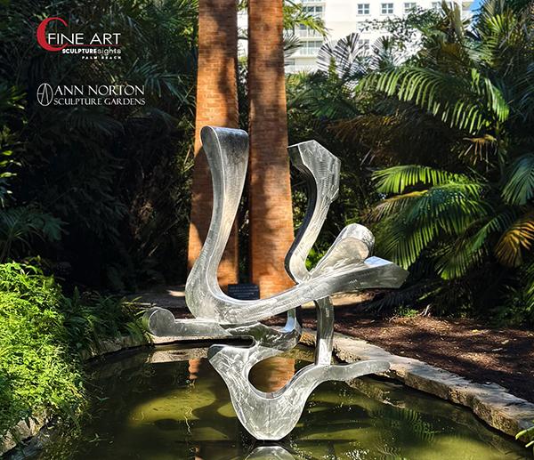
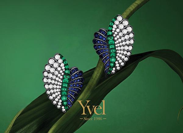
Special Exhibitions PBM+C VIP Preview Beneficiary, Ann Norton Sculpture Gardens, will once again serve as a satellite venue for the fair and will showcase an exciting exhibition by 2026 Artist in Residence Kevin Barrett, Organic Abstractions, curated by PBM+C Exhibitor, Cheryl Sokolow of C Fine Art. The selected works underscore the artist’s expansive range of scale, process, and aesthetic across a variety of fabricated materials including bronze, stainless steel, and aluminum. Yvel, the Official Jeweler of PBM+C, Presents Art to Wear, Where Jewelry Becomes Wearable Artistry. Yvel’s Art to Wear collection redefines jewelry as a true form of wearable art, seamlessly blending innovation and creativity. Breaking traditional boundaries, each piece is designed not just as an accessory but as an artistic expression—bold, unique, and inspired by the belief that art extends beyond galleries into everyday life. VIP Preview: Thursday, March 19 | 5PM – 9PM Benefiting the Ann Norton Sculpture Gardens
Public Hours: Fri, March 20 | 11AM – 6PM Sat, March 21 | 11AM – 6PM Sun, March 22 | 11AM – 6PM
Palm Beach County Convention Center 650 Okeechobee Blvd, West Palm Beach, FL 33401
Parking Valet available. Public parking at the Convention Center Parking Garage Additional parking garages are available across the street at The Square
Brightline Less Traffic. More Art. Go Brightline to Palm Beach Modern + Contemporary & skip the traffic! City to City in just 30 minutes. MIA to FLL to WPB. Once you arrive, Brightline’s new mobility service can get you from the station to the event and back so you can be car-free & carefree. #BrightlinePlus. www.gobrightline.com/train-tickets
Varvara Stepanova (1894–1958): Constructivism, Labor, and the Politics of Form
Varvara Fyodorovna Stepanova (Варва́ра Фёдоровна Степа́нова) stands as one of the most intellectually rigorous and politically committed figures of the Russian avant-garde. Born into a peasant family in 1894, she traversed a remarkable trajectory—from provincial origins to the epicenter of revolutionary cultural production—ultimately becoming a foundational architect of Constructivism alongside her lifelong partner and collaborator, Alexander Rodchenko. If Constructivism sought to dismantle the autonomy of art and reforge it as an instrument of social transformation, Stepanova was among its most lucid theorists and disciplined practitioners.
Education, Early Formation, and the Cubo-Futurist Moment
Stepanova received formal training at the Kazan Art School, where she met Rodchenko. Their partnership—intellectual as much as personal—would become one of the most generative collaborations in twentieth-century art. In pre-revolutionary Moscow, she moved within the same creative milieu as Wassily Kandinsky, among others. The shared apartment anecdote—Rodchenko, Kandinsky, and Stepanova under one roof—captures not merely bohemian proximity but a crucible of competing modernisms: Kandinsky’s spiritual abstraction, Rodchenko’s analytic materialism, and Stepanova’s emerging synthesis of form and function.
Before fully embracing Constructivism, Stepanova engaged with Cubo-Futurism, producing dynamic compositions and artist’s books that fractured pictorial space into rhythmic geometries. These works already reveal her preoccupation with movement, industrial dynamism, and the destabilization of traditional representation. Yet unlike many avant-gardists, she did not remain in the realm of experimental form for its own sake. The Revolution of 1917 provided a historical mandate: art must leave the easel and enter life.
Constructivism and the Refusal of the “Autonomous” Artwork
Constructivism, articulated in dialogue with figures such as Vladimir Tatlin and theorized in polemical debates across Moscow’s artistic institutions, rejected the romantic conception of the artist as solitary genius. Instead, it positioned the artist as a worker among workers—a constructor of visual culture within a new socialist society. Stepanova was not peripheral to this shift; she was central to its operationalization.
Her move from painting to applied design was neither capitulation nor compromise. It was ideological clarity. Textile design, clothing prototypes, stage design, photomontage, and graphic work for journals such as LEF became the laboratories through which she tested Constructivist principles. The grid, the diagonal, and bold chromatic contrasts were not aesthetic ornaments but structuring devices aligned with industrial reproducibility and collective use.
Textile Design and the Social Body
Perhaps nowhere is Stepanova’s revolutionary commitment more visible than in her textile and clothing designs of the early 1920s. Working with state-supported textile factories, she developed patterns that translated avant-garde geometry into mass-produced fabrics. The aim was explicit: to dissolve the boundary between high art and everyday life. Clothing was reconceived as utilitarian, standardized, and emancipatory—freeing women from restrictive bourgeois fashion and aligning the body with modern labor.
Her sportswear designs in particular articulate a new vision of the socialist body: active, rational, gender-progressive. In these works, form follows function with uncompromising clarity. Ornament gives way to structure; decoration becomes systemic. The female body is neither fetishized nor concealed but integrated into the rhythms of collective production.
Emancipation, Labor, and the Revolutionary Woman
The Russian Revolution opened unprecedented possibilities for women’s participation in political and cultural life. Stepanova exemplified this transformation. As an artist working within state-supported institutions—an exceptional circumstance in global art history at the time—she contributed to visual programs that aligned with broader legislative reforms: equal labor rights, the eight-hour workday, wage negotiation, and juridical equality between men and women.
Importantly, her contribution to women’s emancipation was not rhetorical but material. By designing functional garments and accessible textiles, she restructured the visual economy of daily life. Her work supported the ideological claim that gender equality must be embedded in the material conditions of production and representation. In this sense, she was not merely an artist of the Revolution; she was a designer of its social fabric.
Photomontage, Typography, and Visual Communism
Stepanova’s graphic design and photomontage further consolidated what might be termed a visual communism: an aesthetic language of diagonals, sans-serif typography, stark contrasts, and dynamic asymmetry that continues to shape global design. Working closely with Rodchenko, she participated in the development of a visual rhetoric that merged agitation and clarity. The page became a site of construction—images and text engineered for maximum ideological legibility.
Her approach was distinct from that of contemporaries such as El Lissitzky. Where Lissitzky often maintained a quasi-architectural transcendence, Stepanova insisted on immediacy and functionality. Her compositions rarely indulge in metaphysical speculation; they operate as directives, instructions, prototypes.
Legacy and Reassessment
With the rise of Socialist Realism in the 1930s, the experimental fervor of the avant-garde receded under state orthodoxy. Like many of her peers, Stepanova’s radical formal experiments were curtailed. Yet her impact persists—not only in museum retrospectives but in the very grammar of contemporary design: modular grids, bold typographic interventions, and the conviction that visual form carries ideological weight.
From a curatorial perspective, Stepanova demands a reframing of modernism’s canon. Too often overshadowed by Rodchenko in Western narratives, she must be recognized not as adjunct but as co-author of Constructivist methodology. Her career complicates the dichotomy between fine art and applied art, revealing that the most radical gesture of the early Soviet avant-garde was not the invention of abstraction but its insertion into the structures of everyday life.
Varvara Stepanova’s project was nothing less than the reengineering of perception in service of collective emancipation. In her hands, geometry became politics; fabric became manifesto; and design became destiny.


")