, painted rice cup and beans. Courtesy of the artist.")
MaiYap: A House of Small Altars
Sophie Bonet
A House of Small Altars is an exhibition about what survives. Not the spectacular markers of culture, but the quiet systems of care—objects, gestures, and repetitions—that carry identity across time, migration, and loss. Rooted in the lived experience of Chinese–Panamanian artist MaiYap, the exhibition unfolds as a domestic architecture shaped by memory, ritual, and labor. It is a house built not from walls, but from what is held, repeated, and remembered.
The project emerged from a moment of rupture. During the COVID-19 pandemic, amid a global surge in anti-Asian violence, MaiYap began reexamining her identity as an Asian Panamanian woman living in the United States. That reckoning prompted a deeper inquiry: what defines heritage when culture has been carried across oceans, adapted through survival, and preserved largely within the home? She returned to a guiding question that anchors the exhibition: What was in my house that wasn’t in yours?
The answer did not reside in formal tradition or public ritual, but in domestic life—in food, repetition, and unspoken gestures of care. In diasporic contexts, the home often becomes the most resilient site of cultural transmission, where memory is carried through the body rather than the archive, through practice rather than instruction. While language, dress, and public customs may shift across generations, foodways and domestic rituals persist. They are enacted daily, without explanation, and learned through repetition.
For MaiYap, the house was never a singular structure. It existed as a constellation: her family home adjacent to her parents’ store, and the park across the street. These spaces formed a porous ecosystem of labor and play, safety and solitude, devotion and neglect. When she was five years old, her siblings and grandparents moved away to pursue better education, leaving her behind without explanation. That early fracture—being free to roam yet emotionally abandoned—becomes a quiet undertow throughout the exhibition. Memory here is not stable or complete; it is improvised, embodied, and unresolved.
The works in A House of Small Altars do not attempt to reconstruct the past. Instead, they acknowledge memory as fragmented—commemorative without nostalgia, devotional without doctrine. Each installation operates as an altar in the anthropological sense: a mediating structure where the visible and invisible, the personal and collective, the living and ancestral intersect. These altars are small not in significance, but in scale—formed through everyday materials and repeated acts rather than monumentality.

At the center of the exhibition is The Gathering, an installation originally composed of 520 hand-painted white porcelain soup spoons suspended at eye level with hilo pabilo brought from Panama. In Chinese households, the tāng gēng (湯羹) soup spoon holds particular intimacy. Unlike chopsticks, which require dexterity and autonomy, the spoon is often used to feed others—children, elders, the sick—and is associated with warmth, attentiveness, and care.
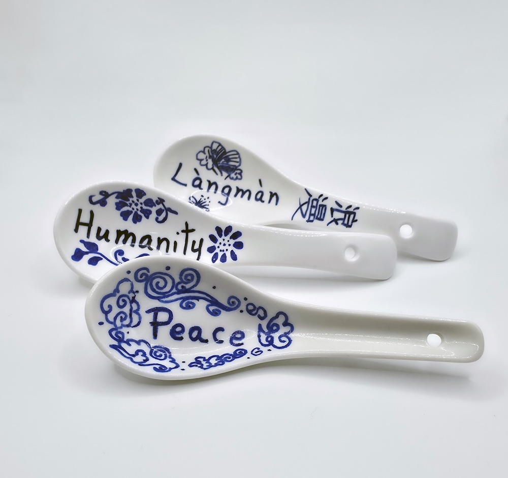
In diasporic homes, food rituals frequently become the most enduring carriers of cultural memory. Ingredients adapt to new geographies and recipes shift, but the rhythm of preparation and sharing remains. Each spoon in The Gathering bears a word in Chinese, Spanish, or English—languages that shape MaiYap’s cultural formation. These words name emotions that arise around cooking, sharing, and receiving food: love, patience, obligation, exhaustion, joy. Meaning does not translate seamlessly; it accumulates through repetition.
The number 520 carries layered significance. In contemporary Chinese culture, it phonetically resembles wo ai ni (“I love you”) and refers to May 20, an unofficial Valentine’s Day. Within the installation, the number also mirrors the scale of domestic labor—cooking not once, but endlessly; loving not as declaration, but as sustained practice. Suspended in the round, the spoons require viewers to move slowly, implicating the body in remembrance.
The choice of hilo pabilo is equally deliberate. A humble cotton twine commonly used in Panamanian homes and small businesses, it belongs to a material culture of repair—tying, bundling, mending, holding things together. Here, it becomes a material archive of labor and care, binding nourishment to work and geography to memory.
Utter Devotion functions as a threshold within the exhibition. Composed of incense sticks, the work draws from the artist’s memory of her mother’s daily ritual of offering three incense sticks before the statue of Guan Yu, widely revered for loyalty, righteousness, protection, and moral integrity.
Although MaiYap was raised Catholic in Panama—a predominantly Catholic country—this private ritual persisted quietly within the home. Such practices exemplify religious syncretism, common in diasporic contexts where belief systems coexist rather than replace one another. Domestic altars often function as sites of cultural preservation under conditions of migration and assimilation. They are not performative or doctrinal; they are sustained through repetition, without witnesses.
In Chinese cosmology, the square symbolizes Earth and the circle Heaven—stability and eternity held in balance. In Utter Devotion, repetition itself becomes sacred. Faith is enacted not through spectacle, but through continuity—through showing up every day.
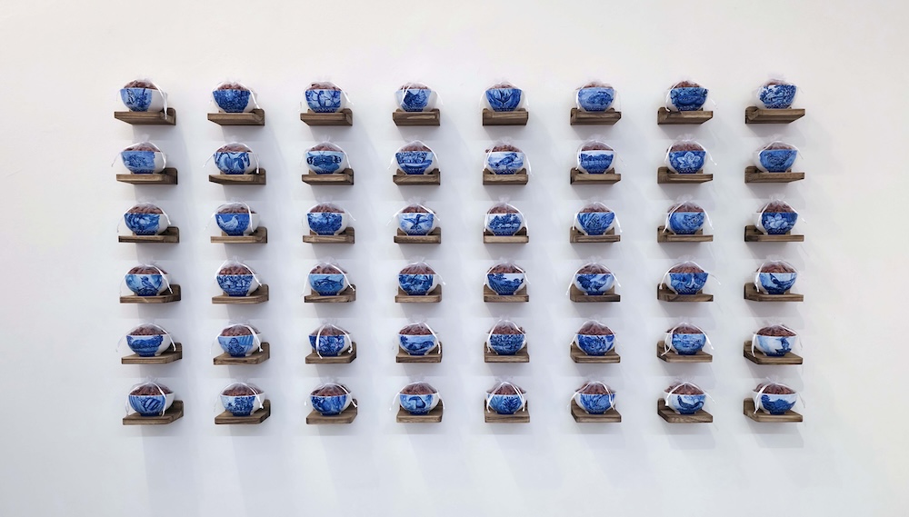
In Las Poroteras, MaiYap presents a body of 88 sculptural vessels made from Chinese rice cups filled with beans and wrapped in organza. Rice cups occupy a specific place in Chinese foodways, offering a practical solution for eating rice with chopsticks while symbolizing sustenance and abundance. The number 88 signifies double happiness, prosperity, and continuity in Chinese numerology.
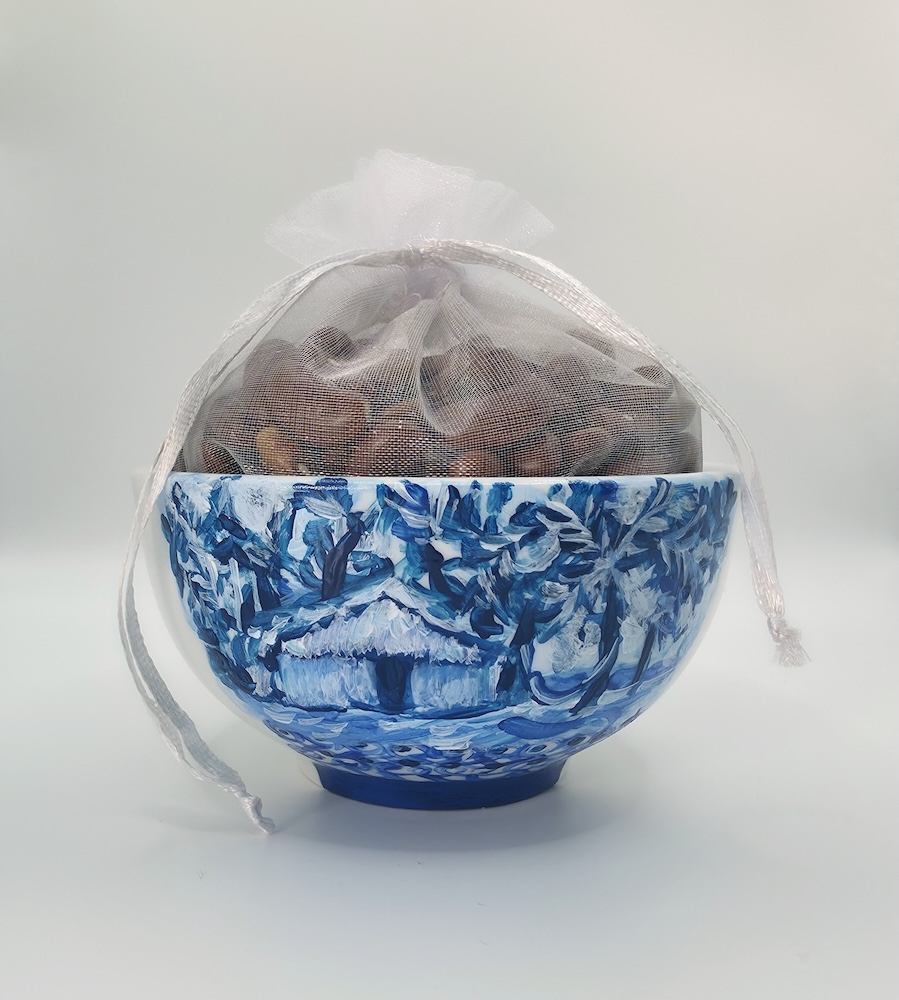
Painted in blue and white in the style of Ming dynasty ceramics, the cups feature imagery drawn from the artist’s childhood in Aguadulce, Panama—palm trees, roosters, fish, jungle landscapes, and the islands of San Blas. These motifs resist singular cultural origin. The vessels are neither Chinese nor Panamanian alone; they are sites of cultural negotiation shaped by migration and adaptation.
The beans reference fertility, agriculture, and women’s labor—particularly the often-invisible work of cultivation, preparation, and sustenance. Across cultures, beans are associated with nourishment and survival. Here, placed in delicate organza bags, they transform the cups into offerings, honoring matrilineal knowledge passed through hands rather than texts.
Over the Moon completes the environment. The installation consists of sculpted mooncakes—originally conceived in a set of 520—resting within a nest constructed from traditional Panamanian pollera fabrics and traditional Chinese tapestries. The nest introduces a register of memory that is soft, tactile, and protective, grounding the work in textile traditions historically tied to femininity, ceremony, and cultural transmission.
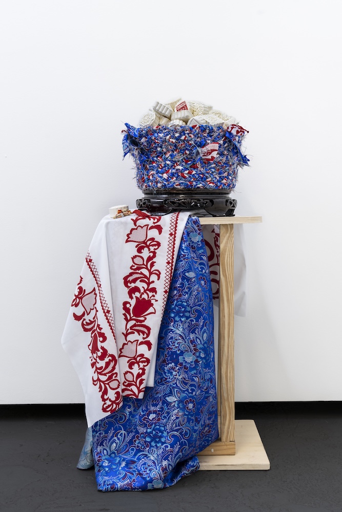
The pollera, one of Panama’s most emblematic garments, carries histories of craftsmanship, ornamentation, and regional identity. Its embroidered floral motifs and layered construction are associated with celebration, visibility, and collective pride. Chinese tapestries, by contrast, often function within domestic interiors as carriers of symbolic imagery and auspicious meaning, passed down through generations as markers of lineage and continuity.
Textiles—among the earliest technologies of care—clothe bodies, line domestic spaces, and absorb touch, wear, and time. Here, fabric becomes shelter rather than surface. The nest does not frame the mooncakes as objects for display; it holds them as offerings—protected, cradled, and gathered.
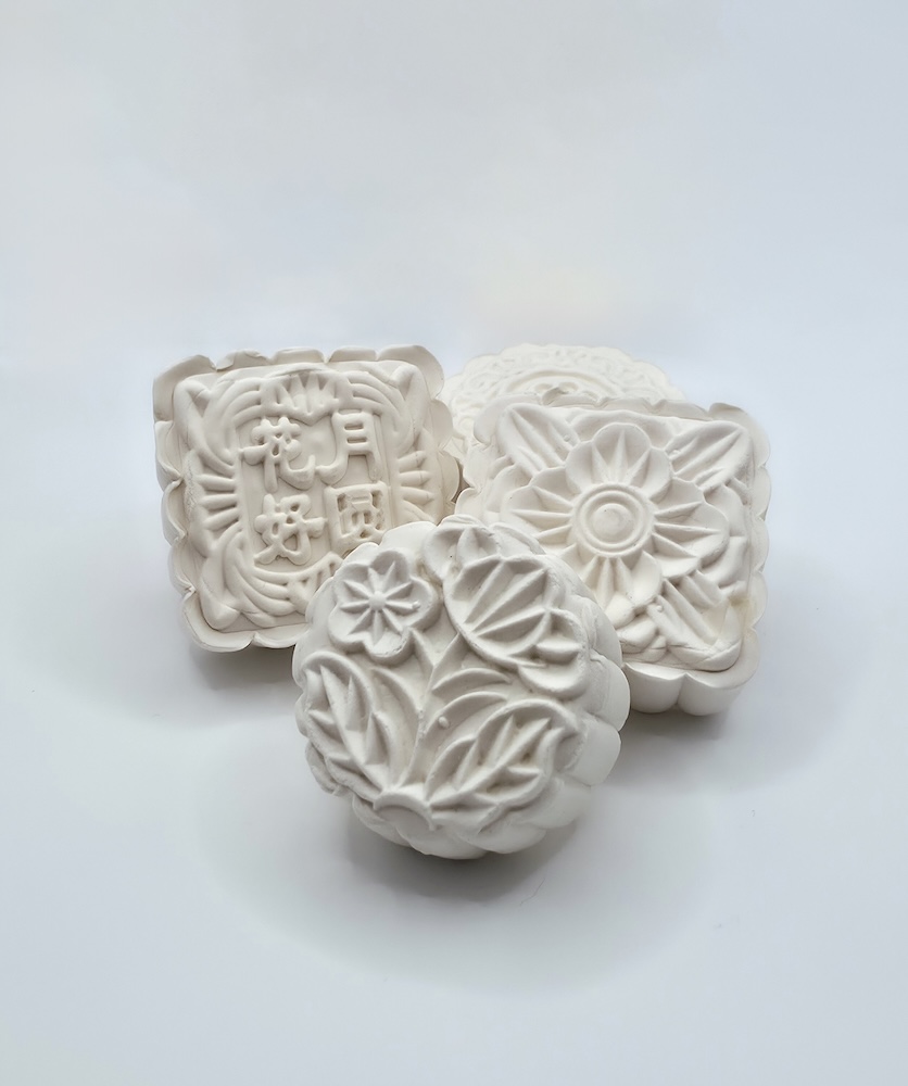
Mooncakes themselves are objects of layered history. Traditionally exchanged during the Mid-Autumn Festival, they symbolize reunion, completeness, and cyclical time. Historically, they also functioned as vehicles for resistance: during the thirteenth century, messages were hidden inside mooncakes to coordinate revolt against Mongol rule. Celebration and survival coexist within their form.
Taken together, the installations form a single environment rather than a sequence of objects. A House of Small Altars operates as a living ethnography—one that understands culture not as static inheritance, but as embodied practice shaped through repetition, care, and everyday labor. As a curator, I approach this exhibition not as an act of classification, but of listening. MaiYap’s guiding question—What was in my house that wasn’t in yours?—becomes an invitation rather than a boundary.


Ultimately, this exhibition is an offering: to a mother who migrated at eighteen and worked her entire life; to ancestors whose knowledge traveled through hands rather than texts; and to viewers, invited not as observers but as participants—asked to slow down, to witness, and to recognize that healing, like devotion, is built through small, repeated acts. In this house, nothing is monumental—yet everything matters.
______________________________________________________________________
Conceptual and Scholarly Context
This essay is informed by interdisciplinary scholarship on memory, ritual, care, and diasporic cultural transmission. It draws particularly from frameworks that understand memory as embodied practice rather than fixed archive (Diana Taylor; Paul Connerton), domestic ritual as a site of cultural continuity under conditions of migration (Arjun Appadurai), and care as an ethical and material practice sustained through repetition, repair, and labor (Joan Tronto).
Bibliography
1. Appadurai, Arjun. Modernity at Large: Cultural Dimensions of Globalization. Minneapolis: University of Minnesota Press, 1996.
2. Connerton, Paul. How Societies Remember. Cambridge: Cambridge University Press, 1989.
3. Hirsch, Marianne. The Generation of Postmemory: Writing and Visual Culture After the Holocaust. New York: Columbia University Press, 2012.
4. Mintz, Sidney W. Sweetness and Power: The Place of Sugar in Modern History. New York: Penguin Books, 1985.
5. Taylor, Diana. The Archive and the Repertoire: Performing Cultural Memory in the Americas. Durham: Duke University Press, 2003.
6. Tronto, Joan C. Moral Boundaries: A Political Argument for an Ethic of Care. New York: Routledge, 1993.
Sophie Bonet (b. 1986) is a South Florida–based curator whose practice is deeply informed by her background in social and cultural anthropology. She approaches exhibitions as living ecosystems—responsive spaces shaped by memory, ritual, and transformation. Her transdisciplinary work is research-driven and grounded in the belief that art functions as a site of dialogue, cultural inquiry, and collective imagination.
Bonet has led exhibitions and public programs across prominent institutions in the United States and abroad, including the Contemporary Arts Museum Houston (CAMH), the Barcelona Museum of Contemporary Art (MACBA), and the Museum of Contemporary Art North Miami (MOCA), where she served as Exhibition Manager for landmark presentations such as Juan Francisco Elso: Por América (in collaboration with El Museo del Barrio), Didier William: Nou Kite Tout Sa Dèyè, and Jamea Richmond-Edwards: Ancient Future. Her early research at MACBA focused on the archival documentation and critical interpretation of Espai 13’s history, tracing three decades of artist-led experimentation at the Joan Miró Foundation.
Currently Chief Curator of The Frank C. Ortis Gallery in Pembroke Pines, Florida, Bonet leads an ambitious exhibition program centered on accessibility, sensory engagement, and community-rooted storytelling. Curating across disciplines—from ecological installation to fiber art and new media—she explores themes of identity, migration, belonging, and place through an anthropological and phenomenological lens.
Bonet holds degrees in Fine Arts, Art History, and Anthropology. She is currently pursuing graduate research examining curating as a ritual and phenomenological practice shaped by memory, embodiment, and cultural translation. She is a member of IKT – the International Association of Curators of Contemporary Art.