Marta González solidifica su carrera en la comedia, participando en la segunda temporada de “Líos De Familia”
“Líos de Familia” es una producción ejecutiva de James McNamara y Anjanette Delgado para “Pantaya” y Gregory Quinn y Zumaya Cordero para “Caribbean Films”.
Marta González es una joven nacida en la República Dominicana con muchos propósitos y sueños. Una latina más que ha tenido que luchar contra la corriente para alzar su voz y poder ocupar un espacio en el difícil y competitivo mundo de la actuación. Actriz y periodista de carrera. Cuenta con 15 años trabajando en los medios de comunicación. Fue parte de la 4ta temporada de la famosa serie “Dynasty” de CW, que se transmite por Netflix. En el 2019 trabajó al lado del reconocido actor John Travolta en la cinta “The Fanatic” que se estrenó en cines y en Amazon Prime. “Cuando hice el casting para la película “The Fanatic”, no sabía que iba a compartir escenas con John Travolta”.
“Ser actriz simplemente me hace feliz. Me gusta entretener al público. Llevarles un poco de alegría o incluso hacer que se desconecten de su día a día. O el hecho de que se relacionan e identifican con lo que hago. Es una virtud que uno disfrute su trabajo, no lo siento como tal. Cuando estoy en el set me siento plena”.
La segunda temporada de “Líos de Familia” se estrena el próximo 25 de agosto por “Pantaya” en USA y Puerto Rico, donde Marta González da vida a Cristina, una ex-reina de belleza casada con un político sin escrúpulos fichado por la fiscalía. Cristina pasa de ser millonaria a quedarse sin un quinto. Vive en una burbuja, en su mundo de apariencias y mentiras, engañando a todos y tapando las locuras de su marido Esteban.
Marta González comparte créditos junto a los protagonistas: Raymond Pozo, Miguel Cespedes y Cheddy Garcia así como Francisca, Brea Frank y Jorge Pabón (Molusco) quienes se unen a la segunda temporada como actores invitados.
Aqua Art Miami will kick off its 16th edition at the Aqua Hotel (1530 Collins Avenue Miami Beach, FL 33139) with a VIP Preview on Wednesday, November 30th before opening to the public December 1-4, 2022. The energetic preview has become the destination for influential collectors and art professionals, many of whom migrate from Aqua’s sister fairs, Art Miami and CONTEXT conveniently nestled between the Venetian Causeway and the MacArthur Causeways, and Art Basel Miami Beach, which is located just a few blocks away.
Aqua Art Miami is the premier location for art aficionados to procure works by young, emerging and mid-career artists. Throughout the years, the fair has continued to solidify itself as a completely unique art fair, consistently staying true to its signature relaxed yet energetic vibe. A roster of well respected international galleries will showcase the fresh artists’ works in the intimate exhibition rooms, which open into the beautiful courtyard of the classic South Beach hotel.
VIP Preview: Wednesday, November 30 | 3pm-10pm
Public Hours: Thursday, December 1 | 12pm – 9pm Friday, December 2 | 11am – 9pm Saturday, December 3 | 11am – 9pm Sunday, December 4 | 11am – 6pm
Tickets
WEDNESDAY, NOV 30, 2022, 3:00 PM – SUNDAY, DEC 4, 2022, 6:00 PM VIP – Aqua Art Miami – Aqua Hotel 1530 Collins Ave, Miami Beach, FL 33139, USA
THURSDAY, DEC 1, 2022, 12:00 PM – SUNDAY, DEC 4, 2022, 6:00 PM GENERAL ADMISSION – Aqua Art Miami – Aqua Hotel Not valid for VIP Preview, Nov 30 1530 Collins Ave, Miami Beach, FL 33139, USA
Aqua Art Miami at the Aqua Hotel 1530 Collins Avenue Miami Beach, FL 33139
Aqua is located on Collins Avenue, a short walk South of Art Basel Miami Beach, and across from the Loews Hotel.
Art Miami + CONTEXT Location One Herald Plaza @ NE 14th Street | Downtown Miami on Biscayne Bay Between the Venetian and MacArthur Causeways
New Bag and Stroller Restrictions: Due to changes in security procedure, large bags will not be permitted into the event. Please do not bring suitcases, folding bicycles, scooters or any large items bigger than a handbag or laptop bag. In addition, strollers are not permitted.
Pets: Show Management strictly prohibits Pets from entering the Aqua facilities. Only animals assisting handicapped or disabled individuals are exempt from this rule.
Artists
A Liam Alexander Mary Frances Attias Antun
B Sarah Becktel Dalia Berlin Karen Bibas Luca Bornoffi Mr. Brainwash Ray Beldner Tamera Bedford
C Philippe Cheng CJ Cowden Peter Carnegie Arminée Chahbazian Eduardo Cabrer Zuzana Chandler Dario Campanile Cinzia Cotellessa
D Roberta De Mutiis Tracy Boulian + David Ahntholz John Denis Sid Daniels
E Natan Elkanovich
F Ana Elisa Fernandez Katherine Filice Tony Fandino Terry Frishman Dolly Faibyshev Amelia Ford
G Amy Gordon Erol Gunduz Kevin Graham Gail Garcia Dobri Gjurkov Rachel Goldsmith
H Ko-Hey! Harikawa Brian Higgins Spencer Hansen Robb Hohmann Atom Hovhanesyan Jordana Hanono Margot Holzapfel
I Donna Isham
J Daniel Jenney Carole Jury
K Nune Karamyan Markus Klinko David Krovblit Oleg Kedria Mykola Khodorovsky Justyna Kisielewicz
L Eileen Lerner Domenico Ludovico Lise Ladouceur Jasmin Leer Eric Jiaju Lee Shelley Lipton Elisa LeJuez
M Cabell Molina Haley Manchon Mr Brainwash Phillip Michaels Margaret McCarthy Kate Maura Hulis Mavruk Joe Mangrum James Meagher Alex Melo
N Gail Nash Arnold Raisa Nosova
O Robert Obier
P Jacki Praxedes Maria Petroff Cindy Press Luis Daniel Pedroza Vered Pasternak Diane Ponder
R Melissa Roldan Roberta Ruocco Carolina Rivera Billy Rhyze Barry Rosenthal Almir Reis Adam Scott Rote Chris Riggs
S Bryant Small Patricia Soto Analvis Somoza Marcela Solana Theodore M. Schinkel Linda Schinkel Rodney Boris Shpeizman Konstantin S Kurt Stimmeder Arron Sturgeon CC Streetzy Strange Dirt Philip Stark Carol Scavotto
T Zoya Taylor David Tyndall Wei Tan Yener Torun Susan May Tell Volodymir Tarasenko
U Stefan Ullrich
V Alexandra von Fedak Sol Villanueva James Van Pelt Marc VanDermeer
W Stephen Wilson Tamara White Laura Waldusky Margeaux Walter Brent Warr
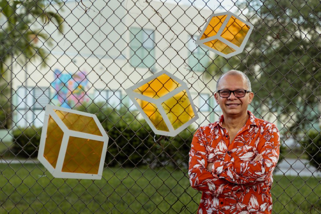
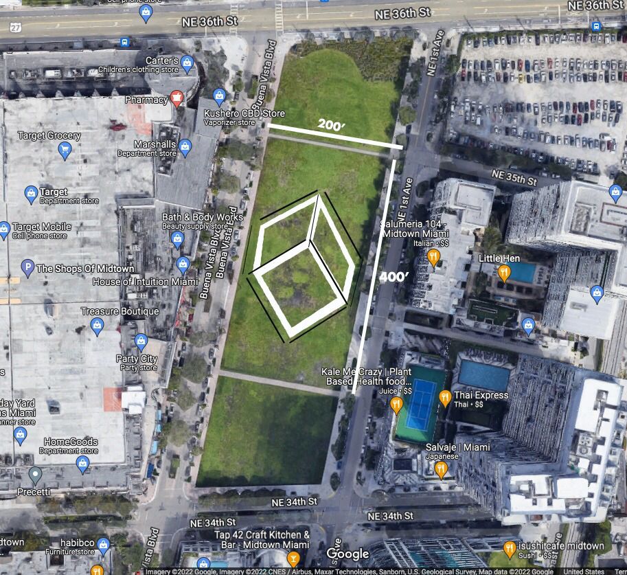
Kube For All
The Biggest Cube Art Installation in the world
Kube For All
The Biggest Cube Art Installation in the world on Friday August 19th 2022
*This installation will be just for one day only*
Be Part of Art History in Miami
Come and help to create this Art Installation Friday August 19th 2022, from 9 am to 2 pm
My name is Rafael Montilla, Miami based contemporary artist. Kube For All is a humanizing movement. During these difficult times, we must come together to focus on our missions, our purpose is to make this world a better place for future generations.
Art statement: My work is based on geometric abstraction and the cube plays a central part in my proposal. The cube represents a symbol of harmony, unity, and balance of our internal and external life.
“Be Part of the largest cube installation”
Where: Midtown Park (The Shops At Midtown Miami)
When: Friday August 19th 2022, 9 AM to 2PM
For more information send me a email to rafaelmontillaart(@)gmail.com
Kubes in Action by Rafael Montilla. Photo: Manuela Delgado.
Kube For All
The Biggest Cube Art Installation in the world
Alexis Cogul pone su sello a la arquitectura de Miami
Miami es una ciudad joven y en proceso de crecimiento a nivel arquitectónico, es el perfecto canvas para el desarrollo urbano. Allí destaca un arquitecto afincado en el sur de la Florida desde hace varios lustros, que desde sus estudios en Coconut Grove y en su natal Barcelona, fusiona su arte en cada proyecto que diseña trayendo una sensibilidad europea a esta ciudad joven, tropical y diversa, donde se combinan diferentes culturas en la que hay mucho potencial para desarrollar en cuanto a diseño y arquitectura.
Se trata de Alexis Cogul, una voz autorizada en el rubro arquitectónico y de diseño internacional a nivel mundial, ha diseñado desde el Dior Café del Design District en Miami, Silverspot Cinema, el penthouse de Brickell Flatiron, y otros destacados proyectos como la Casa U, el cual fue un proyecto nominado por la American Architecture Awards, Villa M casa ubicada en Miami Beach y entre muchos otros, pero que este año se destaca por dos en particular: La Casa B&B Italia (proyecto ganador de varios premios como el Interior Design Magazine Award) en esta obra el diseño entrelaza los materiales con la luz y la naturaleza, y el segundo en proceso de creación, es el espacio Collector Lounge, que estará situado en el famoso Design Miami en el Art Basel 2022.
Cogul labora con los materiales la luz y el espacio. El joven, pero recorrido arquitecto, quien desde niño sabía que quería diseñar y construir, considera que su deber profesional es el de “contar una historia”. Él y su equipo se inspiran en la constante evolución sociopolítica de los hábitats que lo llevan a considerar la arquitectura en un contexto en continuo cambio. Influencias de los estilos de vida contemporáneos, las nuevas tendencias sociales, las artes y los problemas ambientales en curso que lideran el interés en el proceso de diseño intelectual, son conceptos que lo nutren para aparecer con sus innovaciones.
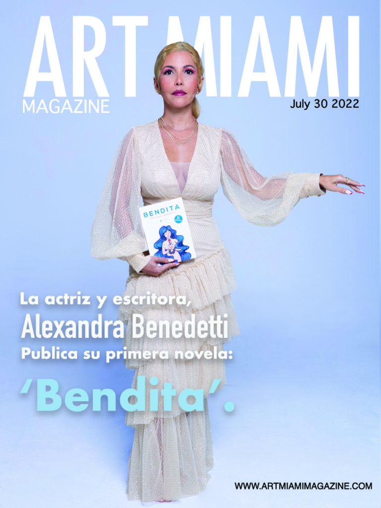
La actriz y escritora, Alexandra Benedetti, publica su primera novela: ‘Bendita’.
Se trata de una novela inclusiva que transcurre al otro lado del Atlántico y que cuenta casi cien años de historia entre sus páginas.
CÍRCULO ROJO.- ‘Bendita’ es una novela fascinante destinada a todos aquellos con ansias de rememorar sus raíces, su propia saga familiar, tal y como refleja su propia autora, Alexandra Benedetti: “Es mi primera novela y es inclusiva. Así como es en la vida real, el entramado de amor en la novela lo viven parejas heterosexuales, homosexuales y poliamorosas. La trama de superación, ha sido inspirada por mi abuelo emigrante europeo y sus hermanos”.
Actriz y Escritora, Alexandra Benedetti
“Así como la trama de los derechos civiles de las mujeres, es un homenaje a mis bisabuelas, abuelas y todas las mujeres de mi vida. Es una saga familiar que transcurre entre 1926 y el 2020, casi cien años de hechos históricos que los personajes y su descendencia vivirán dramáticamente, con pinceladas de comedia”, añade ella misma
Publicada en Círculo Rojo Grupo Editorial, el lector va a encontrar romance, aventura, el drama y comedia. Una novela para todos aquellos que quieran ser inspirados y rememorar sus propias raíces.
SINOPSIS Inspirada en hechos reales. Rosa, Santina y Flora son tres mujeres que unidas por el hilo invisible del destino algún día conocerán a tres muchachos que huyeron del fascismo cruzando el Atlántico en el barquito Bartolomé y fueron escupidos por el mar en territorio
venezolano, moribundos, con las esperanzas rotas y unas pocas monedas de oro. ¡BENDITA la hora milagrosa que el agua de lluvia no los dejó morir de sed! Rosa se olvidará de sus sueños y se entregará al matrimonio, al hogar, a la moral y a los consejos del cura de la iglesia; un evento trágico le cambiará la vida. Mientras que Santina, una de las sirvientas de la casa de Rosa, se atreverá a soñar en grande y pese al racismo en su país, la hambruna de derechos civiles, el Bogotazo y la ola de violencia logrará superarse y llegar muy lejos. Flora es bisexual, separada, libre, soñadora, activista, luchadora y defensora incansable de los derechos civiles de las mujeres en la Colombia de los luminosos años treinta, saboreará varias victorias y también defenderá el amor libre y sin ataduras, aunque le cueste dejar ir al amor de su vida. Cuando las tres mujeres y los tres muchachos se conozcan en lugares y tiempos distintos, se enredarán en un triángulo amoroso que de no ser desatado tendrá consecuencias infernales para dos de los involucrados. Muchos años después nacerá Bimba, la del pelo azul, una mujer milenial, escritora y una de las guardianas del Manifiesto de las victorias, un documento que ha pasado por las manos de tres generaciones, recordando las luchas y victorias por los derechos civiles de las mujeres, y quien está decidida a hurgar en los secretos más guardados y peligrosos de esta saga familiar y contárselos a todas, todos, todes y todxs. La historia transcurre entre mil novecientos veinte seis y el veinte veinte, el año que estalló la pandemia.
COVER. Novela: ‘Bendita’ de Alexandra Benedetti.
AUTORA
Alexandra Benedetti, artista, actriz y escritora colombiana radicada en los Estados Unidos. Inició a temprana edad en el ballet, la danza y el teatro en su natal Cartagena.
Se formó como actriz en el Círculo Teatral y CasAzul Argos en la Ciudad de México y en el Miami Acting Studio en la ciudad de Miami. Cursó el Diplomado en Creación Literaria en el Centro de Creación Literaria Xavier Villaurrutia del Instituto Nacional de Bellas Artes
(INBA). Actuó en diferentes obras de teatro, cortometrajes y largometrajes. Debutó en cine en The Leyend of Zorro (La leyenda del Zorro) interpretando el personaje de Lupe y cerró el ciclo de actriz en la serie Club de cuervos (Netflix) con la interpretación de Julieta, para sentarse a escribir y comenzar un nuevo camino como escritora. Escribió su primer libro, ‘Soñar despierta’, gracias a un llamado interior que la impulsó a compartir una técnica nueva que le sirva a muchas mujeres en su camino de autoconocimiento, creatividad y empoderamiento, un libro que es algo más que un libro, una compañía en ese camino mágico de crear la vida de nuestros sueños. Se inspiró en su propia experiencia y en los ejercicios y lecciones que aprendió en su formación artística. Esta vez la autora nos presenta Bendita, su primera novela, y con esta se lanza al fantástico mundo de la narración de historias y creación de personajes.
Rosa, uno de los cuatro personajes principales femeninos de la novela, está inspirada en su abuela María Cristina y en lo duro que fue para ella quedar viuda con ocho hijos, y Alessandro, uno de los tres muchachos que huyeron del fascismo y llegaron a territorio venezolano primero y después a Colombia, en su abuelo Guillermo y en aquel ancestro inmigrante italiano que se asentó en Colombia sembrando la semilla de su árbol genealógico. La autora crea ficción, un universo en el que es inevitable engancharnos a la vida fascinante de sus personajes, vidas diferentes, transgresoras, atrevidas… Audaces, lúdicos, complejos, ambiguos, patéticos, carismáticos, inverosímiles, magnéticos, estrafalarios, soñadores, con sus luces y sombras… ¡Y de un plumazo o nos identificamos o nos lanzamos a los mundos desconocidos de nuestra imaginación!
FREE Art Happy Hour at Tower Theater, Elvis movie with Spanish subtitles and more events in Miami!
There is no shortage of art & cinema events taking place in Miami during the month of August. Just check out our list below, starting with a FREE art happy hour to kick-off a new “Kitsch Medley” exhibit at Tower Theater Miami on Friday, August 5. We’ve included links to high-res photos with each event description.
Feel free to reach out with any questions and/or if you would like to attend any of these events. Meanwhile, thank you for considering these events for inclusion in your roundup articles.
“Kitsch Medley” Art Happy Hour at MDC’s Tower Theater Miami on Fri., August 5
“Kitsch Medley” Art Happy Hour at MDC’s Tower Theater Miami. Photo credit:Daniel Marin
Join Miami Dade College’s historic Tower Theater Miami, one of the city’s most cherished cultural landmarks, for a FREE cocktail reception to celebrate the opening of the “Kitsch Medley” exhibit by local Cuban-American visual artist Daniel Marin from 6 – 8:30 p.m. on Friday, August 5. During this art happy hour, the public can meet Marin and view his colorful pop art, plus enjoy drinks courtesy of Estrella Damm and E11even Vodka. RSVP HERE: https://www.squadup.com/events/daniel-marin-exhibition-opening
The “Kitsch Medley” exhibit will be on display from August 5 – October 12, 2022. It is FREE and open to the public. Tower Theater Miami is located at 1508 SW 8th St, Miami, FL 33135. 305-237-2463 | www.towertheatermiami.com
Watch ELVIS with Spanish subtitles at MDC’s Tower Theater Miami, starting Fri., August 5
Watch ELVIS with Spanish subtitles at MDC’s Tower Theater Miami.
Put on your blue suede shoes and watch the new hit film, ELVIS, with Spanish subtitles at Miami Dade College’s Tower Theater Miami starting at 7 pm on Friday, August 5. Tickets cost $12.75 per adult; $10 per senior or student; and $8.25 for Miami Film Society members and go on sale one week prior to the screening. To purchase tickets, visit www.towertheatermiami.com. Tower Theater Miami is located at 1508 SW 8th St, Miami, FL 33135. | 305-237-2463
This Warner Bros. Pictures’ musical drama, by Oscar-nominated filmmaker Baz Luhrmann and starring Austin Butler and Tom Hanks, explores the life and music of Elvis Presley (Butler), seen through the prism of his complicated relationship with his enigmatic manager, Colonel Tom Parker (Hanks). The story delves into the complex dynamics between Presley and Parker, spanning over 20 years, from Presley’s rise to fame to his unprecedented stardom, against the backdrop of the evolving cultural landscape and loss of innocence in America. Central to that journey is one of the most significant and influential people in Elvis’ life, Priscilla Presley.
MDC’s Tower Theater Miami Presents “Canaletto & the Art Of Venice” on Tues., August 16
FAMILY COMMISSIONS Eight Local Filmmakers to Debut Short Films Centered on ‘Family’ During FREE Screening Event at MDC’s Tower Theater Miami.
From an intriguing depiction of Mexican painter Frida Kahlo to a stunning film examining the remarkable and often controversial Renoir collection at Philadelphia’s Barnes Foundation and more, Miami-Dade College’s Tower Theater Miami brings Exhibition on Screen art films to the big screen. Next up is “Canaletto & the Art Of Venice,” an immersive journey into the life and art of Venice’s famous view-painter, Giovanni Antonio Canal, better known as Canaletto. The screening of this beautiful film will take place at 7 p.m. on Tuesday, August 16. Movie tickets are $15 per person, per movie and $13 for Miami Film Society members. To purchase tickets, visit www.tower theater miami.com. Tower Theater Miami is located at 1508 SW 8th Street.
FAMILY COMMISSIONS Eight Local Filmmakers to Debut Short Films Centered on ‘Family’ During FREE Screening Event at MDC’s Tower Theater Miami on Thurs., Aug. 25
FAMILY COMMISSIONS Eight Local Filmmakers to Debut Short Films Centered on ‘Family’ During FREE Screening Event at MDC’s Tower Theater Miami. Photo credit: Adrian Cardenas
The word family can mean different things to different people. This is evident in the new short films created by eight Miami-based filmmakers who were selected to participate in a new “Family Commissions” program presented by Oolite Arts and Miami Dade College’s (MDC) Miami Film Festival. Co-funded by The Lynn and Louis Wolfson II Family Foundation, each filmmaker received a portion of $120,000 to produce 8 to 12-minute original works using the theme – family. Now, the public is invited to watch these films, spanning from the escapades of a young man who will stop at nothing to recover a stolen family heirloom to a first-person account of being a gay male and fitting into an ever-changing family dynamic, during a FREE screening event at MDC’s Tower Theater Miami from 7-9 p.m. on Thursday, August 25. Tower Theater Miami is located at 1508 SW 8th Street. RSVP here: https://www.towertheatermiami.com/event/mff-oolite-arts-family-commissions
Cool Off at These Two Summer Exhibits at Oolite Arts in Miami Beach
***Click HERE for high-res photo (credit: Karen Rifas)
Oolite Arts features two new summer exhibitions: “Lean-To,” Oolite’s annual artist-in-residence exhibition featuring works by 15 Miami-based artists, and “At The Edge,” highlighting six female artists who are pushing the boundaries in hard-edge abstraction. Both exhibits are FREE and open to the public through September 11, 2022. Hours are 12 p.m. – 5 p.m. daily. The exhibits are located at 924 & 928 Lincoln Road in Miami Beach. To learn more, visit www.oolitearts.org. | 305-674-8278
MDC’s Tower Theater History
Since 2015, MDC’s Tower Theater Miami is South Florida’s highest-grossing art-house cinema. Our mission is to connect art with audiences, and foster a value for cinema for future generations. The Theater is the year-round home of Miami Film Festival. Our philanthropic work includes free educational screenings for students and subsidized rental fees for non-profits to showcase cinema without commercial pressures.
MDC’s Tower Theater Miami is one of Miami’s oldest cultural landmarks. When it opened in December of 1926, it was the finest state-of-the-art theater in the South.
In the early 1960s, large numbers of Cuban refugees fled to Miami. The area surrounding S.W. Eighth Street – “Calle Ocho” – became a place of new beginnings. For many Cuban families, films at Tower Theater Miami were an introduction to American culture in addition to pure entertainment. Soon the theater altered its programming to include English-language films with Spanish subtitles, and eventually Spanish-language films. However, after almost sixty years of operation, Tower Theater Miami was closed to the public in 1984.
In 2002, the City of Miami authorized Miami Dade College to reopen the Theater. In 2011, USA Today declared MDC’s Tower Theater Miami “one of the 10 great places to see a movie in splendor” in the newspaper’s round-up of the best old-fashioned movie palaces in America, and the same year the Theater came under the programming and operational direction of MDC’s Miami Film Festival. Today, Tower Theater Miami thrives as a social gathering place for cultural connections in Little Havana, where the community can enjoy alternative and culturally specific exhibitions, performances, independent and international films, specializing in both Spanish-language films and English-language films, subtitled in Spanish.
Theater Info
MDC’s Tower Theater Miami is located in the heart of Little Havana, next door to the famous Domino Park. The Theater features two auditoriums, one with 250 seats, the other with 104 seats.
The theater opens 40 minutes before the first scheduled screening of the day.
The theater is handicapped accessible.
To view our full Safety Guidelines Please Click HERE
Accessibility
Wheelchair Accessible Tower Theater is wheelchair accessible. If assistance is needed, please make yourself known to the theater/venue staff.
Closed Captions All foreign language films will have English subtitles. Exclusions may apply for live events. For closed captioning, please refer to individual pages for more information.
Exponer sus obras de arte a la venta en línea es una forma sencilla y eficaz de mejorar su credibilidad como artista y mejorar su exposición a miles de amantes del arte, al tiempo que mejora su saldo bancario.
Aquí tienes 5 consejos clave para ayudarte a vender con más éxito en línea:
1: Suba sus obras con regularidad Portada Florida Art Gallery es visitada constantemente por los motores de búsqueda. Siempre está en los primeros puestos de Google y de muchos otros motores de búsqueda.
Para mantener su obra de arte fresca y visible en Google, asegúrese de subir obras de arte con regularidad.
2: Proporcione imágenes de calidad y múltiples Las imágenes dicen más que mil palabras. Puede subir fácilmente varias fotos de su obra, mostrando sus características, primeros planos de la textura, el marco, el tapete, etc.
Consejos para vender arte en línea
3: Entrar en las exposiciones de arte La compra de arte en línea es cada vez más aceptada por los amantes del arte. Sin embargo, no hay nada mejor que ver la obra antes de comprarla.
Las exposiciones de arte siguen siendo la forma más eficaz de presentar su obra a los amantes del arte. Además, cada exposición de arte de Gallery online en la que es aceptado aumenta su visibilidad en línea en los distintos motores de búsqueda.
4: Añada una biografía de calidad A los amantes del arte les encanta leer la historia de dónde proviene su arte original y cuál es la inspiración y el origen del artista. Así que asegúrate de dedicar tiempo a tu biografía, es una de tus mejores herramientas. Consulte con un crítico de arte para que le ayude.
Recuerda que los premios y galardones se añaden automáticamente a tu biografía, así que es importante que registres cualquier premio con la obra de arte correspondiente.
5: Promueva su arteen lasRedes sociales Las redes sociales son una gran herramienta para dar a conocer su arte. Cada vez que subes una obra de arte nueva, es muy fácil informar a tu red de amigos sobre ella con enlaces para comprar tu obra en Portada Florida Art Gallery.
Aunque tus amigos no compren tu obra, puede que alguno de sus amigos en las redes sociales sí lo haga y refieran a otros amantes del arte.
6. Contacta con webs de compra y venta de arte online.
7. Crear una marca
Para dar a sus piezas la promoción que merecen, es imprescindible crear una marca. Como cualquier producto que se vende, la gente lo compra no sólo por lo que puede hacer o por su aspecto, sino que también compra la marca. Puede empezar por crear un nombre para su negocio. Usted es la marca.
A continuación, piense en quién es su mercado objetivo y en el estado de ánimo que le gustaría que evocaran su obra de arte y su tienda online. Crea un lenguaje visual coherente para que tu marca se sienta adaptada y unificada, con una paleta de colores bien elaborada y una selección de uno a tres tipos de letra. A continuación, cree un logotipo con un creador de logotipos gratuito para crear su propio emblema personal.
Una vez que hayas establecido el tono adecuado y tengas un logotipo que represente a tu marca, asegúrate de llevar ambos a todos tus canales de marketing, no solo a tu tienda, desde el diseño de tu cartera online, los feeds sociales, el boletín de noticias y las tarjetas de visita.
8. Crear una tienda en línea
Al crear una tienda online, considérela su escaparate virtual. Tu tienda online debe representar no solo tus obras, si no también como artista visual y como marca, e intrigar a los compradores para que continúen desplazándose.
Existen muchas plataformas, con las cuales puedes crear un sitio web completamente personalizable que actúe como tu tienda y portafolio en uno. Utiliza una plantilla de comercio electrónico única y elige los colores y las fuentes que se ajusten a tu marca y a las emociones que quieres que transmita tu arte. Incluso puedes incluir un blog de arte si quieres conectar con tus clientes y compartir tus ideas sobre el mundo del arte.
Mejores plataformas para crear su blogs de arte.
Artmiamimagazine.com no tiene relación comercial con ninguna de estas plataformas digitales.
Google Arts & Culture
Blogger (Blogspot)
WordPress.com
Yola
Artsy
Cass Art
Squarespace Website Builder
web.com
Wix
artnet
Booooooom Creative
ARTnews
Juxtapoz
Art Observed
Artspace
Artforum
Art Basel
Aesthetica
Frieze
GARAGE
9. Aclare muy bien lo que usted vende.
Su página de inicio debe explicar explícitamente el tipo de arte que vende. Asegúrese de incluir un párrafo o viñetas junto con imágenes que expliquen la inspiración de su obra. También vale la pena incluir una sección “Acerca de” para que los compradores sepan quién eres y tengan la oportunidad de establecer una conexión personal.
10.De vida a tus productos con fotos o maquetas.
Muestre imágenes de alta calidad de su trabajo en el mundo real, como un póster enmarcado en la pared o una bolsa de mano colgada en el hombro de alguien. Consígalo organizando una sesión de fotos de sus productos o con la ayuda de maquetas. De este modo, los compradores podrán imaginar su trabajo integrado en sus propias vidas y será más probable que realicen una compra.
Implemente características de diseño que hagan que su sitio web sea más interactivo y fácil de usar.
11. SEO
Para aumentar las posibilidades de que los compradores potenciales le encuentren en Google, deberá optimizar su tienda online para el SEO. Este proceso incluye la incorporación de una variedad de contenidos y palabras clave específicas en todo su sitio web. Para empezar, puede utilizar una herramienta de SEO gratuita como Google Keyword Planner o invertir en una de pago, como Ahrefs, para identificar las palabras clave y las frases que la gente busca y que son relevantes para su nicho. Trata de incorporar palabras clave más cortas, como fotógrafo de recién nacidos, así como palabras clave más largas y específicas, como por ejemplo cómo hacer fotografía de recién nacidos, en todo el contenido de tu sitio web. La combinación le dará más oportunidades para que su tienda se posicione en Google.
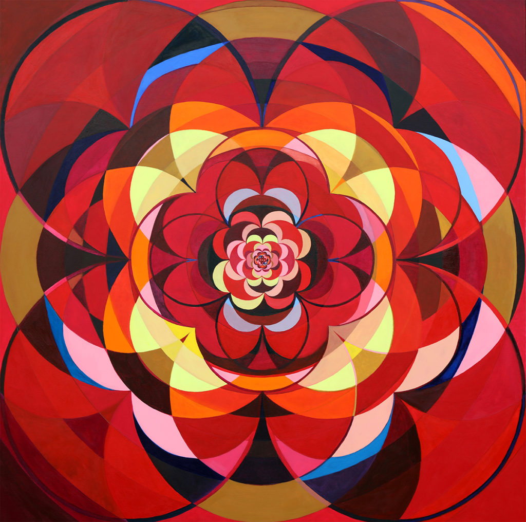
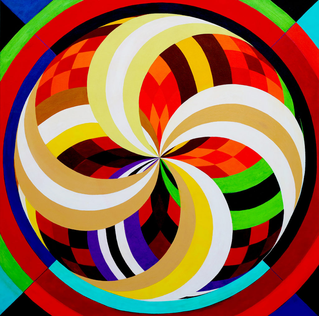
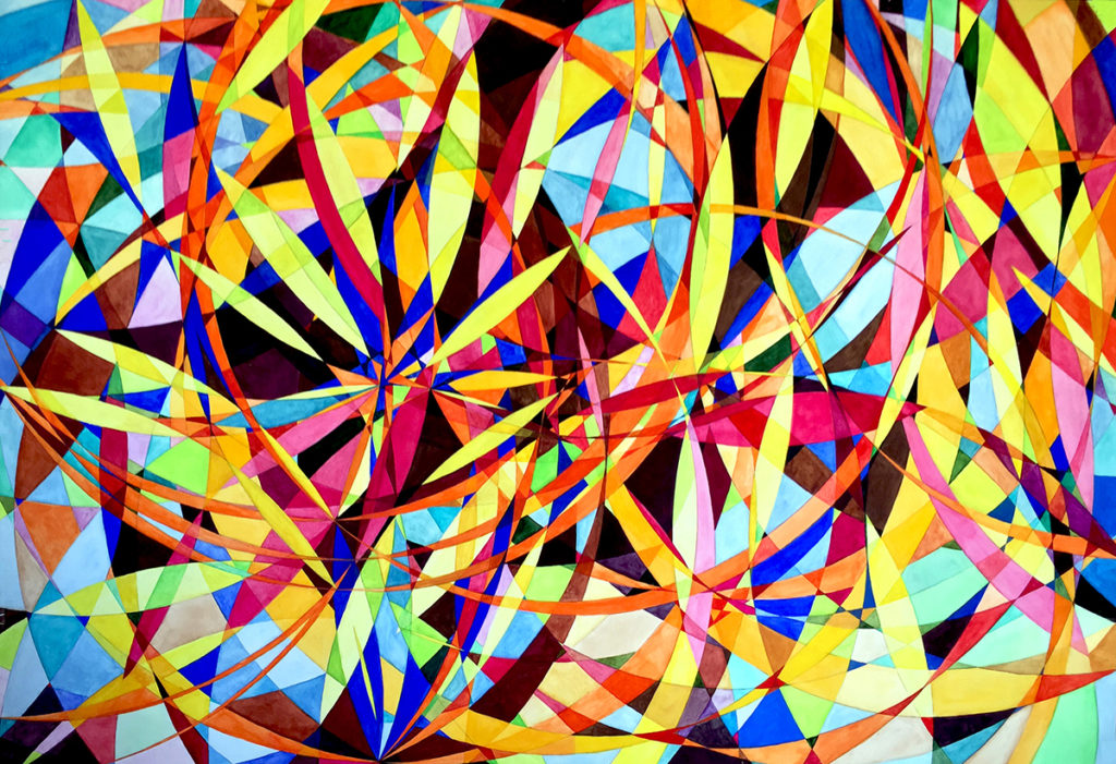
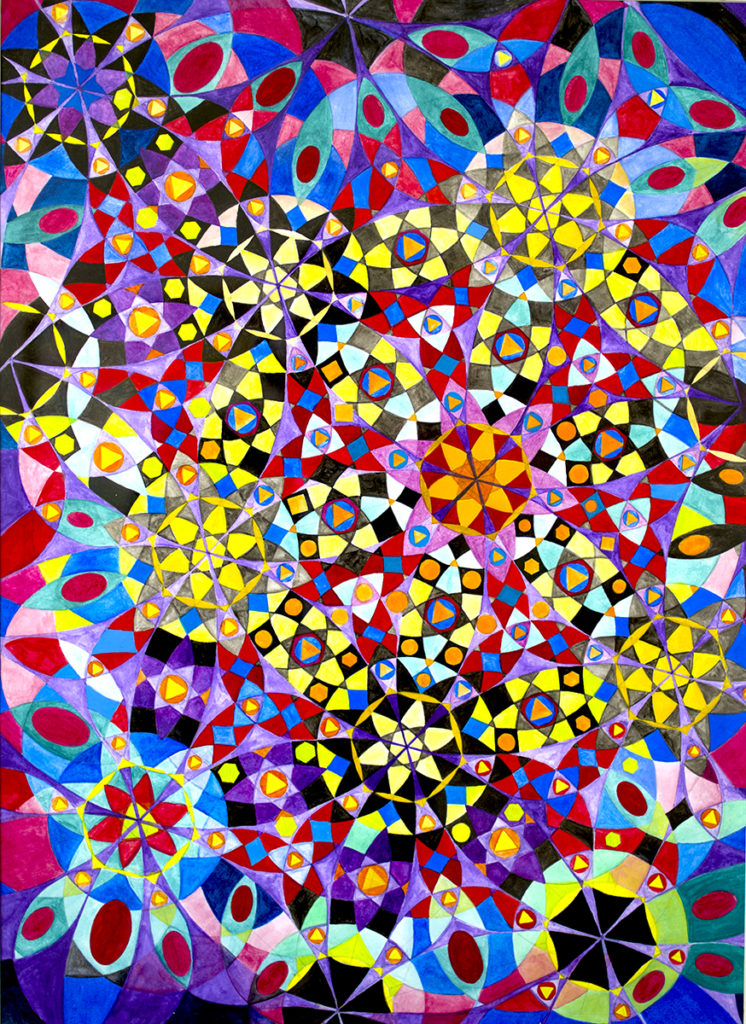
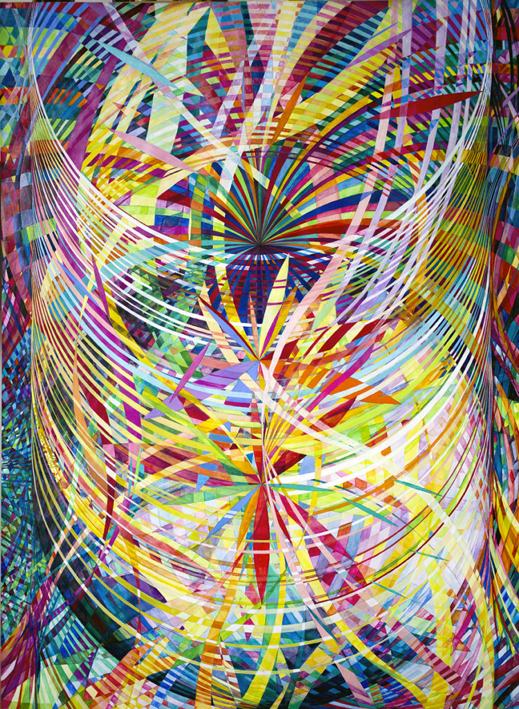
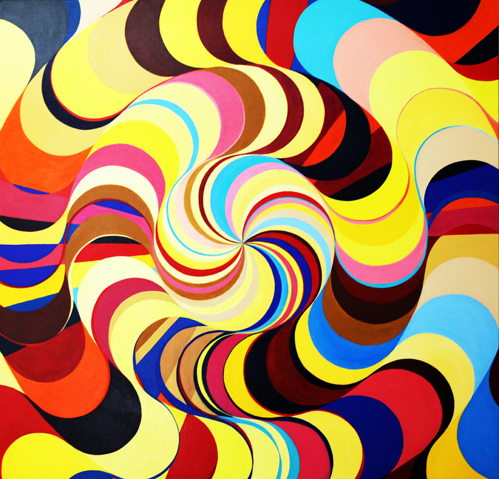
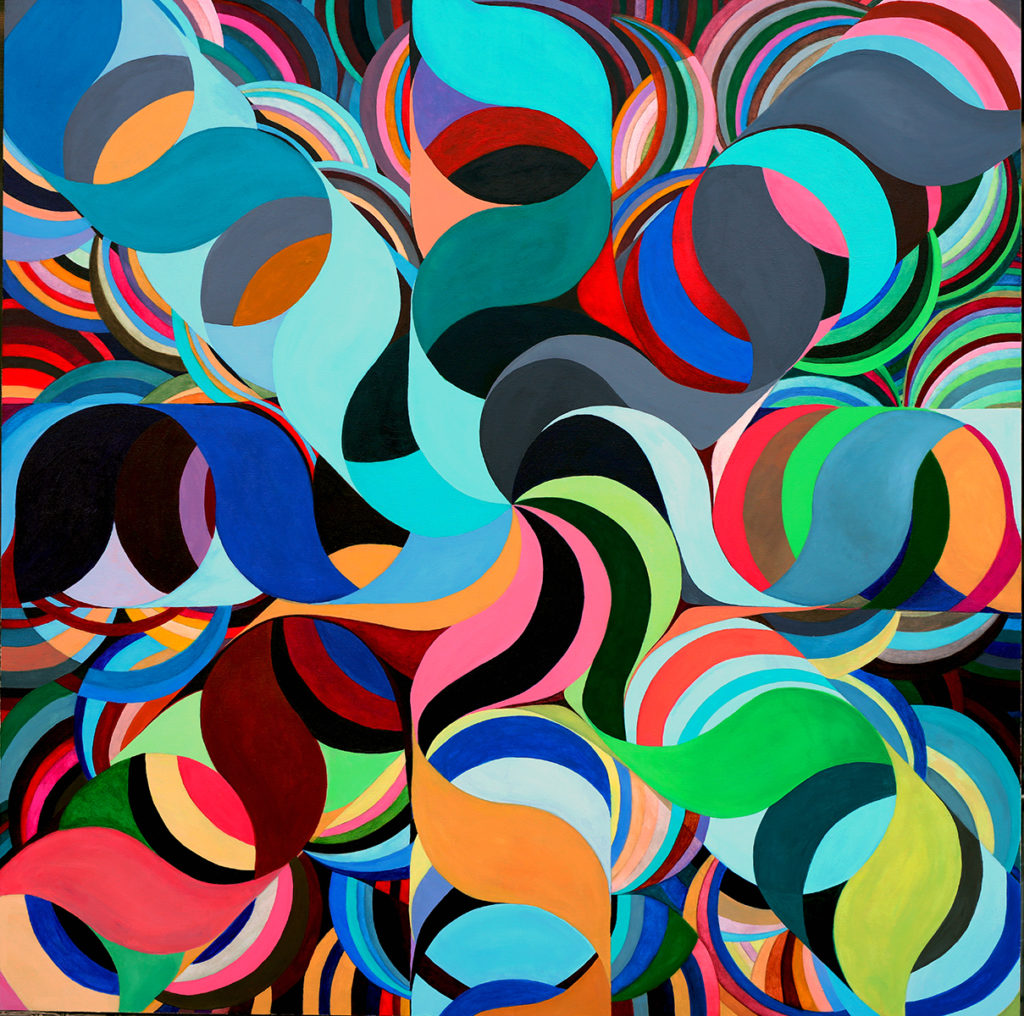
Coalescing Geometries Wheel within a Wheel 116 LSK
LORIEN SUAREZ. COALESCING GEOMETRIES. By Milagros Bello, Ph.D.
Lorien Suarez creates complex webs of hand-made fractalized patterns. She proposes geometric figures in never-ending configurations of infinite iterations. At different scales, and through different “fractured” recurring schemes, the geometric forms progressively augment and multiply in expansive dimensions. Vortexes and vibrant fluids, both tactile and aerial, operate in recursive constructions. Depths, ratios, proportions, scales, and ranges in strong colored stances emerge as relational points of departure. They mimic the cosmic world in imaginary projections of conversing energy waves, multiplying crystals, galactic systems, molecular interfaces, and collisions of particles as forceful form/type model generators.
Wheel within a Wheel 116, Acrylic, 40 in x 40 in, 2018
The intricate visual result signals the artist’s insight and awareness that plainly reveal her force and strong being. In her retrospective, Coalescing Geometries, she affirms, “Creating art is in essence a practice of being attentive and focused in the present moment. Creative insights come to light. Over time, intuitive spiritual expressiveness grows.” The work comes from a vigorous creativity and a resourceful inventiveness that doesn’t need the use of any computer software mediation. It’s Suarez’s artistic hand over canvas or paper, the painter’s sole imprint, which sets the conception of this ingenious imagery.
Wheel within a Wheel 49, Watercolor/Gouache, 60 in x 45 in, 2007
Endorsing her artistic identity, Suarez asserts: “Art to me is a form of knowledge of the heart. Creative practice brings forth discoveries that outlive their creators, serve the evolution of meaningful understanding, and give birth to a more profound vision of the unfolding of life.”
In a further step, the artist goes beyond the complexity of her geometrical creations. Their self- generated turns and expansions also correlate to jewel-like geometric shapes, such as it is in the “amplituhedron”, a geometric object that challenges notions of space and time in quantum physics (Wolchover, Natalie. A Jewel at the Heart of Quantum Physics. Quanta Magazine). This refers to a jewel-like multifaceted master geometry that was conceived by physicists Nima Arkani-Hamed (a professor of physics at the Institute for Advanced Study in Princeton, N.J.) and Jaroslav Trnka (a post-doctoral researcher at the California Institute of Technology) to project quantum particles’ multidimensional trajectories in the subatomic world. Departing from this parameter, the artist traces comprehensive structures that build up together in many facets and volumes, in a rich interplay of kinematic conglomerates (Wolchover, Natalie). She creates “transposed geometries”, altered and swapped, rearranged in sparkled diagrams, in fizzed organizations, in an open system of space, time, and movement.
Wheel within a Wheel 117, Acrylic, 40 in x 40 in, 2018
At first, and attuned with the Mandelbrot model, the artist’s work establishes schemes of visual chaos and order, producing multiple organizations in orderly generators and extensive, shaped iterations. Continuous and self-mirrored structures expand or contract in a decentered visual composition. Euclidian “fractalized” and multihued circles, rectangles, and squares, subdivide in vibrant assemblies of variable densities. (Taylor, Richard. Fractal Expressionism. Where Art Meets Science.)
Wheel within a Wheel 119, Acrylic, 40 in x 40 in, 2018
The visual morphologies of hard-edge outlines superimpose or revolve one into other in mathematical calculations. The works conform a vision of the universe in its meticulous micro and macro optic constructs. The viewer changes perspective from the rational vertical/horizontal paradigm to a sprawling kinetic perception projecting invisible domains in which materiality dissolves towards intangibility and immanence.
Wheel within a Wheel 46, Watercolor/Gouache, 51 in x 72 in, 2007
The work merges two essential elements of visual plasticity appropriated from modernist aesthetics, a potent graphic line of defined contours that strongly delineate and give character to forms, and a chart of colors that desegregate and disseminate into rich tone values and hues. It is at once both a graphic and a painterly approach, reinforcing the “autonomy of means” of the pieces in which the image possesses a “self-sufficient autonomy” (Wolchover, Natalie). The rhythmic lines entwined with luxuriant hues consolidate a compelling visual execution in which any reference to the real is unnecessary.
Wheel within a Wheel 16, Watercolor/Gouache, 30 in x 22 in, 2003
“Wheel Within A Wheel 16,” one of Suarez’s seminal works from 2003, displays a visual chaos/order of a crystal configuration. Fractal colored forms repeat in augmenting boosting patterns, virally interweaving and magnifying. Numerous geometrical subsidiaries, triangles, circles, and convex polygons proliferate in a lavish arrangement of the aerial composition. Governing circles, positioned in tensional asymmetrical locations, emerge as dominant form generators. The flowery and elaborate crystal forms spread widely in the hinted space producing powerful optical effects.
Wheel within a Wheel 50, Watercolor/Gouache, 60 in x 45 in, 2007
The work “Wheel Within A Wheel 50,” shows a huge spinning spiral rotating ad infinitum in a scattering process. It is a complex formulation of multiple interactions and frequencies, showing high-amplitude dimensions that refer to a 3-D quantum graph of moving particles. It is a visual platform for an all-encompassing inward/outward continuum of space-time. At the center of the spiral, there are three core generators, three epicenters of expanding energy, that radially project crisp trajectories, fracturing the planes inside-out and vice versa. The interlacing of colors enhances the kinetic effects, into a hyper recursive panorama of the universe.
Wheel within a Wheel 114, Acrylic, 40 in x 40 in, 2017
The painting “Wheel Within A Wheel 114,” stands as one of the most important canvases in the artist’s production. In it, there is a deep immersion into pure pictorialism, and a major emphasis on volume, paint and mass. Expressive layers of glutinous tint appear in fractioned compounds. A bulky snake-like geometry retorts and spirals inside-out in figure/ground illusionistic effects. The negative space disappears into the physical body of the colossal curly geometry. The multihued fragments succeed one another, continuously dissolving into endless torsions as in a sequel of an Escher-like tessellation design.
In summary, the artist names the unnamable and visually articulates the invisible routes of the metaphysics of the cosmos.
*Dr Milagros Bello’s critical essay “Transposed Geometries” was first published in “Coalescing Geometries” (2019 International Latino Book Award – First Place “Mariposa” 1st Non-Fiction book and Second Place in the Artbook categories). The book features Suarez’s “Wheel within a Wheel” abstract geometric paintings, the artist’s reflections, and critical essays by Peter Frank, Terrence Sanders, John Mendelsohn, Britni Winkler Winkler, and Evan Senn. Published by Art Voices Books and distributed worldwide, including Amazon and Barnes and Noble. Curator Dr Milagros Bello holds a PhD in Sociology with a doctoral thesis in Sociology of Art from Sorbonne University (Paris VII-Jussieu), Paris, France. Dr Bello is an art critic member of the International Association of Art Critics (AICA). Dr Bello has curated numerous shows in contemporary art locally and nationally; she is an art writer for local and international art magazines and a former Senior Editor of Arte Al Dia International art magazine. Since 2000, Bello has taught as a professor of art and critical theories at the Florida International University, Florida Atlantic University, Miami International University (The Art Institute/Miami), and the Istituto Marangoni/Miami. From 2010-2020, she was the director and chief curator of Curator’s Voice Art Projects in Miami, Florida/USA, which pivoted to the new MIA Curatorial Projects due to the pandemic.
Paris+ par Art Basel announces line-up of 156 leading galleries for its inaugural edition.
The first edition of Paris+ par Art Basel will bring together 156 premier galleries from 30 countries and territories – including 61 exhibitors with spaces in France – in a new flagship event that further augments Paris’s standing as a cultural epicenter
The fair will extend beyond the Grand Palais Éphémère through a program of collaborations with Paris’s cultural institutions and its city-wide sector Sites, including publicly accessible works in such emblematic settings as, the Jardin des Tuileries – Domaine national du Louvre, Place Vendôme, Musée national Eugène-Delacroix and Chapelle des Petits-Augustins des Beaux-Arts de Paris
Paris+ par Art Basel will take place at the Grand Palais Éphémère from Thursday, October 20 to Sunday, October 23, 2022, with the Preview Day on Wednesday, October 19
The inaugural edition of Paris+ par Art Basel will bring together 156 leading French and international galleries to present exceptional artworks across all media – from painting and sculpture to photography and digital works. From curated presentations of 20th century masterpieces to solo booths by emerging artists, Paris+ par Art Basel will present a global showcase of the highest quality, firmly embedded in Paris and its cultural scene.
A strong line-up of galleries from France will be joined by exhibitors from across Europe, Africa, Asia, North and South America, and the Middle East, including several first-time participants to any Art Basel show, such as Galerie Anne Barrault, christian berst art brut, Magnin-A, Salle Principale, and We Do Not Work Alone from Paris; Efremidis and Heidi from Berlin; Galerie Cécile Fakhoury with spaces in Abidjan, Dakar, and Paris; LC Queisser from Tbilisi; Seventeen from London; Chris Sharp Gallery from Los Angeles; and Tim van Laere Gallery from Antwerp.
Clément Delépine, Director, Paris+ par Art Basel says: ‘I am truly honored to announce the outstanding list of exhibitors taking part in the inaugural edition of our show in Paris. The composition of the gallery list reflects our commitment to create a show that is both specific to its host city and has a strong global resonance.’
‘The galleries selected for our debut in Paris embody Art Basel’s long-standing tradition of juxtaposing high-quality historical work with avant-garde material,’ says Marc Spiegler, Global Director, Art Basel. ‘Equally important to us, the galleries that make today’s Paris so dynamic are present in large numbers, across many market sectors, giving this show a singularly Parisian personality.’
Galeries
The main sector of the fair will feature 140 of the world’s leading galleries presenting the highest quality of painting, sculpture, drawings, installation, photography, video, and digital works. For the full list of exhibitors in Galeries, please visit parisplus.artbasel.com/galeries.
Galeries Émergentes
Dedicated to emerging galleries across the globe, Galeries Émergentes will feature 16 solo presentations. Exhibitors include Antenna Space from Shanghai; Instituto de Visión from Bogotá and New York; LC Queisser from Tibilisi; Marfa’ from Beirut; Parliament from Paris; Galeria Dawid Radziszewski from Warsaw; sans titre (2016) from Paris and Veda from Florence. For the full list of exhibitors in Galeries Émergentes, please visit parisplus.artbasel.com/galeries-emergentes.
Supported by Groupe Galeries Lafayette, one artist from Galeries Émergentes will be chosen to exhibitat Lafayette Anticipations the following year.
Sites
Sites is dedicated to artistic projects taking place in the heart of Paris. For its first edition, Sites will take place in emblematic settings throughout the city, including the Jardin des Tuileries – Domaine national du Louvre, where 25 sculptures and installations will be exhibited, as well as Place Vendôme, Musée national Eugène-Delacroix and Chapelle des Petits-Augustins des Beaux-Arts de Paris. Applications for Sites at the Jardin des Tuileries are open to all galleries, irrespective of their participation in Paris+ par Art Basel.
Conversations
Curated by Pierre-Alexandre Mateos and Charles Teyssou, and located in the atmospheric Bal de la Marine, a docked boat opposite the Tour Eiffel, the Conversations program will provide a platform for dynamic dialogues between leading figures from the artworld and the broader cultural sphere.
Further details on Sites and the program for Conversations will be released in the coming months.
PR Representatives for France CLAUDINE COLIN COMMUNICATION, Thomas Lozinski and Chiara Di Leva Tel. +33 (0)1 42 72 60 01, [email protected] and [email protected]
PR Representatives for Europe SUTTON, Joseph Lamb Tel. +44 20 7183 3577, [email protected]
PR Representatives for North and South America, the Middle East, and Africa FITZ & CO, Yun Lee Tel. +1 646 589 0920, [email protected]
PR Representatives for Asia SUTTON, Carol Lo Tel. +852 2528 0792, [email protected]
GALLERY LIST PARIS+ | JULY 12 | 2022
PARIS+ | JULY 12 | 2022
GALERIES ÉMERGENTES
Gallery Name
Exhibition Spaces
303 Gallery
New York
A Gentil Carioca
Rio de Janeiro, São Paulo
Miguel Abreu Gallery
New York
Acquavella Galleries
New York, Palm Beach
Air de Paris
Paris
Galerie Allen
Paris
Andréhn-Schiptjenko
Paris, Stockholm
Applicat-Prazan
Paris
Art : Concept
Paris
Alfonso Artiaco
Naples
Balice Hertling
Paris
Galerie Isabella Bortolozzi
Berlin
Ellen de Bruijne Projects
Amsterdam
Galerie Buchholz
Berlin, Cologne, New York
Campoli Presti
Paris, London
Capitain Petzel
Berlin
Cardi Gallery
Milan, London
Ceysson & Bénétière
Paris, Saint-Etienne, Lyon, Koerich, New York
christian berst art brut
Paris
Clearing
Los Angeles, Brussels, New York
Sadie Coles HQ
London
Galleria Continua
San Gimignano, São Paulo, Beijing, Havana, Les Moulins, Paris, Roma
Paula Cooper Gallery
New York, Palm Beach
Pilar Corrias
London
Galleria Raffaella Cortese
Milan
Galerie Chantal Crousel
Paris
Massimo De Carlo
Milan, London, Paris, Hong Kong
dépendance
Brussels
mfc-michèle didier
Brussels, Paris
Dvir Gallery
Tel Aviv, Brussels, Paris
Andrew Edlin Gallery
New York
galerie frank elbaz
Paris
Essex Street/Maxwell Graham
New York
Galerie Cécile Fakhoury
Abidjan, Dakar, Paris
Selma Feriani Gallery
Tunis, London
Konrad Fischer Galerie
Berlin, Düsseldorf
Fitzpatrick Gallery
Paris
Foksal Gallery Foundation
Warsaw
Fortes D’Aloia & Gabriel
Rio de Janeiro, São Paulo
Peter Freeman, Inc.
New York
Gagosian
New York, Beverly Hills, London, Paris, Geneva, Basel, Gstaad, Rome, Athens, Hong Kong
Galerie Christophe Gaillard
Paris
Galerie 1900-2000
Paris
gb agency
Paris
François Ghebaly
Los Angeles, New York
Gladstone Gallery
New York, Brussels, Roma, Seoul
Marian Goodman Gallery
New York, Paris, London
Galerie Bärbel Grässlin
Frankfurt
Greene Naftali
New York
Galerie Karsten Greve
St. Moritz, Cologne, Paris
Hauser & Wirth
Hong Kong, Ciutadella de Menorca, Gstaad, St. Moritz, Zurich, London, Somerset, Los Angeles, New York
Galerie Max Hetzler
Berlin, Paris, London
High Art
Paris, Arles
Hannah Hoffman
Los Angeles
Xavier Hufkens
Brussels
Mariane Ibrahim
Paris, Chicago
Taka Ishii Gallery
Tokyo, Hong Kong
Galerie Jousse Entreprise
Paris
Annely Juda Fine Art
London
Karma
New York
Karma International
Zurich
kaufmann repetto
Milan, New York
Anton Kern Gallery
New York
Galerie Peter Kilchmann
Zurich, Paris
David Kordansky Gallery
Los Angeles, New York
Andrew Kreps Gallery
New York
Galerie Krinzinger
Vienna
Kukje Gallery
Busan, Seoul
LambdaLambdaLambda
Pristina
Layr
Vienna
Galerie Le Minotaure
Paris
In Situ – fabienne leclerc
Paris
Simon Lee Gallery
London, Hong Kong
Galerie Lelong & Co.
Paris, New York
LGDR
New York, Hong Kong, Paris, London
Lisson Gallery
London, East Hampton, New York, Shanghai, Beijing
Loevenbruck
Paris
Luhring Augustine
New York
Magnin-A
Paris
Mai 36 Galerie
Zurich
Marcelle Alix
Paris
Matthew Marks Gallery
New York, Los Angeles
Mendes Wood DM
São Paulo, New York, Brussels
kamel mennour
Paris
Meyer Riegger
Berlin, Karlsruhe
Francesca Minini
Milan
Galleria Massimo Minini
Brescia
Victoria Miro
London, Venice
mor charpentier
Paris, Bogotá
Galerie nächst St. Stephan Rosemarie Schwarzwälder
Vienna
Nahmad Contemporary
New York
Galerie Neu
Berlin
Neue Alte Brücke
Frankfurt
neugerriemschneider
Berlin
Galleria Franco Noero
Turin
Galerie Nathalie Obadia
Paris, Brussels
Pace Gallery
New York, London, Hong Kong, Seoul, Geneva, Palo Alto, East Hampton, Palm Beach, Los Angeles
Galerie Papillon
Paris
Peres Projects
Berlin, Milan, Seoul
Perrotin
Paris, New York, Hong Kong, Seoul, Tokyo, Shanghai
Galerie Francesca Pia
Zurich
Galeria Plan B
Cluj, Berlin
Galerie Jérôme Poggi
Paris
Galerie Eva Presenhuber
Zurich, New York, Vienna
ProjecteSD
Barcelona
Almine Rech
Paris, Brussels, London, New York, Shanghai
Regen Projects
Los Angeles
Michel Rein
Paris, Brussels
Rodeo
London, Pireas
Thaddaeus Ropac
London, Paris, Salzburg, Seoul
Salle Principale
Paris
Esther Schipper
Berlin
Semiose
Paris
Jessica Silverman
San Francisco
Skarstedt
New York, London, Paris, East Hampton
Société
Berlin
Galerie Pietro Spartà
Chagny
Sprüth Magers
Berlin, London, Los Angeles, Hong Kong
Galeria Luisa Strina
São Paulo
Simone Subal Gallery
New York
Sultana
Paris
Take Ninagawa
Tokyo
Templon
Paris, Brussels
Tornabuoni Art
Paris, Florence, Forte dei Marmi, Milan, Crans Montana
Call to artists for the Deering Estate Artist-in-Residence Program
MIAMI ( July 13, 2022 ) —
The Deering Estate’s engaging Artist-in-Residence (AIR) program has launched the application for the 2023 season. A call to artists is currently available for visual, literary, performing, and cross-disciplinary arts and artists are invited to apply before the August 31, 2022, 11:59 pm deadline. The application is for studio residencies and non-studio project residencies at the Deering Estate, beginning as early as January 1, 2023.
The Deering Estate seeks to continue Charles Deering’s legacy of arts patronage by supporting emerging and mid-career artists who work in a multitude of disciplines and media. The prestigious and competitive Artist-in-Residence Program is a direct extension of this legacy, and acts as a wonderful incubator for creative ideas, unique experiences, and collaborative opportunities that engage the public.
As a cultural arts organization, we are very proud of the role that our program has had in our artists’ careers, the positive interactions with the public, and our growing cultural partnerships. We have had the privilege of presenting and collaborating with internationally-acclaimed visual artists, composers, musicians, playwrights, authors, choreographers, and performers.
Interested artists must complete a formal application, which is available online. A printable Frequently Asked Questions (FAQ) document is available on the Deering Estate website to assist applicants with answers to common questions. You can find this and more information on the Deering Estate website.
Completed applications must be submitted by the deadline of August 31, 2022, by 11:59 pm.
Eligibility information is listed within the FAQ and application format. Please read carefully to choose the appropriate residency type.
There is no cost associated with the application process or residency program.
This program offers the opportunity for professional artists to pursue their artistic discipline, create a body of work, connect with other artists, and engage the public, while interacting with the historic, archeological, and natural elements of the Estate’s inspiring environment. Other benefits include access to archives, education and interpretive staff, and possible grant and partnership opportunities. Artists are encouraged to interact with the public during their regular studio hours whenever possible.
The AIR program offers residents free access to the site and/or studio space for extended periods on our beautiful, inspiring, and historic site. Collaboration with other residents, Estate programs, and Estate partners are encouraged and welcomed. Each artist studio is slightly different, but all provide space in one of our historic buildings for two to 12 months. We welcome shared and collaborative residencies and seek to include a broad scope of contemporary and traditional artistic practices. The residency does not provide for overnight housing, and artists must provide their own supplies.
About the Deering Estate The Deering Estate is a 21st Century house museum, cultural and ecological field station, and a national landmark listed on the National Register of Historic Places, owned by the State of Florida, and managed by Miami-Dade County Parks, Recreation and Open Spaces Department. 2022 marks the 100th anniversary of the construction of the Stone House, and along with our philanthropic partners, the Deering Estate Foundation & 100 Ladies of Deering, we will be hosting a series of events & programs in celebration of this momentous occasion. The Deering Estate is located at 16701 SW 72 Ave. in Miami.
Cultural Arts Programming at the Deering Estate is made possible with the support of the Miami-Dade County Department of Cultural Affairs and the Cultural Affairs Council, the Miami-Dade County Mayor and Board of County Commissioners, and The Deering Estate Foundation, Inc.
About the Deering Estate Foundation For those who treasure the Deering Estate, who advocate for its preservation and wish to invest in its future, The Deering Estate Foundation provides opportunities for individuals and corporations alike to partake in membership, signature events, and one-of-a-kind experiences, all in service of providing vital funding and support to the Deering Estate. Through these efforts, the foundation fulfills its mission to uphold the legacy of Charles Deering’s cherished 1920s-era property, to provide funding for the cultural, educational and recreational experiences it offers, as well as its significant scientific and archaeological endeavors to conserve its diverse flora, fauna and the eight native ecosystems that thrive on its 450 acres, and to ensure its longevity as a prized American heritage site. Established in 1989, The Deering Estate Foundation, Inc. is a community-based charitable 501(c) 3 Florida Corporation and the philanthropic partner of the Deering Estate.
# # #
To request materials in accessible format, sign language interpreters, and/or any accommodation to participate in any Miami-Dade Parks sponsored program or meeting, contact Gisel Prado, 305-755-7848 or [email protected] at least seven (7) days in advance to initiate your request. TTY users may also call 711 (Florida Relay Service).