back to top
Sunday, October 26, 2025
Home Blog Page 166

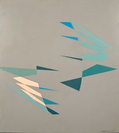
Sonia Delaunay

Sonia Delaunay
Sonia Delaunay

Sonia Delaunay

Who is Sonia Delaunay?

Sonia Delaunay
French, 1885–1979

Who is she?

Sonia Delaunay was a multi-disciplinary abstract artist and key figure in the Parisian avant-garde. Alongside her husband, Robert Delaunay, she pioneered the movement Simultanism. Her exploration of the interaction between colours has created a sense of depth and movement throughout her oeuvre.

What is her background?

She was born Sonia Illinitchna Stern to a Jewish Ukrainian family. At the age of seven she went to live with her comparatively wealthy uncle Henri Terk and his wife, Anna, in St Petersburg, Russia. The Terks offered her a privileged and cultured upbringing in St Petersburg. Nevertheless, her childhood memories of Ukraine remained with her and she often referred back to the ‘pure’ colour and bright costumes of the Ukrainian peasant weddings.

How did she start her career as an abstract artist?

About 1911 I had the idea of making for my son, who had just been born, a blanket composed of bits of fabric like those I had seen in the houses of Russian peasants. When it was finished, the arrangement of the pieces of material seemed to me to evoke cubist conceptions and we then tried to apply the same process to other objects and paintings.

What does she do?

I always changed everything around me… I made my first white walls so our paintings would look better. I designed my furniture; I have done everything. I have lived my art.

Delaunay’s creativity expanded beyond painting to include many other outlets such as Casa Sonia, an interiors and fashion boutique that she set up 1918; The entire set and costume design of Tristan Tzara’s 1923 play Le Cœur à Gaz; An illustration for the cover of Vogue in 1926; Costumes for the films Le Vertige directed by Marcel L’Herbier and Le p’tit Parigot, directed by René Le Somptier; Furniture for the set of the 1929 film Parce que je t’aime; And her textiles label Tissus Delaunay, which sold her designs worldwide.

What is Orphism?

Orphism is a term originating from 1912 when French poet and art critic Guillaume Appollinaire identified the new style of Cubist painting. Appollinaire was inspired by the work of František Kupka and the Delaunays, who, although channelling the Cubist vision, prioritised colour in their work. Appollinaire felt this use of colour brought movement, light and musical qualities to the artwork and therefore referenced the legendary poet and singer of ancient Greek mythology, Orpheus, when naming the movement.

What is Simultanism?

Simultanism is the strand of Orphism practised by the Delaunays. The name comes from the work of French scientist Michel Eugène Chevreul who identified the phenomenon of ‘simultaneous contrast’, in which colours look different depending on the colours around them. For example, a grey will look lighter on a dark background than it does on a light one. The Delaunays dispensed with form and aimed to created rhythm, motion and depth through overlapping patches of vibrant hues.

Is she religious?

For a very long time I hadn’t believed in God, but I would seek out nature, and I felt the need to fulfil my desires […] Now, I would worship pagan gods; it’s the only religion I recognise. Praying to beauty — there is a great deal of selflessness in that, and a purely aesthetic element which alone ennobles life and makes it love.

Where has she exhibited her work?

As well as a major retrospective at the Kunstmuseum Bielefeld in 1958, Delaunay was the first living female artist to have a retrospective exhibition at the Louvre in 1964. She has also had her work shown at Musée d’Art Moderne in Paris, Smithsonian Cooper-Hewitt, National Design Museum, Musée des Arts Décoratifs, Musée National d’Art Moderne and Tate Modern.

What are her key artworks?

Prismes électriques (Electric Prisms), 1914, displays Delaunay’s trademark concentric circles at their best. Interpreted as an ode to modernity, Delaunay refracts the lights and bustle of Boulevard Saint Michel into almost complete abstraction. Everything disintegrates into colour except two figures, which remain discernible in the lower centre of the piece.

Nu jaune, 1908, juxtaposes the models’ warm yellow skin against lashings of cool emerald. This is one of Delaunay’s most striking uses of tone. The bright colours are frequently offset by black marks. These create a bold and heavy outline which is primitivist in its intention. The face of the model is mask like, suggesting melancholy. Delaunay makes no attempt to depict her as attractive, giving the artwork a brusque, modern feel.

What are her thoughts on colour?

Colour is the skin of the world.

Colour was the hue of number.

One who knows how to appreciate colour relationships, the influence of one colour on another, their contrasts and dissonances, is promised an infinitely diverse imagery.

What techniques did Sonia Delaunay?

The Delaunay couple used Orphism to create non-objective imagery, the significance of which was based on the intensity of the expression that they could create with color on the surface of the canvas.

What was innovative about Sonia Delaunay?

Sonia Delaunay’s innovative explorations of color and form were integral to the development of abstract art in the early 20th century. Initially inspired by quilt patterns, Delaunay eventually incorporated the stylistic concerns of Cubism, Fauvism, … Represented by internationally reputable galleries.

What materials did Delaunay use?

His reputation declined somewhat in the latter part of his career but he continued to experiment with materials such as sand, mosaics and lacquered stone to be used in his acclaimed ‘Reliefs’ series.

What medium did Sonia Delaunay use?

Painting is the practice of applying paint, pigment, color or other medium to a solid surface. The medium is commonly applied to the base with a brush, but other implements, such as knives, sponges, and airbrushes, can be used. In art, the term painting describes both the act and the result of the action.

Sonia Delaunay’s innovative explorations of color and form were integral to the development of abstract art in the early 20th century. Initially inspired by quilt patterns, Delaunay eventually incorporated the stylistic concerns of Cubism, Fauvism, and Futurism into her bright, geometric paintings and prints. She variously dubbed her style “Orphism” or “Simultaneism” and focused on the possibilities of color combinations. In 1964, Delaunay became the first living female artist to have a retrospective exhibition at the Louvre; her work would later be shown at institutions including the Musée d’Art Moderne de Paris, the Musée des Arts Décoratifs, the Centre Pompidou, Tate Modern, and Cooper Hewitt, Smithsonian Design Museum. Delaunay also worked in fashion, interior design, graphics, collage, bookmaking, and textiles—and blurred the boundaries between these disciplines and fine art.

Accomplishments

  • By matching primary and secondary colors (red with green, yellow with purple, and blue with orange) to create a kind of visual vibration, Robert Dulaunay developed a new type of expressive, abstract paintings. He called this exploration “Simultaneous Contrast,” but the movement became officially known as Orphism and Sonia was one of its chief practitioners.
  • The Delaunay couple used Orphism to create non-objective imagery, the significance of which was based on the intensity of the expression that they could create with color on the surface of the canvas. They placed lines of primary color beside those of secondary color, understanding that the scientific effect on the eye of such combinations would result in art that could be just as scintillating to the viewer as those depicting a standard view of reality such as a figure reclining on a couch. Their efforts produced a body of work that forced the viewer to experience their pieces visually – yet powerfully.
  • Sonia Delaunay’s exploration of expressive color in the field of textile design differentiates her significantly from other members of the contemporary avant-garde. Besides designing, making, and selling garments in her own fashion boutique, she was responsible for costume design in a range of the performing arts including theatre and dance. She ended up creating a line of textiles so significant that it was picked up by one of the biggest fabric manufacturers in Europe.

Biography of Sonia Delaunay

Childhood and Education

Sonia Delaunay was born Sara Élievna Stern, the youngest of three children, to impoverished Jewish parents in Odessa, Ukraine. At five, she was sent to live with her mother’s well-off brother, Henri Terk, and his wife in St. Petersburg, Russia. Although her mother never allowed a legal adoption, Delaunay thought of them as her family and took the name Sofia Terk, using “Sonia” as a nickname. She received a good education, had access to great art collections, and traveled Europe spending summers in Finland. At sixteen, Delaunay’s art teacher noticed her talent and encouraged her uncle and aunt to send her to Germany for further art training.

Early Training

Eighteen-year-old Sonia began her studies at the Academy of Fine Arts in Karlsruhe in 1904. After two years in Germany, Delaunay moved to Paris to study at the Academie de la Palette. On December 5, 1908 she married her friend Wilhelm Uhde, an art dealer, ensuring that her family wouldn’t be able to force her to come home while also covering for Uhde’s homosexual lifestyle. Uhde gave Delaunay her first one-person show in 1908 featuring numerous portrait studies that demonstrated the early influence of Fauvists like Henri Matisse and introduced her to important art and literary figures, including, in 1909, her future husband, Robert Delaunay.

Sonia married Robert on November 15, 1910 after amicably divorcing Uhde, and their son Charles was born in January 1911. The two were to become one of the art world’s most important partnerships, co-founding Orphism, a variation of Cubist art composed of abstract forms of vibrant color.

Although Delaunay’s early work was in the field of painting, the creation of a patchwork quilt for her son instigated an entirely different direction to her work. She assembled the quilt according to a style she’d seen years earlier in Russia, laying scraps of fabric one beside the other. She was fascinated by the effects of the colors created from these strips once removed from their original context. This interesting discovery, coupled with Robert’s interest in chemist Eugène Chevreul’s theories on color, led the two to create works based on simultaneous color relationships known as Simultanism and soon enough Delaunay began to apply simultaneously contrasted colors not only to paintings, such as Bal Bullier (1912-13), but also to objects, such as cushions, boxes, and clothing.

Delaunay’s refusal to distinguish between the worlds of fine art and crafts, and her friendships with the creative people who gathered at her home on Sundays, resulted in rich a career that included exciting collaborations. Her friendship with poet Blaise Cendrars, for example, led to the creation of a series of “poem-paintings,” including La Prose du Transsibérienn et de la petite Jehanne de France (1913).

Mature Period

Delaunay wearing Casa Sonia creations, Madrid (c.1918-20)

Delaunay traveled extensively throughout her life, each location influencing her work. While in Madrid in 1917, she began to design costumes for a production of Cléopâtre. This was just the first of what would become a number of ballet and theatrical performances for which she would provide designs. The following year she opened a design and fashion shop known as Casa Sonia. Never favoring one artistic pursuit over another, she described these diverse endeavors as, “noble work, as much as a still-life or a self-portrait.”

Between the years 1918 and 1935, Delaunay painted very little, devoting herself to parenting and trying to make a living in order to support Robert’s artistic career. She opened a fashion shop featuring her designs in Paris in 1921 which quickly attracted glamorous customers such as Hollywood actress Gloria Swanson. Delaunay’s fabric designs became so popular that she eventually started her own company with Jacques Herm in 1924 and began a relationship with the Holland-based department store Metz & Co. the following year that would last more than three decades. A growing interest in the Dada art movement led to a fashion collaboration with poet Tristan Tzara, creating “dress-poems” with designs featuring color combinations inspired by his words.

Delaunay returned to painting in 1937 when she and Robert were asked to decorate two buildings for the Paris Exposition Internationale des Arts et Techniques dans la Vie Moderne. The murals she created for this commission were well received. After Robert’s death in 1941 things became very difficult and Delaunay survived by selling both her own designs and Robert’s paintings. Being of Jewish heritage she was forced to move frequently during the war, worried that she would be arrested. There was an occasion, in Cannes, when she was questioned regarding her middle name, “Stern.” Apparently she stood her ground and, refusing to show fear, succeeded in boarding her train and escaping capture. Delaunay was acutely aware of the war, frequently hearing gunfire and watching German troop activity from as close as just outside her hotel windows.

Later Period

At the end of the war, in 1944, Delaunay returned to Paris, intent on assuring that Robert’s artistic legacy received proper recognition. When she was confident that this goal had been met she finally began to focus on her own art, concentrating primarily on painting with a series of gouaches in the 1950s called Rhythme coloré. The series explored the power of color, and the inherent rhythm in their combination on the canvas.

In 1964 Delaunay met author and poet Jacques Damase who would eventually become her partner, nurturing her late career by arranging numerous gallery exhibitions as well as the 1967 retrospective of almost 200 works at France’s Musée Nationale d’Art Moderne.

Near the end of her life, Delaunay’s work achieved both acknowledgement in her own country as well as global attention. As a measure of goodwill, French President Pompidou even gifted U.S. President Richard Nixon her painting Rhythme-couleur No. 1633 (1969).

In 1978, a year before she passed away, she helped design costumes for a performance of the play Six Characters in Search of an Author and finally published her autobiography. Having made an impact on both the art and fashion worlds, it was fitting that she chose to be buried in a dress that Hubert de Givenchy had designed for her to wear while attending a reception for England’s Queen Elizabeth.

The Legacy of Sonia Delaunay

Orphism inspired artists such as Paul Klee to explore the effect of non-objective colored shapes. Later, proponents of the Op art movement, such as Bridget Riley, used color and shape to create optically-charged movement and vibration in their works that have connections to Delaunay’s explorations. Kinetic movement artists, such as Yaacov Agam and Alexander Calder, continued this investigation in the third dimension in their sculptural constructions as well. Delaunay’s textile designs extended the range of her influence into fashion, home decor and the theater. Her ability to introduce art into regular life by creating and wearing clothing, and living in spaces that were of her own design, can be seen as an early form of performance art, inspiring contemporary artists such as Marina Abramovic.

Souce: https://www.theartstory.org/artist/delaunay-sonia/

More about Sonia Delaunay https://en.wikipedia.org/wiki/Sonia_Delaunay

LAS LLORONAS

las lloronas
las lloronas

LAS LLORONAS

OPENING NIGHT – THURSDAY MARCH 3, 2022 (SPECIAL EVENT NIGHT)

FRIDAY-SATURDAY, MARCH 4-5 AT 8:00 PM AND SUNDAY, MARCH 6 AT 6:00 PM

THURSDAY-SATURDAY, MARCH 10-12 AT 8:00PM AND SUNDAY, MARCH 13 AT 6:00PM

THURSDAY-SATURDAY, MARCH 17-19 AT 8:00PM AND SUNDAY, MARCH 20 AT 6:00PM

PERFORMANCE TIME 1 HOUR AND 30 MINUTES. PRE-SHOW COCKTAILS ONE HOUR BEFORE THE SHOW / POST SHOW AT THE END OF EACH PERFORMANCE FOR A NIGHT OF MUSIC AND GREAT DRINKS

BUY TICKETS

SYNOPSIS

Las Lloronas is a hyper-realistic and impactful immersive theater production that introduces the audience to the historical practice of professional mourners and how it was utilized in a fictional Cuban funeral home in the 1950’s and later in Miami, Florida. By utilizing drama and dark humor, the play will show how the practice of hiring professional mourners began as a noble profession designed to assist grieving families and how one llorona distorted the practice into a money-making, criminal enterprise that resorted to extortion and worse.

Las Lloronas will also follow the story of the Perez family from the founding of their family funeral business in Havana, Cuba in the 1950’s, the loss of the business to the Communist regime, their immigration into the United States in the early 1960’s and the restarting of their funeral home in Miami. The play will also show the growth of the business, the introduction of a new generation of family members into the business and the assimilation and partial acculturation of the family and the Cuban community while still struggling to maintain their Cuban customs, culture and traditions.

The audience will be introduced to Little Havana, the epicenter of the Cuban exile experience built on strong Cuban coffee, Cuban food, Cuban music and Cuban work ethic and business sense. The play will emphasize the importance and sanctity of family values.

Las Lloronas is a wild ride through a harrowing epoch of Cuban and South Florida history. It is a saga of family values, nostalgia, crime and corruption, brotherhood and betrayal, power and survival. 

WRITER & EXECUTIVE PRODUCER – MIGUEL MASPONS

Miguel Maspons is a corporate lawyer and a third-generation funeral home owner. Miguel was born and raised in Miami, Florida. He attended Christopher Columbus High School, Harvard College and Boston College Law School.

Some of his earliest memories as a child are spending time on the second floor of his family’s funeral home in Miami where his grandfather, Leopoldo Rivero, who founded the family funeral home business in Havana, Cuba and later in Miami, lived with his parents and Miguel’s great-grandparents, Jose Nestor and Rosa “Abuela Tita” Rivero. Miguel’s first job at the age of fourteen was at the family funeral home, where he was responsible for cleaning up funeral chapels after services. Although the family business did not utilize or employ “lloronas” at the funeral home, Miguel is convinced that some of the women that attended the viewings did not know the deceased and came to the viewings as a sign of respect and to grieve with the families. This is where the idea for Las Lloronas was born.

Beginning in high school and continuing through college, Miguel would often write short stories about the funeral home with no intention of ever sharing these stories. Some of the stories were fact and many of the stories were fiction. In 2013, Miguel shared some of his stories with a friend, Juan Soler, an accomplished and award-winning actor, who encouraged Miguel to continue to write.

As a result of Juan’s encouragement, Miguel created a pilot script for a television series based on many of his stories. While working on the pilot script, Miguel was introduced to Miguel Ferro, an accomplished producer and playwright, who agreed to assist Miguel in making Las Lloronas a reality. Without the support and encouragement of his “tocayo”, you would not be experiencing Las Lloronas.

GENERAL PRODUCER – MIGUEL FERRO

As the founder of Venevision International Theatre, Miguel has  produced over twenty two plays in Spanish, most notably A $2.50 La Cuba Libre, which evolved into a twelve week run in New York City, Baño de Damas, the world premiere of La Lechuga, which he also presented in Santiago, Chile, Master Class at the Broward Center for the Performing Arts and Puerto Rico, Confesiones de Mujeres de 30, the very successful musical, The Queen, La Lupe, Havana en el Fondo del Mar, Palabras Encadenadas, Sorpresas, and Quien Mato a Hector Lavoe?, among many others. Mr. Ferro was the Executive Producer of the popular talk show Laura, which aired on NBC/Telemundo becoming the most successful in Hispanic television for over five years, the Director of Entertainment of America TV, and more recently Vice President of Production of MEGA TV and Vice President of Programming and productions of MIRA TV as well as the Executive Producer of the two largest AIDS Campaigns targeting the Hispanic community for the State of Florida Department of Health.  He was nominated for the Emmy Award for the creation and production of a Florida Department of Health AIDS Campaign and is an Emmy Award winning producer of the show Maria Elvira Live. Mr. Ferro was also the co-founder of Microtheater Miami, and is the creator and founder of Paseo de las Artes and Paseo Wynwood, now Paseo Regency, which has presented more than 500 short plays and one hundred long format plays during the last eight years. Mr. Ferro holds an MBA and MIB from Florida International University. Mr. Ferro is the Vice President of Histepa, Hispanic Theaters and Producers Association, a recently created organization that represents the only eight Hispanic theaters in Miami Dade County. Mr. Ferro was also the co-writer, director, and co-producer of Cuba Under the Stars that opened in December 2020 and ran for sixty-eight shows until March 2021.

DIRECTOR – EDUARDO PARDO

A screenwriter, producer and director of television, radio, film, theater and alternative media, Mr. Pardo graduated as a Social Communicator with a specialty in Audiovisual at the Catholic University. He received the National Award for Audiovisual Journalism 1980 in Venezuela for Síntesis Revista Cultural Televisivo. Pardo has been in the industry for forty-three years, with twenty-seven of them in the USA.

He has worked in mass media with television networks such as RCTV, Venevision, Canal 5 and 8 of Venezuela (Cultural) and has been the director of music videos for the Rodven Venezuelan label. He has been the director, producer and writer of productions for Ecuavisa, Vme (Hispanic PBS in the US), Telemundo, Univision, Fox, Discovery Latin America, Mega TV, Casa Club and MGM, among others, and with international producers such as SEAL (UK), PRISA (Spain), Latin World USA, Promofilm (Argentina) and Estefan Enterprises. He is the designer of television formats and has been the director of reality TV shows in the Hispanic market in the USA with protagonists of Promofilm Argentina for Telemundo. He has been the director of the reality music TV show Nuevas Voces De America, with Estefan Enterprises for Telemundo Network and has been the writer and director of the sports reality show The Final Challenge with Seal UK for Fox Sports USA.

He is also an independent filmmaker and has been the representative of Venezuela in Film Festivals in Montecatini, Laussane, Leicester and Cinema Venezuela USA. He is the creator and director of the radio theater series TeatroAndo and is the creator of digital projects such as Informes del Encierro on YouTube (invited to Miami New Media Fest 2020), Micro virtual live theater and Onstage (theater in virtual reality). Pardo was trained at CELARG (Centro de Estudios Latinoamericanos Rómulo Gallegos) in Venezuela) as a screenwriter and at the Venezuelan Rajatabla foundation as an actor and theater director. Pardo is also a professional trainer and coach for actors and presenters on screen for more than thirty years. He is the author of more than one hundred original plays, with more than eighty productions including three musicals and two macro theater plays. He is the Founder of the T.E.C. Experimental Communications Workshop at the Andrés Bello Catholic University in Venezuela and a founding member of the “Center of Directors for the New Theater” in Venezuela. Pardo was the guest director at international theater festivals with original works such as Juan Telon and Cosas de Niñas. He is also an author, producer and director for Microteatro USA and Container Theater of the Paseo de las Artes, Paseo Wynwood and Paseo Regency Miami. Pardo has presented at seminars on on-screen images, television production, dramaturgy, acting and acting in gibberish for the Miami Dade College and is the author of original books available on Amazon titled TeatroAndo and Bailando con las Musas.

ARTISTIC DIRECTORS – JORGE NOA AND PEDRO BALMASEDA

The tandem made up of Jorge Noa and Pedro Balmaseda are responsible for the artistic, architectural and interior design of this project. They are known and respected within the scenic panorama of Miami for their theatrical designs, as well as for the important work of rescuing the most beautiful traditions of Cuban art. Jorge was born in Camagüey, graduated in Architecture from the Higher Polytechnic Institute in Santiago de Cuba and Pedro was born in Havana and graduated in Dentistry from the University of Havana. Based in Miami since 1998, they run the company Nobarte Interior Designs, Inc. that has created commercial and residential environments throughout South Florida. Nobarte provides scenography and costume design services for various groups in the city, as well as private and corporate events.

They have collaborated closely with Teatro Avante and the Miami International Hispanic Theater Festival and with the Teatro Prometeo of Miami Dade College.  Their creations have been used by various theater groups, such as Wolfson Opera/Musical Teatro Ensemble, Arca Images, Pro Arte Grateli, Veritatem Theather, Adriana Barraza Black Box, and many others.

Nobarte was in charge of designing the theatrical version of Que Pasa USA Today by Loud and Live Productions and Amparo, the true story of Havana Club rum, a Broadway Factor production.

Among their own productions, there are La Ultima Función with the Prima Ballerina Rosario Suarez and Juana, De Amor Una Historia, as well as three exhibitions that included their design works: Journey to the Center of the Scene, Brief Realities and A Decade in Prometeo.

They have participated in various international festivals and their creations have been presented on stages in Spain, Mexico, Puerto Rico, Brazil, Ecuador, Costa Rica, Peru, Slovenia and the United States, with excellent critiques.

Cast

ZULLY MONTERO – “ACA”, FOUNDER OF FUNERARIA PEREZ

Montero was born in Santo Suarez, Cuba. At the age of eleven, Montero gathered a group of friends and created her own plays, which were presented to family and friends. Her mother noticed her interest in performing and placed her in La Academia De Arte Dramatico De La Habana (School of Dramatic Arts in Havana, Cuba). When she graduated from school, she participated in a radio talent contest, which was searching for an actress to participate in a radio soap opera. She won the contest and was featured on the show. Montero moved to her uncle-in-law’s home in New York, and they worked to provide food and shelter for their family. There, she began expanding her acting career from theater to television. In 1979, she played Aurelia in the movie El Super. Then in 1990, she appeared in her first on-screen soap opera, El magnate, and today Ms. Montero has more than forty soaps operas, twenty-five feature films and many theater plays.

MAURICIO RENTERIA – “JOSE”, A MOBSTER KNOWN AS THE CUBAN GODFATHER

Mauricio Renteria is a Cuban actor with an international career. Mauricio’s family was recognized in the entertainment industry in Cuba.  Mauricio emigrated to Venezuela where he starred in a number of very successful telenovelas, most notably De Oro Puro and Cuando Hay Pasión.  Later, Mauricio moved to Miami to continue his career as an actor and participated in a leading role in Telemundo’s hit, De Mente Criminal. Mauricio also has a long and successful career in theater, with Las Lloronas marking his return to the stage after surviving a huge personal battle with cancer. Mauricio is recognized as one of the most influential voices in the entertainment industry in the fight against cancer.

LILI RENTERIA – “MARTA”, FOUNDER OF LAS LLORONAS IN CUBA

Lili Rentería is the daughter of Lilian Llerena and Pedro Rentería, two renowned Cuban actors from stage, film and television. While in her teens, Lili became a popular personality as the conductor of a music television program for the young, and she impressed in Alea’s Los Sobrevivientes (1979), as an ill-fated young lover. In the 1980’s she grew into a first-rate leading actress on stage productions, such as García Lorca’s Mariana Pineda, for which she won recognition in international theater festivals and received many awards in her native country. In the 1990’s Lili moved to Venezuela, where she appeared in several television series. After marrying, she worked in Argentina, where she gave birth to her daughter, Mariana. Lili presently lives in Miami, where she alternates between television, stage, and theater education for children.

CATHERINE NUÑEZ – “ELISA”, LLORONA AND MASTERMIND OF THE LLORONA CRIMINAL SCHEME

Catherine Nuñez is a stage actress from Cuba. She was a company member at GALA Hispanic Theater in Washington, DC and Teatro Círculo in NYC. She has appeared in Exquisita AgoníaEl Perro del Hortelano, Doña Rosita la Soltera, La Vida es Sueño, En el Tiempo de las Mariposas and Que Las Hay…Las Hay! (GALA Theater). Other regional theater credits include DecamerónFrancisca y la Muerte (Synetic Theater), OyemeThe Beautiful (Imagination Stage), and Life is a Dream (Teatro Círculo).

ARMANDO TOMEY – “PACO”, ACA’S SON AND CO-FOUNDER OF FUNERARIA PEREZ  

Armando Tomey was born in 1955 in the province of Camagüey in Cuba and began his acting studies in Havana. In the Cuban capital he obtained a degree in Performing Arts at the Instituto Superior de Arte (ISA) and made his way in film, theater and television, thanks to his versatility. His character Antonio Fresneda on Sol de Batey, owner of the iconic phrase “Oh, Charito, oh!”, made him one of the most popular faces on the island. Another of his great performances was that of Mario in the telenovela La Cara Oculta de la Luna. This character earned him an award for best male performance on TV. In the theater, he has participated in Cuban works such as La Emboscada, Andoba, and in universal classics such as Bodas de Sangre. Within the seventh art he is also remembered for his participation in the films Kangamba, directed by Rogelio París, for which he received wide acclaim. He has also participated in several short fiction films produced by the International Film School of San Antonio de los Baños and has appeared in commercials and video clips. His filmography also includes El Soñador and La Vida es un Carnaval, two co-productions between Italy and Cuba, under the direction of Ángelo Rizo. In 2005, he participated in When the Truth Awakens.

THE CAST OF LAS LLORONAS

Laura Aleman

Fabian Brando

Yelus Ballestas

Ariadna Gonzalez

Isairis Rodriguez

Paloma Piedrahita

Boris Roa

Agostina Alarcon

Ana Collado

Jorge Melo

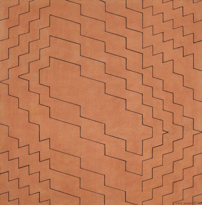
Artist With Geometric Shapes

Sol LeWitt
Sol LeWitt

Art Styles and Artists that Use Geometric Shapes

  • Ellsworth Kelly
  • Wassily Kandinsky.
  • Frank Stella
  • Pablo Picasso.
  • Piet Mondrian.
  • Bridget Riley.
  • Georges Vantongerloo.
  • Robert Morris.
  • Mary Corse.
  • William Roberts.
  • Rafael Montilla.

The first thing to come to mind when thinking about geometry is math, but geometry is also very present in art. Discover the role geometric shapes play in art, including the various stylistic movements and the artists that use them. Updated: 10/11/2021

Definition of Geometric Shapes

Have you ever wondered how artists actually create art? Once they’ve chosen a subject matter, gathered their supplies, and picked up a paintbrush for the first time – what happens next? Sometimes starting with a simple square – or other geometric shape – is the answer.

Geometric shapes come from geometry, which is the math of shapes made of points and lines. Geometric shapes are shapes made out of points and lines including the triangle, square, and circle. Other shapes are so complex that it takes math in order to create them. These shapes are the opposite of organic shapes. While geometric shapes are more precise, organic shapes are natural. In this lesson, we will take a look at geometric shapes.

Geometric Shapes in Art

Let’s take a look at some movements and artists that use geometric shapes:

Bauhaus

Bauhaus was a German school of art that came out of the arts & crafts movement. The arts & crafts movement was more about flowing lines and flowery lines. Bauhaus was in direct opposition to that – it used geometry. Some German architecture that used the Bauhaus geometries still stands today in the cities Bauhaus was founded in.

Wassily Kandinsky, one of the fathers of abstract modern art, painted geometric shapes to represent spirituality and emotions. It was during the Bauhaus period that he found geometrics playing more of a role in his work.

Cubism

Cubism evolved around 1907-1914 in Spain and France. Pablo Picasso and Georges Brauque created surrealistic works using cube shapes. This means they took images that would be organic, meaning natural and flowing, and recreated them as if they were just planes and angles.

Geometric forms are forms that are mathematical, precise, and can be named, as in the basic geometric forms: sphere, cube, pyramid, cone, and cylinder. A circle becomes a sphere in three dimensions, a square becomes a cube, a triangle becomes a pyramid or cone.

Geometric forms are most often found in architecture and the built environment, although you can also find them in the spheres of planets and bubbles, and in the crystalline pattern of snowflakes, for example.

Organic forms are those that are free-flowing, curvy, sinewy, and are not symmetrical or easily measurable or named. They most often occur in nature, as in the shapes of flowers, branches, leaves, puddles, clouds, animals, the human figure, etc., but can also be found in the bold and fanciful buildings of the Spanish architect Antoni Gaudi (1852 to 1926) as well as in many sculptures.

What is geometric artwork?

Geometric art is an artistic movement created in the early 20th century by artists with a fascination for geometric shapes. Geometric Art is created using geometric elements, shapes… Geometric art is inspired by geometry. Geometry is a branch of mathematics related to the shape, size, and relative position of figures.

Why do artists use geometric shapes?

In art, geometric shapes such as circles, lines, squares, and triangles are all used to define and organize space. The use of geometric shapes in art allows artists to express and isolate emotions; Wassily Kandinsky is well-known for expressing spirituality in his later work.

Who started geometric art?

Kazimir Malevich

One of the pioneers and most emblematic artists of abstract geometric art was Kazimir Malevich, who founded the Suprematist movement. His purpose was the search of an absolute and pure expression, nonfigurative, unlike customary art.

When was geometric abstract art popular?

1910 – 1960

Although the genre was popularized by avant-garde artists in the early twentieth century, similar motifs have been used in art since ancient times.

Madí Art movement

Madí is an international abstract art movement initiated in Buenos Aires in 1946 by the Hungarian-Argentinian artist and poet Gyula Kosice, and the Uruguayans Carmelo Arden Quin and Rhod Rothfuss. The movement focuses on creating concrete art and encompasses all branches of art.

Source: https://www.thoughtco.com/definition-of-form-in-art-182437

Examples of Constructivism

Big Bang Mirror
Big Bang Mirror

Examples of Constructivism

John Spacey, author


Constructivism is an approach to education that seeks to construct knowledge through experience. This is loosely based on the philosophy of constructivism that states that objective reality doesn’t exist such that all knowledge is a human construct. The following are illustrative examples of constructivism in education.

Advisors

Constructivism calls upon each student to build knowledge through experience such that knowledge can’t simply be transferred from the teacher to student. As such, teachers play a facilitation role. For example, a school that has students pursue their own projects with the teacher playing a advisory role.

Love of Learning

Students are expected to pursue knowledge in a self-directed fashion. This is based on the idea that people, particularly children, are inquisitive and naturally pursue knowledge. Constructivism avoids doing anything that is likely to damage this love of learning.

Assessment

Tests may be avoided or may be based on unique outputs such as an essay. Assessment may be solely based on a teacher’s opinion as constructivism completely rejects objectivity such as a “correct answer.”

Play

A recognition of the value of play typically runs through constructivist school culture.

Group Work

In many cases, constructionist teaching methods are heavily based on group work. This tends to benefit students who prefer talking to quiet reflection, reading, analysis and synthesis. Where group work is overdone, students who have potential for concentrated quiet effort may suffer.

Simplicable Guide

Class discussion or debate. Constructionism allows students to challenge all ideas including those put forward by teachers and learning materials.

Leadership

Groupings may be mixed-age and older children may be given a leadership role. For example, older children may play a role in leading a field trip.

Experimentation

Running experiments to acquire original knowledge. For example, a student who tests different algorithms for the autonomous movement of a small robot.

Research

Research projects whereby students collect knowledge from sources and apply skills such as critical analysis and composition.

Learning by Teaching

Students are asked to share the results of their projects, research and initiatives with others such that they learn by teaching.

Problem Solving

The development of solutions to open-ended problems. This can be contrasted with traditional education that is mostly based on close- ended problems with a known solution. For example, developing an algorithm for an automated watering system for plants as opposed to an algorithm for sorting a list that has a known optimal solution.

Field Trips

As constructivism views learning as a process of experience, field trips may be viewed as a core learning activity.

Media

The consumption and production of media such as film.

Art

Creative exercises based on the principle of art for art’s sake.

Design

Solving problems with design and design thinking. For example, redesigning a shelve to solve a problem of clutter in a classroom.

Postmodernism

Constructionism and its rejection of objective reality is a defining characteristic of postmodernism. This is a broad academic trend that has had great influence over the social sciences since the 1960s. Science, technology, engineering and mathematics are less influenced by postmodernism because objective reality is important to these fields. For example, if you’re designing an aircraft it is important to calculate the objectively correct answer to how much thrust is required in a particular scenario such that the constructionist idea that there are “no correct answers” is useless or dangerous.

7 Examples of Social Constructionism

Constructionist Geometric Abstract Art

John Spacey, author

Social constructionism is the philosophy or academic approach that views human reality as artificially constructed by social processes. In other words, it views things that people commonly view as “real” as a flexible reality that is defined by processes of communication. The following are illustrative examples of social constructionism.

Culture

Culture are the intangible aspects of society that are defined by shared experiences. For example, a street dance that emerges amongst youth in a city. Culture is convincingly a social construct. However, it can also be argued that culture is driven by physical things like technology, economics and biology. For the example, the invention of portable music players lead to an explosion in street dance as suddenly it was possible to play recorded music anywhere.

Law of the Instrument

Law of the instrument, also known as law of the hammer is a cognitive bias that attempts to use a familiar tool to solve all problems. Social constructionism can be accused of being an attempt to inappropriately expand the social sciences to explain things that are well beyond its useful scope. For example, if you are a psychology professor you may have a tendency to explain everything in terms of psychology, even in areas where this has questionable relevance.

Postmodernism

Social constructionism is often used to suggest that things aren’t “real.” This is used to support relativism, the postmodernist idea that there are no universal truths such that individuals and cultures are free to define reality as they see fit. For example, if democracy isn’t “real” than an individual may feel free to replace it or ignore it. However, if it is based on universal truths of human rights and freedoms, it is not so easy to dismiss.

Idealism

Idealism is the philosophy that ideas define reality. This is a broader view that is consistent with social constructionism. For example, an idealist may believe that a seemingly physical problem such as a large

asteroid speeding towards the Earth can simply be overcome with the mind.

Hard Sciences

Social constructionism tends to run in opposition to hard sciences such as physics, chemistry, biology, geology and climatology. For example, climatology may model an environmental problem in terms of changes in composition of the atmosphere primarily driven by the burning of fossil fuels. Social constructionism may model the same problem using psychology or gender studies. It is common for hard sciences to view this type of analysis as an example of the law of the instrument bias whereby social sciences aren’t the correct tool of analysis.

Economics

Social constructionism effectively views things like money or economic systems as purely illusionary. Traditional economics views such things in terms of capital, goods and constraints that are physical. For example, social constructionism may correctly state that fiat money is simply a digital entity or piece of paper. However, traditional economics would point out that this is a contract that is tied to physical realities such that the value of money is backed by a nation’s future ability to tax its economy. This economy has things like infrastructure, factories and institutions that are very real and not merely a product of popular imagination. This latter view would model the value of the American dollar in terms of the hard and soft capital of the United States as opposed to being a mere illusion.

Fashionable Nonsense

Social constructionism is often based on arguments that reference vague abstractions. It is accused of being ideological as opposed to academic. In 1996, physics professor Alan Sokal submitted an article to the journal Social Text that was purely nonsense but included many of the ideological catchphrases associated with postmodern tribes. The article was accepted for publication. This was the basis for a book by Sokal entitled Fashionable Nonsense which criticized social constructionism as being an ideology that rejects objective reason or that cherry picks data to support ideological aims.

Entre sorbos de Café

entre sorbo de cafe
entre sorbo de cafe

Entre sorbos de Café

Curador y crítico de arte Eduardo Planchart Licea

Un sábado 29 de enero del 2022 con el trinar de los cristo fue, azulejos y las estridentes bandadas de loros, desperté tras haber tenido un extraño sueño en el que me encontraba encerrado en un cubo de vidrio, cuyos soportes eran de madera de pino limpia y lijado. Imaginaba el vacío pleno de energía, era el instante del Big Bang, cuando surgió el primer destello de luz. Abrumadora pasión en la que me introdujo el artista a Rafael Montilla, la visión del  horno cósmico en forma de agujero negro   del que emano el primer resplandor de luz del universo, veía traspuestos a estos fotogramas oníricos la transparencia de las aguas de los llanos inundados, otro mundo mágico al cual fui lanzado por el explorador y fotógrafo Iván Mikolji.

La calma que había fraguado en mi ser en el sueño, hasta el instante entre que el aroma del café achocolatado, llegó a mis sentidos me abandono y fui a buscar una taza, cuando  la angustia comenzó a dominarme al imaginarme las cristalinas aguas del amazonas venezolano y los afluentes del parque nacional Canaima, donde se encuentra el altivo salto Ángel y cerca de él veía a decenas de indígenas Piaroa, Yekuana y Sanema asesinados y esclavizados por ralea humana de los mineros con sus más de 3.700 campamentos de minería ilegal que extraen  cada uno 100 kg diarios de oro,  que se pueden ver sus puntos satelitalmente, muy protegidos por  la narcoguerrilla  aliados del régimen, armados hasta los dientes hacen del Amazonas su territorio y fuente de riqueza. Logran extraer toneladas de oro, también diamantes vinculados a las mafias internacionales, que son extraídos en vuelos ilegales de pista escondidas entre la selva y los llanos a Brasil, Colombia y el terrorismo islámico; dejando muerte y desolación mercurial con cada vuelo, están destruyendo uno de los pulmones del planeta y su mayor fuente de agua dulce, sin crearle ningún cargo de conciencia. Arboles milenarios, ríos, caños ricos en cardúmenes..,  convertidos ahora en caños secos, que será el futuro de nuestra única selva Amazónica sino se actúa para detener este ecocidio que a su vez es un genocidio, solo desolación…. El aroma del café seguía guiando la terrorífica ensoñación.  

Me vi nuevamente en  el cubo flotando en que había soñado, volvió entre el alba con otros flash back que invadieron mi imaginación, pude así salir de aquel apocalíptico presente y veía a mi hijo Oyantay  flaco llamado pero pleno,  bajo las faltas de un volcán   haciendo una sanación, concentrado en su etéreo Ser penetraba la piel y el alma de la dolorida mujer que tenía frente a él. Veía en el rostro huellas de bienestar ante aquellas sanaciones que realizaba el joven curandero, vestido con su bata blanca y su amorosa mirada, recordaba a una Máma Kogui, que están diezmados por el progreso y la narcoguerrilla, en la Sierra Nevada de Colombia los hijos de la Diosa Madre Gauchovanga, que creó a la humanidad de un pelo de su vagina y su sangre menstrual, se consideran los protectores de la tierra madre y ese es el sentido de su existencia.  

Al terminar de tomar el café la luz del amanecer se aclaró,  y  caminaba entre el verdor iridiscente de las hojas de mango al ser acariciadas por la luz solar,  con la taza de café vacía me senté a disfrutar de aquella quietud, que me llevó a los momentos más felices de mi vida. Casi todos giran entre la espumante espuma de las olas del Caribe, huyendo de su rompiente, no en vano los griegos asociaban la blancura espuma de las olas a blancos corceles.  Durante años el amanecer estuvo para mi signado por la espera de la mejor ola. Aún tengo en mi cuerpo las cicatrices de las quillas de la tabla cuando salía de esa montaña de poder, y me golpeaba en el aire una y otra vez. De ahí que mi nariz, se doblara por estos golpes y el labio se me partiera varias veces, son las cicatrices que va dejando la aventura que es la vida, tocarlas y recordarlas en lugar de transmitir dolor, me invaden de éxtasis, siempre a la búsqueda de la ola perfecta que nunca encontré…

Los otros momentos de felicidad que en ese instante reviví me vi entre la arena y el mar,  con mis dos queridos hijos, que pasearon su niñez  sus primeros pasos entre la arena, desnudos y el sol acariciando sus tiernos y bellos cuerpos. Edu el menor se hizo amante del viento y del océano e hizo de su niñez y juventud un desafío por surcar el azul oceánico atrapando el viento entre endebles velas, y el mar le forjó una bella alma.

En estos fotogramas mentales de extática vivencias se coló la caminata llamada la travesía de varios días desde Tabay en Mérida, hasta el pico Bolívar, varias veces a más de cuatro mil metros de altura, estuve a punto de caer al vacío, situaciones que tome con calma, sentimiento que nunca imagine  tener en ese momento, cuando el suelo que pisaba cuidadosamente se hundía entre  millones de piedrecillas sobre las que camina bordeando el Humboldt, resolvía el percance paso a paso,  tuve que quitarme  el pesado morral, para liberarme de peso que luego pude rescatar, donde cargaba   el saco de dormir, las insípidas latas de sardinas y la rica leche condensada, luego lo pude rescatar cuando los compañeros me ayudaron con un especie de garfio y una cuerda pude salvarlo del fondo del barranco, todo esto ocurría porque  no era un montañista, mis compañeros eran geniales alumnos de las Universidad Metropolitana que aún forman parte de mi vida, cada uno me enseñó algo, más importante que la erudición: el valor de la amistad y de la honestidad.

Volví a llenar la de café la taza y entre sorbos saboreaba la vida, como dice la canción de Maná, seguí el vuelo de mi imaginación; tras aquella ascensión quede atrapado entre el mar y el páramo, donde Juan Félix Sánchez con su humildad, devoción y sencillez desarmo todas mis creencias, al convertir su fe  en pétrea belleza,  en los años que conviví con él, entre el matutino desayuno ahumado  en el Páramo, entre arepa andina recién hecha con guarapo y queso ahumado, a veces con trucha recién pescada.

Al irse el día no podía dormir por el frío que llegaba a mis huesos y pasaba esas horas entre lecturas nocturnas a luz de tenues velas releía  a J.J.R. Tolkien, Ursula Leguin y Umberto Ecco así lograba olvidar el frío  hiriente nocturno, acompañado de los rezos el Hombre del Tisure que aún dormido seguía rezando, ni  con las lluvias torrenciales volaban las placas de Zinc dejaba de orar… No podía dejar aquellas vivencias en el olvido, así nació el libro El Gigante del Tisure, que nació palabra a palabra en ensayos que escribía en el Páramo para la Página Cultural de El Universal,  que creó y dirigió una de nuestras tres musas culturales: Sofia Imber era una de ellas, casi en su totalidad estos ensayos fueron editados  por Gráficas Armitano, gracias  a Ernesto Armitano a quien conocía por su amor por el mar, era uno de los mejores veleristas del mundo, y tuvo la audacia de hacer su proyecto sobre Venezuela, una colección de libros que atrapa la belleza de Venezuela tanto en la cultura como en toda su geografía y biomas.  El mismo día que lo llame para darle la idea de hacer ese libro me dijo en el acto, ven a la imprenta en Boleíta Sur. Al entrar a su oficina embellecida de cuadros de Armando Reverón, Oswaldo Vigas, Cabré, Miguel Von Dangel, lo primero que hizo fue pedirme las cientos de transparencias y verlas por horas   con su gastado cuenta hilos apoyado en la mesa de luz, estudiaba cada una de las fotografía  que habían sido tomado a lo largo de tres años, pasó horas viéndolas y preguntando al terminar de verlas sonrió y dijo: Esto me gusta plancharcito. Pero vas a tener que volver al páramo por un tiempo, pues faltan imágenes que muestran la belleza de la luz del páramo y me dio sin desearlo una clase magistral, de cómo debían ser tomadas las fotos, para que tuvieran profundidad, y mostrar la transparencia edénico de las lagunas, y los prístinos chorrerones paisaje que casi todo el año están  dominados por la niebla y  los deseaba bañados de luz solar, así que firmamos un contrato ese mismo día, y   debía volver con un fotógrafo  por varias semanas a tomar las fotografías que deseaba, y otras del complejo del Tisure, sin niebla lo cual solamente tendía a ocurrir en algunas ocasiones en Enero, y así empezó mi pasión por investigar la fotografía de Venezuela, en las largas conversaciones que teníamos sobre como se hacer una buena toma e impresión.

Al regresar del páramo tal era la nostalgia por su niebla, que empecé a bocetear una novela inspirada en la vida y obra de Juan Félix Sánchez, en este jardín donde tomaba café en la falda de la cordillera de la costa, lo escribí en gran parte bajo la sombra y frescura de la misma mata de mango en que estoy ahora, tarde décadas en hacerla pero al terminarla, fue otro de las perlas de mi existencia, la titule: El Mago de la Niebla y se publicó décadas después en el 2011, graciasa Miguel Perez Carreño. socio de Gráficas Lauki  tras cientos de reescrituras y el año pasado lo reescribí nuevamente para publicarlo en capítulos cortos, individuales cada uno independiente del otro cual lego, adaptándola así para ser publicada en casi treinta capítulos en un Diario  digital,  creo es una de las manera de escribir en la era virtual de rápidas lecturas y de  la globalización; y con la engañosa pandemia provocada por el virus chino todo se hizo cercano, y la lejanías reales desaparecieron y  miles de lectores a lo largo de Venezuela  y del mundo leyeron cada uno de los capítulos, a pesar de vivir en un país en deconstrucción son las letras y la pasión por la cultura lo que me  ha permitido vivir en el aquí ahora y proyectar la innovación. Estas fueron las últimas imágenes y palabras que tuvieron eco en mi ensueño en la falda del Ávila un 29  de  Enero del 2022…. Los comentarios, textos, investigaciones, reportajes, escritos y demás productos de los columnistas y colaboradores de analitica.com, no comprometen ni vinculan bajo ninguna responsabilidad a la sociedad comercial controlante del medio de comunicación, ni a su editor, toda vez que en el libre desarrollo de su profesión, pueden tener opiniones que no necesariamente están acorde a la política y posición del portal

Manuel Velázquez: entre lo ancestral y lo contemporáneo.

Manuel Velázquez: entre lo ancestral y lo contemporáneo

Manuel Velázquez: entre lo ancestral y lo contemporáneo

Curador y crítico de arte Eduardo Planchart Licea

Conocí casualmente al artista Manuel Velázquez por azar, cuando fui a estudiar a Oaxaca la colección que creó Rufino Tamayo en su museo de arte prehispánico, único en México, pues la organización, selección y museografía fue direccionada por lo estético. Estuve varios días seguidos estudiándola y en el camino, vi unas vírgenes y santos expuestos en una galería de souvenir, pero el carácter y la fuerza expresiva que tenía destacaban de todo lo que se exponía, así que decidí preguntar a la dueña de la galería por el artista popular que había creado esas obras. Me dijo: sabe vive alejado, pero un taxi lo puede llevar, son varias horas de carretera, y algunas partes son de tierra.

Le pedí que dibujara en un mapa como llegar a su casa-taller. Así, llegué al hogar de Manuel Velázquez que, para mi sorpresa, al entrar en su casa estaba pintando un Santo Recostado sobre una Calaquita expresionista laminaba el entorno con hojilla de oro, dormía plácidamente sobre la muerte, titulada Santo Niño de las Suertes, los estigmas levitantes, no había nada asociado a las crucifixiones cristiana, sino era muy lúdico y era coherente con el lenguaje de las tallas de la galería. Al oír el buenas puedo al entrar, inmediatamente río, pero si estas adentro, porque pides permiso. Y me miró sonriente, con un pantalón pintarrajeado. Y me dijo:
Qué haces, por acá en este rancho-taller, a lo que le respondí: no veo las tallas de los santos populares, que se entremezclan con el colorido de los alebrijes en varias galerías oaxaqueñas. Al ver aquel contraste le pregunté quién los había tallado, pues no tenían firma como es propio del arte popular mexicano y me dieron esta dirección. No entiendo porque siendo tan buen pintor te dedicas a tallar santos, pues por algo será. Sabes, aunque parezca mentira estos cuadros que por lo que veo te gustan, nadie los quiere adquirir en Oaxaca, y de algo tengo que vivir, pero a los turistas les gustan mucho las tallas y se venden muy bien, están inspirados en los santos de la iglesia de San Juan de Chamula.

Asumí el estilo popular como un medio para vivir, y sabes realmente me apasiona. Pues sí, así igual mi compadre que vive también acá, somos de Chiapas y Veracruz. Y para nosotros es más fácil poner nuestros cuadros e instalaciones en la CDMX que en Oaxaca. Y al sentarnos con un café servido en unas bellas tazas de rebosantes, hechas también por él, comenzó nuestra amistad, recordando animadamente mi experiencia en San Juan de Chamula, que le dio un vuelco a mi vida.

En el patio había unas instalaciones hechas en madera inspiradas en los instrumentos prehispánicos para cultivar, y tallar, se inspiraban en la imaginería Maya. Al salir al verlos había quedado impactado, por dos plantas de los pies sobredimensionados sobre los que pintaba lúdicamente, la iglesia de San Juan de Chamula, la ceiba frente a su portal, y todo el espacio sacro dominado por un fuerte toque de humor, como eran las orejas, lunas solares, corazones…

Años después volví a visitarlo en Xalapa, donde había estudiado arte y dirigía un espacio experimental. Había instalaciones y esculturas tanto de él, como de otros jóvenes artistas, y destacaban sus obras, no se había alejado totalmente de esa fusión entre lo prehispánico y lo contemporáneo. Sus cuadros escultóricos, tenían como fuente de inspiración los objetos de cultivo del cacao, y el café. De ellos nacían sus formas y colores, tendía a un minimalismo pictórico vinculado a lo escultórico, en sus exposiciones los cuadros continúan con instalaciones escultóricas. Y ese ha sido una constante a lo largo de su obra.

A medida que va madurando su lenguaje plástico; sin embargo, no abandona la vertiente figurativa, al concentrarse en lo geométrico de series como son las Estructuras. Este imaginario que crea el artista está a la búsqueda de esencias, y evade lo descriptivo y narrativo se enraíza en el día a día y crea concreciones de recuerdo y vivencias que se materializan en estas series caracterizadas por formas minimalistas donde la línea es protagónica e interactúa con el espacio.

Este lenguaje plástico brota de las vivencias y ensoñaciones del creador, en las que destaca la serialidad y del encuentro con sus raíces culturales y espirituales, en una era de fragmentación y píxeles. Lo popular y lo simbólico se funden en los cuadros, al convertir la superficie pictórica en tramas que hacen referencia a lo tradicional recontextualizado en cuadros de series como: Urdimbres…

Manuel de Jesús Velázquez Torres

Artista visual

Veracruz, Xalapa, Mexico

Manuel Velázquez nace el 26 de junio de 1968 en Tuxtla Gutiérrez Chiapas.

Estudió en la Escuela de Artes Plásticas de Chiapas, es Licenciado en Artes Plásticas por la Universidad Veracruzana, Maestro en Estudios de Arte por la Universidad Iberoamericana y Candidato a Maestro en Artes Visuales por la UNAM.

Actualmente es Creador Artístico del Sistema Nacional de Creadores de Arte del Fondo Nacional para la Cultura y las Artes emisión 2018-2021.

Su obra suele ser de gran formato sobre madera. Le interesan las posibilidades escénicas de la escultura, buscando un encuentro más corporal con el espectador.

Ha participado en diversas exposiciones individuales y colectivas en Argentina, Austria, Bélgica, Canadá, Chile, Cuba, Ecuador, Estados Unidos, Eslovaquia, Ghana, Guatemala, Holanda, Italia, Japón, México, Paraguay y Serbia.

Fue director de la Escuela de Artes Plásticas del ICACH, en Tuxtla Gutiérrez, Chiapas; fundador del Jardín de las Esculturas de Xalapa y director en dos periodos de 1998 a 2002 y de 2010 a 2013; Subdirector de Planeación, Seguimiento y Evaluación del Instituto Veracruzano de la Cultura de 2013 a 2016. Es Catedrático de la Facultad de Artes Plásticas de la Universidad Veracruzana y de Realia, Instituto universitario para la cultura y las artes.

Dedica parte de su tiempo a la investigación sobre arte contemporáneo, economía de la cultura y políticas culturales. Colaboró en la revista Sinapsis, el periódico OYE Veracruz, el semanario Performance y en el Diario de Xalapa. Actualmente es colaborador de el Portavoz y Director General de la Galería Flavia. Se ha desempeñado como curador y gestor cultural. Vive y trabaja en Xalapa, Veracruz.

Su obra suele ser de gran formato, sobre madera en técnicas mixtas, aunque también realiza instalaciones y desde hace algunos años incursiona en la producción de imágenes digitales. Es Catedrático de la materia de pintura en la Facultad de Artes Plásticas de la Universidad Veracruzana. Como académico se interesa en renovar y fortalecer los procesos de enseñanza-aprendizaje, y dedica buena parte de su tiempo a la investigación y a la reflexión teórica.

Geometric Abstract Art

Swastika-6 Geometric Abstract Art
Veda Swastika-6 Geometric Abstract Art

All you need to know about Geometric Abstract Art…

        5/5 (2)

In 1852, renowned writer Gustave Flaubert wrote a letter of what today seems like a premonition of what was about to happen back then in the world of art: “Perhaps beauty will become a feeling useless to humanity, and art [will become] something half-way between algebra and music.” Little time after this words were written down, meaning and representation would radically change the limits of visual perception and understanding through a series of artists and styles that would define the geometric abstract art movement and the different artists and facets that have represented it. 

Cezanne and Seurat began to complete Flaubert’s prophecy, setting preconditions for abstract geometric art. Cezanne created his art on the strict and specific laws of geometry, treating nature through different figures like a cylinder, a sphere, a cone, everything seen through perspective, in a way in which every possible side of an object in the composition would be directed towards a central point. Cezanne attempted to go beyond nature and find the laws that composed it, hence his allegory of the divine which would later influence other painters as well. Seurat on the other hand, found harmony in an almost musical perception of reality, highlighting use of primary colours and simple shapes. He said “Art is Harmony. Harmony is the analogy of the contrary and of similar elements of tone, of colour and of line, considered according to their dominance and under the influence of light, in gay, calm or sad combinations”.

0,10 Exhibition: A section of Suprematist works by Kazimir Malevich exhibited for the first time.

These two artists established the grounds for what was to come afterwards and we now recognize purely as fauvism and even expressionism which would be the transcendental basis of geometric abstraction. Geometric abstraction arrived after many decades of figurative painting where sensitive images of detailed landscapes, and portraits of pompous characters where featured in many paintings. This fundamental change consisted in the use of simple geometric figures (squares, circles, triangles) combined inside subjective compositions that lived inside surreal spaces. There was no reference to the real world, only fictional, utopic scenarios as if the goal was to say that painting is something that simply one does. It was born as a reaction towards the excess of subjectivity of the visual artists of previous movements in an attempt to distance themselves from the purely emotional. Abstract geometrical art tried to be precise, sticking to the rules of nature and science.  

Kazimir Malevich, Black Square, 1915, oil on linen, 79.5 x 79.5 cm, Tretyakov Gallery, Moscow (Image By Kazimir Malevich – Tretyakov Gallery, Public Domain
Piet Mondrian, Composition with color fields, oil on vanvas, 48cm x 60.5 cm, Museum Boijmans Van Beuningen

One of the pioneers and most emblematic artists of abstract geometric art was Kazimir Malevich, who founded the Suprematist movement. His purpose was the search of an absolute and pure expression, nonfigurative, unlike customary art. During his twenties Malevich established contact with Larionov, which opened the doors for him to new experiences and international relationships, getting to know fauvists, cubists and Italian futurists, playing a huge role on his own creations. His first experiments lead him to create this movement, based on an acute visual language which consisted of abstract geometric figures and neutral colours. He developed his work between 1912 and 1923. Along with his career, he created a series of numerous black and white geometric abstract art paintings. In 1915 he presented his most iconic and historically transcendental piece, called Black Square. Malevich promoted values of logic, mathematics and objectivity contrary to the subjective sensitive technicality of art established then. Claiming superiority in the abstract arts, this piece also rejected mainstream art of the moment and was considered the beginning of a new current, representing the death of conventional art, opening the doors to a new tradition of art. 

Piet Mondrian, Composition number iii, oil on canvas, 19 ¾ x 19 ¾ in. (50 x 50.2 cm), 1929.

Another transcendental exponent of modern abstract geometric art Piet Mondrian. He would be initiated in the art world by his uncle Frits, a landscape impressionist painter. The early youth days of Mondrian, influenced mostly by Amsterdam’s pictorial environment, included still life paintings, landscapes and academic studies. In order to survive, young Mondrian created copies of paintings that were exposed at the Rijksmuseum (Amsterdam) and drawing illustrations for books. Around 1901, he took on a trip to Spain to watch the bullfights, he was completely shocked and entered in a sort of mystical crisis that leads him to isolate himself in search of a new order, a new synthetic law. Between 1907 and 1908, he started getting in touch with fauvist artists before going to study cubism based on straight lines. During those years, he created a series of now-famous geometric abstract art paintings simply called “composition”. 

Theo van Doesburg. Simultaneous Counter-Composition. 1929-30. Oil on canvas. 19 3⁄4 x 19 5⁄8” (50.1 x 49.8 cm). The Sidney and Harriet Janis Collection

In 1914 Mondrian went back to the Netherlands and in 1917 established a connection with Theo Van Doesburg with whom he created the “De Stijl” (The Style) magazine and its manifesto where we would write many theoretical articles of how art was supposed to be done. He created his first compositions of blue, yellow and red compact rectangles on a white background with primary colours and abstract geometric art with black and white. The purpose of his art was to re-establish the balance between man and nature. In 1920, due to disagreements with Van Doesburg Mondrian separated from the De Stijl movement and started getting in touch with the Bauhaus current and its players. Layer in his life he moved to New York, where we stopped using lines and started substituting them for rectangles and squared figures. Mondrian’s painting changed to be based completely on absolute thorough mathematics. He pretended to create a mix between art, matter and spirit to capture neo-plasticism (De Stijl) the universal harmony (using right angles and primary colours): an approach which goal was to discover the deep spiritual essence of reality and life. In the De Stijl movement, the principles that dominated artistic creation were always absolute abstraction, no reference to reality was allowed, and the language was restricted to lines and right angles, the three primary colours (blue, yellow and red) and the three non-primary colours, grey, white and black. 

Theo Van Doesburg, CompositionVIII_(The Cow), circa 1918, oil on canvas, Height: 37.5 cm (14.7 in); Width: 63.5 cm (25 in), Museum of Modern Art

Famous geometric abstract art painter Van Doesburg, (co-founder of De Stijl) created a series of figurative studies to abstract them into geometric figures composed of lines, colourful rectangles and squares. He would later move on from the movement’s aesthetics by inserting lines of different lengths and widths and colours, this would be a cause of rupture with Mondrian inside the De Stijl since the artist was taking a different path to the one established in the manifesto. Van Doesburg lived a vivid political and educational life, establishing contact with different Bauhaus and constructivism artists, he even got involved in architecture and was a key promoter of the Dadaist movement all across Europe. Since the role of Van Doesburg was so essential to the De Stijl, the movement was not able to survive after his death, although many members stayed active and in touch with each other. Many of its original artists, especially Mondrian continued however to create artworks that would be heavily influenced by the current. 

Bart Van der Leck, Composition, 1918, Oil on canvas, 21 3/8 x 16 3/4 (53.5 x 42.5). Tate Museum

Bart Van der Leck, was another transcendental member of De Stijl, who despite having participated for a brief period of time, was extremely meaningful for the movement. Even though the artist refused to sign the manifesto, he created a series of geometrical abstract artworks in which his conception of geometrical painting and his colour palette had a determining influence on the creations of Piet Mondrian and Theo Van Doesburg. The artist would later still create realistic and figurative paintings and would sporadically continue experimenting with geometrical abstraction without sticking to the previously established rigid geometrical rules of De Stijl. 

Bart van der Leck, Study for Compositions No. 7 and No. 8, 1917, Gouache on tracing paper, 100 x 154 cm, Museo Thyssen-Bornemisza

Geometric abstract art has had many different stages and facets across the history of art starting from the early XX century and expanding towards the present day. The influences of geometric abstract art could be seen along with different decades and continents, having also new waves in Latin-American art during the 60s and 70s. Its influence can still be identified in contemporary art and other movements of the XX century. 

Cover image: Theo Van Doesburg, CompositionVIII_(The Cow), circa 1918, oil on canvas, Height: 37.5 cm (14.7 in); Width: 63.5 cm (25 in), Museum of Modern Art.

Written by Eduardo Alva Lòpez

What Makes Geometric Abstraction So Exciting?

Queen Aminatu, Geometric Abstraction

What Makes Geometric Abstraction So Exciting?

By Artspace Editors

When abstract art burst onto the stage in the Western art world in the early 20th century, its practitioners quickly resolved themselves into two distinct camps: the gestural abstractionists, who built upon the liberatingly loose compositions of Post-Impressionists like Cezanne to create non-objective paintings emphasizing the artist’s hand, and the geometric abstractionists, who seized on the it-is-what-it-is essentialism of Euclidean geometric shapes.

Following the developments of Cubist and Futurist painting—in which the natural world was translated into a stark pictorial language of shapes, lines, and angles—Russia was one of the primary breeding grounds of pure abstraction, with Wassily Kandinsky doing much to popularize geometric art before gravitating to the gestural camp in later years. But it was Kazimir Malevich who today is often viewed as the forefather of geometric abstraction, beginning with his seminal 1915 paintings of black shapes—a circle, a square—on a white ground, and his legendary white-square-on-white-canvas 1919 monochrome.

Installation view of “0.10 (Zero-Ten) The Last Futurist Exhibition of Painting.”
Though geometry can seem dry and mute in comparison to the flights of fancy in gestural abstraction, the artists who pursued meaning in its rigorous shapes found it anything but. Malevich—who called his visually simple but theoretically dense approach “Suprematism”—declared that his intention was to use geometry to convey “the primacy of pure feeling in creative art,” and through it he created totemic works of strange, atavistic power.

RELATED ARTICLE: What Was Suprematism? A Brief History Of The Russian Idealists Who Created Abstraction As We Know It

His confederate, El Lissitzky, on the other hand, painted lively compositions with shapes that often seem to dance on the canvas, using precise balances of shapes and colors to tell spatial stories—for instance, suggesting that a static shape is actually in the process of falling, or rising—or even convey political propaganda. (The most famous example of this is the 1919 pro-Bolshevik poster Beat the Whites With the Red Wedge.) Mondrian, of course, elevated these spatial dynamics to the point where his last painting, Broadway Boogie Woogie, nearly reverted to representationalism by so vividly evoking the traffic flow of New York City’s streets.

Piet Mondrian, Broadway Boogie Woogie, 1942-43. Image via Wikipedia.
From these beginnings, geometric abstraction endured throughout the 20th century as a visual and theoretical counterpoint to gestural movements like Abstract Expressionism, rendered by different artists in many different ways. Josef Albers, for instance, employed compositions of layered squares to explore the manifold qualities of color, considering how different hues relate to each other and their effect on the perception of viewers. Other artists brought geometric shapes into three dimensions as sculpture, with Sol LeWitt’s cubic stacks being expressions of conceptual-art ideas, Dan Flavin’s fluorescent-light arrangements functioning as paragons of Minimalism, and Richard Tuttle’s scrappy arrangements recalling the playfullness of El Lissitzky.

Sol LeWitt, Black Bands in Two Directions, 1991 is available on Artspace.com for $4,700
Meanwhile, still other artists looked back on Malevich’s monochrome with paintings that conveyed form only through the shape of the canvas, like Robert Rauschenberg’s early 1951 white paintings (which he considered stages for the interplay of ambient light and shadow) and Brice Marden’s imposing examples from the 1960s. Artists associated with “hard-edge” painting in the 1960s, such as Ellsworth Kelly, Kenneth Noland, and Frank Stella, rejected the subjective, gestural emphasis of Abstract Expressionism in favor of sharply defined areas of color.

Sarah Morris, Rings, 2009 is available on Artspace.com for $2,900


Today the lineage of geometric abstraction is being continued by younger artists in all manner of ways, from the crisp paintings of Sarah Morris that combine Mondrian’s compositional intricacy with vernacular touches to the colorful arrangements of talents like Mai Braun that pursue an obsession with color that Albers would recognize. To see a variety of approaches to this powerful approach to art, explore our geometric abstraction collection.

Geometric abstraction is a form of abstract art based on the use of geometric forms sometimes, though not always, placed in non-illusionistic space and combined into non-objective (non-representational) compositions. Although the genre was popularized by avant-garde artists in the early twentieth century, similar motifs have been used in art since ancient times. wikipedia.org

GEOMETRIC ABSTRACTION

AMERICAN GEOMETRIC ABSTRACTION IN THE LATE THIRTIES

A specifically American problem, they are unbeatable in thinking things out in series and in numbers. Starting with figures to create a comfortable unity . . . New World!
—Fernand Léger, “New York Seen,” 1931.

“AMERICAN GEOMETRIC ABSTRACTION OF the 1930s,” an exhibition at the Zabriskie Gallery, New York, June 1–July 14, 1972, is being circulated by the American Federation of the Arts. “Geometric Abstraction: 1926–1942,” an exhibition organized by Robert M. Murdock at the Dallas Museum of Fine Arts, October 7–November 19, 1972 included a broad representation of American as well as European work. This article is a revised and expanded version of the author’s essay in the Dallas catalogue, “The Paris-New York Axis: Geometric Abstract Painting in the Thirties.”

The thirties was a decade of Realist art, of scene painting—regionalism and social Realism. The tradition of abstract art in America initiated by the Armory Show had all but petered out. Its “period of greatest activity . . . was probably 1915–27,” wrote Stuart Davis in 1935.1 Davis, like other pioneer American modernists, had been acutely conscious of possessing a distinctly “American” sensibility despite the European origins of his art. Indeed, there were good reasons why a geometricized Cubist style such as his should be thought appropriate to American machinist society. For Europeans certainly, America was the technological hub of the modernistic world. “This geometric abstraction,” was how Léger described New York.2 And for Americans themselves, national characteristics outside of painting (“inventiveness, restlessness, speed, change”)3 seemed to justify the transplantation of modernist styles. In the thirties, however, abstraction became commonly thought of as “un-American”: a foreign degeneracy which threatened the development of national character. Art for art’s sake seemed irresponsible, or at best irrelevant, in a period of social and political disenchantment.

For geometric abstraction this charge held added weight. In Europe the style had accompanied—and had become associated with—the developing hopes for a new ordered society in the twenties. Now they were being destroyed by the Depression, the Spanish Civil War, the Moscow Trials and finally by the outbreak of the Second World War; the art too was held in question. It was therefore not only European but a symbol of the Europe that was fast disintegrating: doubly inappropriate for a country declaring its independence in cultural and political isolationism and wishing to preserve its native traditions from the erosions of modern life. Although such ideas were far from realistic, given that America was fast becoming a centralized and metropolitan nation and as such inseparable from a commitment to international affairs, these were the kinds of justification that lay behind both popular and official enthusiasm for Realist art.

American art, then, meant American subjects; the Public Works of Art Project inaugurated in 1933 made this quite clear. Byron Browne was impelled to write to the Project’s New York office complaining that “as my work contains little or no emphasis on subject matter, I was ignored for a long time. . . .”4 Although matters were improved two years later in the Federal Art Project of the W.P.A., when abstractionism was officially acknowledged, it still remained an unpopular and minority art. Moreover, one suspects that without the efforts of Burgoyne Diller as head of the mural division the new “democratic” acceptance of abstract art could easily have remained administrative tokenism.5

The importance of the Project toward the creation of a New York art community is too well-known to require much comment here. Less heralded, however, is the major artists’ group of the late thirties to emerge from W.P.A. contacts, the American Abstract Artists.6 In the autumn of 1936, a group of artists, including Ilya Bolotowsky, Balcomb Greene, Carl Holty, George L. K. Morris and Harry Holtzman, began to hold informal meetings at Ibram Lassaw’s studio. Depressed at the hostility toward abstraction and at the difficulties in showing their work, they initiated a series of annual exhibitions that fast became, as one writer has put it, “the focus of energies of the emerging American avant-garde.”7 This may be too strong, or at least too simplified, a comment because there were other foci at that time, and when the American avant-garde did finally emerge very few of the A.A.A. members numbered among it. Their geometric emphasis, their separateness from Surrealist influence, and their occasional didactic understanding of art’s potential meant that they could not easily partake of the initiatives of the following decade. They were, moreover, synthesists not innovators—as they readily acknowledged—and this fact primarily, explains their neglect. And yet, their interpretation of earlier styles was in many instances both more original in form and substantial in quality than is generally acknowledged. Ilya Bolotowsky, Burgoyne Diller, Balcomb and Gertrude Greene, Carl Holty, George L. K. Morris, Vaclav Vytlacil, and others, produced important and distinguished paintings through the late thirties, not to mention such other A.A.A. members as Josef Albers, John Ferren, Ad Reinhardt, I. Rice Pereira and David Smith. But to overstate the originality and quality of most of the art would be to miss its essential historical significance. The innovations of Cubism before the First World War laid the groundwork for this art. Not until after the Second World War had a major new esthetic emerged. American geometric abstraction of the late thirties occupies a middle position between the prominence of European art in the Cubist epoch—an epoch which had reached its end in the Paris geometricist groups of the thirties—and the emergence of the New York School. It mediates this crucial transition.

Certainly the most important aspect of thirties abstraction was the way it encapsulated the Cubist tradition. While the newer American painting would owe much to the heritage of Surrealism, and of Matisse, without the detailed knowledge of abstract Cubism it would have been inconceivable. In the thirties, the widest interpretations of Cubism were brought together in a new synthesis: reductive geometry, the late synthetic style, Bauhaus-type painting and biomorphism all became equally available, and inter-relatable. Cubism became, above all else and as never before, a flexible esthetic. This not only cleared the way for what was to come, but often did so in such heroic fashion that thirties geometric abstraction deserves to be remembered not with nostalgia but as the last important stronghold of a fully Cubist art.

II

Although the American Abstract Artists developed a fairly clearcut interpretation of what abstract art should be like (or, at least, its leaders did), its inception was essentially a tactical response to the difficulties of exhibiting rather than a polemical stance for one kind of art alone. The emerging New York art community comprised several fluctuating orbits and the A.A.A. was in no sense isolated. For example, of the other three main groups that have been distinguished in this period,8 The Ten (centered around Mark Rothko and Adolf Gottlieb and exhibiting together from 1935) included the A.A.A. painters Bolotowsky and Louis Schanker (and later Ralph Rosenborg). Another influential group centered around Hans Hofmann’s school on Eighth Street. Some half of the A.A.A. members were Hofmann pupils, and Holtzman taught at the school. The third loose group gravitated around Stuart Davis, Arshile Gorky, Willem de Kooning, John Graham, and David Smith. Davis was editor of Art Front, the journal of The Artists’ Union, from 1934–39, for which Balcomb Greene, the most socially-conscious A.A.A. member, wrote. Gorky was a member of the Paris-based international geometricist group, Abstraction-Création, and, with de Kooning, attended the meetings in Lassaw’s studio that led to the foundation of the A.A.A. David Smith himself joined the organization in 1938. A further grouping of Charles Biederman, John Ferren, George L. K. Morris, Charles Shaw, and Alexander Calder, who exhibited together at Albert Gallatin’s Museum of Living Art in 1936 under the name “Concretionists,” all espoused nonfigurative art and included the principal A.A.A. spokesman on formal issues. The A.A.A. was therefore an integral part of a broader community of New York artists and for the most ambitious members of this community two issues were uppermost in their minds, one ideological, one formal: a concern as to the social relevance of abstraction and its “American” identity, and, more crucially, a wish to create a new art from late Cubism.

By the mid-thirties, New York artists were in an exceptionally advantageous position for learning the best in Cubist art. Hofmann’s presence in the city (from 1933) brought inspired teaching of the freedom possible within Cubism, and how it could be tempered by Matisse’s color—while Matisse’s Bathers by a River of 1916–17 (now at Chicago), which hung in the lobby of Curt Valentin’s gallery, showed these principles in practice. Other singly influential paintings were: Picasso’s The Studio of 1927–28, acquired by the Museum of Modern Art in 1935, whose linear geometric style spawned works by de Kooning, Reinhardt, Gorky, Lee Krasner and many more; the two masterpieces of high synthetic Cubism in the Museum of Living Art, Picasso’s Three Musicians and Léger’s La Ville; and the group of Kandinsky paintings (including two Paris period works) acquired by the Museum of Non-Objective Art in 1937. Moreover, these three New York museums were each directed by partisans of abstract art, and two by geometricist painters. Hilla Rebay had shown with Herwarth Walden’s Sturm group in Berlin, and met Kandinsky, Mondrian, Bauer, Moholy-Nagy and Xceron among others before settling in America in the mid-twenties; and it was these artists she especially supported when helping Solomon R. Guggenheim form the Museum of Non-Objective Art that later took his name.9 Albert Gallatin, a self-taught painter and an editor of the Paris-New York art journal, Plastique, had formed the Museum of Living Art in New York University’s Washington Square premises in 1927.10 Originally a Cubist-based collection, by the mid-thirties it was geometricist in emphasis. Gallatin’s collection was to be most pertinent to the A.A.A.; Jean Hélion wrote the introduction to the 1933 catalogue. Gallatin bought a painting from the first A.A.A. show, joined the association in 1938, and it was after seeing his Mondrians that Holtzman went to Paris to acquaint himself firsthand with neo-Plastic principles and returned as Mondrian’s exegetist in America. At the Museum of Modern Art (founded in 1929), Alfred Barr presented through the thirties a series of major European exhibitions, including the famous “Cubism and Abstract Art” show of 1936. It was, however, in part from Barr’s exclusion of Americans from this show, and from his (temporary) antipathy toward geometric abstraction that the American Abstract Artists group was founded.11

For the geometricist painters “Cubism and Abstract Art” was the most influential exhibition of their period, showing the whole range of abstract art in the Cubist tradition, accompanied by Barr’s now classic text. However, the absence of American representation seemed all the more unfortunate because recent American abstraction was also not included in the exhibition “Abstract Painting in America” at the Whitney Museum the previous year.12 For young artists like George L. K. Morris, the Whitney exhibitors were not true abstractionists, but “had become stalled in various ill-digested ferments of impressionism, expressionism and halfhearted cubism.”13 The uncompromising repudiation of earlier American abstract art this statement implies is important for thirties abstraction. It was in no way an organic extension of the Armory Show heritage. This second wave of innovating artists looked directly to Europe for inspiration, and not to a Europe seen through the eyes of their elders. The strength of scene painting in the early thirties removed these artists from their abstract past and turned them to current Paris art, including that associated with the Abstraction-Création group whose geometric styles offered something approaching tangible rules for making advanced art. Charles Biederman, who went to Paris in 1936, said he “left America because it was hostile to all new efforts. . . . In Paris, however, I came to feel I had arrived too late.”14 Abstraction-Création folded in 1936, with no real successor. The worsening political situation in Europe meant that Paris’ days as the principal artistic capital were numbered.

Neglected by the Museum of Modern Art and the Whitney Museum, the group which met at Lassaw’s, and later at Albert Swinden’s studio began in the autumn of 1936 to plan their own exhibition. Gorky and de Kooning seceded. Invitations to established abstractionists, including Calder and Marin, were not taken up. As founded in November 1936, the American Abstract Artists was based around a core of painters and sculptors all committed, in varying degrees, to a disciplined abstract Cubist style. Morris, critic as well as painter, and student of Léger in 1930, Holty, recently returned from Europe where he had been a pupil at Hofmann’s Munich school and a member of Abstraction-Création, and Greene, an active member of The Artists’ Union, were especially prominent in making the A.A.A. a real force in the regeneration of American Cubist-derived art. But A.A.A. members were by no means stylistically bonded: 39 very different artists comprised their first exhibition in April 1937. This show, held in vacant offices of the Squibb Building on Fifth Avenue, inaugurated a series of annual exhibitions. In 1938, a yearbook was initiated and a tour of western museums arranged through the College Arts Association. The group attracted new members, including Albert Gallatin, Fritz Glarner and David Smith in 1938 and John Ferren, I. Rice Pereira and Ad Reinhardt in 1939. The second annual was held at the Fine Arts Galleries in February 1938. Addressing the members on that occasion Morris was able to claim that their’s was “the sole organization in America that is dedicated to the hewing out of an authentic and appropriate cultural expression.”15

III

Visitors to the first A.A.A. exhibition were given a questionnaire to gauge their interest in the work shown. The results were encouraging: 90% of those who replied saw abstraction as among the natural expressions of civilized man.16 Although the press was not generally sympathetic to A.A.A. work, the New York Times was quick to point out the significance of these findings: “In view of the fact that the official spokesmen for art have consistently preached against abstract art as ‘un-American’, the results of this enquiry show that the American public is far more interested, and would like to see more of it, than anyone had hitherto suspected.”17

An attempt to justify their art as truly “American” runs through statements by many A.A.A. members. It took two forms: justification of their design and color sense as American; and a more general insistence that their art was appropriate to contemporary American society.

One artist, Charles Shaw, actually patterned his shaped canvases after the Manhattan skyline: “Sprouting, so to speak, from the steel and concrete of New York City . . . essentially American in its roots.”18 Few were as specific as this. Writing in retrospect, George L. K. Morris (probably the foremost A.A.A. spokesman on formal issues) remembered a more general American mood in the Squibb show: “There was an honesty of presentation, a sense of fresh discovery, a clearness of color that Europeans were quick to note as something essentially American.”19 He gave no individual examples, but writing in the 1939 A.A.A. yearbook it was color he emphasized. “Anyone who knows America,” he said, “can see that the tone and color-contrasts are quite native, that the cumulative rhythmic organization resounds from an accent which could have originated in America alone.”20 This special “American” color might well have emerged, as Clement Greenberg has noted, because American familiarity with recent European art was for most artists largely through the black-and-white illustrations of journals like Cahiers d’Art.21 This “permitted some Americans to develop a more independent sense of color, if only thanks to misunderstanding or ignorance. And in any case you could have learned more about color from Hofmann, as long as it was just a question of learning, than from Picasso, Miró or Klee. In fact . . . you could learn more about Matisse’s color from Hofmann than from Matisse himself.” Certainly, Hofmann’s teachings were very influential for A.A.A. work, which contains a far greater proportion of loosely-painted abstractions, and employs more vibrant color juxtapositions in geometric work than in comparable Paris groups of the thirties.

If for color the French journals were influential only by omission, they had more concrete and crucial influence elsewhere. In 1933, David Smith began welding after seeing reproductions of Gonzalez’ and Picasso’s welded iron constructions in Cahiers d’Art. In 1932, even more radical Constructivist sculpture, by the Pole Katarzyna Kobro, had been illustrated in Abstraction-Création. Moreover, it is not inconceivable that Ad Reinhardt’s later monochromatic Minimalism ,was in some way stimulated by the declarations of Wladyslaw Strzeminski (Kobro’s husband) on “unistic” painting in the same magazine.22 The main impact of such journals, however, was that they familiarized American artists with the coalesced Cubist tradition manifest in Parisian art of this same period. While defending the Americanness of their work, the A.A.A. willingly acknowledged its roots in European abstraction. This statement by Morris provides the best summary of the group’s principal stylistic components:

There are discernible two main currents that might be claimed as a starting point for many individual artists. Foremost is that French tradition which became grounded upon Cubism and has reached America through several different channels. It recurs in the geometric forms that predominate on the one hand, and in the curved self-contained shapes that have grown through Braque, Arp and Miró on the other. A second current might be said to stem from German abstraction as typified by the Bauhaus and its teaching heritage. Here again we are met with a divided concept—the open pictures of Klee and early Kandinsky on the one hand, and on the other a movement towards closed integration that has influenced the art of today most strongly through Constructivism. Both the Constructivists and the Dutch Stijl group have taught Americans much with their emphasis upon exactness in the absorption of form by color, contour and tone.23

Those deriving principally from geometric Cubism came often to the style through Picasso or Léger. Léger’s visits to New York in 1931, 1936 and 1938, and his brief collaboration on the W.P.A. mural project were undoubtedly influential. Picasso’s late twenties studio interiors (especially the Museum of Modern Art’s painting I have mentioned) were also important. Both of these artists offered a describable system of abstracting reality into a geometric framework of lines and planes which reveals itself in the work of many A.A.A. painters. Sometimes this is very specific, as in Gallatin’s reworking of Léger’s Purist period paintings, but more often it is a general absorption of synthetic Cubist principles.

The influences of Braque, Arp, and Miró) that Morris mentions are readily identifiable in the still-life based paintings of Ray Kaiser and Florence Swift and in the incidence of biomorphic forms in Holty’s and Bolotowsky’s work. For these latter artists, however, it was a biomorphism strongly tempered by the geometric—a similar kind of crossbred art to that practiced within the Abstraction-Création group. Current Paris art provided a storehouse for the various stylistic components on which the A.A.A. drew. Thus, while most A.A.A. art was influenced primarily by French styles, little was unaffected by the “German” undertones they then possessed. A few artists did come close to original German styles (Durnel Grant to the Bauhaus Kandinsky, for example)—and Albers’ membership of the group, and the residence in America of other Bauhaus artists including Moholy-Nagy, offered German sources close at hand. Such was the influence of Paris, however, that German styles affected the A.A.A. most often through the mediation of French eyes. A curious hybrid situation existed in many senses: the crossbred international geometricism of the mid-twenties influencing America through a secondhand interpretation in Paris! And yet, in many cases—in Vytacil’s constructions and Morris’ jigsawlike paintings, in works by Holty, Bolotowsky, Greene, Reinhardt and others—the weight of this conglomerate tradition did not stifle the freshness of the art.

While one does recognize the individual traditions that comprise A.A.A. work—and no artist there was creating entirely original paintings—only rarely were there disciples of a single style. Holtzman and Diller were exceptional in following close neo-Plastic principles (as, outside the group, was Biederman, who lived in New York from 1937–1941). The influence of neo-Plasticism was not so strong in New York in the thirties, and awaited Mondrian’s arrival for its flowering. The work of Shaw and Browne shows general features of this style in their restriction to the rectilinear; but for both of these artists one senses that they abstracted from specific architectural forms.24 Despite the reputation of the A.A.A. as a predominantly geometricist organization with a didactic stand for purity, one must remember that, in fact, some half of its members worked in far looser styles—and that only its leaders were ineluctably committed to the severer forms of abstraction. Many others were what Morris called “expressionist abstract” (a harking of things to come), and several just qualified for the term “abstract” at all: Margaret Peterson and Louis Shanker used clearly figurative elements; Paul Kelpe’s volumetric forms, though indebted to Hélion, had a definitely Surrealist tone. Nevertheless, they united under the call for a pure art in an age of Realism; and despite the broadness of art produced some general similarities can be noted which help to distinguish American abstraction from its European counterpart.

Before such an analysis can be made we must turn briefly to Parisian geometric abstraction of the thirties. This is of importance because American geometric art appeared in direct historical succession to that of Paris. The founding of the A.A.A. in 1936 coincided with the ending of the principal Parisian abstractionist group, Abstraction-Création. The two groups had similar aims: to promote a purified abstract art. They recognized the same inheritance: developed synthetic Cubism and pure nonobjective art. They adopted ideologies as well as formal structures that were alike. There are important differences, however. A comparison of geometric abstraction in Paris in the first half of the thirties to that of New York in the second half offers a unique opportunity to see what happens to a style when transplanted.

IV

Parisian geometric abstraction properly existed as an organized force from around 1930.25 The Cercle et Carré group of 1929–1930 and Theo van Doesburg’s Art Concret group of 1930 were the first real bastions of the style in a city largely antipathetic to its ambitions. Art Concret was objectivist and quasi-scientific in its theories and restricted to the small number of five artists who were willing to court anonymity to create a rigorously nonobjective style. Cercle et Carré, with around 30 exhibiting members, showed far more freedom of movement around the geometricist position and an interplay of geometric and nongeometric currents that Van Doesburg found intolerable. Thus, while Art Concret was the summation of the hardcore utilitarian theories of the twenties, the free interplay of abstractionist ideologies in Cercle et Carré marked the beginning of a new era.

Abstraction-Création-Art non-figuratif, to give it its full name, took over where Cercle et Carré left off. Established in 1931 under the direction of Gleizes, Herbin, and Vantongerloo, it initiated in the following year a series of annual cahiers that included illustrations and statements by a wide and international range of abstract artists. An editorial statement in the first of these explained the significance of the group’s name.26 “Non figuration” was the shared premise: a “pure” art, excluding all explicative, anecdotal, literary, or naturalistic reference. The “abstractionists” of the group were those who “abstracted” from nature—mostly former Cubists like Villon, Delaunay, Gleizes and their followers. The statement distinguishes two kinds of “creationists”: pure geometricists, i.e., de Stijl and Constructivist artists (the group included Domela, Gabo, Kandinsky, Moholy-Nagy, Vordemberge et al.), and those using abstract elements as communicable signs. This latter group is in some ways inseparable from the pure geometricists—for they often understood their reductive vocabulary to contain specific meanings—but seems to refer to artists whose sign language was less strictly geometric. Despite the theoretical exclusion of explicit or associative reference from Abstraction-Création art, the influence of abstract (and, in some cases, referential) Surrealism is undeniable, especially among younger artists. Geometric forms floated in a free space or biomorphic shapes structured into the flat planes of synthetic Cubism show this equally and at its extremes. Paintings by Hélion, Wadsworth, Seligman, and many more, adopt a middle position, arranging their associative elements in a flat or narrow boxlike space of pure Cubist origin. It is a loosened Cubism, though: its tightly-wedged planes prized apart to let in a new illusionism. And more than anything else, this “freed” Cubism characterizes the newer work in the Abstraction-Création cahiers. Though not an invention of the thirties, the thirties saw its gain in popularity. To float biomorphic or machinelike forms in an illusionistic but still ordered space was to combine in a single painting late synthetic Cubism, Bauhaus-style painting, and abstract Surrealism, and still retain an overall geometricist look. It had also the advantage of expressing, in its “liberated” style, a more general and philosophical notion of freedom as well. Though very far removed from its twenties forms, geometric abstraction continued to hold a special kind of “democratic” content which contemporary totalitarian opposition to the art only tended to renew. And as this opposition increased, more and more abstract art was to be justified as the true free art of the free world.27

There were 33 American members in Abstraction-Création. When the cahiers were discontinued after 1936, and the group disintegrated, the journal Plastique continued its work, though shifting the emphasis far more surely toward Surrealism. Plastique (1937–39) is significant for its joint Paris-New York letterhead, and included among its editors Morris and Gallatin (the others being Sophie Taeuber, Cesar Domela and Jean Arp). Its policies, however, were eclectic, to say the least—lacking the confidence that Abstraction-Création had possessed, and not surprisingly so, considering the political situation in Europe at that time. But this meant that when American abstraction was getting established there was no real Paris equivalent to the A.A.A., no vanguard organization to give a direct lead to the still provincial followers. Although Abstraction-Création was near enough to be influential, there was no current geometricist journal to set the level of taste for American art of a similar cast. In any case, if Abstraction-Création had demonstrated anything it was the lack of any single direction for geometric art.

The historical continuity of Abstraction-Création and the A.A.A. is therefore, somewhat misleading. As I have said, the groups shared similar ambitions, but the one did not spawn the other. Earlier French art was but one influence on Abstraction-Création styles, and balanced by that of “German” systems. For the A.A.A., in contrast, earlier French modernism was at least equal in significance to the kinds of geometricism that Abstraction-Création stood for; while its experience of German sources was, by and large, mediated by Abstraction-Création itself. In consequence, American geometricism—looking directly to Léger and Picasso for its structure, and casting side glances to Miró, and Matisse for color and unit distribution—remained at once less vanguard and more flexible than Parisian thirties art, which was absorbing largely from only the immediate past. This more open situation was potentially an American advantage. It was less willed, however, than forced by circumstance; and when the very recent was available the A.A.A. members were quick to react. The alliance of Gallatin and Morris to Plastique and, importantly, Helion’s presence in New York from 1936–40 offered new models for the artists. Helion’s work was the major influence for New York geometricists until Mondrian’s arrival in 1940.

The importance of original synthetic Cubist styles to New York geometricist painting meant, by and large, that spaces stayed narrower and paintings flatter and tighter than in Paris. Morris’ Mural Comosition #1 of 1939 and Reinhardt’s untitled abstraction of the following year are typical examples of one popular compositional method: a geometricism of tensed curves offsetting the rectilinearity of the painting surface. As a method, it brings some memories of Helion, especially with the Morris, but the sense of abstract figures in space that we find in Helion is entirely absent here. Similarly, Bolotowsky’s Abstraction in Pink of 1939 (in a style 41 he was soon to abandon under the influence of Mondrian) uses a favorite Hélion motif, the cantilevered “head,” but once more keeps the painting a spread-out surface. This flattened effect seems, more than anything else, to separate New York geometricism from its Parisian counterpart. Paintings of this period by Giorgio CavalIon, John Ferren, Albert Gallatin, Balcomb and Gertrude Greene, and Carl Holty all show it too. Like the artists of Abstraction-Création they loosened Cubism, except not generally toward greater depth. Rather, they relaxed to some extent the degree to which the contours of interlocking forms are related. Forms were still firmly aligned, but no longer so tightly wedged as in synthetic Cubism itself. Jean Xceron’s Untitled #238 (1937) appears as if a twenties painting had been dissected and reassembled on a larger ground: its forms pulled apart to give them more breathing space and to let them stretch out and reach for the perimeters of the canvas. Like most A.A.A. work this is something of a compromise solution. The precarious balance between an interlocking and flotation of forms renders the picture to a degree unresolved. A.A.A. painting was given to a certain clumsiness in drawing and in detail, and relied often on an imposed coherence such as geometricism provided; but it was as ambitious as most Parisian geometricist work, and, by avoiding the illusionism which too often turned into an open-air kind of space, was at its best more solidly abstract.

It is understood, I hope, that these stylistic comparisons of French and American geometric abstraction are intended as generalizations. Any attempt to explain why the two are different must be generalized as well. One reason I have already suggested: the greater traditionalism of American thirties art that kept earlier French modernism as influential as more recent vanguard activity. To this should be added the greater freedom from Surrealist influence in America in the thirties. This became almost a point of principle. The A.A.A. espoused a purified abstract art. It followed, therefore, in Ad Reinhardt’s words, that “intellectually and esthetically the important thing was that there was no relation between the abstractionists and the surrealists.”28 In thirties America, the “Surrealism” of native artists like Ivan Albright, Peter Blume and Philip Evergood was really a distorted, romanticized or mythicized version of scene painting, conservative both in technique and ideology. Such attempts to unite Cubism and Surrealism that did exist in the thirties were through the Surrealist content in Picasso (Gorky, de Kooning), or through the biomorphism of Arp and Miró, (Holty, Bolotowsky, etc.). And in all such attempts it was very much an unequal partnership—more an expanded Cubism—when compared with the new synthesis that emerged in the following decade.

V
Perhaps the clearest demonstration of how uncompromising American geometricism could be is seen in its relief constructions. The thirties saw a great upsurge in relief-making both in Paris and in New York. The relief fulfilled the idea of a broadened Cubism as well as satisfying the insistence on “real” elements that geometric abstraction always possessed. Within Abstraction-Création, the reliefs of Domela, Delaunay, Gorin, Nicholson and others were both “concrete”—using real pictorial elements instead of painted and therefore illusionistic ones—and “expressive”—broadening the affective range of reductivist systems by giving surface new importance. In America, Biederman was to justify the relief as being more “real” than painting.29 His Work #5, 1937, Paris, made shortly before his return to New York, is remarkable for a simplicity unmatched by any comparable European work. Even Diller’s Construction of 1940, though far more obviously indebted to neo-Plasticism than the Biederman, is a blunter translation of that style than anything Domela attempted. Vytacil’s Construction (1938–39) veers toward the expressive pole in its polychromatic wooden details, yet loses nothing in directness in doing so. It also extremetizes something that belongs to most A.A.A. work: an unpolished, nearly gauche, artisanal quality that seems to characterize a young still-provincial art, but which gives it, at its best, a refreshing straightforwardness. One might even go further and suggest that this quality has seemed to belong, in differing degrees, to most American modernism; both before and after this period, it has continually been attracted to the direct and literal and often prided itself on its realism, either literally so or as an attribute of its literalist taste.

The “universalist” implications of geometric abstraction offered a special kind of “realist” justification to A.A.A. members: not only that their work used “real” pictorial elements and not illusory ones, but that abstraction itself was more real even than social Realism in expressing a permanent order behind mere appearance. For Rosalind Bengelsdorf, therefore, writing in the 1938 A.A.A. yearbook, abstraction was “The New Realism”—not the explicit depiction of the scene painters, but in its overall discipline appropriate to the forms of a contemporary and technological American culture.30

The vocabulary of this claim goes back, in America, to discussions on the social function of art at The Artists’ Union in 1935. In that year, Léger’s essay, “The New Realism,” was published in Art Front,31 calling for an art whose substance was beyond its depicted subject. In an Art Front of 1936, Balcomb Greene followed up with the suggestion that abstract art is in fact a higher kind of social Realism—one that can reach man on a level more basic than specific propaganda.32 For Greene (in social issues what Morris was to the A.A.A. in formal ones), an immediately comprehensible art of the masses will only “bolster up sales for a society which in turn is allowed a generation of dictators for its realization.”33 (A sure reference to Stalinist Russia as well as to Germany.) Abstract art, in contrast, will express a more stable and deeply-rooted liberalism in the universality of its style, while its surrendering of individuality for a common vocabulary of motifs is akin to a socialist vision. By the mid-thirties regionalism was appearing increasingly anachronistic, given the centralization and urbanism of American life. Social Realism was being weakened by its direct leftist associations as first the Moscow Trials and then the Nazi-Soviet Nonaggression Pact showed a compromise of revolution to Realpolitik. Nonobjective art, given its earlier history, offered to liberals like Greene an almost eternalist expression of social idealism untouched by the vicissitudes of day-to-day politics. The artist, therefore, could “anchor himself always in pigments which will not fade while others hitch themselves to a pragmatism which may whip up a new tune tomorrow.”34 Although committed to a social function for art—and understanding the forms of their art as relevant to contemporary society—the A.A.A. refusal to accept a social differentia into art’s actual practice marks an important landmark in the development of art-ideology relationships in America. After the out-and-out social commitment of the Realists and its checking by anti-Stalinist sentiments, the association of social idealism to pure estheticism in the A.A.A. prepared for an almost exclusively art-for-art’s sake justification of advanced painting (anchored in pigments and not in ideologies) that laid the foundations for the New York School .

By 1940, nonfigurative art had been given new impetus in America by the A.A.A. Its membership had increased and its exhibitions were receiving more attention. It was still, however, a minority cause—geometric abstraction seeming too cold, severe, intellectual or academic for most at a time when “abstractions” of any kind seemed hostile to the new calls for humanism and popular culture. The Museum of Modern Art again ignored American abstraction in its “Art in our Time” show of 1939. In 1940, the Museum of Living Art was given just two weeks to vacate its premises at New York University. In some senses, 1940 is the end of an era: the arrival of Mondrian in New York changed the direction of American geometricist art just as the Second World War disrupted New York artistic life. Once the war was over, a new esthetic was occupying the forefront of the scene. But to mark a caesura in 1940 is a more arbitrary division than most. The critical absorption of European modernism did not end with the thirties, and Cubism was to be relaxed and revalued much further in the following decade.

The late thirties was a period of transition, then; but it was more than that—and geometric abstraction of this period deserves a rather more special place in American art history than is usually afforded it. It was the first organized modernist style to emerge from the decisive watershed of the Depression years and as such founded the new American art in a detailed knowledge of abstract Cubism. The A.A.A. itself, in its exhibitions and publications, disseminated the lessons of European modernism, and did so in a serious fashion that raised the discussion of abstract art in America to a new level. Geometric abstraction was also the first American modernist style to entirely dispense with a parochial understanding of what was an “American” art. The social, political, and artistic collapse in Europe allowed this to happen in the late thirties to an extent impossible for earlier American modernists. The A.A.A. saw themselves as picking up the torch of abstraction from Paris. In consequence, although the A.A.A. was not especially concerned with being original per se—more with what Morris called “intelligent derivation” from Paris35—the level of ambitiousness in American art was considerably boosted, thus setting the scene for a totally unqualified modernism accepted as native. Moreover, while inheriting the “modern” socially-relevant ideology of European geometric abstraction—and accepting its consequences for industrialized America—the thirties geometricists witnessed an increasing withdrawal of such possible justification for their art. Few Americans had come to this style for didactic reasons. These were bonuses if required, that was all. While the question of “meanings” remained a vexed one through the thirties (and continued to be so in the forties), the Depression had prevented any union of abstraction and social utopianism such as had existed earlier in Europe. Advanced art was thus forced back onto itself—to delve anew into issues unique to each individual medium.

The path this new investigation took was barred to most of the geometricist painters. If they had opened doors, they had kept many others closed—not the A.A.A., but the other more loosely structured groups had the future on their side. At the end of the thirties, Gorky, Pollock, Hofmann, de Kooning, and Still were showing themselves impatient with the fixed armatures of tectonic Cubism. A decade later, the geometricists would be all but forgotten in the fanfares announcing the New York School.

John Elderfield

—————————

NOTES

1. “On Abstract Art,” in Abstract Painting in America, Whitney Museum, New York, 1935.

2. Cahiers d’Art, VI, 1931 (a translation of “New York Seen” appeared in Artforum, May, 1969).

3. Arthur Dove’s characterization. Quoted by Frederich S. Wright, Arthur G. Dove, Berkeley, 1958, p. 62.

4. Quoted by Francis V. O’Connor, Federal Support for the Visual Arts: The New Deal and Now, Greenwich, Connecticut, 1969, p. 33.

5. See Dialler’s “Poverty, Politics, and Artists, 1930–45,” Art in America, August–September, 1965.

6. Two absorbing accounts of the A.A.A. by George L. K. Morris provide the best introduction to its development: “The American Abstract Artists,“ in the 1939 yearbook of the A.A.A., pp. 85–90; and ”The American Abstract Artists, A Chronicle 1936–56,” in the A.A.A. publication, The World of Abstract Art, New York, n.d. 119–561, pp. 133–145. Further references to the A.A.A. yearbooks are given as: A.A.A., followed by date of publication, with page references following the Arno Press reprint, American Abstract Artists. Three Yearbooks (1938, 1939, 1946), New York, 1969.

7. Barbara Rose, American Art Since 1900, New York, 1967, p. 144.

8. By Irving Sandler, The Triumph of American Painting. A History of Abstract Expressionism, New York, 1970, p. 20

9. For the early collection of this museum: Acquisitions of the 1930s and 1940s, Solomon R. Guggenheim Museum, New York, 1968, introduction by Thomas M. Messer.

10. For the history of this museum up to 1938: A. E. Gallatin, “Abstract Painting and the Museum of Living Art,” Plastique, Spring, 1938, pp. 6–10.

11. Bitter feelings for the Museum of Modern Art were nurtured by some A.A.A. members. Clement Greenberg has written that Alfred Barr “was betting on a return to nature in those years, and the request of the A.A.A. to hold one of their annuals in the museum [in 1937] was turned down with the intimation that they were following what had become a blind alley” (“The late thirties in New York,” Art and Culture, Boston, 1961, p. 231). This refusal caused Balcomb Greene to write that the MoMA “exhibits a craving for popularity which makes impossible any leadership” (“American Perspective,” Plastique, Spring, 1938, p. 14). In 1940, A.A.A. members led by Ad Reinhardt, were to picket the museum for not representing American abstraction.

12. The situation was made worse by the Whitney painting biennale of 1936, which included but ten artists who worked in abstract or near-abstract styles among its 123 exhibitors.

13. “The American Abstract Artists,” A.A.A., 1939, p. 86.

14. Lief Sjöberg, “Interview with Charles Biederman,” The Structurist, No. 3, 1963, p. 62.

15. “To the American Abstract Artists,” Partisan Review, March, 1938.

16. For further details of the questionnaire findings: A.A.A., 1939, pp. 87-88.

17. Quoted by Morris, “The American Abstract Artists,” A.A.A., 1939, p. 88.

18. “The Plastic Polygon,” Plastique, Spring, 1938, p. 28. Interestingly, Mondrian related his narrow vertical paintings of the late thirties-early forties to the skyscrapers of New York City (see Piet Mondrian, Guggenheim Museum, New York, 1971, p. 80).

19. The World of Abstract Art, pp. 136 and 138.

20. “The American Abstract Artists,” A.A.A., 1939, p. 89.

21. “The late thirties in New York,” p. 232.

22. Abstraction-Création-Art non-figuratif, No. 1, 1932, p. 35. While general precursors for Reinhardt’s art are often cited. surprisingly little attention has been paid to the more local examples of those advocating an extreme Minimalism in Reinhardt’s formative years. Given his A.A.A. membership, it is extremely likely he saw Abstraction-Création. What impact Strzeminski’s text had on him, or how he was affected by the illustrations of Strzeminski’s work in later issues, is quite another matter. Since Reinhardt dated his interest in “the all-over as a pure-painting idea” to the early forties (It Is, No. 2, Autumn, 1958, p.76), the Pole might have served as an example rather than as an influence. The same applies to a passage in John Graham’s System and Dialectics of Art (New York, 1937, p. 33), a book widely read by the New York vanguard: “Painting starts with a virgin, uniform canvas and if one works ad infinitum it reverts again to a plain uniform surface (dark in color) but enriched by process and experiences lived through.” Graham called such an art “Minimalism.”

23. “The American Abstract Artists,” A.A.A., 1939, p. 89.

24. For Shaw: the New York skyscrapers. For Browne: learning he was a designer of gravestones necessarily affects one’s reading of his art.

25. For a more detailed discussion of Paris geometricism in this period, see my “Geometric Abstract Painting and Paris in the Thirties,” Artforum, May and June, 1970.

26. Abstraction-Création, No. 1, 1932, p. 1.

27. An editorial statement in Abstraction-Création, No. 2. 1931, p. 1, best illustrates the idea of geometric abstraction understood as a “free” art. In 1936, the dedications of Alfred Barr’s Cubism and Abstract Art and to the second edition of Herbert Reed’s Art Now expressed a similar sentiment.

28. Mary Fuller, “An Ad Reinhardt Monologue,” Artforum, October, 1970, p. 36.

29. For Biederman, in the relief “the rectangle of the canvas becomes an actual non-illusionistic plane from which actual planes gradually emerge into the full reality of structure . . . a development from the limited symmetry of painting gradually into the full-dimensional symmetry structure of reality” (Structure, series 3, No. 1, 1960, p. 20).

30. A.A.A., 1938, pp. 21–22. Although the notion of “realism” discussed here links abstraction to social concerns it outlasted this context, and forties artists used it simply to affirm that abstract art was not unreal. Gottlieb: “To my mind certain so-called abstraction is not abstraction al all. On the contrary, it is the realism of our time” (Tiger’s Eye, I, No 2, December, 1947, p. 43).

31. Art Front, I, No. 8, December, 1935.

32. “Differences over Léger,” Art Front, II, No. 2, January, 1936.

33. “American Perspective,” Plastique, Spring, 1938, p. 12.

34. “Expression as Production,” A.A.A., 1938, p. 30.

35. Morris’ “The American Abstract Artists,” A.A.A., 1919, pp. 85–90, for discussion of this concept, which finds a parallel in John Graham’s System and Dialectics of Art. Neither Morris nor Graham actually opposed originality; they simply recognized that continuity was more important.

Page 166 of 221
1 164 165 166 167 168 221

Recent Posts