Thursday, May 8, 2025
Home Blog Page 151

Los mejores perfumes para los padres, según Jessica Ezenzia 

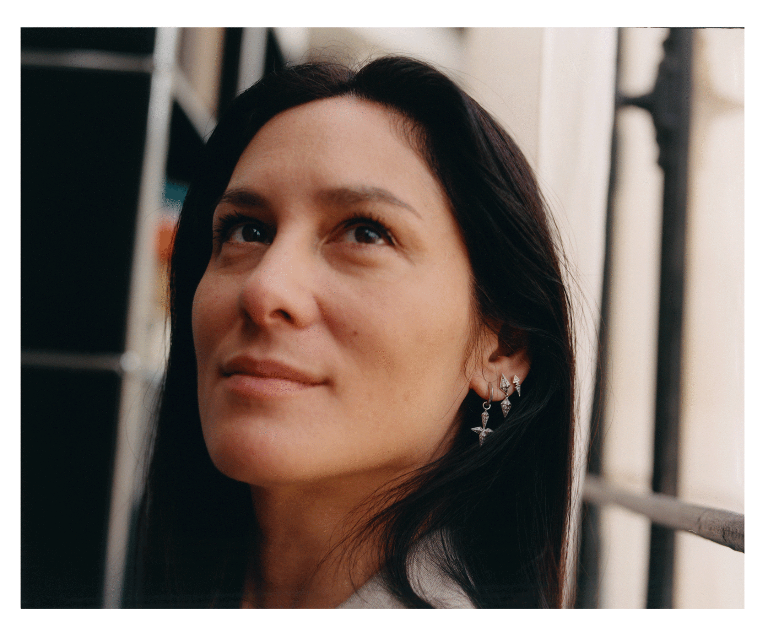
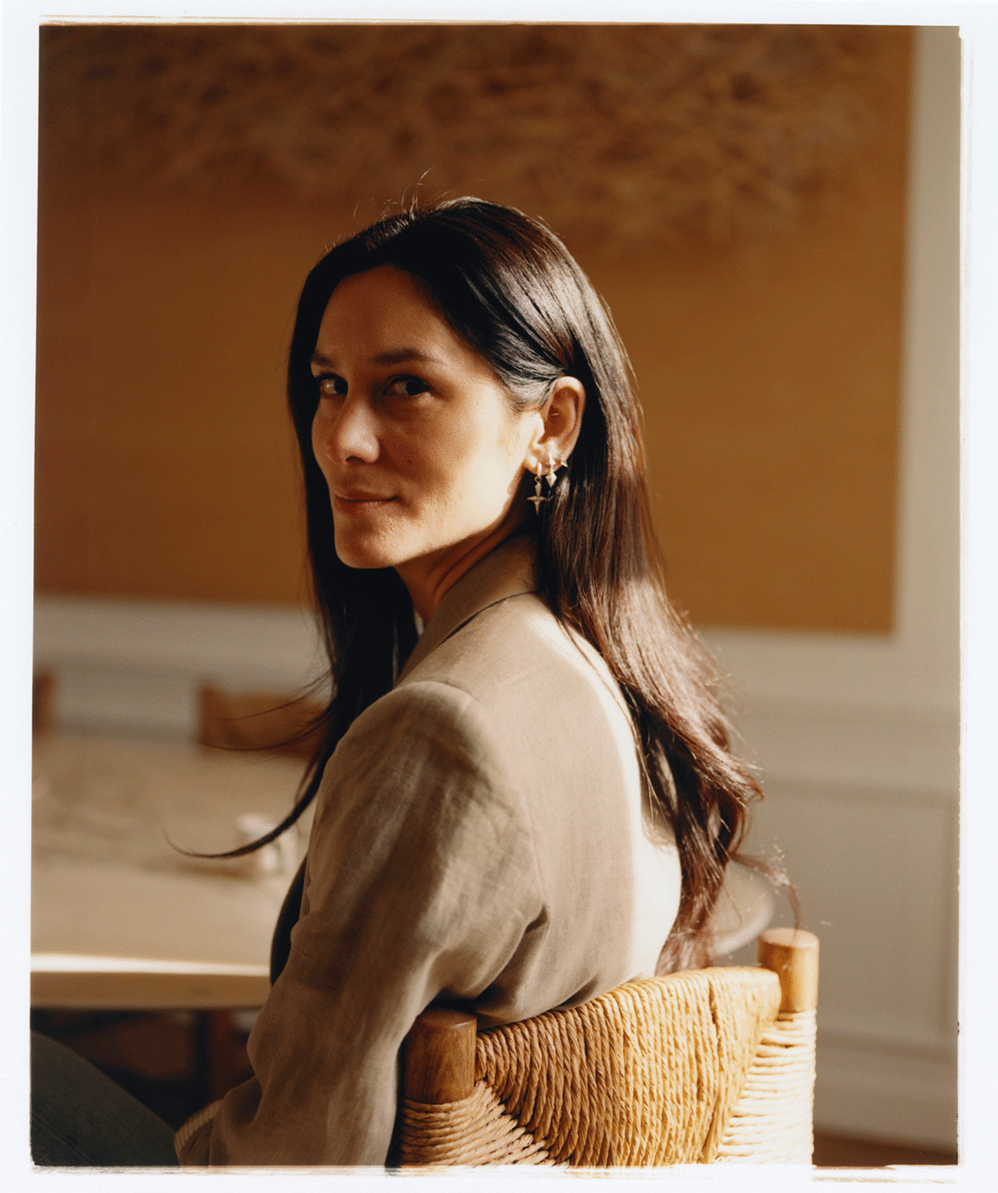
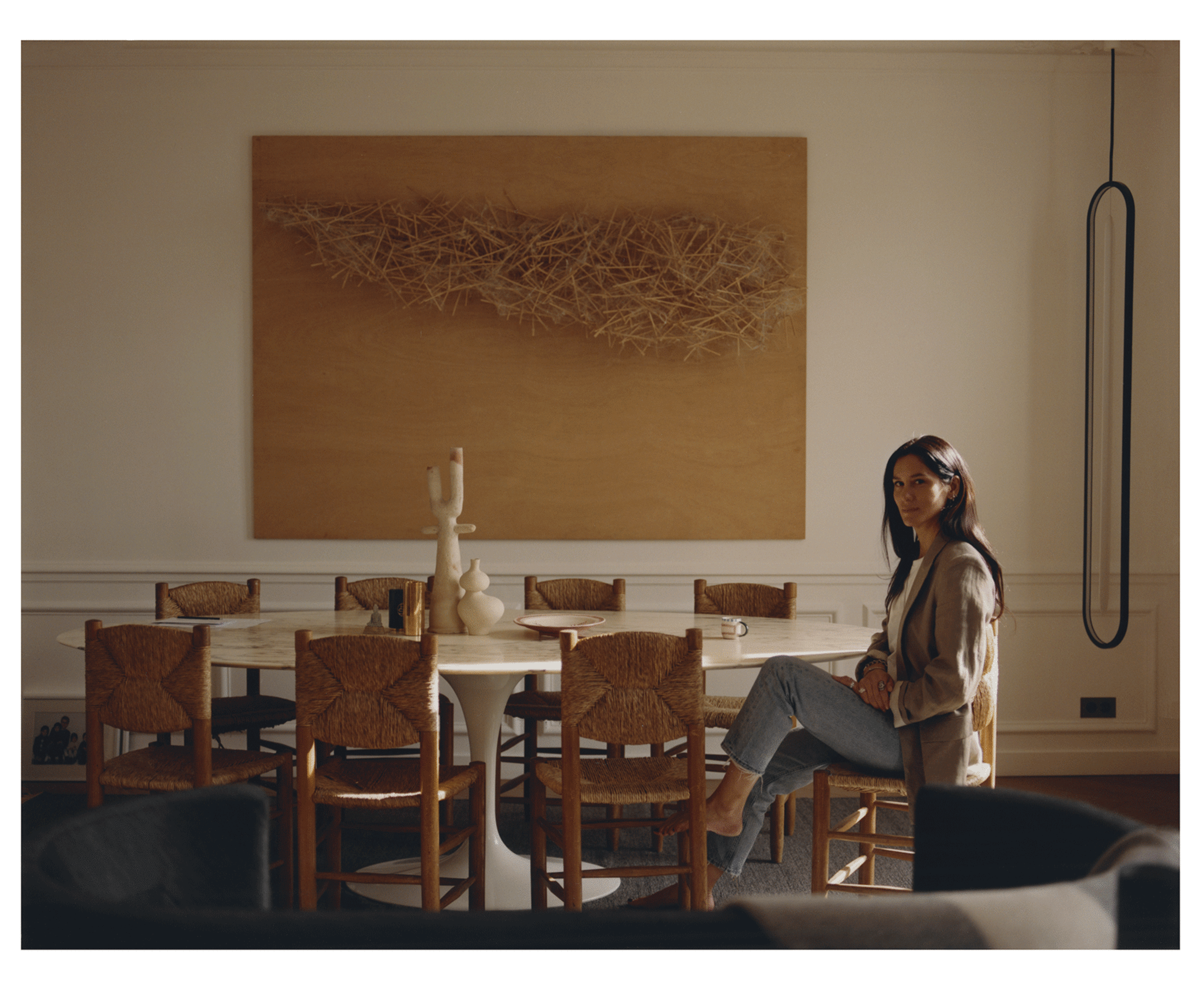
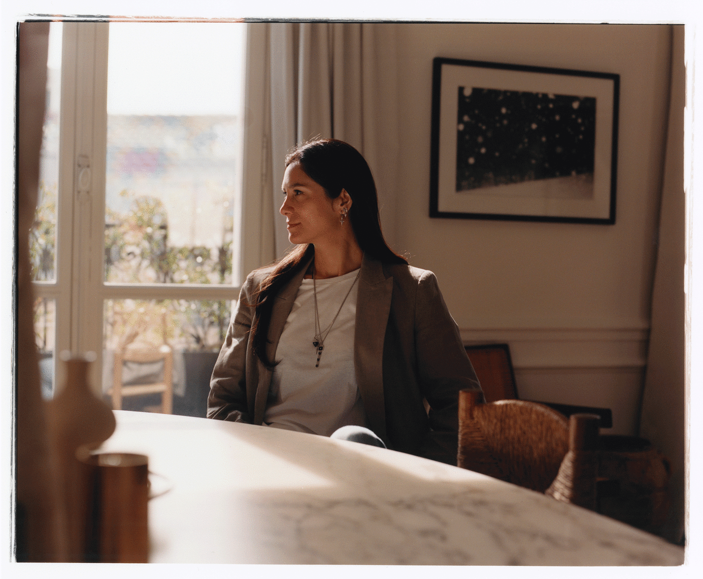
JESSICA FONSECA EZENZIA FOTO BY RAMON DAVILA

Los mejores perfumes para los padres, según Jessica Ezenzia 

La vocera e imagen de la perfumería Ezenzia, Jessica Fonseca, también conocida como Jessica Ezenzia, es una persona autorizada para hablar sobre fragancias. Como estamos cerca del Día del Padre, que tendrá lugar el domingo 15 de junio, la ex modelo venezolana nos comentó sobre  los perfumes más recomendables para regalar a los varones de la casa. “Estamos en época de calor, así que busquemos fragancias que vayan con la persona en su día a día, que sean fáciles de vestir y los hagan sentir identificados”, afirma, para comenzar. “En esta época vienen bien los perfumes que nos hagan sentir como recién salidos de la ducha”, explica. Su lista de consejos favoritos para los padres arranca con aromas frutales como los de coco, piña o mango, que tienen “notas divertidas, fáciles de transportarlo a uno mentalmente a la orilla de una playa para disfrutar del relax veraniego”. Jessica también sugiere regalar a los padres perfumes florales de lavanda o jazmín. También destaca los perfumes de notas cítricas (con manzana verde, limón, lima, pomelo, o el té verde). Y señaló los perfumes con notas acuáticas, limpias y jabonosas. “Esos son perfectos para ir al gimnasio o el trabajo”, sostiene. Algunos de los perfumes de Ezenzia para hombres son “Italian Bergamot”, que es para el día a día; el “Musc D’ Orient”, usualmente para ocasiones especiales; y el “The Jewel of Ocean”, para utilizar en horas de oficina. De damas, menciona el “Posh Cashmere EDP”, el “Purple Haze”, y el “Date Nights Femme”. La enumeración puede ser larga. Los productos se encuentran disponibles en la página online www.ezenzia.com Precisamente Ezenzia posee la distribución exclusiva en todo Estados Unidos de los productos de Anfar, fabricante que desde 1950 es uno de los más exitosos perfumistas y productores de madera oud, conocido como el oro negro de los perfumes árabes. 

Perez Art Museum PAMM
Pérez Art Museum Miami

Types of canvas

Types of canvas

There are 3 types, three treatments

As any budding artist will tell you, when you go to your local art store or browse the canvas surface section of any online retailer or your local store or shop. “in the budding stage” or “in the early stages”. It means to be in the process of development or growth, particularly in the artistic field, referring to someone who is starting their career or exploring their creative potential. There are different sized canvas surfaces, but you will also have to decide between stretched canvas, panels, ‘professional’ canvas, canvas rolls, unprimed vs. primed, and more.

Painters work with a variety of types of paint. Each type of paint requires a specific coating. There are three types of canvas. An oil canvas is intended solely for oil paint. Absorbent canvases are intended for tempera. Universal canvases are suitable for both oil paint and acrylic paint.
Each type of artist’s canvas is given a specific treatment after glueing.

Common Types of canvas

Cotton Canvas
Cotton canvas is an affordable option for painters who are just starting out. A properly prepared cotton canvas will last a long time (and it’s what you’ll find in any of your Painting to Gogh kits). It’s naturally flexible and durable and is often primed with acrylic primer.

Linen Canvas
Linen is made from flax and is more durable, rigid, and longer-lasting than cotton. It’s also the more expensive option. Linen canvas is often primed with oil-based primers and doesn’t warp as much over time, so it’s the go-to choice of many professional artists. You don’t have to worry about this type of canvas becoming too brittle either as linen retains its natural oils.

Canvas Board
Canvas board is another common option for new and student painters. Some are made of primed cotton canvas that’s stretched over a fiberboard, while others are simply a board that’s been primed and stamped to have the texture of canvas. They’re cheaper and great for practicing before you start on your canvas art piece.

Oil canvas

For an ‘oil canvas’, zinc white is used as the primer, bound with linseed oil. After that the canvas is put into a drying room for three days where it air-dries naturally. After that, we sand the canvas again and apply a coating layer based on titanium white. The canvas then has to go back into the drying room for a further ten days.

Absorbent canvases

‘Absorbent canvases’ are given two primer layers of chalk, bound with glue based on rabbit skins. Because this primer is water based, these canvases can be dried in the hot-air oven, where the water can evaporate more quickly.

Universal canvases

‘Universal canvases’ undergo the same drying process in a hot-air over as the absorbent canvases, but the two primer layers are titanium white based.

Reference numbers

Our reference numbers are prefixed with a number that specifies the treatment. If these canvases are untreated they carry the number 0 (e.g. 066), universal canvases carry the number 1 (e.g. 166) and absorbent canvases the number 2 (e.g. 266). Oil canvases, in contrast, carry no prefix number (e.g. 66).

Traditional methods

Most of the treatments are done by machine, but according to traditional methods. For pieces that are wider than the standard size (210 cm), and for special types of artist’s canvas, we will go so far as to perform the entire process manually. The maximum length of manually prepared artist’s canvas is 40 metres.

Painting canvas processes
If canvas will be used for painting, it is stretched around a wooden frame before gesso is applied. This stretching process ensures that the canvas forms a perfectly taut and flat painting surface. Expert canvas stretching also ensures that the warp and weft threads in the canvas form a perfect grid.

9 Tips for Painting on Canvas

  1. Angle Your Canvas To Paint Comfortably
    First, decide whether you’ll be seated or standing when you paint. Many easels are easy to adjust so you can switch between both. Adjust your easel based on your height and how comfortable it is to hold the brush up to the canvas. For some painting techniques, you want to be able to make contact with the canvas at a 90-degree angle. Make sure you can easily see your painting subject, whether it’s a video tutorial, a drawing, or a real-life object.
  1. Take Advantage of Canvas Wedges
    If you received a little packet of wood or plastic pieces with your store-bought canvas, they’re called canvas wedges, canvas tightening keys, or stretcher bar keys. They’re used to stretch and tighten the canvas if it starts to sag. Canvas can get droopy from all the layers of wet paint, temperature changes, humidity, and age. If you notice sagginess after painting, wait until your canvas is completely dry and hammer the wedges in afterward.
  1. Sketch Your Image or Underpaint
    You know the saying, “Measure twice, cut once?” Set yourself up for success by sketching your image before you start laying down paint. Grab a pencil, color pencil, or charcoal and make a sketch on a piece of paper. This is a helpful tip for any painting, but here’s the great thing about canvas: You can use a pencil (graphite) to lightly outline your art on the canvas and then paint over it. Another technique is to do an “underpainting” or “wash,” which is when you use very watered down paint to make a rough sketch. Both tips give you more control over the final image. You can simply follow the lines as you go and you know it’ll be closer to what you want (compared to a freehanded attempt).
  1. Lay Out Your Supplies Before You Get Started
    The last thing you want is to be running around trying to find a Round 6 brush or more paper towels while you’re in the creative zone. Once you start painting, you want everything you need within arms’ reach so that you don’t lose inspiration or have your paint dry too much while you’re hunting for supplies. Gather up your brushes, necessary paint colors (black, white, red, blue, and yellow are usually the minimum), paint palette, a cup of water, paper towels, and anything else you think you’re going to need.
  1. Use Paintbrushes With Firm, Tough Bristles
    The paint brushes you choose have to be able to withstand the hard, rough canvas surface. So, look for brushes with stiff bristles that are graded for acrylic and oil painting. Avoid grabbing any watercolor brushes you have lying around — they’re known for being softer and are going to break down rather quickly when used on canvas. A bonus to using firm-bristle brushes? They make it easier to do unique acrylic painting techniques like dry brushstrokes.
  1. Start With a Toned Canvas To Add a Unique Quality
    Who says you have to start your painting on a plain white canvas? Try a toned background: Simply choose an interesting color, paint the canvas, let it dry, and then start on your artwork. It can make colors pop and enhance the painting’s luminosity. For example, if you’re going to paint a lovely blue sky, you could start out by painting the canvas with a bright yellow. It may seem scary, but the yellow undertone could add a sunlit warmth to everything in your painting. The fun is in experimenting with different colors to see what effect it has. Check out color wheels and color theory to get some ideas.
  1. Get Creative With Solvents and Mediums
    Canvas is extremely durable, which means you can use a wide variety of mediums (products that can thicken and change the texture of paint) and solvents (products that thin paint out and clean paint brushes) to have fun with the look of your artwork. When it comes to acrylic paint, you’re likely going to use water as your solvent. You can apply different mediums to make your painting look glossy, matte, transparent, 3D, and more. These tools give you the freedom to experiment and see what you come up with.
  1. Easily Erase Mistakes With Water, Titanium White, or Sandpaper
    Painter Bob Ross once said, “We don’t make mistakes, just happy little accidents.” So, if your canvas experiences a “happy little accident,” don’t worry. You can use water, titanium white paint, or sandpaper to fix painting mistakes fairly easily. If your painting is still wet: Try scraping off the unwanted paint with your palette knife or something with a sharp edge. Apply some water (or linseed oil for oil paints), wipe the rest away, and paint over with titanium white. Let it dry and then keep painting.
  2. If your painting is dry: Use fine sandpaper to gently grind down the area with unwanted paint. Use a damp towel with water (for acrylics) or linseed oil (for oils) to clean the area and paint over with titanium white. Let it dry and then keep painting.
  1. Choose a Safe Place To Dry and Store Your Canvas When You’re Done
    The last thing that you want is for your new painting to get ruined while it dries! Find a location for the canvas to dry out of harm’s way, away from any water sources, heat sources, small children, or curious pets.

Source: Paintingtogogh.com/blogs/news/how-to-paint-on-canvas

Perez Art Museum PAMM
Pérez Art Museum Miami

La semiotica y las artes

semiotica
semiotica

La semiotica y las artes

La semiótica del arte nos revela que la obra no se completa sin la participación activa del receptor o lector. Su interpretación y experiencia personal son esenciales para construir el significado final de la obra. Este concepto se conoce como “obra abierta”, donde la multiplicidad de interpretaciones enriquece y amplía el alcance de la creación artística.

¿Cuál es la función de la semiótica en las artes visuales?

La semiótica nos permite comprender cómo los seres humanos percibimos e interpretamos el mundo que nos rodea a través de los signos. La semiótica visual, en particular, se enfoca en cómo las imágenes, compuestas por signos y elementos visuales, adquieren significado y nos ayudan a dar sentido a nuestras experiencias.

¿Cómo le ayudará la semiótica en la lectura de artes visuales?

La semiótica nos brinda un marco para entender la compleja interacción entre signos, símbolos y la construcción de significado. Funciona como una lente que nos permite interpretar representaciones visuales en diversas formas de arte, desde pinturas y esculturas hasta fotografías, diseño gráfico y arquitectura.

¿Por qué es tan importante en la comunicación en el arte contemporáneo?

A través de la diversidad de medios artísticos, el arte trasciende su función estética y se convierte en un poderoso canal de comunicación entre artistas y audiencias, conectando a las personas a través de la emoción, la reflexión y la experiencia compartida. La comunicación en el arte no solo nos permite expresar nuestra individualidad y visión del mundo de manera única, sino que también nos invita a explorar y comprender las perspectivas de los demás, enriqueciendo así nuestra experiencia humana.

semiotica

1. Concepto de Semiótica

La semiótica es la ciencia que estudia los signos y su significado. Los signos son cualquier cosa que representa algo más, desde palabras y gestos hasta imágenes y sonidos. En el contexto de las artes, la semiótica analiza cómo los artistas utilizan los signos para comunicar ideas y emociones.

2. Semiología vs. Semántica

Es importante distinguir entre semiología y semántica. La semiología se enfoca en el estudio de los signos en general, mientras que la semántica se centra específicamente en el significado de las palabras y el lenguaje.

3. Signos en las Artes

En las artes, los signos pueden ser cualquier elemento de una obra que comunica significado. Por ejemplo, en una pintura, los colores, las formas y las líneas pueden ser signos que transmiten emociones o ideas. En una obra de teatro, los gestos, el vestuario y la escenografía también pueden ser signos que contribuyen al significado de la obra.

4. La Definición de Signo según Umberto Eco

Umberto Eco, un destacado semiólogo, define el signo como la unidad mínima de significado. Un signo puede ser cualquier cosa que represente algo más, desde una palabra en una conversación hasta una línea en un dibujo.

5. Clasificación de los Signos según Charles Sanders Peirce

Charles Sanders Peirce, otro importante semiólogo, clasificó los signos en tres categorías:

  • Iconos: Signos que se asemejan a lo que representan. Por ejemplo, una fotografía es un icono porque se parece a la persona o cosa que representa.
  • Índices: Signos que están relacionados causalmente con lo que representan. Por ejemplo, el humo es un índice de fuego.
  • Símbolos: Signos que están relacionados convencionalmente con lo que representan. Por ejemplo, la palabra “gato” es un símbolo que representa al animal gato.

Profundizando en la Semiótica de las Artes

La semiótica ofrece una herramienta poderosa para analizar y comprender las artes. Al examinar los signos utilizados en una obra de arte, podemos descubrir capas de significado que de otro modo podrían pasar desapercibidas. La semiótica también puede ayudarnos a entender cómo las obras de arte se relacionan con la cultura y la sociedad en general.

Ejemplos de Semiótica en las Artes:

  • Pintura: El uso del color rojo en una pintura puede simbolizar pasión, peligro o violencia.
  • Escultura: La forma de una escultura puede representar la figura humana, un animal o un objeto abstracto.
  • Música: El ritmo y la melodía de una pieza musical pueden evocar emociones específicas.
  • Cine: Los ángulos de cámara y la iluminación pueden utilizarse para crear suspense o tensión.

La semiótica es un campo de estudio fascinante que puede enriquecer nuestra apreciación y comprensión de las artes. Al aprender a identificar y analizar los signos utilizados en las obras de arte, podemos desarrollar una comprensión más profunda de su significado y su impacto.

La Semiótica y las Artes: Profundizando en los Signos

6. Iconos: Semejanzas Directas

Los iconos son signos que se asemejan directamente a lo que representan. Son representaciones visuales que guardan una relación de semejanza con la realidad. Ejemplos claros son las pinturas, dibujos, fotografías, mapas, etc. Estos signos nos permiten reconocer fácilmente lo que representan debido a su similitud visual.

7. Índices: Sugerencias de la Realidad

Los índices son signos que sugieren o indican una realidad, estableciendo una conexión directa con ella. No son representaciones exactas, pero nos dan pistas sobre lo que está sucediendo o ha sucedido. Por ejemplo, el humo es un índice de fuego, las huellas en la arena son un índice de que alguien caminó por allí, y un rayo es un índice de tormenta.

8. Símbolos: Asociaciones Convencionales

Los símbolos son signos que representan una realidad a través de una asociación simbólica establecida por convención. No tienen una relación directa o de semejanza con lo que representan, sino que su significado se basa en acuerdos culturales o sociales. Ejemplos de símbolos son las señales de tránsito, los logotipos, los gestos, las palabras y los números.

9. La Semiótica Más Allá de las Artes

La semiótica no se limita al estudio de los signos en las artes. Autores como Roland Barthes, Ferdinand de Saussure y Umberto Eco han aplicado el concepto de signo a todos los aspectos de la sociedad humana. La moda, las costumbres, los espectáculos, los ritos y ceremonias, los objetos cotidianos, todos ellos pueden ser analizados desde una perspectiva semiótica para comprender su significado y su papel en la cultura.

10. El Mundo de las Imágenes: Signos Omnipresentes

Los signos están presentes en todas partes, especialmente en el mundo de las imágenes. Cada imagen, ya sea una pintura, una fotografía o un anuncio publicitario, está llena de signos que transmiten mensajes y significados. Al comprender cómo funcionan estos signos, podemos interpretar y analizar las imágenes de manera más crítica y profunda.

La semiótica nos proporciona una herramienta poderosa para comprender cómo los signos dan forma a nuestro mundo y cómo nos comunicamos a través de ellos. Al estudiar la semiótica, podemos desarrollar una mayor conciencia de cómo los signos influyen en nuestra percepción de la realidad y cómo podemos utilizarlos para crear y comunicar significado.

La Semiótica de la Imagen en el Diseño

11. La Imagen como Lenguaje Específico

Como diseñadores, entendemos que la imagen es un lenguaje con sus propias reglas y herramientas. A través de signos particulares, las imágenes pueden representar la realidad de manera objetiva o subjetiva. Nuestra labor como diseñadores es comprender estas herramientas y cómo su presencia o ausencia influye en el mensaje que transmitimos.

12. La Sociedad de la Comunicación y la Importancia de la Imagen

La explosión audiovisual de las últimas décadas ha transformado nuestra sociedad en una “sociedad de la comunicación”, donde la imagen se ha vuelto fundamental en nuestra vida cotidiana. La televisión, el cine, la publicidad y, más recientemente, internet y las redes sociales, nos bombardean constantemente con imágenes que influyen en nuestra percepción del mundo.

13. Análisis Semántico de la Imagen: Signos Plásticos

Al analizar una imagen desde una perspectiva semiótica, debemos prestar atención a sus signos plásticos, aquellos elementos visuales que contribuyen a su significado. Estos signos incluyen:

  • El color: Los colores tienen asociaciones culturales y emocionales que pueden influir en nuestra interpretación de una imagen.
  • La composición: La forma en que los elementos de una imagen están dispuestos puede crear jerarquías visuales y dirigir nuestra atención hacia ciertos puntos.
  • La textura: La textura puede añadir realismo o abstracción a una imagen, y puede evocar sensaciones táctiles.
  • Las líneas y formas: Las líneas y formas pueden crear movimiento, dirección y profundidad en una imagen.
  • Los espacios: Los espacios vacíos o negativos también pueden ser significativos, creando equilibrio o contraste en una imagen.

14. La Ciencia del Color

La ciencia del color es fundamental para comprender cómo los colores interactúan entre sí y cómo afectan nuestra percepción. Como diseñadores, debemos tener en cuenta la ciencia del color al elegir paletas de colores para nuestros proyectos, ya que los colores pueden evocar emociones, crear atmósferas y transmitir mensajes específicos.

15. El Color y su Multitud de Significados

El color es un elemento complejo que puede tener múltiples significados dependiendo del contexto cultural y personal. Los colores pueden estar asociados a emociones, ideas, objetos o incluso marcas comerciales. Por ejemplo, el rojo puede representar pasión, amor, peligro o prohibición.

16. El Blanco: Pureza y Positividad

El blanco se asocia comúnmente con la luz, la bondad, la inocencia, la pureza y la virginidad. En muchas culturas, el blanco es el color de la perfección y la limpieza. En el diseño, el blanco se utiliza a menudo para crear una sensación de espacio, simplicidad y elegancia.

Al comprender la semiótica de la imagen y la ciencia del color, los diseñadores podemos crear imágenes más efectivas y comunicativas. Podemos utilizar los signos plásticos y los colores de manera estratégica para transmitir mensajes específicos, evocar emociones y conectar con nuestro público objetivo.

La Semiótica del Color en el Diseño

17. Amarillo: Luz, Alegría y Energía

El amarillo, color del sol, evoca luz, alegría, felicidad, inteligencia y energía. Su brillo estimula la actividad mental y genera energía muscular. Sin embargo, en exceso, puede resultar perturbador e inquietante. En diseño, el amarillo puro y brillante atrae la atención, pero debe usarse con moderación.

18. Naranja: Entusiasmo y Creatividad

El naranja combina la energía del rojo con la felicidad del amarillo. Representa entusiasmo, felicidad, atracción, creatividad, determinación, éxito y estímulo. Es un color cálido que produce sensación de calor y vigor, estimulando la actividad mental sin la agresividad del rojo.

19. Rojo: Pasión, Peligro y Energía

El rojo, color del fuego y la sangre, se asocia con peligro, guerra, energía, fortaleza, determinación, pasión, deseo y amor. Es un color emocionalmente intenso que acelera el metabolismo, aumenta la respiración y eleva la presión sanguínea. Su alta visibilidad lo hace ideal para señales de advertencia y llamadas de atención.

20. Púrpura (Violeta): Nobleza, Lujo y Creatividad

El púrpura combina la estabilidad del azul con la energía del rojo. Se asocia con la realeza, el poder, la nobleza, el lujo y la ambición. Sugiere riqueza, extravagancia, sabiduría, creatividad e independencia. Es un color preferido por muchos niños y adolescentes, y representa magia y misterio.

21. Azul: Calma, Estabilidad y Confianza

El azul, color del cielo y el mar, evoca estabilidad, profundidad, lealtad, confianza, sabiduría, inteligencia, fe y verdad. Es un color beneficioso para el cuerpo y la mente, ya que retarda el metabolismo y produce un efecto relajante. Se asocia fuertemente con la tranquilidad y la calma.

22. Verde: Naturaleza, Armonía y Seguridad

El verde es el color de la naturaleza, representando armonía, crecimiento, exuberancia, fertilidad y frescura. Evoca una fuerte sensación de seguridad, en contraste con el rojo que indica peligro. El verde tiene propiedades curativas, es relajante para la vista y sugiere equilibrio y resistencia.

Comprender la semiótica del color permite a los diseñadores utilizar los colores de manera estratégica para evocar emociones específicas, crear atmósferas y transmitir mensajes de manera efectiva. Al elegir los colores adecuados, podemos influir en la percepción del público y lograr que nuestras creaciones sean más impactantes y memorables.

La Semiótica del Color en el Diseño (Continuación)

23. Negro: Poder, Elegancia y Misterio

El negro es un color complejo y lleno de contrastes. Representa poder, elegancia, formalidad, muerte y misterio. Es el color más enigmático, asociado al miedo y lo desconocido, pero también a la autoridad, la fortaleza y la intransigencia. En el diseño, el negro transmite prestigio, seriedad y sofisticación.

Connotaciones Positivas del Negro:

  • Elegancia y sofisticación: El negro es un color clásico que se asocia con la alta costura, la moda de lujo y los eventos formales.
  • Poder y autoridad: El negro transmite una sensación de poder, control y autoridad. Se utiliza a menudo en uniformes, trajes de negocios y logotipos de marcas de lujo.
  • Misterio y enigma: El negro puede crear una atmósfera de misterio e intriga, lo que lo hace ideal para diseños relacionados con el cine negro, la literatura gótica o la música dark.

Connotaciones Negativas del Negro:

  • Muerte y luto: En muchas culturas, el negro es el color del luto y se asocia con la muerte, el dolor y la pérdida.
  • Miedo y maldad: El negro también puede representar el mal, la oscuridad y lo desconocido. Se utiliza a menudo en películas de terror y en personajes villanos.

El Negro en el Diseño:

El negro es un color versátil que puede utilizarse de muchas maneras diferentes en el diseño. Puede ser el color principal de un diseño, o puede utilizarse como color de acento para resaltar otros colores. El negro también se utiliza a menudo en tipografía, ya que es un color legible y fácil de leer.

Al utilizar el negro en el diseño, es importante tener en cuenta sus múltiples connotaciones y elegir cuidadosamente cómo se combina con otros colores y elementos visuales. Un uso adecuado del negro puede añadir profundidad, contraste y sofisticación a un diseño, mientras que un uso excesivo o inapropiado puede resultar en un diseño lúgubre o abrumador.

La Semiótica de la Imagen en el Diseño: Elementos Visuales Clave

24. La Composición: Equilibrio y Armonía Visual

La composición es la distribución equilibrada y armoniosa de los elementos dentro de una imagen. Estos elementos pueden ser imágenes, texto o espacios en blanco. La composición se logra mediante el uso de herramientas como el tamaño, la posición, el peso cromático, la proporción, la luminosidad, el contraste, la textura, la perspectiva y la diversidad de planos. Puede ser realista, abstracta, simbólica, geométrica o irregular, reflejando diferentes tendencias pictóricas.

25. La Textura: Sensaciones Táctiles y Visuales

La textura es la cualidad de una superficie que puede ser percibida tanto visual como táctilmente. En el ámbito visual, la textura se describe mediante sus cualidades rítmicas, como la repetición, el movimiento, la rugosidad, la suavidad, el brillo y la calidez. La textura puede añadir profundidad, realismo y riqueza sensorial a una imagen.

26. Líneas y Formas: Dinamismo y Expresividad

Las líneas y formas son elementos fundamentales en el diseño. Las líneas pueden ser rectas, curvas, gruesas, finas, continuas o discontinuas. Las formas pueden ser geométricas, orgánicas, abiertas o cerradas. Cada línea y forma tiene su propia expresividad y puede evocar diferentes sensaciones. Las líneas curvas pueden sugerir suavidad y feminidad, mientras que las rectas pueden transmitir fuerza y masculinidad. Las formas abiertas pueden representar libertad y expansión, mientras que las cerradas pueden sugerir encierro o protección.

27. Los Espacios: Creando Profundidad y Perspectiva

El espacio es el área en la que se distribuyen los elementos dentro de una imagen. Puede ser positivo (ocupado por elementos) o negativo (vacío). El espacio negativo es tan importante como el espacio positivo, ya que crea equilibrio, contraste y puede dirigir la atención del espectador. La distribución de los elementos en el espacio puede crear profundidad, perspectiva y jerarquía visual.

Comprender la semiótica de estos elementos visuales permite a los diseñadores crear imágenes más efectivas y comunicativas. Al utilizar la composición, la textura, las líneas, las formas y los espacios de manera estratégica, podemos transmitir mensajes específicos, evocar emociones y guiar la mirada del espectador a través de la imagen.

La semiótica de la imagen es una herramienta poderosa para analizar y comprender el lenguaje visual. Al conocer los diferentes signos y su significado, podemos interpretar las imágenes de manera más crítica y profunda, y utilizar este conocimiento para crear diseños más impactantes y efectivos.

Análisis Semiótico de Obras Pictóricas: Signos Plásticos en Acción

28. Del Conocimiento a la Práctica: Análisis de Obras Pictóricas

Después de explorar los signos plásticos en teoría, es hora de aplicar este conocimiento al análisis de obras pictóricas concretas. Examinaremos cómo los artistas utilizan la forma, la línea, la composición, el color y la textura para transmitir mensajes y emociones.

29. “El Tejar de Horta” de Pablo Picasso: Un Ejemplo de Análisis

Forma/Línea: Predominan formas geométricas como cubos, cilindros y paralelepípedos, creando una sensación de encierro y pesadez. Las líneas convergen en un punto de fuga distorsionado, generando una perspectiva confusa y fragmentada.

Composición: La composición se caracteriza por el amontonamiento de formas geométricas que llenan todo el espacio, creando una sensación de saturación y ahogo. La falta de un horizonte claro y la ausencia de figuras humanas contribuyen a un ambiente deshumanizado y pesimista.

Color: Los colores planos y apagados, en tonos cálidos como ocres, naranjas, verdes y grises, crean una atmósfera sofocante y opresiva.

Textura: La textura rugosa y el relieve de la tela añaden una dimensión táctil a la obra, reforzando la sensación de pesadez y densidad.

30. Actividad: Análisis Semántico de Obras Pictóricas

Objetivo: Analizar las obras pictóricas enlistadas, identificando los signos plásticos presentes y su contribución al significado de cada obra.

Obras a Analizar:

  • “Persistencia de la Memoria” (1931) de Salvador Dalí
  • “Guernica” (1937) de Pablo Picasso
  • “El Grito” (1893) de Edvard Munch
  • “La Danza” (1910) de Henri Matisse
  • “Hortensia Azul” (1986) de Claudio Bravo
  • “Impresión, Sol Naciente” (1872) de Claude Monet

Instrucciones:

  1. Formar grupos de máximo 2 alumnos.
  2. Analizar cada obra, identificando los signos plásticos presentes (forma/línea, composición, color, textura).
  3. Interpretar el significado de cada signo y cómo contribuyen al mensaje general de la obra.
  4. Presentar un informe escrito con los resultados del análisis.

Este ejercicio práctico permitirá a los alumnos aplicar los conceptos de semiótica aprendidos al análisis de obras de arte reales, desarrollando así su capacidad de interpretación y análisis crítico de imágenes.

31. Más allá de lo básico:

  • Signos Kinésicos: Además de los signos plásticos, las imágenes pueden contener signos kinésicos, relacionados con el movimiento y la postura de las figuras representadas. Estos signos pueden transmitir emociones, acciones y relaciones entre los personajes.
  • Signos Proxémicos: La distancia entre los elementos de una imagen (o entre la imagen y el espectador) también puede ser significativa. La proxémica estudia cómo el uso del espacio puede comunicar poder, intimidad o distancia.

32. Análisis de “El Tejar de Horta”:

Podríamos añadir:

  • Contexto Histórico: El cuadro fue pintado durante un período de agitación social y política en España, lo que podría influir en la atmósfera opresiva y fragmentada de la obra.
  • Influencias Artísticas: Picasso estaba experimentando con el cubismo, un movimiento que desafiaba las convenciones de la representación realista. Esto se refleja en la fragmentación de las formas y la perspectiva distorsionada.

33. Actividad:

Para enriquecer el análisis, se podría pedir a los estudiantes que:

  • Investiguen el contexto histórico y artístico de cada obra.
  • Comparen y contrasten las diferentes obras, identificando similitudes y diferencias en el uso de los signos plásticos.
  • Presenten sus hallazgos en una presentación oral, utilizando imágenes y ejemplos para ilustrar sus puntos.

Más allá de la Pintura:

La semiótica no se limita a la pintura. Se puede aplicar a cualquier forma de comunicación visual, como la fotografía, el cine, la publicidad, el diseño gráfico y la arquitectura.

Aplicaciones Prácticas:

Comprender la semiótica de la imagen puede ayudar a los diseñadores a crear imágenes más efectivas y comunicativas. Al tener en cuenta los diferentes signos y su significado, pueden elegir los elementos visuales más adecuados para transmitir el mensaje deseado y conectar con su público objetivo.

Invitación a la Reflexión:

La semiótica nos invita a mirar más allá de la superficie de las imágenes y a descubrir las capas de significado que se esconden debajo. Al desarrollar nuestra capacidad de análisis semiótico, podemos convertirnos en espectadores más críticos y conscientes del poder de las imágenes en nuestra sociedad.

Perez Art Museum PAMM
Pérez Art Museum Miami

NORTH AMERICA MUSEUMS

NORTH AMERICA Museums

Canada

National Gallery of CanadaNational Gallery of Canada, Ottawa – Exhibits one of the greatest collections of paintings in North America, with works by Van Gogh, Cezanne, Picasso and Pollock

Vancouver Art Gallery, Vancouver – This dynamic and original Museum exhibits a large group of contemporary Art in a beautiful Neoclassical buildingUSA

MetropolitanThe Metropolitan Museum of Art, New York – Arguably America’s greatest museum. Its spectacular collection of contemporary art includes ‘Autumn rhythm’ by Jackson Pollock.

MOMAThe Museum of modern Art (MOMA), New York – Houses the world’s best collection of modern and contemporary Art, featuring masterworks as Picasso’s Demoiselles d’Avignon

GuggenheimThe Guggenheim Museum, New York – Designed by the famous architect Frank Lloyd Wright. The Guggenheim Fundation has also important galleries in Bilbao, Venice, Berlin and Las Vegas.

Brooklyn Museum, Brooklyn, New York – Houses an extensive collection of Art, including works by artists such as Hans Hofmann

Withney Collection of American Art, New York – Houses more than 18,000 American works by American artists, including Hopper, Pollock and de Kooning

Museum of Fine Arts, BostonThe Museum of Fine Arts, Boston is one of the oldest and most respected Art institutions of North America. It exhibits works by Joseph Beuys and Takashi Murakami, among others

The National Gallery of WashingtonThe National Gallery of Washington features a complete collection of painting from the 13th to the 20th century. Includes works by Pollock or Ruscha

Toledo Museum of Art, Toledo – Opened in 1901, exhibits a good collection of European and American Art, with works by Willem de Kooning

Philadelphia Museum of ArtPhiladelphia Museum of Art, Philadelphia – One of the greatest Museums in North America, with a great collection of contemporary Art, including works by Cy Twombly and Jasper Johns

Art Institute of ChicagoThe Art Institute of Chicago houses one of the most outstanding Art collections of the United States, featuring masterpieces by Andy Warhol and Willem de Kooning

Museum of Art, Cleveland – One of the most complete art collections in America, from antiquities to modern masterpieces, with works by Pollock and Warhol

Walker Art Center, Minneapolis – Focused in modern and contemporary Art, includes works by Picasso, Moore and Warhol

Dallas Art Museum, Dallas – Exhibits a good collection of contemporary painting, including works by abstact expressionists like Rothko, Pollock or Kline

Denver Art Museum, Denver – Focused in American Art, this Museum also exhibits a good collection of contemporary Art, with works by Motherwell and Warhol

Menil Collection, Houston – This museum, designed by Renzo Piano, houses a great collection of contemporary Art, from Picasso to Cy Twombly

Museum of Modern Art (SFMOMA), San Francisco – Its collection of modern and contemporary painting includes works by Matisse, Diebenkorn and Jasper Johns

Seattle Art Museum, Seattle – The collections of this Museum have drastically grown in the last decades, and now include contemporary works by Andy Warhol or Richard Serra

Perez Art Museum PAMM
Pérez Art Museum Miami

ART FAIRS

ART FAIRS

America

Art Basel Miami Beach
Leading galleries from North America, Latin America, Europe, Asia and Africa show significant work from the masters of Modern and contemporary art, as well the new generation of emerging stars.
Miami Beach, USA
www.artbasel.com/miami-beach

Frieze Los Angeles
Frieze Los Angeles 2019 will bring together around 70 of the most significant and forward-thinking contemporary galleries from across the city and around the world.
Los Angeles, USA
frieze.com/fairs/frieze-los-angeles

Armory Show New York
Established in 1994 and held annually on Piers 92 & 94, The Armory Show is New York’s premier international art fair, showcasing over 200 galleries from around the world.
New York, USA
www.thearmoryshow.com/

Frieze New York
Frieze New York brings together the most exciting contemporary galleries from around the globe.
New York, USA
friezenewyork.com/
Europe

London Art Fair
Founded in 1989 by London’s Business Design Centre in Islington with the aim of providing a space to showcase the most exceptional modern and contemporary art of our time
London, United Kingdom
www.londonartfair.co.uk

ARCO Madrid
The leading art fair in Spain.
Madrid, Spain
www.ifema.es/arcomadrid_06/

TEFAF Maastricht
At TEFAF Maastricht, the world’s greatest art and antiques fair, you can buy masterpieces of art, antiques and design, showing 7,000 years of art history.
Maastricht, Netherlands
www.tefaf.com/

Art Cologne
ART COLOGNE is the world’s oldest art fair for modern and contemporary art of the 20th and 21st century.
Cologne, Germany
www.artcologne.com/ART-COLOGNE/index-2.php

Art Basel
Art Basel is one of the most important contemporary Art Fairs in the world, with more than 280 of the world’s leading galleries showing the work of over 4,000 artists.
Basel, Switzerland
www.artbasel.com/basel
Asia

Art Dubai
Art Dubai is the leading inter­national art fair in the Middle East, Africa and South Asia.
Dubai, UAE
www.artdubai.ae/
Australia and Oceania

New Zealand Art Show
It’s New Zealand’s best one-stop shop for original New Zealand art.
Wellington, New Zealand
www.artshow.co.nz

Perez Art Museum PAMM
Pérez Art Museum Miami

IVAN AIVAZOVSKY

AIVAZOVSKY, IVAN

AIVAZOVSKY, IVAN (1817-1900) Russian landscape painter.

Ivan Aivazovsky: “The Ninth Wave” – 1850 – oil on canvas – Saint Petersburg, State Museum

Born in Crimea in 1817, to an Armenian family, is arguably the most famous Russian seascape painter. The quality of his paintings made him one of the most respected artists in Russia, earning the Gold Medal at the Saint Petersburg Academy of Arts, and opening his own school at home town of Feodosiya. Aivazovsky painted more than 6,000 works, most notably the famous “The ninth wave”, and a large group of large paintings glorifying the Russian navy. Today Aivazovsky is the most sought-after 19th century Russian painter, and his works are sold for more than $3 million at auctions.

“The ninth wave” is a true masterwork. Aivazovsky reaches in this painting an absolute technical perfection, representing a group of unlucky castaways trying to survive under the merciless charges in form of oceanic waves. Nevertheless, the centre of the composition is the powerful, almost mystical and diffuse representation of the sun, which illuminates the scene with a strange, oneiric range of green and pink shades. This painting is often called “the most beautiful painting in Russia”

1881 – oil on canvas – The Tretyakov Gallery, Moscow, Russia

Son of a Greek shoemaker who emigrated to Mariupol (now Ukraine), Arkhip Kuindzhi (1842-1910) was one of the most important 19th century Russian painters, quite influenced by previous masters as Ivan Aivazovsky. Kuindzhi was a professor in the Saint Petersburg Academy of Arts untill he was fired for support student’s protests.

“Dnepr in the morning” (as “Dnepr in the night”, executed a year before) is considered as one of the first works finished with Kuindshi’s “mature” style, with stunning light and atmospheric effects. This panoramic view is especially remarkable for its simple but very strong composition.

“Dnepr in the morning” (as “Dnepr in the night”, executed a year before) is considered as one of the first works finished with Kuindshi’s “mature” style, with stunning light and atmospheric effects. This panoramic view is especially remarkable for its simple but very strong composition.

Isaac Levitan: “Lake”

1900 – oil on canvas

“Lake” is Levitan’s last painting, an unfinished masterpiece by the Russian painter (born in Kaunas, Lithuania) who mastered the landscape of mood, a very emotional interpretation of the Russian landscape.

While Levitan, as many other Russian landscape painters, was clearly influenced by the Barbizon School, this late work is (un)finished in a somewhat impressionist way.

Alexei K. Savrasov: The rooks have returned

1871 – oil on canvas – Tetryakov Gallery, Russia

Savrasov was one of the most important -arguably the most important- of all the 19th century Russian landscape painters, considered the creator of the “lyrical landscape style”. A trully emblematic work, “the rooks have returned” (or “the rooks have come back”) is Savrasov’s most famous painting, a lovely elegy to the spring announced by the rooks return The canvas shows Savrasov’s love for the rural Russian landscape, very influenced by John Constable. One of Savrasov’s most famous pupils is Isaac Levitan.

Ivan Shishkin: “Morning in a pine forest”

1886 – oil on canvas – Tetryakov Gallery, Russia

Ivan Shishkin (1832-1898) was one of the most important 19th century Russian landscape painters. He was a very famous artist in life, being a professor of painting in the Imperial Academy of Saint Petersburg and in the Higher Art School of Moscow

“Morning in a pine forest” is a marvelous pictorial fantasy that goes beyong the pure realism developed by many other Russian painters of the era. Shishkin has chosen one of his favorite motifs, the dense Russian pine forest, adding the unusual and rather bucolic presence of a family of bears

Fyodor Vasilyev: “Wet Meadow”

1872 – oil on canvas – The Tretyakov Gallery, Moscow, Russia

Died at the age of 23 victim of a tuberculosis, Feodor Vasilyev was a brillian “boy genius” who established himself as one of the most important and respected Russian painters of his era, introducing the lyrical landscape style in Russian painting. “Wet meadow” is a beautiful, lyric masterwork done completely from memory and a few sketches of the Russian plains.

Vasilyev was a fierce competitor to Ivan Shishkin, who was later accused of predujice Vasilyev using his important influences.

Perez Art Museum PAMM
Pérez Art Museum Miami

NEO-CONCRETE

The neo-concrete movement was a splinter group of the 1950s Brazilian concrete art movement, calling for a greater sensuality, colour and poetic feeling in concrete art.

With the construction of the country’s new utopian capital, Brasilia and the formation of the São Paulo Biennial, young Brazilian artists were inspired to create art that drew on contemporary theories of cybernetics, gestalt psychology and the optical experiments of international artists like Bridget Riley and Victor Vasarely.

Lygia Clark, Lygia Pape, Am’lcar de Castro, Franz Weissmann, Reynaldo Jardim, Sergio de Camargo, Theon Spanudis and Ferreira Gullar were unhappy with the dogmatic approach of the concrete group, so published the neo-concrete manifesto in 1959. In 1960 Hélio Oiticica joined the group and his groundbreaking series of red and yellow painted hanging wood constructions effectively liberated colour into three-dimensional space.

“There was total freedom. Nothing was dogmatic. Everyone was willing to be creative.” —Lygia Pape

Neo-Concrete Art was established in response to Concrete Art, which emphasized the use of planes and colors to convey objective scientific principles. The Swiss artist Max Bill, a major exponent of Concrete Art, had significant exhibitions in São Paulo, Brazil in the early 1950s, inspiring a younger generation of artists there. In 1959, the Neo-Concrete Manifesto was written by a group of artists in Rio de Janeiro—including Lygia Clark, Hélio Oiticica, and Lygia Pape—who shared a similar interest in abstract forms and the use of color but wanted to insert poetic, and sometimes political, meaning and a greater sense of freedom and flexibility into their work. The merging of art and life was crucial: painting was to be removed from its frame, sculpture taken down from its pedestal, and the work constantly subject to re-invention by its viewers. This led to developments in participatory and immersive art, as exemplified by Oiticica’s penetrable environments and wearable sculptures or Pape’s envisioning of a world without words in Book of Creation. The critic Ronaldo Brito called Neo-Concrete Art a “rupture” in Brazilian art history, one that would inspire later generations of artists in Brazil, including those practicing under the repressive military dictatorship between 1964 and 1985.

Contemporary Brazilian Artists at Home with Neo-Concrete Movement

Elisa Wouk Almino August 20, 2015

“The house was more than a skin … an organism as alive as our own,” Lygia Clark wrote soon after making the interactive installation “A casa é o corpo: penetração, ovulação, germinação, expulsão” (“The House is the Body: penetration, ovulation, germination, expulsion”) in 1968. Encased inside a giant plastic balloon resembling a womb, the viewer entered a dark interior and brushed against soft surfaces before emerging back into the light. The home, the title of Clark’s work reminds us, acts as another vessel for our bodies.

IMG_2738
Installation view of Fernanda Gomes’s sculptures (click to enlarge)

At the heart of the Neo-Concretist movement, which Clark helped spearhead in Brazil, was the notion that art should be physically experienced. Empty House, Casa Vazia, Luhring Augustine’s current show in Chelsea, mixes Neo-Concrete works with Brazilian contemporary art of a similar sensibility. As co-curator Donald Johnson Montenegro told Hyperallergic, the show borrows its name from Clark’s ideas, who also conceived of her forms in relation to space, or the void. The theme of “emptiness,” or even the imperceptible, likewise recalls what poet Ferreira Gullar said of Neo-Concrete artworks: they’re not objects, but expressions. Neo-Concretism — both a reaction to the “scientific” character of Concrete art and the military coup in 1964 — was, as Gullar put it, born out of “contradiction”: privileging both “mind and body, reason and sensation.”

I have this image of the gallery after hours, when the sculptures hang in the actual vacant space, and I imagine them switched off, asleep. For, as Gullar, Clark, and their contemporaries believed, these works only awaken once we engage them. Upon entering Empty House, Casa Vazia, we’re confronted with what looks like a window shutter with a messy, white paint job. Next to it, another wooden object, possibly a drawer from a desk, is turned on its side. They are lost parts, severed from their original contexts — a home, perhaps. Nearby, an iron structure by the same contemporary artist, Fernanda Gomes, climbs like a tall comb, with its “teeth” meeting the wall, except some of them are almost imperceptibly too short, leaving a hint of space. Gomes’s sculptures seem to be in a continual state of attaching to and detaching from something else.

IMG_2743
Hélio Oiticica, “Relevo Espacial 6” (1959, constructed 1991), painted wood (click to enlarge)

Just across the room dangles one of Hélio Oiticica‘s “spatial reliefs,” “Relevo Espacial 6” (1959) — a form that wishes to disassociate itself completely from its surroundings. Two strings keep this pair of bright-orange, imperfect squares, which taper like binders and create dark cavities in their folds, suspended in space. The work predates and foreshadows Oiticica’s parangolés, where his colorful shapes became malleable and wearable. In Gullar’s words, they were “the dance of form in space.”

There is, as Montenegro and co-curator Lucrecia Zappi put it, something musical about the works on view. Though highly geometric, they are flexible and rhythmic — for instance, Lygia Pape‘s black-and-white wall sculptures that fold onto themselves and create smaller squares and triangles that you could imagine unfurling and spreading like an Oiticica. Called “Livro da noite e dia” (“Book of Night and Day”) (1963/76), the wooden sculptures are puzzles of shapes that come together and apart, sliding over and beneath one another. Like a book, the forms open and close, and move between light and darkness.

https://www.tate.org.uk/art/art-terms/n/neo-concrete

Perez Art Museum PAMM
Pérez Art Museum Miami

Piet Mondrian

piet mondrian
piet mondrian

Arte Concreto – Neoplasticismo

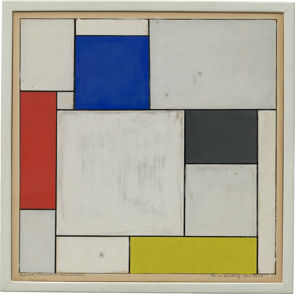
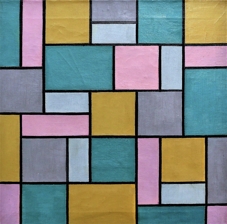
Piet Mondrian, el «pintor de los cuadraditos» fue un artista holandés que creó su obra en torno a la revista De Stijl, principal órgano de difusión neoplasticista.
Para tipos como Mondrian, el arte debía ser representado a través de líneas rectas y colores puros. Cada uno tiene su opinión.
En caso de Mondrian, esto se debía a que lo rectilíneo y lo cromáticamente puro era un símbolo de la expresión del orden cósmico.
Esto está vinculado a las teorías teosóficas que estaban de moda en la Europa de la belle epoquey que a la larga no es más que un intento de abstracción diferente al de Kandinsky. Mucho más ordenado, más matemático… y más frío.

Se formó como maestro de dibujo de educación obligatoria y a finales de siglo en Amsterdam se empezó a relacionar con los innovadores grupos artísticos del momento. Ahí pinta sus primeras obras, a años luz de lo que vendría después: paisajes serenos, grises, tierras, tonos oscuros…

Pero en 1912 se traslada a París, donde conoció a gente como Leger o Braque que le descubren el nuevo y loco arte del siglo XX. Al principio se hizo cubista como ellos, pero poco a poco se fue interesando más por la abstracción.

La Gran Guerra llegó y el artista regresó a los Países Bajos, donde conoció a los que serían sus compañeros de movimiento, Bart van der LeckTheo van Doesburg. Con ellos y otros más (arquitectos, diseñadores…) funda la revista De Stijl.
Con ella este grupo de artistas querían representar las verdades absolutas del universo. A partir de ese mismo momento, Mondrian se expresaría sólo a través de planos de colores primarios y líneas rectas.
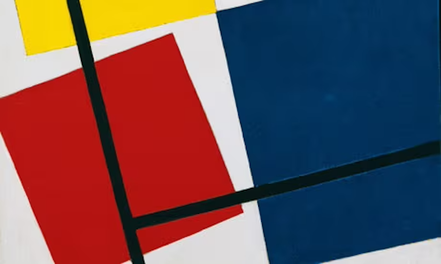
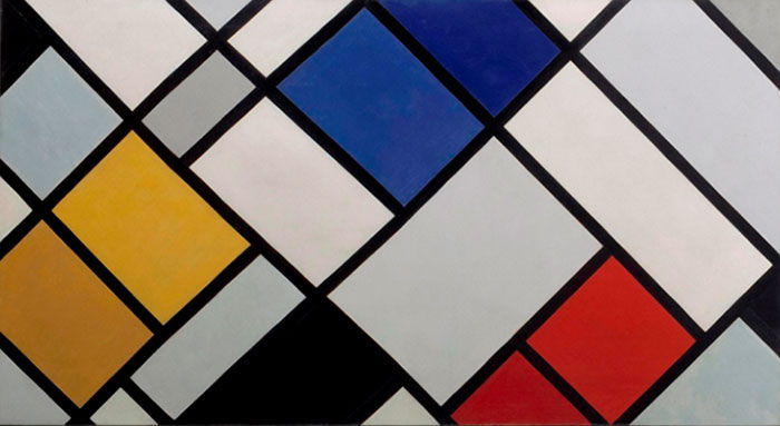
Al final Van Doesburg acabaría usando diagonales, aburrido de tanta línea monótona, y un ofendido Mondrian se separaría definitivamente del grupo por semejante sacrilegio.

Tras esto viajaría, exportando su visión artística: Londres, Nueva York… Ahí perdería la rigidez anterior y ganaría ritmo. Quizás fue el jazz,quizás lo cosmopolita de la Gran Manzana… Quien sabe.

(CC) Miguel Calvo Santos, 27-09-2016

https://historia-arte.com/artistas/piet-mondrian
Perez Art Museum PAMM
Pérez Art Museum Miami

Constructivist Showcase

Concrete art, Constructivism, Constructivism

Constructivist Showcase

Max Bill and Zurich Concrete Art

Beim Stadthaus, www.kmw.ch

«concrete art is when taken to its logical conclusion the pure expression of harmonious measure and rule. It orders systems and with artistic means breathes life into these orders.» The standard that Max Bill (1908 – 1994) set out in his Manifesto for Concrete Art in 1949 is clearly absolute: Harmony and order become the guidelines for an artistic stance preempted decades earlier by pioneers such as Theo van Doesberg and Piet Mondrian. Max Bill raised them to the status of a programmatic agenda. Painting (and sculpture, too) was not supposed to arise for its own sake, but was to be produced in the service of a modern utopia, whereby following in the footsteps of Bauhaus the arts were meant to combine with architecture and the applied arts to form a modern gesamtkunstwerk. In line with this ideal, Max Bill took the stage not only in the field of fine art, but likewise as an architect, designer and university lecturer.

Born in 1908 in Winterthur, Bill first completed an apprenticeship as a silversmith and then studied at the Bauhaus from 1927-8 before returning to Switzerland in 1929, where he initially worked as an architect, and then later as a sculptor, graphic artist and painter. From the 1930s onwards this native of Winterthur emerged as one of the main champions and representatives of Zurich Concrete Art. As the founding director of the Ulm College of Design, he successfully ensured the renaissance of Bauhaus ideas in post-War Germany.

Kunst Museum Winterthur owns a major group of Max Bill works, and they are ideally complemented by paintings and drawings by his contemporaries Camille Graeser, Verena Loewensberg and Richard Paul Lohse. They show that Concrete Art is far more than a set of rules and order, forever breaking its own dogmas asunder with surprising images and colors that strongly appeal to the senses. The exhibition is rounded out with pieces by artists who in subsequent generations took up the traditions of Constructivist Art and reflected on it.

Curators: Konrad Bitterli and David Schmidhauser

Perez Art Museum PAMM
Pérez Art Museum Miami

Galerías para vender tu trabajo creativo en Miami, FL, USA

VALERA-Víctor
VALERA-Víctor

Con el paso de los años, vender arte en Estados Unidos se ha vuelto cada vez más importante. Incluso las galerías, Miami es lugar donde los artista venden más. De hecho, algunas galerías en otros estados reciente reportan que más de la mitad de sus ventas ocurren en a distancia, a la mayoría de sus coleccionistas, hoteles, galerías y nuevos condominios ubicados en el Sur de la Florida.

Desde obras con precios exorbitantes hasta las piezas de nicho, muchos amantes del arte han empezado a comprar arte por internet. Esta industria ha tardado más que otras en unirse al mundo de las ventas en línea, pero mucho ha cambiado en los últimos cinco años. Algunos artistas incluso han dejado de lado a las galerías de su ciudad, enviado sus obras de arte a galerías y art dealers en Miami.

Con una gran cantidad de opciones disponibles para cada tipo de arte, tomar una decisión puede ser algo abrumador. Hemos decidido ayudarte a delimitar tus opciones y explicarte todo lo que tienes que saber para vender arte en la Capital de Latino America. De esta forma puedes concentrarte en producir más y mostrar tu arte en la ciudad del arte.

¿Quieres vender arte en Miami pero no sabes por dónde empezar? No te preocupes, nosotros te ayudamos.

Perez Art Museum PAMM
Pérez Art Museum Miami
Page 151 of 175
1 149 150 151 152 153 175
- Advertisement -

Read our latest edition and order a hard copy below, click on the cover

Miami Art

Stella Sarmiento Jewelry, cuban link chain
Miami Art

Recent Posts