

CANVAS color theory and the color wheel
Ever wondered how designers and artists find the perfect color combination?
They use color theory. Color theory is a practical combination of art and science that’s used to determine what colors look good together. The color wheel was invented in 1666 by Isaac Newton, who mapped the color spectrum onto a circle. The color wheel is the basis of color theory, because it shows the relationship between colors.
Colors that look good together are called a color harmony. Artists and designers use these to create a particular look or feel. You can use a color wheel to find color harmonies by using the rules of color combinations. Color combinations determine the relative positions of different colors in order to find colors that create a pleasing effect.
There are two types of color wheel. The RYB or red, yellow, blue color wheel is typically used by artists, as it helps with combining paint colors. Then there is the RGB, or red, green and blue color wheel, which is designed for online use, as it refers to mixing light – like on a computer or TV screen. Canva’s color wheel is an RGB color wheel, as it is designed for online use.
Color combinations
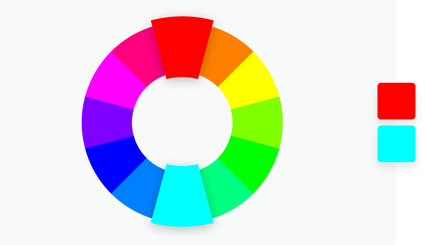
Complementary
Two colors that are on opposite sides of the color wheel. This combination provides a high contrast and high impact color combination – together, these colors will appear brighter and more prominent.
Monochromatic
Three shades, tones and tints of one base color. Provides a subtle and conservative color combination. This is a versatile color combination that is easy to apply to design projects for a harmonious look.

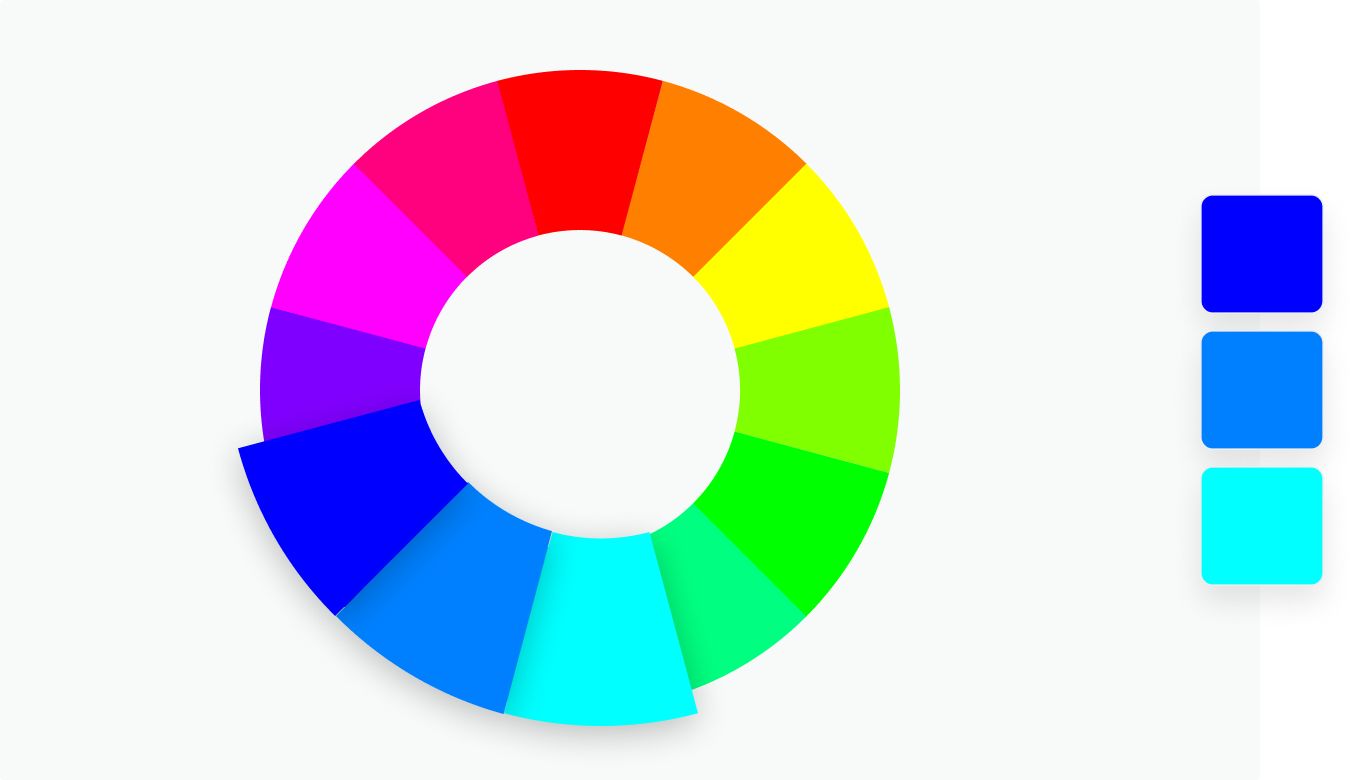
Analogous
Three colors that are side by side on the color wheel. This color combination is versatile, but can be overwhelming. To balance an analogous color scheme, choose one dominant color, and use the others as accents.
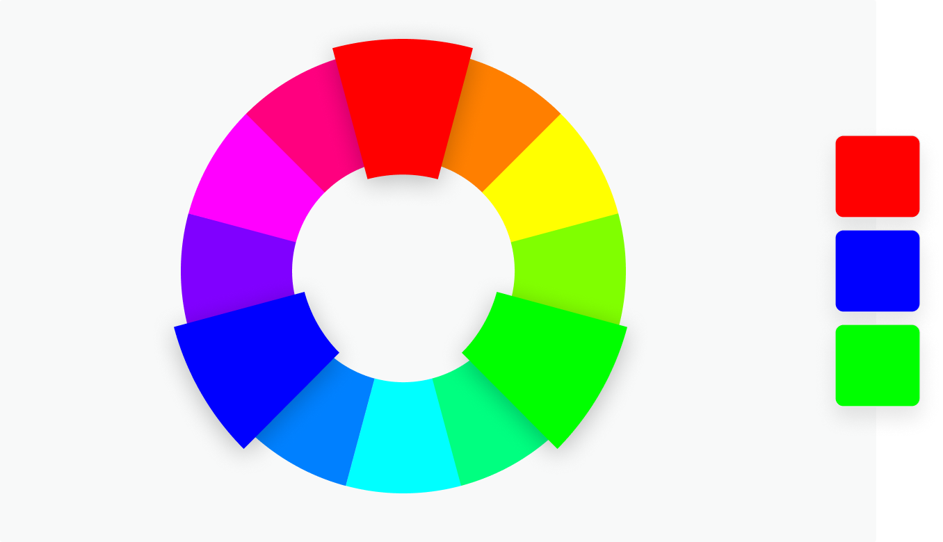
Triadic
Three colors that are evenly spaced on the color wheel. This provides a high contrast color scheme, but less so than the complementary color combination — making it more versatile. This combination creates bold, vibrant color palettes.
Tetradic
Four colors that are evenly spaced on the color wheel. Tetradic color schemes are bold and work best if you let one color be dominant, and use the others as accents. The more colors you have in your palette, the more difficult it is to balance,

Primary, secondary and tertiary colors
There are 12 main colors on the color wheel. In the RGB color wheel, these hues are red, orange, yellow, chartreuse green, green, spring green, cyan, azure, blue, violet, magenta and rose.
The color wheel can be divided into primary, secondary and tertiary colors.
Primary colors in the RGB color wheel are the colors that, added together, create pure white light. These colors are red, green and blue.
In the RYB color wheel, primary colors are colors that can’t be mixed from other colors. There are three primary colors: red, yellow, and blue.
Secondary colors are colors that result from mixing two primary colors. There are three secondary colors. In the RGB color wheel, these are cyan, magenta and yellow. When you mix light, red and green make yellow, green and blue make cyan, and blue and red make magenta.
In the RYB color wheel, the secondary colors are purple (red mixed with blue), orange (red mixed with yellow), and green (yellow mixed with blue).
Tertiary colors are colors made by combining a secondary color with a primary color. There are six tertiary colors. In the RGB color wheel these are orange, chartreuse green, spring green, azure, violet and rose.
In the RYB color wheel, the tertiary colors are red-orange, yellow-orange, yellow-green, blue-green, blue-violet, and red-violet.

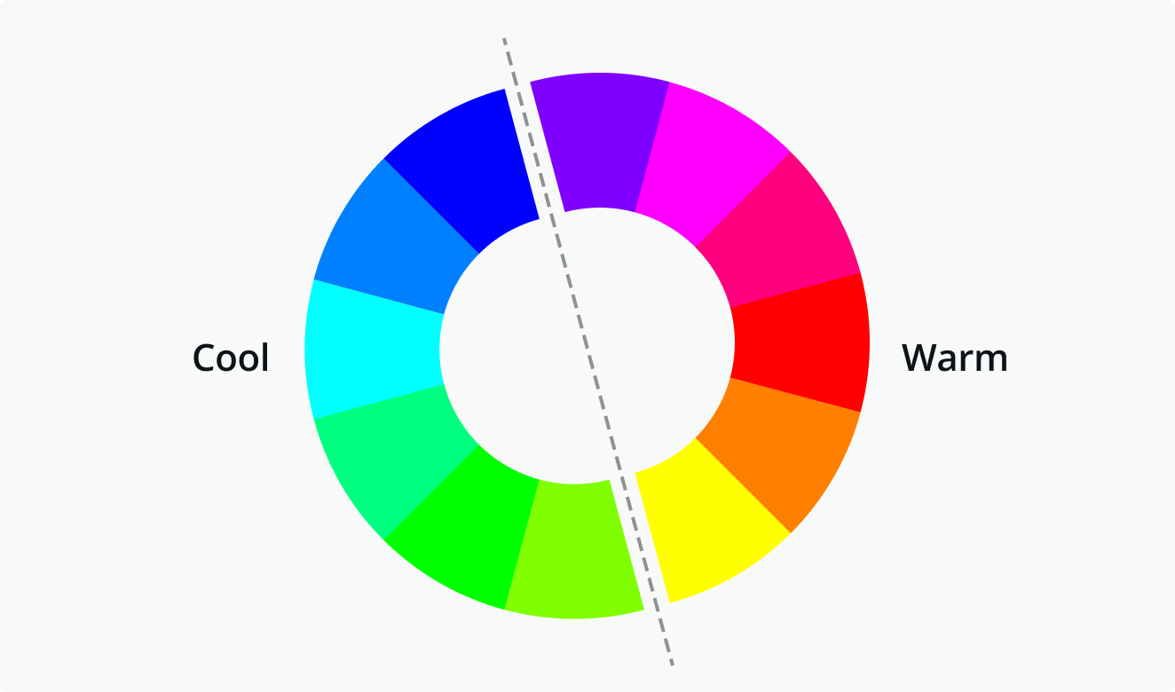
Warm and cool colors
The color wheel can also be divided into warm and cool colors. The warmth or coolness of a color is also known as its color temperature. The color combinations found on a color wheel often have a balance of warm and cool colors. According to color psychology, different color temperatures evoke different feelings. For example, warm colors are said to bring to mind coziness and energy, while cool colors are associated with serenity and isolation.
Warm colors are the colors from red through to yellow. These colors are said to bring to mind warmth, like the sun.
Cool colors are the colors from blue to green and purple. These colors are said to bring to mind coolness, like water.
Shades, tints and tones
You can create shades, tints and tones of a color by adding black, grey and white to a base hue.
Shade
A shade is created by adding black to a base hue, darkening the color. This creates a deeper, richer color. Shades can be quite dramatic and can be overpowering.
Tint
A tint is created by adding white to a base hue, lightening the color. This can make a color less intense, and is useful when balancing more vivid color combinations.
Tones
A tone is created by combining black and white—or grey—with a base hue. Like tints, tones are subtler versions of the original color. Tones are less likely to look pastel, and can reveal complexities not apparent in the base color.

Hue, Saturation and Luminance
A hue is basically any color on the color wheel. When you are using a color wheel or a color picker, you can adjust the saturation and luminance of a hue.
Saturation is the intensity or purity of the color.
Luminance is the amount of brightness or light in a color.

Color meanings and color schemes
This is just an introduction to the fascinating world of color. There’s so much more to learn! For instance, did you know that the color royal blue was created in the 1800s for Queen Charlotte? If you want to discover more about colors, check out our Color Meanings page – it explores the history and meaning of hundreds of colors. Or if you’re looking for more great color combinations, check out our Color Palette Generator or browse thousands of inspirational color schemes.
Color Wheel
– Colour in Storytelling: https://www.youtube.com/watch?v=aXgFc…
– Top 10 uses of color in movies: https://www.youtube.com/watch?v=tILIe…
– Paper de la mariposa psicodélica: https://www.sciencemag.org/news/2016/…


