La Elección del Lienzo: La Base Perfecta para Tu Visión Artística
Seleccionar el lienzo adecuado es una decisión fundamental que puede influir drásticamente en el resultado final de tu pintura. No se trata solo de tamaño, sino de la textura, el tipo de imprimación y la estructura, especialmente cuando consideramos estilos tan diversos como el figurativo, el abstracto, las obras con mucha textura, el hard-edge o el color field. Cada estilo tiene exigencias particulares que el lienzo debe satisfacer.
Pintura Figurativa: Detalles y Sutileza
Para la pintura figurativa, donde la precisión, el detalle y la representación fiel son clave, la elección del lienzo es crucial.
Superficie: Generalmente, se prefieren lienzos con una trama de algodón o lino de grano fino a medio. Una textura demasiado pronunciada puede interferir con los detalles delicados de rostros, anatomías o elementos realistas.
Imprimación: Una imprimación suave y uniforme (gesso) es ideal, ya que permite que el pincel se deslice sin esfuerzo, facilitando las transiciones suaves, el sfumato y la aplicación de capas finas y detalladas.
Tensión: Un lienzo bien tensado es esencial para evitar distorsiones que puedan afectar la precisión del dibujo subyacente.
Pintura Abstracta: Libertad y Expresión
La abstracción ofrece mayor libertad, pero la elección del lienzo sigue siendo importante para apoyar la expresión.
Superficie: Puedes optar por lienzos de grano medio a grueso, que pueden añadir un interés táctil intrínseco a la obra, o incluso superficies más lisas si buscas una fluidez de color sin interrupciones.
Resistencia: Para técnicas con mucha aplicación de pintura, gestos enérgicos o capas gruesas, un lienzo robusto y bien estirado es fundamental para soportar el peso y la manipulación sin ceder.
Tamaño: La abstracción a menudo se beneficia de grandes formatos que permiten al artista trabajar con todo el cuerpo, pero lienzos pequeños pueden invitar a una abstracción íntima y concentrada.
Pintura con Textura (Impasto, Medios Mixtos): Resistencia y Adherencia
Cuando la textura es un elemento principal, el lienzo debe ser un aliado.
Soporte Fuerte: Es vital elegir un lienzo con un bastidor grueso y resistente que pueda soportar el peso de las capas de pintura densa, pastas de modelar o elementos de medios mixtos sin deformarse con el tiempo.
Trama Visible/Robusta: Una trama más abierta o gruesa en el lienzo de lino o algodón puede proporcionar una base excelente para que los materiales se adhieran, creando una interacción textural interesante.
Imprimación Robusta: Una imprimación con buena adherencia es crucial para que las capas pesadas no se agrieten ni se desprendan.
Hard-Edge y Color Field: Suavidad y Superficie Impecable
Estos estilos exigen una superficie casi perfecta para lograr sus efectos característicos.
Hard-Edge:
Superficie: Elige lienzos de grano muy fino o extra-fino, o incluso paneles de madera o MDF. La clave es una superficie lo más lisa posible para permitir líneas nítidas y bordes definidos sin que la textura del lienzo cause irregularidades.
Imprimación: Una imprimación multicapa, lijada entre capas, para obtener una superficie perfectamente lisa y no absorbente que evite que la pintura se “corra” bajo las cintas de enmascarar o difumine los bordes.
Color Field:
Superficie: Similar al hard-edge, una superficie muy lisa o de grano extremadamente fino es preferible para permitir una aplicación de color uniforme y sin interrupciones, donde el color en sí mismo es el protagonista.
Absorción: Dependiendo de la técnica (veladuras, tinción), la absorbencia de la imprimación puede variar, pero la uniformidad de la superficie es lo más importante para evitar marcas de pincel indeseadas o manchas.
En última instancia, el lienzo es el primer punto de contacto entre tu visión y la realidad material de la obra. Elegirlo con intención, considerando el estilo, la técnica y el efecto deseado, es el primer paso para asegurar que tu pintura no solo se vea bien, sino que esté construida sobre una base sólida y adecuada para su propósito artístico.
Categorías populares de artículos de arte en las tiendas
Pinturas: Acrílicos, acuarelas, óleos, pinturas para manualidades y acabados especiales. Lienzos y papel: Desde lienzos en miniatura hasta grandes rollos de lienzo; además de cuadernos de bocetos, acuarelas y blocs para técnicas mixtas. Instrumentos de dibujo: Lápices, carboncillo, pasteles al óleo, rotuladores, bolígrafos pigmentados y estuches de caligrafía. Pinceles y accesorios: Varios tipos de pinceles, paletas, medios acrílicos, barnices, caballetes y bastidores.
El Lenguaje Silencioso del Lienzo: Fundamentos de la Composición Pictórica
La composición es el andamiaje invisible sobre el que se construye toda pintura cautivadora. No se trata solo de dónde colocas los elementos, sino de cómo los organizas para guiar el ojo del espectador, crear armonía, tensión y, en última instancia, comunicar tu visión. Comprender los principios básicos de la composición es como aprender la gramática de un lenguaje visual. Aquí exploramos algunas de las herramientas fundamentales que todo artista debería dominar.
El Equilibrio: Peso Visual y Armonía
El equilibrio es un principio compositivo esencial que distribuye el “peso visual” de los elementos en una obra de arte para crear una sensación de estabilidad y armonía. Este peso visual no se refiere al peso físico, sino a la capacidad de un objeto, color, forma o línea de atraer la atención del ojo. Un buen equilibrio asegura que ninguna parte de la composición domine de manera abrumadora o se sienta demasiado vacía.
Existen dos tipos principales de equilibrio: el equilibrio simétrico y el equilibrio asimétrico. El equilibrio simétrico, como se mencionó con la regla de la simetría, implica una distribución igual de elementos a ambos lados de un eje central, evocando formalidad y quietud. Por otro lado, el equilibrio asimétrico logra la estabilidad a través de la tensión y el contraste, donde elementos de diferente tamaño, forma o color se distribuyen de manera desigual, pero su peso visual compensa, creando una composición más dinámica y a menudo más interesante para el ojo. Dominar el equilibrio permite al artista guiar la mirada del espectador de forma fluida y mantener la coherencia visual de la obra.
La Regla de los Tercios: Simplicidad y Dinamismo
Quizás el concepto compositivo más accesible, la Regla de los Tercios es una poderosa herramienta para crear un interés visual equilibrado sin recurrir a la simetría central estática. Imagina tu lienzo dividido en nueve secciones iguales por dos líneas horizontales y dos verticales equidistantes.
La clave de esta regla es colocar los elementos más importantes de tu pintura –puntos focales, líneas principales, o elementos clave de tu narrativa– a lo largo de estas líneas, y especialmente en sus intersecciones. Esto genera un equilibrio más dinámico y natural que simplemente centrar el sujeto. Un horizonte en el tercio superior o inferior, o un rostro en una de las intersecciones, puede transformar una imagen plana en una escena vibrante que invita al ojo a explorar.
La Simetría: Orden, Equilibrio y Reflexión
La simetría en la composición se refiere a la correspondencia exacta en tamaño, forma y posición de las partes en lados opuestos de una línea divisoria (eje). Puede ser:
Simetría Axial (o Bilateral): Cuando la imagen se refleja perfectamente a lo largo de un eje central, como un rostro humano o una arquitectura clásica. Transmite una sensación de orden, formalidad, estabilidad y equilibrio. Puede evocar calma o solemnidad.
Simetría Radial: Cuando los elementos se organizan alrededor de un punto central, como los radios de una rueda o los pétalos de una flor. Implica movimiento circular o un enfoque centrípeto.
Aunque la simetría perfecta puede a veces resultar estática o predecible, su uso consciente puede ser increíblemente efectivo para crear un impacto visual fuerte y una sensación de armonía inquebrantable. A menudo, se utiliza una casi simetría o una simetría rota para añadir interés sin perder el sentido de equilibrio.
La Composición Triangular: Estabilidad y Tensión Dinámica
La composición triangular es una técnica que utiliza formas triangulares (implícitas o explícitas) dentro de la estructura de la pintura para crear estabilidad, jerarquía y a veces tensión. Al disponer los elementos clave de una escena de manera que formen un triángulo (o varios), se logra:
Estabilidad y Solidez: Una base ancha y un vértice superior (como una pirámide) confieren una sensación de permanencia y arraigo. Los maestros del Renacimiento, como Leonardo da Vinci, la usaban frecuentemente para dar monumentalidad a sus figuras.
Dinamismo y Dirección: Un triángulo invertido o inclinado puede introducir tensión o movimiento. La dirección de las líneas del triángulo puede guiar la mirada del espectador a través de la obra.
Puntos Focales: Los vértices del triángulo a menudo actúan como puntos naturales de interés o dirigen la atención hacia ellos.
La forma triangular, subyacente o visible, es una de las estructuras compositivas más poderosas por su capacidad inherente de sugerir tanto quietud como energía.
La Proporción Áurea: La Belleza Matemática de la Naturaleza
La Proporción Áurea (también conocida como la proporción divina, sección áurea o número phi, aproximadamente 1.618) es un principio matemático que ha fascinado a artistas y pensadores desde la antigüedad. Se encuentra en la naturaleza (espirales de conchas, patrones de hojas) y ha sido empleada en el arte y la arquitectura para crear composiciones que se perciben como inherentemente armoniosas y estéticamente agradables.
Para aplicarla:
Rectángulo Áureo: Un rectángulo en el que la proporción del lado largo al corto es la proporción áurea. Al eliminar un cuadrado del extremo, el rectángulo restante es otro rectángulo áureo.
Espiral Áurea: Generada por una serie de rectángulos áureos que se van reduciendo, creando una espiral que se curva hacia un punto focal.
Aunque su aplicación no siempre es consciente o estricta en todas las obras, la Proporción Áurea sugiere una forma orgánica y “perfecta” de organizar el espacio, dirigiendo naturalmente el ojo del espectador hacia un punto de interés y creando una sensación de equilibrio y fluidez que resuena profundamente con nuestra percepción de la belleza.
Dominar la composición es un viaje continuo. Experimenta con estas reglas, rompe algunas cuando el arte lo exija y, sobre todo, deja que guíen tu intención para crear pinturas que no solo sean vistas, sino que se sientan y se entiendan en un nivel más profundo.
RISD is a nonprofit college and museum founded in 1877 in the city of Providence, RI. Today 2,518 students from 57 countries engage in 44 full-time bachelor’s and master’s degree programs, supported by a committed faculty and worldwide network of more than 33,000 alumni.
By cultivating expansive and elastic thinking, RISD equips artists, designers and scholars to generate and challenge the ideas that shape our world.
President Crystal Williams
Leadership
Guided by President Crystal Williams, our leadership furthers the reach and champions the transformational power of creative education.
Crystal Williams believes that education, art and design, and commitments to equity and justice are essential to transforming our society. Williams has more than two decades of higher education experience. She is an institutional catalyst, helping to envision, define and achieve greater outcomes for students, faculty and staff. As a faculty member, she has focused on advancing artistic inquiry and engagement. As a leader, she ensures through her work that institutions are more effective, mission-aligned and diverse, equitable and inclusive.
RISD is a college and museum located in Providence, Rhode Island.
As one of the first independent colleges of art and design in the US—incorporated on March 22, 1877 as both a school and museum—Rhode Island School of Design has always stood out as something of a maverick.
By the time RISD began offering full bachelor’s degree programs in the 1930s, our reputation for vision and leadership in advanced studio-based education had already begun to grow.
Started by a group of women well before any woman had the right to vote in the US, RISD has always embraced art and design’s capacity to stoke curiosity and spur progress.
Mission and Values
The mission of Rhode Island School of Design, through its college and museum, is to educate its students and the public in the creation and appreciation of works of art and design, to discover and transmit knowledge and to make lasting contributions to a global society through critical thinking, scholarship and innovation.
Land Acknowledgement
Rhode Island School of Design is built on what is now called College Hill, part of the ancestral homelands of the Narragansett Indian Tribe. Indigenous people from many tribes and nations—near and far—live, study and work in Providence today. The amplification of Native voices and histories is crucial to rectifying the many violent legacies of colonialism, and we gratefully acknowledge the ongoing critical contributions of Indigenous people across our state, region and nation.
Our values
We value the material practices of artists and designers as principal modes of engagement with the wider world.
We value the necessary and crucial contribution of deep disciplinary understanding to effective interdisciplinary practice.
We value collaborative interplay across design, fine arts and the liberal arts to cultivate deep literacies, to shape cumulative understanding, to transform thought and to expand making practices.
We value experimental, contextual and culturally diverse methods of creative practice and rigorous scholarship as essential ways of creating knowledge and engaging with complexity and uncertainty.
We value enlightened engagement with emerging and evolving technologies, along with critical reflection on the interests those technologies serve and the impact they have on diverse peoples, communities and the planet.
We value a classroom, studio and campus environment that advances principles of social equity and inclusion, environmental and climate justice, and equal access to resources and opportunities.
We value the development of lifelong skills that integrate the physical, emotional and mental well-being of our entire community.
We value the careful stewardship of our human, financial and physical resources.
We value our role as a place-based institution with a commitment to furthering progress in Providence and Rhode Island through mutually beneficial engagement with the community.
Social Equity and Inclusion
At RISD, our commitment to social equity and inclusion is embedded in our mission, structure, policies and strategic plan. In identifying institutional strengths and challenges, we help enhance a sense of belonging on campus—for all community members. Learn more below about our SEI vision and how we live it in practice.
Since launching our first Social Equity and Inclusion (SEI) Action Plan in 2017, RISD has built upon a series of core values inspired by student activity and input across our community. Among others, these include:
embedding social equity and inclusion in all institutional structures and processes.
fostering a campus culture that welcomes difference, promotes student agency and enables collective community building.
increasing diversity among students, faculty and staff.
making RISD more accessible across a diverse range of social groups.
ensuring equal access for all students to the supports they need for academic success.
Ensuring RISD’s commitment to social equity and inclusion, in principle and practice, is a cross-collaborative, community-wide effort. We realize this commitment through contributions by institutional leadership, faculty across all disciplines, and a network administrative offices that put key initiatives into action, as well as uphold our values in how we engage our community and the world. And critical to our collective work toward a truly equitable, inclusive RISD is the input, activity and creative contributions of our students and alumni, and their work toward a more just institution and world.
Founding RISD: women lead the way
A radical experiment
RISD was founded and nurtured by a small group of women well before any woman in America gained the right to vote. That year Helen Adelia Rowe Metcalf urged 34 members of the Rhode Island Women’s Centennial Commission to invest their group’s surplus funding of $1,675—which they had raised for RI’s contribution to the Philadelphia Centennial Exhibition in 1876—in founding a school of art and design (instead of building a public fountain, one of the other options on the table).
The idea behind the college was driven by the desire to support the state’s thriving textiles and jewelry industries in particular, with the first courses of study offered at RISD addressing two main areas: Freehand Drawing and Painting and Mechanical Drawing and Design.
Under Metcalf’s able leadership, the women who founded RISD embarked on a radical experiment that set a precedent for its ongoing commitment to challenging expectations.
Forwarding the family legacy
In pouring her time, energy, vision and funds into running the institution and ensuring its survival, Metcalf was joined by her daughter Eliza Radeke (pictured), who from 1913–31 was the first woman to serve as RISD’s president.
An avid and eclectic collector, Radeke worked closely with artists, dealers and museum directors to develop the RISD Museum’s extensive collection and funded the construction of the gallery that connects Pendleton House to the 1926 museum building named in her honor.
Radeke was then succeeded by her niece Helen Metcalf Danforth, who was president from 1931–47 before serving RISD’s first Board of Trustees chair from 1947–65. It was during her tenure that RISD earned the right to grant college degrees (as opposed to certificates) in 1932 and became a fully accredited college in 1949.
“Still We Rise”: Addonis Parker’s Powerful Solo Exhibition Opens at The ARC in Celebration of Juneteenth
OPA-LOCKA, FL The Ten North Group is proud to announce the opening reception of “Still We Rise: The Art of Addonis Parker,” a compelling solo exhibition by Miami-based artist Addonis Parker. This powerful show, celebrating themes of art, identity, and resilience, will launch tonight, Friday, June 13, 2025, from 6:00 PM to 10:00 PM EDT at The ARC (Arts & Recreation Center), located at 675 Ali Baba Avenue, Opa-locka, FL 33054.
Presented by Ten North Group, this vibrant exhibition arrives just ahead of Juneteenth, a fitting tribute to the spirit of freedom and perseverance. Through his signature powerful visuals and dynamic storytelling, Addonis Parker invites viewers on an evocative journey through themes deeply rooted in the African American experience. His work — ranging from iconic large-scale murals that command attention in public spaces to intricate and deeply personal canvas paintings — is directly inspired by Maya Angelou’s unforgettable poem, “Still I Rise.”
Parker’s art serves as both a reflection and a celebration of identity, resistance, heritage, and resilience. Visitors to “Still We Rise” will have the opportunity to experience firsthand the emotional depth and masterful technique that define his unique artistic voice.
This opening reception promises to be an inspiring evening, fostering community engagement and providing a platform for vital cultural dialogue.
Event Details:What: Still We Rise: The Art of Addonis Parker – Opening Reception When: Friday, June 13, 2025, from 6:00 PM – 10:00 PM EDT Where: The ARC (Arts & Recreation Center), 675 Ali Baba Avenue, Opa-locka, FL 33054 Admission: Free and open to the public.
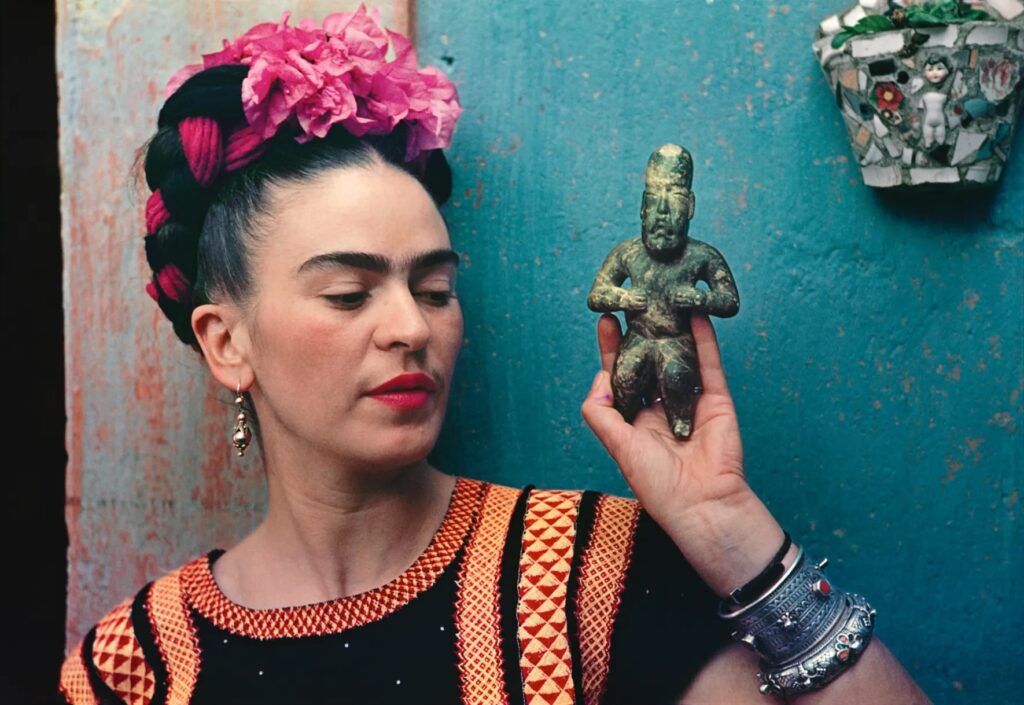
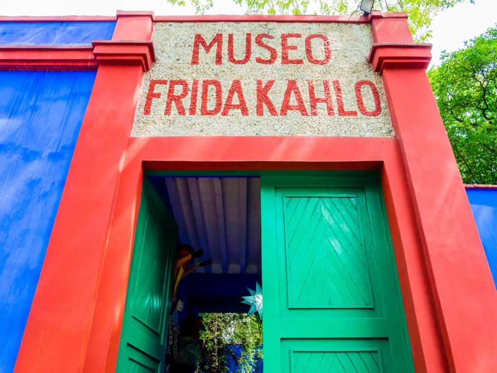
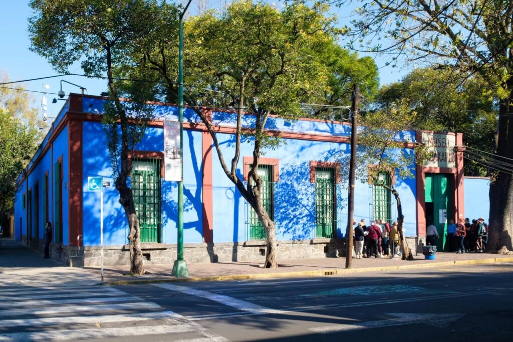
A Shadow Falls Over Casa Azul: The Scandal of Missing Frida Kahlo Masterpieces
A bombshell revelation has shaken the art world, with allegations surfacing that a significant number of works by iconic Mexican artist Frida Kahlo have vanished from the very institutions tasked with preserving her legacy. Hilda Trujillo Soto, who served as director of the Diego Rivera Anahuacalli and Frida Kahlo museums in Mexico City for nearly two decades, has publicly claimed that at least two oil paintings, eight drawings, and several pages from Kahlo’s intimate diary are missing from the Casa Azul collection.
Masterpieces Misplaced- Uncovering the Scandal Behind Frida Kahlo’s Lost Art
The allegations, detailed by Trujillo Soto in an extensive blog post, paint a disturbing picture of potential mismanagement and negligence. She claims that evidence of these disappearances, brought to the attention of museum trustees as early as 2009 and again in 2013, was seemingly ignored. Some of these allegedly missing works, she suggests, have even appeared in U.S. galleries and auction houses, despite strict Mexican laws prohibiting the permanent export of works by Kahlo and Diego Rivera without specific permits.
Among the most poignant losses are pages from Kahlo’s diary, a deeply personal chronicle of her later life, her declining health, and her profound relationship with Diego Rivera. Six specific folios from March 1953 were reportedly found missing when Trujillo Soto compared the original diary to its 1994 facsimile. The diary’s spontaneous drawings and cathartic writings are not just artistic artifacts; they are a crucial part of Mexico’s cultural heritage. Further concerns have been raised about other potentially missing pages, including one drawing allegedly valued at $10 million, which was controversially claimed to have been burned at a party as part of a failed NFT project in 2022.
Lost & Priceless- The Frida Kahlo Works That Disappeared Without a Trace
The institutions overseeing the museums, including the Bank of Mexico trust, have responded by stating that Trujillo Soto never filed formal complaints during her tenure, and have even suggested her contract was terminated due to administrative irregularities. However, these claims have gained significant traction among art experts, with German art historian Helga Prignitz-Poda, a leading Kahlo specialist, confirming long-standing knowledge of missing works. Linda Downs, former executive director of the College Art Association, also corroborated awareness of missing notebooks and sketches from the Casa Azul archive as far back as 2014.
Stolen Beauty? The Enigma of Frida Kahlo’s Missing Artworks
This scandal emerges at a particularly sensitive time, as the museum finalizes loan agreements for major upcoming Kahlo exhibitions at the Museum of Fine Arts, Houston, and London’s Tate Modern. The allegations cast a long shadow over the provenance and security of invaluable cultural treasures.
Missing Fridas- The Untold Story of Lost Masterpieces and Museum Missteps
The alleged disappearance of these works raises critical questions about accountability, the protection of national artistic heritage, and the ethics of the international art market. As investigations continue and the art world grapples with these revelations, the hope remains that clarity will emerge, and any missing pieces of Frida Kahlo’s extraordinary legacy can be rightfully returned to their intended home.
Where Are Frida’s Masterpieces? Inside the Disappearance of Priceless Art
Exploring Innovation and Inclusion at the Museum of Contemporary Art North Miami (MOCA) By AMM
Tucked in the heart of North Miami, the Museum of Contemporary Art (MOCA) stands as a beacon of creativity, dialogue, and cultural exchange. Located at 770 NE 125th Street, MOCA North Miami has become a vital platform for both emerging and established contemporary artists, reflecting the rich diversity and dynamic spirit of South Florida and beyond.
Under the visionary leadership of Executive Director Chana Sheldon, MOCA continues to build on its reputation as a forward-thinking institution committed to accessibility, community engagement, and thought-provoking exhibitions. With a focus on inclusivity and experimentation, the museum has played a pivotal role in the careers of numerous contemporary artists while serving as a creative and educational hub for the local community.
A Legacy of Artistic Excellence
Originally established in 1981 and formally incorporated as a museum in 1996, MOCA North Miami has carved out a unique place in the international art world. Its programming is distinguished by bold curatorial choices that highlight underrepresented voices and challenge conventional narratives in contemporary art. From site-specific installations to multimedia presentations, the museum fosters an environment where artistic boundaries are pushed and critical discourse is encouraged.
Recent and Notable Exhibitions
MOCA’s exhibitions frequently explore the intersection of identity, culture, and social justice, often spotlighting artists from the African diaspora, Latin America, and the Caribbean. Past highlights have included solo presentations from artists such as AfriCOBRA co-founder Wadsworth Jarrell, as well as thematic group shows examining urgent topics ranging from climate change to migration.
A Hub for Education and Community
True to its mission of accessibility, MOCA offers a robust education department that serves thousands of students and families annually. Through art classes, workshops, summer camps, and public programming, the museum empowers young artists and fosters lifelong learning. Its popular Jazz at MOCA concert series, held monthly and free to the public, further underscores the museum’s commitment to making the arts an integral part of everyday life in North Miami.
Looking Forward
With free admission for North Miami residents and a growing international profile, MOCA is not only a destination for contemporary art lovers but also a key player in shaping the cultural landscape of South Florida. As it continues to expand its reach and impact under Chana Sheldon’s direction, the museum remains rooted in its mission: to make contemporary art accessible, relevant, and transformative for all.
Visit MOCA North Miami 📍 770 NE 125th St, North Miami, FL 33161 📞 (305) 893-6211 🌐 https://mocanomi.org
Open to the public with a range of exhibitions, events, and educational opportunities—MOCA North Miami invites you to explore the continuum of contemporary creativity.
Unlocking Miami Art Week: Your Guide to Strategic Engagement 2025
Miami Art Week, anchored by Art Basel Miami Beach, transforms our city into a global art epicenter each December. For artists, it’s an unparalleled opportunity – a bustling nexus of creativity, commerce, and connection. As an artist coach, I often get asked for advice on navigating this intense period. While the sheer scale can be daunting, understanding its dynamics is key to making it work for you.
First, let’s clarify the landscape. Art Basel Miami Beach is the pinnacle, showcasing museum-quality and cutting-edge works from established galleries. While inspiring, it might not be the direct pathway for emerging artists seeking representation. However, its orbit includes at least twenty “satellite” fairs, each with its unique focus and personality. These are often where you’ll discover galleries more actively seeking new talent. Beyond the fairs, dozens of special events, parties, tours, and public art happenings permeate the entire city. Miami Art Week, held in December, remains the most significant annual art fair event in the United States.
Second, and crucially, understand that these fairs are primarily about commerce. Galleries invest significant resources to be there, with their main objective being to sell art and connect with collectors. While gallerists observe the broader scene, they’re not actively scouting for new artists in their booths; they’re there to champion and sell the artists they already represent.
However, this doesn’t diminish the immense value for every artist in visiting the fairs. It’s an invaluable chance to research hundreds of gallery programs in one concentrated location, observe trends, and – most importantly – network and connect with other artists and arts professionals in a less formal setting.
Elevating Your Presence: The Power of Miami Art Week and Art Miami Magazine 2025
This is where strategic promotion becomes vital. Beyond simply attending, consider how platforms like Miami Art Week and Art Miami Magazine can elevate your visibility:
Pre-Fair Exposure: Getting featured in Art Miami Magazinebefore or during the week can be a game-changer. Collectors, curators, and gallerists often consult these publications to identify artists and trends of interest. A well-placed feature can direct attention to your work, creating a buzz that extends beyond a fleeting booth visit.
Targeted Reach: Both Miami Art Week (as a collective marketing entity for the entire event) and Art Miami Magazine speak directly to the audience you want to reach – serious collectors, curators, and industry insiders. Promoting your artwork through these channels ensures your work is seen by the right eyes, even if you don’t have a booth at one of the leading fairs.
Building Your Narrative: A feature that allows you to articulate your artistic vision, process, and themes compellingly, supplementing the visual experience of your work. It provides context that can deepen a viewer’s connection to the content.
By strategically leveraging the reach of Miami Art Week’s overall promotion and seeking features in publications like Art Miami Magazine, artists can transform a visit into a powerful platform for exposure, dialogue, and career advancement. It’s about being seen and understood within the dynamic tapestry of one of the world’s most important art events.
Conquering Art Basel During Miami Art Week: Essential Tips for Artists and Enthusiasts
Art Basel Miami, and the constellation of satellite fairs that orbit it, transforms Miami into the epicenter of the art world each December. It’s an exhilarating, often overwhelming, experience. To help you navigate this intense week and make the most of it, here are ten refined tips:
1. Pronunciation Matters: It’s “Bah-zel,” Not “Bay-sil”
Let’s get this straight from the start: it’s Basel like the city in Switzerland, not the herb. The Miami fair is an offshoot of the original Basel event, so referring to it as Art Basel Miami or Art Basel Miami Beach is always a good idea. Knowing the correct pronunciation will save you from an awkward correction by an “experienced” visitor!
2. Plan Your Attack: Time is Your Most Precious Commodity
You simply can’t see everything. Success at the fairs hinges on meticulous planning. Research which galleries are exhibiting, note the days and hours for each fair, and map out your daily itinerary. Prioritize the fairs most important to you for the early part of your trip. Group fairs that are geographically clustered to minimize travel time, and remember to factor in transit. Evenings are for networking; seize every opportunity to meet and connect with other artists and art professionals.
3. Ground Your Expectations: It’s a Marathon, Not a Sprint
Manage your expectations from the outset. It’s highly probable you’ll return home with nothing tangible to show for your efforts beyond a hefty credit card bill. Don’t anticipate immediate, life-altering breakthroughs. Your career is a marathon. Every person you meet and every experience you have contributes to the bigger picture. Focus on soaking in the art, learning, and making genuine connections, rather than fixating on instant results.
4. Brace for Impact: Emotional Reactions Are Normal
Your first Miami Art Week can be a whirlwind of emotions. It might be exhilarating, or it might trigger feelings of depression (“Is my art good enough?”), frustration (“I missed that party!”), or even anger (“Is this commercialism really the art world?”). These reactions are entirely normal. Acknowledge them, let them pass, and refocus on the art.
5. Booth Etiquette: Never Solicit Gallerists Directly
This is crucial: Do not approach a gallerist or gallery staff in their booth to pitch your work. Avoid handing out cards or announcing you’re an artist unless they specifically ask. Their primary focus is sales and engaging with potential buyers. If a natural conversation arises and they’re not busy, that’s different. But as a general rule, direct solicitation in the booth is a major faux pas.
6. Document Everything: Your Memory Will Fail You
You’ll see thousands of artworks and countless galleries. Take notes! Carry a small notepad and pen, or use your phone, to jot down the names of galleries and artists that pique your interest. This will be invaluable for follow-up research once you’re back home.
7. Embrace Serendipity: Go Where You’re Invited
Much of the magic happens outside the official venues. Say “yes” to invitations for drinks, parties, or even breakfast. These more relaxed environments are where you’ll genuinely connect with fellow artists, collectors, and gallerists who are less stressed and more open to conversation. Be friendly, be open, and follow where the week takes you.
8. Stay Alert: Beware of Creeps and Fakers
As the fairs grow, so does the presence of unscrupulous individuals. Be aware, be safe, and trust your judgment. Avoid being alone with strangers, and be wary of anyone promising opportunities that seem too good to be true. Legitimate offers will still be there for you to follow up on after the fairs conclude.
9. The Follow-Up: Your Post-Fair Homework
Once you’re home, the real work begins. Research every gallery that interested you; most have submission guidelines (or policies against them) clearly stated on their websites. Explore artists you admire to see where they exhibit, and check those galleries’ submission policies too. Connect on social media with anyone you genuinely connected with. If someone mentioned an opportunity, follow up professionally.
10. Be a Gracious Guest: Respect Miami
Remember that Miami is home to many. While the fairs bring revenue, respect the local community and environment. Be a considerate guest throughout your stay. A positive impression ensures a welcome return for an even more productive experience next year!
Voces locales en la Trienal de Tijuana: 2 Internacional Pictórica; un acercamiento
Por Roberto Rosique
Tijuana se revela nuevamente como meca de posibilidades expresivas donde la pluralidad se manifiesta sin restricción alguna. Los artistas que fueron seleccionados para la muestra de la “Trienal de Tijuana: 2 Internacional Pictórica”, bajo el certero comando curatorial de la brasileña Leonor Amarante, muestran una nueva faceta de la escena local, ante aquella que había comenzado a desdibujarse después de la primera década del siglo en tránsito, compuesta por una generación de artistas entusiastas que replicaban las tendencias del mainstream a lado del modelo expositivo inSITE centrado en la instalación y el arte insitu, dejando a un lado la producción plástica que había dominado el panorama desde los tiempos remotos en que esta producción nacía principalmente para satisfacer el gusto de turistas, quienes la adquirían como souvenir y adorno para sus residencias, en su mayoría sin mayor pretensión.
Ese pujante grupo que inspiró a Néstor García Canclini a imaginar esta región como un laboratorio de la posmodernidad —equiparable en su momento a Nueva York, aun entonces dictador de normas— había logrado sobrevivir a las dificultades de un mercado hegemónico que no dejaba de folclorizar todo lo producido por el “otro”. Algunos de estos artistas lograron avanzar con éxito, aunque se distanciaron de los espacios expositivos locales para definir sus propios caminos; mientras tanto, otros comenzaron a diluirse en el olvido. Hoy parece más evidente que surge una nueva y febril camada de aspirantes a ocupar un lugar en los márgenes de la hegemonía artística, dominada ya no solo por Nueva York, Londres y Alemania, sino por otros epicentros de los grandes circuitos del arte.
Algunos de estos artistas se dan cita en la “Trienal de Tijuana: 2 Internacional Pictórica”, un certamen de la Secretaría de Cultura que, a través del Centro Cultural Tijuana (CECUT), invita a la comunidad creativa nacional e internacional a participar con obras o proyectos que exploren, desde lo pictórico, nuevas poéticas, problemáticas y derivas. Una convocatoria que busca provocar en los participantes un acercamiento al campo ampliado de la creación, libre de las limitaciones del formato, e incentivar la inter y transdisciplina como medios para facilitar una total libertad creativa y la construcción de paradigmas estéticos diversos.
En su segunda edición, la Trienal de Tijuana, contó con la curaduría de la brasileña Leonor Amarante, se ha dicho, quien, con una experiencia sobrada de reconocimientos, llevó a cabo este proyecto, culminando en una magna exposición inaugurada en El Cubo, del CECUT en septiembre de 2024. La Trienal, declara la curadora:
Es un ejercicio lúdico y desafiante, una experiencia intensa potenciada por el mensaje contenido en las obras elegidas. Muchas de las cuestiones ideológicas del espacio pictórico fueron investigadas por los autores de las 101 propuestas seleccionadas, de entre las 537 que provinieron de 15 países. El conjunto demuestra el interés de los artistas por temas actuales como inteligencia artificial, territorio, inmigración, violencia, ancestralidad, ecología. Se examinaron cuestiones ideológicas del espacio pictórico, creando una antropología visual de la contemporaneidad. (Amarante, 2023)
Un evento que apuesta por promover la reflexión y la producción de expresiones contemporáneas, uniendo a generaciones pasadas y emergentes, que aspira a convertirse en un referente para los acontecimientos culturales que promueven la libertad creativa.
De esta amplia selección curada por Leonor Amarante, y tras la decisión del curador invitado Humberto Chávez Mayol, junto con el voto de los artistas seleccionados y el voto popular, la obra Pese a todo, la alegría del encuentro de Samara Colina fue galardonada con el premio único. Por su parte, las piezas Después de 10 años, entre el mar y mi afecto nos volvimos a encontrar (2023) de María Orozco y Woolander de Enrique Rubio recibieron menciones honoríficas; artistas, originarios de Guanajuato, Gto., Zacatecas, Zac., y Pachuca, Hgo., respectivamente.
De esa elección forman parte también 10 artistas radicados en Tijuana cuya obra da cuenta de la diversidad temática mencionada por Amarante. Acerquémonos más a sus obras y descubramos esos matices que las caracterizan.
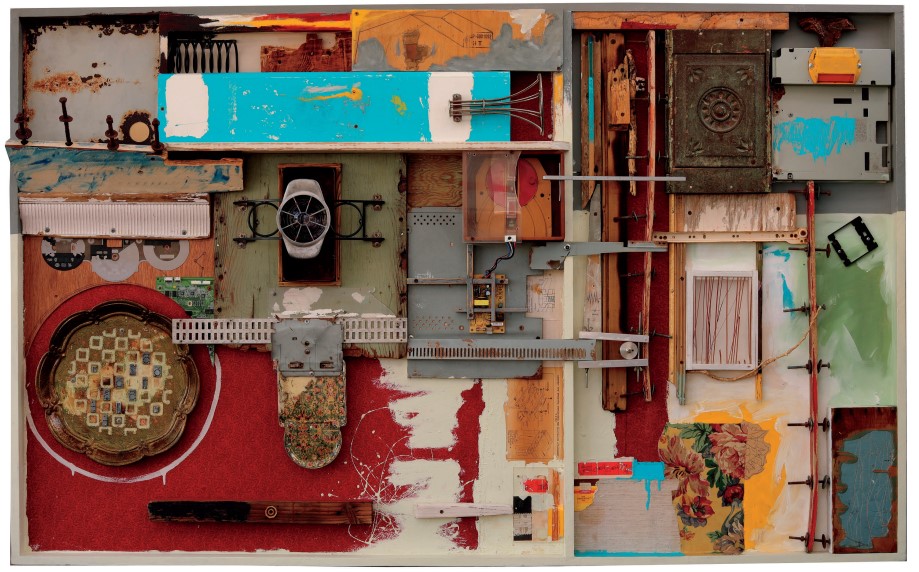
Alejandro Zacarías / Artefacto, 2023,
Técnica mixta,195.58 x 121.92 cm / ensamble.
El arte de hoy revela una creciente insatisfacción con el uso de un solo elemento para comunicar una idea o emoción; parece exigirse rutas más complicadas donde se hacen comunes las combinaciones técnicas y disciplinas. Esta tendencia responde, en gran medida, a la complejidad social actual: una realidad llena de conflictos, desigualdades y tensiones que empuja al arte a expresarse desde la pluralidad. En este contexto, el encabalgamiento de objetos, la interdisciplinariedad y la multiplicidad se han convertido en recursos fundamentales para las exploraciones artísticas.
Frente a una sociedad en constante cambio, caracterizada por la agitación política y la erosión de hegemonías tradicionales, estas estrategias permiten al arte capturar y reflejar de manera más fiel las complejidades del presente. Así, la pluralidad en el lenguaje artístico se presenta como una vía eficaz para representar y cuestionar la naturaleza expansiva y dinámica de la sociedad actual.
Alejandro Zacarías (Guadalajara, Jalisco, 1970), es un artista que trabaja con ensamblajes compuestos por restos de construcciones urbanas, utensilios domésticos en desuso y desechos industriales. Con estos elementos, crea un universo caótico y complejo que, pese a su aparente desorden, está organizado por una intransigente lógica interna. Al disponerlos en ubicaciones aparentemente aleatorias, logra una atmósfera que refleja el espíritu de Tijuana, ciudad en la que reside: un espacio urbano caótico y anárquico, habitado por una comunidad multiétnica y plurilingüe de locales y migrantes atraídos por el sueño americano. Muchos de estos migrantes, sin alternativas, perciben la ciudad como un lugar de paso, lo que genera una relación distante y una tendencia a contribuir también al desorden urbano, que, en concordancia con una ciudadanía impasible ante el desgobierno citadino, la ciudad se alza inconmovible y críptica.
Gestos, que, en cierto modo, alimentan la imagen de una ciudad que, sin ocultar su abandono, sobrevive entre la indiferencia de sus habitantes y la inacción de las autoridades, ajenas al caos creciente. De entre esos despojos metropolitanos, Zacarías reúsa lo que a su mirada desprejuiciada sirve para corporificar sus ideas.
La obra Artefacto (2023), con la que Alejandro participa en la exposición de la Trienal de Tijuana, está construida bajo estas premisas y reúne elementos que dialogan en una analogía con el caos. Es precisamente este caos el que da sentido a la obra y le infunde vitalidad. Por un lado, se destaca el dinamismo de la pieza y su capacidad de sobrevivir en cualquier contexto; por otro, la obra actúa como un reflejo —casi mimético— del entorno caótico que representa. Sobre su obra, el autor comenta, palabras más, palabras menos:
Un artefacto es un objeto ambiguo que se origina del término latino artefactum, combinando arte y factum, es decir, “hecho con arte.” Su versatilidad permite que funcione en distintas áreas: como herramienta artesanal, industrial o incluso explosiva, y puede surgir de la casualidad o el azar. Este concepto explora la constante búsqueda de sentido en lo absurdo de nuestra realidad. En la obra Artefactos de Nicanor Parra [2002], el poeta recoge frases y objetos comunes, desvinculándolos de su contexto original para crear nuevos significados, redefiniendo así el papel del poeta como un recolector y transformador de lenguaje. (Zacarías, 2023, s/p.)
La obra, en ese sentido, es posible verla también como una representación del proceso de supervivencia y adaptación que se da en contextos urbanos intensamente complejos como Tijuana. Aquí, el ensamblaje de desechos urbanos, domésticos e industriales se revela como una metáfora de cómo la ciudad y sus habitantes construyen su identidad a partir de fragmentos y de lo que otros consideran desechable. Esta acumulación de “residuos” se convierte en un lenguaje visual que reivindica lo que ha sido dejado de lado, dándole una segunda vida en un entorno artístico.
Además, el acto de reunir estos objetos en un “universo caótico” resuena con el concepto de “lo abyecto” —aquello que está al margen de lo aceptable o lo bello en una sociedad— y cómo en ese margen pueden encontrarse significados profundos. Este enfoque sugiere que la obra es un comentario sobre la invisibilidad y la marginalización, elevando los restos de la vida urbana a un estatus de objeto de reflexión y crítica social.
“Es, en muchos casos —escribe Zacarías— un golpe de suerte que nace del encuentro y la casualidad entre la incertidumbre y la búsqueda constante por darle un sentido a lo absurdo que puede ser nuestra existencia, o a eso que llamamos realidad, sin saber a ciencia cierta a qué nos referimos con ello”. (ibid., 2023, s/p)
Una elegante y sentida justificación de cómo se da el proceso, pero sobre todo expresa una visión profundamente existencial y casi azarosa de la vida y de la búsqueda de significado. Si para él, en muchos casos, la construcción de sentido en la existencia es el resultado de un “golpe de suerte”, un momento fortuito donde la incertidumbre y la búsqueda personal se cruzan. Este encuentro parece espontáneo y efímero, casi como si el sentido no se encontrara al final de un camino deliberado, sino por casualidad en el proceso mismo de vivir.
Por otro lado, su correlación con los Artefactos de Nicanor Parra abre una lectura interesante sobre cómo el artista, al igual que Parra en su recolección y reinterpretación de frases y objetos, transforma el sentido inicial de los elementos y genera un nuevo significado en el contexto del ensamblaje. Esta transformación, que se basa en el encuentro entre azar e intención, sugiere una visión de la realidad como algo ambiguo y fragmentario, donde los “artefactos” se convierten en metáforas de la búsqueda de sentido en un mundo que no siempre revela su lógica.
Este enfoque también abre la interpretación a una reflexión existencial: en un contexto donde cada elemento parece separado de su origen o función original, el espectador es invitado a cuestionar la estructura misma de la realidad y su sentido aparente. Como las piezas de la obra de Alejandro Zacarías, nuestras vidas están formadas por retazos que intentamos ordenar, sin garantías de lograr un sentido final, sino más bien creando algo en el camino.
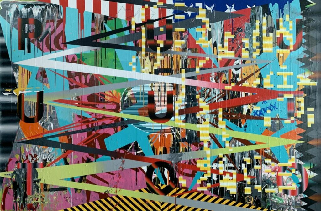
Daniel Ruanova
Heráldica para una Sociedad Política Incipiente, 2021
Pintura de gran formato, flanqueada por una pantalla pequeña en loop infinito de dos archivos (GIF y MP4) derivados del mismo proceso pictórico. 320 x 210 cm + pantalla digital de 25 cm
Frente al embate de lo conceptual, la pintura se alza con protagonismo. Aunque no fue totalmente desplazada durante el auge de la desobjetualización en el último tercio del siglo pasado, permaneció al margen. Sin embargo, el regreso de la imagen (apropiada) tomó fuerza a través del remake de lo plástico, con los movimientos neo insubordinándose a la hegemonía de lo conceptual. Esto representó un triunfo para el mercado, que, seducido por el recurso plástico que siempre le ha dado dividendos, celebró el cambio. Tras un largo período sometido a la abstracción excéntrica, el antiarte, el arte de acción, las intervenciones del Earth art y el dominio conceptual que priorizaba la pureza de la idea sobre cualquier otra expresión, este retorno fue una bocanada de aire fresco para las arcas del mercado y sus ávidos coleccionistas.
Tiempos enjundiosos de acciones animadas tras el telón de la postmodernidad donde pasado y presente se coligaban sin tener que preocuparse más por la razón celosa y coercitiva modernista, todo esto hizo posible más tarde que la pintura desde su campo expandido se acomodara también en este nuevo panorama creativo.
En Tijuana también se vivieron esos tiempos desde los revuelos que inSITE provocara en aquellos turbulentos noventa y el protagonismo de Estandartes (Salón/Bienal de Estandartes) que como insignia flotante reivindicaba lo plástico ante la embestida conceptual de inSITE. Lo plástico ha estado siempre presente en la región, ya sea replicado desde una propuesta modernista o explorado en un marco ampliado por lo conceptual.
Dentro de esta última línea se encuentra una parte de la producción de Daniel Ruanova (Mexicali, B. C., 1976), y es justamente con esta obra Heráldica para una Sociedad Política Incipiente, 2021, seleccionada por Leonor Amarante para formar parte de la Trienal; una pieza que hace gala de lo pictórico, una condición obligada para poder ser elegida, que resuelve acertadamente desde la estética y su conceptualización.
Esta obra plástica incorpora un elemento digital que refuerza, desde su construcción, el contenido de una pieza pensada desde la complejidad visual. Así, Ruanova subraya la pluralidad de una imagen reconocible en medio de una intrincada red geométrica abstracta, como una forma de mostrar los embrollos sociales actuales. Aunque el artista incorpora una narrativa de fondo, la obra no se limita a una interpretación única. Sobre ella, comenta:
Todas mis pinturas empiezan con una idea como base física y conceptual, la primera etapa de un camino con destinos desconocidos. A unos pasos se deja de ver el comienzo y solo se ve el camino, andado y por andar. Trato de retratar la heráldica del hoy mexicano, los símbolos que usamos para darle forma al grito político. Van treinta años desde que el EZLN interrumpió en el sueño popular nacional, y se convirtió en un sinfín de cosas. Esta pintura, esta idea, este documento, empieza con una mutación de aquellos sueños de liberación social convertidos en una pesadilla de atrincherados del narco estado. (Ruanova,2023).
En esta declaración, Daniel destaca su proceso artístico como un viaje incierto que parte de una idea inicial, pero cuya forma y significado evolucionan durante el desarrollo. Al concebir la pintura como un “camino andado y por andar”, Ruanova sugiere que su obra no tiene un destino fijo, sino que responde a la construcción continua de significado y a las mutaciones de los símbolos políticos en México. Al referirse a la “heráldica del hoy mexicano”. apunta a su intención de capturar los símbolos que estructuran el discurso político actual, muchos de los cuales se originan en movimientos sociales como el EZLN.
Sin embargo, nos dice, que el paso del tiempo ha transformado estos ideales en una “pesadilla” atrapada en el contexto del narcoestado, lo cual indica una crítica hacia la distorsión de estos sueños de liberación. La metáfora de “enterrar” la idea sugiere un proceso de ocultamiento o sacrificio de estos ideales originales, absorbidos por la construcción de una nueva imagen que reinterpreta y confronta la complejidad de la realidad actual.
Un trabajo que, además, dispara imaginarios, cuya retorica visual de elementos sobrepuestos contiene un sinfín de narrativas y en donde las partes protagonizan también el hecho, quizá con los mismos valores que el todo, una lectura que obliga a remitirnos a Edgar Morin (2005), [3]quien propone una forma de comprender la realidad que reconoce la interconexión e interdependencia de todos los fenómenos, abordando lo múltiple y lo diverso sin reducirlo a un solo elemento o causa. Este enfoque, al igual que la obra de Ruanova, no busca simplificar, sino conectar elementos dispares, entender las partes en relación con el todo y, a la vez, considerar el todo como un sistema emergente que no puede ser comprendido únicamente desde sus componentes individuales.
Una obra, pues, inserta en la complejidad de lo contemporáneo, buscando señalar los desaciertos gubernamentales, dejando claro su correlación con la intrincada realidad social, y las múltiples posibilidades de lecturas que en esa maraña de elementos ofrece como un discurso pleno de alternativas.
El arte de hoy, en constante avance, siempre dispuesto al cambio, invita al creador a establecer esa dinámica para hacerse visible, una condición que implica asumir riesgos, que puede dar lugar a resultados inesperados de imprecisiones afortunadas, derivaciones poco estructuradas e interpretaciones ambiguas o incluso oportunidades para superar experiencias previas y responder a las demandas de una puesta en escena abierta a la disrupción y la espontaneidad. En este contexto, emergen propuestas innovadoras y audaces que aceptan el desafío de la autonomía, el riesgo y lo impredecible, logrando resultados frescos y enriquecedores.
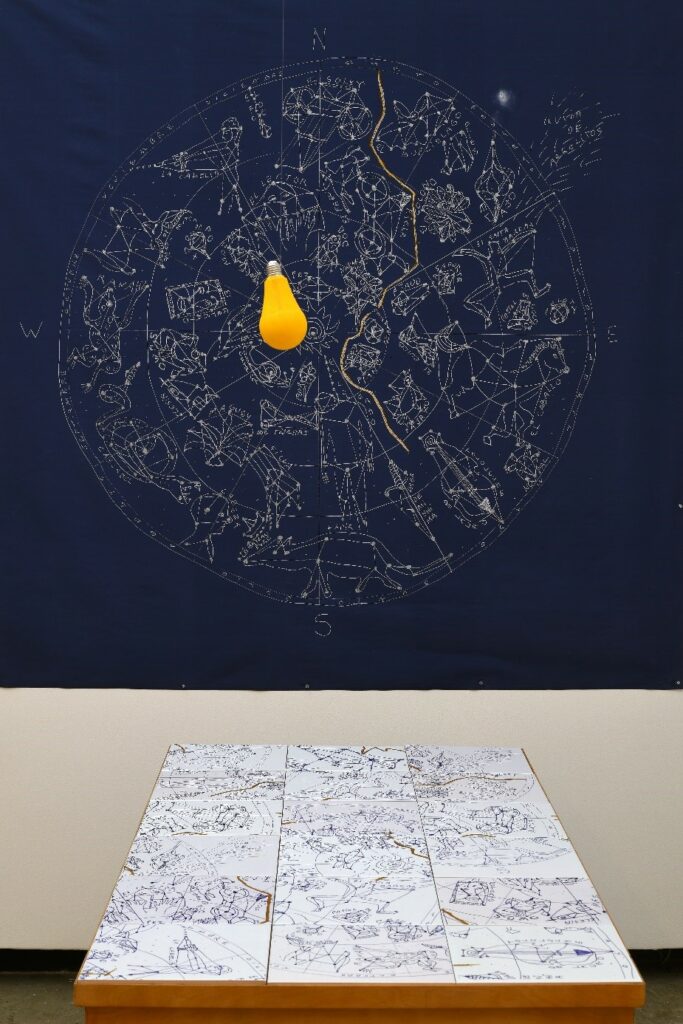
En esta búsqueda de autodefinición constante se encuentra la obra variada de Franco Méndez Calvillo (San Luis Potosí, S.L.P., 1948), un artista visual con una fuerte tendencia neoexpresionista que con cierta recurrencia acude a las bondades de lo contemporáneo y suma experiencias, prácticas e ideas para conformar una obra cuyo peso conceptual las valida. La pieza Universo fracturado (2023), con la que participa en la Trienal, fue conformada en esa atmósfera interdisciplinar con la que narra una historia que nace del seno íntimo del hogar para desplegarse hacia otros horizontes.
Franco, explica un poco las intenciones, la manera técnica en cómo encaró el reto para llegar a una solución, y ahí es posible, además de comprender sus intenciones estético-conceptuales, redimensionar la obra, centrándola en la instalación que también deja opciones a nuevas lecturas. Esto nos dice del origen y el proceso:
“Me propuse resignificar un elemento que me es muy personal: la mesa de la cocina de mi casa, objeto donde como (solo, la mayoría de las veces), lugar donde escribo, me comunico (celular o computadora). organizo mi día, y también leo. Pretendo alterar sus funciones usuales, interviniéndola con materiales ajenos, que no le corresponden naturalmente, replanteando así otras posibilidades de interpretación.
Emplee imágenes digitales sobre cerámica(mosaicos), consistentes en impresiones parciales de un mapa estelar conformado por constelaciones imaginadas y diseñadas por mí, con base en recuerdos de elementos y situaciones de importancia personal, partiendo de la niñez a la actualidad”. (Méndez Calvillo, 2023, s/f)
Esta conceptualización se adentra en el terreno de la resignificación a través de reconfigurar un objeto cotidiano y personal: la mesa de la cocina. Este mueble, que el artista asocia con rutinas íntimas —alimentarse, escribir, organizarse, comunicarse, leer—, se transforma en una suerte de lienzo o soporte para una narrativa personal. Al intervenirla con materiales y elementos que rompen con su función tradicional, el artista abre espacio para una interpretación que va más allá de su utilidad física.
La inclusión de mosaicos cerámicos con imágenes de un mapa estelar de constelaciones imaginadas añade otra capa simbólica. Estas constelaciones representan recuerdos y experiencias significativas desde la niñez hasta el presente, transformando el objeto en un espacio íntimo de memoria. Este proceso invita al espectador a contemplar la mesa como un universo personal donde el tiempo, los recuerdos y la cotidianeidad convergen. Así, el acto de reinterpretar las constelaciones y mapear los recuerdos sobre un objeto funcional evoca el poder del arte para desafiar y expandir las definiciones de espacio y significado en la vida cotidiana.
Franco Méndez Calvillo, en su descanso de la pintura figurativa, altamente narrativa que produce, se desentiende por un momento de ella para expresarse con otras herramientas y disciplinas y así, darse el tiempo para ofrecer un arte de hoy, que del pasado solo se filtran los dibujos estelares y las secuelas de la estética kantiana como acto desinteresado, libre de utilidad o deseo, en el que la belleza es apreciada por sí misma, que no depende de conceptos o intereses prácticos, sino de la armonía entre la imaginación y el entendimiento.
El arte, como aquí demuestra Franco, no se mide por el tiempo, pero sí lo emplea como medio para manifestarse en el presente.
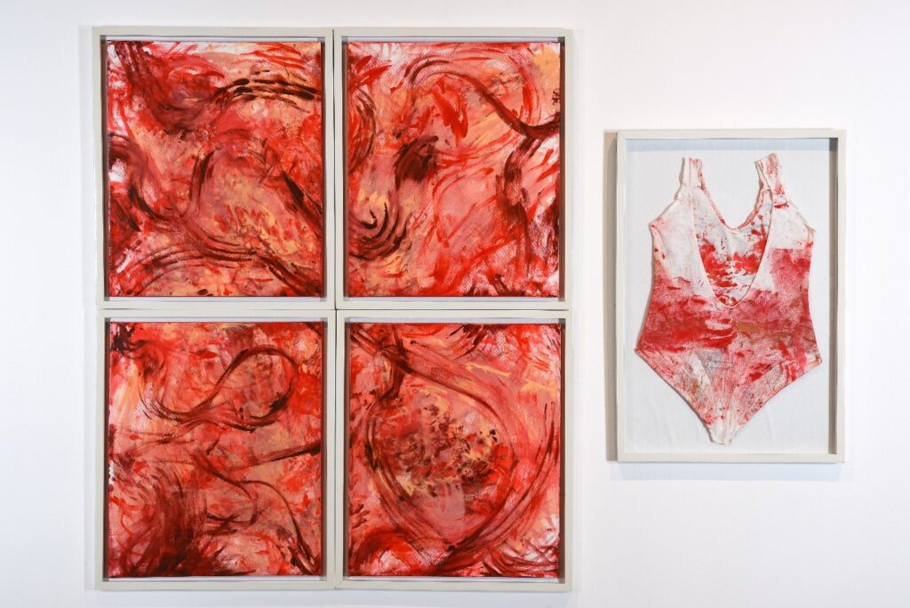
Constanza Fragoso / Miomatosis, segundo acto, 2023
Costura, pintura acrílica y performance, políptico: 4 piezas de 67 x 57 x 2.5 cm y 1 pieza de79 x 54 x 3 cm
Es difícil negar que la propia experiencia sea una de las fuentes de inspiración más potentes para un creador. Cualquier recuerdo o vivencia puede transformarse en el germen de un proyecto artístico, lo cual permite afirmar que gran parte de las obras de arte contiene, en mayor o menor medida, un componente autobiográfico. Sin embargo, algunos artistas centran exclusivamente su producción en lo que extraen de sus experiencias personales, como fue el caso de Frida Kahlo, Louise Bourgeois, Ana Mendieta y Tracy Emin, entre otros. Para estos creadores, el impacto de su obra reside en gran medida en la honestidad con la que comparten su experiencia, lo que les confiere tanto valor como reconocimiento por su postura franca que suele resultar referencial para muchos.
En estos casos, el arte no solo se convierte en una forma de expresión, sino también en una catarsis: un proceso de reconstrucción en el que revelan aspectos íntimos de su personalidad, el paso del tiempo marcado en sus cuerpos, sus traumas y alegrías. Sus obras terminan siendo espejos de dramas personales, tristeza, dolor y calamidades, y el hecho de exponerlo públicamente se convierte en una vía hacia la reconstrucción de sí mismos, así como en una manera de fortalecer su identidad. A través de esta vulnerabilidad, logran conectarse con el espectador en un nivel profundo, permitiendo que el arte funcione como un puente hacia una comprensión compartida de la experiencia humana.
Esta honestidad y transparencia son elementos poderosos que desafían al espectador a reflexionar sobre sus propios traumas y procesos de sanación, lo que dota a estas obras de una capacidad transformadora. De este modo, el arte basado en la experiencia personal no solo refleja la historia de quien lo crea, si no que abre espacios de diálogo en los que se confrontan y resignifican los propios recuerdos, haciendo de la creación un acto profundamente humano y colectivo.
Parto de estas ideas que fueron detonadas por la obra de Constanza Fragoso (Tijuana, B. C., 1992), que denomina: Miomatosis. Segundo acto (2023), en cuyo título engarza ya una tragedia y en su descripción devela su dolor, desesperanza y valor autobiográfico.
Constanza resuelve técnicamente la obra en un políptico monocromático en donde el rojo connota toda la violencia que esta condición patológica implica: la anormalidad del sangrado uterino intenso, el matiz rojo suigéneris de la tumoración comúnmente multilobulada que la autora, de cierta manera, representa en el cuarteto de imágenes en cuya abstracción deja ver formas abultadas que aluden al tumor, al sangrado y a los restos del acto quirúrgico. Una representación de inclemente naturalidad.
Completa la escena con una pieza de drama intenso, resuelta en una prenda femenina enmarcada, que bien puede ser una ropa interior fisiológica (absorbentes, a prueba de fugas), en su caso, teñida de manchas rojas que descubren la tragedia cotidiana.
La pieza en su composición encierra la crudeza de una situación desesperante, a esto la autora le adiciona una detallada descripción de lo vivido, cerrando el círculo y abriendo las expectativas para interpretaciones que seguramente llevarán a la empatía. Un trabajo que deja al descubierto la intimidad de una condición patológica y todas las consecuencias que trae consigo.
Así describe la esencia de su obra Constanza:
“Vivir una enfermedad ginecológica a lo largo de los años, la miomatosis uterina, ha causado estragos tanto físicos, emocionales, pausas e incertidumbre, una larga lucha como mujer. Intervenida quirúrgicamente varias veces a sus 23 años de vida, se enfrenta a fantasmas del pasado a sus 29 años con una nueva cirugía, una nueva cesárea para extirpar nuevos miomas.
Sin posibilidades de tener hijos a sus 30 años, la artista se enfrenta constantemente a conversaciones conservadoras, machistas o invasivas sobre su cuerpo, sus procesos como mujer, como bailarina y como artista. Su carrera como bailarina fue pausada por la misma problemática de salud a temprana edad y más adelante por un esguince de segundo grado causado por violencia y negligencia en su carrera como técnico en danza”. (Fragoso, 2023, s/f)
La declaración expone una profunda conexión entre su experiencia personal de una enfermedad ginecológica, sus implicaciones emocionales y sociales, y su carrera como artista. Esta obra parece explorar el dolor, la frustración y la lucha constante que implica enfrentarse a una condición que afecta tanto su vida personal como profesional.
Interpretarla implica comprender la obra como un reflejo de la resistencia y vulnerabilidad del cuerpo, la identidad y el rol de género. La artista no solo enfrenta los efectos físicos de la miomatosis uterina—incluyendo múltiples intervenciones quirúrgicas y la pérdida de la posibilidad de tener hijos—sino también el peso de las expectativas culturales y las opiniones invasivas sobre su cuerpo y sus decisiones. La obra, por tanto, adquiere una fortaleza particular en la forma en que visibiliza el dolor físico y emocional y desafía las narrativas sociales impuestas, como la presión de encajar en ideales de maternidad, feminidad y resistencia.
El valor de Miomatosis también reside en el arrojo del artista al exponer su experiencia de enfermedad y los obstáculos profesionales asociados, como el abandono forzoso de su carrera de danza. Su relato invita a la reflexión sobre el impacto de la salud en la identidad y el arte, y sobre cómo el cuerpo femenino, a menudo objeto de expectativas y juicio, es también un espacio de resistencia y lucha personal.
La fortaleza de la obra está en su capacidad para cuestionar estas construcciones y mostrar que el arte puede ser tanto una respuesta al dolor como un proceso de sanación y empoderamiento personal.
El arte de estos tiempos parece que dejó de preocuparse por la estética que regía la esencia composicional y lógica de una obra que debía ser clara desde estas premisas para, desde lo simbólico, emocionar y complacer, y aunque estas formas de hacer arte no han desaparecido, su función de ornamento no basta para reflejar la realidad compleja que conforma a la cotidianidad contemporánea. Hay otras preocupaciones en los artistas para develarlas y no hay limitaciones técnicas para llevarlas a cabo. Esto, por supuesto, conlleva también mayor dificultad para sus lecturas y por ello recurrentemente se requiera de las explicaciones cuyos argumentos se vuelven medulares para su comprensión; pero estas son también otros recursos que merecen igual su reconocimiento.
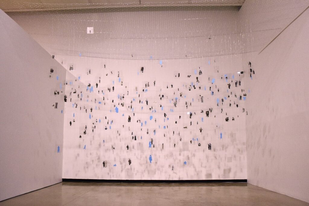
Nereida Dusten(Hermosillo, Sonora, 1992), participa en esta trienal con una instalación que estructuró desde el peso conceptual, parte de analogías y la argumentación para justificarla, y apela a la inteligencia del espectador para cerrar el círculo. La obra, en primera instancia, se muestra halagadora a la vista, los 365 hombrecillos azules y blancos que penden de finos hilos sujetos a la maya colocada en la parte superior de la instalación, liberan tantas evocaciones como recuerdos vengan a la mente del que las observa; pero se vuelve retadora cuando después de leer la conceptualización que acompaña a su ficha técnica exige un poco más que la mirada para su comprensión.
Aún y cuando la autora plantee una reflexión sobre el color el azul, asociado a las emociones, particularmente a sentimientos de tristeza y vacío existencial, y observa la ironía que supone el emplear dicho color para ciertos fármacos antidepresivos como el alprazolam, en la obra denominada Azul celeste no. 2 (2023), subyacen otras lecturas consustanciales, mostrando que el arte, como vehículo comunicativo, informa, devela y cuestiona.
La autora nos dice respecto a su pieza:
“Azul celeste, no. 2, (2024), trae consigo una reflexión sobre la teoría del color y el color asociado a las emociones, es particularmente un análisis sobre el uso del color azul asociado a los sentimientos de tristeza y vacío existencial. A partir de este análisis sobre el color, hago una observación sobre la ironía que supone usar este mismo color para ciertos fármacos antidepresivos, por ejemplo, el alprazolam, medicamento que empecé a tomar desde hace algún tiempo por prescripción del psiquiatra. Es por esto que me interesa hacer una reflexión sobre la saturación del color en las emociones, haciendo una asociación directa con este fármaco ansiolítico-antidepresivo”. (Dusten, 2023, s/f)
La artista emplea el color azul no solo como un concepto teórico, sino también como un vehículo para explorar su experiencia personal con el alprazolam, un ansiolítico de este color que forma parte de su tratamiento. Esta elección establece una conexión entre el azul, la tristeza y la medicación, creando una ironía central en su obra: el mismo color que representa el dolor emocional es el color de una sustancia diseñada para aliviarlo. Al asociar el color azul con emociones como la tristeza y el vacío existencial, la artista plantea una reflexión sobre el papel simbólico de los colores en nuestra experiencia emocional y sobre cómo ciertos fármacos, al compartir este tono, buscan mitigar el sufrimiento sin necesariamente abordarlo en su profundidad.
La obra también invita a una lectura crítica sobre la medicalización de las emociones y la intervención de la industria farmacéutica, señalando cómo el sufrimiento personal —como la ansiedad o la depresión— se traduce y reduce frecuentemente a un tratamiento farmacológico. Al elegir el color azul para vincularlo con el alprazolam, la obra parece cuestionar la “anestesia emocional” que esta práctica genera, al proponer soluciones rápidas y lucrativas para problemas profundos y complejos.
A través de esta metáfora, el color azul representa no solo la tristeza o el vacío, sino también una crítica a la idea de “recubrir” las emociones para hacerlas funcionales en lugar de comprenderlas a fondo. Así, la obra no solo narra la vivencia emocional de la artista, sino que también señala cómo nuestras emociones son moldeadas tanto por experiencias individuales como por un sistema que se beneficia de medicalizarlas, lo que sugiere una pérdida de autonomía emocional.
En última instancia, el azul se convierte en un símbolo de resignación, reflejando una cierta aceptación de la medicalización como estado permanente. Al suspender o “colgar” a sus personajes en una especie de caparazón externo, la obra parece simbolizar el aislamiento emocional y la desconexión que puede surgir de la dependencia de estos fármacos. Este distanciamiento entre la experiencia interna y el entorno apunta a un cuestionamiento sobre cómo hemos llegado a “colorear” nuestras emociones y a gestionarlas bajo los términos de una industria que las convierte en productos regulables, restringiendo nuestra autonomía emocional en un contexto donde las emociones están cada vez más mediadas y controladas.
El arte es un medio generoso para plantearnos intrincados sucesos o intenciones sin tener que representarlas bajo la argucia mimética, esta obra de Dusten en su aparente hermetismo conlleva la obligada reflexión que nos invita a superar lo visual ante la cavilación que siempre nos proveerá más de lo que la misma pieza aporta.
En el campo distendido de lo creativo, las derivaciones artísticas parecen no tener fin y creo que así debe ser, pues como reflejo de nuestra realidad histórica deben ser concordantes con los cambios trepidantes de la sociedad.
La lucha por los derechos humanos, el respeto y la igualdad ha transformado nuestra sociedad, impulsando una reevaluación profunda del falocentrismo y su papel en la construcción de una cultura heteronormativa y cargada de prejuicios. Esta revisión ha permitido cuestionar y desplazar la perspectiva patriarcal, situándola en una dimensión crítica como un sistema opresivo y limitante. En este contexto, el arte ha emergido como un vehículo fundamental para promover este cambio, y el rol de la mujer en esta transformación ha sido decisivo.
Una de las estrategias centrales en esta lucha por la igualdad ha sido la reivindicación del trabajo doméstico, históricamente relegado a una posición de invisibilidad y escaso reconocimiento. Las actividades como la costura y el bordado, vistas durante siglos como meramente funcionales o decorativas, han comenzado a ser apreciadas también por su valor creativo y artístico.
Artistas contemporáneas emplean la costura para reflexionar sobre temas como la recuperación de la memoria o la visibilización de historias marginales. Al adoptar esta técnica, desafían la jerarquía tradicional de materiales en el arte, validando un medio asociado a lo doméstico y cotidiano como una plataforma de alta expresión estética y conceptual. La costura en el arte contemporáneo ofrece una analogía poderosa con las realidades sociopolíticas actuales, donde cuestiones de identidad, género y resistencia ocupan un lugar central.
Inicio con esta explicación el acercamiento a la obra de una artista fronteriza, centrada en esta dinámica de la costura, como lo han hecho varias artistas de su generación y aunque en las palabras antes dichas, se pone el énfasis en los valores reivindicativos de este género textil; da gusto encontrarse con un discurso diferente, que no niega nada de lo dicho, sino que abre el entendimiento hacia otros destinos.
El trabajo de Oslyn Wizard (Tijuana, B. C., 1977), con el que participa en esta muestra pictórica, y denomina: Otro medio para llegar a un fin (2023), declara en su título y en la argumentación de la misma, una intención en particular; pero es obvio que esta obra encierra múltiples lecturas que merecen tenerse en consideración.
La declaración que la artista hace respecto a su trabajo es básica, directa y convincente, pero no dejan a un lado otras fortalezas contenidas. Nos dice:
“Transformar el quehacer de la costura en una herramienta para llegar a la pintura ha sido uno de los ejes principales que mueve mi producción. El hilo se ha convertido en un elemento gráfico y aglutinante, así como las telas y textiles entran en lugar de manchas de pintura que conversan con la materialidad de la disciplina, y que muchas veces toman su lugar.
Las piezas que desarrolló se ubican dentro del espacio de la contemplación pictórica, pero también hay un interés grande por profundizar en el carácter de la materia por sí sola. En el textil, su hechura y sus cualidades. La técnica de entretejido de hilos que conforman una tela resguarda energías no solo de la persona o máquina que las elaboraron, sino también usos y memorias. Tienen una narrativa propia. Esto, para mí, empapa a los textiles con una gran capacidad expresiva la hora de transformarlos en obra y reinsertarlos dentro del lenguaje del arte contemporáneo”. (Wizard, 2023, s/p)
Por tal se podría interpretar la costura no solo como técnica, sino como un medio que revisita y reivindica las historias y vivencias de aquellos que tradicionalmente han trabajado con textiles. En esta lectura, el hilo y la tela no son simples herramientas o materiales, sino vehículos cargados de memoria colectiva e identidad cultural. Así, la costura se convierte en una narrativa visual que conecta la creación artística con prácticas cotidianas y ancestrales.
Además, esta transformación de la costura en un medio pictórico sugiere una ruptura con las jerarquías tradicionales del arte, al situar prácticas manuales en el mismo espacio de valor que la pintura. La obra, al incluir textiles que resguardan historias personales y colectivas, plantea un cuestionamiento profundo sobre el valor de lo “artístico” frente a lo “artesanal,” dignificando el proceso textil como una forma de expresión igualmente capaz de generar contemplación y diálogo.
Este significado inherente resalta la capacidad de los textiles para contar historias que, a menudo invisibilizadas, adquieren aquí una voz propia, fusionando lo íntimo y lo universal en una propuesta artística inclusiva y rica en significados.
No solo redefinen el espacio pictórico, el acto de la costura y el entretejido de hilos es posible interpretarlo como un acto de reconstrucción y resignificación de historias individuales y colectivas, donde cada hilo se convierte en un trazo que va más allá de la representación estética y adquiere un peso simbólico; al igual que se convierte en un medio de reflexión sobre la identidad y las historias escondidas en lo cotidiano, transformando la práctica artística en un acto de preservación y transformación cultural.
El cortometraje de Angélica Escoto (Tijuana, B. C., 1967). Ninguna isla es una ballena (2023), se presenta como un recurso creativo que, a través de sus elementos narrativos y estéticos, cuenta una historia y transmite un mensaje. No obstante, este trabajo incorpora fuertes componentes del video documental, un medio que ocupa una posición singular en el campo de las artes y los medios de comunicación. Su capacidad, en ambos casos, para capturar la inmediatez y la concreción de los eventos, junto con su potencial para revelar los matices de la experiencia humana, lo convierte en una herramienta poderosa. Sin embargo, esta fuerza descriptiva no solo le confiere credibilidad, sino que también lo sitúa en el centro de un debate esencial sobre la naturaleza de la realidad.
El filme, en palabras de su autora, parece explorar temas como la introspección, la imaginación como fuerza vital, y la redención a través de un lenguaje visual y narrativo poético. La ballena no solo es un escenario, sino un agente activo en la transformación espiritual del individuo.
“Ninguna ballena es una isla”, es un cortometraje: Una intromisión a los intestinos de la ballena, un espacio laberíntico, enmarañado, intrincado, una forma de redención más allá de la muerte y donde el poder de la imaginación es una poderosa búsqueda personal que libera un acto lúdico que desaparece con un grito” ¡Soplo a la vista! (Escoto, 2023, s/p)
La referencia que hace a los “intestinos de la ballena” evoca el viaje introspectivo, un descenso a las profundidades del ser. Este espacio “enmarañado” e “intrincado” puede interpretarse como una metáfora de la mente o del alma humana, lugares donde se enfrentan los miedos, las culpas o las memorias reprimidas. El laberinto sugiere un proceso de búsqueda y de autodescubrimiento que no es lineal, sino lleno de complejidades.
Sugiere que este viaje al interior de la ballena trasciende lo físico. Puede aludir a una purificación espiritual o un renacimiento simbólico, donde la muerte no es un final, sino una transición hacia un estado de comprensión o reconciliación personal.
La imaginación se presenta no solo como una vía de escape, sino como un acto de creación que permite reinterpretar la realidad y encontrar sentido, incluso en situaciones de desesperanza. La experiencia es descrita como un “acto lúdico”, lo que contrasta con la solemnidad de la redención, dotándola de un dinamismo y una vitalidad que potencian la libertad, y su frase final parece ser un momento de culminación, un estallido de liberación emocional y física. El grito es un símbolo de catarsis, un acto final que rompe con la opresión del laberinto interno y devuelve al personaje o a la narración al mundo exterior, quizá transformado.
Un cortometraje que, envuelto en los sonidos de las vocalizaciones, del lenguaje de las ballenas, nos conduce por un poema sonoro que no solo nos sumerge en un viaje introspectivo, sino que también podría estar evocando el agotamiento de un ecosistema. La ballena, como uno de los mamíferos marinos más emblemáticos, se convierte en un microcosmos de la naturaleza herida. Un film que, incluso, invita a ser leído como una llamada a la regeneración ecológica.
En este contexto, la redención que alude Angélica no solo se refiere a la transformación personal, sino a una reconciliación colectiva con la naturaleza, una toma de conciencia sobre la urgencia de proteger a las ballenas y, en extensión, al medioambiente.
El grito final: “¡Soplo a la vista!”, es también, desde esta perspectiva, un acto de protesta y visibilización de la problemática. Es un momento de ruptura que llama la atención sobre la fragilidad de estos seres y la urgencia de actuar. El “soplo” también remite a la respiración de las ballenas, un símbolo de vida que, en el contexto de la extinción, adquiere un tono de resistencia.
El título mismo bajo esta expectativa cobra una nueva dimensión al enfatizar la interdependencia entre los humanos y las ballenas. Su extinción no sería un fenómeno aislado, sino una señal de desequilibrio global. Este enfoque subraya que la lucha por la supervivencia de las ballenas es, en última instancia, una lucha por la supervivencia de todos.
El vertiginoso universo contemporáneo, donde imágenes e ideas se superponen con asombrosa facilidad, se ha convertido en un recurso esencial para el arte interdisciplinario actual. Esta convergencia de disciplinas y lenguajes abre paso a resultados estéticos inusuales, capaces de provocar nuevas formas de percepción. Estas obras, al desafiarnos a mirar desde ángulos inesperados, generan experiencias innovadoras que enriquecen nuestra relación con el arte y el mundo que nos rodea.
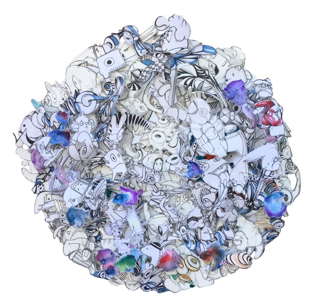
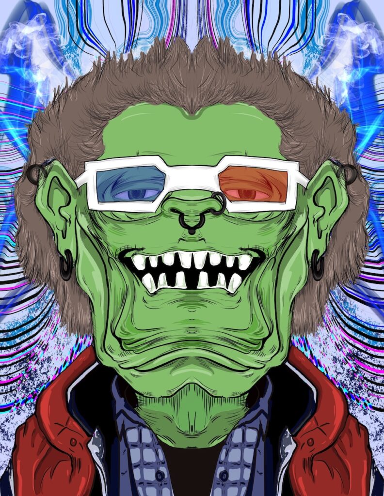
Con esos recursos Maik Jiménez (Tijuana, B. C., 1998) construye su obra “El emperador verde”, producto de múltiples dibujos realizados con antelación, recortados y reensamblados, creando un enmarañado cosmos de elementos diversos: figuras, rostros, líneas, iconos (Fig.1) con el que conforma multihistorias tridimensionales y que en esta ocasión proyecta sobre esa masa de recortes pegados, imágenes del Emperador verde, pinturas digitales (Fig.2) creada mediante una aplicación para iPad, encabalgando de esa manera historias, las que resulta sencillo comparar con esta pluralidad contemporánea que también encabalga imágenes e historias.
(Fig.1)
Sobre esta pieza, Maik Jiménez expresa:
La pieza es un fragmento de una historia que he agregado a toda mi obra en donde existen paralelismos con el mundo real, siguiendo la teoría del monomito de Joseph Campbell, historias inspiradas en relatos de mi vida, exagerados con influencias de toda la ficción que me acompaña desde niño (Star Wars, He Man, Thundercats, La pantera rosa, El inspector gadget, películas como: Volver al futuro, Los cazafantasmas, Cantinflas, etc.) Mis personajes imaginarios interactúan entre todas mis piezas son diferentes escenarios los cuales son cambiantes de acuerdo a la etapa que se encuentre mi obra y mi vida. Cuentan una historia no necesariamente coherente; fragmentos del presente, pasado y en ocasiones del futuro. El verdadero protagonista de la obra son los errores y el intento por adaptarse al discurso de una narrativa sin final. Decidí incorporar las piezas digitales del “Emperador Verde” proyectado sobre la pieza física redonda que simboliza el planeta explorado y el emperador vigilante constante del universo.
La obra interdisciplinaria y la conceptualización que provee Maik Jiménez, revela una obra profundamente personal y expansiva, que combina elementos autobiográficos con un imaginario colectivo influenciado por la cultura popular y la teoría mítica.
Inspirado en el concepto del “viaje del héroe” de Joseph Campbell, según nos dice, y adaptado a una narrativa no lineal y fragmentada; sus piezas actúan como capítulos de una historia en constante evolución, que refleja su vida personal y su desarrollo artístico. Esta estructura abierta resalta la idea de que la vida misma es un ciclo de errores, aprendizajes y transformaciones.
(Fig. 2) (Fig. 2)
Las referencias a estos íconos de la cultura popular (Star Wars, He-Man, Thundercats, etc.) no son meros guiños nostálgicos; funcionan como un lenguaje compartido que conecta al autor con el espectador. Estas influencias enriquecen su universo creativo, aportando capas de significado que van desde lo épico y heroico hasta lo absurdo y humorístico. Los personajes que habitan esta obra son extensiones de su identidad y memoria y su interacción en diversos escenarios refleja el cambio constante en la vida del autor, funcionando como un espejo de su estado emocional y creativo en distintos momentos.
La obra enfatiza los errores y la imperfección como elementos centrales. En lugar de buscar una narrativa cerrada o coherente, el autor celebra el proceso de adaptación y transformación. Esto subraya una postura existencial: aceptar la incertidumbre y el cambio como parte inherente de la experiencia humana.
Este personaje simbólico, el “Emperador verde”, proyectado digitalmente sobre la pieza física, representa la conexión entre lo tangible y lo virtual, entre la creación artística y la omnipresencia de una figura mítica. La forma redonda, que simboliza un planeta, sugiere un mundo en constante exploración, con el “emperador” como guardián o testigo de este universo en expansión.
En conclusión, la obra es una reflexión sobre la vida como un conjunto de historias fragmentadas, atravesadas por influencias externas y procesos internos, donde los errores y la adaptación constituyen el verdadero viaje heroico.
Alice in Spiral
“La Necesidad de la Empatía Vial: una iniciativa para la intervención del espacio”, 2024
Pintura acrílica sobre lsa calles que circundan la rotonda en la colonia Santa Fe, de189 m x14 m. de ancho
(Plotter ilustrativo del proyecto, colocado en las instalaciones del Cecut)
La intervención del espacio público desde el punto de vista artístico tiene un valor multifacético que trasciende lo meramente estético, contribuyendo significativamente a la mejora del contexto urbano y del tejido social. Más allá de reconfigurar el paisaje urbano y transformar espacios grises o deteriorados en áreas visualmente atractivas, su valor radica en su capacidad para actuar como catalizador social, constructor de memoria colectiva y promotor de la participación ciudadana.
Estas intervenciones sensibilizan sobre la importancia del espacio público y cuestionan las fronteras entre lo público y lo privado, fomentando la reflexión sobre el uso compartido y la corresponsabilidad en el mantenimiento del entorno. A través de un extenso conjunto de cualidades, el arte en el espacio público se posiciona como un agente en pro del bien común.
En un contexto donde la resolución directa de problemas cobra cada vez más relevancia, el arte también impacta en la movilidad y las vialidades mediante intervenciones funcionales. Un ejemplo destacado es el proyecto propuesto por Alice in Spiral (Alice Aguilar Hernández, Tijuana, B. C., 1992) para la Trienal de Tijuana, que combina elementos de señalización con el objetivo de mejorar la vialidad e influir positivamente en el comportamiento vial y peatonal. Estas obras amplían los márgenes del arte al asumir nuevas responsabilidades, donde lo simbólico —como el uso del color— es redimensionado por su funcionalidad y su valor humano.
Alice tiene claro por donde transitar con el arte sin tener que continuar en la brega de hacer objetos suntuosos, la realidad que la acosa, fue el mejor pretexto para encontrar otros destinos. Escribe al respecto:
Los problemas ocasionados por el tránsito excesivo de vehículos en las zonas urbanas de las metrópolis son cada día más comunes y complicados, vivo en Tijuana, una de las ciudades más complejas y urbanísticamente mal planeada que acarrea como consecuencia serios problemas a la movilidad vehicular y consecuentemente convirtiendo la vida urbana en una calamidad, y si a esto le agregamos la falta de señalizaciones adecuadas, el incumplimiento de las reglas de tránsito del conductor, la falta total de sentido de responsabilidad, cooperación y empatía social, hacen de esta ciudad un infierno. Mi proyecto tiene como objetivo, a través de la intervención del espacio urbano, particularmente de las glorietas existentes en los cruceros urbanos más transitados de la ciudad, coloreando (particularizando) cada una de los carriles de la calle que deben utilizarse para dar vuelta en U, vuelta en L o seguir de frente, empleando colores primarios como guías viales (Alice, 2024. s/p).
Una descripción sencilla y clara que llama al respeto a los reglamentos establecidos, a circular por el carril correcto como un recurso para evitar el aglomerado de automóviles, mejorando el flujo vehicular, el ánimo del conductor e incrementando las probabilidades de conductas más empáticas. Un proyecto que tiene claro la responsabilidad social del arte que puede beneficiar directamente a su comunidad.
Un proyecto que nunca llegó a materializarse debido a la displicencia de las autoridades del departamento de vialidad y otros organismos, que se negaron a otorgar los permisos necesarios. Sin embargo, la propuesta sigue siendo una idea magnífica, con el potencial de replicarse en cualquier parte donde se requiera de esos necesarios ordenamientos urbanos. Alice con este proyecto señala cómo el arte puede ejercer una influencia tangible en la resolución eficaz de problemas y mostrarse más allá de la tradicional función simbólica que bajo la supervisión del mercado convierte al arte únicamente en insumo que acicala muros y vanidades.
Crear a través del arte espacios para la reflexión, el diálogo y la acción, supera la limitación de ser únicamente una expresión estética, si no que se convierte en un vehículo de transformación social, cuestionando narrativas dominantes y desafiando estructuras de poder, y no se conforma con reflejar solo la realidad, sino que contribuye activamente a transformarla, imaginando y construyendo una sociedad más armónica y justa.
Cuando el artista se enfoca en visibilizar las luchas de los marginados, el arte no solo informa, sino que involucra al espectador de manera visceral, permitiéndole experimentar la realidad de “el otro”. Este encuentro emocional es un primer paso para romper con la indiferencia y la apatía, fomentando una comprensión más profunda de las injusticias sociales.
Históricamente, el arte ha sido un medio poderoso para dar voz a quienes han sido silenciados; ofrece un espacio para que estas historias sean contadas y escuchadas. En este sentido, el arte actúa como un espejo que refleja las realidades invisibilizadas, pero también como un faro que ilumina las posibilidades de cambio.
Es un medio para imaginar futuros alternativos y plantear nuevos modelos de convivencia. Por ejemplo, el arte comunitario y participativo fomenta la colaboración y la inclusión, promoviendo la cohesión social. Este tipo de arte no solo señala problemas, sino que involucra a las comunidades en la creación de respuestas colectivas, empoderándolas en el proceso.
Sin embargo, este enfoque no está exento de tensiones. Existe el riesgo de que el arte se instrumentalice, perdiendo su autonomía en favor de una agenda social o política específica. También se enfrenta a críticas por parte de quienes consideran que el arte debe ser independiente de cualquier función social. A pesar de esto, el equilibrio entre la estética y la ética es donde el arte comprometido encuentra su mayor fortaleza, permitiendo que su impacto sea tanto emocional como intelectual.
La idea de vivir con una discapacidad no es algo que la mayoría de las personas aspire a experimentar. Sin embargo, quienes tienen alguna discapacidad a menudo enfrentan múltiples barreras, no solo físicas, sino también sociales, como la discriminación y la subestimación de sus capacidades. En una sociedad que tiende a marginar y estigmatizar, resulta fundamental reconocer el inmenso esfuerzo que estas personas realizan para adaptarse y participar en un entorno que muchas veces no está diseñado pensando en ellos.
El trabajo de Braulio Huerta Ortiz (1999), busca generar empatía y comprensión mediante una experiencia participativa. Invita a las personas a llevar a cabo actividades artísticas simulando condiciones de discapacidad: les proporciona pinceles, pinturas y bastidores, pero con la condición de que deben crear usando la boca o los pies. El resultado, aunque técnicamente limitado, no es el objetivo principal. Más bien, el valor radica en el proceso y en el esfuerzo que implica adaptarse a estas nuevas condiciones.
Este ejercicio lúdico y pedagógico va más allá de lo meramente artístico. Invita a los participantes a reflexionar sobre las dificultades que enfrentan las personas con discapacidad en u vida cotidiana, promoviendo una conexión emocional y una mejor comprensión de su perspectiva. La actividad no solo sensibiliza sobre los desafíos, sino que también resalta la resiliencia y la creatividad de quienes viven con discapacidad.
Prácticas artísticas tienen, además, el potencial de cuestionar nociones preconcebidas sobre la habilidad y el valor del arte. A través de este enfoque, Huerta logra involucrar al público en un diálogo profundo sobre inclusión, empatía y el rol del arte como medio para tender puentes entre experiencias humanas diversas.
Recapitulando
La “Trienal de Tijuana: 2 Internacional Pictórica” reafirma la capacidad del arte para articular complejidades contemporáneas desde una perspectiva plural e inclusiva. Al reunir a artistas de diversas trayectorias y contextos, se posiciona como un laboratorio cultural que dinamiza el panorama artístico local e internacional. Este evento subraya la transición de una producción plástica enfocada en estereotipos turísticos hacia una práctica reflexiva que aborda problemáticas globales. La pluralidad y el diálogo intergeneracional destacan como valores fundamentales, consolidando a la ciudad como un epicentro de experimentación y renovación estética.
La Trienal busca desafiar las dinámicas del mercado hegemónico y los intentos de folclorización que históricamente han relegado la producción artística desde los márgenes. Con un enfoque en lo pictórico y desde su campo ampliado e implícito, el evento no solo redefine límites al integrarlo con prácticas interdisciplinarias, sino que también propone nuevas poéticas y narrativas. Así, se erige en una plataforma crítica que fomenta la reflexión sobre la mundialización del arte, mostrando a Tijuana como un referente cultural que celebra la diversidad estética y contribuye a un legado artístico innovador.
1 Roberto Rosique, coordinador de la Trienal de Tijuana: 2 Internacional Pictórica. Artista visual, profesor, escritor y curador de arte radicado en Tijuana, B. C. 2 Alemania, Argentina, Brasil, Colombia, Costa Rica, Cuba, Ecuador, España, Estados Unidos, Inglaterra, México, Panamá, Paraguay, Perú y Venezuela.
3 Amarante, L. (2023). SELECCIÓN DE PROPUESTAS. Trienal De Tijuana: 2. International Pictórica. https://trienal.cecut.gob.mx/seleccion-2/ 4 Parra, N. (2002). Artefactos visuales, Universidad de Concepción, Chile https://www.memoriachilena.gob.cl/archivos2/pdfs/MC0013511.pdf 5 Morin, E. (2005) Introducción al Pensamiento complejo. Gedisa editorial. Barcelona 6 Los miomas (leiomiomas) son tumores benignos del músculo uterino, que a menudo causan sangrado uterino anormal, acompañado de dolor invalidante y a veces síntomas urinarios o intestinales, infertilidad o complicaciones del embarazo.
Creative Growth Art Center: Where Art Flourishes and Lives Transform
For many, the Creative Growth Art Center in Oakland, California, isn’t just an art studio; it’s a profound statement on inclusion, creativity, and the power of human expression. Indeed, for some, like myself, it stands as “the most fabulous art studio in the world.” This non-profit organization is a beacon in the contemporary art landscape, tirelessly working to advance the inclusion of artists with developmental disabilities.
Located in Oakland, California, Creative Growth provides an unparalleled environment where artistic talent is not only nurtured but celebrated. At its core, the center offers a supportive studio environment, a vital space where artists can explore, experiment, and create without judgment or limitation. This nurturing atmosphere is foundational to their mission, allowing each artist to develop their unique voice and vision.
Beyond the studio, Creative Growth ensures its artists gain crucial visibility through robust gallery representation. This commitment to showcasing their work in the broader contemporary art world is paramount, challenging preconceived notions and proving that exceptional art knows no boundaries. By actively integrating these artists into the contemporary art dialogue, Creative Growth not only enriches the art world but also strengthens the wider community, fostering understanding and connection.
The impact of Creative Growth extends far beyond the canvas or sculpture. It empowers individuals, builds confidence, and demonstrates that artistic expression is a fundamental human right and a powerful catalyst for personal growth and societal change. It’s a place where talent is unearthed, potential is realized, and the definition of who can be an artist is beautifully expanded. Their dedication to creating a truly inclusive and vibrant art community is truly inspiring.
El Laberinto del Coco at the Miami Beach Bandshell
Experience the Electrifying Sounds of El Laberinto del Coco at the Miami Beach Bandshell
Presented by Rhythm Foundation and Live Arts Miami’s Mundos Series
Miami Beach, FL – Prepare for an unforgettable night of rhythm, culture, and musical fusion as El Laberinto del Coco takes the stage at the iconic Miami Beach Bandshell on Saturday, July 19, 2025, from 8:00 PM to 10:00 PM.
Led by renowned percussionist and visionary Héctor “Coco” Barez, this 15-piece Puerto Rican bomba-fusion ensemble weaves an intoxicating tapestry of Latin rhythms, jazz, funk, and folkloric traditions. A former member of Calle 13 and a pioneer in contemporary Caribbean music, Coco Barez brings together traditional percussion, lush strings, and a commanding horn section to ignite the stage with sound and soul.
15-piece Puerto Rican Bomba-Fusion band, led by visionary director Hector “Coco” Barez. Incorporating traditional percussion, strings and horns for an intoxicating sonic tapestry of Latin, jazz, funk and old rhythms. Presented by Rhythm Foundation and Live Arts Miami’s Mundos series. Food & beverage are available for purchase at the show. The Bandshell is an open-air covered venue, all programs are rain or shine. Your ticket, once purchased, is non-refundable.
El Laberinto del Coco is more than a concert—it’s a celebration of heritage, innovation, and community through music. The performance is part of Live Arts Miami’s Mundos Series, which highlights global voices and genre-defying artistry.


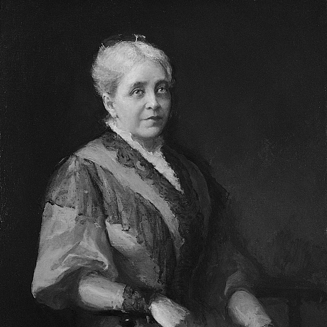
 In pouring her time, energy, vision and funds into running the institution and ensuring its survival, Metcalf was joined by her daughter Eliza Radeke (pictured), who from 1913–31 was the first woman to serve as RISD’s president.