La baronesa Elsa von Freytag-Loringhoven nunca pretendió ser artista, en palabras de Jane Heap: “ella es la única de todo el mundo que viste Dadá, ama Dadá y vive Dadá”. Murió en 1927 en la más absoluta miseria, aunque de su ingenio vivió todo el arte conceptual neoyorkino y su exaltación de lo estrafalario en el mundillo de los Andy Warhol. Jean Duchamp en su emigración a USA aprovechó al máximo las dotes artísticas de Elsa incluso hasta apropiarse de la autoría de la obra de referencia, el urinario fuente. Elsa recolectaba basura y de ella elegía trozos de madera que etiquetaba como Catedral, cañerías fálico-flácidas que denominaba God, etc… y un urinario que denominó Fuente, bajo el pseudónimo de R. Mutt.
Elsa von Freytag-Loringhoven
Como en tantos otros ejemplos del mundo del arte, en ocasiones fluye la antiética. En 1982, en el Archives of American Art Journal, se publicó una carta de Jean Duchamp dirigida a su hermana Suzanne. La carta está fechada el 11 de abril de 1917, en ella escribió que “una amiga con el pseudónimo masculino de Richard Mutt envió, como escultura, un urinario de porcelana para la exposición de los Independientes. Yo tuve que poner mi cargo a disposición y los beatos rumores van a correr en Nueva York”.
Según parece a la muerte del fotógrafo, Duchamp se apropió de la autoría, ya famoso, dado que se habían escrito teorías académicas y curatoriales. Duchamp ya participaba del mito fundador del arte conceptual y se trataba de una importante contribución americana al modernismo, que no podía doblegarse hacia una pordiosera. A raíz de 1982 hay autores, como Glym, que sugieren que Duchamp no solo se apropió de la creatividad de Elsa, sino que también se apropió de su discurso, como se percibe en sus entrevistas.
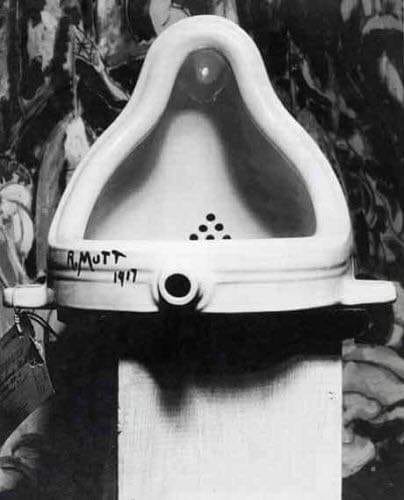
“La fuente de las Fuentes”, 1917, firmada Richard Mutt, pseudónimo de la baronesa Elsa. Este es la obra original fotografiada por Alfred Stieglitz, quién falleció en 1950.
Fountain – Marcel Duchamp or Elsa von Freytag-Loringhoven?
Instalación artística. El arte de instalación es un tipo de arte contemporáneo en el cual el artista utiliza, como parte de la composición, el propio medio (como paredes, piso, luces e instalaciones) además de objetos diversos. En muchas ocasiones, los materiales escogidos, llenan más o menos el espacio y el espectador es invitado a moverse alrededor de la obra o interactuar con la pieza, en esos casos el espectador mismo deviene parte de esa obra en ese preciso momento y ese preciso tiempo. A veces las instalaciones son frágiles por lo que solo pueden ser vistas desde la puerta o un extremo del espacio.
Existen varios precedentes para este tipo de arte, pero no fue hasta los años 80 que los artistas comenzaron a especializarse en las instalaciones. Materiales de todo tipo, luces y sonido han seguido siendo elementos fundamentales para la instalación artística.
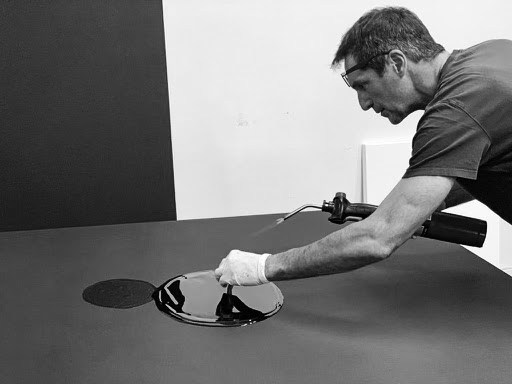
En los inicios, las instalaciones eran usualmente creaciones temporales; eran parte del moderno movimiento que trataba de desechar la idea del arte como objeto coleccionable. Esta tendencia es también vista en el Arte povera y en el Arte conceptual. De cualquier forma, en la actualidad, muchas instalaciones artísticas son realizadas para muestras permanentes y muchas de ellas han sido compradas y vendidas como las obras de arte tradicionales. Uno de los ejemplos más conocidos es la obra “20:50” de Richard Wilson, que consistía en una habitación llena de aceite de cárter y que fue creada en 1987 para la Matt’s Gallery de Londres pero que fue subsecuentemente exhibida en la Royal Scottish Academy de Edimburgo y luego comprada por la colección Saatchi de Londres.
Características de Arte instalación
Como género dentro de las artes plásticas, la instalación se supedita a los sitios de arte o emplazamientos para los que ha sido o fue concebida. Algunas instalaciones son sitios específicos de arte y sólo puede existir en el espacio para el que fue creada.
El uso de materiales diversos, la asimilación de diferentes escalas, la libertad de concepto y de la potenciación de la interactividad entre el producto artístico y el público son algunas de las características más importantes de esta peculiar manera de concebir obras de arte. Otro aspecto dentro de la concepción de instalaciones artísticas es el emplazamiento, en este sentido se hace válido recordar que existen artistas que en su búsqueda de una mayor interacción social, manifiestan su gusto por los espacios exteriores o urbanos, mientras que otros continúan creando dentro de los restringidos límites de las galerías de arte, museos y recintos de exposición.
En la praxis del arte instalativo, más que la apreciación de la escultura tradicional, cuyo fundamento se establece sobre la base del trabajo artístico, en la instalación la intención del artista es primordial debido a su conexión con el Arte conceptual y con las actitudes comunicativas en su obra.
En el arte de la instalación los artistas pueden hacer uso de cualquier medio o material, pueden usar desde materiales naturales y tradicionales hasta los más novedosos medios de comunicación, incluso existen artistas que han llegado a utilizar la energía pura como el plasma o el fuego. Otro elemento importante a acotar dentro del género instalativo es que existen instalaciones en las que el artista incorpora sonidos, olores, sensaciones térmicas, etc., contribuyendo así a propiciar lecturas más profundas y ricas en los expectadores. Uno de los creadores de la instalación artística que utiliza luces es James Turrell.
Orígenes de la instalación artística
Muchos encuentran el origen de este género en artistas como Marcel Duchamp y el uso de objetos cotidianos resignificados en espacios de galerías y museos como obras artísticas. Sin embargo, se puede decir que el más cercano precedente está dado en los Environments (ambientes). Unos de los creadores de los “Environments” fue el artista norteamericano Allan Kaprow con obras realizadas a partir de 1957. En una entrevista sin fechar publicada en 1965 Kaprow decía acerca de su primer Environment: “Yo simplemente rellené toda la galería. Cuando abres la puerta te encuentras en medio de un ambiente integral. Los materiales eran diversos: sábanas de plástico, envoltorios de celofán, trozos de cinta adhesiva, pedazos de esmalte rajados y manchados y piezas de ropa coloreadas”. También había luces colocadas en medio de todo esto y “cinco maquinas de escribir desplegadas alrededor del espacio tocando sonidos electrónicos que yo había compuesto”. Desde ese momento la creación de instalaciones devino una importante corriente del arte moderno, principalmente a partir de la década de 1990.
Otro antecedente interesante puede ser la exposición de 1958 en Paris del artista francés Yves Klein que consistía en una habitación vacía y aunque el término no surgió hasta la década de 1970, este gesto es a veces visto como la primera instalación, en el sentido en que se entiende el término en la actualidad.
En 1961, en Nueva York, Claes Oldenburg creó un ambiente, Counter and Plates with Potato and Ham que, en estos momentos se considera instalación.
The Devil does not exist, It is just a tool used by churches.
In situ: Urban action by Rafael Montilla
I am sure the devil does not exist, It is just a tool used by churches. What exists are demon beings like fidel castro, hitler, hugo chavez, nicolas maduro among others. If we really believe in God, we must know that we don’t need a PR (Priests or Pastors) to get to God. This video is not to make any money, it is for art.
Song: The Rolling Stones – Sympathy For The Devil Circus
LA TRIENAL DEFORMES 2020 ES UNA INSTANCIA DE NIVEL INTERNACIONAL QUE BUSCA POSICIONAR LA PRÁCTICA DE LA PERFORMANCE EN SUS VARIADAS EXPRESIONES (DANZA, TEATRO, ARTES VISUALES, MÚSICA, POESÍA) CREANDO ESPACIOS DE INTERCAMBIO Y OBRAS DE ARTE ACCIÓN, DEDICADAS A LA FORMACIÓN DE AUDIENCIAS DE DIVERSOS RANGOS ETARIOS.
Nuestra propuesta
Por primera vez la Trienal Deformes reunirá artistas provenientes de Asia, Europa y América, teniendo una fuerte presencia de artistas latinoamericanos. En esta versión seremos testigos de diversas manifestaciones de Performance, ampliando la visión del lenguaje hacia manifestaciones híbridas o provenientes de áreas no puristas, como los son el activismo, el ritual, la performance sonora, el videoperformance, la virtualidad y streaming, la poesía, así como realizaciones más ligadas a las artes escénicas como el teatro y danza. En esta versión tendremos el gusto de contar con importantes artistas nacionales e internacionales. Destaca la participación de Clemente Padin (Uruguay), Alejandra Glez (Cuba), Marton Robinson (Costa Rica), Marcela Cadena (Colombia), Daniela Giebel Aquino (Bolivia), Carmen Berenguer (Chile), Alastair MacLennan (Irlanda), Bartolomé Ferrando (España), Abel Azcona (España), Boris Nieslony (Alemania), Sophie Dupont (Dinamarcana), Nina Claire (Noruega), Peter Baren (Holanda), Razieh Goudarzi (Irán), Mohammed Abd Alwasi (Irak), Seiji Shimoda (Japón), Moon Jaeseon (Corea), Yifei Hu (China), Chumpon Apisuk (Tailandia), Saurganga Darshandhari (Nepal), Harpreet Singh (India).
El diablo no existe, es solo una herramienta utilizada por las iglesias. In situ: Urban action by Rafael Montilla
TRAYECTORIA
Hemos sido organizadores y participantes de Bienal Internacional de Performance DEFORMES 2004-2016 realizadas en Chile (ciudad de Santiago-Valparaíso-Valdivia).
TESIS CURATORIAL
La Máquina de guerra y las organizaciones sin Estado
La Trienal Deformes es una instancia de nivel internacional que busca posicionar la práctica de la performance en sus diversas expresiones (danza, teatro, artes visuales, música, etc.), en un lugar de exhibición relevante. Debido a que esta práctica ha adquirido cada vez mayor complejidad, es difícil conceptualizarla de manera precisa. La performance es el acto, el gesto, la pose, el sonido, del cuerpo del artista o de otra persona, con un expreso interés artístico o creativo. El juego con el movimiento, el ritmo, el sonido y el espacio son claves para analizar este tipo de prácticas y actualmente es una corriente que reúne varios géneros distintos. Queremos revisar esas trayectorias y composiciones y las formas que ha tomado en diversos puntos de mundo.
A su vez, la Trienal será itinerante y se moverá en dos espacios geográficos, abarcando mayores territorios y públicos variados. Santiago-Valparaíso, abarca dos regiones cada una con un diferente acercamiento a la práctica performática, que sería importante introducir a los participantes de la Trienal, con quienes se producirán diálogos y discusiones sobre esta práctica. Cada escena tiene su propio contexto e historia y desde los territorios se emanan materiales que algunos artistas de performance utilizan para su creación, produciendo intervenciones en el espacio público o la irrupción callejera. Por lo tanto, es relevante que la Trienal Deformes se traslade y adquiera un carácter nómade y, al igual que su relación con las instituciones y lugares no oficiales. Que la Trienal se desplace entre los lugares como las academias, galerías, museos; y, también, transite en el espacio público y los barrios ( del cuerpo y los sociales) es una forma de diálogo recíproco entre la vida formal y lo cotidiano de la cultura masiva.
La Trienal Deformes tiene un fundamento técnico que consiste en el período de preparación previa al evento y de su repercusión posterior. Este evento cada tres años irá señalando los caminos que ha tomado la performance en sus versiones más contemporáneas. Al mismo tiempo que realiza un guiño a las prácticas pioneras y experimentales que surgieron en la segunda mitad del siglo XX, algunos de sus referentes más destacados siguen vigentes en el circuito del arte.
De esta manera, la Trienal Deformes se constituirá en el espacio de visibilidad de prácticas performáticas actuales y algunos históricos, activando las redes y los espacios para que esta práctica tenga cabida en la cultura regional.
Para la primera trienal consideramos a Alastair MacLennan, Bartolomé Ferrando y Clemente Padín, entre otros, exponentes que llevan más de 30 años de trayectoria en el campo, con múltiples encuentros, festivales y talleres de performance en sus cuerpos; asimismo reunirá artistas provenientes de Asia, Europa y América más una fuerte presencia de artistas latinoamericanos.
Además, a diferencia de otras instancias de encuentro y prácticas de performance, uno de los ejes de esta Trienal Deformes será su área dedicada a la teoría de la performance. Pensamos desplazar el pensamiento crítico desde los centros dominantes y revisar las escrituras y reflexiones que han surgido en nuestro territorio o hemisferio. Destacados intelectuales han estudiado la performance desde una raíz latinoamericana que le entrega un sentido más radical y político a la práctica, como Víctor Vich, Miguel López, Mildred Duran, Irina Garbatzky, Juan Pablo Sutherland.
ARTISTAS CONVOCADOS PRESENCIALES Y ONLINE
Ítem artistas y teóricos convocadosTrienal Deformes
Artistas Internacionales-Online / noviembre 2020
1- Abel Azcona-España
2- Alastair MacLennan-Irlanda
3- Alejandra Glez-Cuba
4- Alexia Miranda- El Salvador
5- Andrez Olmos-Bolivia
6- Ana Vela-Ecuador
7- Andrea Cárdenas-Argentina
8- Anastasia Yeremeyeva-Rusia
9- Barbara Le Beguec Friedman-Francia
10- Boris Nieslony-Alemania
11- Camillat Camillat-Brasil
12- Carmen Lafran-Alemania
13- Christine Brault-Canadá
14- Chumphunut Phuttha-Tailandia
15- Chumpon Apisuk-Tailandia
16- Cinthia Vargas-Ecuador
17- Daniela Giebel Aquino-Bolivia
18- Dani d’Emilia-Portugal
19- Emilio Santisteban-Perú
20- Evamaria Schaller-Alemania
22- Juan Angel Italiano-Uruguay
23- Javier Sobrino-Argentina
24- Jessica van Deursen-Holanda
25- José Roberto Sechi – Brasil
26- Khaing Su-Myanmar
27- Kiyo Gutierrez-México
28- Olga Kozmanidze- Alemania/Rusia
29- Manuela Maroli-Italia
30- Marcela Cadenas-Colombia
31- Markus Goessi-Suiza
32- Marton Robinson-Costa Rica
33- Mauritz Tistelo-Suecia
34- Mohammed Abd Alwasi-Irak
35- Mongkol Plienbangchang-Tailandia
36- Moon Jaeseon-Corea
37- Nenad Bogdanovic-Serbia-ex-Yugoslavia
38- Nina Claire-Noruega
39- Peter Baren-Holanda
40- Ras Sankara Agbok-Togo
41- Razieh Goudarzi-Irán
42- Smitha Cariappa-India
43- Sanjoy Chakraborty-Bangladesh
44- Saurganga Darshandhari-Nepal
45- Sophie Dupont-Dinamarca
46- Sophie Scheifele and Olivier Schlund -Francia
47- Takumi Hashimoto-Japón
48- Yeuk To-Hong Kong
49- Uma Banerjee-India
50- Vaida Tamoseviciute-Lituania
Presentación especial:
Guillermo Gómez Peña y La Pocha Nostra en confinamiento. Performance para sobrevivir el apocalipsis- México.
Nacionales-Online
1- Carmen Berenguer
2- Hernán Parada Gonzalez
3- Estela Morales
4- Mar Marianne
5- Paz Jara
6- Ginés Olivares
7- Carolina Jerez Berenguer
8- Carolina Alicia Hernández Esguep
9- Gonzalo Rabanal
Taller de Performance-Online
Gustavo Álvarez- México
DEFORMES
DEFORMES es un colectivo transdisciplinario de arte de performance chileno sin fines de lucro, compuesto por artistas visuales y escénicos, activistas culturales, sociólogos, antropólogos, entre otros, que realiza periódicamente bienales, talleres, y encuentros internacionales de arte acción. También es un centro cultural que crea alianzas estratégicas con diversas instituciones nacionales e internacionales. Es una matriz de archivo en torno al arte de la performance en Chile, que implica distintos soportes de registro y documentación.
Nuestra misión: expandir una plataforma de encuentro, diálogo y compromiso entre
performistas de América Latina y el mundo.
Nuestra visión: potenciar redes de intercambio, mediante el lenguaje de performance y medios digitales
Equipo Organizador
Equipo Directivo:
Alejandro de La Fuente
Mila Berrios Palomino
Gonzalo Rabanal
Director proyecto FONDART 2020-21:
Bernardo León Gómez
Coordinación teórica:
Alejandro de La Fuente
Producción en terreno:
Rodrigo Peralta
Mila Berrios Palomino
Difusión Periodística:
María Graciela Romero
Teóricos-Online
Alina Peña (México)
Mildred Duran (Colombia-Francia)
Irina Garbatzky (Argentina)
Juan Pablo Sutherland (Chile)
Miguel Ängel López (Perú)
Víctor Vich Flores (Perú)
Textos
Pancho López (México)
Hernán Pacurrucu (Ecuador)
Mila Berrios (Chile)
Alejandro de la Fuente (Chile)
Gonzalo Rabanal (Chile)
Artistas Internacionales-Presenciales / abril 2021
Learn to Paint While Exploring Your Journey as an Artist
Get A Painter’s Journey Today for Only $139
Learn to Paint – Anne Blair Brown
Anne Blair Brown was born in North Kingstown, Rhode Island and currently resides in Nashville, TN. Her work centers on both rural and urban landscapes, people, and interior spaces. While she enjoys the quiet solitude of her studio, she delights in painting on location. Brown says, “Painting from life creates an intimacy with the subject that I just can’t get from a photograph, and it heightens my sense of spontaneity. That energy is translated to the canvas in and out of the studio.”
What You’ll Learn:
-You will learn confident paint application. -You will learn the skills to edit your subject, eliminate fussy detail, and allow the “soul” of your painting to shine through. -You will learn to create movement and energy in your paintings. -You will learn how to set up the basic shapes at the beginning to ensure plenty of “play-time” with interpretive brushwork and color mixing. -You will come away with a deeper confidence in conceptualizing and executing a painting from start to finish.
“The A.I.M. Biennial presents site specific installations created by local artists responding to the historically layered landscapes, landmarks, architecture, and communities of South Florida during Miami Art Week 2020.”
A.I.M. is: Art in Movement • Art is Matter • Andedan ici Mwen • Activism is Movement • Ahora imagina Movimiento • Acabamos iniciar Machetes •Art in Miami • Any intimate moment • American Indian Movement…
The AIM Biennial—a project which features new site-specific installations throughout South Florida, created by local cultural practitioners–including visual artists, dancers, activists and performers–who represent our region’s diversity. With an emphasis on ritual, monuments and shrines, these installations have been produced in response to historically layered landscapes, landmark locations, urban vernacular architecture, the Everglades and the various communities of our region.
A published catalogue includes maps and site locations. AIM was organized by william cordova (cultural practitioner, NY/Miami), Marie Vickles (Education director Perez Art Museum / Curator Little Haiti Cultural Center), Gean Moreno (Director, Knight Foundation Art + Research Center at Institute of ContemporaryArt, Miami), and Mikhaile Solomon (Curator / Director of Prizm Art Fair).
ARTISTS AIM Participants Almaz Wilson Aramis O’Reilly Arturo E. Mosquera Barron Sherer Beatriz Monteavaro Carol Jazzar Carol K. Brown Carol Todaro Carol-Anne McFarlane Carolina Cueva Charo Oquet Chire Regans (VantaBlack) Debbie Acevedo Devora Perez Dinizulu Gene Tinnie Dona Altemus Donald McKnight Ena Marrero Ernesto Oroza Frances Trombly Francie Bishop Good Francisco Masó Gavin Perry GeoVanna Gonzalez Glenn Saffo Glexis Novoa Gustavo Matamoros James Allister Sprang Janese Weingarten + Dave Kudzma Jared McGriff Jessica Gispert Jorge Pantoja Julio Mitjans Kabuya Saffo Kandy Lopez Karen and Harold Rifas Kathleen Hudspeth Kerry Phillips Kevin Arrow Kristen Thiele Laura Marsh Leyden Rodriguez-Casanova Liliam Dooley Linda Chamorro + Felice Grodin lou anne colodny Luis Gispert Mariano Bejarano Marisol Blanco Mark Handforth Michiko Kurisu N. Masani Landfair Niki Lopez Onajide Shabaka Rafael Domenech Ralph Provisero Rick Lowe Robert Huff Robert McKnight Robert Thiele Rosemarie Chiarlone Rudolf Kohn Samuel Tommie Sonia Baez-Hernandez Tara Chadwick Terence Price II Tom Scicluna Tom Virgin Wagner, Hand & Pflug Yanira Collado
ORGANIZERS
MARIE VICKLES Director of Education at the Pérez Art Museum Miami andCurator-in Residence at the Little Haiti Cultural Complex (LHCC)
WILLIAM CORDOVA interdisciplinary cultural practitioner
GEAN MORENO Curator of Programs at ICA Miami
MIKHAILE M. SOLOMON Director of Prizm Art Fair
Locations: Homestead, Dade, Broward, Palm Beach Counties, Seminole Indian Reservation. Satellite locations in Georgia, Tallahassee and Texas.
Writing about art is hard. Writing about art that you made can be even harder. We hear artists say, “If I knew how to describe my work in words, I’d be a writer, not an artist.” While this may be true, what’s “truer” is the fact that at some point, you as an artist will be asked to write an artist statement—and whether or not it is good, will matter. So, what makes an artist statement “good”? Whether you’re applying for a residency or grant, or you just want to perfect your elevator pitch, here are a handful of things not to include in your artist statement, plus a few tips to make the process a little less excruciating.
1. Your Artist Statement Is Not “A Piece”
Resist the temptation to use this as an opportunity to write a poem or subvert the “institution of the artist statement.” We get it; you’re an artist. We really do just genuinely want to know what your art is about. Please tell us.
2. Oh, You Loved Art as a Child? Join the Club
The worst way to start an artist statement is with the following words: “Every since I was a little girl, I’ve always loved making art.” Unless you were literally raised by wolves or grew up in a hermetically sealed suite a la Bubble Boy, this is not interesting information. Most kids love art, and regardless, having a long love affair with your craft doesn’t mean much—it’s what you have to show for it that counts. There is really no need to explain when you became interested in art.
3. Avoid These Words:
Juxtapose Humanity Human condition Concerns Chaos Uncanny (unless it truly, truly is uncanny. Look up the definition.) Notions Speculative Explores Rupture Troubled Liminal Controversial (unless it actually sparked controversy.) Deconstructs
4. Just Use Fewer Words in General
Don’t convolute your sentences by beating around the bush. For instance: “My art practice is concerned with exploring notions of gender” really means, “My art is about gender.” Or, “I’m interested in investigating ideas and concepts surrounding notions of race” becomes “I investigate race.” Be specific and don’t use vague words that keep you from getting to the point.
5. If Your Work Is About You, Why Should We Care?
If you’re making art about your personal experience, fine. But the question you have to ask yourself is, “Why is my personal experience relevant to anyone but me?” What does your experience say about the world you live in? What can people learn from your story that might be useful to them? Use your experience to illustrate some larger issue, topic, culture, or idea that others can relate to or learn from.
6. Find Help
Not everyone is a good writer, and that’s totally okay. You shouldn’t need to be able to recite the Chicago Manual of Style verbatim to write a good artist statement. But don’t let your lackluster writing skills be an excuse for a sloppy statement. Find a wordsmith, buy them a beer, and ask them to help you edit your text. Not only will a poorly written statement make your ideas harder to understand, but grammatical errors could also come off as evidence of apathy and irreverence towards whatever opportunity you’re vying for.
7. Don’t Say Your Work Is Interesting—We’ll Be the Judge of That
Remember what your middle school English teacher told you—show, don’t tell. Describing your work as meaningful, captivating, groundbreaking, beautiful, or interesting doesn’t tell your reader anything about what your work actually is. (Plus, it comes off as a little cocky.) Instead, write about your work in a way that shows how it’s interesting.
8. Don’t Reference Deleuze Unless You Absolutely Have To
In general, it’s probably best to avoid relying on the ideas of other people to prop up your work. But if you really must reference a philosopher, critic, or theorist, make sure to write a very brief (could be five words) description of who that person is. Don’t assume everyone who reads your statement had the same liberal arts education you did. In terms of referencing other artists: if your work intentionally and deliberately references other artists, and these references are integral to the meaning of your work, by all means, name the artists you reference. Otherwise, do not compare yourself to other artists, e.g., “Like Picasso, I paint…”
9. Know What “International Art English” Is, And Void Using It
In 2012, Alix Rule and David Levine brilliantly and hilariously wrote about what they called “International Art English”: the “the curious lexical, grammatical, and stylistic features” too commonly found in art-world press releases. Here is a tiny excerpt, but do yourself a favor and read the entire thing:
“IAE has a distinctive lexicon: aporia, radically, space, proposition, biopolitical, tension, transversal, autonomy. An artist’s work inevitably interrogates, questions, encodes, transforms, subverts, imbricates, displaces—though often it doesn’t do these things so much as it serves to, functions to, or seems to (or might seem to) do these things. IAE rebukes English for its lack of nouns: Visual becomes visuality, global becomes globality, potential becomes potentiality, experience becomes… experiencability.”
10. Write About the Most Interesting Aspects of Your Work (Not All Aspects Are Interesting)
Explaining your process can reveal something about your work that isn’t immediately known by just looking at it. If this is the case, explain away. But for most artists, this play-by-play account just isn’t necessary. For instance, if you’re a painter, there is really no need to mention that you begin your day by priming your canvases, or that your artwork always begins with “an idea” or “a sketch.” Figure out what makes your work unlike other people’s and focus on that. For some artists, that is their process, for others it might be their research methods, or concepts, or relationship to art history, etc.
11. Keep It Short and Sweet
If you’re applying for an opportunity like an artist residency, art school, or a grant, chances are your artist statement will be one of many. Keep in mind that the person reading your statement may only have time to skim the first few lines, so if you can succinctly describe your practice in four sentences, do it. Less is more. You don’t want the success of your application to rely on whether or not your panelist can read 2,000 words in 60 seconds.
12. Your Love for Making Art Doesn’t Justify its Worth
Please, please, please don’t write about how much you love painting, or how fun it is to be in the studio, or how ceramics is a form of therapy. Don’t get it wrong—we’re very happy for you if you feel these ways, and we understand that working creatively can be a very uplifting and joyful process. But here’s the thing: your experience of making your art in no way influences our experience of looking at it. This may seem counter-intuitive, but an artist statement is not about you, the artist; its about your work, the art.
13. Talk It Out
If you’re having writers block, don’t give up. Download a voice recording app on your phone and record yourself talking about your work out loud to a friend (or your cat.) After you transcribe your speech and edit out the likes and ums, you might be surprised with how good it sounds. And if not, at least you’ll have something down on the page that you can work from. Text that is conversational and seemingly effortless is easier and more fun to read that text that seems like it was painstakingly laborious to write.
14. Obviously, Describe Your Work
If someone was standing in front of your art, what questions might they ask you? What could you tell them that would give them a richer, more informed viewing experience? Write about your work in a way that will add something to the viewing experience, not just summarize it. If you’re having trouble getting the juices flowing, here are a few questions you can answer to get you started (just remember, you don’t need to address all of these in your statement.):
Why did you make the art that you made? What does it say about the world? What does it help people understand? What does it look like? What did you make it out of and how did you make it? How does it address the history of its medium? What sort of culture, topic, or issue does it describe? What do you expect your audience to gain from it?
Miami Art Week: Nora N. Khan at the Art + Research Center
ICA Miami
Miami Art Week Reserve Your Free Timed Ticket Now
Tickets are now available for Miami Art Week! ICA Miami will be open through Sunday, December 6 with extended hours, enhanced cleaning procedures prioritizing the health and safety of visitors and staff, timed tickets, and a limited number of walk-in opportunities available each day.
Knight Foundation Art + Research Center Nora N. Khan
Thurs, Dec 3 7pm Virtual Lecture ICA Miami for a free public lecture with Art + Research Center visiting faculty Nora N. Khan. Khan is an art critic, media scholar, and faculty of Rhode Island School of Design, Digital + Media, teaching critical theory, artistic research, writing for artists and designers, and technological criticism.
Photo: Alex Lockett.
Art Basel Lyle Ashton Harris and Gean Moreno
Fri, Dec 4 2pm Conversation
ICA Miami and Art Basel for a special conversation between artist Lyle Ashton Harris and Gean Moreno on the cultural impact of the “Ektachrome Archive,” a body of documentary images that Harris produced in the late-1980s and early-1990s, on view now at ICA Miami.
Exhibitions Special Exhibition
Photo: Zachary Balber.
Allan McCollum Works since 1969
2nd and 3rd Floors Through Jan 17, 2021 Reserve your ticket now to see the highly-anticipated first US museum retrospective for American artist Allan McCollum. This exhibition surveys McCollum’s output over more than five decades, and makes inquiries into the artist’s series of “regional projects” created since the 1990s.
Live Artist Talk with Tony Vazquez-Figueroa to Close Out Miami Art Week
Live Artist Talk with Tony Vazquez-Figueroa to Close Out
Miami Art Week
LnS GALLERY presents PETROPIAS: A Preview, a focus installation by represented artist Tony Vazquez-Figueroa as curated by Tami Katz-Freiman. On Sunday, December 6, to close out Miami Art Week, Vazquez-Figueroa will present a live talk on the installation. The talk will take place both at 12pm and at 3pm in-person to the first ten people who reserve at each hour. It will also be streamed live via LnS Gallery Instagram Live and Facebook Live. Timed ticketing will be available for groups of ten or less, regulated to allow visitors in and out of the space. Each ticket ensures one free entry to the exhibition. Please kindly wear your masks.
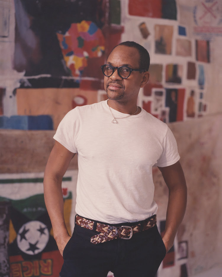
Artist Tony Vazquez-Figueroa in his studio (Mexico)
While 2020 has presented many with unprecedented challenges, Tony Vazquez-Figueroa has used the isolating collateral effects of COVID-19 as the fuel behind his thoughts that would ultimately become PETROPIAS. Tony Vazquez-Figueroa describes PETROPIAS: A Preview as follows: “What you see here is a sort of a preview, a glimpse into some of the ideas developed in PETROPIAS, where I investigate how oil-rich countries create not only unique physical environments like oil refineries, but also peculiar socio-economic and cultural environments, similar to those elaborated by philosopher Michel Foucault in his concept of Heterotopia. PETROPIAS plays on the petrostate, entropy and dystopia and revolves around idea of holes, refineries, and containers as revealed both structurally and metaphorically.”
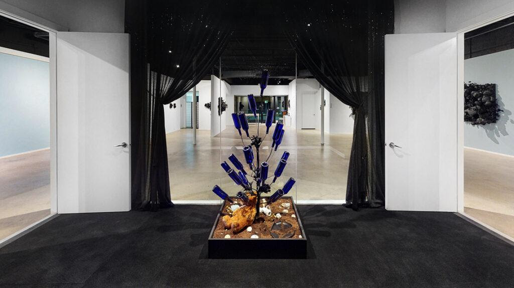
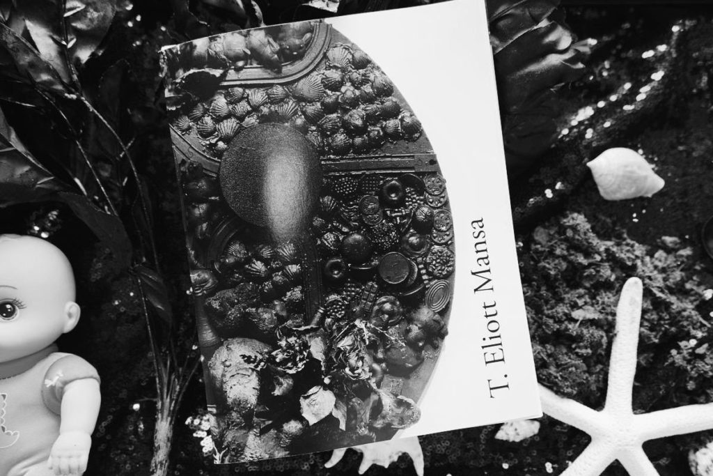
For Those Gathered in the Wind by T. Eliott Mansa will be on view at LnS GALLERY beginning December 2, 2020 – February 9, 2021. The powerful collection of recent assemblages featured in the exhibition embodies Mansa’s expression of the connection between mourning and loss, calling to both ancient and current practices, from Africa to the American West. We will be open with extended hours during Miami Art Week starting this Wednesday, December 2 to Saturday, December 5 from 9am to 7pm and Sunday from 12pm to 5pm.Guests are asked to register in advance for timed visits for groups of no more than 10 people.A virtual exhibition of the show is also available to view. A catalogue with an essay by Cultural Producer and Curator, Donnamarie Baptiste, accompanies the show and is available to purchase. All catalogue sale proceeds will be donated to the initiative for the planned Miami Museum of Contemporary Art of the African Diaspora (Miami MoCAAD).
Exhibition Catalogue of For Those Gathered in the Wind, a solo exhibition by T. Eliott Mansa Isabella Marie Garcia.
ABOUT LnS GALLERY LnS is a multi-use art space specializing in contemporary art with a focus on Miami-based artists, and is guided by and named after the gallerist team of Luisa Lignarolo and Sergio Cernuda, partners in marriage and business. The 5000-square foot space is located in North Coconut Grove, within walking distance from the Coconut Grove Metrorail Station. 2610 SW 28th Lane, Miami FL 33133
In 1990 CITCO came about, in the heart of Verona’s marble district, operating in the field of extraordinary inlaid marble surfaces and furniture complements.
CITCO have reinterpreted the concept of luxury and modified the perception of marble. Advanced technologies now let designers give unexpected forms to marble, but it cannot become truly unique without the exceptional skills of highly qualified craftsmen. Citco’s secret, to offer true works of contemporary art, is the renewed focus on this tradition of handiwork.
CITCO products have an extremely select international market, which, in order to grow, entrusts itself to the word of mouth of those, customers and professionals, who have had the opportunity to experience its excellent quality.
CITCO collaborates with renowned international designers such as Norman Foster, Ferruccio Laviani, Arik Levy, Daniel Libeskind and Zaha Hadid Architects.
About Galleria Ca’ d’Oro
The Ca ‘d’Oro Gallery , a historical place of exhibitions for the greatest names of twentieth century art and expression with an incessant artistic and intellectual vivacity for over forty years, is today an important center for the promotion and dissemination of creative talent, Italian and international.
Heir to the San Bernardo Gallery , opened in Rome by Amadore Porcella in 1945, the Ca’ d’Oro opened its doors to the public in December 1970 in its original location on via dei Condotti.
Inaugurated in 1990 by Antonio Porcella , director of the Ca ‘d’Oro Gallery as well as councilor of the Giorgio and Isa de Chirico Foundation , the space in Piazza di Spagna focuses its activity on the idea of art as an indispensable value for cultural growth, becoming a stage for unique events.
The preparation and experience of Antonio Porcella in the field of art have marked the culture of the capital, bringing artists such as Giorgio de Chirico, Renato Guttuso, Giacomo Manzù, Salvador Dalì, Carlo Carrà, Bruno Caruso, to the city and from the city to the world, Alberto Sughi, Ruggero Savinio, Corrado Cagli, Ennio Calabria and Renzo Vespignani.
The Ca ‘d’Oro Gallery has always stood out for its artistic sensitivity, intellectual gaze and historical professionalism, which have united four generations of the Porcella family, whose art gene has revealed their own attitude to each one: Alpinolo Porcella , artist and writer (1874-1962), his son Amadore Porcella , who from painting devoted himself to the study of art to become an international critic. His lectures and lessons in the History of Art at the Pontifical Bolivarian University of Medellin (Colombia) are precious. The son Antonio, loving art from an early age, managed to start the gallery activity first in the headquarters on via Condotti and then in Piazza di Spagna, where he passed on his passion to his daughter Gloria, who is now responsible and curator of art of the Ca ‘d’Oro Gallery.
Promotion and enhancement of contemporary art are the guidelines of Gloria Porcella , who in recent years has been assisted by Lamberto Petrecca in the organizational and artistic design work. Together they are able to grasp the artistic signs of the present and make each exhibition and create a significant moment in the history of national and international art.
Gloria Porcella with enthusiasm, courage and professionalism enhance contemporary artistic expressions, promoting art in its being revelation, reflection, provocation, disturbance and a sign of social. In this spirit, starting from 1997, the portfolio of artists linked to the Gallery has been enriched with names of the caliber of Seward Johnson, whose works it holds the European exclusive, Alfredo Rapetti, Erika Calesini and the Cracking Art Group.
In December 2010, during Art Basel Miami, the Gallery opened its new headquarters in Coral Gables with the installation of the REgeneration Art Project of the Crackin Art Group. Currently the Gallery is in the Ironside where it continues to promote Italian and European art with passion and enthusiasm.
A new major opening took place in 2015 when the new New York office was opened.
Since 2013 the Gallery has participated in the most important American art fairs such as Context Art Miami, Scope New York, Art Wynwood Miami and Art Southampton.
William A. Read Brand Development
Phone: 305.864.3434, Ext: 126
Address: 1666 Kennedy Causeway, Suite 703, Miami Beach, FL 33141