Monday, June 2, 2025
Home Blog Page 172

Ex ejecutivo discográfico y motivador mexicano Miguel Garrocho

Miguel-Garrocho

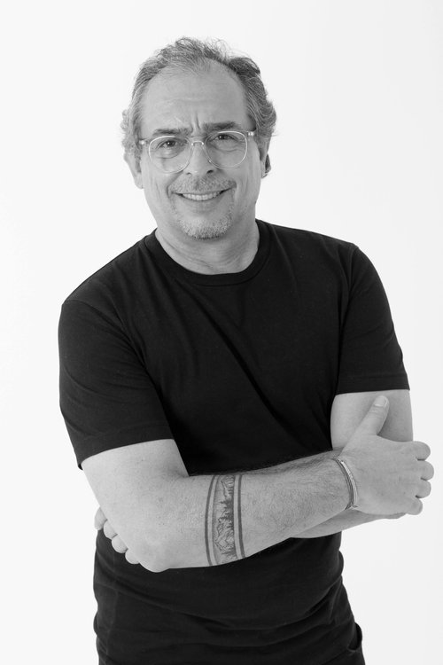
Miguel Garrocho es un ex músico mexicano que ha tenido una larga trayectoria como directivo de Warner, Sony y otras compañías discográficas poderosas, trabajando a la par de figuras como Laura Pausini, Maná, Luis Miguel and Jesse & Joy. “Ha sido un reconocido y querido ejecutivo” de Mercadeo, lo halagó la influyente periodista colombiana Leila Cobo, en una de sus columnas más recientes en la revista Billboard Magazine
  Garrocho comenzó a estudiar el tema del Mejoramiento Personal en 2016 y hace unos meses, finalmente, dejó la industria musical para convertirse en motivador y “producir un impacto” en los demás. “Me gusta ayudar a los demás en situaciones complejas, caóticas o inciertas, y orientarlos en el encuentro de una nueva forma de ver la vida y caminar hacia sus objetivos”, dice, como declaración de principios.

  El flamante “life coach” -que reside en Miami-, comunicador nato, se dedica a dar conferencias en distintos puntos del país, a ofrecer cursos, y a atender consultas privadas en persona o vía online. “Hay que romper paradigmas”, propone, “sortear fronteras, y observar espacios de incertidumbre desde una posición irreverente y desapegada para generar menos angustia y estrés”.

  Garrocho cree que transitar por la vida de una forma más liviana “crea realidades más cercanas, en un ESTAR más pleno, sabiendo que nos espera un FUTURO PERFECTAMENTE IMPERFECTO”. Más información en www.elgarrocho.com

Perez Art Museum PAMM
Pérez Art Museum Miami

Frank Stella: Experiment and Change

Frank Stella
Frank Stella

Frank Stella: Experiment and Change

NOVEMBER 12, 2017 – JULY 29, 2018

Frank Stella: Experiment and Change

NSU Art Museum Fort Lauderdale is pleased to present Frank Stella: Experiment and Change, an exhibition that spans the artist’s 60-year career from the late 1950’s to the present. The exhibition, composed of approximately 300 paintings, relief sculpture and drawings will offer insight into his trajectory from minimalism (e.g. the geometry of the black paintings) to maximalism (eg. the spatially complex constructionist and large sculptures of the Moby Dick series.) Curated by Bonnie Clearwater, Director and Chief Curator, Experiment and Change leads the museum’s 60th anniversary celebration presented by AutoNation, and will be on view from November 12, 2017 to July 29, 2018.

The exhibition juxtaposes works from various periods of Stella’s career, revealing his aesthetic development and focusing on his “Working Archive,” which contains material never exhibited before, such as notes, sketches and maquettes that shed light on his growth as an artist. Stella’s diverse interests include art history, architecture, new materials (fluorescent pigment, carbon fiber, titanium, et al.) and computer-aided modeling for rapid prototyping. His preparatory studies show the ideas in his work that led to a notion about the enlargement of pictorial space.
Included will be penciled color sequences for the larger concentric square paintings (1973), flat foam-core cut-outs leading to the emergence of a more generous “working space” and 3D printed models from the 1990’s through the present outlining the use of digital technology.

Frank Stella (b. 1936) emerged as part of a generation of American artists excited by, driven and challenged by Abstract Expressionism. Frank Stella: Experiment and Change emphasizes the variety of expression found throughout his entire body of work. The twists and turns of Stella’s career are illuminated by insights that were discovered during the curatorial process. This exhibition elaborates on the research Clearwater began for a previous exhibition, Frank Stella at 2000: Changing the Rules, an in-depth exploration of the artist’s bold paintings, sculpture and architectural models from the 90’s.

Clearwater notes, “An initial spark of his artistic aspirations was the experience of seeing Rogier van der Weyden’s early Netherlandish Crucifixion Diptych (c. 1460) at the Philadelphia Museum of Art while an undergraduate at Princeton University. Stella said that the sheer visual impact of van der Weyden’s diptych appeared as a ready-made definition of art. Rogier’s painting became a goal for him to hope to live up to. Given the characterization of this moment I realized the necessity to remap his career to show how this painting, rather than the rules of formalist modernism, propelled his progress.

Clearwater further states “We can see the influence of van der Weyden in the large number of diptych-like paintings divided into two equal parts. A typical double concentric painting, Paradoxe sur le comediene, (1974), and a mitered maze work such as Fortin de las Flores support this view.

These paintings might also encourage us to speculate how Stella’s attraction to the use of shallow pictorial space and bright fluorescent pigments helped him to approach his goal, the absolute beauty of the Netherlandish masterpiece.”

One of the exhibition’s highlights is Deauville (1970) a 45-foot long canvas shaped like a thoroughbred racetrack. As an aficionado of racing of all kinds, he often imagines himself running across the canvas. “While his contemporaries Donald Judd and Dan Flavin created work that was machine-made, I see Stella as a modern day John Henry, racing against the machine, brushing paint from one end of the canvas to the other and back again, setting an admirable and competitive pace.”

For Stella, Deauville was the starting point for the exhibition design at NSU Art Museum. The shape of the elongated oblong painting complements the museum’s curved galleries designed by leading modernist architect Edward Larrabee Barnes. Architecture has played into Stella’s work throughout his career. The Irregular Polygons (1965-66) broke with the conventional rectangular format of easel painting, as did the early 1960’s notched aluminum paintings. This departure was suggested by a view of European mural painting, which noted the irregularity of the perimeter. The interruption of the imagery by windows, doorways and other architectural features generated irregular edging which in turn generated irregular and complicated surfaces. This notion coupled with illustrations from intersecting Kazmir Malevich’s planar geometry helped to establish the shaped canvas as a format in its own right, one which Stella continues to exploit.

In the exhibition, Deauville is shown adjacent to several Irregular Polygons and a large double concentric square Parodoxe sur le comediene (1974), and works from the Polish Village series (1971-74), which represent Stella’s first constructed relief paintings, his attempt to build a painting and then paint it. Among these works we find a full-scale sketch, a 12-foot cartoon for Suchowola, and a Polish Village relief, drawing attention to Stella’s leap from a flat, two-dimensional plane to the literal three-dimensional depth of these constructions.

Another project inspired by architectural space enlists Hooloomooloo paintings (early 1990’s) made for the Kawamura Museum in Japan. The entire series of these paintings will be exhibited at NSU Art Museum, creating an almost continuous frieze on the second floor, starting on a long curved wall and ending high above the atrium. The irregular shapes of these paintings were determined by the architectural space of the Japanese museum. Removed from their intended location, their arched forms and cutout shapes appear arbitrary until the viewer imagines the resulting negative space as doors, windows and arches.

“Stella believes that art offers at least the illusion of ultimate freedom. In the context of the art world, he appears fearless and indifferent to risk. Even works that initially looked like misfits to him (and others) now appear revelatory in light of his most recent pursuits,” explains Clearwater.

Frank Stella’s Experiment and Change is part of NSU Art Museum’s Regeneration Series, exhibitions designed to explore the wide-ranging impact of World War II on artists in Europe and the United States. It was launched in 2016 with Anselm Kiefer from the Hall Collection. Stella’s work is grounded in the post-war philosophical shift in which the individual was to master his/her own existence as popularized through the zeitgeist of existential philosophy, phenomenology and gestalt psychology. When Stella stated in a 1964 radio interview, “What you see is what you see,” not only was he suggesting that his compositions were nothing more than their appearance, but he was also pointing out that his work dealt with the psychology of perception and could be rephrased as, “What you see is how you comprehend what you see.”

About Frank Stella
Born in 1936 in Malden, Massachusetts, and based in New York, Frank Stella is one of the most important artists working today. He first studied art in high school at Phillips Academy in Andover, MA and continued painting at Princeton University where he graduated with a degree in history. Following his graduation in 1958, he moved to New York and achieved fame before the age of 25. His Black Stripe Paintings (1959), comprised of a regulated sequence of stripes painted in enamel with the broad strokes of a house painters brush, debuted in the Sixteen Americans exhibition at Museum of Modern Art in the same year. In 1962, Stella’s first solo exhibition was presented by the Leo Castelli Gallery in New York. His first retrospective was presented by the Museum of Modern Art in 1970 and he was honored with a second retrospective by the institution in 1987. His work has subsequently been the subject of retrospective exhibitions throughout the United States, Europe, and Japan, including the touring exhibition Frank Stella: A Retrospective, which originated at Whitney Museum of American Art in 2015. Among his numerous honors, he received the National Medal of the Arts in 2009 and the Lifetime Achievement Award in Contemporary Sculpture in 2011.

ARS and Frank Stella have approved the museum’s use of these photographs of Frank Stella’s work on the website.

The exhibition is presented by Dr. David and Linda Frankel and S. Donald Sussman and Michelle Howland,
Four Seasons Private Residences Fort Lauderdale and The Surf Club

Additional support is provided by Wege Foundation, Vontobel Swiss Wealth Advisors AG, Sandra Muss and the David and Francie Horvitz Family Foundation.

Exhibitions and programs at NSU Art Museum Fort Lauderdale are made possible in part by a challenge grant from the David and Francie Horvitz Family Foundation. Funding is also provided by Nova Southeastern University, Hudson Family Foundation, Wege Foundation, Broward County Board of County Commissioners as recommended by the Broward Cultural Council and Greater Fort Lauderdale Convention & Visitors Bureau, the State of Florida, Department of State, Division of Cultural Affairs and the Florida Council on Arts and Culture. NSU Art Museum is accredited by the American Alliance of Museums.

Perez Art Museum PAMM
Pérez Art Museum Miami

Sean Scully, LA Deep show, Lisson Gallery

Guadalupe, Oil on aluminum, 85 x 150 x 2 1/8 inches, 2022, ©Sean Scully; Courtesy Lisson Gallery

Sean Scully, LA Deep show, Lisson Gallery
Los Angeles, September 23-November 4, 2023
by Lorien Suárez-Kanerva
Art Miami Magazine Article

“I undo the authority of the grid
I make the edges tremble
And the color unnameable
All that clarity and certainty
I subvert.”
Sean Scully, Grid, October 9, 2023.

From September 23 to November 4, Lisson Gallery’s LA Deep exhibition draws together five decades of Sean Scully’s paintings. The exhibition comprises new artworks and some of his earlier 1970s paintings from his time in Los Angeles. LA-based art critic Peter Frank drew from Scully’s early history in LA to relate the artist’s nascent fondness for the city. “His first one-person show in the United States was March [1975] in California, at La Tortue, a prominent gallery in Los Angeles. He came out…to open the show and to lecture at universities throughout the state. The warm reception given his show…added to Scully’s enthusiasm…as did his discovery of an active and sophisticated art scene.” Sean Scully held
an opening talk with artist Andy Moses at the gallery about their shared connection to Los
Angeles.

Video credit:  ©Sean Scully; Courtesy Lisson Gallery 

Scully is a groundbreaking artist. As Arthur C. Danto observed, “Scully’s historical importance lies in the way he has brought the great achievement of Abstract Expressionist painting into the contemporary moment.” Art critic David Carrier likewise affirmed, Scully “moved from being a very skilled minimalist to occupying a powerful position very much all his own.” Scully forged a distinctly original creative path for himself as a painter and for the future of painting itself.
In my conversations with Scully, he reflected on this solitary path. The experience was “existentially deep – I was alone.”
When I painted ‘Backs and Fronts,’ it was a challenge. I was breaking the rules — written by the most important critics. I did it without sense. Because when you placed it against another system, it didn’t make sense. It is necessary to reinvent a way of seeing or accepting it. It was difficult for most. The edges were broken. The proportions didn’t make sense mathematically.
It was a matter of feeling. And the proportions of my body. And the colors were completely intuitive. And that’s why I was breaking all the rules.

Backs and Fronts, Oil on Linen and canvas, twelve attached canvases, 96 x 240 inches, 1981, ©Sean Scully

Scully moved away from American Formalism of the 80s and its focus on a “purity of
abstraction and perfection of geometry.” He sought to humanize geometry.
I think of geometry as profound and timeless. And in a sense, the thing that binds us together.
I have a deeply held belief about trying to make geometry speak to people instead of making
them submit to it and the authority of perfection. Impurity makes life inventive, and purity
leads to sterility, so my paintings look the way they look. They’re romantic, moody, and
emotive. Sometimes, there is a lot of melancholia in them, touching on my being Irish and
born on the street.

Scully observed that human relationships and how to be are our central problems now. He
perceives this tension in human relationships as inherent to being human. Sartre’s
“irrevocable three” serves as its reasoning– where, by its very nature, perception grips
irreconcilable tensions upon identity and its definition of and for the self and the other and
their relationships.

Stack Colors, Aluminum and automotive paint, 108 x 48 x 48 inches, 2018, ©Sean Scully; Courtesy Lisson Gallery

Outside by the entrance of the gallery stands Scully’s Stack Colors sculpture. The treatment of its edges placed this way and that without apparent rhyme or reason draws from Scully’s seminal 1981 Backs and Fronts painting. The intuitive arrangement of forms, where squares are layered “before, between, and behind,” posits the question of their relationship to each other in space. It is an essential facet of Scully’s work. The multicolored sediment-like strata
operates like “landlines” building up a composite tower bridging earth and sky. The
“landline” is a distinguishing harmonious element in Scully’s work. It has a romantic quality
assisted by the associations with the parallel arrangement of the horizon and its linkages to
the land, sea, and sky.

Scully found an affinity with Samuel Beckett’s writing: “ash grey sky mirrored earth mirrored sky,” which Scully identified as a parallel composition to his landline paintings.

Upon entry into the gallery’s main exhibition space, Scully’s newest Landline paintings are arranged as a set of triptychs on the right and left side walls. The arrangement emphasizes the relationships and interconnections between his works.

Wall Landline Dark Glade, 85 x 75 x 2 1/8 inches, Oil on aluminum, 2022, Wall Landline Red, 85 x 75 x 1 5/8 inches, Oil on aluminum, 2022, (right) Wall Landline Tappan, 85 x 75 x 2 1/8 inches, Oil on aluminum, 2022, ©Sean Scully; Courtesy Lisson Gallery

The Landline paintings can also be appreciated in light of Andy Moses’ conversation with Scully about the authority of ruins – addressing how ancient monuments hold material weight through time with their stone structure. Within each work, an inset painting has center stage. Scully described the concept of the inset: “Here are basically two paintings: the painting of a hole and a painting of what fills that hole…Trying to put something into the painting that gives it a human figurative, figural aspect as a metaphor. In these paintings…I am dealing with the figure in the window.” Scully refers to the figure in the window for his appreciation of Matisse’s prevailing use of the motif in his paintings. In connection to the figurative associations Scully creates within his abstract work, art critic Dávid Fehér observed that “the window operates as a crossing point between mimesis and abstraction.”

Wall Landline Triptych, Oil on aluminum, 85 x 269 1/4 x 2 1/8 inches (each,) 2022, ©Sean Scully; Courtesy Lisson Gallery

The unorthodox structure of Beckett’s writing appealed to Scully. The painter admired it as “so frontal and real life.” Beckett captured conceptual sensibilities in a statement about his work in a 1959 letter. ‘Holes in paper open and take me fathoms from anywhere”. So also, Scully’s insets transport viewers.

Final Grey ½, Acrylic and tape on canvas, 84 x 84 inches, 1974, (right) Second Order ½, Acrylic on canvas, 60 x 60 inches 1974, ©Sean Scully; Courtesy Lisson Gallery

Image 5: (left) Final Grey ½, Acrylic and tape on canvas, 84 x 84 inches, 1974, (right)
Second Order ½, Acrylic on canvas, 60 x 60 inches 1974, ©Sean Scully; Courtesy Lisson
Gallery

Cityscapes and his travels to Morocco in 1969 inspired Scully’s Supergrid paintings. The beauty of numerous multicolored dyed wool strips stretched and laid out as an arrangement appealed to him. Scully also wanted to bring together the energies of Jackson Pollock and Mondrian into his work. “Pollock represented for me a kind of desire and freedom [while] Mondrian represented conscious structure and morality.” Scully recognized a fusion he could contribute from these irreconcilable facets. “I tend to try to work with -both of them- all the time.”

Blaze, Acrylic on canvas, 85 x 152 3/4 x 1 3/8 inches, 1971, ©Sean Scully; Courtesy Lisson Gallery

Blaze as a painting beckons on a prominent wall. Employing fast-drying acrylic paint, tape, paintbrush, roller, and a spray gun, Scully created a zig-zagging array of juxtaposed – appearing and reappearing stripes and bands. Scully observed of his Supergrid paintings: “by overlaying systems which are measured differently. They are vertical and horizontal, and layered and layered, until I got to the point where I didn’t think I could put anything else on

without losing all the moves I had made.” This endless symmetry presents neither a beginning nor an end.

Guadalupe, Oil on aluminum, 85 x 150 x 2 1/8 inches, 2022, ©Sean Scully; Courtesy Lisson Gallery

Opposite to Blaze, stalwart Guadalupe’s squares define spaces stripped down to an essential nakedness. Their blockish power, upon closer observation, recedes, revealing inklings into the process, and instances of the artist’s efforts appear as innate idiosyncrasies in the surface and the underlying layering and placement of his rich paint swaths and the layered brushwork contained in these squares. The squares are “folds” in the picture plane. For Scully, “folding metaphorically serves as an allusion to endless regeneration. Artistic culture to me is like a huge rug that is constantly folded and unfolded by us. Every time it is refolded, it grows new secrets, new wonders.”

His Wall of Light paintings (represented with Guadalupe in the exhibition) were inspired by an image of a streaming wall of light that he saw at Chichen Itza. Scully described how the light changed the walls from orange to blue to black, pink in the morning. Fehér describes the effect that the sunlight had on the surface of the stone wall “as simultaneously solid and volatile…the stone walls seem to dissolve in the sunlight, while the sunlight appears to be embodied in the stone wall…but are unified into a harmonious synthesis.” Hidden behind the solid-colored blocks but revealed as their salient electrified edges, an underlying, vivid underpainting appears in the background, acting as a “Wall of Light.”

Scully’s Wall of Light brings to mind French philosopher Simone Weil’s reflections in Gravity and Grace. “Man only escapes from the laws of this world in lightning flashes. Instances when everything stands still, instants of contemplation, of pure intuition…It is through such instances that he is capable of the supernatural. Inspiration apprehended in the moment and revealed by nature appear as liminal windows that open an engagement with the transcendent and can draw forth an expressive form of catharsis.”

In the 80s, Scully returned to painting in oil. His artwork was “painted very directly, very physically… It takes a long time until everything comes together to make a style, to make a way of putting down paint.” Through each stroke placed, textural traces of Sean Scully’s process grant the viewer fissures into the moments of its conception.

Scully’s most recent works were painted on metal. The decision to use it as a surface was based on his work in the 80s with aquatints and etchings. There’s a novel quality that Scully described as “a dull but vibrant light.”

This pressing, caressing action that I make on these big paintings with the motion of my body, gradually changes the colors and their character, to produce a surface unique to painting, and colors that I have not seen before in abstraction.
The character revealed appears in direct alignment with distinct instants, alive with the artist’s
intent and engagement with the medium and the materiality of each artwork.

The painting, the putting down of the paint, is physical and made in layers so that the underpainting subverts what is on top. But what is on top is only the end of a process and the final layer; underneath that final layer is a body that gives a feeling of the history of the handprint of my life, my vision, and my work…The tracks in between the stripes set up a vibration that is a counterpoint to the certainty of the form.

For Scully, the act of painting reveals “structured feelings.” Danto described, the need for “wide brushes and great physical strength to move the nearly viscous pigment and to keep it within boundaries.” Travail is evident in the gestural character of his painting. Scully stated that “I am working, wet on wet, in an emotionally charged state. So I am not looking for clarity. I am looking at emotion”. His paintings mirror Scully’s engagement with an undiluted expressive process sustained by a commanding force.

In our conversation, Scully reflected on his upbringing and how his conception of space was affected by his childhood experiences.

We got an upgrade in Dublin when I needed a birth certificate. We lived with the gypsies, the travelers. When those people are born, they don’t get birth certificates. So, to get a birth certificate, we were fortunate enough to be given a room. The room I have visited since is two meters by two meters down in the cellar with one window. This experience had a psychological impact. I’ve never allowed space into my paintings, or I fill it all up. They are very claustrophobic.

Poignant motifs appear recurrently through his references to windows, doorways, walls, and grids in his paintings.

Dark In, Oil on aluminum, 85 x 75 x 2 1/8 inches, 2023, ©Sean Scully; Courtesy Lisson Gallery

Color reflects emotion, memory, and experiences of the natural world. Richly chromatic, Dark In holds an earthier sensibility as a painting. Though I am aware that often I fight for color in my work, to assert my connection to the natural world, I actually have no theory about color whatsoever. Afterwards I can always interpret them as active, sad, resolved, awkward, etc., though not when I’m painting them.

Scully appreciates colors he has drawn from his travels.


There are three types of colors in Mexico. It’s very delicate, pale, yellow, grey, and rose in the morning. At night, it is very blue, but a deep blue. And there’s another color sense that’s crazy – of celebrations, costumes, party dresses and ceremonies, and the houses, too. The house is red, but even in the middle or next to the door, if the red is worn, they will use another color immediately next to it that doesn’t make sense. I love this. It’s similar to paintings, especially from the early 80s.

Thoreau’s prayer “not to be in haste to detect the universal law, [but rather] let me see more clearly a particular instance” has echoes distilled through Scully’s artwork and reflections. Scully’s earnest expression takes up recurring and thoroughly humanized motifs of window, the door, folding, layering, and walls. As Scully observed, “I am using the language of the universal to make something personal. And somehow, I believe this approach has more authentic universality and human expression in it.” Appearing as abstract geometric forms, his paintings speak to universally shared human understandings. Patient attentiveness to moments spent in nature, travels, and city life are transmuted with meaning as metaphors brought to life in his work. Half a century “laying down the paint” has built up a seminal testament to Scully’s resilient courage, his intellectual refinement and a brutal streetwise creative grasp of life.

Perez Art Museum PAMM
Pérez Art Museum Miami

AAM

the american alliance of museums

AAM

The American Alliance of Museums’ mission is to champion equitable and impactful museums by connecting people, fostering learning and community, and nurturing museum excellence. 

Our vision is a just and sustainable world informed and enriched by thriving museums that contribute to the resiliency and equity of their communities.

The American Alliance of Museums (AAM) is the only organization representing the entire museum field, from art and history museums to science centers and zoos. Since 1906, we have been championing museums through advocacy and providing museum professionals with the resources, knowledge, inspiration, and connections they need to move the field forward.

Our Alliance of 35,000 museums and museum professionals seeks to better our communities, and our world, through collaborative human-centered experiences, education, and connection to histories, cultures, the natural world, and one another. Our members spark curiosity and wonder, widen horizons and understanding, and create community connection through a shared commitment to equity and learning.

Strategic Priorities

AAM’s 2022-2025 strategic framework is the result of a 12-month effort of our staff and board of directors. During that process, we gathered thousands of pieces of input from across the field in survey responses, thought leadership, and focus groups.

As we pursue our goals, we will focus on four priorities:

  • Social & Community Impact: The Alliance will advocate for the value of museums, their power to change the world, and their essential roles in sustaining strong, inclusive, and resilient communities by enriching education systems, bolstering economies, strengthening the social fabric of communities, improving peoples’ wellbeing, and beyond.
  • DEAI & Anti-Racism: Building on our momentum as a driving force for Diversity, Equity, Accessibility, and Inclusion (DEAI), the Alliance will engage partners, allies, and experts to champion an anti-racism movement across the museum field, catalyzing and supporting changemakers in museums and efforts to create more equitable outcomes in all aspects of their structures and programming.
  • The Museum Community: Our Alliance will bolster its role in supporting, celebrating, and convening the broad scope of the museum community. Following a period of radical disruption for the museum field, we will comprehensively review and adapt key fieldwide programs and initiatives to enable the museum community to connect and thrive.
  • The Way We Work: Equally important as what we do, AAM will critically review how we work to ensure equity is at the core of our culture, our structure is agile and scaled to national service as a changemaker and leader, and our business model facilitates a financially sustainable future.

Land Acknowledgement

Every community owes its existence to generations from around the world who contributed their hopes, dreams, and energy to making the history that led to this moment. Some were brought here against their will, some were drawn to leave their distant homes in hopes of better lives, and some have lived on this land for more generations than can be counted. Truth and acknowledgment are critical to building mutual respect and connection across all barriers of heritage and difference. We begin this effort to acknowledge what has been buried by honoring the truth.

For our virtual land acknowledgment, we would like to specifically acknowledge the ancestral lands of the Piscataway people, the lands on which the American Alliance of Museums office is located. We pay respects to their elders past and present.

Perez Art Museum PAMM
Pérez Art Museum Miami

ARTE CONCRETO

Concrete art, Constructivism, Constructivism

ARTE CONCRETO

El arte concreto fue un movimiento artístico con un fuerte énfasis en la abstracción geométrica. El término fue formulado por primera vez por Theo van Doesburg y luego fue utilizado por él en 1930 para definir la diferencia entre su visión del arte y la de otros artistas abstractos de la época. Después de su muerte en 1931, Max Bill, quien organizó la primera exposición internacional en 1944 y luego ayudó a promover el estilo en América Latina, definió y popularizó el término. El término se adoptó ampliamente después de la Segunda Guerra Mundial y se promovió a través de una serie de exposiciones internacionales y movimientos artísticos.

El arte concreto es un movimiento artístico con un fuerte énfasis en la abstracción. El artista Theo van Doesburg, estrechamente asociado con el movimiento artístico De Stijl, acuñó el término “arte concreto” ya que en 1930 fundó el grupo Art Concret y articuló sus características en un manifiesto. titulado “The Basis of Concrete Art”, firmado por otros cuatro artistas del grupo, entre ellos Otto G Carlsund, Jean Hélion y Leon Tutundjian. El manifiesto explicó que el arte resultante no debe ser referencial en la medida en que sus componentes no deban referirse, o aludir a, las entidades que normalmente se encuentran en el mundo natural y visible Esta es una distinción de la abstracción en general, en un sentido más general, el “arte abstracto” podría incluir y con frecuencia incluye la “abstracción de formas en la naturaleza”, pero el “arte concreto” estaba destinado a emanar directamente de la mente “y, por consiguiente, para ser más” cerebral “que el arte abstracto en general, el arte concreto a menudo está compuesto de características visuales básicas como planos, colores y formas.” Sentimiento “tiende a estar ausente del arte concreto La” mano “del El artista puede ser difícil de detectar en obras de arte concreto. El arte concreto puede parecer, en algunos casos, haber sido realizado por una máquina. El arte concreto a menudo tiene una referencia visual fundamental a la geometría, mientras que el arte abstracto más general puede encontrar su base en el componentes del mundo natural Una formulación de una descripción del arte concreto podría incluir una considerable dependencia de las cualidades formales de una obra de arte El manifiesto de Theo Van Doesburg declaró que el arte “no debe recibir nada de la naturaleza”s propiedades formales o de la sensualidad o el sentimentalismo Queremos excluir el lirismo, el dramatismo, el simbolismo, etc. “En el arte concreto, una ecuación matemática puede servir como punto de partida. El arte concreto puede incluir pintura y escultura.

Origen
Después de la ruptura formal de De stijl, después del último número de su revista en 1928, van Doesburg comenzó a considerar la creación de un nuevo colectivo centrado en un enfoque similar a la abstracción. En 1929, discutió sus planes con el pintor uruguayo Joaquín Torres-García, con candidatos para este grupo, entre ellos Georges Vantongerloo, Constantin Brancusi, František Kupka, Piet Mondrian, Friedrich Vordemberge-Gildewart y Antoine Pevsner, entre otros. Sin embargo, van Doesburg dividió a los candidatos entre los artistas cuyo trabajo aún no era completamente abstracto y los que estaban libres de referencialidad. Como esta clasificación implicaba la posibilidad de una descalificación del primer grupo, las discusiones entre los dos pronto se rompieron,

A continuación, van Doesburg procedió a proponer un grupo rival, Art Concret, que defendía un arte abstracto geométrico estrechamente relacionado con la estética del neoplasticismo. En su opinión, el término “abstracto” aplicado al arte tenía connotaciones negativas; en su lugar prefería el término más positivo ‘concreto’. Van Doesburg finalmente se unió a Otto G. Carlsund, Léon Arthur Tutundjian, Jean Hélion y su compañero de inquilino, el tipógrafo Marcel Wantz (1911-1979), quien pronto abandonó la carrera política. En mayo de 1930 publicaron un solo número de su propia revista en francés, Revue Art Concret, que presentaba un manifiesto conjunto, posicionándolos como el grupo más radical de abstraccionistas.

BASES DE LA PINTURA CONCRETA
Decimos:

El arte es universal.
Una obra de arte debe ser completamente concebida y moldeada por la mente antes de su ejecución. No recibirá nada de los datos formales de la naturaleza o de la sensualidad o el sentimentalismo. Queremos excluir el lirismo, el drama, el simbolismo, etc.
La pintura debe estar completamente construida con elementos puramente plásticos, es decir, superficies y colores. Un elemento pictórico no tiene ningún significado más allá de “sí mismo”; como consecuencia, una pintura no tiene otro significado que no sea “sí mismo”.
La construcción de una pintura, así como la de sus elementos, debe ser simple y visualmente controlable.
La técnica de pintura debe ser mecánica, es decir, exacta, antiimpresionista.
Un esfuerzo hacia la claridad absoluta es obligatorio “.

El grupo fue efímero y solo se exhibió en tres ocasiones en 1930 como parte de exposiciones colectivas más grandes, la primera en el Salon des Surindépendents en junio, seguida de Production Paris 1930 en Zürich y en agosto la exposición AC: Internationell utställning av postkubistisk konst (Exposición internacional de arte post-cubista) en Estocolmo, curada por Carlsund. En el catálogo de este último, Carlsund afirma que el programa del grupo “es claro: purismo absoluto. Neoplasticismo, purismo y constructivismo combinados”. Poco antes de la muerte de van Doesburg en 1931, los miembros del grupo Art Concret todavía activos en París se unieron a la asociación más grande Abstraction-Création.

Antecedentes teóricos
En 1930, Michel Seuphor había definido el papel del artista abstracto en el primer número de Cercle et Carré. Se trataba de “establecer, sobre los cimientos de una estructura que es simple, severa y sin adornos en cada parte, y dentro de una base de estrecha unidad no disimulada con esta estructura, una arquitectura que, utilizando los medios técnicos disponibles para su período, se expresa en un lenguaje claro que es verdaderamente inmanente e inmutable “. El historiador del arte Werner Haftmann rastrea el desarrollo de la abstracción pura propuesta por Seuphor a la síntesis del constructivismo ruso y el neoplasticismo holandés en la Bauhaus, donde la pintura abandonó la artificialidad de la representación de Autenticidad tecnológica. “En estrecha relación con la arquitectura y la ingeniería.

Como Van Doesburg había señalado en su manifiesto, para ser universal, el arte debe abandonar la subjetividad y encontrar la inspiración impersonal puramente en los elementos con los que se construye: línea, plano y color. Algunos artistas posteriores asociados con esta tendencia, como Victor Vasarély, Jean Dewasne, Mario Negro y Richard Mortensen, solo llegaron a la pintura después de estudiar ciencias por primera vez. Sin embargo, todos los avances teóricos buscan la justificación en la práctica pasada, y en este caso las proporciones matemáticas expresadas en forma abstracta deben identificarse en varias formas de arte durante milenios. Así, argumentó Hartmann, “la eliminación de las imágenes representativas y el uso abierto de la geometría pura no implican un rechazo radical y definitivo del gran arte del pasado,

El artista holandés Theo van Dusburg proclamó el concepto de arte concreto en 1924, y en 1930 fue introducido en el programa ese mismo año por el grupo de arte Art concret. Se preveía que, en el caso ideal, el arte puramente concreto debería basarse en parámetros puramente matemáticos y geométricos. No es abstracto en el sentido literal de la palabra, ya que no abstrae la realidad material, sino que materializa los principios espirituales ideales. El arte concreto no tiene ningún significado simbólico propio; más bien, genera construcciones puramente geométricas y especulativas para el maestro. Richard Lohse vio en el arte concreto una forma de constructivismo.

El objetivo del arte concreto, el artista y escultor suizo Max Bill, se expresó en 1949 de la siguiente manera: “El arte concreto se impone la tarea de crear valores espirituales que estén listos para ser consumidos de la misma manera que una persona crea objetos materiales para el mismo. . Las obras de arte concreto en su etapa final de desempeño son el estándar más puro de medida y orden de armonía. Organiza sistemas y utiliza medios artísticos para dar vida a este orden. “.

El arte concreto difiere del abstraccionismo y del constructivismo principalmente porque se desarrolla al estudiar las leyes de las matemáticas y el pensamiento científico (en primer lugar, la armonía de las figuras geométricas), concentrándose en la interacción de la forma y el color en el dibujo y en los estudios de las posibilidades. de transferencia de color. De acuerdo con las ideas de los artistas de esta dirección, la obra de arte primero tuvo que “madurar” por completo en la imaginación del maestro, y solo entonces se transfirió al lienzo. Debe protegerse de las influencias de la naturaleza, los sentimientos y la razón: el lirismo y la tragedia de los acontecimientos momentáneos, el simbolismo, etc. no deben afectar el proceso de creación. La imagen debe ser creada únicamente a partir de elementos plásticos formales. Ninguno de estos elementos de la imagen debe tener un significado independiente.

Desarrollo
Si bien Abstraction-Création era una agrupación de todas las tendencias modernistas, hubo algunos dentro de ella que llevaron la idea del arte de inspiración matemática y el término “arte concreto” a otros países cuando se mudaron a otros lugares. Una figura clave entre ellos fue Joaquín Torres García, quien regresó a Sudamérica en 1934 y fue mentor de artistas allí. Algunos de ellos fundaron el grupo Arte Concreto Invención en Buenos Aires en 1945. Otro fue el diseñador Max Bill, que había estudiado en la Bauhaus en 1927-9. Después de regresar a Suiza, ayudó a organizar el grupo Allianz para defender los ideales del arte concreto. En 1944 organizó la primera exposición internacional en Basilea y al mismo tiempo fundó abstract-konkret, el boletín mensual de la Gallerie des Eaux Vives en Zurich.

Abstraction, which had been quietly gathering momentum in Italy between the world wars, emerged officially in the Movimento d’arte concreta (MAC) in 1948, whose foremost exponent, Alberto Magnelli, was another past member of Abstraction-Création and had been living in France for many years. However, some seventy native painters were represented in the Arte astratta e concreta in Italia exhibition held three years later at the National Gallery in Rome. In Paris recognition of this approach resulted in several exhibitions of which the first was titled Art Concret and held at the Gallerie René Drouin during the summer of 1945. Described as “the first major post-World War 2 exhibition of abstract art”, the artists exhibited there included the older generation of abstractionists: Jean Arp, Sophie Taeuber-Arp, Sonia Delaunay, César Domela, Otto Freundlich, Jean Gorin, Auguste Herbin, Wassily Kandinsky, Alberto Magnelli, Piet Mondrian, Antoine Pevsner and van Doesburg. In the following year a series of annual exhibitions began in the Salon des Réalités Nouvelles, which included some of these artists and were devoted, according to its articles of association, to “works of art commonly called: concrete art, non-figurative or abstract art”.

En 1951, Groupe Espace se fundó en Francia para armonizar la pintura, la escultura y la arquitectura como una sola disciplina. Esto reunió a escultores y arquitectos con artistas antiguos como Sonia Delaunay y Jean Gorin y los recién emergentes Jean Dewasne y Victor Vasarély. Su manifiesto se publicó en L’Architecture d’Aujourd’hui ese año y se colocó en las calles de París, defendiendo la presencia fundamental de las artes plásticas en todos los aspectos de la vida para el desarrollo armonioso de todas las actividades humanas. Se extendió al lado de la política práctica, habiendo elegido como presidente honorario al Ministro de Reconstrucción y Desarrollo Urbano, Eugène Claudius-Petit.

A medida que avanzaba el tiempo, se comenzó a hacer una distinción entre ‘abstracción fría’, que se identificó con Arte geométrico concreto y Abstracción cálida ‘, que, a medida que avanzaba hacia los diversos tipos de abstracción lírica, reintrodujo la personalidad en el arte. El primero eventualmente se incorporó a movimientos internacionales basados ​​en aspectos tecnológicos defendidos por los pioneros del Arte Concreto, emergiendo como arte óptico, arte cinético y arte programático. El término Concreto también comenzó a extenderse a otras disciplinas además de la pintura, incluyendo escultura, fotografía y poesía. La justificación de esto fue teorizada en América del Sur en el Manifiesto Neo-Concreto de 1959, escrito por un grupo de artistas en Río de Janeiro que incluía a Lygia Clark, Hélio Oiticica y Lygia Pape.

Citas

Theo van Doesburg
“La obra de arte debe estar (!) Totalmente diseñada y diseñada en la mente antes de ejecutarse. No debe contener nada de las condiciones formales de la naturaleza, los sentidos y los sentimientos. Queremos desactivar el lirismo, el drama, simbolismo, etc. La imagen debe (!) Construirse exclusivamente de elementos plásticos, i. H. a partir de superficies y colores. Un elemento de imagen no tiene otro significado que él mismo
… porque hemos dejado el tiempo de búsqueda y experimentos especulativos. detrás de nosotros. En busca de la pureza, los artistas se vieron obligados a destruir la forma natural. Hoy en día, la idea de la forma de arte es tan anticuada como la idea de la forma natural.
Prevemos el tiempo de la pintura pura. Porque nada es más concreto, más real que una línea, un color, una superficie … Concreto y no pintura abstracta. Porque la mente ha alcanzado el estado de madurez. Necesita medios claros e intelectuales para manifestarse de manera concreta.
… El color es la sustancia básica de la pintura; sólo significa en sí mismo. Pintar es un medio para realizar visualmente la idea: cada imagen es un pensamiento en color … Antes de que el trabajo se traduzca en materia, está completamente en conciencia (!). También es necesario que (!) La realización tenga una perfección técnica igual a la del diseño intelectual … Trabajamos con las magnitudes de las matemáticas (euclidianas o no euclidianas) y la ciencia, es decir, con los medios del pensamiento. “La
pintura es un medio para realizar visualmente la idea”.

Richard Paul Lohse
“El número reemplaza al individuo, los temas asumen la función expresiva del elemento”

“La tarea crucial es activar el proceso lógico-sistemático de tal manera que (!) Emerja una formulación artística dinámica y los principios de orden emergen como un medio para clasificar esta intención“.

Max Bill
Como objetivo del arte concreto Max Bill formulado en 1949 en su introducción al catálogo de la exposición Arte concreto de Zurich: “… el objetivo del arte concreto es desarrollar objetos para uso intelectual, así como el hombre crea objetos para el Uso material. El arte concreto en su consecuencia final es la expresión pura de la medida armónica y la ley. Organiza sistemas y da vida a estas reglas con medios artísticos “.
Max Bill 1947:” El objetivo del arte concreto es desarrollar objetos para uso espiritual. Tanto como el hombre crea objetos para uso material. (…) El arte concreto, en su consecuencia final, es la expresión pura de la medida y la ley armoniosas. Organiza los sistemas y da vida a estas órdenes por medios artísticos “.

Texto introductorio de la página de inicio del Museo de Arte Concreto en Ingolstadt
Tenía grandes objetivos sociales y, a través de su arte, quería hacer que los sistemas y estructuras fueran visibles y, por lo tanto, reformables. (…) La generación de artistas nacidos en la década de 1970 nunca sería etiquetada como “Arte concreto”. El término se ha vuelto histórico, pero el contenido es tan relevante como lo fue a principios del siglo XX. ”

Dimensión internacional

CiudadGrupoAñoLos artistas
Buenos AiresAsociación Arte Concreto Invención1945
Buenos AiresMovimento madi1946Carmelo Arden Quin, Gyula Kosice, Rhod Rothfuss, Martín Blaszko, Diyi Laañ, Elizabeth Steiner, Bahía Juan
CopenhagueLinien II1947Ib Geertsen, Bamse Kragh-Jacobsen, Niels Macholm, Albert Mertz, Richard Winther, Helge Jacobsen
MilánMovimento Arte Concreta (MAC)1948Atanasio Soldati, Gillo Dorfles, Bruno Munari, Gianni Monnet
ZagrebGrupo Exat 511951
ParísGrupo Espace1951
MontevideoGrupo de Arte No Figurativo1952José Pedro Costigliolo, María Freire, Antonio Llorens
Rio de JaneiroGrupo Frente1952Aluísio Carvão, Carlos Val, Décio Vieira, Ivan Serpa, João José da Silva Costa, Lygia Clark, Lygia Pape, Vicent Ibberson
Sao PauloGrupo Ruptura1952Waldemar Cordeiro, Geraldo de Barros, Luis Sacilotto, Lothar Charroux, Kazmer Fejer, Anatol Wladslaw, Leopoldo Haar
UlmHochschule für Gestaltung1953
CordobaEquipo 571957
PaduaGruppo N1959Alberto Biasi, Ennio Chiggio, Toni Costa, Edoardo Landi, Manfredo Massironi.
MilánGruppo T1959Giovanni Anceschi (1939), Davide Boriani (1936), Gabriele De Vecchi (1938), Gianni Colombo (1937-1993) y Grazia Varisco (1937)
ParísMotus / GRAV1960Hugo Demarco, Moyano, Horacio García Rossi, Julio Le Parc, Francois Morellet, Francisco Sobrino, Yvaral (Jean Pierre Vasarely)
ClevelandGrupo anonima1960
RomaGruppo Uno1962Gastone Biggi, Nicola Carrino, Nato Frascà, Achille Pace, Pasquale Santoro, Giuseppe Uncini. Palma Bucarelli
la HabanaLos Diez Pintores Concretos1957-1961Pedro de Oraá, Loló Soldevilla, Sandú Darié, Pedro Carmelo Álvarez López, Wifredo Arrcay Ochandarena, Salvador Zacarías Corratgé Ferrera, Luis Darío Martínez Martínez, José María Mijares Fernández, Rafael Soriano López y José Ángel Rosabal Fajardo

Source: https://www.hisour.com/es/category/style/trends/

Perez Art Museum PAMM
Pérez Art Museum Miami

Suprematismo 1913–1922

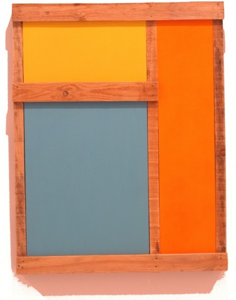
Rafael Montilla Queen Amina Mohamud, 2020 acrylic on canvas 40x40

Para mí se hizo evidente que había que crear nuevos marcos para la pintura en colores puros, construidos por exigencia de los colores; y, en segundo lugar, que el color debería abandonar la mezcla pictórica y convertirse en un factor independiente, que se incorpora a la construcción como un individuo de un sistema colectivo y de la independencia individual. 

Kazimir Malevich

Por mucho que no se diga, los rusos fueron pioneros en arte en los primeros años del siglo XX. Y uno de los creadores más vanguardistas de esos primeros años fue el pintor Kazimir Malévich, que promovía nada menos que la abstracción.

Un universo sin objetos. Sin indicio visual posible. Arte no descriptivo. Quizás conseguir representar «la nada», que viene a ser representarlo todo.

Pero… ¿cómo representar la nada?. Pues sencillamente no se puede, pero sí se puede crear arte centrado sólo en las propiedades físicas de la propia obra. De esa manera quizás el espectador podría llegar a la pura y simple sensación.

Los suprematistas simplifican, ordenan todo, reducen los colores y, así, quizás los espectadores de una obra nos olvidemos que estamos ante una representación, sino ante todo el universo reducido en un cuadrado.

Perez Art Museum PAMM
Pérez Art Museum Miami

Ernesto Cabrera

Ernesto Cabrera canta en Los Adolescentes y The Latin Divos

Ernesto Cabrera canta en Los Adolescentes y The Latin Divos

Ernesto Cabrera es una de las principales figuras musicales de su generación. Cubano, radicado en Miami, es un profesional extremadamente preparado en su difícil arte, el de cantar; cantar no solamente música popular sino que también lírica. Nadie le ha regalado nada y tiene una carrera digna y destacada. Actualmente sobresale en dos proyectos grupales de estilos bastante opuestos. Uno es el trío The Latin Divos, que mezcla el pop con la ópera, mientras que la otra agrupación es connotada dentro del género de la salsa, se trata del grupo Los Adolescentes. Con ambas formaciones Ernesto se destaca, pone una buena dosis de talento y, además, viaja sin parar, realizando conciertos. Al joven le gusta recordar y apreciar cada paso que ha dado. Llegó a Miami en 2016 y no debió esperar mucho para hacerse notar por sus cualidades vocales. Ocurre que dos años después participó en uno de los programas de nuevos talentos que tanto gustan al público alrededor del mundo: corría el año 2018 e hizo una audición en el espacio “La Voz”, de la Cadena Telemundo. Allí encantó a un representante de Los Adolescentes, que precisamente necesitaba a un vocalista en la orquesta. Ernesto dijo sí y empezó el periplo salsero. Sobre The Latin Divos siente un especial afecto. Con el trío ha recorrido buena parte del mundo; sus compañeros también son talentos cubanos, Will Corujo y Fernando González. “Creo que The Latin Divos ha marcado un antes y un después en Miami”, juzga, orgulloso, e invita a seguir a los Divos en las plataformas digitales. Ernesto no desdeña la posibilidad de efectuar labores como solista. “Me gustaría grabar un disco, aunque no es mi prioridad actualmente”, apunta. En los pocos respiros que le dan Los Adolescentes y The Latin Divos, este gran artista ofrenda sus conocimientos dando clases particulares. “Tengo la dicha y la satisfacción de vivir de la música”, afirma.

Perez Art Museum PAMM
Pérez Art Museum Miami

Leila Tschopp

Leila Tschopp
Leila Tschopp

1978 – Argentina

Se graduó en 2002 como profesora de Pintura en la Escuela Nacional de Bellas Artes Prilidiano Pueyrredón, Buenos Aires, y realizó clínicas de producción de obra con Tulio de Sagastizábal.

Obtuvo el segundo premio en Pintura del Salón Nacional (2014) y el segundo premio en el Salón Banco Central (2011). Recibió becas de la Fundación Pollock-Krasner (2012); del Fondo Metropolitano de las Artes (2012), y del Fondo Nacional de las Artes (2008). Participó de numerosas residencias internacionales, entre las que se destacan: Art Omi, Nueva York (2015); Programa de Residencias para Creadores de Iberoamérica y Haití, FONCA-AECID, México (2014) y Skowhegan School of Painting and Sculpture, Maine, Estados Unidos (2013).

Desde 2006 realiza muestras individuales tanto en la Argentina como en el exterior; entre ellas, Disfraz, Fundación Esteban Lisa (Buenos Aires, 2015); La persistencia, Galería Diagrama (México D.F., 2014); Diagrama #1: Movimientos dominantes, Centro Cultural de la Memoria Haroldo Conti (Buenos Aires, 2013); Modelos ideales, 713 Arte Contemporáneo (Buenos Aires), y El salto, galería Transversal (San Pablo) (2012); Modelos ideales, La Maison de l’Argentine (París, 2011); Modelos ideales, KIOSKO Galería (Santa Cruz de la Sierra, 2010); Aun cuando yo quisiese crear, Palais de Glace (Buenos Aires, 2009), y El contexto soy yo, Centro Cultural de España en Buenos Aires (2008).

Participó de numerosas exhibiciones colectivas: El teatro de la pintura, Museo de Arte Moderno de Buenos Aires (MAMbA) (2014); Geometría al límite, Museo de Arte Contemporáneo de Buenos Aires (MACBA) (2013); About Change, World Bank (Washington), y Beyond Desire, ACC Galerie (Weimar) (2011); PintorAs, Museo de Arte Contemporáneo de Rosario (2010), y Argentina hoy, Centro Cultural Banco do Brasil (San Pablo, 2009).

Su obra es parte de las publicaciones 100 Painters of Tomorrow, London, Thames & Hudson, 2014, y Poéticas contemporáneas, Buenos Aires, Fondo Nacional de las Artes, 2011. Sus trabajos integran las colecciones del MACBA; el Museo Castagnino+macro, Rosario; el Goethe Institut, Lisboa; el World Bank, Washington, y el Banco Central de la República Argentina.

Leila Tschopp
Leila Tschopp
Leila Tschopp
Leila Tschopp
Leila Tschopp
Leila Tschopp
Perez Art Museum PAMM
Pérez Art Museum Miami

How To Be Ready To Transition Into A Full-Time Art Career

How to become a full-time artist

How To Be Ready To Transition Into A Full-Time Art Career

Artworkarchive.com

Sports and art aren’t often two areas that overlap, but sometimes advice for athletes is exactly the same as advice for artists. You have probably heard the quote from Wayne Gretzky that goes, “you miss 100% of the shots you don’t take.”

And while we deal more in paint strokes and gallery submissions than goal shots, the sentiment remains true.

Don’t let your doubts or fears keep you from turning your art hobby into a full-time career. Follow these steps to make sure you are building a solid foundation for yourself before making the leap to a full-time art career.

Be Honest With Yourself About Why You Want to Be a Full-Time Artist

Many artists work part-time or even full-time jobs while establishing their art careers. If you have already been balancing both, you probably know how exhausting it can be. This fatigue may lead you to consider jumping in feet first to your art career.  

But before you get in the deep end, ask yourself why you want to make a career out of your art.

Do you believe your work will benefit from more focused time? Do you have such a passion for your art that you can no longer see yourself doing anything else? Do you want to be famous? Do you want freedom from the 9-5?

Write this all down and reflect on where your motivations are coming from.

Take Serious Stock of Whether Or Not You Are Ready

Regardless of your motivation, transitioning into a full-time career is going to take more than just creating art. You are will take on the new role of business owner and will need to take on the responsibilities that come with that if you want to make a living.

Take a good long look in the mirror, and ask yourself if you are ready to become a business owner.

There is nothing wrong with the answer to this question being “no.” In fact, it could save you a lot of stress and set you up for when the answer is eventually an enthusiastic “yes!”

If you currently have a full-time job, scaling down to a part-time job or picking up freelance projects as you transition to making your hobby a full-time gig can provide the financial stability needed to take risks, invest in materials and alleviate some of the stress.

If you aren’t fully ready—either financially or emotionally—you will struggle to build your empire, and you surely won’t enjoy the ride.

Develop a Business Plan You Will Stick To

When you are just starting out, you may not see the need to create a business plan for your art career. It just doesn’t seem that urgent and making the work often takes precedent. But, by taking the time to thoughtfully plan out your business and get it on paper, you will be able to identify the strengths and weaknesses of your business.

Thinking about your pricing and business expenses will be key to making sure you can support yourself before going full-time.

Write down the estimated cost of materials, business cards, marketing materials, and don’t forget to include a budget for paying yourself. Once you have your business expenses laid out, you should clearly see how much you need to sell and for how much in order to make a profit.

Need a hand getting started? Check out these resources from creative business coach Jennifer Lee.

Find More Ways Than One Way Make Money

Getting gallery representation or selling at art fairs are often the first venues that come to mind when thinking considering where to make money as an artist. But, there are other ways you can make money from your work.

Licensing your work is another great way to make additional income and get your work seen by tons of people.

Also, consider the options you have to sell art online. The growth of online shopping had extended to artwork and can be a great sales platform for your business. Just make sure to pick an online platform that will work best for your art business.

If you are ready to plan your sales revenue, start with this cheat sheet outlining the 7 ways you can increase sales in your creative business from the founder of the of the Artist Entrepreneur, Catherine Orer. Then, check out this webinar about business plans in collaboration with Artwork Archive. 

Cultivate a Unique and Authentic Brand For Yourself

Developing a brand for yourself will be one of the single most important things you can do when transitioning into a full-time art career. This is also the hardest part for many artists.

Creating a brand will require some self-reflection to understand how you want people to recognize and relate to your business. Will your audience relate to you as being fun and quirky? Will they recognize your fun, bright colors? Or will they see something in nature and think of your brand?

Take some time to think about what kind of artist you are and what message you want to send to your audience. Your business name, logo, cards, website and social media presence are all ways to communicate your brand. Make sure you keep all things that your customers see consistent with your brand.

Don’t Shy Away From Promoting Yourself

There are many platforms out there to help you make a professional website and online portfolio for yourself. Take advantage of them as a way to drive people to your site.

You can create a professional portfolio of all your work online using a platform like Artwork Archive.

Artists on Artwork Archive have significantly increased sales by adding a link to their public profiles on their social media pages and website.

Perez Art Museum PAMM
Pérez Art Museum Miami

Oli Sihvonen

Oli Sihvonen
Oli Sihvonen

Sihvonen, Oli

1921-1991 – Estados Unidos


Su formación artística comenzó en la Norwich Free Academy, Connecticut, y continuó en la Art Students League, Nueva York. Luego de servir durante la Segunda Guerra Mundial en el Ejército estadounidense, en 1946 prosiguió sus estudios en el Black Mountain College, principalmente con Joseph Albers. Entre 1954 y 1956 enseñó dibujo y diseño en el Hunter College, Nueva York. Luego realizó una residencia artística de un año en la Fundación Helene Wurlitzer, Taos, Nuevo México, ciudad en la que se estableció durante un tiempo junto con su familia. Allí expuso regionalmente y enseñó en las universidades de New Mexico y Denver.

El trabajo de Sihvonen se caracterizó por el estudio sistemático de la interacción entre las formas geométricas, las superficies y la adyacencia de los colores, y cómo estas combinaciones influyen en la percepción visual. Asimismo, en su pintura exploró la geometría y los efectos ópticos y el impacto que éstos generan en los espectadores. Paradójicamente, durante su estadía en Nuevo México su carrera cobró impulso en el circuito artístico de la Costa Este, y participó en las exhibiciones más aclamadas, como Geometric Abstraction in America (1962), Whitney Museum of American Art, Nueva York; The Formalists (1963), Washington Museum of Contemporary Art, y la legendaria The Responsive Eye (1965), en el Museum of Modern Art, Nueva York, el que luego adquirió una de sus obras para su colección permanente.

Sihvonen fue premiado por las fundaciones Pollock- Krasner (1988) y Adolph and Esther Gottlieb (1985) y por el National Endowment for the Arts (1967 y 1977). Sus obras están incluidas en las colecciones permanentes de la Corcoran Gallery of Art, Washington D.C.; el Whitney Museum of American Art; el Museum of Modern Art; la Rockefeller University, Nueva York; el Dallas Museum of Fine Arts; el Art Institute of Chicago; el Asheville Art Museum y el Black Mountain College Museum, Ashville; el Albuquerque Museum of Art; y el University of New Mexico Art Museum, Alburqueque, entre otras prestigiosas instituciones.

Oli Sihvonen
Oli Sihvonen
Oli Sihvonen
Oli Sihvonen
Oli Sihvonen
Oli Sihvonen
Perez Art Museum PAMM
Pérez Art Museum Miami
Page 172 of 177
1 170 171 172 173 174 177
- Advertisement -
Stella Sarmiento Jewelry, cuban link chain
Miami Art

Recent Posts