Revelando “ INSIDE DE WALLS” un exhibición de arte cautivadora.
Por Nubia Abaji.
En una agradable tarde en Coral Gables, la comunidad artística de la ciudad se reunió en el Museo para la muy esperada noche de inauguración de “INSIDE THE WALLS”. Comisariada por Gabriela Fernández, la exposición prometía ofrecer una exploración de temas contemporáneos a través de la lente de artistas emergentes. La velada no decepcionó, inspirando a los asistentes con admiración y reflexiones sobre la importancia y el poder del arraigo y el colectivo como se denoto en la pieza central del salon.
“INSIDE THE WALLS” trasciende los límites tradicionales de la exposición al invitar a los espectadores a profundizar en los espacios íntimos que definen la experiencia humana.
La exposición presenta una variedad de medios, que incluyen pinturas, esculturas, instalaciones, piezas textiles y fotografia, cada una de las cuales contribuye a la narrativa general de los espacios personales y colectivos.
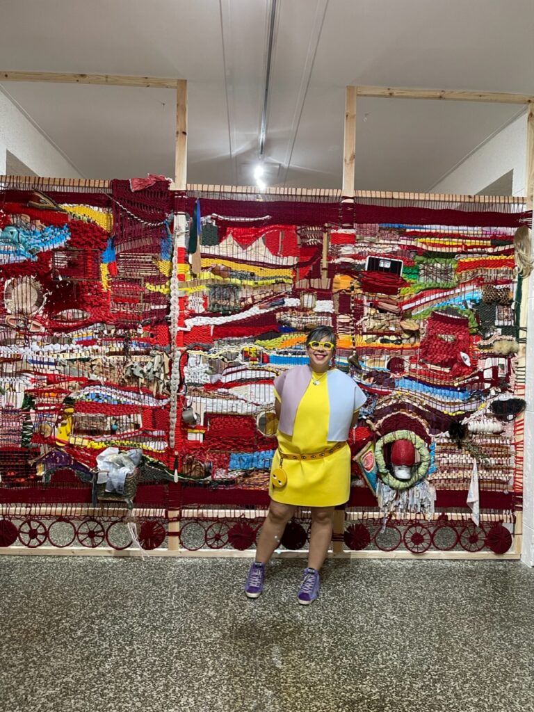
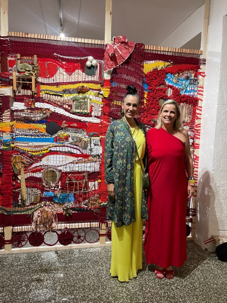
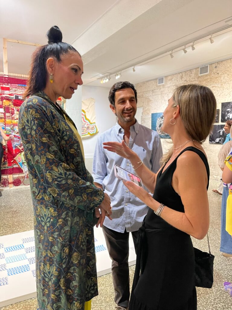
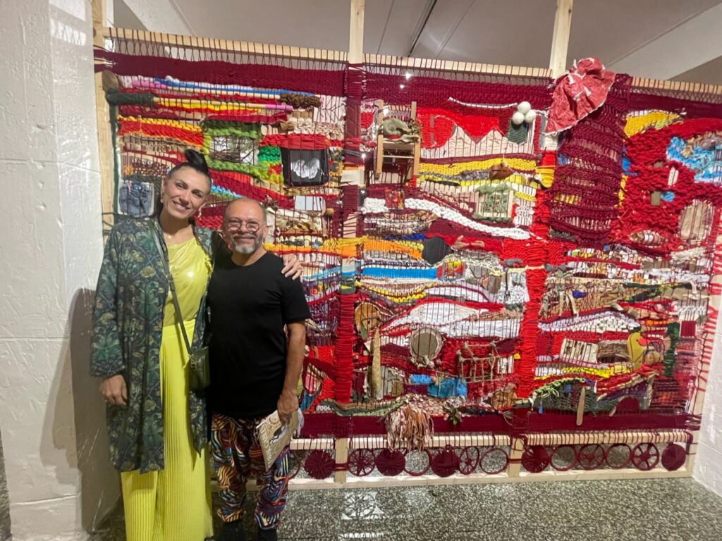
Uno de los aspectos más destacados de la exposición es la instalación colaborativa creada por el grupo de alrededor de diez artistas de la organizacion Fama (Fiber Art Miami Artists), entre las que pudimos saludar a las artistas Marine Fonteyne, Roberta Blatt, Valeria Montag, Vero Murphy, todas bajo la dirección de Aurora Molina. Esta pieza, construida dentro del propio museo, sirve como punto focal de la exposición. Molina, una célebre artista conocida por sus obras intrincadas y socialmente conmovedoras, orquestó esta colaboración para reflejar el dinamismo y la complejidad de la comunidad y la identidad. La instalación, una estructura textil extensa y multifacética, invita a los visitantes a navegar por sus rincones, y cada giro revela una nueva perspectiva o una historia oculta. Encapsula la esencia de “INSIDE THE WALLS” al transformar el espacio del museo en una obra de arte viva.
La colaboración de Molina con los artistas de Fama es un testimonio del poder de la creatividad colectiva. La contribución única de cada artista se entrelaza con el tapiz general, creando una pieza cohesiva y rica en capas. La instalación es una exploración evocadora de temas como la pertenencia, la memoria y los muros invisibles que nos protegen y confinan al mismo tiempo. Se anima a los visitantes a entrar física y metafóricamente “dentro de las paredes”, interactuando con el arte a un nivel personal.
Mientras los invitados deambulaban por la exposición, pudieron contemplar una variedad de otras obras fascinantes. Pinturas que desdibujan la línea entre la realidad y la abstracción, esculturas que desafían las percepciones espaciales y piezas multimedia como fotografias que ofrecen experiencias sensoriales ricas que contribuyen a la profundidad y amplitud de “INSIDE THE WALLS”.
La noche inaugural no fue sólo un festín visual sino también una celebración. La nutrida concurrencia entre la que se encontraban varios artistas mejoraron la experiencia de inmersión, permitiendo a los asistentes perderse en el arte. El statement de “Yo soy tu y tu eres yo, todos somos uno” del uno de los artistas visitantes, Rafael Molina y su performance “KUBEMAN” que concuerda perfectamente con esta colectiva nos eboca nuevamente a la importancia de la interelacion de unos y los otros. Fue muy grato poder compartir con la vista de la artista Maüi Trujillo radicada en Paris acompanada de la Artista Magaly Otaola, Gady Alroy y el destacado curador Jose Antonio Navarrete, las conversaciones entre amantes del arte y se intercambiaron ideas e interpretaciones.
“INSIDE THE WALLS” tendrá una duración de seis meses, lo que brindará al público una amplia oportunidad de interactuar con esta extraordinaria exhibicion. En la velada con el director del museo Elvis Fuentes, reiterammos que el Museo de Coral Gables, es definitivamente un valioso centro de intercambio cultural y artístico que solidifica su estatus como piedra angular de la comunidad con esta exposición.
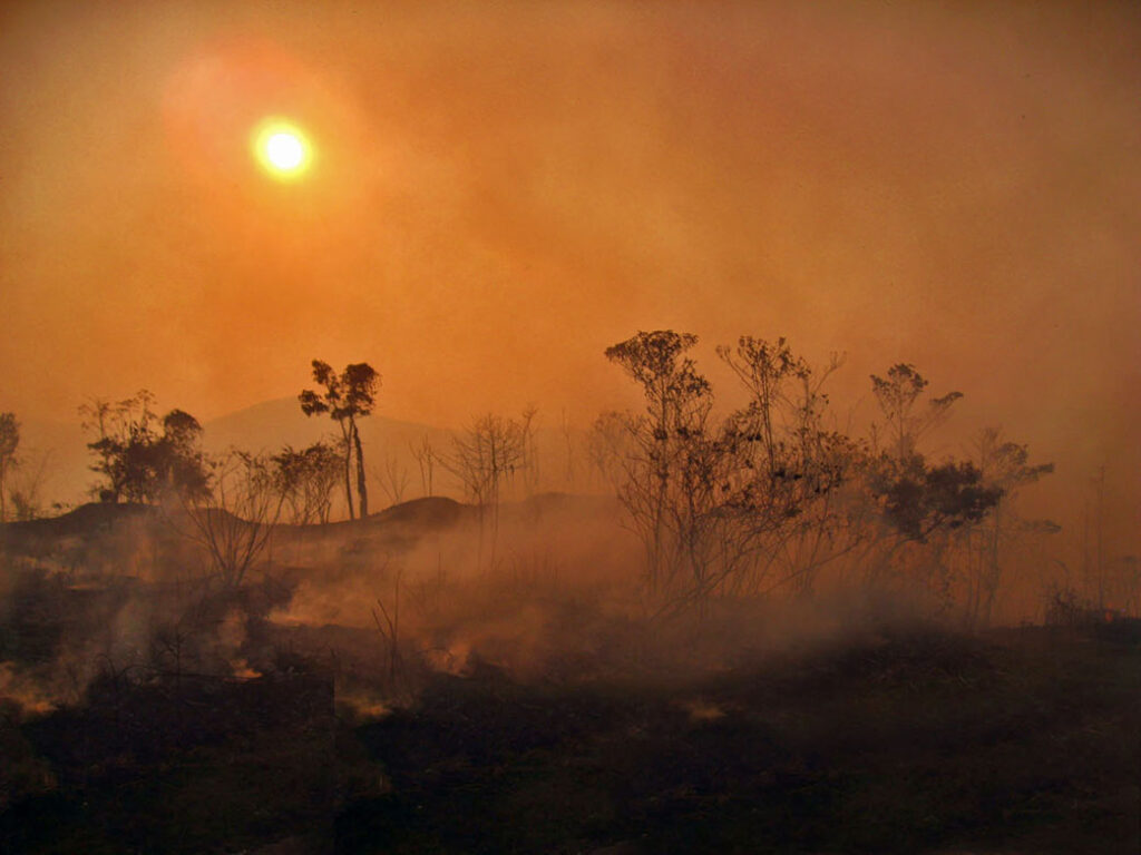
Amazonas Resiliente es la temática del concurso internacional de Cortometrajes Amazinev
Amazonas Resiliente es la temática del concurso internacional de Cortometrajes Amazine
La asociación Watunna Venezuela convoca al Concurso Internacional de Cortometrajes Amazine, en su tercera edición, cuya temática “Amazonas Resiliente“, aspira mostrar las dimensiones, problemáticas y beneficios de ese sistema fluvial y de bosque más grande del mundo, que se extiende a nueve países cuya complejidad, sustentabilidad y beneficios para la humanidad son vitales.
Orientado a apoyar y fomentar el desarrollo de talentos en el ámbito de la creación audiovisual y cinematográfica, el concurso se plantea este año reunir diversas lecturas del Amazonas, un bioma incomparable e insustituible que alberga una población de 47 millones de personas, de las cuales más de 2 millones corresponden a pueblos indígenas de aproximadamente 500 grupos diferentes, posee una biodiversidad extraordinaria y representa el 20% del agua dulce en estado líquido del planeta.
Para la organización Watunna Venezuela, con sede en Francia y su concurso Amazine, son enormes los desafíos cuyos problemas se agravan y se hacen más recurrentes. Su presidente Ana María Méndez-Schreier comenta que el concepto de resiliencia, originalmente aplicado a los seres humanos ha tenido que extenderse cada vez más a escenarios y procesos socio-ambientales y naturales.
“La naturaleza en este caso específico, la Amazonía, si actuamos con la premura del caso, también puede ser resiliente: aún tiene la capacidad de adaptarse, renovarse, reinventarse y recuperarse ante las adversidades “.
Como especialista ambiental Ana Maria Mendez Schreier expresa que esta nueva edición del concurso internacional de cortometrajes aspira aportar una lectura sobre el Amazonas “que permita ir disminuyendo y sustituyendo la minería ilegal, la deforestación, pérdida de la biodiversidad, contaminación, la presencia de grupos irregulares, la migración forzada y hostigamiento de los grupos indígenas, por actividades económicas, formas de emprendimiento y alternativas sustentables, como la agroecología, zoo-criaderos y el ecoturismo. Trabajando juntos, haciendo presión, activismo y difusión, se puede cambiar el destino de la Amazonía y dirigirlo hacia la justicia, el respeto de los derechos humanos e igualdad social, con desarrollo económico inclusivo, desde el compromiso y la responsabilidad global “.
Podrán participar cortometrajes con una duración máxima de 30 minutos incluidos los títulos de crédito, y podrán estar grabados con cualquier dispositivo de grabación : cámara de teléfono móvil, cámara fotográfica digital, cámara de acción, Tablet, videocámara etc., pudiendo luego, si se desea, editar con herramientas externas, deberán con una mínima calidad HD para su parcial o total reproducción y proyección
Asimismo, el creador debe tener todos sus derechos sobre la obra, y cada cortometraje presentado deberá estar subtitulado en inglés, así como también, tener título, autor, guionista, director y todos los derechos de propiedad. Podrán presentarse trabajos tanto de ficción como de animación, documentales o entrevistas narrativas; los formatos de archivo pueden ser MOV, MPEG4, AVI, WMV, MP4. Se otorgará un premio único de 2.000 Euros.
Los jurados de este año son la documentalista, guionista y cineasta venezolana Anabel Rodriguez Ríos, la economista, gestora cultural y directora de cortometrajes de la Amazonía peruana Marllory Quío y el cineasta y defensor de los derechos indígenas, Vincent Carelli, quien llevó el video a las comunidades aborígenes de Brasil desde 1986 con el proyecto Vídeo nas Aldeias, produciendo materiales en sus lenguas originarias y promoviendo el intercambio cultural.
Las inscripciones estarán abiertas hasta el 1ro de octubre de 2024 y deben efectuarse a través de la web del concurso www.watunna.org. Los objetivos de Amazine son enteramente culturales y de activismo y conservación ambiental.
Este proyecto cuenta con el apoyo del Circuito Gran Cine, la Asociación Diálogo por Venezuela, VenEuropa, Observatorio de la Diáspora Venezolana, Programa Somos Caura, Observatorio Venezolano de Derechos Humanos Ambientales, Todos por el futuro y Clima 21Ddhh.
WWW.WATUNNA.ORG
@SHORTSAMAZINE
fotografía cortesía de la comunidad indígen: Lucho Navarro
fotografias paisajes del Amazonas cedidas por SOS Orinoco
‘A canvas for black artistry’: Miami exhibit celebrates Harlem Renaissance literature and art
WLRN Public Media | By Amanda Rosa | Miami Herald
Published May 24, 2024 at 8:00 AM EDT
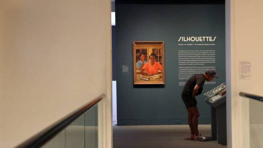
A guest stop to read parts of the “FIRE!” magazine at entrance of the Silhouette exhibition inside The Wolfsonian – FIU on Wednesday, May 22, 2024, in Miami Beach, Florida.
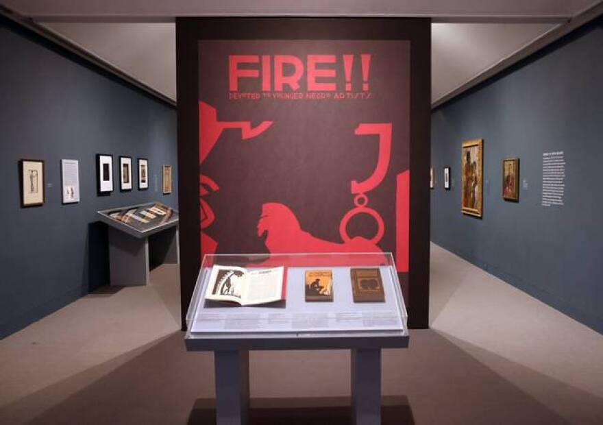
Most people just see the sphinx. Then they notice the circles looped onto the sphinx’s backside, connecting it to an inexplicable J shape. Then the eye moves up to the name of a 1920s magazine: “FIRE!! Devoted to Younger Negro Artists.”
The bold, blown up magazine cover is the first artwork that visitors see when the elevator doors open to The Wolfsonian – FIU museum’s seventh floor. On a recent tour, Miami-based art curator Chris Norwood pointed out what most people miss. The sphinx is an earring. The J is an ear. The random pattern on the artwork’s border is actually a Black woman’s profile.
Once you notice the woman’s face, that’s all you see.
The “FIRE!” magazine cover greets guest as they exit the elevator and enter the Silhouette exhibition inside The Wolfsonian – FIU on Wednesday, May 22, 2024, in Miami Beach, Florida.
Norwood was intentional when he chose this wall-sized image to welcome people into the world of “Silhouettes: Image and Word in the Harlem Renaissance,” a sprawling exhibition celebrating the 100 year anniversary of the start of the Harlem Renaissance at The Wolfsonian on South Beach. The show, up since November, closes on June 23.
“It’s a really interesting metaphor because we’re so drawn into the middle, that we don’t focus on the outliers,” Norwood said of the FIRE!! magazine cover. “We’re always sucked into the middle of things that we don’t see the bigger picture sometimes. It just really just exemplifies the idea of blackness being this bigger picture.”
“Silhouettes” highlights the beauty of book and magazine covers — often illustrated in the style of silhouettes — with the same reverence of paintings and sculptures. The show is all about the storied collaborations between some of the greatest minds, visual artists and authors working between the 1920s and ‘40s, when African-American art, literature and music flourished.
Today, we refer to that era as the Harlem Renaissance. At the time, author Alain Locke dubbed it as The New Negro Movement.
Art collector Chris Norwood at the Hampton Art Lovers gallery at the Historic Ward Rooming House in Overtown. Norwood curated “Silhouettes: Image and Word in the Harlem Renaissance,” a sprawling exhibition celebrating the 100 year anniversary of the start of the Harlem Renaissance at The Wolfsonian.
Norwood worked closely with FIU English professor Shawn Christian on the show, which pulls from The Wolfsonian’s own collection of first edition Harlem Renaissance books. The exhibition also features loaned art from N’Namdi Contemporary, Fisk University Galleries, the Archives at Florida Memorial University, Norwood’s collection, Hampton Art Lovers, Kenkeleba Gallery, Norton Museum of Art, Beth Rudin DeWoody and the family of Harlem Renaissance artist Aaron Douglas.
Douglas illustrated the artwork gracing the cover and pages of FIRE!!, a short-lived magazine with an ironic name. After its first and only issue was published, its offices burned down.
But that single issue was enough to make an impact, Norwood said. It was radical, with stories on street life and prostitution in New York City. Writers like Langston Hughes and Zora Neale Hurston contributed to the magazine — and went on to contribute even more to American culture.
‘People felt more free’ It all started with the urge to rip out pages from a book.
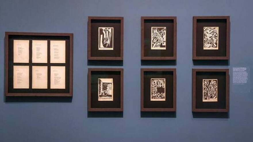
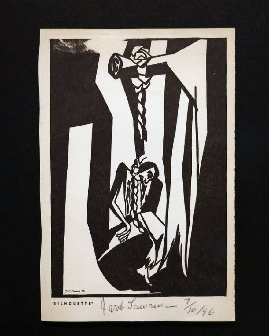
A few years ago, Norwood, a collector and gallerist, acquired an original copy of “One-Way Ticket,” a book of poems written by Langston Hughes with illustrations by Jacob Lawrence, from an auction. The poems and artwork were inspired by The Great Migration, when 6 million African Americans migrated from the South to the North from 1910 to 1970. The illustrations in Norwood’s copy are signed by Lawrence himself.
Pictured are One Way Ticket poems and illustrations at the Silhouette exhibition inside The Wolfsonian – FIU on Wednesday, May 22, 2024, in Miami Beach, Florida.
Each illustration accompanies a poem. There’s one about the blues, a funeral, a graduation and buying a one-way ticket to anywhere but the South. “I am fed up With Jim Crow laws, People who are cruel, And afraid,” Hughes wrote.
Admittedly, Norwood isn’t a literature expert, but he knows how to appreciate art. He carefully tore out each poem and illustration to frame them. Now they’re displayed side-by-side in the exhibition.
“That relationship [with writers] allowed these artists who could not be seen in galleries and museums around the world to now have a vehicle to do that,” Norwood said.
Pictured is one of the illustrations of the One Way Ticket poems at the Silhouette exhibition inside The Wolfsonian – FIU on Wednesday, May 22, 2024, in Miami Beach, Florida.
The exhibition is a treasure trove of history. Take James Weldon Johnson, a recurring character in the show and a true Renaissance man.
Born in 1871 in Jacksonville, Johnson was a prolific author, a musical theater song writer, a U.S. diplomat in Latin America under the Roosevelt administration, the first Black man to sit for the Florida bar and the first executive director of the NAACP.
And, Norwood almost forgot to mention, Johnson is best known for writing “Lift Every Voice and Sing,” a song known today as the Black national anthem. He wrote it as a poem, and his brother composed the music. Johnson was the principal of the school where a choir of children first performed the song in Jacksonville to celebrate Lincoln’s birthday. Johnson and his brother moved to New York City, where they wrote hundreds of songs for musicals, Norwood said. In his absence, the song spread through the South, resonating with Black children. The song was later adopted by the NAACP.
“What I’ve learned, at the end of the day, is that James Weldon Johnson was even more amazing than I thought he was,” Norwood said.
African-American author, lawyer and songwriter James Weldon Johnson originally “The Autobiography of an Ex-Coloured Man” anonymously but republished it during the Harlem Renaissance under his own name. The cover artwork was done by artist Aaron Douglas.
In the first vitrine of books in the exhibition, sitting next to FIRE!!, is Johnson’s book “The Autobiography of an Ex-Coloured Man.” The burnt orange cover art, also by Douglas, shows the silhouette of a Black man sitting in nature looking up at the skyline of a big city and “grappling with this new modern era,” Norwood explained.
Johnson wrote and published the book anonymously in 1912. But during the Harlem Renaissance, he reprinted it with his name on the cover.
“People felt more free,” Norwood said. “He literally didn’t feel comfortable writing this book under his own name 10, 15 years prior.”
Portraits and protests Norwood’s history lesson continued as he walked into a section of the show dedicated to portraits. “The Bible of the Harlem Renaissance,” he said, is Alain Locke’s book, ‘The New Negro.’ Locke was a philosopher, author and “the godfather of the Harlem Renaissance.”
This quote from Locke’s book is printed on the wall: “Whoever wishes to see the Negro in his essential traits, in the full perspective of his achievement and possibilities, must seek the enlightenment of that self-portraiture which the present developments of Negro culture are offering.”
“In today’s world, we all think we’re so important, we do selfies all the time,” Norwood said. “During this time period, the idea that Black people were worthy of portraits was something revolutionary.”
Norwood pointed to a portrait by German artist Winold Reiss of a young man dressed in a sharp gray suit named Harold Jackman, who “exemplified what this New Negro was,” Norwood said. Jackman was a New York University graduate, a model, a public school teacher, an art advocate and “the best looking Black man in Harlem.” (It’s hard to argue. This man was ridiculously handsome.)
Portraits appear throughout the show; images of good-looking, well-dressed, well-to-do, successful Black Americans captured through photography, paint, pastels and sculpture.
In a Wolfsonian-owned painting called “Harlem,” a distinguished woman in a mustard dress balances a baby on her hip. Nearby is a pensive portrait of Zora Neale Hurston, drawn by Reiss. Another gallery displays black-and-white photographs of legendary Harlem Renaissance entertainers like Billie Holiday and Ella Fitzgerald.
In another painting, Grace Goens, Douglas’ favorite cousin, sits for a portrait in an eggplant dress. Across the gallery, is another portrait Douglas made, a watercolor painting of a baby girl, Goens’ niece. “That is the person who actually loaned us this work,” Norwood said.
In another exhibition section about racial uplift is a portrait Douglas painted of singer Marian Anderson the year after she became a civil rights icon. In 1939, Howard University invited her to perform at a large Washington, DC venue, but the venue owners refused to let her sing. Public outcry over the ordeal reached First Lady Eleanor Roosevelt, who helped arrange for Anderson to sing at the Lincoln Memorial on Easter Sunday in front of 75,000 people.
Anderson got the last laugh, and she’s smirking in her portrait.
A painting of singer and civil rights icon Marian Anderson painted by artist Aaron Douglas in 1940. The portrait is on display at The Wolfsonian – FIU for the exhibition “Silhouettes: Image and Word in the Harlem Renaissance.”
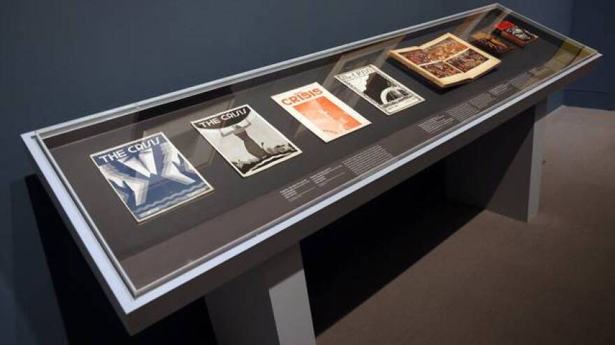
Florida, Harlem and beyond The Harlem Renaissance stretched far beyond Harlem, Norwood said. He gestured toward a vitrine of ultra rare copies of The Crisis, the official newsletter of the NAACP, the first Black American national news outlet and the oldest Black publication in the world. It was founded and edited by W. E. B. Du Bois.
“The covers of these were a basically a canvas for black artistry,” Norwood said. Artists like Douglas (once again) and Laura Wheeler Waring illustrated magazine covers with the grandeur of movie posters.
The vitrine of Crisis magazines is displayed at the Silhouette exhibition inside The Wolfsonian – FIU on Wednesday, May 22, 2024, in Miami Beach, Florida.
The Crisis was a springboard for Black writers and artists. The publication featured national and international coverage of civil rights and equality issues for a Black American audience to read. Among those issues was Italy’s 1935 invasion of Ethiopia, an African country that has never been colonized. The invasion caused an uproar in African-American communities, with marches in Harlem and Chicago.
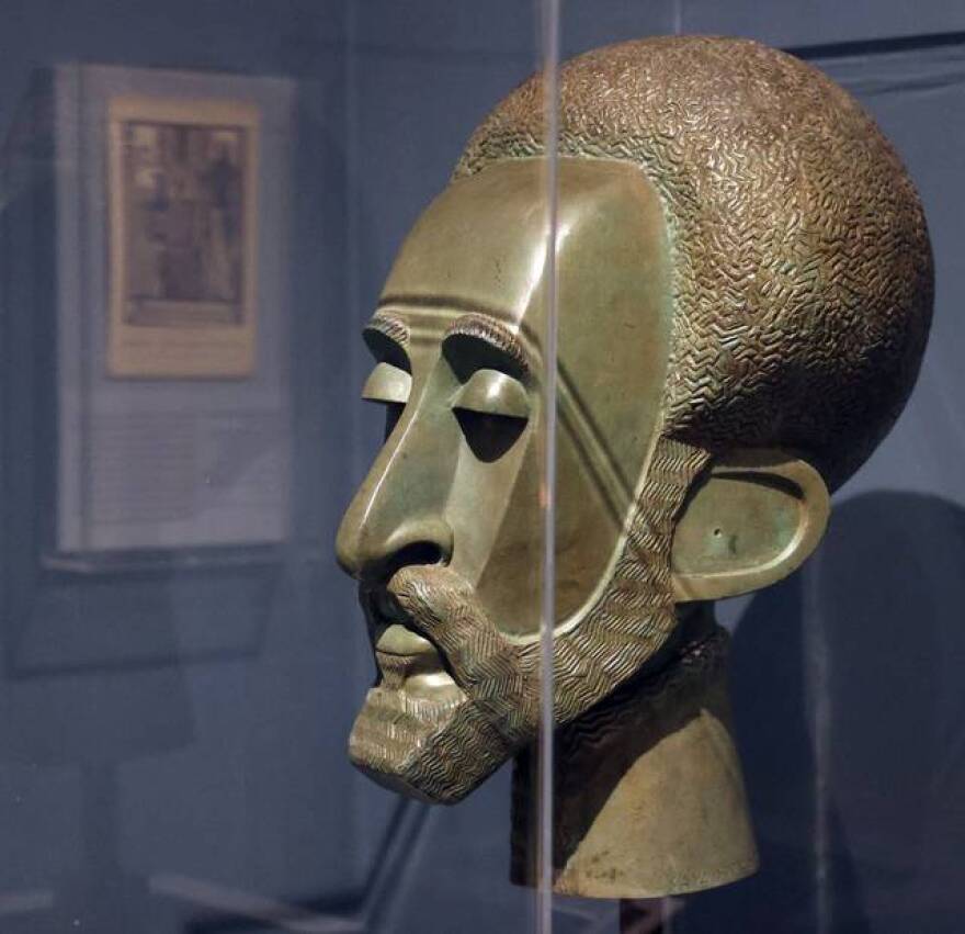
A small frame houses a pamphlet that captures this moment in history. It’s an issue of Negro History Week, edited by Carter Godwin Woodson, who originated Black History Month. The James Lesesne Wells illustration, called “Ethiopia Appeals for Justice,” depicts Ethiopian Emperor Haile Selassie, who spent years in exile in England during the invasion. While Selassie was there, an artist created a bust sculpture of him. That sculpture, part of The Wolfsonian collection, is displayed next to the pamphlet.
Pictured is the Ethiopian sculpture at the Silhouette exhibition inside The Wolfsonian – FIU on Wednesday, May 22, 2024, in Miami Beach, Florida.
The exhibition ends by paying homage to Floridian artist’s contributions to the Harlem Renaissance. Chief among them is Hurston, an artist who’s memory lingers throughout the show. Raised in Eatonville, Florida, Hurston moved to New York to study at Barnard College. She was an accomplished anthropologist and author of books about Black culture and life in the South, like the classic novel “Their Eyes Were Watching God.”
Despite her achievements, Hurston was underpaid and underappreciated. She died in poverty and was buried in an unmarked grave in 1960. Twelve years later, author Alice Walker uncovered her resting place and created a marker.
Artist Winold Reiss depicted Floridian author and anthropologist Zora Neale Hurston in this portrait. The artwork is on display at The Wolfsonian – FIU on South Beach for an exhibition on the Harlem Renaissance.
Patricia Feito, a museum visitor and Barry University English professor, marveled at the copies of Hurston’s books in the exhibition. Feito doesn’t visit museums often, but she said she was blown away by “Silhouettes” and the history it represents. It even gave her goosebumps.
“To see it all here in one space and so beautifully curated is, for me, a special moment,” Feito said. “This is seminal for Floridians, largely because there are significant artists, writers, anthropologists who are represented so beautifully in this exhibition that are from Florida and represent a culture in Florida.”
Museums play a role in educating the public on overlooked histories through the art they show and collect, Norwood said. He hopes audiences walk away from the exhibition understanding that the history of Harlem Renaissance was more than singing and dancing. “It touched on so many aspects of life,” he said.
“So often in today’s society, people believe the world began the day they were born. There’s a ambivalence towards knowing history,” he said. “If you don’t know history, how can you ever know if you’re being innovative?”
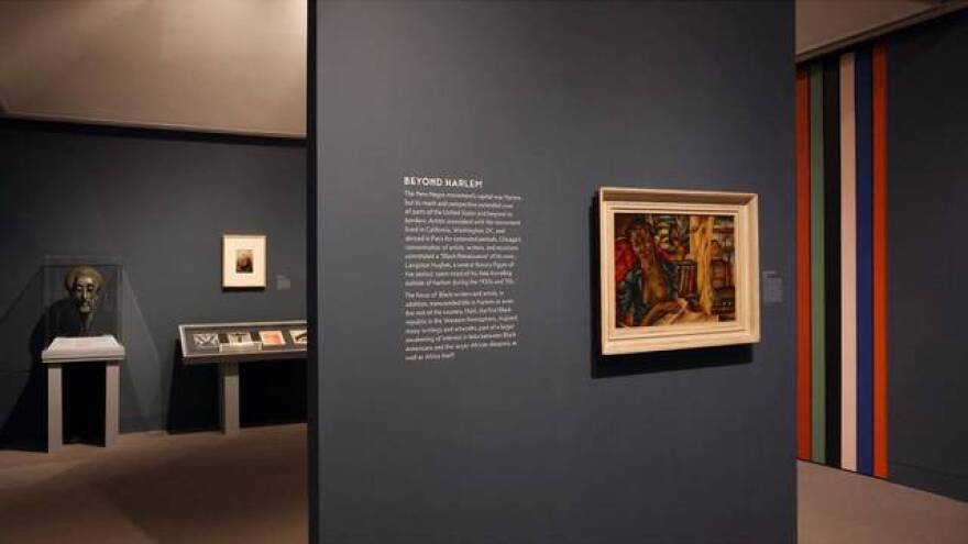
Pictured is one of the sections of the Silhouette exhibition inside The Wolfsonian – FIU on Wednesday, May 22, 2024, in Miami Beach, Florida.
Silhouettes: Image and word in the Harlem Renaissance
Where: The Wolfsonian–FIU, 1001 Washington Avenue, Miami Beach When: On view until June 23 Info: Free admission for Florida residents. Find more info here.
This story was produced with financial support from individuals and Berkowitz Contemporary Arts in partnership with Journalism Funding Partners, as part of an independent journalism fellowship program. The Miami Herald maintains full editorial control of this work.
Unveiling “INSIDE THE WALLS”: A Captivating Art Exhibition
Coral Gables Museum May 24, 2024
By Nubia Abaji
On a pleasant afternoon in Coral Gables, the art community gathered at the Museum for the highly anticipated opening night of “INSIDE THE WALLS,” curated by Gabriela Fernández. The exhibition promised to offer an exploration of contemporary themes through the lens of emerging artists. The evening did not disappoint, leaving attendees with admiration and thought-provoking reflections on the importance of cultural roots and the collective as denoted in the centerpiece of the room.
“INSIDE THE WALLS” transcends traditional exhibition boundaries by inviting viewers to delve deeper into the intimate spaces that define the human experience.
The exhibition features a variety of media, including paintings, sculptures, installations, textile pieces and photography, each of which contributes to the overall narrative of personal and collective spaces.
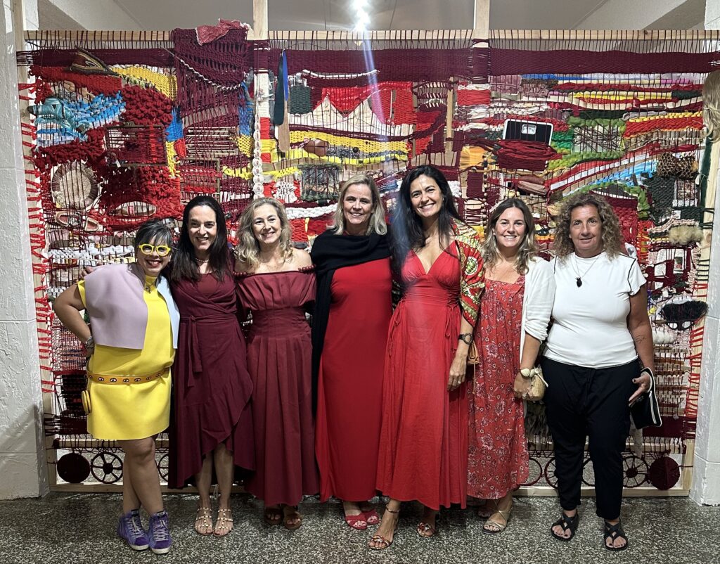
One of the highlights of the exhibition is the collaborative installation created by a group of around ten artists from the organization FAMA (Fiber Art Miami Artists), among whom we were able to meet the artists Marine Fonteyne, Roberta Blatt, Valeria Montag, Vero Murphy, all under the direction of Aurora Molina. This piece, built within the Museum itself, serves as the focal point of the exhibition. Molina, a celebrated artist known for her intricate and socially moving works, orchestrated this collaboration to reflect the dynamism and complexity of community and identity. The installation, a sprawling, multifaceted textile structure, invites visitors to navigate its corners, each turn revealing a new perspective or hidden story. It encapsulates the essence of “INSIDE THE WALLS” by transforming the museum space into a living work of art.
Molina’s collaboration with FAMA artists is a testament to the power of collective creativity. Each artist has a unique contribution which is woven into the overall tapestry, creating a cohesive and richly layered piece. The installation is an evocative exploration of themes such as belonging, memory, and the invisible walls that protect and confine us at the same time. Visitors are encouraged to physically and metaphorically enter “within the walls”, interacting with the art on a personal level.
As guests wandered through the exhibition, they were able to view a variety of other fascinating works. Paintings that blur the line between reality and abstraction, sculptures that challenge spatial perceptions, and multimedia pieces such as photographs that offer rich sensory experiences that contribute to the depth of “INSIDE THE WALLS.”
Opening night was not only a visual feast but also a celebration. The large audience, which included several artists, enhanced the immersive experience, allowing attendees to lose themselves in the art. The statement “I am you, and you are me, we are all one” by one of the visiting artists, Rafael Montilla, and his performance “KUBEMAN” coincides perfectly with this collective and reminds us again of the importance of the interrelation of one and other. It was very pleasant to be able to share with the Paris-based artist Maüi Trujillo, accompanied by the Artists Magaly Otaola, Gady Alroy, and the prominent curator Jose Antonio Navarrete, the conversations between art lovers’ ideas and interpretations.
“INSIDE THE WALLS” will run for six months, giving the public ample opportunity to interact with this extraordinary exhibition. In the evening with museum director Elvis Fuentes, we reiterated that the Coral Gables Museum is a valuable center of cultural and artistic exchange that solidifies its status as a cornerstone of the community with this exhibition.
Photos courtesy of Red Thread Art Studio (Angela Bolaños, Anna Biondo, Aurora Molina, Aida Tejada, Bella Cardim, Debora Rosental, Fernanda Froes, Flavia Daudt, Flor Godward, Juliana Torres, Marcela Ash, Marine Fonteyne, Mirele Volkart, Paola Mondolfi, Roberta Blatt, Sarah Laing, Valeria Montag, Vero Murphy)
Throughout his august career, Julio Larraz has consistently and profoundly tackled the manner in which time is signified and grasped in painting. Temporality, or the presence of time in consciousness (or being), may well be the most complex and difficult concept to explore in painting. The first breakthrough came in Diego Velázquez’s Las Hilanderas (1657) with the blur of the loom spokes on the left and those of the young woman’s fingers on the right. The issue seemed clear: time, like the wind, is visible only by its effects, and so motion and its evanescence in sensorial awareness constitute the primary, if not the exclusive, language for the visual representation of temporality. Other Baroque masters, such as Bernini and Rembrandt, also delved into the theme which would harken later to Turner, Goya, Géricault, Delacroix, among others. In the modern era, the concept is central to various abstractionist movements–Informalism, Abstract Expressionism, and Kineticism.
Temporality haunts representational painting in particular because of its focus on the life-world (Edmund Husserl’s term for the reality we share experientially). From Van Gogh and Gauguin to Sargent and Sorolla to the Surrealists and beyond, the struggle to reflect through painting on our consciousness of time endures. Music, literature, and cinema are inextricably grounded in time; hence they offer quite different insights into its dynamics in consciousness. Architecture has an implied temporal component in how we experience buildings by moving around and through them.
ELECTIONS FROM CORAL GABLES MUSEUM’S PERMANENT COLLECTION
Galeras Gallery, Coral Gables Museum | March 23 – Jun 9, 2024
Coral Gables Museum showcases a selection from its Permanent Collection, reflecting our steadfast commitment to the mission of celebrating, investigating, and honoring the civic arts of architecture, urban and environmental design, and the visual arts while fostering an appreciation for the culture and history of Coral Gables. Spanning from historical artifacts to contemporary artworks, alongside significant architectural and urban design elements, visitors are invited to explore the multilayered stories that these pieces evoke about our built environment and the integral role civic art plays in shaping our communal and individual identities. This exhibition serves as a vibrant testament to the enduring power of art to inspire, connect, and reflect our community’s pride as The City Beautiful.
We would like to thank donors for their generosity and trust, and invite others to consider Coral Gables Museum as the future home for their treasures. We also invite you to donate to our Phineas Paist Acquisitions Fund in order to significantly expand the depth of our historic holdings.
SELECCIONES DE LA COLECCIÓN PERMANENTE DEL MUSEO DE CORAL GABLES
Galería Galeras | 23 de marzo – 26 de mayo de 2024
El Museo de Coral Gables exhibe una selección de su Colección Permanente que refleja nuestro firme compromiso con la misión de celebrar, investigar y honrar las artes cívicas de la arquitectura, el diseño urbano y ambiental, así como las artes visuales, a la vez que fomentamos el aprecio por la cultura y la historia de Coral Gables. Abarcando desde artefactos históricos hasta obras de arte contemporáneas e importantes elementos arquitectónicos y de diseño urbano, esta muestra es una invitación a explorar múltiples historias sobre nuestro entorno y el papel integral que desempeña el arte cívico en la configuración de nuestras identidades comunitarias e individuales. Esta exposición es un vibrante testimonio del poder imperecedero del arte para inspirar, conectar y reflejar el orgullo de nuestra ciudad como La Ciudad Hermosa.
Nos gustaría agradecer a las personas que han donado a nuestra colección por su generosidad y confianza. Quisiéramos también invitarlo a considerar el Museo de Coral Gables como el futuro hogar de sus tesoros. También le animamos a contribuir a nuestro Fondo de Adquisiciones Phineas Paist que nos permitirá expandir y profundizar en nuestra colección histórica.
Latin Grammy® winner Yamandu Costa is widely considered one of the great guitarists in the world today. This virtuoso 7-string guitar player has left audiences breathless around the world with his impressive skill and overwhelming passion. Born in Rio Grande do Sul to a musical family, he played his first major concert at age 17 in São Paulo and quickly gained international fame for his incredible talent. Yamandu is credited with reviving Brazilian guitar music and his diverse repertoire includes styles like chorinho, bossa nova, milonga, tango, samba and chamamé, making him difficult to categorize into a single genre. A 2021 Latin Grammy winner for Best Instrumental Album, Costa has collaborated with Bobby McFerrin, Richard Galliano, Doug de Vries, Gilberto Gil, Toquinho, João Bosco, Ney Matogrosso, Marisa Monte, Renato Borghetti, and many more. He has also been a featured soloist with symphony orchestras around the world.
“Musicians of this caliber that make you fall out of your seat come once in a generation.”
La Presse Montreal
About Sanctuary of the Arts Sanctuary of the Arts (SOTA) is a collaborative, artist-led institution that operates under three tiers of service to South Florida’s diverse community: 1) To present world-class national and international talent, 2) To support and strengthen existing small and medium arts organizations, and 3) To support the next generation of young artists with an array of mentorship opportunities, including strategic planning, development, production, rehearsal and performance space. Both a presenter and/or producer, SOTA’s reach and impact is exponentially maximized through four resident companies, and over 10 collaborative partners, all leading to a wider audience base, more personal engagement, and ultimately assisting in workforce development of sustainable arts careers. About Brazilian Nites Brazilian Nites, a booking agency and production company founded in 1989, offers top-level Brazilian artists and bands the opportunity to perform at prestigious venues, clubs and festivals in the US and Canada. With offices in Los Angeles and also Miami, headed by Gene de Souza, the agency has presented tours with Marisa Monte, Tribalistas, Djavan, Lulu Santos, Alceu Valença, Diogo Nogueira, Yamandu Costa, among many other. For more info visit BrazilianNites.com.
EL ASTRO DEL FUTBOL NUEVAMENTE ASISTIÓ A LA BRESH, GENERANDO REVUELO ENTRE LOS PRESENTES Y COINCIDIENDO CON MARIA BECERRA QUE CANTÓ EN LA FIESTA.
LA BRESH SIGUE DE GIRA EN MAYO Y JUNIO EN ESTADOS UNIDOS.
Luego del triunfo del Inter Miami ante DC United, el astro del futbol, Leo Messi y su esposa Antonela Rocuzzo, asistieron nuevamente a la famosa Fiesta Bresh que se celebró este fin de semana en el Hotel Hard Rock Hollywood generando emoción y un gran revuelo entre los presentes.
Junto con Luis Suarez, su esposa Sofi Balbi, Elena Galera, Stef Roitman y un grupo de amigos, coincidieron con la reconocida artista María Becerra quien cantó en la fiesta. Fue una noche especial, se les vió alegres, con su sencillez de siempre posando ante las cámaras, cantando y disfrutando de la música de su compatriota.
Es la segunda vez en pocas semanas que Messi asiste a la Bresh, algo que evidencia que es uno de sus planes favoritos.
“Qué hermoso tenerlos en casa, los amamos. La noche más linda del mundo.” comentó Bresh en su cuenta de instagram.
La Fiesta Bresh que se replica en diferentes lugares del mundo y van millones de personas, sigue de gira en mayo y junio por Estados Unidos. Continύa en New York y Chicago el 25 de mayo, seguido de Houston el 31 de mayo, luego Dallas 1 de junio, San Francisco 7 de junio, Los Ángeles 8 de junio y Austin 15 de junio. En Miami todos los viernes en M2 (www.fiestabresh.com).
¿Que tiene la Bresh que figuras como Messi y grandes artistas regresan a la Fiesta Bresh? Descúbrelo asistiendo a sus fiestas alrededor del mundo.
BRESH – USA ROADTRIP:
New York, NY – mayo 25 – HK Hall
Chicago, IL – mayo 25 – Park West (Sueños Festival)
Houston, TX – mayo 31 – Warehouse Live Midtown
Dallas, TX – junio 1 – The Echo Lounge & Music Hall
San Francisco, CA – junio 7 – August Hall
Los Angeles, CA – junio 8 – The Bellwether
Austin, TX – junio 15 – Emo’s Austin
Miami, FL – Cada viernes en M2
Boletos en: www.fiestabresh.com
Sigue a Bresh en: Instagram: @bresh TikTok @fiestabresh
Bonnie Clearwater joined NSU Art Museum Fort Lauderdale as Director and Chief Curator in September 2013. An influential leader who played a major role in Miami’s emergence and development as an international arts center, she is widely recognized for her curatorial vision, scholarship and record in administration, public education and community outreach. Ms. Clearwater spearheaded an exciting phase of transformation at NSU Art Museum that includes an overall rebranding and expansion of the museum’s reach locally, nationally and internationally. Her initiatives include the development of a world-class exhibition program, expansion of the museum’s education initiatives and public programming, and increased engagement with diverse audiences.
Known for her ability to identify and nurture emerging artists, over the past two decades, she presented the first U.S. solo museum exhibitions for some of today’s most significant artists including: Daniel Arsham, Hernan Bas, Tracey Emin, Teresita Fernandez, Mark Handforth, Jonathan Meese, Albert Oehlen, Matthew Ritchie and Shinique Smith. She also curated historically important solo exhibitions of artists David Smith, Frank Stella, Roy Lichtenstein, Richard Artschwager, Malcolm Morley, Jack Pierson and Helen Frankenthaler, in addition to groundbreaking thematic exhibitions.
Recognized for her experience in museum education, Ms. Clearwater guides NSU Art Museum Fort Lauderdale’s education program, in which students of all ages are inspired by direct access to the museum’s exhibitions, collection and professional staff.
Ms. Clearwater has written extensively on Modern and contemporary art and is a respected scholar of Mark Rothko. She is the author of The Rothko Book (Tate Publishing/Abrams) and Mark Rothko: Works on Paper, (Hudson Hills). Other publications include: Tracey Emin: Angel Without You (contributing writer) (Rizzoli); Edward Ruscha: Words Without Thoughts Never to Heaven Go, (Abrams); Roy Lichtenstein: Inside/Outside and Frank Stella at 2000: Changing the Rules (both for MOCA, North Miami); editor/contributing author of West Coast Duchamp (Grassfield Press) and Ana Mendieta: A Book of Works (Grassfield Press), among other titles.
From 1997 – 2013, she was the Executive Director and Chief Curator of the Museum of Contemporary Art, North Miami where she developed an internationally renowned exhibition program and guided the museum’s education program. Prior to that, she was Executive Director of the Lannan Foundation Art Programs in Los Angeles and Director of the Lannan Museum in Lake Worth, Florida. She served as Curator of The Mark Rothko Foundation in New York and concurrently was Curator of the Leonard and Evelyn Lauder Collection also in New York. She also served as Curator of the Peter Norton Family collection.
She has an M.A. in art history from Columbia University and a B.A. in art history from New York University.
"The Time Begins": A Group Exhibition Exploring Time, Memory, and Perception
“The Time Begins”: A Group Exhibition Exploring Time, Memory, and Perception
The Miami Hispanic Cultural Center (MHCC) is proud to present “The Time Begins,” a group exhibition opening on Thursday, May 23rd, from 6:00 PM to 9:00 PM. Curated by Picardo, this dynamic exhibition showcases the work of a collective of talented local artists, offering a unique and impactful experience through art.
Exploring the Duality of Time
“The Time Begins” delves into the multifaceted concept of time, inviting viewers to contemplate the interplay between memory, perception, and its influence on our experience. Through a diverse range of mediums including photography, sculpture, painting, and mixed media, the participating artists will showcase their personal interpretations of this universal theme.
A Vibrant Opening Reception
The opening reception promises to be a captivating event, with the opportunity to meet the artists, engage with their thought-provoking works, and delve deeper into the essence of “The Time Begins.” Guests will enjoy live performances, light refreshments, and a fun photo booth to capture memories of the evening.
Join the Conversation
The MHCC invites the community to experience “The Time Begins” and participate in the ongoing conversation around time, memory, and the power of artistic expression.
Exhibition Details
Exhibition Title: The Time Begins
Opening Reception: Thursday, May 23rd, 6:00 PM – 9:00 PM
Location: Miami Hispanic Cultural Center, 111 SW 5th Ave, Miami, FL 33130