back to top
Thursday, August 28, 2025
Home Blog Page 136

ART FAIRS

Kubes in Action, Mono-ha artwork in Miami, FL

ART FAIRS

  • Art Basel Miami Beach Miami Beach, FL NOVEMBER 30 – DECEMBER 3, 2022
  • 2022
    • Frieze London The Regent’s Park, London, UK OCTOBER 12 – OCTOBER 16, 2022
    • Art BaselBasel, Switzerland JUNE 16 – JUNE 19, 2022
    • Independent New York, NY MAY 5 – MAY 8, 2022
    • Outsider Art Fair New York, NY MARCH 3 – MARCH 6, 2022
    • Felix Art Fair Los Angeles, CA FEBRUARY 17 – FEBRUARY 20, 2022
    • Art Basel OVR:2021 Online FEBRUARY 9 – FEBRUARY 12, 2022
  • 2021
    • Art Basel Miami Beach Miami Beach, FL DECEMBER 2 – DECEMBER 4, 2021
    • Dallas Art Fair Dallas, TX NOVEMBER 11 – NOVEMBER 14, 2021
    • Frieze London The Regent’s Park, London, UK OCTOBER 13 – OCTOBER 17, 2021
    • Independent New York, NY SEPTEMBER 9 – SEPTEMBER 12, 2021
    • Frieze New York New York, NY MAY 5 – MAY 9, 2021
  • 2020
    • NADA Miami Online DECEMBER 1 – DECEMBER 5, 2020
    • Art Basel OVR:2020 Online SEPTEMBER 23 – SEPTEMBER 26, 2020
    • FAIR Online MAY 20 – JUNE 21, 2020
    • Frieze Viewing Room Online MAY 6 – MAY 15, 2020
    • Independent New York New York, NY MARCH 5 – MARCH 8, 2020
    • Felix Los Angeles, CA FEBRUARY 13 – FEBRUARY 16, 2020
  • 2019
    • Art Basel Miami Beach Miami Beach, FL DECEMBER 5 – DECEMBER 8, 2019
    • NADA Chicago Invitational Chicago, IL SEPTEMBER 18 – SEPTEMBER 21, 2019
    • Frieze New York New York, NY MAY 2 – MAY 5, 2019
    • Dallas Art Fair Dallas, Texas APRIL 11 – APRIL 14, 2019
    • Material Art Fair Mexico City, Mexico FEBRUARY 7 – FEBRUARY 10, 2019
  • 2018
    • NADA Miami Miami, FL DECEMBER 6 – DECEMBER 9, 2018
    • Upstairs Art Fair Amagansett, NY JULY 13 – JULY 15, 2018
    • Frieze New York New York, NY MAY 3 – MAY 6, 2018
    • Dallas Art Fair Dallas, TX APRIL 12 – APRIL 15, 2018
    • NADA New York New York, NY MARCH 8 – MARCH 11, 2018
  • 2017
    • NADA Miami Miami, FL DECEMBER 7 – DECEMBER 10, 2017
    • arteBA Buenos Aires, Argentina MAY 24 – MAY 27, 2017
    • Dallas Art Fair Dallas, TX APRIL 6 – APRIL 9, 2017
    • The Armory Show New York, NY MARCH 2 – MARCH 5, 2017
    • NADA New York New York, NY MARCH 2 – MARCH 5, 2017
    • Outsider Art Fair New York, NY JANUARY 19 – JANUARY 22, 2017
  • 2016
    • The Armory Show New York, NY MARCH 3 – MARCH 6, 2016
    • NADA New York New York, NY MAY 5 – MAY 8, 2016
    • Dallas Art Fair Dallas, TX APRIL 14 – APRIL 17, 2016
    • NADA Miami Beach Miami Beach, FL DECEMBER 1 – DECEMBER 4, 2016
  • 2015
    • Dallas Art Fair Dallas, TX APRIL 9 – APRIL 12, 2015
    • The Armory Show New York, NY MARCH 5 – MARCH 8, 2015
    • NADA New York New York, NY MAY 14 – MAY 17, 2015
    • Officielle, FIAC Paris, FRANCE OCTOBER 21 – OCTOBER 25, 2015
    • NADA Miami Beach Miami Beach, FL DECEMBER 3 – DECEMBER 5, 2015
  • 2014
    • Dallas Art Fair Dallas, TX APRIL 11 – APRIL 13, 2014
    • NADA New York New York, NY MAY 9 – MAY 11, 2014
    • Officielle, FIAC Paris, FRANCE OCTOBER 21 – OCTOBER 26, 2014
    • NADA Miami Beach Miami Beach, FL DECEMBER 4 – DECEMBER 7, 2014
  • 2013
    • NADA Miami Beach Miami Beach, FL DECEMBER 1 – DECEMBER 4, 2011
    • NADA New York New York, NY MAY 4 – MAY 7, 2013
    • Dallas Art Fair Dallas, TX APRIL 12 – APRIL 14, 2013
  • 2012
    • NADA New York New York, NY MAY 4 – MAY 7, 2017
  • 2011
    • Art Los Angeles Contemporary Los Angeles, CA JANUARY 27 – JANUARY 30, 2011
    • NADA Hudson Hudson, New York JULY 30 – JULY 31, 2011
    • NADA Miami Beach Miami Beach, FL DECEMBER 1 – DECEMBER 4, 2011
  • 2010
    • NADA Miami Beach Miami Beach, FL DECEMBER 2 – DECEMBER 5, 2010
  • 2009
    • NADA Miami Beach Miami Beach, FL DECEMBER 3 – DECEMBER 6, 2009
  • 2008
    • NADA Miami Beach Miami, FL DECEMBER 3 – DECEMBER 7, 2008

EL MUEBLE

Rafael-Montill-El-Mueble-Peter Regalado Productions

Obra de teatro “El Mueble”

Peter Regalado Productions (“Cuba Nostalgia” – “Cuba Under The Stars”) presenta una gran comedia en el Westchester Cultural Arts Center:

EL MUEBLE (O todas esas cosas que nunca diremos)”

De Juan Carlos Rubio y Yolanda G. Serrano

Con Adrián Mas y Tania Guzmán

Dirección: Tony Acevedo

ESTRENO: sábado 17 de septiembre, 8 pm

Boletos a precios accesibles en www.wcacenter.org o 305-222-2221

“El mueble” también tendrá funciones el 18, 23, 24 y 25 de septiembre.

(Debajo de la foto, más información)

Sinopsis de “El mueble”

Una pareja instalada en la rutina decide ir a la tienda Ikea un sábado por la tarde a comprar una estantería. Tati es una mujer organizada y segura; Carlos es un hombre desorganizado e inseguro. Tati quiere ir a la mueblería El Dorado y comprarse un mueble “mueble”. Carlos prefiere una estantería barata en Ikea. Al final, se hace siempre lo que él quiere, aunque ella siempre tenga la razón. Tati cede, compran en Ikea, y el montaje se convierte en un infierno, de desencuentros, desavenencias y reproches. En definitiva, que hay cosas que hay que decirlas, pero también cosas que hay que callarlas. Con cada tornillo, taquito y bisagra saltan por los aires las quejas ocultas y las reclamaciones evidentes. Y es que, cuando un mueble entra por la puerta, el amor sale por la ventana.

SLATOPARRA

SLATOPARRA Art Gallry

SLATOPARRA was born from the partnership between Leonor Parra, founder of Carré Latin in Paris, the only festival dedicated to the promotion of the Latin American art scene, and Alex Slato, an expert in Latin American art with over 30 years of experience and former director of the Museum of Latin American Art (MOLAA) in Long Beach, California. Combining their extensive experience, Leonor and Alex have set up SLATOPARRA as an friendly exhibition space strengthening the long-standing relationship between the Parisian art scene and Latin American artists, bringing art works from Central and South America and the Hispanic Caribbean to the European public. SLATOPARRA desires to fortify its position as an essential space which would exclusively be dedicated to showcasing the work of modern and contemporary Latin American artists.

Located in the prestigious Matignon district (6 avenue Delcassé, 75008, Paris), the SLATOPARRA gallery offers both a selection of new contemporary works, as well as second-hand pieces from Latin America by combining an exhibition calendar with a schedule filled with activities, such as lectures, film screenings, readings, discussions… thus reinforcing its mission to promote dialogue regarding Latin American artistic and cultural expressions and contributing to the legitimization of these artists in the international market.

SLATOPARRA does its utmost to put its knowledge and resources to the disposition of the community, thus strengthening the close link between artists, collectors and institutions.

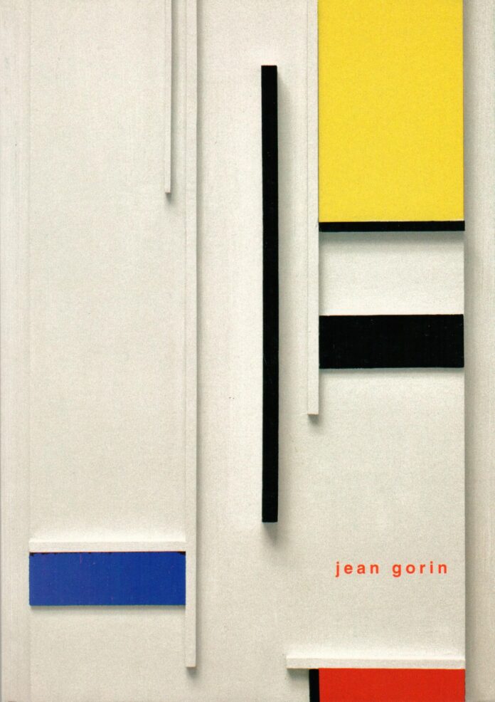
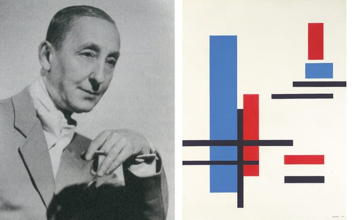
GEOMETRIC ABSTRACT PAINTING AND PARIS IN THE THIRTIES, PART II

Constructivism art Rafael Montilla

GEOMETRIC ABSTRACT PAINTING AND PARIS IN THE THIRTIES, PART II

John Elderfield, Artforum.com

 . . a controllable structure, a solid structure without chance or individual caprice. Without imagination? Yes. Without feeling? Yes, but not without spirit, not without universality and, as I think, not empty.
—Van Doesburg, 1930

We are Quakers, whose severely cut clothes are made of damask and cloth of silver.
—Aldous Huxley, 1930

IN THE YEARS AROUND 1930 when Mondrian was painting his most minimal works, Van Doesburg had “totally finished with any arrangement or composition guided with sentiment.”17 Art concret of 1930 was the last theoretical manifestation of Van Doesburg’s ever eloquent demands for an objective method, or at least a utilitarian universalism, and, though his last writings approach a “scientific” character, this “science” still held a spiritual and esthetic content revealing but a tougher kind of what was nevertheless akin to the machine-romanticism of twenties abstractionist theory: “If one does not succeed in tracing a straight line by hand, one takes a ruler. Typewriting is clearer, more legible, and more beautiful than handwriting. We do not want an artistic handwriting.” (my italics).18 Nevertheless, Van Doesburg’s propagandist activities had been an important force for the partisan geometric style and his death at Davos in 1931 must surely count as a factor relevant to the relaxation of extreme positions and the compromise of geometric and non-geometric currents which characterizes Parisian art of the thirties. In this sense Van Doesburg’s last “simultaneous” and “mathematical” compositions mark the end of an era. But some did, of course, extend the premises of art conceived in the mind before achieving its realization in “a technical perfection equal to the perfection of its composition.”19 The long-standing anti-individualist principles were continued by artists like Vordemberge and Vantongerloo, the one in a precise but surfacely sensual manner and the other in an anonymous and intellectually oriented “functional” system which yet developed beyond the geometric basis of Art concret. Thus, Alfred Barr’s 1936 suggestion that “the geometric tradition in abstract art . . . is in the decline” and “non-geometric biomorphic forms . . . are definitely in the ascendant” is generally confirmed.20

“I might have known,” Mondrian is reported to have said, when hearing in 1938 that Vantongerloo was using curved lines, for even Vantongerloo’s “severely cut” art appeared a sell-out of pure neo-Plastic principles. But Vantongerloo’s work, though sometimes close in appearance to Mondrian’s, had so consistently been concerned with “expanding” tensions irreconcilable (ultimately) with a rectilinear format that it was perhaps predictable that he would eventually sacrifice the plane for the image. “Space is not geometrical,” he had written in 1925,21 and indeed much of his work while giving the appearance of rectilinear or planar structure was based upon principles of spherical volume (in sculpture) and radiating con-centric form (in painting). For Vantongerloo, mathematical analysis had shown that the straight line, the square and the rectangle were but aspects of a truly reasonable vocabulary and had, moreover, been used “by the majority of artists, including some of the most famed” as “emblems of vanity,” the straight line being “just as bourgeois and anti-universal as a portrait of Lenin, a prosperous businessman, a monarch, or anyone else”—words heretical to neo-Plasticism.22 And so, “while his horizontal-vertical compositions had often been conceived as the function of an ovoid or a curve, these curved forms now became directly visible in his work.”23 Several of Vantongerloo’s early thirties compositions seem to have used the horizontal-vertical schema to support an impression of concentric movement around a centrally placed element; and this is still visible in Courbes of 1937, except that now discrete curves are placed within the divided field (in a manner, incidentally, close to that of Kandinsky’s contemporary work) even though these curves are “geometrically” tense (in some works they look like straight lines in disguise). By 1938, however, the linear elements are far freer and there is no longer any attempt to reinforce these elements with an imposed geometric surface structure; the comparison with Surrealist abstraction becomes more and more manifest. But the modifications which Vantongerloo made to the “high art” formulae of the twenties are far less extreme than those of many other members of the Abstraction-Création group, which Vantongerloo helped found in 1931.

Art d’aujourd’hui of 1925 had represented a pretty catholic selection of modern art, including work from some half a dozen groups and countries as well as from France. Only about half of the exhibited work was abstract. In contrast, Cercle et Carré of 1929–30 took far more of a stand for abstraction itself, and, though admitting some hardly abstract painters, its core consisted of artists like Mondrian, Kandinsky, Arp, Schwitters, Vantongerloo, Vordemberge-Gildewart, Tauber, Pevsner and Huszar. The name of Van Doesburg is absent: he, seeming to dislike groups run by others, was busy preparing Art concret with Hélion and Carlslund, Tutundjian and Wantz. But after Van Doesburg’s death, Abstraction-Création alone carried the torch of pure abstract art. Abstraction-Création-Art non-figuratif was officially established in Paris on February 15, 1931, dedicated to “non-figuration, c’est a dire culture de la plastique pure, a l’exclusion, de tout element explicatif, anecdotique, litteraire, naturaliste, etc.,” and (in the 1935 issue of its magazine) claimed 416 members, half of whom lived outside of Paris. In this 1935 memorandum, “Cubists, Futurists, Surrealists or other tendencies are not indicated”; and, although by 1935, and indeed earlier, non-purist tendencies had infiltrated the group, the basic shared premises were of a “culture de la plastique pure” and an “art non-figuratif.” Typical members ranged from the well-established abstractionists (Mondrian, Kandinsky, Moholy-Nagy, Arp, Gabo, etc.) to late De Stijl members (Domela and Vordemberge) to emerging Paris artists (Gorin and Hélion) and included important contingents from England (Nicholson and Hepworth) and Poland (Strzeminski and Stazewski) as well as from Switzerland, America and elsewhere. With all these to account for (and over 400 others) it would be foolish to attempt a comprehensive catalog of styles; but certain general features may be noted from the character of work produced: as a group, the interrelation of (1) French (post-Cubist) abstracting systems and foreign (De Stijl, Elementarist, Constructivist, etc.) non-objective ones; (2) the overall premise of “art non-figuratif” to associative ones (the subject is the image or the image implies the subject), i.e. the connection with Surrealist trends; (3) a general (almost philosophical) idea of “freedom” as against that of formal restraint. And in terms of internal organization the interplay of (a) surface and illusionistic space; (b) geometric and biomorphic or zoomorphic forms; (c) an anonymous and “expressive” technique.

Although these features are most apparent in the work of younger artists, the character of Kandinsky’s Paris work is usefully illuminated in this context. Kandinsky’s arrival in Paris in 1933 coincided with the modification of the dogmatic “constructive” geometrical forms of his Bauhaus years in favor of a more complex and expressive manner. Striped of 1934 shows Kandinsky organizing the new biomorphic forms across clearly separated positive-negative strips, playing the fixed against the free in terms of both form and space, creating tensions calculated to effect a dramatic pictorial impact. That Kandinsky was essentially involved with tensions and relationships as emotive principles is suggested by the incidence of such words as “contrasts,” “actions,” “accents,” etc., in the titles of the Paris paintings. The contrast of fixed and free appears also in such devices as entirely containing amoeboid forms within a divided surface field, anchoring elements to an edge, then disturbing their equilibrium with spatial ambiguities, manipulating figure-ground relationships across symmetrically divided compositions, and so on. Dominant Curve of 1936 introduces the distinctly illusionistic set of “steps” which leads up to emphasize the top-heaviness of the composition and graphically illustrates the suggestion that Kandinsky equated illusionistic and cosmic space and related the upper section of his canvas to the heavens and the lower part to the earth.24 The variety of forms in this work and their frequent transparent spatial interpenetration does not, however, completely disguise the overall impression of elements somehow being released forward from the plane of the canvas, something Kandinsky had discussed a year earlier in his essay, “Toile Vide25 And this sense of movement outside the canvas area, toward the spectator, is what links this work with the seemingly more rational Striped of 1934. In his Concerning the Spiritual in Art, Kandinsky mentioned “some ideal plane” which existed “in front of the material plane of the canvas”;26 and in Point, Line and Plane that “the recession and advance of the form elements draw the basic plane forward (toward the observer) and backwards in depth (away from the observer) in such a manner that the basic plane, like an accordion, is pulled apart in both directions.”27 Thus the “material” or “basic” plane (i.e. the picture plane) is conceived as an elastic surface which might extend forward, toward the observer, and create, between the observer and the work itself, an imaginary “ideal plane,” an effect supported in the Paris works by textural variation.28 This may occur in both works which assert their relationship to the rectangular frame (like Striped) and in those which tend to disregard literal shape (like Dominant Curve): both are illusionistic, though different in nature—the one a kind of quadri riportati where the frame contains a potential spatial release; the other a quadratura of confusion between the real and imagined. It must, however, be admitted that by isolating elements from the periphery of the pictorial surface the likelihood of extra-pictorial extension, in the associative sense, is enhanced; and this is an important characteristic of Kandinsky’s Paris works, whose revaluation of Bauhaus constructional principles subsume structural analogies to dynamist ones, the biomorphic and zoomorphic shapes (appearing from about 1934) suggesting a real universe of baroque energy. It seems certain that the introduction of such shapes owed much to the influence of Paris artists like Miró and Arp, but it would nevertheless not be amiss to think of Kandinsky’s late work, like Mondrian’s, as a kind of release within which a deeply-rooted structural basis is allied to a new freedom of application (of which the radically liberated color range is not the least in significance). That these works reflect the spirit of thirties Paris appears not only in their quasi-Surrealist connections, but also, in the opposite direction, in Kandinsky’s involvement with the idea of a “concrete” art. After suggesting “reale Kunst” in 1935 as an alternative to “abstract” he finally decided on Van Doesburg’s “concrete” (Abstract and Concrete, 1938); but Kandinsky’s use of this word was without the utilitarian emphasis Van Doesburg gave it: it rather referred to a real “world of art” which does not depict the “world of nature” but, like the latter, is subject to “the general laws of the ‘cosmic world,’” from which Kandinsky’s work had always been informed.

Kandinsky’s concern for the “ideal” (forward) plane finds curious, if less spiritual, parallels in the relief constructions of artists like Domela and Vordemberge. For both of these artists the tableau-objet appeared as the logical extension of an Elementarist vocabulary towards more personalized “expression.” An awareness of surface properties carried into relief is a significant hallmark of thirties abstraction (visible also in such different artists as Delaunay, Reth and Nicholson); and although it can be traced back to the Constructivist “culture of materials,” in the thirties a new consciously esthetic culture of materials (for) themselves appeared. While Vordemberge’s Composition No. 7 of 1924 expresses that clarity of basic form evidencing an elementary vocabulary translated into the materials of mass-production which places it securely in the era of the neue Sachlichkeit, Domela’s thirties reliefs reveal a sense of luxurious and sensual pictorial values (closer to Mies’s Barcelona Pavilion than to the Dessau Bauhaus): his Tableau-relief of 1932 is a superb example of how the “dynamic” characteristics of a counter-composition format achieved equivalence in three dimensions, and how the polemical asceticism and reductivism of the twenties began to give way to sensitivity, and to individuality. Domela’s first reliefs date from around 1929; and once the break had been made with the purely painted surface his reliefs became more complex and their materials more varied—brass, copper, perspex, various woods (and later marble, ivory and sealskin). From 1932 the curved line appeared which, as with Vantongerloo, expressed a rejection of De Stijl principles. Two Ovals of 1934 belongs so certainly to the thirties, not only in its overall precious look but even in such details as the clustered rods which recall Mondrian’s multiple line structure.

But if complexity and sensuality do appear as a general characteristic of thirties abstraction, some do not fit this pattern. Less typical of the thirties is the seven-strong Polish contingent of Abstraction-Création of which the most renowned members are Wladyslaw Strzeminski and Henryk Stazewski. Perhaps their continued “utilitarian” approach was because neither of them played any active role in Paris itself, but their work should be mentioned here if only because the Polish contribution to abstract art is still insufficiently appreciated or documented.29

Stimulated by Russian abstract art, Strzeminski and Stazewski concerned themselves with “newness” and “utilitarian beauty,” using universalist elements for an art of “collectivist construction.” What links these two is the wish to avoid a hierarchy of formal elements; instead the kind of homogenous equivalence which produced works like Stazewski’s White on White of 1932 (Galerie Denise-René, Paris) and Strzeminski’s “unistic” paintings. But their paintings were not always as entirely reductive as their tough theories: Stazewski, for example, worked also in both an actively optical manner and a controlled surface one (cf. his Abstract Composition of about 1929). Strzeminski, however, when not painting his unistic works, seems to have often limited his means to two interlocking shapes in a series of “architectonic” compositions (cf. his Composition Architectonique of 1926). Strzeminski had originally been very much impressed by Suprematism but came to oppose its “dynamism” and its dramatic form and color contrasts, as well as its “cosmic” metaphysics which “causes form to be neglected, and literature to overgrow.” For him, the desire for dynamism was an extra-pictorial concern, both philosophically and formally. This alone separates the Pole from his Parisian contemporaries. In 1928 Strzeminski published his Unism in Painting which rejected all “dramatic baroque” for “uniform” pictorial characteristics: “. . . be it late Cubism, Suprematism, or Mondrian’s Neoplasticism, the planes are flat, yet the whole is not flat”; “. . . the dynamism of planes throws the plane of color outside the plane of the picture”; rather, “. . . a picture should be uniform and flat.” In the unistic works, formed by a regular pattern of dabs or furrows of paint, Strzeminski came close to his theoretical ambitions: “The purpose ought not to be the division of the picture, but its unity, presented in a direct way: optically. So one must renounce the line, one must renounce rhythm . . . one must renounce oppositions and contrasts . . . one must renounce division,” for a totally reductive and monochromatic unistic art.

If this essay was intended to establish a total picture of abstract art in Paris in the thirties far more should be concerned with non-geometric currents. Since, however, the state of thirties geometric art in relation to its twenties past is the main theme, such important figures for this period as Arp, Delaunay or Magnelli are here neglected.30 It should yet be stressed that at the Paris core of Abstraction-Création there was felt to be no real division between geometric and non-geometric abstract painting (nor, indeed, between the painters and sculptors, though the latter are also excluded here) although the identity of abstraction itself was sacrosanct. That such different artists as Arp, Delaunay, Domela, Gabo, Gleizes, Herbin, Magnelli and Vantongerloo could work together indicates the broad-minded give and take that occurred in the merging of the abstract schools. What we need to remember, however, is that in the thirties abstract artists were still conscious of being an unpopular minority of the École de Paris, and that (as Haftmann has suggested) to the Paris art world, shaped by Impressionism, purely non-figurative painting with a machine-like impersonality and using new materials had a look of anti-art about it. Nevertheless, some young French artists were attracted to pure geometry, Gorin and Hélion for example. But, as Hélion’s development shows, this was most often an intermediary stage toward a freer kind of abstract painting. Hélion, a student of architecture and engineering, was drawn to De Stijl ideas and at 26 collaborated with Van Doesburg in Art Concret—his Composition Orthogonale of 1929–30 very much reveals the formulistic and anonymous premises of Van Doesburg’s side of the De Stijl tradition. By 1932, however, when Hélion had joined Abstraction-Création,31 his work was using elements in a less rigid manner (cf. his Equilibre of that year), and by 1935 his Bande Verte shows volumistic forms floating in a space which, although obviously deriving from a Cubist box-space, is yet comparable to the more emotional “space” in Paule Vézelay’s Worlds in Space (also 1935); a far cry from the older utilitarian geometric style. This relaxation of established geometric currents is what typifies Paris thirties art, and distinguishes it from similar collaborations of geometric and non-geometric art in other countries.32 The perhaps inevitable tendency of an elementary vocabulary to proliferate was, as has been suggested, one reason for this development. Others were the “fine art” atmosphere of Paris where, unlike further east, the idea of a “modern” metropolis never really existed; and the contemporary strengths of Realism and Surrealism. But it is worth also considering that, despite the modifications the geometric style underwent in this period, abstraction continued to hold, for some, a special kind of “democratic” social content and that the contemporary totalitarian opposition to this art tended to renew its original universalist implications.33

Certainly there is evidence for this view in the pages of the Abstraction-Création journals. In the fourth number, for example, Gorin reasserted that abstraction was directed “Vers un Art Social et Collectif Universel” and Evie Hone wrote that by tending to destroy individualist principles abstraction became concerned with communist ones. But one of the clearest statements of this kind, and one which does tend to support the suggestion that the principle of “freedom” is the significant common factor of the art and ideology of the thirties in other than totalitarian states,34 appears as an editorial statement: “Le Cahier ‘Abstraction-Création’ No. 2 parait au moment où, sous toutes les formes, sur tous les plans, dans quelques pays d’avantage qu’ailleurs, mais partout, la pensée libre est férocement combattue . . . Nous placons ce cahier No. 2 sous le signe d’une opposition totale à toute oppression, de quelqu’ordre qu’elle soit.” (And we remember that a similar sentiment is to be found in Alfred Barr’s 1936 dedication of Cubism and Abstract Art.)

But this is only one side of the picture: the decline of pure abstraction might well be explained, in avant-garde terms, by the fact that artist and public had now a common enemy—that the threat of totalitarianism dissolved the validity of a belligerent avant-garde—and the new popularity of realist styles in “democratic” countries understood as the wish to assert a common “humanism” and as part of the post-depression revaluation of the metropolitan ideal which had in the twenties informed the geometric style. Likewise, the “social ideal” of the twenties had so obviously failed, not only in Germany but as importantly in Soviet Russia where, though modernist fine art idioms had ended in 1922, advanced architecture and design seemed, to many western observers, to have been given the go-ahead. But the fiasco of the Palace of the Soviets competition in 1932 finally ended that ideal of a possible revolutionary art; and Gide was “. . . forced to admit in so many words: that is not what we wanted. One step more and we should even say: it is exactly what we did not want.” (Retour de l’U.R.S.S., 1936.) By 1936, optimism was hard to come by in France: in social, economic and fiscal terms the country was in confusion. In that year the last number of Abstraction-Création appeared. (An attempt to continue its work was made by the Arps and Domela who founded the review Plastique in the spring of 1937. It began by confirming the sources of the geometric style—the first number was devoted to Malevich, but the following issues seem to confirm that the avant-garde had in fact united—with features on not only abstract art but Surrealism.) Butif Russia was the big disappointment, America was the big opportunity. (The third number of Plastique was dedicated to the development of abstract art in America.) In the same year as Abstraction-Création ended, Alfred Barr put on his big Cubism and Abstract Art show at the Museum of Modern Art in New York and the Association of American Abstract Artists was founded. In the 1935 memorandum of Abstraction-Création, “interest” in abstract art in America had been noted (the American contingent of Abstraction-Création was second in size of the foreign countries represented),35 although it was surely affirmed that “. . . Paris is the center of the movement . . . We sincerely hope she will keep this position and prerogative.” However, the increase in emigration of important artists throughout the thirties and the coming of World War II saw the pendulum swing again; for many, America offered a rediscovery of the metropolis in the new world.

John Elderfield

—————————
NOTES

17. Letter to Kok, Jan. 23, 1930. Quoted in the catalog, De Stijl, Stedelijk Museum, Amsterdam, 1951, 46.

18. Manifeste de l’art concret, 1930.

19. Manileste de l’art concret 1930. Of the younger artists Vordemberge was most obsessed with technical perfection.

20. Cubism and Abstract Art, New York, 1936, a book by now part of the history of abstraction. But Barr’s strict division of “non-geometrical abstract art” and “geometrical abstract art” into separate currents which had emerged as such by the mid-thirties (on the jacket diagram) falsifies the true thirties merging of styles.

21. Vantongerloo, Paintings, Sculptures, Reflections, New York, 1948, 12.

22. Vantongerloo, 42. The. reference to “some of the most famed” artists is obviously directed at Mondrian. Vantongerloo later writes that, “The concept of the vertical as an absolute value, impersonal, semi-religious, directly social, anti-theosophical has not been understood.”

23. Max Bill in the catalog, Georges Vantongerloo, Marlborough Fine Art, London, 1962, 5.

24. Rose-Carol Washton, “Kandinsky. A space odyssey,” Art News, LXVIII, 6, October 1969, 49 .

25. Cahiers d’Art, X, 5–6, 1935, 117.

26. Wittenborn edn., New York, 1947, 67 (which, however, gives “prior to” for vor der).

27. Guggenheim edn., New York, 1947, 124.

28. This is also suggested by Paul Overy (Kandinsky: the Language of the Eye, London, 1969, 119) who writes that Kandinsky arranged his forms in “such a way that (the picture plane) appears to expand beyond the physical limits of the canvas. The forms seem to be related to unseen elements beyond the frame.” But Overy considers this effect irreconcilable with the division of picture plane into separate rectangular compartments (which are supposed to contract not expand it). Striped shows, however, that Kandinsky did in fact effect expansion from a divided field, since the expansion at question is not lateral but forward. But Overy’s suggestion (p. 120) that Kandinsky’s more frequent disregard for the edges of the picture plane in the Paris works is akin to Mannerist or Baroque spatial principles is relevant here.

29. The following quotations come mainly from a special Polish number of Typographica (No. 9, June 1964). Other references to Stazewski and Strzeminski are in Bernard Karpel’s bibliography to George Rickey, Constructivism, Origins and Evolution, London, 1967. A pamphlet on Stazewski by Hanna Ptaszkowska was produced in 1965 by Wydawmctwo Artystyczno-Graficzne, Warsaw in the series “Wspolczesne malarstwo polskie.”

30. Paris in the thirties saw also the beginnings of geometric art by artists like Max Bill and Ben Nicholson, but since their work of this period less directly informs my thesis than that of those who had before the thirties found a geometric style and henceforward modified it, they too are excluded.

31. Hélion was an important and active member of Abstraction-Création, especially in his contacts with young English artists. He invited Nicholson and Hepworth to join the association and it was on his suggestion that Myfanwy Piper started Axis.

32. For example, the proto-Surrealist and abstract membership of Unit 1 in England in 1933–35. Cf. Charles Harrison, “Abstract Painting in Britain in the early 1930s,” Studio International, CLXXIII, 888, April 1967, 180–191.

33. For the relationship of the ideologies of the twenties and the thirties in Germany see my “Total and totalitarian art,” Studio International, April, 1970.

34. Harrison, 185; who quotes the following passage.

35. The higher figures are: Paris—209, Switzerland—68, France (except Paris)—43, America—33, Holland—12, Great Britain—11, Germany—11.

GEOMETRIC ABSTRACT PAINTING AND PARIS IN THE THIRTIES, PART I

Constructionist Geometric Abstract Art

GEOMETRIC ABSTRACT PAINTING AND PARIS IN THE THIRTIES, PART I

John Elderfield, Artforum.com

“IT WON’T DO,” WROTE Theo Van Doesburg in 1925, “it won’t do to use the exterior forms of the new as a recipe, in order to produce decorative or applied arts.”1 But by the early thirties abstraction seemed to have lost its uncompromising character, its equilibrium, and some younger abstract artists were producing what Van Doesburg had mockingly called “quadratic baroque.” Both Van Doesburg and Mondrian had, in fact, recognized that second generation abstractionists ran the risk of borrowing exterior stylistic forms without a full comprehension of their implicit spirit; but the abstract “mannerisms” which these old masters noticed in others’ work was not entirely absent from their own. Mondrian, for example, having reached a climax in reductive development in the very sparse canvases of 1930–1933, embarked on work of increasing complexity and ambiguity which tended to contradict his avowed aims of “equilibrium” and “plastic regularity.” Likewise, the Paris work of that other old master of abstract art, Kandinsky, radically revalued “constructive” principles for an art of illusionism, drama and even sentiment. But Paris in the thirties wasn’t Germany in the twenties, and in the last years of international abstraction before World War II, a different and special kind of abstract art was created.

The story could well begin in January of 1929, at the Paris exhibition of Friedel Vordemberge-Gildewart, with the meeting of the critic Michel Seuphor and the Uruguayan painter Torres-Garcia.2 Here, and at subsequent meetings at the Café Voltaire and the Brasserie Lipp, the idea of a new group of abstract artists was discussed. Mondrian and Van Doesburg were consulted, as was Arp and others, and in March of 1930 Cercle et Carré came into being. Although short-lived, the mailing list of this group provided the basis for the more durable organization, Abstraction-Création, run by Herbin and Vantongerloo, which made propaganda for abstract art until it too collapsed in 1936.

But the sources of the Paris thirties alliances go back further than this. If Abstraction-Création developed from Cercle et Carré, the latter group similarly owed much to earlier attempts to introduce to Paris foreign geometric abstraction. In the twenties, the Paris art world had reacted to any such attempts with extreme coolness: the 1924 De Stijl exhibition was a flop, and Mondrian’s difficulties in selling his work in Phis period are well known. The most ambitious attempt to bring in this alien abstraction was perhaps that of the painter Poznanski, who had a small success with the Art d’aujourd’hui exhibition of 1925, partly achieved, no doubt, by the clever ploy of showing foreign geometric work and indigenous post-Cubist abstraction together. But despite the very defensive tone adopted in the catalog statement—with its respectable references to Poussin and predictable antithesis of abstract art and photography—only Zervos’ Cahiers d’Art could find anything good to say about it.3 Nevertheless, with the increase in emigrations from Germany to Paris, the alliance of foreign hard-core abstractionists to those Paris-oriented artists who had developed to an extreme the decorative possibilities of synthetic Cubism was what became characteristic of Paris thirties abstraction. The interplay of these trends against the background of the increasing social unrest of the period is an important theme. Another is the internal formal crisis in which geometric abstraction found itself in the thirties—something made partly explicable by the influence of non-geometric currents, but owing as much to certain implicit and idealistic contradictions in the theory of abstraction itself as developed in the early Utopian years. It is to this formal crisis we must look first, and its effect on that most consistently Utopian artist, Mondrian.

To me, the circle and the square were the sky and the earth as symbolized by the ancient Oriental religions; they formed a kind of rudimentary alphabet by means of which everything could be expressed with the most limited means. They evoked prehistoric runes and the early Chinese I-Ching, or Book of Changes.
—Michel Seuphor

SEUPHOR’S DESCRIPTION OF THE SYMBOLS of Cercle et Carré well suggests his dependence on the international abstractionist esthetic, with its dual motives of mysticism and utilitarianism. The idea of “a kind of rudimentary alphabet” was developed in the period around the Great War and although becoming for many an almost functional system, was originally informed by the occult connections of figures like Malevich, Mondrian and Kandinsky, who were concerned with a psychic (not physical) grammar of “thought forms” (not functional or materialistic ones). Indeed, the emergence of abstraction might well be viewed as an attempt to repudiate the materialism of contemporary society. But the spiritual connections of the early years were increasingly put aside by such tougher-minded propagandists as Van Doesburg and Moholy-Nagy, and, as developed, the theory of Elementarism wished to free its formal vocabulary from this original superstructure so that art might be less dependent upon individual caprice and, by becoming very nearly utilitarian, have a closer social contact. This utilitarianist assumption welcomed the reductivist origins of abstractionism, believing that an art of lowest common denominator would assert “universal” qualities, but ignored the dependence of this exclusive vocabulary on a belief in the primacy of consciousness over environmental materialism. The transference of a simplistic, personally-motivated ideal into a collectively anonymous art activity took little account of the individualistic sources, finding it convenient to subsume the “elements” themselves but more difficult to construct anything like a workable syntactic guide. It could even be said that the individualistic will never be absent from a construction based on reductive principles and that social or “universalist” ambitions imply a built-in redundancy, not brevity, of “language,” an elaboration, not contraction, of “elements.”

As a utilitarian theory, Elementarism falls flat, since the context of elements is what is important, and once the relational aspect is brought in, the individual elements themselves are relatively insignificant. For example, what characterizes Mondrian’s art is not the elements themselves, which may be rationally described, but their irrational organization. Moreover, reductivism cannot be prolonged indefinitely (Malevich’s work showed this) and formal proliferation is perhaps inevitable. For Mondrian, however, reductivism was not so much an initial assumption as something worked for through a decade, “the slow and sure path of evolution . . . towards the spiritual,” as he put it himself.4 While others were expanding the “rules” to include new elements (e.g., Moholy-Nagy’s new “biotechnical” elements) or enlivening the old ones in new directions (Van Doesburg’s introduction of the diagonal in his “counter-compositions”) Mondrian persisted in the straight and narrow of his prescribed formal system. But once the zenith had been reached, Mondrian’s “exact law-abiding organization” (as Kandinsky defined “composition”) gave way to more elaborate and intricate forms. Around 1932–33, some kind of crisis occurred, bringing, as part of a general crisis affecting much Paris art of that period, a reassessment of the premises of the previous decade.

Mondrian had considered the years 1921–22 crucial in his career. Although he had been producing totally non-figurative art since 1915–16 it was only around 1922 that he settled for what were to be the principal characteristics of his subsequent development: a square or vertical painting format enclosing relatively pure primaries on a white background and structured by strong black lines most often extending to the very edges of the painting surface. The development and purification of this formula occupied him for the next ten years. After a gradual increase in pictorial “openness” from around 1925, effected principally by allowing the largest rectangular area of any composition to be unbounded on one or two sides by internal dividing lines, he arrived at two or three basic compositional types which he developed from around 1928–1932. The work of this period is characterized by maximum clarity of elements and of color placement, “solemnity” of composition, and relative anonymity of style (he sometimes burnished the surface to suppress brush-work). The culmination of this approach is in the minimal works of 1930–32–33, many of which utilize a cruciform theme (reminiscent of Schoenmaeker’s “construction of nature’s reality”) and approach an “ultimate solution” in their color reduction and linear sparsity (cf. Composition 2 with Black Lines of 1930). In Modernist terms, Mondrian had thus entrenched his work more firmly in its area of competence, its purity, and imposed a regulating norm with a new force and a new completeness.5 From around 1933, however, this “regulation” gave way to what appears to be irrationality by the use of lines ambiguous in effect and of spaces whose functions were even illusionist. But Mondrian was, of course, never a rationalist, and only a classicist in the low-grade sense.6 He had never worked in a consistently formulistic manner (there are only nine modular paintings in Seuphor’s catalogue raisonné), and in only very few of his works do the dimensions of the pictorial elements directly echo the picture’s enclosing shape self-evidently.7 Thus considering Mondrian’s concern for the irregular emotional image it is tempting to consider the thirties work as releasing that which had been repressed in the anti-intuitive atmosphere of the twenties or as an atavistic resumption of pre-twenties complexity. However, the dependence of Mondrian’s post-1933 work on compositional types developed in the twenties (albeit in free synthesis) suggests the more likely explanation of this work as produced in a period of imbalance, itself not redressed in Europe. In the Paris works, style itself serves as the source for style while the original philosophical (external) impetus grows weaker. But this effects a corollary freedom from a priori concepts which, importantly, substantiates a revitalized manner far less worried about “meaning” (cf. the later appearance of descriptive titles) which finds ultimate resolution (outside of Europe) in an increasingly unconceptual style in which the logic of development within a certain formal configuration was itself the means of self-realization. But the Paris works reveal their transitional nature between philosophy and formalization in a kind of dramatic and emotive “mannerism” of effect. And if these adjectives seem themselves too emotional, a closer look at some typical works will reveal their validity.

It could be argued that the sparse- works of 1930–32–33 which we have taken to be the climax of Mondrian’s “philosophical” development are themselves theatrical in character and forbade future developments. Composition 2 with Black Lines of 1930 uses lines of strikingly different width; so. much so that the principal horizontal might even be read not as a line at all, but as a (black) colored area transversing the side-turned “T” shape and setting up a distinct illusion (like the curtain-rod in Vermeer’s Lady reading at the window at Dresden) and implying recession through three separate zones (the horizontal, the “T,” the ground). However, the secondary horizontal, of a width midway between those of the principal elements, is contrived to tie the composition by relieving the “tragic” domination of the principal horizontal form and by asserting the “peripheral” nature of the composition. Mondrian’s tendency to flank the largest area of his paintings With smaller rectangular divisions was one of the most important devices of this period, and this work is one of the most purified versions of this theme. The development of this trend is hard to follow through the thirties because of the complexity of the works, but it appears to be significant for the later use of pulse-like color areas freed from their black-line encasements which first appear attached to the very limits of the painting surface and which are subsequently developed “all-over” in the American paintings. Here, how-ever, our reading switches from the apprehension of recession (with the horizontal predominant) and of flatness (through the peripheral stress of the flanking areas, especially of the “spiritual” ladder form along the right-hand edge).

The most startling extension of the minimal premises of around 1930 is perhaps the Composition with Blue and White of 1936, one of four works in vertical format begun in 1935 (the other three being completed in New York in 1942).8 These four works carry the spiritual ladder format to its most extreme conclusion, and though the New York paintings of the group compromise the verticality of the 1936 work, all imply the dramatic extension of the vertical beyond the physical limits of the pictorial surface. Mondrian defined the “tragic” concept as “suffering through the domination of the one over the other.”9 In Composition with Blue and White, the uninterrupted left-hand vertical was the ultimate tragic statement, as was also the vertical space-channel, which does most to suggest the extra-pictorial extension, with space operating here as a “positive” element (something even more apparent in the other three vertical compositions where the tying of both of the twin columns to their respective sides of the paintings substantiates the effect). This “mannerist” device (Mondrian would have called it “Gothic”) is an important demonstration of the dynamic and dramatic character of post-1933 work. But was It self-consciously dramatic? As a device, this up-dated coulisse was not to be repeated in this form; but other pictorial. oddities of the thirties work reveal comparable effects: a questioning of the function of line as a positive didactic element or as enclosing positive space (the relationship of “image” and “ground”); an awareness of the dual function of peripherally positioned elements as both extending and enclosing space (the relationship of “cosmic” to purely pictorial space).

While the “ladder” format of Composition with Blue and White associates it with Mondrian’s use of peripheral elements in the compositions of the late twenties and early thirties, both the stressed central channel and the repetition or mirroring of similar elements at each side of the work effect an emphasis not peripheral but tending towards concentricity. Van Doesburg had described the earlier development from the Cubist concentrical composition to the neo-Plastic peripheral one in De Still VII, stressing the importance of neo-Plasticism in abolishing “the center and all passive emptiness.”10 In the peripheral composition, the stress is directed away from the center and “towards the extreme periphery of the canvas” even appearing “to continue beyond it.” While Mondrian does not return to the Cubist concentrical composition where “the periphery of the canvas remains blank and therefore gives an impression of emptiness” he does, however, utilize peripherally positioned elements to (paradoxically) reemphasize the center. The characteristic nature of neo-Plasticism had been created by allowing the intersection of lines within the center parts of the canvas area to imply their extensions toward the edges and by placing formal elements (both lines and colored areas) so as to reduce emphasis on any single part of the surface in favor of a total expression of the whole surface. As a work tended towards minimalism, so “openness” of effect would be expanded, stressing the identity of relatively few elements as part of some larger implied cosmic space. This tendency reached a climax in the thirties — in the minimal works of 1930-32-33, but more especially in those works based upon a Greek cross motif where the arms of the cross are close together and they intersect close to the center of the composition, producing a “radiating” effect (cf. the Composition with Yellow Square of 1936, in the Arensberg Collection). When, however, Mondrian moved the arms of the cross away from the center toward the edges of the canvas attention was directed toward the central “enclosed” space, an effect often aided by the mirroring of like elements across the picture surface, with the result that “the symmetrical composition has ‘pressed’ itself more and more towards the center” (as Van Doesburg characterized “concentricity”). Nevertheless, the Greek-cross based works tend to retain some vestige of a depicted image, though it is often hardly discernible because of the proliferation of lines which Mondrian used.

Composition with Red, Yellow and Blue, begun in 1939 but not completed until 1942, was one of a series of complex extensions of the Greek-cross format utilizing a small colored square in the lower right corner as a common motif.11 Here, the characteristic ambiguity of image and shape occurs, attention being directed from a searching for a structurally coherent image/theme to the all-over surface structure itself, lines functioning both as dividing color and non-color (white) areas and, in those sections where they closely approximate each other, as a surrounding “ground” for the non-color to act as a positive (while the blue-colored area to the bottom left is used in a way analogous to that of line) — a complication of effect further obscured by optical flickerings at line intersections. Such assumed polarities as lines dividing or containing, planes as before or behind these lines, and balance as equilibrious or disturbed are questioned in a new synthesis of pictorial dilemmas. Likewise, the relationships of line to plane, enclosure to explosure, color to non-color appear to be in flux, as is the basic one, for Mondrian, of horizontal to vertical. Here, the numerous vertical lines separate themselves in space from the four slightly broader horizontals (which form a kind of pictorial analogy to the horizon) disturbing the “gravity” effect, which is a fairly consistent feature of many of the thirties compositions (only the cruciform-based compositions are surely weighted towards the top—cf. Composition 2 with Black Lines), and serve to counteract the effect of any discernible depicted image. The format begins to echo, instead, its physical shape, directing movement within the surface rather than to its edges and beyond it. We have noted how Composition with Blue and White does this in one direction only, pressing in laterally; but while it is only rarely that Mondrian effects enclosure principally from top and bottom, most of the complex works of after 1933 compromise excessive verticality and control (contain) the central channel with horizontal bands which create shapes of horizontal direction down the center of a work flanked by principally vertical shapes along the sides. This kind of format was only fully realized in New York, but the importance of the reappraisals which began in the Paris years after 1933 towards Mondrian’s final manner is very considerable.

If the “explosion” of the Greek-cross motif did suggest the way toward the new spatial enclosure of works like Composition with Blue of 1937, then the original motif has been successfully subsumed in favor of the total image. Only with difficulty does the internal configuration assert itself against the emphasis on edge created by placing the outermost lines so near to the limits of the canvas surface. But, like the majority of the Paris works (and unlike Composition with Red, Yellow and Blue), the vertical emphasis remains and is supported by a gravity-like effect of clustering lines to form a U-shaped border around this composition. In contrast, the greater equivalence of vertical and horizontal elements in the London-New York Composition with Red, Yellow and Blue is to be typical of Mondrian’s last works. Mondrian’s concern for enclosed spaces in the later thirties sees this kind of vertical-horizontal equivalence developing, and one may trace the preoccupying themes of this period through to the mature New York works—to paintings like New York of 1941–42 and New York City I, of the same years, where the total effects are of edge-flanking, central enclosure, and some remnant of vertical emphasis (through U-shaped color placement in the former and proliferation of vertical lines in the latter). It may be even claimed that Broadway Boogie-Woogie (1942–43) is a direct descendant of the various space-channel compositions of the thirties, though here, of course, the radical employment of a multi-colored grid, within which color can operate, resolves the problem of tensions between a differentiated linear and chromatic structure.

The use of colored lines instead of black lines was anticipated early in the thirties by the Composition with Yellow Lines (1933). Max Bill has suggested that Mondrian’s lozenge compositions contain implications of the kind of extra-pictorial extension we have noted in Composition with Blue and White, except that it is only the lines and not the spaces which are supposed to extend themselves.12 If, however, we turn our attention to the spaces (while remembering Mondrian’s apparent assertions that secondary phenomena were incidental to his aims), then Composition with Yellow Lines, and some comparable lozenges,13 exhibit the kind of enclosed space of. other works of the thirties; and assertively so, even appearing to stress that “center and all passive emptiness” of the concentric composition. The word “concentric” is here used advisedly, for this seemingly simple composition reveals subtleties and ambiguities somehow typifying the thirties work as a whole. There are two kinds of concentricity in this work. One is noticed by accepting Max Bill’s reading of the colored bands as extending themselves into the surrounding space. In this case, then, of all Mondrian’s lozenge compositions this is the most daring since all the four assumed “intersections’’ occur outside of the painting and imply a space larger than and overlaying that physically presented, effecting a kind of octagonal centralized image where the real and the imagined meet. The other appears from considering the character of the bands themselves: the two broader and two narrower strips oppose each other on one diagonal and mirror themselves on the other, while the increase in width of bands from right to bottom to left and above almost suggests a clockwise movement just developing momentum when halted (an effect emphasized when the work is hung according to Mondrian’s directions, “with the center no lower than the eye-level of a man standing up and, if possible, with the bottom corner coming at eye-level,”14 when the suggestion of a kind of “cosmic” motion is the more pronounced). In New York, Mondrian told J. J. Sweeney that “. . . it is important to discern two sorts of equilibrium in art: (1) static balance, (2) dynamic equilibrium,” and that while “it is always natural for human beings to seek static balance . . . vitality in the continual succession of time always destroys this balance. Abstract art is a concrete expression of such a vitality.”15 Interestingly, he was talking about his lozenge works; the description well fits this one.

In the same interview Mondrian talked of the “desperate struggle” to achieve “dynamic movement in equilibrium.” This concept had been formulated early in his career as an abstract artist: the idea that “expansion as an outward aspect of active primitive power results in a physical creation—form . . . Form is created when expansion is limited. If expansion is fundamental (because the action is based thereon) this must be prevalent in the representation.” This was in the first volume of De Stijl.16 And here he continued to suggest that expansion and limitation were the two extremes of formal creation which required expression in any work. The “desperate struggle” to contain both of these is never so apparent as in the thirties work: a period on the one hand of extreme refinement and sophistication of method, but also of spatial ambiguity both in and outside the canvas. The increasing complexity of effects, using double and multiple lines, allowing so-called secondary phenomena to confuse the perception of composition, speak more of bravura then balance and increasingly involve the spectator in their formal play, standing between the classical equilibrium of neo-Plastic pantology and the complex pictorialism of the exiled Mondrian, the painter.

—John Elderfield

—————————

NOTES

1. De Stijl, VI, 108.

2. Cf. Seuphor’s accounts of this period in: L’Art Abstrait, Paris, 1950; Dictionary of Abstract Painting, New York, 1958; Abstract Painting, New York, 1964. Additional information was kindly given me by Cesar Domela, Jean Gorin, Jean Hélion and Paule Vézelay. The principal Paris journals of this period concerned with abstraction are: Cercle et Carré (ed. Seuphor & Torres-Garcia), Nos. 1–3, 1929–30; Art Concret (ed. Van Doesburg, Hélton, et al), single number, 1930; Abstraction-Création-Art non-figuratif (ed. Herbin, Vantongerloo, et al), Nos. 1–5, 1932–36; Plastique (ed. Arp, Taueber-Arp, Domela, et al), Nos. 1–5, 1937–39.

3. Review by Zervos in No. 1, Jan. 1926, 16.

4. Quoted by Michel Seuphor, Piet Mondrian. Life and Work, New York, 1956, 151.

5. Cf. Clement Greenberg’s mention of Mondrian in “Modernist Painting,” Art and Literature, No. 4, Spring 1965.

6. Cf. Reyner Banham, “Mondrian and the Philosophy of Modern Design,” Architectural Review, CXXII, 729, October 1957, 227–229.

7. Cf. Richard P. Lohse, “Standard, Series, Module: New Problems and Tasks of Painting” in G. Kepes, Module, Symmetry, Proportion, London, 1966, 128–161.

8. Composition with Red, Yellow and Blue (Seuphor catalog, 387), Composition (S. 386), Composition (reproduced Frank Elgar, Mondrian, London, 1968, 201). All 1935–42.

9. Cf. the sketchbook page with composition diagrams by Mondrian discussed in Robert P. Welsh’s excellent catalog, Piet Mondrian, Toronto, Philadelphia, The Hague, 1966, 188.

10. “Schilderkunst en plastiek. Over contra-compositie en contra-plastiek.”

11. Cf. Welsh, Piet Mondrian, 202.

12. Cf. Max Bill, “Die Komposition 1/1925 von Piet Mondrian,” Jahresbericht 1956 der Zürcher Kunstgesellschaft.

13. Such as Composition 1 A, 1930 (S. 408) and the more complex Composition in a square with red, 1943 (S. 411); but not lozenges like Composition with Two Lines, 1931 (S. 409) which imply openness.

14. Inscribed by Mondrian on the back of the painting. Cited by L. J. F. Wijsenbeek, Piet Mondrian, London, 1969, 122.

15. J. J. Sweeney, Piet Mondrian, Museum of Modern Art, New York, 1948.

16. “De nieuwe beelding als stijl.”

Wanda Fernández destaca en el mundo de la imagen

Wanda Fernández destaca en el mundo de la imagen

Wanda Fernández destaca en el mundo de la imagen

Wanda Fernández, esteticista certificada, empresaria y Top Aesthetic Consultant, al frente de su clínica estética Beiamed, en Miami, afirma que tras un procedimiento estético hay un proceso psicológico positivo que aumenta la confianza y la seguridad tanto en hombres como mujeres. “Sentirse bella inspira a tener más seguridad y es beneficioso para la salud mental”, afirma. Es por su talento y la calidad de su trabajo que Wanda Fernandez cuenta con la confianza de famosas celebridades como: Ivy Queen, Yailin Las Más Viral, Nicole Zavala, Michelle Lewin, entre muchos otros. Sus inicios en el mundo de la belleza se remontan a su niñez en su natal Bayamón, Puerto Rico donde desde muy pequeña le gustaba mirar a sus vecinas, maquillarla y hacerles cambios de imagen para que cuando llegaran sus esposo las vieran bonitas y arregladas. Durante su adolescencia decide estudiar cosmetología, inscribiéndose en la Modern Academy, muy reconocida en Puerto Rico. Ya en su juventud y con experiencia en el mundo de la belleza, conoce a un ejecutivo de Estée Lauder Companies que le ofreció trabajo, logrando llegar a Miami como maquillista internacional, logrando el reconocimientos de la importantes la revista Elle, quien la catalogó como una de las 50 mejores maquillistas de EEUU. Wanda Fernandez considera que su trabajo es un proceso artístico: “Tienes que combinar los colores, moldear la nariz; es como esculpir, porque estás cambiando la forma de la cara, teniendo en cuenta la armonía y el balance”. La cosmetóloga siempre realiza una evaluación con su equipo médico para determinar los procedimientos necesarios. “Todos los consejos que se dan son personalizados, todos los rostros son diferentes. Estamos buscando el bienestar y que a esa persona le vaya bien desde la primera. Sentirse bella es tener salud mental, y también inspira a tener más seguridad en sus casas y en el trabajo. Le cambia la personalidad, habla, camina y actúa diferente”

The Seraphic Fire Digital Library

Seraphic Fire Digital Library

Announcing: The Seraphic Fire Digital Library

Seraphic Fire is excited to announce, today, the launch of its new Digital Library, a streaming platform that will offer monthly and yearly subscriptions, one-time concert rentals, and a 7-day free trial. This will provide unprecedented, on-demand access to video and audio recordings of Seraphic Fire productions and live performances, Pre-Concert Conversations, and extras, allowing audiences to experience the music of Seraphic Fire from the comfort of their homes.
To kick off the launch of this momentous addition to Seraphic Fire’s offerings, the entirety of the innovative Season S is available for streaming. In response to the pandemic, Season S featured remotely recorded choral works combined with poetry and visuals for a stunning virtual concert experience. Originally priced at $20 per concert, full-length concerts and excerpted works are now available with a monthly or yearly subscription to the Digital Library.

The content will not stop there. Seraphic Fire will continue adding to and refreshing the Digital Library content on a monthly basis. In the lead-up to its landmark 20th Anniversary Season on November 3rd alone, several additional full-length concerts from the 2021-22 Season will be added to the platform. As the platform gains traction, Seraphic Fire plans to add content that has never before been available to the public, including interviews with artists, guest conductors, and artistic leadership.
Users can try out the service, risk free, with a 7-day free trial. Subscriptions are available at $5 monthly or $50 yearly with select one-time video rentals available to non-subscribers for $4 per video. The Seraphic Fire Digital Library can be accessed at SeraphicFire.vhx.tv. Digital media projects are made possible by a generous donation from David L. Webb and W. Lynn McLaughlin.

About Seraphic Fire
Seraphic Fire brings together professional vocal and instrumental artists from around the US and internationally to perform and record repertoire ranging from medieval chant and Baroque masterpieces to commissions by leading living composers.
Seraphic Fire’s artistic accomplishments also have translated to partnerships with The Cleveland Orchestra and New World Symphony, among others. At the forefront of Seraphic Fire’s mission is a commitment to community well-being and musician advancement through educational programs for South Florida’s underserved elementary students, as well as rising music professionals at University of Miami, Florida International University, UCLA, and the Aspen Music Festival and School.
www.SeraphicFire.org

Aixa Sánchez

Aixa Sánchez

Curadores venezolanos

Aixa Sánchez, una destacada figura en el ámbito cultural de Venezuela, es una periodista, editora, gestora e investigadora apasionada por las artes visuales. Residiendo en Caracas, su compromiso con la promoción y el estudio del arte contemporáneo es innegable. Desde 2011, ha asumido el rol de Directora Asociada de Oficina #1, un espacio pionero en el país que celebra el arte contemporáneo autogestionado por artistas. Además, durante el período comprendido entre 2002 y 2010, ocupó la posición de Directora Ejecutiva en la Sala Mendoza, una destacada institución cultural.

El legado de Aixa también abarca su participación como Jefe de Redacción en la revista Estilo, la única publicación especializada en artes visuales en Venezuela durante la década de los noventa. Su influencia no se detiene aquí, ya que ha sido colaboradora y miembro del Consejo Editorial de Extracámara, una revista de fotografía de renombre. Además, su labor como investigadora y coordinadora de proyectos internacionales en el Museo Alejandro Otero ha dejado una huella significativa.

Aixa Sánchez también dejó su marca en la literatura de arte, coeditando el libro “Sala Mendoza.1956-2001. 45 años de arte contemporáneo en Venezuela”. Su formación académica incluye una Licenciatura en Comunicación Social de la UCAB y estudios en Museología, además de su participación en la Maestría de Estudios Literarios de la UCV, consolidando así su amplio conocimiento interdisciplinario.

Por otro lado, Alberto Asprino, originario de Maracaibo y arraigado en Caracas desde 1974, es una figura notable en la escena artística venezolana. Su trayectoria abarca la arquitectura y las artes visuales, destacando su licenciatura en Arquitectura de la Universidad Central de Venezuela. Su labor multifacética incluye roles como promotor, curador, museógrafo y asesor en instituciones culturales tanto en Venezuela como en el extranjero.

Desde 1975, las creaciones de Alberto Asprino han tenido un lugar prominente en salones y bienales de arte nacionales e internacionales, lo que refleja su impacto en el panorama artístico contemporáneo. Su capacidad para fusionar su formación arquitectónica con la expresión artística ha dado como resultado una obra rica en significado y forma.

Ambos, Aixa Sánchez y Alberto Asprino, representan voces influyentes que han dejado una marca indeleble en el mundo del arte y la cultura en Venezuela.

Artist-run Warehouse 4726 launches nonprofit collaboARTive

Queen Aminatu, Geometric Abstraction

Artist-run Warehouse 4726 launches nonprofit collaboARTive  as a resource for connecting to creativity and community.

This September, Warehouse 4726 will launch the new non-profit initiative, collaboARTive, as an innovative new idea providing flexible artist studio space in smaller time segments. collaboARTive will continue to meet the needs of Miami’s creative community with a focus on serving a wider range of artists and creatives at all levels of practice. Long standing partner DVCAI continues to support this effort, serving as fiscal agent for the nascent nonprofit organization. 

Artists and creatives rely on dedicated studio space to develop a meaningful practice. A dedicated studio affords the possibility for deep contemplative thought while providing a cohort of like-minded creatives to work through ideas. Co-founders Jean and Ignacio Font believe an artist’s studio is a sanctuary where ideas and techniques get explored. 

In response to this need for sanctuary, Miami-based visual artists Jean and Ignacio Font,  in a partnership with Rosie Gordon Wallace of Diaspora Vibe Cultural Arts Incubator, opened Warehouse 4726 in the Bird Road Arts District.

Since opening, Warehouse 4726 has provided affordable studio space to more than 25 artists and has grown from four to nine artist studios. The micro-business serves as a community arts center, hosting more than 150 events with numerous partners, all crafted to encourage community, conversation, and creativity. 

As a project funded by Font Squared Arts Marketing, Warehouse 4726 lives out a mission to encourage visual artists to mature in their practice through affordable studio space, community with fellow artists, and resources for career development. 

Expanding its original mission, the transformation from Warehouse 4726 to collaboARTive will strive to inspire creativity, community, and conversation that lead to opportunities for personal growth and development beyond the traditional artist persona, shining a light on the importance of creativity for everyone. They do this by offering affordable studio space, flexible time, resources, and programming that builds community with fellow creatives.

Current programming delivered by Warehouse 4726 reaches artists and creatives across almost every continent on the globe, including the U.S., Canada, the U.K., Australia, and more. Creative Play Programming will continue as a way to build community, encourage dialogue around the importance of creativity, and develop an artistic practice. Collage and Connect, Studio|Life, and Open|Studio will all provide opportunities for community, conversation and creativity, while being offered free to anyone interested in connecting with their own creativity. 

While the organization only offers 2 flexible studios right now, the vision is to identify a location for 20 flexible studios or more. Traditional studio spaces will continue to be part of the organization’s offerings, as well. The waiting list for space on a monthly basis is long and growing every week;  the founders of collaboARTive will continue to provide space when available and will include additional studios as part of the expansion. The founders are looking for more space.

Annual Membership includes an array of benefits and resources including access to the studio scheduling calendar. A dedicated newsletter with resources and opportunities for artists is just one of the benefits that collaboARTive members will receive. 

Four hour sessions are offered 5 days a week, including weekends, making access to studio space affordable and convenient. Artists will have the space they need to create and the fellowship of other artists using the space. Growing community and finding like-minded artists and creatives is another way collaboARTive plans to create value and make an impact in Miami. 

A special launch party is scheduled for Saturday, September 17th as a way to introduce this innovative studio solution to Miami. Learn more about the organization and register for the launch party by visiting collaboARTive.org. 

WHAT: collaboARTive Launch Party

WHERE: Warehouse 4726, 4726 SW 75 Avenue, Miami FL 33155

WHEN:Saturday, Sept. 17, 2022 from 7pm to 9pm

MORE INFORMATION:  https://collaboartive.org

Rafael Santana

Rafael Santana Nazoa

Rafael Santana Nazoa (Caracas, 1956)

Arquitecto graduado en la Facultad de Arquitectura y Urbanismo de la Universidad Central de Venezuela en 1984. Realizó estudios en el Programa de Gerencia de Instituciones sin fines de lucro, Instituto de Estudios Superiores de Administración (IESA) en 1998.
Durante el período 1977-2001 (en dos épocas por un total de 18 años), se desempeñó en diversas posiciones en la Galería de Arte Nacional de Caracas, como museógrafo, conservador, curador y Director Ejecutivo. Su actividad en la GAN abarcó prácticamente todos los aspectos de la gestión museística, perteneciendo al equipo fundador de la institución.
Como Curador y museógrafo independiente ha realizado numerosos trabajos de museografía y arquitectura interior. También asesora a instituciones museísticas, galerías de arte y colecciones privadas en aspectos de conservación, registro y archivos digitales de colecciones de arte y archivos documentales.
Desde el 2001 se desempeña como Director Asistente de la Colección Patricia Phelps de Cisneros. En este cargo actúa como museógrafo, asesor técnico y coordinador de las muestras nacionales e internacionales de la Colección, tanto de la Colección de arte abstracto latinoamericano como de la Colección Orinoco, de etnografía del Amazonas venezolano. Esta gestión ha incluido el diseño de instalación de numerosas muestras en importantes instituciones museísticas de América Latina, Estados Unidos y Europa.

La exposición del Taller Curatorial Experimental III-2013 podrá ser visitada hasta el domingo 20 de octubre de este año, de martes a sábado de 11:00 am a 7:00 pm y los domingos de 11:00 am a 4:00 pm, en Periférico Caracas/Arte Contemporáneo, que está ubicado en el Centro de Arte Los Galpones, de la 8ª transversal con Av. Ávila de Los Chorros.

Rafael Santana Nazoa y Álvaro Sotillo
Moderadora: Lourdes Blanco de Arroyo

Page 136 of 203
1 134 135 136 137 138 203

Recent Posts