ARTE & AI
¿Qué significa la inteligencia artificial para los artistas visuales?
Resumen Ejecutivo
La irrupción de la inteligencia artificial en el campo de las artes visuales constituye uno de los fenómenos culturales más significativos del siglo XXI. Esta conferencia examina, desde una perspectiva crítica e interdisciplinar que une la teoría estética, la ingeniería de sistemas de IA y la estrategia de mercadeo digital, el impacto real y potencial que herramientas como Claude, ChatGPT, DALL·E, Midjourney, Microsoft Copilot y Stable Diffusion ejercen sobre la práctica artística contemporánea.
El argumento central es doble: la IA no elimina al artista, sino que redefine radicalmente qué significa serlo. Y al mismo tiempo, el mercado del arte —sus galerías, sus coleccionistas, sus plataformas digitales— está siendo transformado a una velocidad que exige que los creadores comprendan técnica, estética y negocio en simultáneo.
I. Introducción: El Momento que Cambia Todo
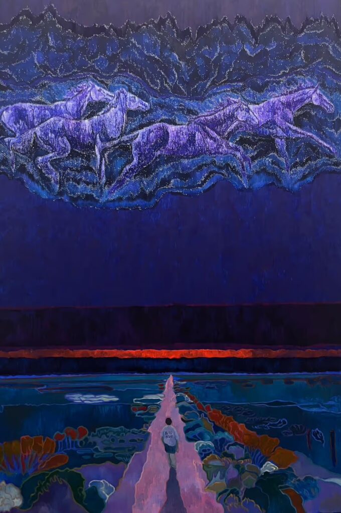
En 1839, cuando Louis Daguerre presentó el daguerrotipo al mundo, los pintores del realismo francés temieron la obsolescencia de su oficio. El tiempo demostró lo contrario: la fotografía no mató a la pintura; la liberó. Le permitió al pintor abandonar la representación fidedigna de la realidad y abrazar el impresionismo, el expresionismo, el cubismo, la abstracción. En otras palabras, la fotografía fue el detonante que hizo posible el arte moderno.
Estamos hoy en un umbral similar, pero con consecuencias de una complejidad cualitativamente mayor. Las herramientas de generación de imágenes por inteligencia artificial no son simplemente cámaras más sofisticadas. Son sistemas capaces de sintetizar, en segundos, imágenes que llevarían días, semanas o meses al artista más técnicamente dotado. Y más inquietante aún: lo hacen a partir del aprendizaje sobre millones de obras humanas existentes, planteando preguntas fundamentales sobre autoría, originalidad, propiedad intelectual y el valor de la creatividad humana en sí misma.
Esta conferencia no pretende dar respuestas definitivas. Pretende, en cambio, ofrecer un mapa conceptual lo suficientemente preciso para que artistas, académicos, curadores y emprendedores creativos naveguen con inteligencia este nuevo territorio.
II. Anatomía de las Herramientas: Qué Son y Cómo Funcionan
2.1 Claude (Anthropic)
Claude, desarrollado por Anthropic, representa una nueva generación de modelos de lenguaje de gran escala (LLMs) diseñados con un énfasis particular en la seguridad, la alineación con valores humanos y la capacidad razonadora de largo aliento. Desde la perspectiva del artista visual, Claude no genera imágenes directamente, pero su utilidad creativa es considerable: puede redactar declaraciones de artista con profundidad conceptual, elaborar propuestas de proyecto, analizar obras a nivel crítico, o funcionar como interlocutor intelectual en el desarrollo de series temáticas.
Lo que distingue a Claude en el ecosistema creativo es su capacidad para sostener conversaciones complejas sobre estética, historia del arte y teoría cultural, lo que lo convierte en una herramienta particularmente valiosa para artistas conceptuales y para quienes buscan articular la dimensión discursiva de su práctica. Desde el ángulo del marketing digital, Claude puede generar copies para redes sociales, catálogos de exposición, comunicados de prensa y estrategias de contenido con una coherencia tonal que otros modelos aún no alcanzan.
2.2 ChatGPT y GPT-4 (OpenAI)
ChatGPT, el modelo de OpenAI que popularizó la IA conversacional a escala masiva, ofrece capacidades similares a Claude en cuanto a generación de texto, pero su ecosistema de plugins y su integración con DALL·E lo convierten en una plataforma multimodal de mayor alcance para el artista. La versión GPT-4 puede analizar imágenes (visión computacional), lo que permite al artista subir bocetos o referencias y recibir retroalimentación conceptual, referencias históricas o sugerencias de dirección creativa.
Desde una perspectiva técnica, GPT-4 opera mediante transformers de atención masiva entrenados sobre corpus de texto de escala internet. Su fortaleza reside en la versatilidad: puede pasar en segundos del análisis de una obra de Gerhard Richter a la redacción de un contrato de licencia creativa o a la generación de un plan de marketing para una galería emergente.
2.3 DALL·E 3 (OpenAI)
DALL·E 3 representa la más reciente iteración del modelo generativo de imágenes de OpenAI y constituye, en términos de coherencia textual-visual, un salto cualitativo respecto a sus predecesores. Integrado directamente en ChatGPT, permite al usuario describir en lenguaje natural una imagen y recibir en segundos una representación visual de alta resolución.
Desde el punto de vista del artista, DALL·E 3 es notable por su respeto al texto dentro de las imágenes —históricamente un punto débil de los modelos generativos— y por su capacidad para mantener coherencia estilística a través de múltiples generaciones. Su limitación más discutida es la tendencia a evitar ciertos estilos reconocibles de artistas vivos, una política deliberada de OpenAI que tiene implicaciones legales y éticas profundas.
2.4 Midjourney
Si DALL·E 3 representa el enfoque de la accesibilidad masiva, Midjourney encarna la orientación hacia la calidad estética de alta gama. Operando a través de Discord, Midjourney ha construido una comunidad activa de artistas, diseñadores e ilustradores que utilizan la plataforma como herramienta de producción profesional.
Lo que distingue a Midjourney es su sensibilidad estética entrenada: sus outputs tienen una consistencia visual, una riqueza de textura y una profundidad compositiva que, en las versiones 5 y 6, se acercan a la calidad de ilustración editorial de primer nivel. El sistema de parámetros de Midjourney —aspect ratio, stylize, chaos, weird— ofrece al artista un nivel de control que, si bien es diferente al control manual sobre un pincel o un píxel, constituye un nuevo vocabulario de control creativo que merece ser aprendido como tal.
2.5 Microsoft Copilot
Microsoft Copilot, integrado en el ecosistema de Microsoft 365 y potenciado por modelos de OpenAI, representa la entrada de la IA generativa en los flujos de trabajo creativos y profesionales del artista contemporáneo. Para galerías, estudios de diseño o artistas que operan como pequeñas empresas, Copilot en PowerPoint, Word o Excel puede transformar radicalmente la eficiencia administrativa, liberando tiempo para la práctica creativa propiamente dicha.
Desde la perspectiva del marketing digital, Copilot en Microsoft Designer ofrece capacidades de generación de imagen integradas en herramientas de diseño gráfico, lo que reduce significativamente la curva de aprendizaje para artistas que no tienen formación en software de diseño pero necesitan producir materiales de comunicación profesional.
2.6 Stable Diffusion
Stable Diffusion es el modelo de código abierto que más profundamente ha democratizado la generación de imágenes por IA. A diferencia de DALL·E o Midjourney, que operan en plataformas cerradas, Stable Diffusion puede ejecutarse localmente en hardware de consumidor, puede ser modificado, puede ser entrenado sobre datasets específicos y puede ser integrado en flujos de trabajo personalizados mediante APIs.
Esta apertura tiene consecuencias enormes para el artista serio. Permite el entrenamiento de modelos personalizados (mediante técnicas como LoRA o DreamBooth) sobre el propio corpus artístico, generando en efecto un modelo que imita el estilo propio con notable fidelidad. Es aquí donde la IA comienza a plantear preguntas verdaderamente complejas sobre la identidad estética y la noción de estilo como propiedad intelectual.
III. La Pregunta Filosófica: ¿Qué es la Creatividad en la Era de la IA?
La crítica de arte ha debatido durante siglos la naturaleza de la creatividad. Harold Bloom habló de la angustia de las influencias; Picasso, con su célebre pragmatismo, observó que los buenos artistas copian mientras los grandes artistas roban. La IA hace literal esta metáfora de una manera que incomoda profundamente.
Los modelos de difusión latente aprenden a generar imágenes mediante un proceso de entrenamiento sobre millones de imágenes existentes. En sentido estricto, todo lo que producen es una síntesis estadística de lo que ya existe. No hay experiencia vivida detrás de un output de Midjourney, no hay intención fenomenológica, no hay historia personal que informe la elección de un color sobre otro.
Y sin embargo, cuando un artista utiliza Midjourney para explorar una dirección estética que de otro modo no podría imaginar o ejecutar técnicamente, algo genuinamente nuevo puede emerger. La pregunta no es si la máquina crea, sino qué crea el humano al dirigirla.
Desde la teoría estética contemporánea, el debate más productivo no gira en torno a si la IA es o no creativa, sino en torno a dónde se ubica el locus de la agencia creativa en sistemas humano-máquina. La respuesta más honesta es que depende: depende de la calidad del prompt, de la capacidad crítica del artista para seleccionar y editar outputs, y del grado en que la obra resultante está articulada en un discurso conceptual coherente.
Arthur Danto argumentó que lo que convierte un objeto en obra de arte es su inserción en un mundo del arte, en una estructura de interpretación teórica. Por este criterio, una imagen generada por IA puede perfectamente ser arte, pero solo si hay un artista que la sitúe en ese marco con intencionalidad y discurso. La máquina no puede hacer eso por sí sola.
IV. Impactos Prácticos en la Práctica Artística
4.1 La Transformación del Proceso Creativo
Para el artista que adopta estas herramientas con seriedad metodológica, el proceso creativo no desaparece: se desplaza. El trabajo ya no se concentra exclusivamente en la ejecución técnica —el trazo, la pincelada, el píxel— sino en la dirección conceptual, la curaduría de outputs, el refinamiento iterativo y la articulación discursiva del resultado.
Esto no es necesariamente una pérdida. Muchos de los artistas más influyentes del siglo XX trabajaron con asistentes, procesos industriales o técnicas de producción mediadas. Warhol es el caso paradigmático: The Factory no era un lugar donde el maestro ejecutaba cada serigrafía con sus propias manos, sino donde una visión artística se materializaba a través de procesos colectivos y mecánicos. La IA puede leerse como la extensión lógica de esta tradición.
4.2 Implicaciones para la Formación Artística
Una de las preguntas más urgentes para las instituciones educativas es cómo integrar el dominio de estas herramientas en el currículo sin sacrificar el desarrollo de las competencias fundamentales: el dibujo analítico, la comprensión del color, la historia del arte, la crítica. El riesgo no es que los estudiantes usen IA, sino que la usen como atajo frente al aprendizaje profundo.
La propuesta más coherente desde una perspectiva pedagógica es tratar la prompt engineering —la habilidad de comunicar con precisión y creatividad a un modelo de IA— como una nueva forma de alfabetismo visual. Pero esta alfabetización debe edificarse sobre una base de comprensión histórica y técnica, no reemplazarla. Un artista que no entiende la diferencia entre un sfumato leonardesco y el chiaroscuro barroco no podrá utilizar estos términos en un prompt de Midjourney para producir algo que dialogue de manera significativa con esa tradición.
4.3 El Mercado del Arte en Transformación
Desde la perspectiva del marketing digital, la IA ha alterado profundamente la economía de la imagen. El costo de producción de contenido visual de alta calidad ha caído dramáticamente. Esto tiene consecuencias ambivalentes: por un lado, democratiza el acceso a la producción visual; por otro, devalúa la imagen como commodity y pone presión económica sobre ilustradores, diseñadores y fotógrafos de stock cuyo trabajo era precisamente ese tipo de producción de calidad estándar.
Sin embargo, el mercado de arte de alta gama —el que opera en ferias como Art Basel, Frieze o TEFAF, el que mueve Christie’s y Sotheby’s— no ha colapsado. Al contrario, el NFT de Beeple vendido por 69 millones de dólares en 2021, y el subsecuente debate sobre su valor, ilustra que lo que el mercado del arte premium valora no es la imagen en sí misma sino la narrativa, la procedencia, la escasez verificada y la autenticidad conceptual. En ese registro, el artista humano con una voz y una posición crítica articulada sigue siendo irreemplazable.
V. Cuestiones Éticas y Legales Irresueltas
5.1 La Propiedad Intelectual en Crisis
El desafío legal más urgente que plantea la IA generativa es el de la propiedad intelectual de los datos de entrenamiento. Los grandes modelos generativos fueron entrenados sobre conjuntos de datos que incluyen obras protegidas por copyright sin el consentimiento explícito de sus creadores. Los juicios colectivos contra Stability AI, Midjourney y DeviantArt son el primer frente de una batalla legal que definirá el paisaje creativo de la próxima década.
La posición del autor de esta conferencia es que la analogía con el aprendizaje humano —los artistas también aprenden mirando obras ajenas— tiene límites importantes. Un artista humano tarda años en internalizar influencias, y el resultado de ese proceso es siempre una síntesis mediada por la experiencia vivida y la voluntad estética. Un modelo de IA puede ingerir millones de obras en días y reproducir estilos con una fidelidad que ningún aprendiz humano podría alcanzar. Esta diferencia de escala y velocidad no es cuantitativa: es cualitativamente diferente y requiere un marco legal específico.
5.2 El Sesgo Algorítmico en la Representación Visual
Los modelos de IA reproducen y potencialmente amplifican los sesgos presentes en sus datos de entrenamiento. Los estudios realizados sobre Stable Diffusion y Midjourney muestran consistentemente que los prompts neutrales tienden a generar imágenes con sesgos de género, raza y cultura occidentalista que reflejan las desigualdades de representación en los datasets de internet.
Para el artista comprometido con una práctica de representación crítica y diversa, esto no es un detalle técnico: es una cuestión ética fundamental. Utilizar estas herramientas acríticamente es participar en la reproducción de estructuras de exclusión visual. Utilizarlas críticamente —identificando y cuestionando sus sesgos, trabajando deliberadamente en contra de ellos— puede convertirse en sí mismo en una práctica artística de resistencia.
5.3 Autenticidad, Atribución y Transparencia
En el mercado del arte, la autenticidad es un valor cardinal. La pregunta de si una obra producida con asistencia de IA debe ser declarada como tal, y en qué términos, no tiene aún respuesta institucional consolidada. Algunas ferias y convocatorias han comenzado a exigir declaración de uso de IA; otras permanecen en silencio normativo.
La posición ética más sólida, desde la perspectiva de este autor, es la transparencia total: el artista que utiliza IA debe declararlo, no como confesión de una debilidad sino como descripción honesta de su proceso. La transparencia no disminuye el valor de la obra; lo sitúa en el contexto correcto para su evaluación crítica.
VI. El Artista Visual del Futuro: Un Perfil Emergente
La conjunción de las herramientas examinadas en esta conferencia sugiere que el artista visual más competitivo en el horizonte inmediato no será necesariamente el más técnicamente hábil en el sentido tradicional, ni el más sofisticado en el manejo de IA. Será aquel que pueda navegar con fluidez entre múltiples registros: el registro técnico-digital, el registro histórico-crítico, el registro conceptual-discursivo y el registro estratégico-comercial.
Este es, paradójicamente, el perfil del artista renacentista actualizado: el uomo universale que Leonardo personificaba, traducido a los términos del siglo XXI. Conocimiento técnico profundo —ahora incluyendo programación y lógica de modelos de IA—, pensamiento crítico e histórico robusto, y capacidad para operar con eficacia en las estructuras económicas de su época.
Las habilidades que serán más valiosas incluyen: dominio del prompting avanzado como forma de dirección creativa; capacidad para entrenar modelos custom sobre corpus artísticos personales; comprensión de los mercados NFT y de las plataformas de venta de arte digital; alfabetismo legal básico en propiedad intelectual; y, sobre todo, la capacidad de articular un discurso crítico coherente sobre la propia práctica que justifique y contextualice el uso de estas herramientas.
VII. Conclusión: La IA como Espejo Crítico de la Creatividad Humana
La inteligencia artificial no ha respondido las grandes preguntas sobre la creatividad: las ha radicalizado. Nos obliga a preguntarnos qué es exactamente lo que valoramos cuando valoramos una obra de arte: ¿la destreza técnica? ¿la originalidad conceptual? ¿la expresión de una experiencia humana singular? ¿la capacidad de generar significado en una comunidad interpretativa?
Cada una de estas respuestas lleva a una evaluación diferente del lugar que la IA puede o no puede ocupar en la práctica artística. Y esa pluralidad de respuestas no es una debilidad de la crítica: es su mayor fortaleza. El arte sobrevive —y prospera— precisamente porque no puede reducirse a una sola función ni evaluarse con un solo criterio.
La recomendación final de esta conferencia es simple pero exigente: los artistas visuales deben conocer estas herramientas desde adentro. No para rendirse a ellas, sino para poder utilizarlas, cuestionarlas y, cuando sea necesario, resistirlas con conocimiento de causa. El artista que no entiende cómo funciona Midjourney es tan vulnerable ante él como el fotógrafo del siglo XIX que desconocía la química del daguerrotipo. Y el artista que lo domina completamente, pero no tiene nada que decir con él, seguirá siendo, simplemente, un técnico.
La creatividad, en última instancia, no reside en la herramienta. Reside en la pregunta que el artista le hace al mundo, y en la voluntad de sostenerla con coherencia, integridad y visión a lo largo del tiempo.
“La pregunta no es si la máquina puede crear arte. La pregunta es qué tipo de artista quieres ser en el mundo que la máquina está ayudando a construir.”
Referencias y Lecturas Recomendadas
Danto, A. C. (1964). The Artworld. Journal of Philosophy, 61(19), 571–584.
Bloom, H. (1973). The Anxiety of Influence. Oxford University Press.
Manovich, L. (2001). The Language of New Media. MIT Press.
Hertzmann, A. (2018). Can Computers Create Art? Arts, 7(2), 18.
Elgammal, A. et al. (2017). CAN: Creative Adversarial Networks Generating Art by Learning About Styles and Deviating from Style Norms. ICCC Proceedings.
McCorduck, P. (2004). Machines Who Think. A. K. Peters/CRC Press.
Zylinska, J. (2020). AI Art: Machine Visions and Warped Dreams. Open Humanities Press.
OpenAI. (2023). DALL·E 3 Technical Report. openai.com.
Stability AI. (2022). Stable Diffusion: High-Resolution Image Synthesis with Latent Diffusion Models. Stability AI Research.
Anthropic. (2024). Claude: Model Card and Evaluations. anthropic.com.
© 2025 — Conferencia Universitaria: Arte, Tecnología y Cultura Digital