Dialogue with the
Primordial Sea
Alba Triana
On Thursday, January 23, 2025, I attended the closing event for the exhibition “Dialogue with the Primordial Sea” at Locust Projects. This insightful evening featured a thought-provoking conversation with artists Alba Triana and Rodolfo Peraza, who explored the fascinating intersection of technology, nature, and art. The event was a perfect way to wrap up the exhibition, providing an engaging discussion about how artists use technology to reveal invisible forces like magnetic fields and digital networks.
Both Triana and Peraza shared their unique approaches to blending the digital and natural worlds through their artistic practices. They delved into how technology can be used as a tool to explore and expose forces that are typically beyond our perception, such as the flow of data in digital networks or the subtle presence of electromagnetic energy. It was inspiring to hear them speak about their creative processes and how they navigate the complexities of translating these invisible forces into visually engaging art.
The exhibition itself, located at 297 NE 67th St, Miami, was a stunning reflection of these ideas, offering visitors a space where the digital and natural seemed to coexist and communicate. The artwork not only engaged with the concept of unseen forces but also asked the audience to consider how technology can alter our understanding of the world around us.
The closing event was an incredible opportunity to reflect on the profound ways in which technology can enhance our perception of reality and deepen our connection to the natural world. Both Alba Triana and Rodolfo Peraza provided invaluable insights into how art can bridge the digital and the organic, leaving me with a renewed sense of awe for the unseen systems that shape our environment.
Locust Projects presents a newly commissioned immersive kinetic sound installation by Alba Triana, an internationally recognized Miami-based intermedia artist who investigates the intersection of art, science, and technology to reveal the inseparable relationship between our surroundings and the imperceptible forces that govern the natural world.
Dialogue with the Primordial Sea at Locust Projects is an expansion of the artist’s ongoing Delirious Fields Series, exploring the complex interplay between the tangible and intangible, the individual and the collective, chance and organization, and self-organizing processes in nature. By engaging with these phenomena on a large scale, the installation unveils and immerses the viewer in the unseen underlying dynamics that shape humanity.
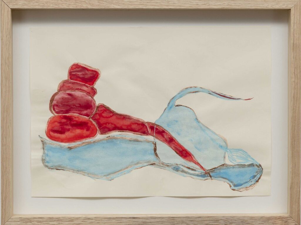
The site-specific installation features a series of magnetic spheres that alternately levitate or pendulate as they interact with invisible magnetic fields. Each system consists of a magnetic sphere and two coils. When a coil emits a magnetic field, the sphere levitates near it, manifesting the field’s intangible presence. When the field dissipates, the sphere pendulates freely, propelled by gravity. As a whole, the installation behaves like a collective—an organism composed of interrelated parts that function together tracing ephemeral lines of movement across the walls of the space. Controlled by a probabilistic code, the spheres exhibit both individual and collective behaviors. Amidst the randomness, moments of synchronized stillness and synchronized activity emerge, evoking a living entity that constantly self-generates.
Commissioned by Locust Projects as part of the Knight Digital Commission series, this site-specific work offers Alba Triana an exceptional opportunity to scale her previous explorations into a large-scale, immersive installation. Transforming the Project Room into a space that embodies intangible yet powerful forces and relationships, Triana pushes the limits of her practice, deepening her exploration of the ethereal realms from which everything—including humans and their creations—emerges.
Dialogue with the Primordial Sea was a ‘Curator’s Pick,’ selected by Executive Director Lorie Mertes from artist applications to the 2024 Knight Digital Commissions open calls.
About the Artist
Alba Triana is a Miami-based, Colombian-born sound and intermedia artist. Through immersive installations, sound and light sculptures, and vibrational objects, Triana’s work explores the relationship between the natural world and our human condition. Exploring vibration, energy, interconnectedness, and nature’s self-organization, Triana’s oeuvre examines how the vitality of everything—both alive and inert—shapes who we are and what emerges from within us.
Triana has been recognized with several prestigious awards, including The Ellies x Oolite Arts Creator Award, Miami (2019); the Prix Ars Electronica Award of Distinction, Austria (2022); the CIFO Grants and Commissions Award, Miami (2023); and the ArtFields Grand Prize (2024). In her native Colombia, she has also earned numerous accolades, such as the National Electroacoustic Music Contest (1995), the IDCT National Composition Contest (1997), the “Otto de Greiff” National Contest (1998), and the Alliance Française Best Exhibition Award (2009).
Triana has participated in various commissions and residencies with renowned institutions, including Kronos Quartet; Oolite Arts, Miami; Groupe de musique électroacoustique de Bourges (GMEB), France; the Civitella Ranieri Fellowship, Italy (2018); the South Arts Fellowship for Florida (2020); and the Ministry of Culture, Colombia. From 2018 to 2021, with support from Pro Helvetia—Swiss Arts Council, she conducted research on vibration and interconnectedness at a particle level, collaborating with thought-leading research institutions including European Organization for Nuclear Research (CERN), Swiss Federal Institute of Technology Lausanne (EPFL), and the University of Geneva in Switzerland.
Triana’s work has been exhibited internationally at Ars Electronica Festival, Lentos Kunstmuseum, Austria; Biennale des Arts Numériques, Centquatre-Paris, France, Museo de Arte Moderno de Bogotá, Colombia; and ISEA—International Symposium on Electronic Arts. Her work has been featured at the Subtropics Experimental Sound and Intermedia Festival, Miami, and Sónar+D Festival, Barcelona, and is included in collections across Europe, Latin America, and the United States, including Colección SOLO and Otazu Foundation Collection, Spain; Banco de la República de Colombia, and the Museum of Modern Art of Bogotá, Colombia.
ABOUT THE ARTIST
Alba Triana is a Miami-based, Colombian-born sound and intermedia artist. Through immersive installations, sound and light sculptures, and
vibrational objects, Triana’s work explores the relationship between the natural world and our human condition. Exploring vibration, energy, interconnectedness, and nature’s selforganization, Triana’s oeuvre examines how the vitality of everything—both alive and inert— shapes who we are and what emerges from within us.
Triana has been recognized with several prestigious awards, including the Prix Ars
Electronica Award of Distinction, Austria (2023); the CIFO Grants and Commissions Award, Miami (2023); and the ArtFields Grand Prize (2024). In her native Colombia, she has also earned numerous accolades, such as the National Electroacoustic Music Contest (1995), the IDCT National Composition Contest (1997), the “Otto de Greiff” National Contest (1998), and the Alliance
Française Best Exhibition Award (2009).
Triana has participated in various commissions and residencies with renowned institutions, including Kronos Quartet; Oolite Arts, Miami; Groupe de musique électroacoustique de Bourges (GMEB), France; the Civitella Ranieri Fellowship, Italy (2018); the South Arts Fellowship for Florida (2020); and the Ministry of Culture, Colombia. From 2018 to 2021, with support from Pro Helvetia— Swiss Arts Council, she conducted research on vibration and interconnectedness at a particle level, collaborating with thought-leading research institutions including European Organization for Nuclear Research (CERN), Swiss Federal Institute of Technology Lausanne (EPFL), and the
University of Geneva in Switzerland.
Triana’s work has been exhibited internationally at Ars Electronica Festival, Lentos Kunstmuseum, Austria; Biennale des Arts Numériques, Centquatre-Paris, France, Museo de Arte Moderno de Bogotá, Colombia; and ISEA—International Symposium on Electronic Arts. Her work has been featured at the Subtropics Experimental Sound and Intermedia Festival, Miami, and Sónar+D Festival, Barcelona, and is included in collections across Europe, Latin America, and the United States, including Colección SOLO and Otazu Foundation Collection, Spain; Banco de la República de Colombia, and the Museum of Modern Art of Bogotá, Colombia.