

Zurich Concrete artists
Concrete Art/Geometric Abstraction
In 1930, the Dutch artist Theo van Doesburg established art concrèt, according to which the composition of a work is to be developed based on objective geometrical principles. Although Van Doesburg already died a year later in 1931, his approach is still employed by numerous present-day artists. The Zurich school of concrete artists formed in Switzerland included Max Bill, Verena Loewensberg, Richard P. Lohse and Camille Graeser. Vera Molnar and Aurélie Nemours were among the major advocates of Concrete Art in France. The collection of the Wilhelm-Hack-Museum also possesses works by numerous Concrete artists active in Germany, for example Horst Bartnig, Hartmut Boehm, Peter Staechelin and Ludwig Wilding.
The Fantastic Four: Zurich Concrete, Geometric Abstract Art
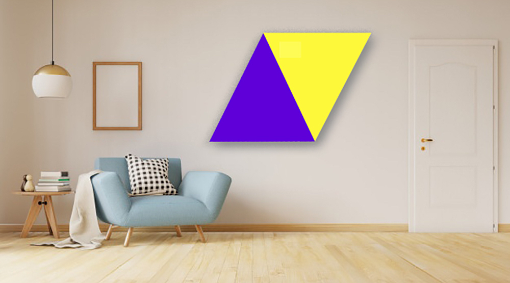
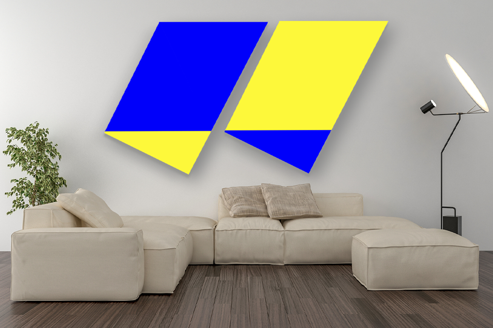
The traces, shadows and aftershocks of Concrete art – and, in particular, the Zurich Concrete school – have been seen and felt everywhere in contemporary Swiss art production, with its emphasis on hard-edged, geometric abstraction. The term ‘Concrete Art’, coined in 1930 by Theo Van Doesburg in a manifesto written for the first issue of Art Concret, defined and delineated a departure from realism, nature and symbolism. Its reductionist principles of line, colour and plane organized into austere, systemic wholes – themselves copped and refined from the Bauhaus and De Stijl – were meant to ‘represent abstract thoughts in a sensuous and tangible form’, as Max Bill, the movement’s ringleader, once wrote. Concrete art was intended to create new ‘object[s] for intellectual and spiritual use’.
If such sincere proclamations sound a tinny Utopian alarm today, the kind of reduced, geometrically-prone art they proposed remains insistently de rigueur, from the Neo-Geo antics of French Switzerland (led by godfather John Armleder) to the Northern Swiss gangs of younger Basel and Zurich-based artists, who increasingly process Concrete art’s methods through the filters of digitization or consumerism. Consequently, the exhibition ‘The Fantastic Four: Zurich Concrete and Special Friends’ did not come as a particular surprise. At Haus Konstruktiv, the ‘Fantastic Four’ of the Marvel comic from whence this somewhat cloying title came, are reconfigured as the superheroes of Zurich Concrete: Bill, Camille Graeser, Verena Loewensberg and Richard Paul Lohse. The ‘special friends’ comprised a motley, intergenerational group of contemporary artists – among them, Saâdane Afif, Bruno Jakob and Shirana Shahbazi – whose radically disparate production can still be located, at times, in Concrete art’s shadow.
Haus Konstruktiv’s permanent collection is notably broad, and the exhibition mostly rode its able shoulders. Graeser’s lucid oil paintings on canvas, with their grounding in graphic design – like many of the Zurich Concretes, he worked in all areas of design: furniture, architecture, advertising – bookend his career. Gestoppte Rotation (Stopped Rotation, 1943) proved prescient of the geometric, abstract photography movement of today, while the funny, poignant Drei Farben: drei gleiche Volumen, 1/12 grün bewegt (Three Colours: Three Equal Volumes, 1/12 Shifted Green, 1975/76), featured one of his horizontal bands of colour attempting to make a break for it.
Loewensberg’s wonderful paintings from the late 1960s and ’70s, meanwhile, look like radio frequencies or lighting bolts swathed in colour, conjuring computer approximations of Clyfford Still’s (more famous) drippy abstractions from the same period. Bill’s revelatory painting of powdery pastel hues blossoming from a spiral, Betonung einer spirale (Accentuation of a Spiral, 1947), however, took the award for sheer timelessness.
In the wake of such works, the contemporary inclusions were somewhat disappointing and the choices difficult to interpret – surely there are other Swiss-related artists whose work follows Concrete art more explicitly – but some of the pairings were nevertheless inspired. Best known for her photorealist, figurative murals rendered by Iranian sign painters, Shahbazi showed large geometric works that were both lovely and surprising. If Killian Rüthemann’s site-specific installations – playfully dark retorts to geometric abstraction’s legacy – fit perfectly, Afif’s punk-ish performance documentation was less expected. Still, Concrete art’s intentions to unite art and life in all its ably designed forms bore this contribution out. And should the spectator have persisted in the misguided thinking that this Swiss movement remained regional, there was one scene-stealing side project: a series of sketches, drawings and paintings by Fritz Glarner for the famous 1960s-era Rockefeller Dining Room in New York. The artist, who emigrated to the US in 1936, designed the room for Nelson Rockefeller himself, bringing Zurich Concrete – and Glarner’s own brand of Mondrian-inflected wit, with its jam of flat, hard-edged geometric forms tricked out in blue, red and yellow – to the most American and yet international of settings.
QUINN LATIMER
Quinn Latimer is a writer and contributing editor of frieze. Her most recent book is Like a Woman: Essays, Readings, Poems (Sternberg Press, 2017).


