Wednesday, April 16, 2025
Home Blog Page 113

GAC ACRYLIC SPECIALTY POLYMERS

GAC 100 (Product #3910)
GAC 200 (Product #3920)
GAC 400 (Product #3940)
GAC 500 (Product #3950)
GAC 700 (Product #3970)
GAC 800 (Product #3980)
GAC 900 (Product #3990)

PRODUCT DESCRIPTION

GACs can be blended with GOLDEN Acrylic Paints to extend the paint, regulate transparency, create glazes, increase gloss, reduce viscosity or improve adhesion and film integrity. The GAC polymers can also be used for binding pigment solids for various effects and surfaces. Unlike the other GOLDEN Mediums and Gels, GAC Acrylic Polymers have only a minimum amount of thickeners, levelers, defoamers and surfactants to ensure good film formation.

The consistency of the GAC polymers is very fluid, and thinner than other GOLDEN Mediums. GOLDEN Fluid Acrylics are slightly thicker than the GACs, but will be the color line least changed in viscosity with any addition of a GAC polymer.

Each GAC product represents a unique polymer that offers certain specific attributes. Therefore, each GAC will have its own unique benefits and applications. Refer to the individual product description of each GAC (below) to find the proper medium to use for a particular application.

PRODUCT APPLICATION

Mixing

GAC polymers should be gently stirred or rocked back and forth prior to use, but should never be shaken, as this will incorporate significant amounts of foam which will be very difficult to eliminate. Foam can severely affect the transparency of the film causing an apparent foggy or hazy quality. When applying with a brush, use minimal agitation and force, and do not overwork, as this too will result in foaming.

Spraying

If spray application is desired, blend with GOLDEN Airbrush Medium. Start at 2 parts GAC Medium to 1 part GOLDEN Airbrush Medium. When faster drying is required, replace the Airbrush Medium with GOLDEN High Flow Medium.

Varnishing

The GAC polymers are intended for use as binders, modifiers or additives for acrylic paints. They are not intended for use as a final varnish. Golden Artist Colors manufactures two different varnish systems, Polymer Varnish and Mineral Spirit Acrylic (MSA) Varnish (See the GOLDEN Varnish Information Sheets for more details).

ADDITIONAL INFORMATION

Support Induced Discoloration:

Common supports (e.g. cotton canvas, linen, masonite) contain water-extractable materials that can cause discoloration in transparent glazes. To minimize Support Induced Discoloration (S.I.D.), prime support with 2 coats of GOLDEN GAC 100.

Replacing Rabbitskin Glue:

Traditionally, rabbitskin glue (also known as hide glue) was used to reduce the flexibility of canvas before painting. Although the rabbitskin glue does reduce flexibility, it is extremely brittle. It is hygroscopic, which means that it will always be water-soluble. Even when the glue is completely dry, high humidity will re-introduce water into the film, causing it to soften or swell up. Over time, this constant swelling and drying of the film can cause severe paint-film cracking and delamination.

GAC 400 can be used in a similar fashion for stiffening canvas. Apply directly to the front of the raw canvas for maximum stiffness. It is imperative that it be applied directly to the raw canvas. It is ineffective over any other medium, and most likely will flake off and cause delamination of subsequent paint layers. Since GAC 400 is not effective against oil penetration, the use of GAC 100 over GAC 400 is recommended for oil painters

Note: Since GAC 400 is brittle, it is important that it not be rolled tightly, or bent back upon itself. This will cause cracking of the polymer film and may transfer cracks into additional paint layers. This is especially a risk with cured oil paints.

Linseed Oil Blocker:

Two coats of GAC 100 before gessoing will substantially reduce linseed oil penetration into the canvas fibers. If stiffness and oil-blocking are desired, apply a coat of GAC 400 to the front, directly into the raw canvas, followed by one coat of GAC 100 onto the front of the canvas. Follow this by the desired number of gesso coats.

GAC POLYMER INDIVIDUAL PRODUCT DESCRIPTIONS

Use the below descriptions to decide which attributes are best-suited for a particular application:

GAC 100: Universal Acrylic Polymer / S.I.D. Blocker / Most Flexible GAC Polymer.

  • This polymer is one of the most universal used in paint manufacturing. Artists who had used “Rhoplex” (a registered trade name) will find that this GAC most closely reflects the properties to which they were accustomed.
  • The most flexible with a moderate level of tack and gloss.
  • Useful for diluting and extending colors, especially when film flexibility and integrity are important characteristics.
  • Wets pigment surfaces well. The most ideal for artists formulating their own paints.

GAC 200: Increases Film Hardness of Acrylic Paints / Increased Non-porous Surface Adhesion.

  • The hardest and least flexible of any Golden Acrylic product. Caution is advised when using this product alone.
  • Used in its pure form, it is limited to applications on rigid supports, as its lack of flexibility may lead to cracking when flexed. When used alone it needs to be applied and left to dry at a minimum temperature of 70F / 21°C.
  • Ideal as an additive to acrylic paints to increase film hardness and reduce dry film tack.
  • Improves adhesion to non-porous surfaces; however some surfaces, such as glass and glazed tile, will not allow for a permanent bond
  • Dries with high gloss and excellent film clarity.
  • Promotes cleaner edges of hard-edge techniques. The harder paint film has less “pull” as the masking tape is removed.

GAC 400: Fabric Stiffener / Rabbitskin Glue Alternative.

  • Dries to a very hard and stiff film.
  • Most useful for priming fabrics (cotton, linen, silk, etc.) when stiffness is desired.
  • Used as a rabbitskin glue alternative when applied directly to raw canvas or linen.
  • Allows sculpting and shaping of draped fabrics.
  • NoteOptional heat settingwill decrease water sensitivity butalso releases low levels of formaldehyde; therefore if choosing to heat setit is recommended that adequate ventilation be provided.

GAC 500: Self Leveling Applications / Hard Yet Flexible / Best Isolation Coat Medium for Spray-Application.

  • Unique balance of film hardness and flexibility.
  • Mix 2 parts GAC 500 to 1 part High Flow Medium to produce a good spraying, fast-drying isolation coat.
  • Beneficial as an additive for acrylic paints for increasing mar resistance and decreasing dry film tack, without disturbing the balance between hardness and flexibility.
  • Useful when working on flexible or rigid supports.
  • Offers a self leveling working quality.
  • Dries to high gloss film with good clarity/transparency.
  • Useful to hard-edge painters to seal masking tape for cleaner edges. Apply over masking tape. Let dry before applying additional paint layer.

GAC 700: Increases Film Clarity.

  • Dries to a clear, high gloss film, with moderate hardness and exceptional transparency.
  • Offers reduced shrinkage upon drying.
  • NoteThis emulsion has a tendency to generate foam during application. Exercise care while brushing.

GAC 800: Reduced Crazing of Dried Films / Best for Direct Pouring.

  • Most useful as an additive for acrylic paints when pours/puddles are desired. Most acrylics will craze, which is the formation of valleys that run through a pour/puddle nullifying the uniformity of the film. Such crazing is the result of shrinkage forces exerted during the drying process. GAC 800 stands alone in its resistance to such film discontinuity.
  • Dries with good gloss and film flexibility, but with a slight “hazy” quality.
  • Useful as a modifier when adhesion to chalky surfaces is desired.

GAC 900: Increases Launderability of Acrylic Paint.

  • Designed to be used as a modifier for acrylic paints for painting on clothing. See the GOLDEN Acrylics on Fabric Application Information Sheet for more extensive information.
  • Offers a soft, pliable feel and when properly heat-set, provides excellent laundering stability.
  • Blend with GOLDEN Heavy Body, Matte or Fluid Acrylics for brush or screen application.
  • Mix with GOLDEN High Flow Acrylicsfor “Tie-Dye” effects.
  • Note: The heat-setting process will release low levels of formaldehyde; therefore it is recommended that adequate ventilation be provided.

GOLDEN Acrylics on Fabric Application Information Sheet 

GOLDEN ACRYLICS ON FABRIC

Applications. Use the information below to select the proper paint system for your desired application method.

APPLICATION DESCRIPTION

The four lines of GOLDEN Acrylics of interest to fabric artists include: High Flow, Fluid Acrylics, Heavy Body, and Matte Colors. The main difference between each of these lines of acrylic colors is viscosity (thickness) or consistency. High Flow Acrylic Colors are the thinnest and are ready to spray. Fluid Colors are similar in consistency to a heavy cream. Heavy Body and Matte Acrylics are thick, with a buttery consistency. These various acrylic paint lines, each using the same lightfast pigments, allow the artist to combine the effects of spraying, staining, brushing and other application techniques.

TECHNIQUES FOR FABRIC PAINTING

Hand Brushing

GOLDEN Heavy Body (including Iridescent and Interference Colors), Matte, Fluorescent, and Fluid Acrylics are appropriate for hand brushing techniques and heat-setting is not required. To provide a softer hand1, which also prevents cracking in thicker passages, blend 1:1 with GAC 900 or GOLDEN Silk-screen Fabric Gel (for thicker paint applications). The GAC 900 and the Silk-screen Fabric Gel contain a special polymer additive that is designed to impart a softer hand, while offering excellent launderability 2 when properly heat-set (see directions below)

Airbrushing/Spraying

For best results, blend GOLDEN Fluid Acrylics with GOLDEN Airbrush Medium. Start with a 1:1 mixing ratio, and increase amount of GOLDEN Airbrush Medium as desired to increase sprayability and/or transparency. When artwork is complete, spray a thin coat of GAC900 for least color loss. Airbrush Medium can also be substituted with GAC900 if a softer hand is desired (follow heat-set directions below). GAC900 is thin enough to help with making the Fluid Acrylics sprayable much like the Airbrush Medium. For durability and washability in a spray application, these are the recommended systems, and will perform significantly better than GOLDEN High Flow Acrylics alone.

GOLDEN Fluids blended with GOLDEN Airbrush Medium do not require heat-setting for launderability, yet equal the performance of fabric paints that do. If an artist already possesses Fluid Acrylics for canvas painting, it is not necessary to purchase fabric paints in order to do fabric painting; they just need to get GAC900. Allow for garments to cure for at least 4 days prior to washing (Note: heat-setting will speed the curing time required and should increase the launderability).

GOLDEN Heavy Body, Matte, Iridescent, Interference and Fluorescent Colors can also be sprayed onto fabric; however, their thicker viscosities warrant more dilution with GOLDEN Airbrush Medium which yields weak, transparent coverage.

Although not recommended for fabric use, GOLDEN High Flow Acrylics may be blended 1:1 or more with the GAC900 to aid in washfastness (properly heat-set according to directions listed below). This blend, although better than GOLDEN High Flow Acrylics alone, is still not equal to the launderability performance of the Fluid Acrylics/Airbrush Medium mixture.

Areas containing soft spray applications such as gradated areas, shading, and any skylines should be sprayed with a light coat of GAC 900 to increase launderability.

Tie-Dye/Staining

The viscosity of GOLDEN High Flow Acrylics is ideal for tie-dye and staining applications. Pre-wetting the fabric with water and using the GOLDEN High Flow Acrylics in place of fiber-reactive dyes creates brilliant patterns. Adding GOLDEN Acrylic Flow Release can also help the paint penetrate into the fabric (follow directions on label). To increase the launderability, blend the GOLDEN High Flow Acrylics 1:1 with GAC900. After applying the paint to the fabric, wait for it to be completely dry before heat-setting or washing. This will maximize the amount of color that “sets” 3 into the fabric. If GAC900 is blended with the acrylic paints, follow the directions for heat-setting below. GOLDEN Fluid Acrylics may also be used for this technique, but will require the addition of water to thin to the proper viscosity, along with the GAC900 to increase the launderability.

Silk-Screening

GOLDEN Heavy Body, Matte, Fluorescent, or Fluid Colors blended 1:1 with GAC900 or Silk-Screen Fabric Gel produce silk-screen inks with excellent durability on fabric. The mixture used is dependent on two factors: the material to be printed and personal preference of paint consistency. (Refer to GOLDEN Information Sheet on the Silk-Screen Fabric Gel for the most complete information on this technique).

If screening onto heavy, cotton material, a thinner mixture of Fluid Colors and GAC900 may be desired, as its thin consistency helps to penetrate into material. If printing on a polyester or synthetic material, a pastier mixture of Heavy Body Acrylics and Silk-Screen Fabric Gel will work better due to a lower tendency of the ink to “bleed” into the material. Some experimentation is needed to find the system that is best suited for your work.

Mixtures (1:1) from Thickest Consistency to Thinnest
  • Heavy Body or Matte Acrylics/Silk-Screen Fabric Gel
  • Heavy Body or Matte Acrylics/GAC900
  • Fluid Acrylics/Silk-Screen Fabric Gel
  • Fluid Acrylics/GAC900​
  • High Flow Acrylics/GAC900

Both GAC900 and Silk-Screen Fabric Gel impart softness of hand, while offering excellent launderability. Proper heat-setting is required for both products (see below for heat-setting instructions).

RECOMMENDATIONS

Proper product selection, heat-setting, and care ensure long garment life.

Application of Large Areas or Long Lines

Filling in large areas with thick paint will produce a very stiff, uncomfortable garment. Blend color with GAC900/Silk-Screen Fabric Gel to reduce the stiffness of the acrylic paint. If painting in a thick manner, short strokes of paint will hold better than long lines. The longer the line, the greater the chance of cracking when washed. A washing machine”s agitator may stretch the garment beyond its limit and thus cause cracking.

Material Considerations

Test materials thoroughly before large production runs or when using a unique fabric.
The looser the weave of the fabric (cotton/poly blends), the better the penetration and hold the paint will have on the material.
Thicker fabrics (sweatshirt-type weaves) should be slightly stretched with a backer-board to allow for better penetration of the paint into the material.
To increase the adhesion onto any fabric a very light misting of water (e.g.-with a plant-mister) will increase the penetration into the material. Care should be taken with this technique, as over applying the water could result in bleeding of the color.

Heat-setting

The heat-setting process will release low levels of formaldehyde; therefore adequate ventilation is recommended when heat setting.

Fabrics treated with GAC900/Silk-Screen Fabric Gel-modified paints must be heat set if maximum launderability is necessary. Products conform to ASTM D4236. All GOLDEN products should be used in accordance with safe handling practices. Read product labels prior to use. The polymer must first air dry to the touch to form the initial bond with the fabric, followed by one of the heat-set methods listed below:

  • Heat Press according to press manufacturers’ recommendations.
  • Iron for 3-5 minutes with a medium-hot iron on the reverse side (side opposite of the application). On delicate fabrics where lower heat levels must be used, a longer ironing time will be necessary.
  • Professional Oven Cure for 2-3 minutes at 300F; 4 minutes at 250F.
  • Clothes dryer: Commercial: medium-high temperature for 20-40 minutes. Household: high temperature for 40-50 minutes.
Washing and Drying
  • Let paint dry thoroughly (at least 4 days) before washing.
  • Hand-washing will dramatically increase garment life.
  • Always turn garment inside-out for laundering.
  • Avoid hot water washing. This will tend to soften and loosen acrylic paint from the garment.
  • Cold water works best for automatic washing of the painted garment.
  • Heat-set when appropriate.
  • Set washer to gentle cycle.
  • Drip-drying instead of using the clothes dryer will increase the life of the garment.

SUMMARY

GOLDEN Artist Colors Acrylics are professional artist paints.

If properly prepared and cared for, GOLDEN Artist Colors Acrylics will produce a fabric artwork with good durability. GOLDEN Artist Colors Acrylics are produced with 100% Acrylic Polymer Emulsion. This produces a film with excellent flexibility, and chemical, water, and ultraviolet resistance. The milky emulsion dries transparent, allowing pigments to show their full color. All pigments in GOLDEN Acrylics are chosen for the greatest clarity and permanency within each chemical class. GOLDEN Acrylics dry quickly and may be painted over immediately yet complete drying/curing will take longer. Avoid freezing. Minimum film formation temperature is 48oF/9oC.

To thin, use water or GOLDEN Mediums. For slower drying, use GOLDEN Retarder. Do not mix with oils. Paint on any non-oily surface. Non-absorbent surfaces should be abraded for increased adhesion. Clean tools with soap and water. Keep tools wet during use.

DEFINITIONS

1Soft Hand – decrease in the hardness of the paint when dry, leaving a comfortable and breathable feel to the fabric.
2 Launderability – the ability for the fabric to be washed.
3Sets – after washing, it is the remaining color left in the fabric.
4Bleed – a halo effect around the brushstroke.

Quick Reference Chart for Choosing GOLDEN Acrylic Paints for Fabric Use.
GOLDEN Acrylics to use for FabricHand BrushingAirbrushing or SprayingTye-Dyeing of StainingSilk-Screening
High Flow Acrylics  */+ 
Fluid Acrylics*+**
Iridescent Acrylics****
Interference Acrylics****
Heavy Body Acrylics+* +
Fluorescent Acrylics****
Matte Acrylics** *
* Can be used for this technique
+ Best Recommendation for particular technique
Quick Reference Chart for Choosing Which GOLDEN Gel/Medium to Blend with GOLDEN Acrylics for Fabric Use.
GOLDEN Mediums to use for FabricHand BrushingAirbrushing or SprayingTye-Dyeing of StainingSilk-Screening
Airbrush Medium */+  
GAC 900+*+*
Silk-Screen Fabric Gel*  +
Acrylic Flow Release  */+ 
* Can be used for this technique
+ Best Recommendation for particular technique

Disclaimer

The above information is based on research and testing done by Golden Artist Colors, Inc., and is provided as a basis for understanding the potential uses of the products mentioned. Due to the numerous variables in methods, materials and conditions of producing art, Golden Artist Colors, Inc. cannot be sure the product will be right for you. Therefore, we urge product users to test each application to ensure all individual project requirements are met. While we believe the above information is accurate, WE MAKE NO EXPRESS OR IMPLIED WARRANTIES OF MERCHANTABILITY OR FITNESS FOR A PARTICULAR PURPOSE, and we shall in no event be liable for any damages (indirect, consequential, or otherwise) that may occur as a result of a product application.

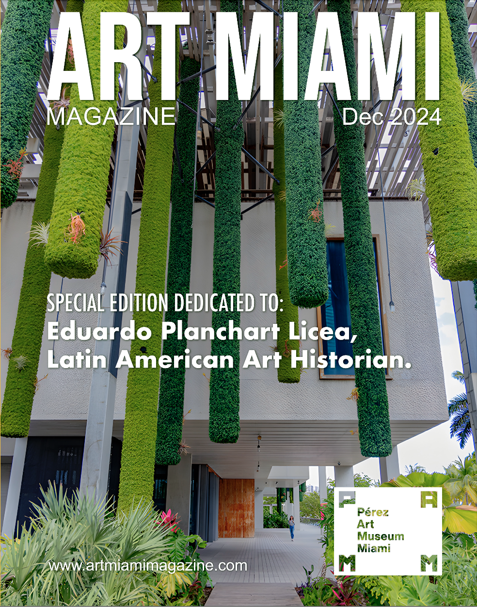
Perez Art Museum PAMM
Pérez Art Museum Miami

1st-art-gallery.com

Swastika-10
Swastika-10

1st Art Gallery

About 1st-art-gallery.com

Information written by the company

We’re the largest and oldest online retailer for handmade Oil Painting Portraits & Reproductions. With tens of thousands of satisfied customers in more than 120 countries we are the world’s largest supplier of Made-to-Order Oil Paintings! Our talented artists have created hundreds of thousands of paintings for art lovers around the world, as well as clients that include the Royal Family, major hotel chains, luxury cruise-liners, museums, interior design firms, the largest real estate developers, Hollywood production companies and many more. Why Choose 1st-Art-Gallery? Actually, the answer’s simple. If you want a hand-made reproduction of an amazing piece of art, or if you’re looking to turn a photograph into an original painting, 1st Art Gallery is the best, most affordable gallery around. Our painters are experienced, our turnaround time is quick and our prices are low. In fact, you’ll get a painting for what some of our competitors charge for a print. It Starts And Ends With Quality 5-star, 100% satisfaction guarantee! Free Worldwide shipping! In business for over 18 years! The #1 recommended source! The largest selection by a factor of 20! Creating a great piece of art requires time, resources, equipment and most of all, an exceptional artist. At the 1st Art Gallery, you’ll find a team of some of the finest reproduction artists in the world. Every day, they create works of art that measure up to the standards of the artists that originally painted them centuries ago. Using only the finest oil paints and canvases, our artists can create a 1st Art Gallery painting in 21 days. This investment in time and attention to detail make our paintings truly one of a kind.

About 1st-Art-Gallery.com

Now in our 18th year, we make it possible for everyone to own a museum-quality reproduction of any famous masterpiece and turn their photographs into beautifully crafted handmade portraits.

We strive to deliver an excellent experience, and therefore we will not rest until we know our customers have received the very best service and highest quality paintings. Our work is always covered by a 100% money-back guarantee, a lifetime warranty, and we offer free worldwide shipping.

We invite you to explore the over 500,000 paintings we offer on our website, and we are confident that you will find a piece of art that matches perfectly with your needs. Our customer service is available 24/7 to answer any questions you may have, as well as our Art Advisory service which provides assistance in helping you choose your artwork, free of charge.

Why Choose 1st Art Gallery?

  • 100% Satisfaction guarantee
  • A first-class painting provider with 300,000+ happy customers.
  • Free personalized proofs before shipping
  • 365 Days Money-back guarantee
  • Infinite Styles and customization
  • Lenient 365 days return policy
  • A priceless keepsake to cherish for many years to come
  • Free shipping worldwide
  • Exceptional customer service
  • Unlimited adjustments and modifications
  • Top-level quality control
  • Optional digital graphic design to create your masterpiece
  • Quality product by our classically trained artists
  • Lifetime guarantee
Perez Art Museum PAMM
Pérez Art Museum Miami

GreatBIGCanvas.com

Constructionist Geometric Abstract Art

Great BIG Canvas

Since 2006, Great BIG Canvas has been leading the industry in art and photography reprints and customizable art products. Great BIG Canvas offers décor solutions for both home and commercial settings, including corporate offices and retail spaces. As our name implies, we offer some of the largest art prints in the industry. Shoppers can view our constantly growing online collection of more than 750,000 images, which includes fine art photography, abstract art, and renowned masterpieces.

The Passion and Power of Art

At Great Big Canvas, our team of curators, craftsmen, and customer service agents live and breath art because we believe that art wields the power to inspire, energize, and transform people and places. To that end, our purpose and vision is to help you find the art that speaks to your unique vision, passions, and style.

Curated with Care

Whether you know exactly what you want, or need a little guidance, our online tools and curation experts will match wall art you love to your individual taste and style. We’ve made buying wall art easy with curated collections based on the latest trends as well as timeless classics. From abstract art, to classic icons, to movie posters, we’ve got art for anything you’re into.

Perez Art Museum PAMM
Pérez Art Museum Miami

Mateo Manaure

Mateo Manaure

Artists should identify connections that allow them to establish goals and develop their sensitivity, reaffirm their confidence, broaden their humanism, multiply their aspirations, and transform their hopes into reality. These beliefs will make them more conscious of the universe around them and simultaneously nurture thoughts of beautiful utopias that will stimulate their creative process, and their desire to express contemporaneity in a dignified context.

Born in 1926 in Uracoa, Estado Monegas, Mateo Manaure is considered one of the leading exponents of mid-century Venezuelan geometric abstraction. Trained academically at the Escuela de Artes Plásticas in Caracas, Manaure’s early work reflected a more traditional approach to artmaking focusing on such classical genres as nudes, still lifes, and landscapes. But 1947 marked a decisive moment, awarded the prestigious Premio Nacional de Bellas Artes, Manaure soon departed for Paris where his paintings experienced a dramatic transformation, initially gravitating towards abstract surrealism and eventually embarking on a brief but dynamic abstract geometric phase. And, while his production witnessed a number of stylistic permutations in the ensuing years alternating between figuration and abstraction, the period from 1952-56 left an indelible mark on the history of Venezuelan abstract and vanguard art practices.

Manaure’s Parisian period also coincided with his seminal involvement with Los Disidentes (The Dissidents), a coalition of Venezuelan artists (active from 1945-50) that also included -Jesús Rafael Soto, Narciso Debourg, Alejandro Otero, Pascual Navarro, Herminy Perán, Rubén Núñez, Nena Palacios, J.M. Guillermos Péres, Alirio Oramas, Luis Guevara Moreno, Aime Battistini, Armando Barrios, Omar Carreño (refer to lot 222), and Carlos Gonzáles Bogen. Through their journal of the same name and their accompanying radical manifesto No (1950), Los Disidentes championed a progressive vision, that eschewed the conservative academicism embodied by the Escuela de Artes Plásticas and the Escuela Paisajista in Caracas, and in its place advocated for experimentation and geometric abstraction.

Upon his return to Caracas in 1952, Manaure set out in earnest to put these ideas into practice and found an immediate affinity with the modernist project unfolding so indicative of that era’s unprecedented growth and development. The latter was most evident in the architectural and public art works designed by the legendary modernist architect Carlos Raúl Villanueva, whose Cuidad Universitaria, the main campus of the Central University of Venezuela, is considered a landmark of city planning and architecture. Villanueva commissioned Manaure to execute several murals, painted wood reliefs, and stained glass windows for Cuidad Universitaria all reflective of the young artist’s newly adapted aesthetic. By 1956, the year both of these works were painted, Manaure was a leading figure of the abstractionist movement, exhibiting abroad at the Venice Biennial and locally at the Museo de Bellas Artes. Composicin No. 1 (the present lot) and Untitled (refer to lot 56) eloquently underscore Manaure’s approach to geometric abstraction. Here, the artist disrupts the modernist grid through trapezoidal planes, fragmented or broken lines, and asymmetrical spaces that rather than accentuate the rectilinear or rigid infuse his compositions with a kinetic power and lyrical sensibility. The poetic nuances of Manaure’s work are further ignited in Composicin No. 1 through his exhaustive exploration of the chromatic possibilities of black that he strategically highlights with notes of red and white, imbuing this work with a sense of depth and tension. In contrast Untitled is an exercise in controlled exuberance through the use of vibrant planes of red, yellow, green and black that suggests Manaure’s desire to evoke a sense of the local or regional amid the universal. The optimism embodied by this radical period would soon dissipate, and while Manaure remained active including returning to abstraction, most notably in the 1970s with his iconic Columnas Policromadas, his brief production during the 1950s would prove to be one of his most enduring and paradigmatic, fully engaged with his contemporaneity and the utopian ideals so emblematic of that moment.

Perez Art Museum PAMM
Pérez Art Museum Miami

COLORES COMPLEMENTARIOS

Los colores complementarios

COLORES COMPLEMENTARIOS

Los colores complementarios son pares de colores que, cuando se combinan, se cancelan mutuamente. Esto significa que cuando se combinan, producen un color de escala de grises como blanco o negro. Cuando se colocan uno junto al otro, crean el contraste más fuerte para esos dos colores particulares. Debido a este impactante choque de colores, el término colores opuestos a menudo se considera más apropiado que los “colores complementarios”.

Qué pares de colores se consideran complementarios depende de la teoría del color que uno use:

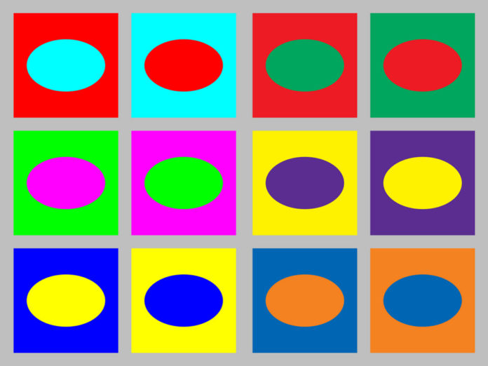
La teoría moderna del color utiliza el modelo de color aditivo RGB o el modelo de color sustractivo CMY, y en estos, los pares complementarios son rojo-cian, verde-magenta y azul-amarillo.
En el modelo de color RYB tradicional, los pares de colores complementarios son rojo-verde, amarillo-violeta y azul-naranja.
La teoría del proceso del oponente sugiere que los pares de colores más contrastantes son rojo-verde y azul-amarillo.

En diferentes modelos de color

Modelo de color tradicional
En la rueda de color tradicional desarrollada en el siglo XVIII, utilizada por Claude Monet y Vincent van Gogh y otros pintores, y todavía utilizada por muchos artistas hoy en día, los colores primarios se consideraron rojo, amarillo y azul, y el primario-secundario los pares complementarios son rojo-verde (Navidad), azul-naranja (Westwood) y amarillo-violeta (Mesa Alta).

En la representación tradicional, un par de colores complementarios se compone de un color primario (amarillo, azul o rojo) y un color secundario (verde, morado o naranja). Por ejemplo, el amarillo es un color primario, y los pintores pueden hacer púrpura mezclando rojo y azul; entonces, cuando se mezclan pintura amarilla y violeta, los tres colores primarios están presentes. Dado que las pinturas funcionan al absorber la luz, tener las tres primarias juntas da como resultado un color negro o gris (ver color sustractivo). En manuales de pintura más recientes, los colores primarios sustractivos más precisos son magenta, cian y amarillo.

Los colores complementarios pueden crear algunos efectos ópticos llamativos. La sombra de un objeto parece contener algo del color complementario del objeto. Por ejemplo, la sombra de una manzana roja parecerá contener un poco de color azul verdoso. Este efecto a menudo es copiado por pintores que desean crear sombras más luminosas y realistas. Además, si miras fijamente un cuadrado de color durante un largo período de tiempo (treinta segundos a un minuto) y luego miras un papel o una pared blanca, verás brevemente una imagen residual del cuadrado en su color complementario.

Colocados uno al lado del otro como pequeños puntos, en una mezcla de colores partitiva, los colores complementarios aparecen en gris.

Colores producidos por la luz
El modelo de color RGB, inventado en el siglo XIX y completamente desarrollado en el siglo XX, usa combinaciones de luz roja, verde y azul sobre un fondo negro para hacer que los colores se vean en el monitor de una computadora o en la pantalla de televisión. En el modelo RGB, los colores primarios son rojo, verde y azul. Las combinaciones complementarias primaria-secundaria son rojo-cian, verde-magenta y azul-amarillo. En el modelo de color RGB, la luz de dos colores complementarios, como el rojo y el cian, combinados a plena intensidad, hará que la luz sea blanca, ya que dos colores complementarios contienen luz con todo el rango del espectro. Si la luz no es completamente intensa, la luz resultante será gris.

En algunos otros modelos de color, como el espacio de color HSV, los colores neutros (blanco, grises y negro) se encuentran a lo largo de un eje central. Los colores complementarios (como se define en HSV) se encuentran uno frente al otro en cualquier sección transversal horizontal. Por ejemplo, en el espacio de color CIE 1931, se puede mezclar un color de longitud de onda “dominante” con una cantidad de la longitud de onda complementaria para producir un color neutro (gris o blanco).

Impresión a color
La impresión en color, como la pintura, también utiliza colores sustractivos, pero los colores complementarios son diferentes de los utilizados en la pintura, porque enmascaran la luz. Como resultado, se aplica la misma lógica que a los colores producidos por la luz. La impresión en color utiliza el modelo de color CMYK, que crea colores mediante la sobreimpresión de tinta cian, magenta, amarilla y negra. Al imprimir, los colores complementarios más comunes son magenta-verde, amarillo-azul y cian-rojo. En términos de colores complementarios / opuestos, este modelo da exactamente el mismo resultado que usar el modelo RGB. Se agrega negro cuando es necesario para oscurecer los colores.

En teoría y arte
El efecto que los colores tienen sobre los demás se ha notado desde la antigüedad. En su ensayo Sobre los colores, Aristóteles observó que “cuando la luz cae sobre otro color, como resultado de esta nueva combinación, adquiere otro matiz de color”. Santo Tomás de Aquino había escrito que el púrpura se veía diferente al blanco que al negro, y que el oro parecía más llamativo contra el azul que contra el blanco; el arquitecto y escritor del Renacimiento italiano Leon Battista Alberti observó que había armonía (coniugatio en latín y amicizia en italiano) entre ciertos colores, como rojo-verde y rojo-azul; y Leonardo da Vinci observó que las mejores armonías eran aquellas entre colores exactamente opuestos (retto contrario), pero nadie tenía una explicación científica convincente de por qué eso fue así hasta el siglo XVIII.

En 1704, en su tratado sobre óptica, Isaac Newton ideó un círculo que mostraba un espectro de siete colores. En este trabajo y en un trabajo anterior en 1672, observó que ciertos colores alrededor del círculo se oponían entre sí y proporcionaban el mayor contraste; llamó rojo y azul, amarillo y violeta, y verde y “un púrpura cerca de escarlata”.

En las décadas siguientes, los científicos refinaron el círculo de colores de Newton, dándole finalmente doce colores: los tres colores primarios (amarillo, azul y rojo); tres colores secundarios (verde, morado y naranja), hechos combinando colores primarios; y seis colores adicionales, hechos combinando los colores primario y secundario.

En 1793, el científico británico nacido en Estados Unidos Benjamin Thompson, Count Rumford (1753-1814), acuñó el término colores complementarios. Mientras se hospedaba en una posada en Florencia, hizo un experimento con velas y sombras, y descubrió que la luz coloreada y la sombra proyectada por la luz tenían colores perfectamente contrastantes. Él escribió: “Para cada color, sin excepción, cualquiera que sea su matiz o sombra, o como sea que se componga, hay otro en perfecta armonía con él, que es su complemento, y puede decirse que es su compañero”. También señaló algunos de los beneficios prácticos de este descubrimiento. “Mediante experimentos de este tipo, que podrían hacerse fácilmente, las damas pueden elegir cintas para sus vestidos, o aquellos que proporcionan habitaciones pueden organizar sus colores sobre la base de la armonía más perfecta y del más puro sabor. Las ventajas que los pintores pueden derivar de el conocimiento de estos principios de la armonía de colores es demasiado obvio como para requerir una ilustración “.

A principios del siglo XIX, científicos y filósofos de toda Europa comenzaron a estudiar la naturaleza y la interacción de los colores. El poeta alemán Johann Wolfgang von Goethe presentó su propia teoría en 1810, afirmando que los dos colores primarios eran los que se encontraban en la mayor oposición entre sí, amarillo y azul, representando la luz y la oscuridad. Escribió que “el amarillo es una luz que ha sido humedecida por la oscuridad, el azul es una oscuridad debilitada por la luz”. Fuera de la oposición de azul y amarillo, a través de un proceso llamado “steigerung” o “augementation”, nació un tercer color, rojo. [Page needed] Goethe también propuso varios juegos de colores complementarios que se “exigían” mutuamente. Goethe, “amarillo” exige “violeta”; naranja [exige] azul; púrpura [demandas] verde; y viceversa “. Las ideas de Goethe eran muy personales y a menudo no estaban de acuerdo con otras investigaciones científicas, pero fueron muy populares e influyeron en algunos artistas importantes, incluido J.M.W. Turner.

Casi al mismo tiempo que Goethe publicaba su teoría, un físico, médico y egiptólogo británico, Thomas Young (1773-1829), demostró mediante experimentos que no era necesario utilizar todos los colores del espectro para crear luz blanca; podría hacerse combinando la luz de solo tres colores; rojo, verde y azul. Este descubrimiento fue la base de los colores aditivos y del modelo de color RGB. Mostró que era posible crear magenta combinando luz roja y azul; para crear amarillo mezclando luz roja y verde; y para crear cian, o azul-verde, mezclando verde y azul. También descubrió que era posible crear prácticamente cualquier otro color modificando la intensidad de estos colores. Este descubrimiento llevó al sistema utilizado hoy en día para crear colores en una computadora o pantalla de televisión. Young también fue el primero en proponer que la retina del ojo contenía fibras nerviosas que eran sensibles a tres colores diferentes. Esto prefiguró la comprensión moderna de la visión del color, en particular el descubrimiento de que el ojo tiene tres receptores de color que son sensibles a diferentes rangos de longitud de onda.

Casi al mismo tiempo que Young descubrió colores aditivos, otro científico británico, David Brewster (1781-1868), el inventor del caleidoscopio, propuso una teoría contradictoria de que los colores primarios verdaderos eran rojo, amarillo y azul, y que el verdadero los pares complementarios eran rojo-verde, azul-naranja y amarillo-púrpura. Entonces, un científico alemán, Hermann von Helmholtz, (1821-1894), resolvió el debate demostrando que los colores formados por la luz, los colores aditivos y los formados por pigmentos, colores sustractivos, de hecho operaban por reglas diferentes, y tenían diferentes patrones primarios. y colores complementarios.

Otros científicos observaron más de cerca el uso de colores complementarios. En 1828, el químico francés Eugene Chevreul, haciendo un estudio sobre la fabricación de tapices de Gobelin para hacer que los colores fueran más brillantes, demostró científicamente que “la disposición de los colores complementarios es superior a cualquier otra armonía de contrastes”. Su libro de 1839 sobre el tema, De la loi du contraste simultane des couleurs et de l’assortiment des objets colorés, que muestra cómo los colores complementarios se pueden utilizar en todo, desde textiles hasta jardines, fue ampliamente leído en Alemania, Francia e Inglaterra, y colores complementarios un concepto popular. El uso de colores complementarios fue más publicitado por el crítico de arte francés Charles Blanc en su libro Grammaire des arts et du dessin (1867) y más tarde por el teórico estadounidense del color Ogden Rood en su libro Modern Chromatics (1879). Estos libros fueron leídos con gran entusiasmo por pintores contemporáneos, particularmente Georges Seurat y Vincent van Gogh, que pusieron las teorías en práctica en sus pinturas.

En arte
En 1872, Claude Monet pintó Impresión, Amanecer, un diminuto sol naranja y una luz naranja reflejada en las nubes y el agua en el centro de un paisaje azul brumoso. Esta pintura, con su llamativo uso de los colores complementarios naranja y azul, dio su nombre al movimiento impresionista. Monet estaba familiarizado con la ciencia de los colores complementarios y los utilizó con entusiasmo. Él escribió en 1888, “el color tiene su impacto por los contrastes más que por sus cualidades inherentes … los colores primarios parecen más brillantes cuando están en contraste con sus colores complementarios”.

Naranja y azul se convirtieron en una combinación importante para todos los pintores impresionistas. Todos habían estudiado los libros recientes sobre la teoría del color, y saben que la naranja colocada junto al azul hizo que ambos colores fueran mucho más brillantes. Auguste Renoir pintó barcos con rayas de pintura naranja cromo directamente del tubo. Paul Cézanne usó naranja hecha de toques de amarillo, rojo y ocre sobre un fondo azul.

Vincent van Gogh fue especialmente conocido por usar esta técnica; creó sus propias naranjas con mezclas de amarillo, ocre y rojo, y las colocó junto a barras de siena rojo y verde botella, y debajo de un cielo azul turbulento y violeta. Él también puso una luna naranja y estrellas en un cielo azul cobalto. Le escribió a su hermano Theo “buscando oposiciones de azul con naranja, de rojo con verde, de amarillo con púrpura, buscando colores rotos y colores neutros para armonizar la brutalidad de los extremos, tratando de hacer que los colores sean intensos, y no una armonía de grises “.

Describiendo su pintura, The Night Café, a su hermano Theo en 1888, Van Gogh escribió: “Intenté expresar con rojo y verde las terribles pasiones humanas. La sala es de color rojo sangre y amarillo pálido, con una mesa de billar verde en el centro , y cuatro lámparas de amarillo limón, con rayos de naranja y verde. En todas partes es una batalla y antítesis de los más diferentes rojos y verdes “.

Afterimages
Cuando uno mira fijamente un solo color (rojo por ejemplo) durante un período prolongado (aproximadamente treinta segundos a un minuto), luego mira a una superficie blanca, aparecerá una imagen secundaria del color complementario (en este caso, cian). Este es uno de los varios efectos secundarios estudiados en la psicología de la percepción visual que generalmente se atribuyen a la fatiga en partes específicas del sistema visual.

En el caso anterior, los fotorreceptores de la luz roja en la retina están fatigados, lo que disminuye su capacidad para enviar la información al cerebro. Cuando se ve luz blanca, las porciones rojas de luz que inciden sobre el ojo no se transmiten tan eficientemente como las otras longitudes de onda (o colores), y el resultado es la ilusión de ver el color complementario ya que la imagen ahora está sesgada por la pérdida del color, en este caso rojo. A medida que los receptores tienen tiempo para descansar, la ilusión desaparece. En el caso de mirar la luz blanca, la luz roja aún incide sobre el ojo (además de azul y verde), sin embargo, dado que los receptores para otros colores claros también se están fatigando, el ojo alcanzará un equilibrio.

Aplicaciones prácticas
El uso de colores complementarios es un aspecto importante de arte y diseño gráfico estéticamente agradables. Esto también se extiende a otros campos, como colores contrastantes en logos y exhibidores minoristas. Cuando se colocan uno al lado del otro, los complementos se hacen más brillantes.

Los colores complementarios también tienen usos más prácticos. Debido a que el naranja y el azul son colores complementarios, las balsas salvavidas y chalecos salvavidas son tradicionalmente de color naranja, para proporcionar el mayor contraste y visibilidad cuando se ven desde barcos o aviones sobre el océano.

Las gafas rojas y cian se utilizan en el sistema Anaglyph 3D para producir imágenes en 3D en pantallas de computadora.

Perez Art Museum PAMM
Pérez Art Museum Miami

Rafael Montilla: imagen puente de amor.

Rafael Montilla photo south-beach

Rafael Montilla: imagen puente de amor.

Las imágenes del fotógrafo Rafael Montilla producen un efecto seductor a la mirada. Esa seducción de la imagen, agregando el anzuelo de la ciudad amada, induce a la exploración de la esencia analógica de lo fotográfico que no implica solo seducir la mirada de lo que se queda de ilusión de lo real en lo que ella representa, sino que, sin perder su libertad de representación, la fotografía incita a encontrar el mensaje que asoma en la punta del iceberg de la imagen que flota en la superficie fotográfica de lo que ella da a significar.

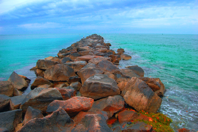
Una de las fotografías más austeras de Rafael Montilla, en I love Miami, focaliza un sentido metafórico del mensaje: ese alineamiento de piedras, especie de puente o lengüeta empedrada que entra en las aguas, hace un triángulo con la visión en una perspectiva, de lo cercano a lo lejano, a través de un camino que avanza en el mar hacia un indefinido horizonte. Cada elemento se hace símbolo. El titulo de la fotografía “Llegar a la punta” agregan un significado lingüístico a la imagen, reforzando el sentido de  lo que hay leer en ella: superar los tropiezos o piedras del camino, cuando anhelamos alcanzar “la punta” (objetivo, cúspide, meta). La imagen nos dirige la visión hacia una lectura del espacio entre símbolos (piedras, puente, caminos en la mar) de un imaginario que, consciente o inconsciente, organiza la imagen para significar un más allá de lo que ve el espectador a simple vista. Las palabras simplemente vienen a anclar uno de los sentidos posibles.

Como esa fotografía citada, la mayoría de ellas configuran una referencia pontificia del espacio urbano (Luces del puente, Los puentes unen y separan) cuya visión poetiza la estética del modelo constructivo contemporáneo de la ciudad de Miami; pero aún en aquellas fotografías donde el puente no aparece, la fotografía construye la conexión imaginaria: tierra y agua unidas por el reflejante espejo (Sunset, Mar como cielo, Sale del agua); árbol y forma arborícola de fuegos a través de las palmeras. Existen esos puntos luminosos que emergen entre las construcciones con el valor fuerte de símbolo: el amor a la ciudad  está atravesado de la luz. Bajo esa luz, el fotógrafo descubre realidades que se alinean en simetrías, perspectivas y símbolos que se asimilan a las artes de la contemporaneidad. Las formas y colores, en Los arcos y Los puentes unen y separan, son imágenes de proyectivas del diseño escultural en las vías de comunicación citadina.

El arte de Rafael Montilla construye el puente de la imagen al sentido. Fija el paso al mensaje que emerge entre la captación espacial de Miami a través del lente tecnológico y la comunicación artística que dirige el hallazgo fotográfico hacia una retórica o una simbólica para construir el mensaje que leemos en la imagen. “Llegar a la punta” es una imagen con ese agregado verbal que apunta a la travesía, pisando y tropezando piedras en el camino, hasta acceder, después de tantos tropiezos y dificultades,  a un objetivo en el horizonte de la vida. Las luces que aparecen a través de puentes, rayos de la rueda de la bicicleta, arboles iluminados, son parte de una simbología luminosa del amor, tanto hacia la ciudad como hacia la fotografía. Esa es la misión de la fotografía para Rafael Montilla en I Love Miami.

Maracaibo, 16 de agosto de 2016.

Víctor Fuenmayor: Caballero de Las Artes y de Las Letras de la República Francesa, Doctor en Semiología (Universidad Paris VII) y Miembro del AICA, Asociación Internacional de Críticos de Arte.

Perez Art Museum PAMM
Pérez Art Museum Miami

Arte de stijl

Arte de stijl

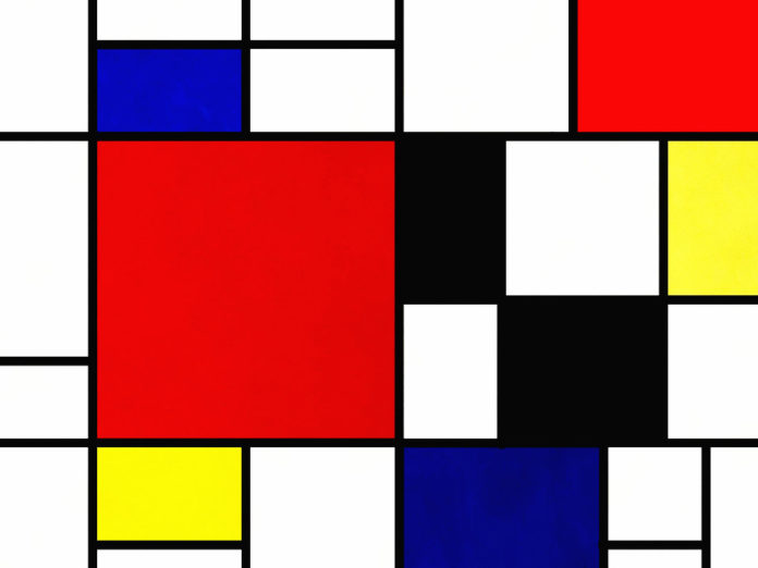
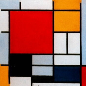
Se considera que el bloqueo de color es la exploración de tomar colores que son opuestos en la rueda de colores y combinarlos para crear combinaciones de colores interesantes y complementarias. Se asocia comúnmente en la moda como una tendencia que se originó a partir de la obra de arte del pintor holandés, Piet Mondrian. Sin embargo, otros expertos discuten si su obra de arte es el verdadero origen del bloqueo de color.

Historia
La mayoría de los historiadores cree ampliamente que Piet Mondrian, un artista de principios de siglo, cuyas pinturas eran una colección de líneas claras y cuadrados planos, inspiró esta tendencia actual de bloqueo de color. Mondrian valoraba la simplicidad y, por lo tanto, experimentó hasta qué punto podía simplificar su trabajo, maximizando la simplicidad y manteniendo formas geométricas reconocibles, aunque abstractas. Mondrian más tarde llamó a este estilo de pintura Neo-Plasticismo. En el movimiento de neoplasticismo de Piet Mondrian, su arte inspiró directamente el mundo de la moda, así como la decoración del hogar y los productos horneados. Aunque se dice que Mondrian es la figura clave del movimiento de arte moderno, hay otros que creen que el crédito de esta tendencia recae en Georges Seurat y Claude Monet.

Sin embargo, las fuentes informan que fue Piet Mondrian quien inspiró a otros diseñadores como Yves Saint Laurent para crear los famosos vestidos Mondrian. Antes de que la estética de Mondrian superara al mundo de la moda, la materialización del arte pop en los años 50 abrió los ojos de Estados Unidos a un mundo más vibrante pero estructurado. Pop Art incorporó las mismas líneas limpias y colores sólidos que abarcaba el trabajo de Piet Mondrian. Los defensores de la teoría del origen de Georges Seurat y Monet afirman que esta nueva aceptación condujo a la revolución del bloqueo del color.

La estética del neoplasticismo de Mondrian evolucionó a través de las décadas, llegando a incluir aspectos como el color sintético y una fuerte estructura impuesta en la década de 1960. La tendencia de bloqueo del color despegó en los años 60 cuando diseñadores de moda como Yves Saint Laurent adoptaron esta estética revolucionaria. No pasó mucho tiempo antes de que esta nueva tendencia llegara hasta Londres; la juventud de Londres comenzó a usar conjuntos que se conocerían como moda moderna. La moda Mod se parecía mucho al estilo artístico de Piet Mondrian; separaciones de color sólido que no coinciden y que estaban compuestas de bloques en diferentes tonos.

En cuanto a hoy, el bloqueo de color se ve con mayor frecuencia en el hogar como una novedad en diseño de interiores. Aunque algunos argumentan que el bloqueo del color es una cosa en el pasado, las figuras y entusiastas de la alta costura creen que esta tendencia retro continúa prosperando como resultado de la generación hipster que revive la tendencia y la convierte en algo visto como una moda.

Proceso
En el mundo de la moda, el proceso de bloqueo de color se refiere al uso de bloques de colores. El bloqueo de color es diferente de la forma en que las personas se visten generalmente porque los colores del atuendo se consideran más fuertes o los colores que chocan. Las figuras de la moda explican que el bloqueo del color consiste en usar múltiples artículos de ropa de colores lisos en un solo atuendo. El bloqueo de color tradicional consiste en juntar dos o tres colores diferentes pero complementarios en un solo conjunto. También se considera que bloquea el color, incluso si los colores no son opuestos directos en la rueda de colores. Por ejemplo, el amarillo y el naranja están uno al lado del otro, pero agregar púrpura (un color en el lado opuesto de la rueda) crea un atuendo de color bloqueado.

Reglas
Los íconos de la moda, los diseñadores y las figuras han desarrollado reglas que van junto con el arte del bloqueo del color. Las reglas básicas para el bloqueo de color se centran en la teoría del color. La teoría del color establece que existen reglas no escritas en el bloqueo del color, como no usar demasiados colores a la vez y equilibrar un atuendo con un neutral como el gris.

Beneficios
Dado que el bloqueo de color es una forma abstracta de arte, es fácil crear ilusiones para acentuar las formas del cuerpo, haciendo que las personas se vean más altas y delgadas. El bloqueo de color proporciona versatilidad a la ropa que otras tendencias y estilos no ofrecen.

Diseño de interiores
El bloqueo del color se ha extendido recientemente a la decoración del hogar y al diseño de interiores. Esta tendencia toma la misma idea en el diseño del hogar que en la moda: los colores se combinan sin preocuparse de combinarlos. En el hogar, el bloqueo de color se utiliza principalmente en la decoración de las habitaciones y en las paredes. La decoración choca entre sí o, en casos más suaves, los colores opuestos se complementan entre sí para proporcionar una atmósfera interesante y refrescante en una habitación.

Técnicas de arte
Adapte la tendencia de moda del bloqueo de color para su hogar. Use estas técnicas para comenzar.

Bloqueo de color de medios mixtos
Haga un collage de medios mixtos colocando tiras de papel y tela en una hoja de papel de acuarela. Primero, agregue bloques de color con pintura acrílica. Pegue con cinta adhesiva las áreas para pintar, use agua para diluir la pintura a su tono deseado y use un pincel de artista para pintar sobre el color. Para una apariencia fluida, permita que la pintura se filtre debajo de la cinta. Una vez que la pintura se seque, retire la cinta y pegue los restos de papel y tela con adhesivo en aerosol.

Rayas de acuarela
Crea un patrón de franjas sueltas de color bloqueado con acuarela. Sumerge tu pincel en agua, luego en la pintura de acuarela. Arrastre el pincel desde la parte superior de la banda hasta la parte inferior de la banda, sin levantarlo. Repita con colores y marco adicionales cuando esté seco.

Cuadrados concéntricos
Use papel de scrapbooking para crear capas de cuadrados concéntricos. Elija múltiples tonos de un solo color. Monte la primera hoja completa (la nuestra era de 12×12 pulgadas) en un trozo de placa de núcleo de espuma con adhesivo en aerosol. Corte cada cuadrado 2 pulgadas más pequeño que el cuadrado anterior, luego aplique capas con adhesivo en aerosol.

Bloqueo de color en madera
Los paneles de madera de una tienda de suministros de arte son el telón de fondo perfecto para diseños gráficos. Traza o dibuja líneas y curvas en la madera con ligeras marcas de lápiz. Use pintura acrílica para rellenar sus formas, permitiendo que el panel se seque entre colores y capas.

Bloqueo de textura
Cambie la textura de sus materiales, en lugar del color, para otra versión del bloqueo del color. Dos cuadrados del mismo tamaño en el mismo tono de amarillo, un papel liso para álbumes de recortes y el otro tejido de tapicería con nudos, crean un contraste en la textura. Use adhesivo en aerosol para unir los cuadrados al tablero de núcleo de espuma, luego enmarque.

Diseño de lado a lado
Para diseños angulares, use cinta de pintor para enmascarar los diseños, especialmente si los colores correrán uno al lado del otro. La cinta te dará un borde bonito y limpio. Asegúrese de dejar que la pintura se seque completamente y cure antes de pegarla y pintar el siguiente color.

Cambialo
Combina dos tendencias en una combinando el bloqueo de color con un efecto ombre. Comience con un color base para un bloque, luego diluya con pintura blanca para obtener un tono más claro para el siguiente bloque. Dilúyalo con otra ronda de pintura blanca para obtener un tono aún más claro. O compre gradientes premezclados.

Perez Art Museum PAMM
Pérez Art Museum Miami

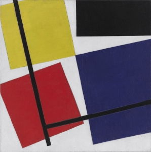
Constructivismo 1915–1935

Constructivism art Rafael Montilla

“Las calles son nuestros pinceles, las plazas nuestras paletas… 

Vladímir Mayakovsky


Constructivismo

1915–1935

Las calles son nuestros pinceles, las plazas nuestras paletas… 

Vladímir Mayakovsky

El suprematismo estaba muy bien, pero ¿era útil para el pueblo ruso, en su mayoría analfabeto?.

La respuesta era evidente. Ni siquiera hoy en día entendemos de todo lo que querían decir esos místicos radicales experimentando con geometrías.

Lo que había que hacer es llevar el suprematismo a las masas y que el arte trascendiera la ideología política.

El constructivismo supuso una identidad visual para el comunismo soviético y tuvo como objetivo principal llevar el arte al pueblo rescatándolo de las élites.

Eso no significa en modo alguno el cese de la experimentación. Los constructivistas se centraron en todos los ámbitos creativos y exprerimentaron con todas las disciplinas, técnicas y nuevas tecnologías, además de continuar la experimentación geométrica suprematista.

Más que arte para ser mostrado en una galería burguesa, el constructivismo hizo arte para el pueblo mezclando todas las artes en un amalgama utópico de diseño, ingeniería, arquitectura, pintura, escultura…

Perez Art Museum PAMM
Pérez Art Museum Miami

ARTWORKS MEDIA

migrant mother
migrant mother

Visual arts media is the material and tools used by an artist, composer or designer to create a work of art, for example, “pen and ink” where the pen is the tool and the ink is the material. Here is a list of types of art and the media used within those types.

acrylic
aluminium
appropriation
aquatint
assemblage
augmented reality
basalt
bas-relief
binder
board
brass
bronze
brush
burlap
cable
cameo
canvas
carbon fiber
card
cardboard
casein
cement
ceramics
chalk
charcoal
chisel
clay
cliché-verre
cloth
coal
collage
collotype
color varnish
colored pencils
concrete
copper
cotton
crayon
digital
drawing
drypoint
dust
elephant dung
embroidery
emulsion
enamel
encaustic
engraving
etching
fabric
fabric straps
fat
feather
felt
felt-tip pen
fiberboard
fiberglass
flashlight
fluorescent paint
fresco
frottage
gesso
glass
glitter
gloss
gold
gold leaf
gouache
granite
graphite
grisaille
gum arabic
hemp
hologram
indian ink
ink
intaglio
iron
iron plate
ivory
japanese paper
jute

lacquer
laid paper
lavis
leadpoint
leather
lemon
light box
light bulb
limestone
linen
linocut
linoleum
lithography
magna
mahogany panel
majolica
marble
masking tape
masonite
metal
metalpoint
mezzotint
mixed media
mixed technique
mosaïque
mural
music paper
nails
oak
objet trouve
obsidian
oil
oilcloth
onyx
paint
painted metal
panel
paper
papyrus
parchment
pastel
pebbles
pen
pencil
pergament
photogram
photographic paper
photography
photogravure
photomontage
photomosaic
piano
pigment
plaster
plastic
plexiglas
plug socket
plywood
polyester
polymer
polymer paint
polystyrene
poplar
porcelain
postcard
print
printed brochure
pyroxylin
ready-made
recorder with cassette
rubber

sand
sanguine
satin
scrapings
screen print
sepia
silk
silks creen
silverpoint
sponge
spray paint
stained glass
steel
stencil
stone
string
stump
tapestry
tar
tempera
terracotta
tin
travertine
tusche
twine
varnish
vellum
vitrage
wall
wash
watercolor
wax
white
whitewash
wire
wood
woodblock print
woodcut
wooden chair
wooden sled
wool
zinc

MEDIUM

Medium can refer to both to the type of art (e.g. painting, sculpture, printmaking), as well as the materials an artwork is made from

In relation to art this term has two principal overlapping, even slightly confusing meanings. Painting, sculpture, drawing, printmaking, are all media of art in the sense of a type of art: however, the term can also refer to the materials a work is made from

For example a sculpture in the medium of bronze or marble; a painting in the medium of oil paint on canvas, or watercolour on paper; a drawing in the medium of pencil or crayon; a print in the medium of etching or lithography.

In modern art new media in both senses have appeared. First of all, modern artists, from Pablo Picasso and Marcel Duchamp on, have established that art can be made of absolutely any material, so the media of modern art, in that sense, have ranged from found or appropriated objects and materials of all kinds, to the artist’s own bodily excretions and the body itself. Many modern works are made from a variety of such things and the term mixed media has had to be coined to take account of this.

This expansion of media, in the sense of materials, has given rise to new media in the overarching sense of a type of art. For example, assemblage, installation and performance are all three-dimensional art forms sufficiently distinct from traditional sculpture to become considered new media in themselves. In the case of the first two the medium from which they are usually made is a variety of materials, that is, mixed media. Performance art uses the artist’s own body as the material or medium.

Finally, in a third meaning, the term medium also refers to the liquid in which the pigment is suspended to make paint. So the medium of the medium of oil paint is linseed oil.

Source: https://www.tate.org.uk/art/art-terms/m/medium

Perez Art Museum PAMM
Pérez Art Museum Miami

Marlow Moss

Marlow Moss
Marlow Moss

Marlow Moss es una destacada pero olvidada artista que trabajó la abstracción geométrica, y su singular enfoque del espacio merece más atención. Este manuscrito toma como caso de estudio la obra de Marlow Moss Composición en rojo, negro y blanco (1953) de la colección del Stedelijk Museum de Ámsterdam y explora el concepto de líneas dobles y truncadas de Moss. Al activar una obra de arte abstracta de un artista ignorado producida en el periodo de posguerra, exploro el potencial de un concepto de espacio incorporado. El estudio reflexiona sobre la interrelación entre espacio, movimiento y cuerpo en la abstracción geométrica. ¿Cómo puede la abstracción geométrica revelar que el espacio y el género están relacionados? ¿Cómo pueden los conceptos feministas del espacio trastocar los sistemas espaciales patriarcales? ¿Qué relación existe entre el espacio y las identidades sociales? ¿Cómo puede el enfoque espacial de Moss revivificar un concepto feminista de la corporalidad?

En primer lugar, se ofrece una breve información biográfica sobre Moss a modo de antecedentes históricos. A continuación, discuto cómo el discurso masculino dominante de la historia del arte tiene una estructura excluyente. A continuación, examino el enfoque de Moss sobre el espacio y el cuerpo. Exploro cómo se interrelacionan la construcción del espacio y el género centrándome en el dinamismo y la fluidez de los lienzos de Moss. Propongo que Moss hizo una contribución crucial al vocabulario de la abstracción geométrica con su concepto de líneas dobles y truncadas, y argumento que sus líneas son la abstracción de un movimiento corpóreo. Por último, propongo que la forma en que Moss entiende el espacio a través del movimiento corporal puede interpretarse como una estrategia feminista y permite una reteorización del cuerpo fuera de los marcos patriarcales.

Marlow Moss (1889-1958), nacida en Londres, fue descrita en su día por Fernand Léger como una artista “que se resiste a la manía moderna de las clasificaciones”[1] Por mencionar algunos de sus atributos, fue alumna de Léger, discípula de Piet Mondrian, pintora, artista británica en París, emigrante en los Países Bajos, mujer, queer, drag king, de clase media alta, judía, atea y existencialista.

Al principio, Moss estudiaba arte en Slade, Londres, cuando cambió su nombre, Marjorie Jewel, por otro de género neutro, Marlow, y empezó a vestir ropa masculina. En 1927 se trasladó a París y estudió en la Académie Moderne, con Fernand Léger y Amédée Ozenfant, que ejercieron una gran influencia sobre Moss. En París conoció a su compañera de toda la vida, la escritora holandesa Antoinette Hendrika Nijhoff-Wind. Fue Nijhoff quien le presentó a Mondrian; Moss quedó fascinada por la estructura arquitectónica y los colores de Mondrian, y adoptó el lenguaje neoplástico de Mondrian para hacer realidad su ambición de “espacio, movimiento y luz”[2].

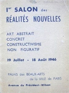
Moss fue un actor importante de la escena artística parisina de entreguerras, y fue buena amiga de Jean Gorin, Georges Vantongerloo y Max Bill. Fue una de las fundadoras de la Abstraction-Création (1931-1936), una asociación de artistas abstractos creada en París con el objetivo de promover el arte abstracto a través de exposiciones colectivas. A lo largo de la década de 1930, expuso regularmente con la Asociación 1940 en el Salon des Surindépendants, el Parc des Expositions, el Parc de Versailles y Le Salon des Réalités Nouvelles de París, así como en las exposiciones colectivas Konstruktivisten de la Kunsthalle (1937) de Basilea y Abstracte Kunst (1938) del Stedelijk Museum de Ámsterdam.

Al comienzo de la Segunda Guerra Mundial, abandonó Francia y se trasladó a los Países Bajos. Al año siguiente, la invasión alemana la obligó a regresar a Inglaterra. Las exposiciones que se celebraron durante su vida en la Hanover Gallery (1953, 1958), Londres, y tras su muerte en el Stedelijk Museum de Ámsterdam (1962) se centraron en presentar su enfoque visual. Sin embargo, la obra de Moss sigue sin ser suficientemente reconocida por su importancia dentro de los movimientos abstractos de entreguerras. La primera razón es la destrucción de sus obras en su estudio francés durante un bombardeo en 1944. La segunda es la estructura de la historia del arte, constituida en el marco de la dominación masculinista y la heterosexualidad obligatoria.

Fuera de la vista
En 1971, Linda Nochlin se preguntaba “¿Por qué no ha habido grandes mujeres artistas?” en su famoso ensayo que comparte título con esta pregunta urgente[3]. La crítica al canon histórico del arte occidental no es nueva, pero sigue siendo pertinente. Según Nochlin, el problema es sistémico: la estructura de las instituciones artísticas que dio forma a los programas, la financiación y las colecciones de los museos está construida sobre un sujeto blanco y masculino. Este sujeto se asume como “natural” en la narrativa y, por lo tanto, la historia del arte y las instituciones excluyen a las mujeres, a los queer y a los artistas no occidentales. Desde el ensayo de Nochlin, a lo largo de estos cincuenta años, la teoría feminista ha ampliado este discurso y los museos han ido revisando sus políticas junto con estos debates. Ahora, un discurso autocrítico está en auge. Sin embargo, la exclusión sistémica sigue entre nosotros y afecta tanto a las instituciones artísticas como a la vida cotidiana. La lucha contra las prácticas discriminatorias sistémicas debe ser un proceso continuo y renovarse inventando nuevas estrategias contra los también cambiantes aparatos de poder y formas de exclusión, dominación y violencia. Por lo tanto, es necesario y urgente que los museos se replanteen y reevalúen constantemente sus prioridades, políticas y prácticas para ser más inclusivos y justos.

El revisionismo histórico es una estrategia productiva para llenar el vacío existente en las colecciones y prácticas expositivas de los museos. Es una forma importante de comprometerse críticamente con la historia del arte. El revisionismo histórico feminista aborda la exclusión estructural de las mujeres artistas que son reclamadas por la historia[4]. La principal ambición de esta estrategia es incluir a aquellas que han sido ocultadas, suprimidas y dejadas de lado. Las estrategias revisionistas pueden revivir cualquier obra de arte del pasado para movilizar el pasado, el presente y el futuro.

La historia del arte tiende a debatirse como una serie de acontecimientos revolucionarios que representan de forma dominante al artista occidental masculino. El esquema de Alfred H. Barr en el catálogo de la exposición Cubismo y Arte Abstracto (1936) en el MoMA es un ejemplo de cómo se ha narrado el arte moderno a través de un diagrama de flujo cronológico en el que los movimientos conectados por flechas direccionales indican influencia y reacción[5] La historia del arte moderno de Barr se ha convertido en icónica y naturalizada. Sin embargo, Meyer Schapiro sugiere que el esquema de Barr sitúa “el arte de todo el mundo en… un único plano antihistórico y universal como panorama de las energías formalizadoras del hombre”[6] Asimismo, Griselda Pollock criticó el enfoque de Barr, ya que “crea una tradición que normaliza una historia del arte moderno particular y un conjunto de prácticas de género”[7] La narrativa de Barr establece una norma que se basa en el artista varón blanco heterosexual y se produce mediante una estructura de exclusión y subordinación.

Las políticas de inclusividad en las instituciones artísticas requieren, por tanto, una problematización del discurso masculino del modernismo[8]. Esta perspectiva ve la historia del arte como constituida por acontecimientos consecutivos, sincrónicos, y una linealidad de “-ismos”. Encontrar a una mujer artista en esta historia del arte moderno es muy raro. Mujeres artistas como Moss han sido tachadas de anacrónicas y de carecer de poder para producir conceptos críticos. El innovador concepto de doble línea de Moss ha permanecido casi siempre en las notas a pie de página de los escritos sobre Mondrian. Sus obras rara vez se han visto en público. Resulta llamativo que Composición en rojo, negro y blanco de Moss, tras su llegada a la colección del Stedelijk Museum en 1962, se expusiera por primera vez en su exposición individual póstuma del mismo año y, aparte de las presentaciones de colección no registradas, solo en otras tres exposiciones, la última de las cuales es Artistas migrantes en París (2019-2020) en el Stedelijk[9] Sus obras han permanecido en la sombra durante mucho tiempo. Sin embargo, pueden ampliar nuestra visión hacia el arte abstracto y el espacio.

Además, como escribe Lucy Howarth, si la historia del arte sigue percibiéndose como una serie de desarrollos revolucionarios, artistas como Moss pueden evaluarse como un retroceso[10]. Sin embargo, la obra de Moss nos ofrece conceptos estéticos innovadores, y una visión anacrónica hacia Moss puede subvertirse para considerar cuestiones socioculturales contemporáneas. Giorgio Agamben sugiere que “lo contemporáneo es lo intempestivo y a través del anacronismo somos más capaces de captar nuestro tiempo”[11] Además, Elizabeth Grosz escribe:

Algo es inoportuno por ser anacrónico, que es otra forma de decir que aún no se ha agotado en su pasado y todavía tiene algo que ofrecer que permanece sin explotar. La teoría feminista se ha dirigido a releer el pasado en busca de lo que hay en él sin utilizar[12].

En lugar de ser monológica y estática, la historia del arte moderno puede ser dinámica y diacrónica. Agamben propone un régimen de historicidad representado espacialmente por una línea quebrada, en oposición a la continuidad cronológica[13]. Esta línea quebrada recuerda las líneas truncadas de la obra de Moss Composición en rojo, negro y blanco. La estructura espacial de Moss puede interpretarse como una manifestación visual de la idea que Agamben tiene de la historia. En esta pintura abstracta, Moss realiza una movilidad incesante: las formas orbitan rítmicamente, rápidas y lentas, sin límites. El movimiento de las líneas en el lienzo de Moss y la composición dinámica nos inspiran a imaginar una historia del arte no sincrónica, dinámica y móvil.

En lugar de ser monológica y estática, la historia del arte moderno puede ser dinámica y diacrónica. Agamben propone un régimen de historicidad representado espacialmente por una línea quebrada, en oposición a la continuidad cronológica[13]. Esta línea quebrada recuerda las líneas truncadas de la obra de Moss Composición en rojo, negro y blanco. La estructura espacial de Moss puede interpretarse como una manifestación visual de la idea que Agamben tiene de la historia. En esta pintura abstracta, Moss realiza una movilidad incesante: las formas orbitan rítmicamente, rápidas y lentas, sin límites. El movimiento de las líneas en el lienzo de Moss y la composición dinámica nos inspiran a imaginar una historia del arte no sincrónica, dinámica y móvil.

Cuerpo y espacio
Para Moss, el arte y la vida eran inseparables, y ambos están siempre en un estado de devenir[14]. La idea de Moss de un “estado de devenir” se revela en sus composiciones dinámicas. Moss nos ofrece un nuevo concepto del espacio en la abstracción geométrica creando un movimiento perpetuo en el lienzo a través de la doble línea y las líneas truncadas. Moss suele ser reconocida por sus líneas dobles, visibles en la mayoría de sus cuadros. Sin embargo, más tarde desarrolló las líneas truncadas, que son igualmente esenciales para entender a Moss. Ambas son su solución al espacio estático del plano pictórico; las líneas crean un flujo en la superficie del lienzo con una energía ilimitada. El elemento clave para comprender plenamente a Moss es examinar el modo en que capta y abstrae el espacio. Moss percibe el movimiento en el espacio con su cuerpo y al mismo tiempo crea espacio pictórico con esta percepción. Moss concibe el espacio mediante el movimiento en términos de primacía de la corporeidad. Por lo tanto, las pinturas de Moss nos permiten concebir la corporalidad en términos diferentes a efectos feministas.

La mayoría de los escritos sobre Moss exploran esta doble línea; primero mencionan a Moss como seguidora de Mondrian y luego exploran su contribución al lenguaje abstracto. Por ejemplo, en un catálogo de 1974 de obras de Mondrian en colecciones holandesas, Cor Blok escribe que, tras la introducción de las líneas dobles por parte de Moss, Mondrian las adoptó en sus composiciones y empezó a duplicar o multiplicar sus líneas a principios de los años 30.[15] Además, Yve-Aiain Bois menciona la aparición de Moss en el primer número de Abstraction Création. Bois escribe sobre su adhesión a la estética de Mondrian y más tarde señala su contribución de la línea doble al vocabulario de Mondrian[16]. De forma similar, Carel Blotkamp escribe sobre Mondrian: “La línea doble la tomó prestada con toda seguridad de uno de sus discípulos más fieles… Marlow Moss”[17].

En realidad, fue Moss quien influyó en Mondrian para que utilizara la doble línea, pero la invención de Moss ha quedado en su mayor parte en las notas a pie de página de Mondrian[18]. Debemos preguntarnos por qué Moss introdujo las líneas y cuál fue el efecto de ello. Para Moss, en los cuadros de Mondrian faltaba movimiento y la doble línea ofrecía una solución. Hasta 1931, Mondrian pretendía “congelar el tiempo y obtener un equilibrio universal estático en el que todo estuviera neutralizado, cada fuerza anulada por su opuesto”. Sin embargo, como ya se ha comentado, Mondrian dio marcha atrás a partir de 1932 y exploró el dinamismo en su obra adoptando la “línea doble”[19] Moss introdujo por primera vez las líneas en sus cuadros en 1931. Las líneas son perfectamente visibles en las dos obras de 1931 publicadas en el primer número de Abstraction-Création (1932). Causaron sensación en el grupo Abstraction-Création.

Más adelante, Moss aseguró otro tipo de movimiento en el espacio: introdujo líneas truncadas. Este tipo de líneas son más visibles en sus obras posteriores, sobre todo de la década de 1950, como Composición en rojo, negro y blanco. Moss amplía los contornos del lienzo con sus líneas. En Composición en rojo, negro y blanco, la línea de la esquina superior derecha y la de la esquina inferior izquierda parecen filtrarse desde el borde del cuadro. Las mitades superior e inferior del cuadro se ven forzadas a separarse por un movimiento que parece ir más allá del lienzo y conectarlo con su entorno. Las líneas fluyen sobre y desde la superficie del cuadro. Traspasa los límites espaciales del lienzo.
Otro óleo sobre lienzo, Azul, rojo, negro y blanco (nº 3) (1953), realizado el mismo año que Composición en rojo, negro y blanco, comparte estas características. También se expuso en la muestra individual que Moss organizó en 1962 en el Stedelijk Museum. Ambos cuadros son el resultado de su exploración del movimiento en series de pinturas realizadas entre 1950 y 1953[20] La estructura geométrica de estas obras crea un cambio dinámico en el plano pictórico. En ambas, las líneas parecen sobresalir de la superficie pictórica. En Azul, rojo, negro y blanco (nº 3), las líneas cortas crean dinamismo al cruzarse en el lado izquierdo. Una de las líneas cortas situada en la parte superior derecha sobresale de la superficie, mientras que la que está debajo se desplaza hacia la izquierda. Parecen moverse en direcciones opuestas. Las líneas rojas y negras más cortas se magnetizan y se mueven una hacia la otra. La movilidad está garantizada por la energía magnética entre las líneas.
Del mismo modo, volviendo a Composición en rojo, negro y blanco, las líneas del centro se magnetizan entre sí y también interactúan con el cuadrado rojo. Las formas geométricas fluctúan en la superficie, afectadas por la tensión entre estas líneas. Hay una movilidad perpetua, una energía continua en los lienzos de Moss. Sus composiciones son como un flujo y reflujo, un patrón recurrente de ir y venir. El flujo y reflujo designan la marea descendente y la marea ascendente. La marea es el cambio cíclico en la superficie del mar causado por las posiciones relativas de la Luna y el Sol. Las posiciones relativas de las líneas crean un movimiento similar en la superficie del lienzo de Moss. La superficie del lienzo está en movimiento, como la superficie del mar. Este fenómeno geográfico puede percibirse como una metáfora espacial que nos informa sobre la aproximación de Moss al espacio a medida que sus líneas fluyen sobre la superficie del lienzo.
Moss percibe y siente su entorno a través del cuerpo. Para Moss, el espacio se construye mediante el movimiento, por lo que visualiza el flujo constante. El lienzo se nutre de la movilidad del cuerpo y viceversa. Moss desestabiliza el lienzo estático llevando la corporeidad a su superficie. En el catálogo de la exposición de Moss en el Stedelijk, su socio, el escritor A.H. Nijhoff, cita a Moss: «No soy pintor, no veo la forma, sólo veo espacio, movimiento y luz», y luego desarrolla la obsesión de Moss por el espacio, el movimiento y la luz con una anécdota biográfica:

Al periodo juvenil de intenso trabajo musical le siguen largos años de enfermedad (tuberculosis) y ociosidad forzada. Al reanudar la vida normal, siente ansias de movimiento, de actividad…. Mientras tanto, su vitalidad encuentra una salida en el baile. Toma clases de ballet. De nuevo el ritmo, el movimiento en el espacio, la arquitectura coreográfica[21].

Al bailar ballet, Moss establece una relación con el espacio a través de los movimientos corporales. Su comprensión del espacio es un ejemplo de encarnación del espacio. Se compromete con el ballet como una forma de abrazar el movimiento en el espacio. Su forma de entender el espacio a través del movimiento corporal puede interpretarse como una estrategia feminista.
Las mujeres han sido alienadas y cosificadas a través de la contención y la derogación del cuerpo femenino. Las conceptualizaciones patriarcales del cuerpo formaban una «Mujer» universal en términos esencialistas y ahistóricos. Suponía un cuerpo precultural, prelingüístico, prosocial y natural. Cuestionar estos conceptos patriarcales del cuerpo se aplica a las ambiciones feministas. Moss crea un marco para reconocer los cuerpos de las mujeres como activos, móviles, líquidos y autónomos. Dado que Moss ve tanto la vida como el arte como un estado constante de devenir, su conceptualización del cuerpo también está constituida por procesos de devenir. Las obras abstractas de Moss tienen el potencial de reteorizar el cuerpo fuera de los marcos patriarcales. El cuerpo no es un estado fijo del ser, sino que fluye.
Las líneas truncadas que constituyen el apogeo de su ambición de espacio, movimiento y luz se asemejan a los pequeños, delicados pero eficaces gestos del ballet. La movilidad de los lienzos de Moss la emparenta más con su maestro de la Académie Moderne, Fernand Léger, que con Mondrian[22]. No es casualidad que Léger también se relacione con el ballet en su única película, Ballet Mécanique (1924), en la que establece un paralelismo entre el movimiento del hombre, la máquina y la ciudad. Si Moss entiende el espacio a través del movimiento corporal, entonces el desbordamiento de líneas en los cuadros de Moss señala los límites expandibles del cuerpo.
Para la geógrafa feminista Gill Valentine, el género y el espacio se controlan y producen a través del mismo marco regulador:

El género es la estilización repetida del cuerpo, un conjunto de actos repetidos dentro de un marco regulador muy rígido que congelan nuestro tiempo para producir la apariencia de sustancia, de un «espíritu natural». Del mismo modo, la heterosexualización del espacio es un acto performativo naturalizado a través de la repetición y la regulación. Estos actos producen un «cúmulo» de suposiciones incrustadas en las prácticas de la vida pública sobre lo que constituye un «comportamiento adecuado» y que se fusionan con el tiempo para dar la apariencia de una producción «adecuada» o «normal» del espacio[23].

Como dice Valentine, tanto la regulación del género como la del espacio requieren un acto coherente y repetitivo. Si junto al paralelismo de Valentine entre género y espacio traemos a colación la famosa conceptualización de Judith Butler del género como una configuración estilizada a través de actos y gestos corporales repetitivos, el objetivo de Moss, trastocar el espacio cerrado y regulado de una cuadrícula de una sola línea a través de la movilidad corporal visualizada como líneas que fluyen, abre un espacio para imaginar una teoría feminista del cuerpo[24]. Tanto el cuerpo como el espacio son artefactos socioculturales, y Moss, que los entiende como tales, desafía las nociones tradicionales de cuerpo, género y espacio. De ahí que lleve la corporeidad al lienzo y cree un espacio dinámico en el que los comportamientos espaciales y de género puedan desnaturalizarse y desplazarse.
Moss crea una forma corpórea de conocimiento del espacio que se opone a la racionalidad masculinista. Para Gillian Rose, otra geógrafa feminista, la racionalidad masculinista es una forma de conocimiento que presupone un conocedor que cree que puede separarse de su cuerpo[25]. En la misma línea, Briony Fer escribe que el esfuerzo de Mondrian por la estabilidad en el lienzo se alinea con su objetivo de reducir la corporeidad fuera del plano pictórico[26]. [26] El discurso neoplástico de Mondrian «pretende encontrar una “nueva plástica”, o una “nueva estructura”, “reduciendo la corporeidad de los objetos a una composición de planos que dan la ilusión de yacer en un solo plano”»[27] Renuncia al cuerpo fuera del lienzo, creando un espacio contenido e incorpóreo.
La reducción del cuerpo fuera del cuadro oculta la construcción social del cuerpo y el género, ya que el género es un acto corporal. En la abstracción geométrica incorpórea, en el espacio incorpóreo del lienzo, las identidades de género siguen siendo una ilusión, imposible de «encarnar», igual que la ilusión de los objetos que yacen en un plano.
No obstante, el espacio dinámico de Moss puede permitir una conceptualización feminista de la corporeidad y las identidades de género. Se puede establecer una analogía entre el espacio físico, el espacio del lienzo, y el suelo metafórico de la identidad de género a través de la metáfora espacial de Butler del «suelo». Butler sugirió que «el suelo de la identidad de género es la repetición estilizada de actos a través del tiempo y no una identidad aparentemente sin fisuras»[28] El espacio dinámico de Moss expone que no hay un «suelo sustancial de identidad» sino una «discontinuidad ocasional». La discontinuidad de líneas en el lienzo de Moss es una manifestación abstracta de la discontinuidad de las identidades de género. El identificador «mujer» en el que se basa el feminismo no es un sujeto estable y universal, sino un proceso. Como la corporeidad es la condición material de la subjetividad, entonces el cuerpo es un proceso. En consecuencia, el sujeto feminista no es estable, siempre cambia y se desborda de los marcos rígidos, como las líneas de Moss.
Liz Bondi sugiere que la subjetividad es una posición. Hay que preguntarse «¿dónde estoy?» o «¿dónde me sitúo?» para posicionarse; esto crea la posición del sujeto[29]. Utiliza términos geográficos de referencia para revelar cómo se constituye la subjetividad. Bondi afirma que pensar en términos de espacio nos ayuda a entender la identidad como proceso, siempre fracturada y múltiple, y por tanto contradictoria.
Esta contradicción coincide con el concepto de «espacio paradójico» que Gillian Rose desarrolló para entender la producción del espacio social en relación con el género. La geografía paradójica es un espacio en el que el sujeto está en todas partes y en todas partes. Está al margen y en el centro al mismo tiempo. El espacio paradójico nos permite «reconocer tanto el poder de los discursos hegemónicos como insistir en la posibilidad de resistencia». Es una «geografía multidimensional estructurada por la diversidad contradictoria simultánea de las relaciones sociales». Es una geografía tan múltiple como contradictoria…. Fragmentan el peso muerto del espacio masculinista y rompen sus exclusiones…. El espacio paradójico, por tanto, es un espacio imaginado para articular una relación problemática con los discursos hegemónicos del masculinismo”[30] Así, el sujeto no puede definir una posición concreta y estable y, por tanto, la subjetividad nunca es sólida y definitiva. En consecuencia, los límites materiales del sujeto, los límites del cuerpo, son inestables. Este espacio, cuerpo y sujeto paradójicos encuentran su respuesta visual en el flujo de las pinturas de Moss.

De hecho, en el catálogo de la retrospectiva póstuma de Moss en la Galería Carus de Nueva York, en 1979, Randy Rosen cita a Moss, escribiendo: «El secreto de la forma no reside en la forma en sí misma, sino en el continuo cambio y desplazamiento de las formas»[31] Rosen continúa:

El ojo ya no puede «fijarse» en una forma concreta, ni localizar la fuente estructuradora, ni determinar el principio o el final del campo espacial. El lienzo se ha convertido en un puro campo de energía. Las últimas obras de Marlow Moss constituyen una importante nueva percepción del espacio. Aunque sigue empleando una lectura espacial coherente, las paradojas y la mutabilidad del espacio están implícitas. Es un concepto del espacio que los artistas contemporáneos de nuestro tiempo siguen explorando[32].

Hay una energía continua en los cuadros de Moss. Las formas geométricas y las líneas crean una tensión en el espacio pictórico. Moss nos ofrece un espacio que reconoce que el cuerpo se desplaza dentro del espacio y también interactúa con otros cuerpos sobre un terreno inestable. De este modo, el cuerpo está en proceso de convertirse, lo que concuerda con el enfoque teórico feminista del cuerpo.

Conclusión

Moss no sólo desafía las normas de género por su aspecto, por su nombre, por apropiarse de un look masculino con sus trajes sastre, sus fustas y su corte de pelo corto, sino también con sus líneas dobles y quebradas. Moss trastoca el discurso espacial masculinista a través de su percepción del espacio. Sus líneas truncadas que flotan libremente crean un imaginario estético para una subjetividad fracturada y discontinua, garantizada por un relato feminista del espacio y el cuerpo. Su forma de relacionarse con el movimiento a través del cuerpo crea un espacio paradójico. En este espacio, el sujeto es contradictorio y el cuerpo no puede entenderse como un cuerpo precultural, prosocial y puro, sino como un objeto social y discursivo, un cuerpo ligado al orden del deseo, la significación y el poder[33].

El cuerpo es importante para entender la existencia cultural y social de las mujeres, pero el feminismo debería introducir la corporeidad evitando conceptos del cuerpo como un objeto biológicamente dado o como una pantalla en la que se pudiera proyectar lo masculino y lo femenino[34]. En su lugar, las mujeres deberían desarrollar modelos autónomos del cuerpo y crear posiciones contradictorias. Los espacios paradójicos pueden desafiar las conceptualizaciones masculinas del cuerpo, la subjetividad y el espacio. Como escribió Butler con perspicacia

Los debates feministas contemporáneos sobre los significados del género conducen una y otra vez a una cierta sensación de problema, como si la indeterminación del género pudiera culminar finalmente en el fracaso del feminismo. Tal vez los problemas no tengan por qué tener un significado tan negativo. Causar problemas era, dentro del discurso imperante en mi infancia, algo que nunca se debía hacer precisamente porque eso te metería en problemas. La rebelión y su reprimenda parecían estar atrapadas en los mismos términos, un fenómeno que dio lugar a mi primera percepción crítica de la sutil artimaña del poder: la ley imperante amenazaba con meterte en líos, incluso te metía en líos, todo para mantenerte alejada de los líos. De ahí que llegara a la conclusión de que los problemas son inevitables y la tarea, cuál es la mejor manera de crearlos, cuál es la mejor manera de estar en ellos[35].

Sin duda, Marlow Moss causó problemas. La tarea no consiste en estabilizar un sujeto y un cuerpo coherentes en los debates feministas, sino en reconocer una multiplicidad de cuerpos en un campo de diferencias. Además, los museos, como espacios para coleccionar, exponer y escribir la historia del arte, pueden producir conceptos espaciales alternativos siendo más inclusivos y causando problemas de género. Exponer, coleccionar y también encargar obras a mujeres artistas son herramientas muy cruciales para trastocar el orden patriarcal de la historia del arte y de las instituciones artísticas. Mientras los museos se redefinen actualmente, la historia del arte debería reescribirse desde una perspectiva más inclusiva. Propongo que es esencial que las instituciones artísticas revisen a las artistas que han quedado en la sombra. Como dice Adrienne Rich: «La revisión -el acto de mirar atrás, de ver con ojos nuevos, de entrar en un texto antiguo desde una nueva dirección crítica- es para la mujer algo más que un capítulo de la historia cultural: es un acto de supervivencia»[36].

Sobre la autora
Nacida en 1992 en Estambul, Gülce Özkara se licenció en Sociología por la Université Paris X Nanterre y posteriormente obtuvo un máster en Estudios Culturales en la Universidad Bilgi de Estambul. Özkara fue comisaria adjunta de la exposición colectiva “Miniature 2.0: La miniatura en el arte contemporáneo” (2020-2021) en el Museo Pera de Estambul. Anteriormente, trabajó como representante de artistas en Pilot Gallery, Estambul. También ha colaborado en varias publicaciones como editora y escritora. Özkara está interesada en las estrategias culturales para reparar las narrativas históricas.

Las referencias bibliográficas no se tradujeron

[1] Fernand Léger, “The Machine Aesthetic: The Manufactured Object, the Artisan, and the

Artist,” in The Documents of 20th Century Art, ed. Edward F. Fry (London: Thames & Hudson, 1973).

[2] Marlow Moss, quoted in Lucy Harriet Amy Howarth, “Marlow Moss (1889–1958)” (PhD dissertation, University of Plymouth, 2008), 1.

[3] Linda Nochlin, Why Have There Been No Great Women Artists? (London: Thames & Hudson, 2021).

[4] Maura Reilly, Curatorial Activism: Towards an Ethics of Curating (London: Thames & Hudson, 2018), 23.

[5] See the catalogue at MoMA’s website.

[6] Meyer Schapiro, “Nature of Abstract Art,” in Abstraction, ed. Maria Lind (London: Whitechapel Gallery / Cambridge, MA: MIT Press, 2013), 34.

[7] Griselda Pollock, Vision and Difference: Feminism, Femininity and Histories of Art (London and New York: Routledge, 2008), 71–72.

[8] Ibid., 72.

[9] The other three shows were: Europa rondom, Stedelijk Museum, 1997; Summer 2013 : Linder, Barbara Hepworth, Marlow Moss, Gareth Jones, Patrick Heron, Nick Relph, R H Quaytman, Allen Rupersberg = In Focus : Marlow Moss = BP Spotlight : Marlow Moss, Tate Saint Ives, 2013; 100 jaar De Stijl, Stedelijk Museum, 2016.

[10]  Lucy Howarth, Marlow Moss, Modern Women Artists (Sussex: Eiderdown Books, 2019), 17.

[11] Giorgio Agamben, “What is Contemporary?,” in What is an Apparatus?, ed. Werner Hamacher (Palo Alto, CA: Stanford University Press, 2009), 40–41.

[12]  Elizabeth Grosz, “The Untimeliness of Feminist Theory,” NORA—Nordic Journal of Feminist and Gender Research 18, no. 1 (2010): 48–51.

[13] Giorgio Agamben, Infancy and History: The Destruction of Experience (London: Verso, 1993).

[14] The wall text of Moss’s work Composition in Red, Black and White (1953) exhibited in the Stedelijk Museum’s group exhibition Migrant Artists in Paris stated: “Art is—as Life—forever in the state of Becoming.”

[15] Howarth, “Marlow Moss,” 30.

[16] Yve-Alain Bois et al., Piet Mondrian 1872–1944 (Boston, New York, Toronto, London: Bullfinch Press, Little Brown and Company, 1994), 62. Quoted in Howarth, “Marlow Moss,” 31.

[17] Carel Blotkamp, Mondrian: The Art of Destruction (London: Reaktion Books, 1994), 214. Quoted in Howarth, “Marlow Moss,” 31.

[18] As Howarth explains, the double line has an important place in the interpretation of Moss, especially used in queer readings which evoke the Derridean concept of différance. However, in this manuscript I mostly engage with feminist theory. Also, the truncated lines have an equally important place as the double lines. Moss used both types lines to ensure movement in the composition.

[19] Yve-Alain Bois, “Slow (Fast) Modern,” in Time, ed. Amelia Groom (London: Whitechapel Gallery / Cambridge, MA: MIT Press, 2013), 49.

[20] Howarth, “Marlow Moss,” 277.

[21] Antoinette Hendrika Nijhoff-Wind, ed., Marlow Moss, exh. cat. (Amsterdam: Stedelijk Museum, 1962).

[22] Howarth, “Marlow Moss,” 14.

[23] Gill Valentine, “(Re)Negotiating the ‘heterosexual street,’” in Bodyspace:

Destabilizing Geographies of Gender and Sexuality, ed. N. Duncan (London and New York: Routledge, 1996),

146–55, 148.

[24] Judith Butler, Gender Trouble: Feminism and the Subversion of Identity (New York: Routledge, 1999), 179.

[25] Gillian Rose, Feminism and Geography: The Limits of Geographical Knowledge (Cambridge, UK: Polity Press, 1993), 155.

[26] Briony Fer, On Abstract Art (New Haven: Yale University Press, 1997), 41.

[27] Ibid., 40.

[28] Butler, Gender Trouble, 179.

[29] Liz Bondi, “Locating Identity Politics,” in Place and the Politics of Identity, eds. Steve Pile and Michael Keith (London and New York: Routledge, 1993), 82–100.

[30] Rose, Feminism and Geography, 155.

[31] Randy Rosen, Marlow Moss, exh. cat. (New York: Carus Gallery, 1979), 1.

[32] Ibid., 2.

[33] Elizabeth Grosz, Volatile Bodies: Toward a Corporeal Feminism (Bloomington: Indiana University Press, 1994), 17–18.

[34] Ibid., 18.

[35] Butler, Gender Trouble, xxvii.

[36] Adrienne Rich, On Lies, Secrets, and Silence: Selected Prose 1966–1978 (New York: W.W. Norton & Company, 1979).

Perez Art Museum PAMM
Pérez Art Museum Miami

Beginnings of Concrete Art

Concrete art, Constructivism, Constructivism


Beginnings of Concrete Art

Constructivism

Concrete Art can trace its origins back to the early-twentieth-century movement of Constructivism, which in turn cannot be discussed in isolation from the invigorating effects of the 1917 Russian Revolution. Since the late 1900s, Russian artists such as the Suprematist Kazimir Malevich, and various individuals attached to movements such as Rayonism, Neo-Primitivism, and Cubo-Futurism, had been undertaking exercises in breaking down the picture plane and redefining sculptural form. This aim was shared with other movements across Europe, such as Cubism, but in the febrile political atmosphere of Russia in the mid-1910s it was increasingly pegged to a revolutionary political agenda. Non-figurative representation was seized on as a metaphor for the revolutions in thought and perception that the Revolution would usher in.

Amongst the many artists central to this yoking together of revolutionary and artistic sentiment were the sculptor Naum Gabo, his brother Antoine Pevsner, Varvara Stepanova and her husband Alexander Rodchenko, and Vladimir Tatlin. As significant as the revolutionary impetus of their work – and closely related to it – was a current of logical, scientific, anti-emotional thought. To these artists, non-figurative expression became a way of representing the objective scientific and mathematical forces that configured the universe’s appearance to the naked eye. By representing those forces, their artworks would become the talismans around which Soviet society and psychology would construct itself. In their 1920 statement “The Realistic Manifesto”, Gabo and Pevsner asserted: “we construct our work as the universe constructs its own, as the engineer constructs his bridges, as the mathematician his formula of the orbits”. This basic sentiment remained at the core of much Concrete Art.

De Stijl and Neo-Plasticism

While Constructivism was being defined and debated in Russia, a group of artists based in the Netherlands were developing a geometrical abstraction of similar import, though with a more spiritual, less explicitly politicized value. Chief amongst them was the Dutch painter Piet Mondrian, who, during the 1900s-10s, was influenced first by Seurat’s Pointillism and then by Picasso and Braques’s Analytical Cubism. Attracted to artistic styles that proposed universally applicable principles of composition – and committed to the logical dissection of the picture plane – he fell increasingly under the sway of the Theosophical movement. In particular, he was inspired by the Neo-Platonist mathematician M.H.J. Schoenmaker, who in his 1916 text Principles of Plastic Mathematics had proposed a system of mathematical forms underlying all perceptible reality, consisting of contrasting horizontals and verticals and the three primary colors.

Piet Mondrian's <i>Composition with Large Red Plane, Yellow, Black, Gray, and Blue</i> (1921) sums up many of the principles of Neo-Plasticism

The following year Mondrian, along with the Dutch artists Theo van Doesburg, Vilmos Huszár and Bart van der Leck, and the architects J.J. Oud, Gerrit Rietveld and Robert van ‘t Hoff, founded the journal De Stijl. It was dedicated to the newfound principles of abstraction that Mondrian had discovered in theosophical theory and mathematics, and which other group members had reached independently. Pioneered by Mondrian and dubbed “Neo-Plasticism”, the style promoted in the journal was based on a strict, non-symmetrical arrangement of vertical and horizontal elements, with the color-palette restricted to black, white, red, yellow and blue. The aim, in short, was to forge a universal language for art that could unite peoples and cultures in the wake of the First World War. Like Constructivism in Russia, this new style was intended to transcend medium boundaries, with comparable principles being applied to design and architecture.

If Constructivism supplied the political and rational vigor of the Concrete Art movement, Neo-Plasticism provided an underlying spiritual impetus, while still being rooted in a utopian social vision, and in comparable principles of rational, geometrical abstraction. In practical terms, debates in and around the De Stijl grouping gave rise to the coinage of the term Concrete Art, as its most outspoken member Theo van Doesburg became increasingly frustrated with the strict formalism of Mondrian, and hunted out new forms and terminologies.

Towards Concrete Art: Theo Van Doesburg at the Bauhaus and Beyond

Van Doesburg's <i>Simultaneous Counter-composition</i> (1929)

Amongst the sources of friction in the Neo-Plasticist movement during the early 1920s was that Theo van Doesburg was increasingly engaged with the ideology of the Bauhaus school. Formed in Weimar in 1919 by the architect Walter Gropius, the Bauhaus had by the early 1920s become the principle outpost of Constructivist aesthetics in Europe, particularly after László Moholy-Nagy took over the school’s “basic course” in 1923. Van Doesburg gave lectures on De Stijl at the Bauhaus in 1921, and in 1922 moved to Weimar to integrate himself with the faculty. He was considered too dogmatic by Gropius to be offered a teaching post, but based himself near the institution, teaching interested students about Constructivism, Dada and De Stijl.

During 1912-14, Mondrian had lived in Paris, and in 1919 he returned there. In 1923 van Doesburg left Weimar for the French capital to be closer to him, but their physical proximity – previously, they had never actually lived near to one another – led to animosity. Introverted and esoteric, Mondrian was often affronted by the pugnacious, extroverted van Doesburg.

Van Doesburg was also becoming increasingly frustrated with Neo-Plasticism’s insistence on the exclusive use of primary colors and straight lines. In 1926, he developed a style called Elementarism which introduced diagonals and mixed colors into the compositional lexicon: his Simultaneous Counter-Composition (1929-30) gives a sense of the distinctions which had emerged within the movement around De Stijl by that time. Mondrian, for his part, seceded from the group in protest.

Nonetheless, Mondrian and van Doesburg remained in Paris for the remainder of the 1920s, and it was partly their presence there which meant that the most vital developments in geometrical abstraction during that decade occurred within the city, culminating in the publication of Van Doesburg’s “Basis of Concrete Painting” in 1930, just a year before his death.

Key themes

Art Concret: Movement, Magazine and Manifesto

Theo van Doesburg's “Basis of Concrete Painting” as it appeared in Art Concret in (1930)

As well as hosting a burgeoning abstract art movement, Paris in the 1920s was the center of Surrealism, spearheaded by the writer André Breton, which had emerged partly from the anti-rationalist spirit of Dada. Combining Dada’s love of the inexplicable and other-worldly with an increasingly realistic method of representation, Surrealism stood for all that artists such as Mondrian and van Doesburg opposed. It was partly from this sense of collective opposition that various new groupings emerged in the late 1920s, committed to the cause of a rational, abstract art.

In 1929, the Uruguayan artist Joaquín Torres-García and the Belgian painter Michel Seuphor formed the group Cercle et Carré. Their aim was to bring together all artists committed to rational geometrical abstraction under an inclusive banner, but the dogmatic van Doesburg, who had initially been involved in discussions about the founding of the group, felt that it should be guided by more stringent principles. To that end, he formed the short-lived rival collective Art Concret, and in the single issue of its journal, Art Concret (1930), published what has since become known as the foundational document of Concrete Art:

We declare:

1. Art is universal.

2. The work of art must be entirely conceived and formed by the mind before its execution. It must receive nothing from nature’s given forms, or from sensuality, or sentimentality.

We wish to exclude lyricism, dramaticism, symbolism, etc.

3. The picture must be entirely constructed from purely plastic elements, that is, planes and colors. A pictorial element has no other meaning than “itself”, and thus the picture has no other meaning than “itself”.

4. The construction of the picture, as well as its elements, must be simple and visually controllable.

5. Technique must be mechanical, that is, exact, anti-impressionistic.

6. Effort for absolute clarity.

“Basis of Concrete Painting” (1930) is a typically terse, polemical tract, calling in effect for a synthesis of all previous movements towards the rational expression of non-naturalistic subject-matter. Espousing a universal compositional language freed from emotional, spiritual, and subjective impulses, van Doesburg laid the groundwork for a movement that would divorce itself entirely from the expression of perceptual reality or symbolic meaning. Concrete Art was to be a language of pure form, signifying nothing more itself, defined on universally intuitable and logical principles. At the root of this ideal were both the rational and political idealism of Russian Constructivism and the esotericism of De Stijl.

In 1931, van Doesburg died of a heart attack, aged just 47. His manifesto thus stands as an unrealized statement of intent, and it was down to a younger generation of artists to bring his vision of Concrete Art to fruition. One of van Doesburg’s last acts was to help found the group Abstraction-Création, which incorporated Cercle et Carré and Art Concret, uniting the sparring factions in Paris’s community of abstract artists.

Max Bill and the Allianz Group

Max Bill in 1970

Following Theo van Doesburg’s death, a figurehead was needed to spearhead the nascent Concrete Art movement. Although both Wassily Kandinsky and Hans (Jean) Arp penned their own manifestos for concrete art (in 1938 and 1942 respectively) it was necessary for this figure to emerge from the younger generation of abstract artists. Such a figure emerged in Switzerland in the form of the artist and polymath Max Bill. Born in 1908, Bill had studied at the Bauhaus during 1927-29, learning from artists including Wassily Kandinsky, Paul Klee, and, most significantly, Josef Albers. In 1929, Bill moved to Zurich to set up a studio, focusing on sculpture, painting and architecture while he earned money as a designer.

Influenced by his Bauhaus tutors, Bill sought through his work to express scientific and mathematical formulas in intuitive and tangible forms, expressing as little as possible of his own emotional investment in his work, and eschewing ‘subject-matter’. In this sense, his work was quintessentially Concrete. Nonetheless, Bill was twenty-five years younger than van Doesburg, and had no strong personal connection to him. His seizure on the term “Concrete Art” represented an act of homage, even appropriation. Still, it was primarily through Bill’s endeavors over the next two decades that Concrete Art found widespread recognition and acceptance.

In 1937, Bill formed the Allianz group to promote Concrete Art, along with the artists Richard Paul Lohse and Leo Leuppi. The group held its first show in Basel that year, and subsequent exhibitions were mounted across Switzerland during the late 1930s and early 1940s. Switzerland’s neutrality during the Second World War ensured the group’s continued productivity while artists and writers fled from violence and persecution in nearby countries.

Some of the group’s work – like Bill’s Endless Ribbon series of Möbius strip sculptures – aimed to express the new scientific theories which defined modernity, such as space-time relativity. Others, like Lohse, used methodical visual arrangements to draw out all the possible visual expressions of a mathematical or algebraic formula. In all cases, the compositional aesthetic was meticulously neat, and the work entirely divorced from ‘reality’ as such. At the same time, the Allianz artists were interested in exploring tonal harmonies, and their work is often vibrantly colorful as compared to that of the De Stijl artists, for example. In the context of the Second World War, Concrete Art also had an implicit political impetus: in attempting to define a universally intuitable visual language, Concrete Artists were attempting to lay the groundwork for intercultural dialogue and empathy.

From the 1940s onwards, Bill increasingly turned his attention to commercial and industrial design, following in the footsteps of the Constructivists, who had sought to merge artistic expression with functional craftsmanship. In 1944 Bill cemented his own reputation and that of the movement by staging the first international exhibition of Concrete Art in Basel, by which time the style was spreading across Europe and beyond.

Developments in Europe, 1945-60

By the mid-1940s, groups influenced by Bill and the Allianz group’s variant of Concrete Art had sprung up all over the world. These groups emerged organically, from a range of regional and national contexts, and expressed a huge range of creative impulses. But they were all buoyed by the internationalism of the post-war years, and united by an underlying interest in non-figurative expression, as well as an investment in science, maths and logic.

Limiting our focus to Europe, we can posit at least eight groups to emerge between the end of the Second World War and 1960. The earliest of these included Linien 2, founded in 1947 in Copenhagen, Movimento Arte Concreta, founded in Milan in 1948, Group Exat 51, founded in Zagreb in 1951, and Group Espace, founded in Paris in the same year. Amongst the significant artists of the post-war period to attach their names to these groups were the Danish Ib Geertsen, the Italian Alberto Magnelli (a former member of Abstraction-Création), and the sometime Orphist Sonia Delaunay.

Catalogue for the first exhibition of the Salon des Réalités Nouvelles (1946)

Paris remained a center of activity, with the first significant exhibition of Concrete Art following the Second World War held at the Gallerie René Drouin in 1945. This exhibition included the work of pioneers of Neo-Plasticism and other proto-Concrete movements, such as César Domela and Jean Gorin, exemplifying the tendency of Concrete Artists and theorists to claim developments prior to 1930 as steps in the advancement of the genre. In 1946, the Salon des Réalités Nouvelles was founded as a successor institution to the Abstraction-Création group: the new, Paris-based gallery promoted what it called “concrete art, non-figurative or abstract art”.

Developments in Latin America, 1945-60

Joaquin Torres Garcia's <i>Pintura Constructiva 6</i> (1929). Garcia returned to his native Uruguay in the 1930s and helped to spearhead the early development of concrete art in Latin America.

We might posit various reasons why the most significant developments in Concrete Art between the end of the Second World War and the start of the 1960s occurred in Latin America. One may be the newfound confidence that the major economies of Latin America, including Brazil and Argentina, had assumed in the aftermath of the war in Europe, shielded from its long-term effects while benefiting from the wartime economy. These countries had also welcomed an influx of European artists and theorists fleeing the conflict, while the appropriation of Realist and folk-art by authoritarian governments in Mexico and elsewhere led to a flight from an art of ‘easy messages’. Since the 1930s, artists like Joaquín Torres-García (co-founder of Cercle et Carré) in Uruguay and Emilio Pettoruti in Argentina, had also been pioneering a regional traditional of geometrical abstraction.

An important early event in the emergence of Latin-American Concrete Art was the publication of the single-issue art journal Arturo in Buenos Aires in 1944, leading to formation of the Asociación Arte Concreto-Invencíon in the city the following year, and the Arte Madí group in 1946. Both groups were heavily influenced by De Stijl and European Concrete aesthetics, and both were committed to an art of pure geometrical abstraction. However, in Latin America Concrete Art also inherited something of the political vigor of the Russian Constructivist vanguard, its products often intended to stand for new forms of social and political organization. The continent was, after all, undergoing a period of rapid industrial, technological and social development; as such, Concrete Art became an ambitious, future-oriented genre.

Gyula Kosice's <i>Monument to Democracy</i>, installed in Buenos Aires in 2000. Kosice was a founding member of the Arte Madí collective

The Asociación Arte Concreto-Invencíon was co-founded by Tomás Maldonado, a committed Marxist who believed that the logical forms of Concrete Art could form the basis for new models of societal organization and new psychological paradigms. As such, the Asociación artists – including Maldonado, Manuel Espinosa, Alfredo Hlito, Enio Iommi, Raúl Lozza and Lidy Prati – remained committed to a number of tight creative constraints. The Arte Madí artists – Gyula Kosice, Rhod Rothfuss and Carmelo Arden Quin – were also committed to the expression of modern life through Concrete Art. But their forms were more playful than those of the Asociación artists, moving more freely into the realms of sculpture, Kinetic and Light Art, and influencing the later emergence of Neo-Concretism in Brazil.

Following the emergence of the Arte Madí and Arte Concreto-Invencíon groups, similar collectives sprang up elsewhere, such as the Grupo de Arte No Figurativo in Montevideo, Uruguay, the Grupo Frente in Rio de Janeiro, and Grupo Ruptura in São Paulo. All three were formed in 1952, a year after a major retrospective of Max Bill’s work in São Paulo had cemented his reputation amongst Latin-American Concretists. The latter two groups proved particularly influential on subsequent developments in Concrete Art. Grupo Frente included the artists Lygia Clark, Hélio Oiticica and Lygia Pape, all of whom were involved in the conceptualization of Neo-Concretism at the close of the decade. The Grupo Ruptura, meanwhile, laid the foundations for the emergence of Concrete Poetry – a kind of visual poetry influenced by Concrete Art – through their creative exchanges with the poets of São Paulo’s Noigandres collective.

The construction of Brazil’s new capital Brasília, during 1956-60, on principles strongly influenced by International Style architecture, Constructivism, and the country’s emergent Concrete Art movement, shows the significance of the movement in Latin America. It was here, and not in Europe, that the principles of Concrete Art were most strikingly advanced at mid-century.

The Hochschule für Gestaltung

The Hoschschule für Gestaltung campus, designed by Max Bill

The most significant late development in Concrete Art in Europe was probably the formation of the Hochschule für Gestaltung in Ulm, West Germany in 1953. Co-founded by Max Bill and Inge Scholl, sister of the murdered White Rose Movement leaders Hans and Sophie Scholl, the HfG was established as a successor institute to the Bauhaus, which had closed under Nazi pressure in 1933. As such, it was committed both to the cultural and moral rebirth of Germany and to advancing the principles of abstract art, functional design, and architecture. Again, the aesthetics of Concrete Art were integrated with a progressive political agenda.

Though the school had closed by 1968, many artists connected to the Concrete Art movement, including Tomás Maldonado and Josef Albers, were involved in designing or teaching courses at Ulm, and so the influence of Concrete Art was impressed upon a further generation of designers, architects, and artists. As such, and because of the HfG’s interdisciplinary approach, the principles of Concrete Art remained in fruitful dialogue with functional design and architecture even at this late stage of its evolution. Nowhere is this more evident than in the design of the HfG campus itself by Max Bill, on principles strongly influenced by his aesthetic as an artist, and by International Style architecture.

The poet Eugen Gomringer also worked at the school, as a secretary to Bill (who was the Hochschule’s first rector). In 1955, Gomringer hosted the Brazilian poet Décio Pignatari, a representative of the São Paulo based Noigandres group. This resulted in the development of Concrete Poetry, which took on its own tenor and character as it merged with developments in late Anglo-American literary modernism, serving as one of the Concrete Art movement’s lasting legacies.

Later Developments – After Concrete Art

Neo-Concretism

Hélio Oiticica's installation at the Inhotim Institute in Brumadinho, Brazil

With the inauguration of the São Paulo Biennial in 1951 and the mounting of a National Exhibition of Concrete Art in São Paulo in 1956, Brazil had established itself as one of the centers of the modern art-world, and of the Concrete Art movement in particular.

However, by the close of the 1950s, many Brazilian artists felt that Concrete Art had become inordinately narrow and inadvertently colonialist in its outlook, binding itself to strict rules of composition that were overly invested in rationalism, and tethered to the pre-war achievements of European artists. A number of artists involved in the Grupo Frente, including Lygia Clark, Lygia Pape, and Hélio Oiticica began producing artworks more governed by intuitive, phenomenological interactions with materials and space, inviting more creative interactions with the viewer.

Their sentiments found collective expression through the writing of a poet, Ferreira Gullar, who was himself frustrated with the rationalistic approach of the Noigandres Concrete Poets Augusto and Haroldo de Campos and Décio Pignatari. In 1959, with the support of Pape, Clark, Oiticica and others, he published a “Neo-Concrete Manifesto” in the Jornal do Brasil, in response to an exhibition of Neo-Concrete Art recently staged in Rio de Janeiro:

We use the term “neo-concrete” to differentiate ourselves from those committed to non-figurative “geometric” art (Neoplasticism, Constructivism, Suprematism, the School of Ulm) and particularly the kind of concrete art that is influenced by a dangerously acute rationalism.

The Neo-Concrete movement was short-lived, as by the 1960s its founding members were moving into event-based and conceptual practices, but its influence has, ironically, been far more widely felt than the movement it supplanted. In placing the affective, sensory relationship between viewer and artwork at the center of its concerns, it predicted and helped to bring about a more general sea-change in modern art from the 1960s onwards; it was particularly analogous to the contemporaneous development of Minimalism in North America.

Kinetic Art

If Concrete Art in post-war Europe represented a reaffirmation of the principles of geometric abstraction within painting and sculpture, Kinetic Art – and the overlapping movement of Op Art – represented the extension of Constructivist principles into the realm of moving objects. Like Neo-Concretism, its heyday occurred around the time that the Concrete Art movement was waning. Nonetheless, it developed partly through dialogue with the older movement, and can be seen as an aspect of its legacy

By the 1950s, artists such as Victor Vasarely in France and Alexander Calder in the USA (and, slightly later, Bridget Riley in England) had applied their fascination with logical constructive principles and non-figurative form to artworks which gave the impression of motion, or which literally moved. In extending the artwork in time as well as space, they applied concrete principles of construction to a new dimension of expression, breaking down the established boundaries of geometrical abstraction.

Other artists, such as the French-Hungarian Nicholas Schöffer, produced Kinetic works powered by computers that would move in response to external stimuli – such as his CYSP 1 (1956) – heralding the emergence of Systems Art and Cybernetic Art. Concrete and Constructivist principles were extended into the realm of semi-autonomous machines, presented as artworks, or even as artists (CYSP 1 famously performed in a ballet). In the face of such developments, Concrete Art seemed increasingly staid in its ambitions. Nonetheless its advances prefigured and inspired those of Kinetic Art, which also drew in Concrete Artists such as Gyula Kosice.

Concrete Poetry

Décio Pignatari's concrete poem “Bebe Coca Cola” (1957) offers an ironic commentary on North-American consumerism. The word “cola” mutates into the word “cloaca”, associated with waste and excrement.

Like Constructivism, Concrete Art was intended to define compositional principles so elementary that they would transcend medium boundaries. One aspect of this vision was realised in the mid-1950s through the emergence of Concrete Poetry. Through the collective endeavors of the Swiss poet Eugen Gomringer – based at the Hochschule für Gestaltung in Ulm – and the Brazilian poets of the Noigandres collectives (consisting of the brothers Augusto and Haroldo de Campos and Décio Pignatari), a style of poetry was defined that spread across continents, and which responded to the compositional advances of Concrete Art. The first manifesto of Concrete Poetry was written by Gomringer in 1954, though its tenets were firmly established by the Noigandres’s “Pilot Plan for Concrete Poetry” in 1958.

The aim of Concrete Poetry was that words would be used in the same ways as the compositional elements of a Concrete Artwork, referring to nothing more than the compositional logic of the poem itself, and often presented in visual patterns borrowed from Concrete Art. Though this proved an almost impossible aim to realise in the long term, Concrete Poetry nonetheless inspired an international movement, with more clusters of Concrete Poets appearing across the world during the 1950s-60s – and in more locations – than had cells of Concrete Artists during the 1940s-50s.

Between 1968 and 1970, three major anthologies of Concrete Poetry appeared, signalling both the high-water mark and beginning of the end of the Concrete Poetry movement. Like the Concrete Art movement, its achievements had by this point been redefined by artists frustrated with the inherent limits of its rationalist programme.

Developments in North America, 1950s-60s

In 1950s America, a number of artists and sculptors turned against the romantic angst and mythologization of the individual that characterized its most successful post-war export, Abstract Expressionism. Many of these artists looked back to the examples of De Stijl and Constructivism for an artistic style based on more rational, impersonal principles. Since the 1930s, the USA had also welcomed a number of émigrés from Europe schooled in the principles of geometrical abstraction, such as Josef Albers, who left Germany following the closure of the Bauhaus under Nazi pressure in 1933.

Though Concrete Art was never as coherent and dynamic a movement in North America as in South America, individual artists such as Charles Biederman made distinctive contributions to the development of geometric abstraction in the 1940s-50s. Josef Albers’s tenure as head of the painting programme at Black Mountain College from 1933 to 1949 also ensured that principles of logical, non-figurative composition influenced the development of North-American painting at mid-century.

Moreover, in a number of native North-American movements, particularly Hard-Edged Painting, we can sense a fascination with the internal dynamics of composition, an emphasis on clarity of form, and a rejection of the artist’s individual emotional imprint, bearing the mark of Concrete Art’s influence. Through this development and many others, including the emergence of North-American Minimalism in the early 1960s, the influence of Concrete Art resonates through the subsequent development of postmodern art.

“Human thinking in general (and mathematical thinking in particular) need, in the face of the unlimited, a visual support. This is where art comes in.” Max Bill

“Concrete art holds an infinite number of possibilities.” Max Bill

“Such constructions are developed only on the basis of their given conditions and without any arbitrary attempt to modify them for reasons of proportion. With this method once the basic theme has been chosen – whether it be simple or complex – an infinite number of very different developments can be evolved according to individual inclination and temperament.” Max Bill

“This method of thus developing and transforming a fundamental idea – a theme – into a variety of expressive forms derived from the theme itself is used by various artists in the realm of concrete art.” Max Bill

Perez Art Museum PAMM
Pérez Art Museum Miami

Liubov Popova

Liubov Popova
Liubov Popova

Liubov Popova

Rusia, 1889–1924

  • Suprematismo
  • Constructivismo

Liubov Sergueïevna Popova (Любо́вь Серге́евна Попо́ва) fue una de esas artistas rusas asociadas a las vanguardias de la época revolucionaria. Destacó entre sus colegas, situándose en la élite del arte ruso de después de la Revolución de 1917, que ayudó activamente a construir con pintura, escultura, moda y lo que le pusieran por delante.

Popova se distinguió por composiciones muy arquitectónicas y también es característico de ella la búsqueda de la no-objetividad, por lo que ente sus principales influencias estuvo Malevich.

Sus primeras obras fueron pintura de paisaje, retratos y figuras humanas. Pero cuando entra en contacto con las vanguardias Popova se vuelve una «radical». El cubismo o el futurismo se adaptan mejor a lo que ella quiere decir. Se interesa por el collage y uso del relieve, además de adquiri importancia el material usado. Es en 1916 donde empieza su reflexión sobre la presencia o ausencia del objeto, hacia la no-objetividad.

Con el triunfo de la Revolución rusa, Popova se convierte en una de sus artistas más importantes. Compone telas suprematistas, donde mezcla color, volúmenes y líneas, con formas geométricas que se confunden unas en otras y crean una organización de los elementos, no como medio de figuración, sino como construcciones autónomas.

En 1921 abandona la burguesa pintura de caballete. A partir de entonces «la organización de los elementos de la producción artística debe volver a la puesta en forma de los elementos materiales de la vida, es decir, hacia la industria, hacia lo que llamamos la producción».

Y así continuó, produciendo arte hasta que murió de escarlatina a los 35 años.

(CC) Miguel Calvo Santos, 05-11-2017

Perez Art Museum PAMM
Pérez Art Museum Miami

ARTISTS ART INSTITUTIONS

ABSTRACT EXPRESSIONISM

Australia
South Australian School of Design, Adelaide, Australia
National Gallery of Victoria Art School, Melbourne, Victoria, Australia
Austria
Universität für angewandte Kunst Wien (Kunstgewerbeschule), Vienna, Austria
Akademie der Bildenden Künste Wien, Vienna, Austria
Belarus
Vitebsk Art School, Vitebsk, Belarus
Belgium
Académie Royale des Beaux-Arts (ARBA-ESA), Brussels, Belgium
Royal Academy of Fine Arts, Antwerp, Belgium
Denmark
Royal Danish Academy of Fine Arts, Copenhagen, Denmark
France
Académie des Beaux-Arts, Paris, France
Académie Julian, Paris, France
École des Beaux-Arts, Paris, France
Académie Royale de Peinture et de Sculpture, Paris, France
Académie Colarossi, Paris, France
Académie de La Palette, Paris, France
Académie de la Grande Chaumière, Paris, France
Georgia
Tbilisi State Academy of Arts, Tbilisi, Georgia
Germany
Akademie der Künste Berlin, Berlin, Germany
Akademie der Bildenden Künste München (Munich Academy), Munich, Germany
Städelschule (Academy of Fine Art), Frankfurt, Germany
University of Greifswald, Greifswald, Germany
Kunstakademie Düsseldorf, Düsseldorf, Germany
Dresden Academy of Fine Arts, Dresden, Germany
Academy of Fine Arts, Karlsruhe, Germany
Greece
Athens School of Fine Arts (ASFA), Athens, Greece
Hungary
Hungarian University of Fine Arts, Budapest, Hungary
India
Maharaja Sayajirao University of Baroda, Vadodara, Gujarat, India
Italy
Accademia delle Arti del Disegno, Florence, Italy
Accademia di Belle Arti di Roma, Rome, Italy
British School at Rome, Rome, Italy
Japan
Rikkyo University, Tokio, Japan
Lithuania
Vilnius Academy of Arts, Vilnius, Lithuania
Mexico
Academia de San Carlos, Mexico City, Mexico
Netherlands
Jan Van Eyck Academie, Maastricht, Netherlands
Rijksakademie van beeldende kunsten, Amsterdam, Netherlands
Gerrit Rietveld Academie, Amsterdam, Netherlands
Norway
Royal School of Art and Design of Christiania, Oslo, Norway
Poland
Jan Matejko Academy of Fine Arts, Krakow, Poland
Russia
Zvantseva School of Drawing and Painting, St. Petersburg, Russia
Imperial Academy of Arts, Saint Petersburg, Russia
Moscow School of Painting, Sculpture and Architecture, Moscow, Russia
Vkhutemas, Moscow, Russia
Surikov Moscow State Academic Art Institute, Moscow, Russia
Spain
Real Academia de Bellas Artes de San Fernando, Madrid, Spain
United Kingdom
Royal Academy of Arts (RA), London, UK
Camberwell College of Arts (School of Arts and Crafts), London, UK
Bath School of Art and Design, Bath, UK
UCL Slade School of Fine Art (University College London), London, UK
Byam Shaw School of Art, London, UK
Central Saint Martins (CSM), London, UK
Chelsea College of Arts (University of the Arts London), London, UK
Norwich University of the Arts (NUA), Norwich, UK
Westminster School of Art, London, UK
Glasgow School of Art (GSA), Glasgow, UK
Hastings College of Arts and Technology (HCAT), East Sussex, UK
Ukraine
Kyiv Art School, Kyiv, Ukraine
National Academy of Visual Arts and Architecture, Kyiv, Ukraine
Transcarpathian Art Institute, Uzhhorod, Ukraine
Grekov Odessa Art School, Odessa, Ukraine
South Ukrainian Ushynsky National Pedagogical University, Odessa, Ukraine
Kharkiv State School of Art, Kharkiv, Ukraine
USA
American Academy of Arts and Sciences, Cambridge, MA, US
Carnegie Mellon University (Carnegie Institute of Technology), Pittsburgh, PA, US
Hunter College, City University of New York, New York City, NY, US
Bennington College, Bennington, VT, US
Pennsylvania Academy of the Fine Arts, Philadelphia, PA, US
American Artists School, New York City, NY, US
National Academy Museum and School (National Academy of Design), New York City, NY, US
Tufts School of the Museum of Fine Arts, Boston, MA, US
Black Mountain College, Black Mountain, NC, US
Art Students League of New York, New York City, NY, US
Washington and Lee University, Lexington, VA, US
School of the Art Institute of Chicago (SAIC), Chicago, IL, US
Maryland Institute College of Art (MICA), Baltimore, MD, US
Art Center College of Design, Pasadena, CA, US
Yale School of Art (Yale University), New Haven, CT, US
University of California (UCLA), Los Angeles, CA, US
Otis College of Art and Design, Los Angeles, CA, US
Cleveland Institute of Art, Cleveland, OH, US
Parsons School of Design (Chase School, New York School of Art), New York City, NY, US
San Francisco Art Institute (SFAI), San Francisco, CA, US
University of Cincinnati, Cincinnati, OH, US
School of Visual Arts (SVA), New York City, NY, US

Guild of Saint Luke
Self-taught
Czech Republic
Academy of Fine Arts (AVU), Prague, Czech Republic
Bulgaria
National Academy of Arts (NAA), Sofia, Bulgaria

Perez Art Museum PAMM
Pérez Art Museum Miami

Old Masters

Cézanne
Cézanne

Artists Painters

AIVAZOVSKY, IVAN (1817-1900) Russian landscape painter
Ivan Aivazovsky – The Ninth wave

ARCIMBOLDO, GIUSEPPE (1527-1593) Italian Renaissance painter
Giuseppe Arcimboldo – biography

BAROCCI, FEDERICO (1535-1612) Italian Renaissance painter
Federico Barocci at the Saint Louis Art Museum (2012)

BERNINI, GIAN LORENZO (1598-1680) Italian baroque sculptor
Portrait Busts by Bernini at the Getty (2008)
Bernini’s terracotta models at the Metropolitan (2012)

BLAKE, WILLIAM (1757-1827) British artist
The River of Life – William Blake at the Tate Liverpool (2008)
‘A new heaven is begun’ – William Blake at the Morgan Museum (2009)

BOSCH, HYERONIMUS (c.1450-1516) Flemish Renaissance painter
“The garden of delights” – 50 masterworks of painting

BRUEGHEL, PIETER (c.1526/30 – 1569) Flemish Renaissance painter
“The triumph of the death” – 50 masterworks of painting

CHURCH, FREDERIC EDWIN (1826-1900) American romantic painter
Frederic Edwin Church’s Maine landscapes in Portland (2012)
Frederic Church and the Landscape Oil Sketch (2013)

COURBET, GUSTAVE (1819-1877) French realistic painter
Gustave Courbet: from Paris to New York

CRANACH, LUCAS the Elder (1472-1553) German painter
Lucas Cranach the elder at the Royal Academy

DAUMIER, HONORÉ (1808-1879) French realist painter
Honoré Daumier and the Caricature, Cantor Arts Center (2012)

DELACROIX, EUGÈNE (1798-1863) French romantic painter
“Liberty leading the people” – 50 masterworks of painting
Eugène Delacroix at CaixaForum Madrid (2011)

DURER, ALBRECHT (1471-1528) German Renaissance painter
“View of Arco” – 50 masterworks of painting
Albrecht Dürer: self-portrait – 10 great self-portraits

FRANCESCA, PIERO DELLA (c.1415-1492) Italian painter
“The dream of Constantine” – 50 masterworks of painting

FRIEDRICH, CASPAR DAVID (1774-1840) German romantic painter
“Chalk cliffs at Rügen” – 50 masterworks of painting
Friedrich at the Nationalmuseum, Sweden (2009)

GIORGIONE (c.1478-1510) Italian Renaissance painter
“The tempest ” – 50 masterworks of painting

GIOTTO DI BONDONE (1266-1337) Italian Renaissance painter
Giotto di Bondone – biography

GOYA, FRANCISCO DE (1746-1828) Spanish painter and engraver
Dark Goya – a virtual tour on Goya’s Black paintings
Goya – Lights and Shadows, at CaixaForum Barcelona (2012)
Goya’s ‘Disasters of War’ at the Georgia Museum of Art (2012)

GRECO, EL (1541-1614) Greek/Spanish Renaissance painter
El Greco and Modernism – Kunstpalast, Düsseldorf (2012)

HALS, FRANS (c.1582-1666) Dutch Baroque painter
Frans Hals’s brave brushwork at the Metropolitan (2011)

HUI, WANG (1632-1717) Chinese painter
Landscapes Clear and Radiant: The Art of Wang Hui at the Metropolitan (2008)

INGRES, JEAN AUGUSTE DOMINIQUE (1780-1867) French Neoclassical painter
Drawings by Ingres at the Morgan Library and Museum (2011)

KUINDZHI, ARKHIP (1842-1910) Russian landscape painter
Arkhip Kuindzi: “Dnepr in the morning”

LEONARDO DA VINCI (1452-1519) Italian Renaissance painter
Searching the real da Vinci code: a complete analysis
Leonardo da Vinci: self-portrait – 10 great self-portraits
Landmark exhibition of Leonardo opens in London (2011)

LEVITAN, ISAAC (1861-1900) Russian landscape painter
Arkhip Kuindzi: “Lake”

LEYSTER, JUDITH (1609-1660) Dutch Baroque painter
Judith Leyster at the National Gallery of Washington (2009)

LIEVENS, JAN (1607-1674) Dutch baroque painter
Lievens – a Dutch master rediscovered at the NGA (2008)

LOMBARDO, TULLIO (1460-1532) Italian Baroque sculptor
Tulio Lombardo at the National Gallery of Washington (2009)

MELÉNDEZ, LUIS (1715-1780) Spanish Baroque painter
Luis Meléndez at the National Gallery of Washington (2009)

MICHELANGELO (1475-1564) Italian Renaissance artist
“The last judgement” -50 masterworks of painting
Michelangelo’s “The young archer” at the Metropolitan Museum

MURILLO, BARTOLOMÉ ESTEBAN (1617-1682) Spanish baroque painter
Murillo and the Art of Friendship – Prado Museum

POUSSIN, NICOLAS (1594-1665) French baroque painter
Poussin and Nature: Arcadian landscapes – at the Metropolitan

RAPHAEL SANTI (1483-1520) Italian Renaissance painter
“Portrait of a cardinal” – 50 masterworks of painting
Late Raphael at the Prado Museum (2012)

REMBRANDT VAN RIJN (1606-1669) Dutch baroque painter
“The night watch” – 50 masterworks of painting
Rembrandt: self-portrait – 10 great self-portraits
“Rembrandt and the Face of Jesus” in Philadelphia (2012)

SANDBY, PAUL (1731-1809) British landscape painter
‘Picturing Britain’: Paul Sandby at the National Gallery of Scotland

SAVRASOV, ALEXEI (1830-1897) Russian landscape painter
Alexei Savrasow: “The rooks have returned”

SHISHKIN, IVAN (1832-1898) Russian landscape painter
Ivan Shishkin: “Morning in a pine forest”

TITIAN (1485-1576) Italian Renaissance painter
The Triumph of Love: Titian at the National Gallery of London (2009)
Titian’s ‘Diana and Actaeon’ at the National Gallery of London (2009)

TURNER, J.M. WILLIAM (1775-1851) British romantic painter
Joseph Mallord William Turner – master of atmospheres
Turner retrospective at the Metropolitan (2008)
Turner watercolours at the National Galleries of Scotland (2012)
NGA presents ‘Turner Inspired: In the Light of Claude’ (2012)
Turner from the Tate – The Making of a Master (2013)

UCCELLO, PAOLO (1397-1475) Italian Renaissance painter
“The battle of San Romano” – 50 masterworks of painting

VAN DYCK, ANTHONY (1599-1641) Flemish Baroque painter
Museo del Prado presents ‘The Young Van Dyck’ (2012)

VAN EYCK, JAN (c.1390-1441) Dutch Renaissance painter
“The marriage Arnolfini” – 50 masterworks of painting

VASILYEV, FYODOR (1850-1873) Russian landscape painter
Fyodor Vasilyev: “Wet meadow”

VELÁZQUEZ, DIEGO DE (1599-1660) Spanish baroque painter
“Las Meninas” – 50 masterworks of painting

JAN VERMEER (1632-1675) Dutch baroque painter
“View of the Delft” – 50 masterworks of painting

WATTEAU, JEAN ANTOINE (1684-1721) French baroque painter
Watteau: Music and Theater at the Metropolitan Museum (2009)

Perez Art Museum PAMM
Pérez Art Museum Miami

Suprematism Exhibitions

Black Square by Kazimir_Malevich
Black Square is an iconic painting by Kazimir Malevich.

Suprematism Exhibitions

SUPREMATISM Exhibitions (Russian Cultural Center, Houston, Texas, 2015/Shapiro Center, Columbia University, New York City, 2015)Tom R. Chambers·Monday, April 23, 201815 ReadsBlack Square Interpretations and Other Suprematist Explorations (two-person show with Max Semakov), CaviArt Gallery, Russian Cultural Center, Houston, Texas, March 6 – April 7, 2015.

Suprematism Exhibitions

Tom R. Chambers and Max Semakov/MiMs Art Group come together to pay tribute to Kazimir Malevich through a series of artworks that interpret his “Black Square”, and explore Suprematism. Chambers is based in Houston, Texas, and Semakov is based in Moscow, Russia, which moves this collaboration to a higher plane of exchange between the citizenry of two countries – America and Russia. Chambers and Semakov through their interpretations and explorations move Suprematism in the direction of Neo-Suprematism. Their artworks accentuate and cultivate non-objectivity – the supremacy of pure feeling in creative art.

Suprematism Exhibitions

“Suprematism Infinity: Reflections, Interpretations, Explorations” (December 1, 2015 – January 22, 2016) showcases works by Tom R. Chambers, Mark Khidekel, Irina Nakhova and Max Semakov. It explores works inspired by the legacy of Suprematism through new forms, styles, media, and technology.

Invented by Kazimir Malevich a century ago, Suprematism became one of the most radical and influential art movements of the 20th century. It brought the Russian avant-garde into a state of absolute non-objectivity, based on “pure feeling.” Suprematism created a perception of multiple dimensions without horizons or boundaries and translated these perceptions into energetic relationships between primary geometrical forms. Suprematism also produced a synthesis that merged exploration of the imagination with revolutionary changes in modern science; it allowed development while embracing science and technology as creative tools.

Suprematism Exhibitions

Tom R. Chambers, an artist and educator of digital/new media art, exhibits a transition from realistic photos to pixel abstractions in his series of pixelscapes, “My Dear Malevich” and “Red Sweep Black Square”. They are part of a larger body of works entitled “Black Square Interpretations and Other Suprematist Explorations.” For Chambers, “Pixelscapes is minimal art in keeping with Malevich’s Suprematism – the feeling of non-objectivity – the creation of a sense of bliss and wonder via abstraction.”

Mark Khidekel explores the Suprematist form-creation principles through his career as an architect, designer, and artist. Khidekel has produced many multi-functional projects, including his Post-Suprematist design for the St. Petersburg Russian Museum’s Depository and innovative environmental projects in Russia and the US such as Ostrov (1970s) and Bridge-city (2008-2014). These continue the visionary and environmental legacy of futuristic projects from the 1920s.

Irina Nakhova, the first female artist to represent Russia at the Venice Biennale, will display a digital documentation of part of her Green Pavilion’s “total environments,” which according to The Guardian was one of “the best 5 pavilions” of Venice Biennale 2015. Her discovery of the liberating power of Suprematism in the early 1980s allowed Nakhova to abstract herself from the Soviet reality and create a new artistic environment in her own apartment. It became one of the seminal projects of Moscow conceptualism and Nakhova’s site-specific environmental art. Nakhova’s “Malevich’s Cube,” is the focal point of her “time machine”. Marked by three lightening squares the black room is “the axis of past, present and future.” Space, light, colors, and video imagery create an experience that is both emotionally charged and engaging for the viewer. In Nakhova’s words, the black cube represents a “strange, mysterious, unpredictable Russia.”

Max Semakov, a photographer and artist, exhibits his series “Where is Black?” that injects colored planes into ordinary landscapes in the search for the point of transition to the Suprematist universe. His project “Suprematist Park” is inspired by Suprematist architectons transformed into elements of recreational architecture.

Chambers and Semakov, who share similar aspirations, produce works that have similarities in method or intent to earlier Suprematist pieces, but make use of digital/new media, resulting in the hybridization of the non-objective form.The issues of nature, space and the environment remain cornerstones of contemporary discourse. It is through Suprematism that these issues can be discussed emotionally and creatively. The “blissful sense of liberation” experienced by Malevich can be found in a legacy that continues to encourage the emergence of new ways to create and interpret art.

Curator: Regina Khidekel.Tom R. Chambers donated his works, “My Dear Malevich” and “Red Sweep Black Square” to the Russian American Cultural Center (RACC) Art Collection, New York City.

This exhibition is in conjunction with the “100 Years of Suprematism” conference, Shapiro Center, Columbia University, New York City, December 11 – 12, 2015. It is organized in celebration of the centenary of Kazimir Malevich’s invention of Suprematism and the first public display of his Suprematist paintings in December, 1915. The two-day conference is organized in association with the Harriman Institute, the Lazar Khidekel Society, and SHERA. It features presentations by an international and renowned group of scholars. Among them are leading researchers in the field from the United States, Russia, and the United Kingdom. The event includes a presentation of “Kazimir Malevich: Letters and Documents, Memoirs and Criticism” (London: Tate, 2015)

Red Square by Kazimir Malevich
Painterly Realism of a Peasant Woman in Two Dimensions, more commonly known as Red Square, is a 1915 painting by Kazimir Malevich.
Black Square by Kazimir_Malevich
Black Square is an iconic painting by Kazimir Malevich.

Red Sweep Black Square

This project is a video re: Kazimir Malevich‘s “Black Square” and “Red Square”, both exhibited in 1915. They approximate being one and the same, but Malevich considered his “Black Square” to be the true icon – its zero form – for Suprematism. In Malevich’s system, the movement from black-and-white Suprematism to colored and finally to white Suprematism was indicated by three squares: a black, a red, and a white one. (Vitebsk, Aleksandra Shatskikh, 2007 [1917-1922])

The first time Malevich exhibited his “Red Square”, in 1915, it was subtitled “Pictorial Realism of a Peasant in Two Dimensions”. During the Vitebsk years, the representation of the “Red Square” was politicized. Lazar Lissitzky had a hand in this Bolshevization of the Suprematist figure. He turned the “Red Square” into the Unovis seal. However, Malevich and all the other Suprematist-Unovis members deemed the “Black Square” to be the true symbol of Unovis. (Vitebsk, Aleksandra Shatskikh, 2007 [1917-1922])

In the video below, the sweeping of the color red acknowledges “Red Square” as a Suprematist figure, but there is always a return to the true icon, “Black Square” for Suprematism. Click on player to view.

Perez Art Museum PAMM
Pérez Art Museum Miami
Page 113 of 116
1 111 112 113 114 115 116
- Advertisement -

Read our latest edition and order a hard copy below, click on the cover

Miami Art

Stella Sarmiento Jewelry, cuban link chain
Miami Art

Recent Posts