Ed Moses: California Cool
J. D. Malat Gallery
April 13-May 7, 2022.
by Lorien Suárez-Kanerva
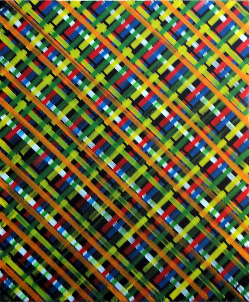
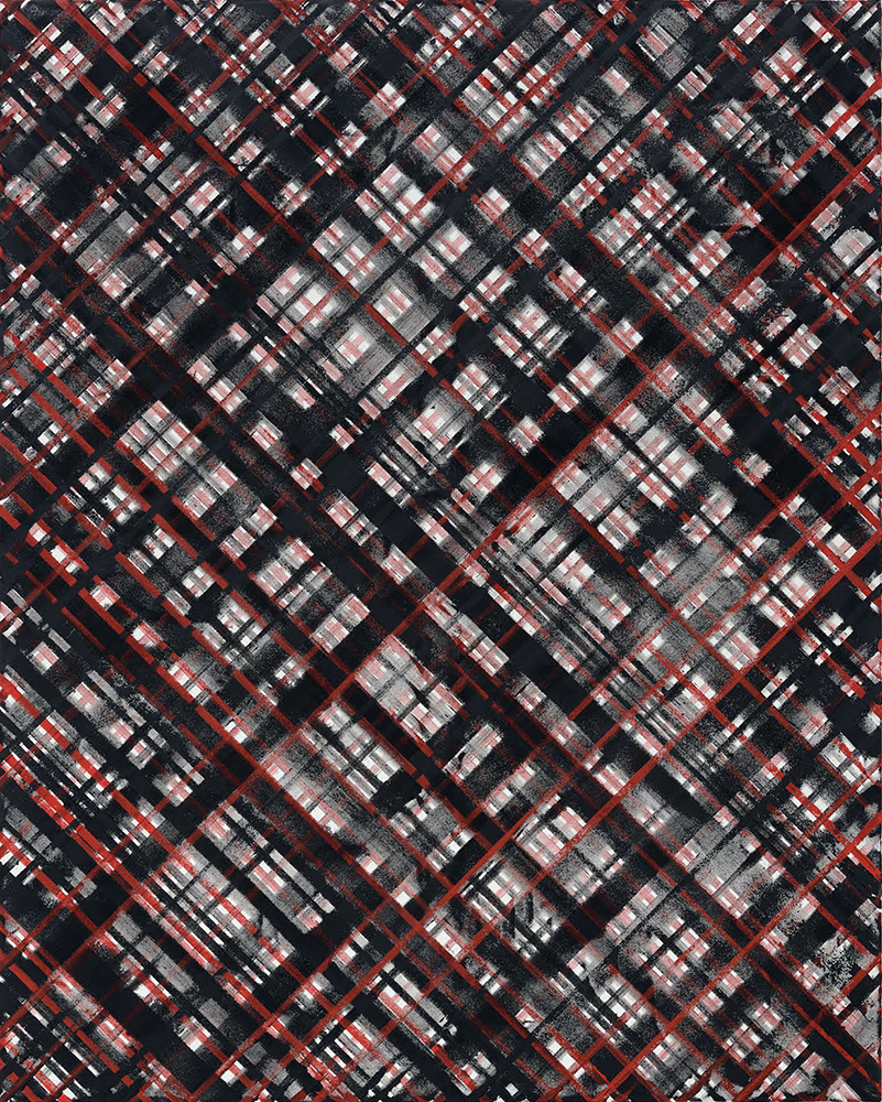
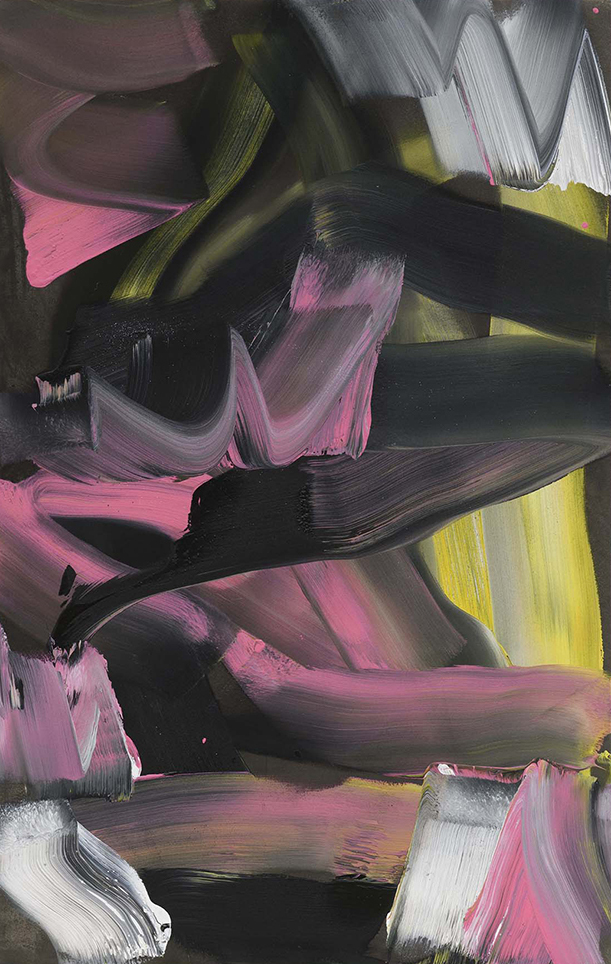
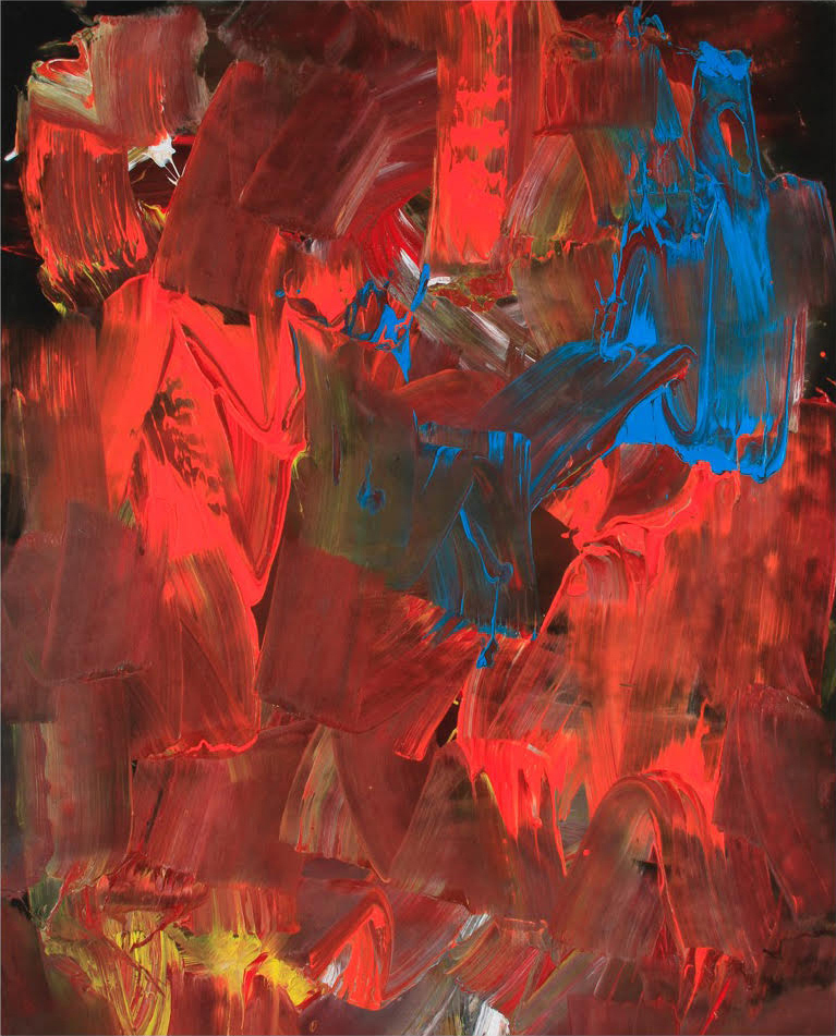
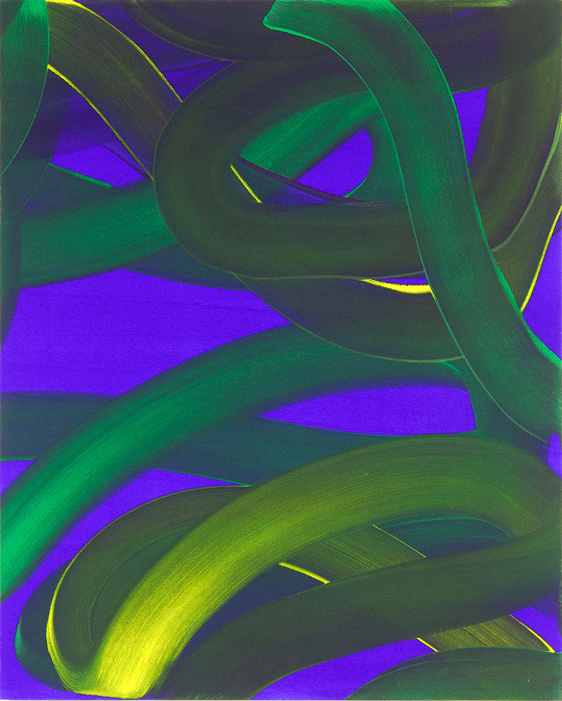
The “Ed Moses: California Cool” exhibition at J. D. Malat Gallery ran from April 13 through May 7 in London. The show comprised a selection of Ed Moses’s grid and gestural abstract paintings. Moses’ linearly cohesive complexes of diagonal matrices extend fully to span his canvases. Both askew and parallel, the interconnected weave, like a Navajo rug, anchors and unfurls a startling compositional space. With compelling impulsive energy, Moses’ abstract, unstructured and lyrical, gestural paintings align closer with Pollock’s unconstrained drip process.
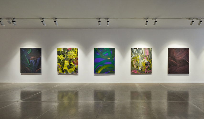
Both the grid and gestural paintings extend in space through rich visual elements that combine several earlier features from Moses’ distinctive mark making form. Fluid bands of voluminous washes undulate as seamless strokes. The un-orchestrated sequence of serpentine-like configurations vibrates from the energetic and robust chromatic dichotomy.
Purple and green, yellow alongside tints and tonalities of mauve and black move in an unruly sequence of streaks and dabs. Another painting reveals unreserved tracks of hot pink. In others works, vibrant primary hues appear dramatically at insertions layered through black and white strokes that swoop and juxtapose in tandem.
Moses’ long iconoclastic approach to painting drew together an original work process with a distinct formal ground breaking intangible awakening through line, form, color, texture, and spatial elements. Betwixt the unorthodox play with materials and its application, the dusted glitter, the sprayed-dripped-mopped-rolled-poured-strip-layered and brushed (oil and acrylic) paint set in strata and films register an imprint on his wet un-primed canvas. An outdoor concrete deck served as Moses’ workspace — an open forum of discoveries.
Throughout his expansive, iconic career, known for exploratory mutations, Moses evinced a predisposition towards periodic re-engagements with his self-described obsessive grid-mark- making process. “When I lose my way, I go back to the grid.” Early on in his work with graphite, he applied strokes in a laborious effort to explore its magical potentiality. As he described: “if I pressed hard enough, I would press to manifest some magic.” Repetition was also an element in his process, and he returned to it regularly. Like a ritual, a frenetic exertion tempo stirred a “transformative presence” by way of his efforts.
Gaston Bachelard in “Earth and Reveries of Will,” draws a philosophical study of human will, labor and matter. The philosopher’s framework provides some phenomenological linkages with Moses’ exploration.
“The act and its image-there is a heightened state of being, a dynamic experience so completely that passivity is reduced to nothingness. There is no question that imagery uplifts us, improves us; it gives us the potential to become more than what we are.”
The artist frequently studied his own works. He rotated, placed them in groupings, flipped. them over while in process and once completed. He worked alternatively on the remaining “ghost” imprint that seeped through on the canvas’ flip side. He identified in this way interconnections and places for innovation.
Moses wanted to be known as a Shaman and Explorer. “Do I want to express myself? No. I want to discover. There’s a constant wrangling back and forth and contradiction between “me” and discovery…that wrangling…becomes energizing. Sometimes I feel absolutely glowing because something came out the way it did.” He saw a primal quality in the Lascaux’s cave paintings he visited that was universally available to art-makers. These “scratched symbols” found in the caves “supplied a connection between the unknown, death, and fertilization.” He felt a “primordial urge” and “a rooted, genetic connection to magic.”
Moses connected this drive with “his obsession with painting. Every morning I can’t wait to go out and start painting.”
Moses thought that artists held this unique transformative role that was “a rooted, genetic connection to magic.” Independently, Bachelard’s analysis, while not directly referencing the artist, underscores Moses’ speculative assertion through the writer’s characteristic universal terms.
“The laborer…is not satisfied with adjustment by geometric calculation, but…finds joy in the malleability of…the raw materials of their work, in the exercise of their powers, they receive visions of the universe, contemporaneous visions of Creation.”
Moses worked up close to his media, not allowing himself the vantage point of distance to affect his execution of the painting through compositional calculations. “The challenge is to be in that kind of momentum, in tune, and to bypass control.” He wanted to circumvent his “smarts” and assertions for control to break structure down by working in a Zen-like “zone.”
Moses shared an experience akin with the “sublime” inspired by the upward gaze of Giovanni Bellini’s “Saint Francis.” “You lift off in some way into another zone, through a crack in space and time. You turn and roll out into this space, slicing the cortex. This can be a sublime moment.” When addressing art, he thought that it couldn’t be more than its maker. “Unless the process outfoxes the determiner, or the determination.” A process could lead to something not perceivable until its appearance. “I’m discovering. as well as applying. When we think of transformation, we don’t get to a higher place. We get to another place.” His artwork outdoors revealed a marked transformation. This shift brought a kind of change akin to mutation. Creativity and growth were terms he didn’t favor. He saw his artwork marked by episodic variations not improvements.
Repetitive efforts led to inspired forms that were unanticipated, intuited, and uncalibrated. He did lose interest or became uncomfortable when he reached a point of “too much” beauty. Then, he would take up any seminal tangent of the prior process that beckoned with potential.
“A material image dynamically experienced, passionately adopted, patiently explored, is an opening in every sense of the word [real and figurative.] The material image transcends immediate existence and deepens superficial existence.” (Bachelard)
From a familial vantage point, Andy Moses noted that Ed Moses transitioned noticeably from a psychological standpoint with the shift out of doors. Andy affirmed that the open space and the ensuing Buddhist countenance of letting go gave Ed perceptible freedom.
Ed Moses’ psyche’s workings brought a vital unfurled dictum, like a mantra, to his painting process. A high anger state and the fear of death stemmed from his hard upbringing. “Images carry out quite subtly the massive battle of wills which rages at the core of our being… they represent an explicit, dynamic engagement with the world.” (Bachelard) The haunting and terror he experienced nightly were grapple-able outdoors in daytime art-making. While from his 40s-to 60s, he knew a constant psychological strain, this shifted in later decades.
The work of the late Ed Moses compels notice – a human visceral avowal of being. The open honest expression of inner travail. Like a shaman, Moses art-making was not only for himself but for others. A rigorous, earnest and diligent daily innovative exploration defined a legacy stirred by the “indefinable, haunting, and primordial.”
*Article first published in Whitehot Magazine on April 25, 2022.