ARTE ABSTRACTO: 3 PREGUNTAS QUE TRANSFORMAN TU PINTURAS
Un Método de Autoindagación para Artistas del Siglo XXI
Después de tres décadas enseñando abstracción —lírica, geométrica, gestual, matérica, conceptual— y otros tantos años frente al lienzo en mi propio estudio, he llegado a una conclusión radical: el mayor obstáculo en la práctica abstracta no es técnico, sino de claridad interna. No se trata de dominar el dripping de Pollock o la precisión cromática de Rothko. Se trata de saber escucharte.
Hoy quiero compartir con ustedes un método de autoindagación que he visto transformar el trabajo de cientos de estudiantes y que yo mismo aplico religiosamente cada vez que enfrento una obra estancada, una serie que no avanza o simplemente cuando siento que estoy repitiendo gestos vacíos. Son tres preguntas simples, pero si te detienes el tiempo suficiente para responderlas con honestidad brutal, todo comienza a moverse.
LAS TRES PREGUNTAS ESENCIALES
1. ¿Qué quiero conservar y amplificar?
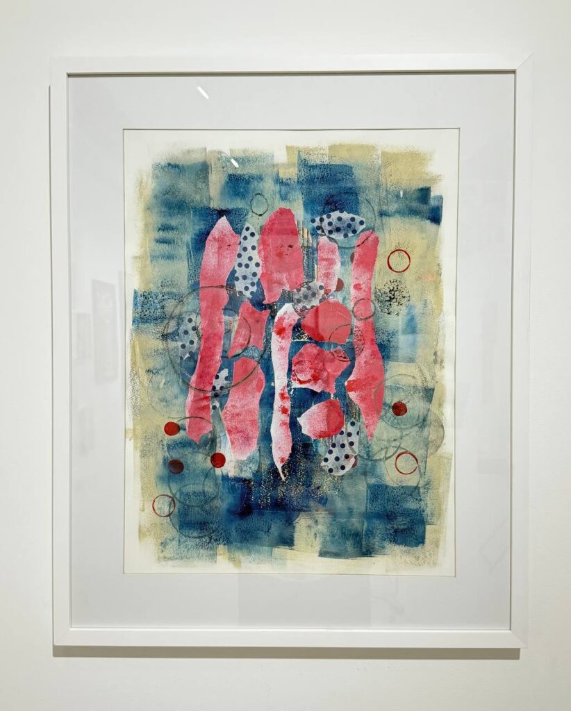
Esta primera pregunta opera como un acto de reconocimiento consciente. En el caos productivo del taller —manchas, gestos, capas, errores, aciertos— hay elementos que resuenan con verdad. En la abstracción lírica, la obra debe retransmitir la emoción del artista de una manera que pueda ser entendida y compartida por el público Ecoosfera. Pero antes de que el público pueda entenderla, tú debes reconocer qué es lo que verdaderamente vibra en tu trabajo.
¿Es el color? ¿Es un gesto específico que repites sin darte cuenta? ¿Es la textura matérica que surge cuando trabajas con espátula en lugar de pincel? ¿Es la tensión entre zonas vacías y saturadas? ¿Es el ritmo interno de tus composiciones geométricas?
Ejercicio práctico para el taller:
Selecciona 10-15 obras recientes (terminadas o en proceso). Obsérvalas durante 20 minutos sin juzgar, solo registrando. Después, responde en tu cuaderno:
- ¿Qué elemento visual aparece consistentemente y me emociona cada vez que lo veo?
- ¿Qué momento del proceso me genera mayor satisfacción? (¿La primera mancha? ¿Las capas finales? ¿El momento de destrucción-reconstrucción?)
- Si tuviera que conservar solo UN aspecto de mi práctica actual, ¿cuál sería?
Una vez identificado, la pregunta es: ¿Cómo puedo amplificarlo? Si descubriste que tu verdad está en los contrastes cromáticos, ¿qué pasaría si toda una serie se construyera exclusivamente desde esa tensión? Si tu gesto más auténtico aparece en los primeros 15 minutos de trabajo intuitivo, ¿qué sucedería si honraras esa velocidad en lugar de “corregirla” después con capas calculadas?
La abstracción lírica transmite un sentido de una visión espiritual más grande que un artista decide plasmar en su arte, relacionándose con la sensibilidad mística más que con una pintura de acción mecánica MACBA. Amplificar lo verdadero no es repetir mecánicamente, sino profundizar en aquello que te conecta con algo más grande que tú mismo.
2. ¿Qué necesito detener?
Esta es la pregunta más difícil. Requiere humildad, porque implica admitir que hay cosas en tu práctica que ya no te sirven, que son inercias, hábitos zombie, gestos aprendidos que repites porque “así se hace” pero que ya no tienen vida.
En mis años de docencia, he visto estudiantes brillantes atrapados en lo que llamo “el síndrome del recurso seguro”: esa técnica, ese color, esa composición que funcionó una vez y ahora se repite compulsivamente porque genera validación externa (me lo compraron, me lo elogiaron, me dieron un premio). Pero internamente, el artista sabe que está muerto.
La abstracción lírica se centra en dejar fluir la creatividad sin miedo de romper las reglas, permitiendo que las emociones guíen el proceso creativo ApreciArt. Pero a veces, nuestras propias reglas auto-impuestas se vuelven jaulas más restrictivas que cualquier tradición académica.
Preguntas de diagnóstico:
- ¿Qué estoy haciendo por obligación, no por necesidad interior?
- ¿Qué elementos de mi trabajo están ahí porque “se supone” que deben estar? (Por ejemplo: “Un cuadro abstracto debe tener al menos 5 colores” o “Si trabajo con geometría, debo usar regla”)
- ¿Qué me genera aburrimiento durante el proceso? (El aburrimiento del artista siempre se transmite a la obra)
- ¿Qué críticas recibo que, en el fondo, reconozco como verdaderas pero me niego a aceptar?
Detener no es fracasar. El fracaso no es el fin, sino una oportunidad para aprender y mejorar, siendo esencial en la creatividad Miroirmagazine. Detener es madurar. Es reconocer que lo que te sirvió hace tres años ya cumplió su función. Es agradecer a esa técnica, a ese estilo, a esa paleta cromática, y liberarte de ella.
En mi propio trabajo, hace años trabajaba obsesivamente con campos de color tipo Rothko. Funcionaba, vendía, me identificaban con ello. Pero una tarde, frente a un lienzo a medio hacer, me di cuenta de que estaba ejecutando movimientos automáticos. No había presencia. Detenerlo fue aterrador —¿quién era yo sin esos rectángulos flotantes?— pero absolutamente necesario. Tardé dos años en encontrar mi nuevo lenguaje, pero cuando emergió, era genuino.
3. ¿Con qué sueño realmente para este trabajo?
Esta pregunta te saca del presente mecánico y te conecta con tu visión más audaz. No se trata de metas realistas (“terminar 20 cuadros este año”) sino de deseo profundo: ¿qué te excita verdaderamente? ¿Hacia dónde te llama la intuición cuando silencias el miedo y la autocensura?
La abstracción lírica debe tener una base de orientación espiritual propia del pintor y un mensaje importante qué comunicar al mundo Wikipedia. Pero ese mensaje no surge de fórmulas aprendidas, sino de permitirte soñar sin límites.
Método de exploración:
Escribe durante 15 minutos sin detenerte, completando estas frases:
- “Si no tuviera miedo al ridículo, mi trabajo se vería así…”
- “Lo que realmente me gustaría explorar pero no me he atrevido es…”
- “Si pudiera trabajar sin preocuparme por vender/exponer/ser comprendido, haría…”
- “La obra que me obsesiona pero nunca he intentado es…”
A veces, lo que descubres es que estás trabajando en abstracción geométrica porque te formaste en esa tradición, pero tu verdadero sueño es la abstracción gestual salvaje. O viceversa: llevas años haciendo action painting pero lo que anhelas secretamente es la quietud meditativa de los campos de color minimalistas.
No hay vergüenza en cambiar. La abstracción lírica hace énfasis en el proceso creativo, basado en el automatismo y la improvisación cromática y gráfica Galeriadeartemx, pero eso no significa que debas quedarte atrapado en un solo registro expresivo toda tu vida.
En mi caso, después de décadas trabajando exclusivamente en gran formato, soñaba con series íntimas, pequeñas, casi privadas. Me parecía una traición a mi “marca”. Pero cuando finalmente me permití hacerlo, descubrí una libertad experimental que había olvidado existía.
CÓMO APLICAR ESTAS PREGUNTAS EN DIFERENTES CORRIENTES ABSTRACTAS
Para estudiantes de Abstracción Lírica / Expresionismo Abstracto:
Ustedes trabajan desde la emoción, el gesto, la intuición. El tema que desarrollan los pintores de abstracción lírica es la expresión de la emoción pictórica del artista, individual e inmediata, rechazando representar la realidad de forma objetiva Infobae.
- ¿Qué conservar? Ese momento de flow donde el pincel se mueve solo, donde no piensas. Esos colores que surgen de tu inconsciente, no de teorías cromáticas.
- ¿Qué detener? La sobre-corrección racional. Ese momento en que tu cerebro izquierdo dice “esto es un desastre, hay que arreglarlo” y empiezas a controlar lo que debería ser salvaje.
- ¿Con qué sueñas? Quizá sueñas con formatos monumentales donde tu cuerpo completo pueda participar del gesto. O con series donde un mismo estado emocional se explore en 50 variaciones.
Para estudiantes de Abstracción Geométrica:
La abstracción geométrica mantiene una simplificación y ordenación de las formas y colores, basándose en la geometría, trazando líneas verticales, diagonales u horizontales Wikipedia.
- ¿Qué conservar? La precisión, el equilibrio, la tensión entre orden y caos controlado. La satisfacción de la exactitud.
- ¿Qué detener? La rigidez que mata la vida. Esa regla auto-impuesta de que “todo debe medirse con exactitud milimétrica”. A veces, la perfección es enemiga de la vitalidad.
- ¿Con qué sueñas? Tal vez sueñas con introducir elementos orgánicos en tu geometría. O con geometrías imposibles, arquitecturas que desafían la lógica euclidiana.
Para estudiantes de Color Field Painting:
- ¿Qué conservar? Esa cualidad meditativa del color puro. El silencio visual que generan tus campos cromáticos.
- ¿Qué detener? La timidez cromática. Si amas el color, ¿por qué trabajas siempre con la misma paleta “segura”?
- ¿Con qué sueñas? Quizá sueñas con que tus campos de color no sean planos, sino vibrantes, con texturas sutiles que solo se revelan en contemplación prolongada.
Para estudiantes de Abstracción Matérica:
- ¿Qué conservar? La fisicalidad, la tactilidad, la presencia material del objeto-cuadro.
- ¿Qué detener? La acumulación por acumulación. A veces, menos materia dice más.
- ¿Con qué sueñas? Tal vez sueñas con materiales que nadie ha usado antes, con texturas que desafían lo pictórico y se acercan a la escultura.
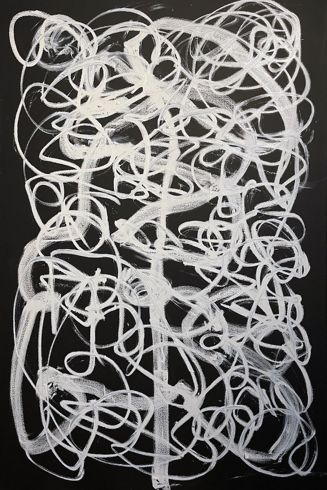
Para estudiantes de Abstracción Gestual / Automatismo:
- ¿Qué conservar? La inmediatez, el gesto como huella del cuerpo y el tiempo.
- ¿Qué detener? El gesto vacío, el automatismo que se vuelve mecánico. No todo movimiento rápido es auténtico.
- ¿Con qué sueñas? Quizá sueñas con performances donde el gesto se documenta en tiempo real, o con gestos a escala arquitectónica.
LA PRÁCTICA DE LA DESACELERACIÓN
Aquí viene el aspecto crucial que he aprendido después de décadas: estas preguntas solo funcionan si te detienes. Durante la fase de incubación, nuestro cerebro observa el proyecto con objetividad y relajadamente, acercándose a la tarea sin que seamos conscientes de ello College of Psychic Studies.
Vivimos en una cultura de producción constante. Redes sociales que exigen contenido diario. Galerías que piden series completas en meses. Estudiantes que preguntan “¿cuántos cuadros debo hacer para graduarme?”. Todo conspira contra la pausa reflexiva.
Pero la calidad de tus respuestas depende directamente de la calidad de tu silencio. No puedes responder honestamente “¿qué quiero conservar?” mientras estás scrolleando Instagram viendo qué hacen otros artistas. No puedes identificar qué necesitas detener si estás en modo producción automática 24/7.
Protocolo sugerido:
- Agenda una cita contigo mismo: Dos horas, mínimo una vez al mes. Sin teléfono. Solo tú, tu cuaderno y estas tres preguntas.
- Crea un ritual: Puede ser caminar antes, hacer yoga, meditar. Lo que sea que aquiete tu mente analítica y active tu intuición.
- Escribe sin censura: No es para mostrar a nadie. Respuestas feas, contradictorias, incómodas. Todo vale.
- Actúa en consecuencia: Las respuestas solo tienen poder si las honras con acciones concretas. Si identificaste que necesitas detener el uso de negro en tus composiciones, guarda ese tubo de pintura durante tres meses. Si soñaste con formatos pequeños, compra bastidores de 20x20cm mañana mismo.
CUANDO LAS RESPUESTAS TE ASUSTAN
A veces, estas preguntas revelan verdades incómodas:
- Que estás trabajando en un estilo que no te gusta pero que vende.
- Que odias trabajar en tu estudio pero no sabes cómo cambiarlo.
- Que sueñas con dejar la pintura y hacer video, pero invertiste 10 años construyendo una carrera como pintor.
- Que estás haciendo arte para complacer a un profesor, un galerista, un padre.
Estas revelaciones son dolorosas pero liberadoras. El proceso creativo implica habilidad en la toma de decisiones y pensamiento divergente, permitiendo transformar la realidad y auto-transformarse Illusionaries.
He visto estudiantes llorar en mi oficina cuando finalmente admiten que están en el programa equivocado. Y he visto el alivio inmenso que sigue a esa admisión. Porque solo cuando reconoces la verdad puedes alinearte con ella.
No estoy diciendo que debas abandonar todo cada vez que sientes incomodidad. La persistencia es virtud. Pero hay una diferencia abismal entre la incomodidad del crecimiento (cuando estás expandiéndote hacia lo desconocido) y la incomodidad de la traición a ti mismo (cuando sabes que estás en el lugar equivocado).
Estas tres preguntas te ayudan a distinguir.
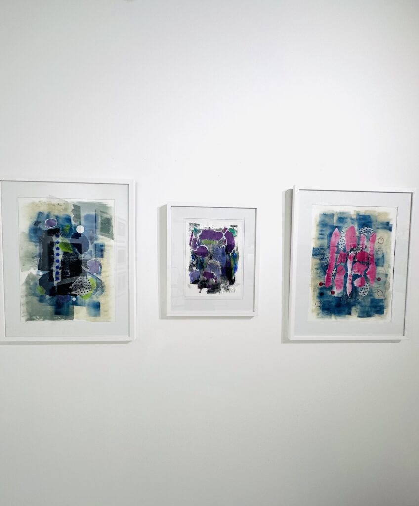
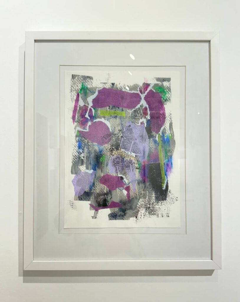
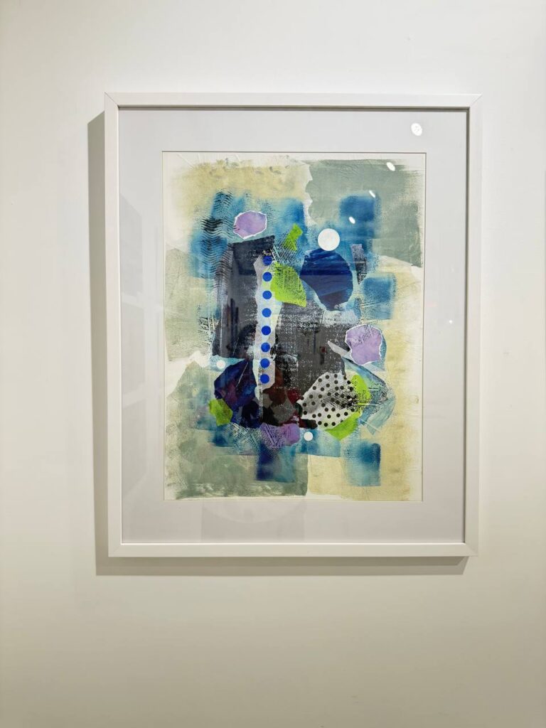
TESTIMONIO: CÓMO ESTAS PREGUNTAS TRANSFORMARON UNA SERIE
Les comparto un caso real de una alumna, Laura, que trabajaba abstracción gestual. Llevaba dos años haciendo cuadros grandes, explosivos, llenos de energía. Reconocimiento, ventas, todo funcionaba. Pero vino a mi tutoría completamente bloqueada.
Aplicamos las tres preguntas:
¿Qué quieres conservar?
“El color. Específicamente, ese azul ultramar que uso casi obsesivamente. Y el agua como medium, me encanta cómo diluye la pintura.”
¿Qué necesitas detener?
Silencio largo. Finalmente: “El tamaño. Estoy exhausta de trabajar en 2×3 metros. Me duele físicamente. Y creo que estoy compensando con tamaño lo que me falta en profundidad.”
¿Con qué sueñas?
“Con acuarelas pequeñas. Series de 50, 100 piezas del tamaño de una hoja de papel. Quiero poder trabajar en mi mesa, cerca de la ventana, no en ese estudio frío y enorme.”
Cuatro meses después, Laura había creado una serie de 80 acuarelas abstractas de 20x30cm. Eran íntimas, delicadas, profundas. La exposición fue un éxito crítico mayor que todo su trabajo anterior. Pero más importante: ella estaba viva en su práctica de nuevo.
Las preguntas funcionaron porque las escuchó y actuó.
CONCLUSIÓN: HACER ARTE DESDE LA VERDAD
Al enfrentarnos a un cuadro abstracto, lo primero que percibimos son los elementos formales (líneas, manchas, colores, textura), y vinculando estos elementos con los conceptos asociados a cada tipología, podemos inferir el tipo de búsqueda detrás de la obra Ibero MTY.
Pero antes de que el público pueda inferir algo de tu obra, tú debes saber qué buscas. Y esa búsqueda se aclara cuando te detienes el tiempo suficiente para preguntarte con honestidad:
¿Qué quiero conservar y amplificar?
¿Qué necesito detener?
¿Con qué sueño realmente?
Estas preguntas no arreglan nada. No son fórmulas mágicas. Son herramientas de escucha interna. Y en una práctica como la abstracción —donde no hay modelos externos que copiar, donde todo surge de tu interior— la capacidad de escucharte con claridad es tu mayor activo.
Cuando empiezas a hacer más de lo que se siente verdadero, cuando sueltas lo que ya no pertenece, cuando te das permiso de moverte hacia lo que te excita en lugar de lo que se siente seguro, el trabajo se aclara, la energía cambia y el proceso cobra vida.
No solo en tu arte. En toda tu existencia.
Porque al final, estas tres preguntas no son solo sobre pintura. Son sobre cómo quieres vivir.
Ahora es tu turno. Apaga el teléfono. Abre tu cuaderno. Y responde.


")