A Bach-Lover’s Delight:
The Third Annual Seraphic Fire Enlightenment Festival
In two back-to-back weeks of choral-orchestral works, the third annual Enlightenment Festival will offer
performances that exemplify what Seraphic Fire does best—Bach—featuring two of the composer“
greatest oratorios. Conductor Patrick Dupre Quigley shared his excitement about the Enlightenment
programs: “This is the first time we have been able to devote the entire two weeks to Johann Sebastian
Bach; it’s the perfect way to show off the strengths and talents of our choir, soloists, and orchestra.
Almost like a birthday present for our audience, we are delighted to have one of our original members
join us – countertenor Reginald Mobley. His interpretations of Bach have taken him all over the world
working with the greatest Baroque ensembles and conductors. There’s no more fitting way to celebrate
20 years than by having Reginald sing Cantata 170.”
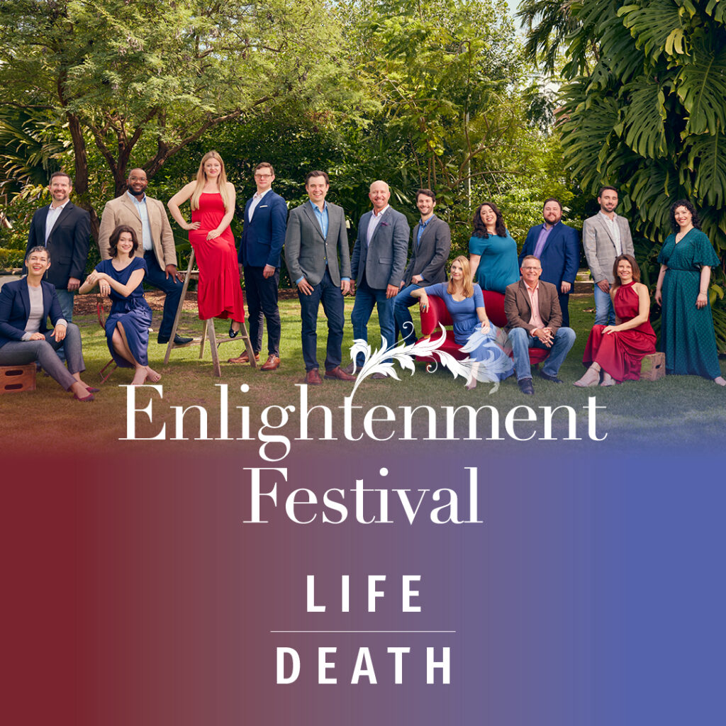
FESTIVAL PROGRAM WEEK 1: Life | Death
Thu, Feb 16, 7:30 pm | Miami | St. Sophia Greek Orthodox Cathedral
Fri, Feb 17, 7:30 pm | Coral Gables | St. Philip’s Episcopal
Sat, Feb 18, 7:30 pm | Ft. Lauderdale | All Saints Episcopal
Sun, Feb 19, 4:00 pm | Miami Beach | All Souls Episcopal
During an age of high mortality, Johann Sebastian Bach experienced the stark and tenuous nature of life
and death firsthand. As a result, Bach’s music of human existence and death is, unsurprisingly, probing
and profound. Seraphic Fire sings two of Bach’s haunting cantatas on death, and Reginald Mobley is
featured in the solo alto cantata Vergnügte Ruh in this musical evening of inspiration and reflection.
Program:
Bach, Johann Sebastian Herr, gehe nicht ins Gericht, BWV 105
Bach Vergnügte Ruh, beliebte Seelenlust*, BWV 170
Bach Aus der Tiefen rufe ich, Herr, zu dir, BWV 131
FESTIVAL PROGRAM WEEK 2: Beginning | End
Thu, Feb 23, 7:00 pm | Naples | Vanderbilt Presbyterian
Fri, Feb 24, 8:00 pm | Coral Gables | Church of the Little Flower
Sat, Feb 25, 7:30 pm | Ft. Lauderdale | All Saints Episcopal
Sun, Feb 26, 4:00 pm | Boca Raton | St. Gregory’s Episcopal
Joyous arrivals and awe-inspiring departures are featured in the closing concert of Seraphic Fire’s third
annual Enlightenment Festival. Selections from Johann Sebastian Bach’s Christmas Oratorio portray an
expectant mother and and the Magi searching for that child. The Ascension Oratorio is particularly
thrilling with spectacular opening and closing trumpets, its coloratura passages, and equally challenging
chorale. Chamber orchestra and students from the UCLA Ensemble Artist Program join Seraphic Fire
singers to perform two of Bach’s great works in a burst of sonic glory in this arresting program.
Program:
Bach, Johann Sebastian Weihnachts-Oratorium, Parts I and V, BWV 248
Bach Himmelfahrtsoratorium, BWV 11
Tickets and subscriptions are on sale now at SeraphicFire.org and by phone at 305.285.9060.
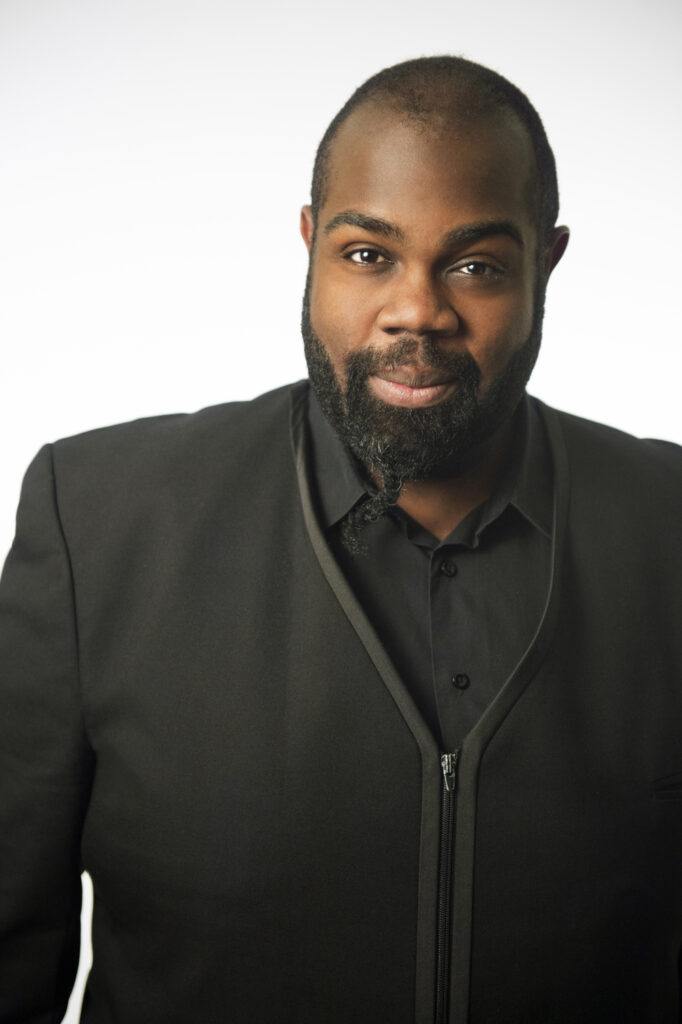
About Reginald Mobley
Noted for his ‘shimmering voice’ (BachTrack), GRAMMY-nominated American countertenor Reginald
Mobley is globally renowned for his interpretation of the baroque, classical and modern repertoire
and leads a very prolific career on both sides of the Atlantic.
An advocate for diversity in music and its programming, Reginald became the first ever programming
consultant for the Handel & Haydn Society following several years of leading H&H in his community
engaging Every Voice concerts. He also holds the position of Visiting Artist for Diversity Outreach with
the Baroque ensemble Apollo’s Fire, and is a regular guest with Philharmonia Baroque Orchestra,
Washington Bach Consort, Seraphic Fire, and Agave Baroque. With the latter, Reginald recorded
‘American Originals’, a collection of Spirituals, which granted his nomination to the GRAMMY Awards
in 2022.
About Patrick Dupre Quigley
Patrick Dupre Quigley, conductor, founded Seraphic Fire in 2002 in Miami, FL. For more info on Patrick,
click here.
About Seraphic Fire
Seraphic Fire brings together professional vocal and instrumental artists from across the US and
internationally to perform and record repertoire ranging from medieval chant and Baroque
masterpieces to commissions by leading living composers.
Seraphic Fire’s artistic accomplishments also have translated to partnerships with The Cleveland
Orchestra and New World Symphony, among others. At the forefront of Seraphic Fire’s mission is a
commitment to community well-being and musician advancement through educational programs for
South Florida’s underserved elementary students, as well as rising music professionals at University of
Miami, Florida International University, UCLA, and the Aspen Music Festival and School.