¡Llamado a artistas visuales! Participa en “ART for ALL III” y exhibe tus obras de arte
PORTADA Art Gallery y Portadaflorida.com te invita a formar parte de “ART for ALL III”, un emocionante evento de arte y entretenimiento que se llevará a cabo el sábado, 11 de noviembre de 2023, en el Centro Comercial Wellington Mall 12794 Forest Hill Blvd, Wellington, FL 33414.
“ART for ALL III” brinda una oportunidad única para que artistas visuales exhibán sus obras en un entorno dinámico y accesible. Si eres un artista plástico en busca de una plataforma para mostrar tu talento y conectar con un público diverso, esta es tu oportunidad.
La exposición se llevará a cabo en el Center Court del Original Wellington Mall, proporcionando una ubicación céntrica y de gran afluencia de visitantes. Tendrás la oportunidad de exhibir tus obras de arte y tener interacciones directas con los visitantes, quienes estarán interesados en apreciar y adquirir piezas artísticas.
“ART for ALL III” es un evento inclusivo que abarca una amplia gama de estilos y medios artísticos. Valoramos la diversidad creativa y alentamos a artistas de todos los niveles de experiencia a participar. Ya seas un artista emergente o establecido, esta es tu oportunidad de destacar y ampliar tu audiencia.
Si estás interesado en participar en “ART for ALL III”, te invitamos a enviar tu solicitud de participación. Envíanos tu nombre, una breve descripción de tu obra y algunos ejemplos visuales de tu trabajo a [email protected]. El plazo para presentar las solicitudes es el Octubre 1 2023
Para más información esperamos recibir tus solicitudes y ver tus increíbles obras de arte en “ART for ALL III”!
CUSTOM STRETCHED FRAMES & CANVASES IN ALL SHAPES & SIZES.
Canvas and stretched frames suitable for a wide range of painting styles, including Hard Edge, Geometric Abstraction, Op Art, Post-painterly Abstraction, Concrete Art, and Color Field painting.
Looking for a custom-made canvas or stretched frames with unique shape or style? Have a special project in mind and seeking someone who truly comprehends the materials and possesses the expertise to execute it flawlessly? Look no further! Feel free to send us an emai [email protected], and we’ll be more than happy to assist you. Rest assured, we have real individuals here, and we make it a priority to answer ASAP. We genuinely look forward to hearing from you and discussing your requirements!
Eco-Friendly Wood
Custom Shapes Available
Custom Sizes Available
Hand Glued & Nailed by Trained Staff
We are located in Miami, FL. Most of our stretcher frames and canvases are shipped assembled or unassembled depend on the order, shipping rates across the United States Mexico and Canada.
Our custom canvases and stretched frames are meticulously crafted using only the finest materials to ensure exceptional quality:
• We use acrylic primed medium weight 100% cotton canvas, known for its durability and versatility.
• The stretcher bars are handmade from American Pine/Hardwood, providing sturdy support for your artwork.
• Our experienced artisans with over 25 years of expertise meticulously stretch the canvas by hand, ensuring a smooth and taut surface.
• The corners are professionally folded, creating a clean appearance while maintaining the canvas's re-stretchability.
• Each canvas is purposefully designed to be a perfect match for oil or acrylic paintings, allowing your artwork to truly shine.
With our commitment to using high-quality materials and skilled craftsmanship, our custom canvases provide the ideal foundation for your artistic creations.
Custom made canvases and stretched frames.
Terms & Conditions: All Sales Final
As this is a custom program where each product is tailored to your specific requirements, we kindly ask for your understanding that all purchases of custom canvases are final. We are unable to accept returns or offer exchanges for credit. To ensure a seamless experience, we recommend carefully measuring your space before placing your order to ensure that the large canvases will fit appropriately and clear any entryways. If you require assistance, our team is always available to help.
Please note that larger sizes may necessitate the use of a special freight carrier for shipping. If your frame exceeds the limitations of ground carriers, it will be delivered by a freight carrier, resulting in additional shipping charges. Our dedicated Custom Shapes & Custom Canvas Customer Service team will notify you if these charges apply and provide you with an accurate quote when placing your order.
Did you know there are 1,750,000 Podcasts and over 43 Million Episodes Worldwide? Do you know that podcast hosts are ALWAYS looking for guests?
Speak to Millions and Make Millions through Stages, Live or Virtual Events, Podcasts, and Webinars (while growing a massive audience and doubling your income).
For coaches, gurus, speakers, teachers, experts and service providers who want TO SPREAD YOUR STORY, MESSAGE, AND PRODUCTS TO MILLIONS.
YOUR AUDIENCE WANTS MORE
THAN JUST INSPIRATION. THEY WANT MORE THAN JUST MOTIVATION. THEY WANT MORE THAN JUST INFORMATION.
They want metamorphosis. They want a revolution.
They want to leave your event so inspired, so passionate, and so on fire for what they can achieve that they can’t help but envision the better future they’re now equipped to create.
That’s the energy that Ted McGrath brings to the stage – and that’s the energy your audience is desperate for.
HOW TO PODCAST | BEGINNER’S GUIDE ON HOW TO LAUNCH THIS ONLINE MARKETING TOOL
1. Create a Goal for a Podcast
The first thing you need to do to learn how to podcast is to determine your goal. The first time I recorded myself on video, I used only a mobile phone, but I was clear on my objectives.
It’s the same thing with a podcast. A goal helps you plan.
How do you set the goal? Define what the end result is.
If you’re into health, you may talk about the latest trends in healthcare. If your business is about coaching, you can discuss the benefits of having one. You just need to be as specific as possible.
These questions can also help you:
Will the podcast be the end product? In this case, it needs to be highly valuable and packed with information.
Will the podcast help to source leads? If so, it needs to be engaging enough to help capture the audience’s attention.
Will the podcast be a component of brand building? In this case, it needs to create the right image based on the industry.
2. Know the Details
As mentioned, your podcast goal has to be specific, but even the objective itself has to be broken down. After all, you cannot appeal to all types of listeners. You want to draw only your dream clients.
You can follow the steps below:
A. Determine the Audience First
Who is your audience? This could be a specific demographic or industry or passion. Define the level of education and insight the audience already has.
B. Find the Reason They Will Listen
When creating a podcast episode, the first course of business will be to pull in the audience. It’s important to give listeners a true reason why they should listen.
Why should the audience invest an hour of their time in this? If they do, what will they get out of it?
3. Create the Name and Brand for the Podcast
I couldn’t emphasize enough the importance of branding. With so many podcasts out there, you need to find a way to stand out.
When it comes to learning how to podcast, I say names can be very versatile, but they should offer some catch to draw in the listener.
For example, a clever name still needs to incorporate some detail or company information to ensure those who find it knows it fits their needs.
If you’re a coach or a speaker, then you’re the brand. You may want to know your channel to yours.
Another option is to keep things simple. When a user is looking through a podcast app or channel for a topic, they type in keywords.
What are these as they relate to the topic of the podcast? It’s possible to use the most likely searched words as the title of the podcast.
Give them exactly what they’re looking for to ensure they click to listen.
4. Break Down the Podcast
Let’s get to the details on how to podcast.
A. Length
When learning how to podcast, length matters. You don’t want to them to get bored they fail to reach to the part where you’re sharing important information or call to action. You also don’t want to be fast they’re not getting anything substantial.
Most podcasts these days average 15 and 30 minutes. Longer versions can go up to an hour and still hold the listeners’ attention.
You don’t want to go beyond 90 minutes unlike a webinar since it doesn’t have visuals, which could have kept the discussion even more engaging.
To determine the best length, consider the amount of high-quality, must-have information available. Additionally, think of the audience.
If they’re listening on their way home from work, the ideal length is 20 minutes. If it’s leisure listening, and if you have solid information, an hour can work best.
B. Frequency
Podcasting is a tool used across all industries. This makes it hard to provide specific information about how often a podcast episode is necessary. Budget and marketing goals can also contribute to this frequency.
Generally, an episode every week or every other week is ideal. A weekly episode can help encourage people to come back just enough to continue to engage with your brand.
C. Blocks of Content
If you’ve been on my blog for some time, then you know I like to break down my content. In fact, it’s part of my blueprint.
I don’t give all the information in one sitting. Otherwise, my client will have an information overload, and they wouldn’t know how to make sense of everything. It will make my program useless to them.
You can follow the same strategy when teaching yourself how to podcast.
Instead of weekly episodes, create a series, each with maybe three or five episodes. One builds on the next to create a comprehensive, cohesive plan.
The benefit here is the listener comes back week after week (or depending on the frequency of release) to engage numerous times with the podcast.
D. Titling Episodes
Provide clear, motivating titles for individual episodes. It ensures users they can find the information they’re looking for quickly.
Consider commonly searched tools such as “How to” style pieces or “Seven tips to.” Include a few keywords within the episode title when possible. This makes it easier for search engines to rank the podcast.
5. Record a Podcast
We’ve basically covered half on how to podcast. The next half is all about recording.
This one can be a bit more technical, and thus, it may require getting used to. The good thing is you don’t need hi-tech systems to start.
A headset mic is a good place to start. It provides better sound quality and gives the user the ability to move freely.
If you’re planning to do interviews, two of such headsets are necessary. As success grows, you can start investing in a digital recorder and mixer to add value to the podcast.
At some point, you may have to edit your audio file, so having some type of recording and editing software is essential. A number of options are available including specially designed podcast maker software.
6. Publish the Podcast
Once you’re done with the podcast, you’re ready to publish it. For this one, you need to choose a host.
It lets other people access the podcast so they can download and listen to it. I am not referring to iTunes and YouTube since these websites only provide access but not the hosting.
It’s very important you can make the podcast accessible to the public. Fortunately, you have a lot of options such as iTunes, Spotify, Google Play Music, TuneIn Radio, and YouTube.
Choose a directory based on content and overall functionality.
7. Market a Podcast
Learning how to podcast won’t be complete without marketing or promoting it. You can’t expect people to know about it immediately, right? You also need to get the word out to your target clients who don’t know anything about you.
What I love to do is to broadcast my podcast on social media. I also make sure it has a nice cover art to make it appealing. You can also link it to your website and include the link to your email marketing campaigns.
8. Utilize Feedback to Thrive
I am a big fan of analytics and understanding more about the audience and behavior. In fact, it’s one of my New Year’s resolutions – get deeper with my marketing techniques.
Besides learning how to podcast, you should also know how to do analytics and interpret the data available.
Once a podcast goes live, it remains accessible to the audience long term. Over time, you can obtain and then analyze audience habits. You can then use this information to make improvements.
Some of the questions you can tackle are:
How long do listeners remain on the audio file?
Where is the most likely source for finding the podcast?
What are listeners doing after they listen?
What type of feedback is available about the content, structure, and people involved?
What does the audience want going forward?
Learning how to podcast can take some time, so don’t beat yourself up if you can’t get it right the first time. With practice, you will be great at it and use it to support your online marketing strategies.
What other things do you wish to know on how to podcast? Tell me more about it in the comments section below.
game-changers world-makers rule breakers
Did you know there are 1,750,000 Podcasts and over 43 Million Episodes Worldwide? Do you know that podcast hosts are ALWAYS looking for guests? If you are looking to build your business online, being a podcast guest is the FASTEST way to create influence and get clients! Whether your business focuses on Health, Wealth, or Relationships; below, you’ll find 100 growing, popular, and big time podcasts. Each podcast has an associated contact for you to pitch yourself as an expert guest. You will use the Podcast: Guest Speaker One Sheet to compose your request.
Health & Wellness Maintenance Phase: Aubrey Gordan & Michael Hobes; https://open.spotify.com/show/3rDR8CfpIEMpITG2UC3w5W Contact: [email protected] Huberman Lab: DR. Andrew Huberman; https://open.spotify.com/show/79CkJF3UJTHFV8Dse3Oy0P Contact: https://hubermanlab.com/contact/ Ted Health: TED; https://podcasts.apple.com/us/podcast/ted-health/id470623173 Contact: https://www.ted.com/podcasts/ted-health The Doctor’s Kitchen: Dr. Rupy Aujla https://podcasts.apple.com/us/podcast/the-doctors-kitchenpodcast/id1316938642 Contact: https://thedoctorskitchen.com/contact The Ultimate Health Podcast: Jesse Chapause https://podcasts.apple.com/us/podcast/ted-health/id470623173 Contact: [email protected] Audice Wellness Services: Audice Wellness Services; https://open.spotify.com/show/7iAVJ3zVTGv9omVDXrqlyG Contact: https://www.audicewellnessservices.com/contact Science VS: Gimlet Media; https://podcasts.apple.com/us/podcast/science-vs/id1051557000? mt=2 Contact: https://twitter.com/blytheterrell Contact: https://twitter.com/wendyzuk Optimal Health Daily: Optimal Living Daily; https://podcasts.apple.com/us/podcast/optimal-healthdaily/id1136251922?mt=2 Contact: https://oldpodcast.com/about/contact/ Hurdle: Emily Abbate; https://podcasts.apple.com/us/podcast/hurdle/id1330434098?mt=2 Contact: http://www.eabbate.com/media-inquiries Food Heaven Podcast: Dear Media; https://podcasts.apple.com/us/podcast/food-heavenpodcast/id1041814489 Contact: https://dearmedia.com/contact/ Eat Sleep Work Repeat: Bruce Daisley; https://play.acast.com/s/eatsleepworkrepeat Contact: [email protected] Hidden Brain: Hidden Brain; https://play.acast.com/s/hiddenbrain Contact: [email protected] The Food Programme by: BBC Radio 4; https://play.acast.com/s/foodprogramme Contact: [email protected] The Nutrition Diva: Quick and Dirty Tips; https://podcasts.apple.com/us/podcast/the-nutrition-divas-quickand-dirty-tips-for-eating/id289338154 Contact: [email protected] Sleep With Me: by Dearest Scooter; https://play.acast.com/s/sleepwithmepodcast Contact: https://www.sleepwithmepodcast.com/contact/ Food Podcast with Christy Harrison: Christy Harrison; https://play.acast.com/s/foodpsychapodcastaboutnutritioneatingdis ordersfoodpsychology?mt=2?mt=2 Contact: [email protected] Science Weekly: by The Guardian; https://play.acast.com/s/guardian-science?mt=2 Contact: https://www.theguardian.com/science/series/science+science Happy Place: by Fearne Cotton; https://play.acast.com/s/happy-place Contact: https://www.officialfearnecotton.com/about Feel Better, Live More with Dr Rangan Chatterjee: Dr Rangan Chatterjee; https://play.acast.com/s/feelbetterlivemore Contact: [email protected] Stuff Mom Never Told You: iHeartRadio; https://play.acast.com/s/stuffmomnevertoldyou Contact: https://twitter.com/MomStuffPodcast/ The Doctor’s Farmacy with Mark Hyman: Dr. Mark Hyman; https://podcasts.apple.com/us/podcast/the-doctors-farmacy-withmark-hyman-m-d/id1382804627 Contact: https://drhyman.com/press-interview-inquiries/ On Purpose With Jay Shetty: Jay Shetty; https://open.spotify.com/show/5EqqB52m2bsr4k1Ii7sStc Contact: [email protected] Insatiable: Ali Shapiro; https://podcasts.apple.com/ca/podcast/insatiable/id1074126728 Contact: [email protected] Mind Pump, Raw fitness truth; https://podcasts.apple.com/us/podcast/mind-pump-raw-fitnesstruth/id954100822?mt=2 Contact: https://www.mindpumpmedia.com/contact-us The Dumbbells: Head Gum; https://podcasts.apple.com/us/podcast/id1169289521 Contact: [email protected] Sika Strength: Sika Strength; https://podcasts.apple.com/gb/podcast/sika-strength/id1462817955 Contact: https://www.sikastrength.com/contact/ Rich Roll Podcast: Rich Roll; https://soundcloud.com/richroll Contact: [email protected] The Human Upgrade with Dave Asprey: Dave Asprey; https://podcasts.apple.com/us/podcast/the-human-upgrade-withdave-asprey-formerly/id451295014 Contact: https://bulletproofmedia.wufoo.com/forms/m1jlp7hp03xjs4l/ No Meat Athlete Radio: Matt Frazier & Doug Hay; https://podcasts.apple.com/ca/podcast/no-meat-athleteradio/id476196931 Contact: https://www.nomeatathlete.com/contact-us/ Fitness & Exercise BarBend: Podcast BarBend; https://podcasts.apple.com/us/podcast/barbendpodcast/id1472885658 Contact: https://barbend.com/contact-us/ The Stronger By Science Podcast: StrongerByScience.com; https://podcasts.apple.com/us/podcast/the-stronger-by-sciencepodcast/id1463054544 Pushing The Limits: Lisa Tamati; https://podcasts.apple.com/us/podcast/pushing-thelimits/id1207975008 Contact: https://www.lisatamati.com/page/contact/ The WODcast: Podcast wodcastpodcast.com; https://podcasts.apple.com/us/podcast/the-wodcastpodcast/id504413684 Contact: https://www.facebook.com/WodcastPodcast/ Diet Starts Tomorrow: Betches Media; https://podcasts.apple.com/us/podcast/diet-startstomorrow/id1374942074?mt=2 Contact: [email protected] The Journal: The Wallstreet Journal; https://open.spotify.com/show/0KxdEdeY2Wb3zr28dMlQva Contact: [email protected] Snacks Minute: Robinhood Financial LLC; https://open.spotify.com/show/0RrdRP2clWr5XCAYYA2j2A Contact: https://robinhood.com/contact Bad Bets: The Wallstreet Journal https://podcasts.apple.com/us/podcast/bad-bets/id1588735104 Contact: [email protected] Marketplace: Marketplace; https://open.spotify.com/show/6zYlX5UGEPmNCWacYUJQGD Contact: [email protected] W.T.F What’s the Future: Brian Solis; https://open.spotify.com/show/3rU7mTV330c6rnSpqU7oxc? si=u2GPWOI7QZWlVdesGeUo0g&nd=1 Contact: https://www.briansolis.com/contact/ So Money with Farnoosh Torabi: Farnoosh Torabi; https://podcasts.apple.com/us/podcast/so-money-with-farnooshtorabi/id955939085?mt=2 Contact: https://farnoosh.tv/contact/ Wealth & Finance Harvard Alumni Entrepreneurs Invites: Harvard Alumni Entrepreneurs; https://open.spotify.com/show/2no2UGC7Sy1gaEdEPSIEYv? si=EOghOeQASgW3CMICpa8aoQ&nd=1 Contact: [email protected] The Tim Ferriss Show: Tim Ferriss; https://open.spotify.com/show/5qSUyCrk9KR69lEiXbjwXM Contact: https://tim.blog/contact/ Over the Wall with Rob Locascio: Rob Locascio; https://open.spotify.com/show/5Y29JHfw6men6QTk5c897w?si=66- AVsCCTkCtCDj-iiEpyg&nd=1 Contact: https://twitter.com/roblocascio?lang=en Entrepreneurs on Fire: Jonn Lee Dumas; https://podcasts.apple.com/us/podcast/entrepreneurs-onfire/id564001633?mt=2 Contact: https://www.eofire.com/contact/ How I Built This with Guy Raz: NPR; https://open.spotify.com/show/6E709HRH7XaiZrMfgtNCun Contact: https://www.guyraz.com/contact Business & Entrepreneurship Bigger Pockets Real Estate Podcast: Bigger Pockets; https://open.spotify.com/show/23JyccHPmQ8fzmpmnvQ6hR Contact: https://www.biggerpockets.com/contact-us Indie Hackers/Software Social/Indie Bytes: Indie Hackers; https://www.indiehackers.com/podcasts Contact: https://www.indiehackers.com/contribute HBR Brightcast: Harvard Business Review; https://hbr.org/2018/01/podcast-ideacast Contact: https://hbr.org/contact-us Youpreneur With Chris Ducker: Ducker; https://podcasts.apple.com/us/podcast/youpreneur-the-profitablepersonal-brand-expert-business/id590043753?mt=2 Contact: https://youpreneur.com/contact/ Entrepreneurs on Fire: Fire Nation; https://www.eofire.com/podcast/ Contact: https://www.eofire.com/contact/ Startup Stories- Mixergy: Andrew Warner; https://podcasts.apple.com/us/podcast/startup-storiesmixergy/id348690336?mt=2 Contact: https://help.mixergy.com/contact This Week in Startups: Thisweekin; The Ashish Walia Show https://podcasts.apple.com/us/podcast/this-week-instartups/id315114957?mt=2 Contact: https://twitter.com/AshishW203?source=about_page Entrepreneurial thought Leaders: Stanford eCorner; https://podcasts.apple.com/us/podcast/entrepreneurial-thoughtleaders/id80867514?mt=2 Contact: https://ecorner.stanford.edu/contact/ Startups for the Rest of Us; https://www.startupsfortherestofus.com/ Contact: https://twitter.com/startupspod The Tropical MBA Podcast: Dan Andrews, Ian Schoen; https://podcasts.apple.com/us/podcast/the-tropical-mba-podcastentrepreneurship-travel/id325757845 Contact: https://www.tropicalmba.com/voicemail/ Masters in Business: Bloomberg; https://podcasts.apple.com/us/podcast/masters-inbusiness/id730188152 Contact: https://ritholtz.com/contact-2/ SPI (Smart Passive Income) with Pat Flynn: SPI; https://open.spotify.com/show/7wjv5MRCXWXImqTFhcufLy? si=QZJkVJiSQdWI6tkKCnHcCw&nd=1 Contact: https://www.smartpassiveincome.com/contact/ The Copywriter Club Podcast: The Copywriter Club; https://thecopywriterclub.com/podcast/ Contact: https://thecopywriterclub.com/contact/ Online Marketing Made Easy: Integrity Network; https://podcasts.apple.com/us/podcast/online-marketing-madeeasy-with-amy-porterfield/id594703545?mt=2 Contact: https://www.amyporterfield.com/contact/ Duct Tape Marketing: John Jantsch; https://podcasts.apple.com/us/podcast/duct-tapemarketing/id78797836?mt=2 Contact: https://ducttapemarketing.com/about/contact-duct-tapemarketing/ Marketing School; https://marketingschool.io/ Contact:https://docs.google.com/forms/d/e/1FAIpQLSep5x2u5qVuwj z19A5sJh4Xy0YUCJ3CKNEmlqrY8EM39zxYBA/viewform Marketing eCommerce Master Plan: Chloe Thomas; https://podcasts.apple.com/us/podcast/ecommercemasterplan/id1005744797?uo=4&itscg=30200&itsct=podcast_box Contact: https://ecommercemasterplan.com/contact/ Shopify Masters: Shopify; https://podcasts.apple.com/ca/podcast/shopify-masters-theecommerce-business-and/id900763980?mt=2 Contact: https://www.facebook.com/shopify/posts/today-onshopify-masters-podcast/10154009230531881/ Ecommerce Purpose & Goals Ten Percent Happier with Dan Harris: ABC News; https://podcasts.apple.com/us/podcast/ten-percent-happierwith-dan-harris/id1087147821 Contact https://www.tenpercent.com/press Seeking Wisdom: Drift; https://wperp.com/30288/top-50-business-podcasts-for-busyentrepreneurs/ Contact: https://twitter.com/dcancel Radiolab: WNYC; https://podcasts.apple.com/us/podcast/radiolab/id152249110? mt=2 Contact: https://wnycstudios.zendesk.com/hc/enus/requests/new Working: Slate Magazine; https://podcasts.apple.com/us/podcast/working/id930665651 Contact: https://slate.com/contact A16z Podcast: Andreessen Horowitz; https://podcasts.apple.com/us/podcast/a16z-podcast/id842818711 Contact: https://future.a16z.com/pitch-us 99% Invisible: Roman Mars; https://podcasts.apple.com/us/podcast/99-invisible/id394775318 Contact: https://99percentinvisible.org/about/contact/ Artists & Designers Leadership & Personal Development Lead to Win: Michael Hyatt; https://podcasts.apple.com/us/podcast/lead-towin/id1294885433 Contact: https://michaelhyatt.com/michael-hyatt-press/ She Did It Her Way: Amanda Boleyn; https://podcasts.apple.com/us/podcast/she-did-it-herway/id1451816201 Contact: https://shediditherway.com/contactus The Rachel Hollis Podcast: Stitchers; https://www.stitcher.com/show/rise-podcast Contact: [email protected] Being Boss: Being Boss; https://podcasts.apple.com/us/podcast/being-boss-mindset-habitstactics-and-lifestyle-for/id956310359 Contact: https://beingboss.club/emily The Strategy Hour Podcast: Abagail Pumphrey and Emylee Williams; https://podcasts.apple.com/us/podcast/the-strategy-hour-podcastonline-business-blogging/id1186889023 Contact: https://bossproject.com/connect Relationships & Love Unlocking Us with Brene Brown: Parcast; https://open.spotify.com/show/4P86ZzHf7EOlRG7do9LkKZ Contact: https://brenebrown.com/media-kit/ Where Should we Begin: Gimlet Media; https://podcasts.apple.com/us/podcast/where-should-webegin-with-esther-perel/id1237931798 Contact: https://www.facebook.com/esther.perel Modern Love: The New York Times; https://podcasts.apple.com/us/podcast/modernlove/id1065559535 Contact: [email protected] Relationship Advice:Sarah Kosterlitz https://podcasts.apple.com/us/podcast/relationshipadvice/id840534227 Contact: https://idopodcast.com/contact/ Dear Sugars: The New York Times https://podcasts.apple.com/us/podcast/dear-sugars/id950464429 Contact: [email protected] Savage Lovecast: The Stranger; https://podcasts.apple.com/us/podcast/savagelovecast/id201376301 Contact: https://twitter.com/fakedansavage Multiamory: Pleasure Podcasts; https://podcasts.apple.com/us/podcast/multiamory/id913403767 Contact: https://www.multiamory.com/contact I Do Podcast: I Do Podcast; https://idopodcast.com/ Contact: https://idopodcast.com/contact/ Death Sex & Money with Anna Sale: WNYC; https://www.wnycstudios.org/podcasts/deathsexmoney Contact: https://nypublicradio.zendesk.com/hc/en-us? cf_chl_captcha_tk=zv4G10h2aJOzK.McP8KmaLYk7tB1oJ6k_.M1Rd 0h2wA-1639772252-0-gaNycGzNBuU Committed With Joe Piazza: I Heart Radio; https://www.iheart.com/podcast/105-committed-29439911/ Contact: https://twitter.com/committedpod/ The Bounceback With Laura Yates: Laura Yates; https://www.laurayates.org/podcast Contact: https://www.laurayates.org/contact Small Things Often: The Gottman Institute; https://podcasts.apple.com/us/podcast/small-thingsoften/id1498172564 Over It with Cristine Hassler: Cristine Hassler; https://christinehassler.com/podcast/ Contact: https://christinehassler.com/contact/ Love With Integrity: Silvy Khoucasian; https://podcasts.apple.com/us/podcast/love-withintegrity/id1456831120 Contact: https://lauracoe.com/contact/ Love is like a Plant; http://www.yaywithme.com/love-is-like-a-plant Contact: http://www.yaywithme.com/work-with-me-1 Marriedpreneur Life: Love and Launch Secrets; https://marriedpreneurlife.com/marriedpreneur-life-podcasts/ Contact https://marriedpreneurlife.com/contact-ol-sway/ ONE Extraordinary Marriage: Tony & Alisa Dilorenzo; https://open.spotify.com/show/2aAYFp8Pbrs1JeAO3AHJ1W Contact: [email protected] MOOD with Lauren Elizabeth: Toast News Network; https://podcasts.apple.com/us/podcast/mood-with-laurenelizabeth/id1484220983 Contact: https://www.laurenelizabeth.co/connect Death, Sex & Money: WNYC; https://podcasts.apple.com/us/podcast/death-sexmoney/id870688022?mt=2 Contact: https://wnycstudios.zendesk.com/hc/en-us/requests/new? cf_chl_captcha_tk=5XlQ7PKNTOgmtpcyeKdjMOt7c.OLo8i1dUe0X D1Citk-1639772675-0-gaNycGzNCOU The Love Hour: KevOnStage MrsKevOnStage; https://podcasts.apple.com/us/podcast/the-lovehour/id1445509054 Contact: @TheLoveHour Why Won’t You Date Me? with Nicole Byer: Team Coco; https://podcasts.apple.com/us/podcast/why-wont-you-date-mewith-nicole-byer/id1314759544 Contact: https://teamcoco.com/contact We Still Like Eachother; https://open.spotify.com/show/1EioR5I3T3bSGhu7mnfJwa Contact: https://twitter.com/WSLEOpodcast
ABOUT THE AUTHOR
TED MCGRATH
Transformation Coach, Theater Performer, Speaker, and Best Selling Author
Ted is a theater performer, speaker, and best selling author. He has created 5 household brands and made millions teaching Coaches, Speakers, and service based Business Owners how to turn their life story and life experience into a lucrative business that impacts millions and makes millions.
Tips for Finding a Public Commission Art Opportunity
Interested in making work that will become a part of your city’s landscape?
Suzy Kopf
Artmiamimagazine.com
If you’re an artist interested in making work that will be shown publicly or that will become part of the permanent landscape of your city, you need to consider applying for public commissions.
“Public art is any opportunity that an artist has to engage with the public realm. It is about artists making a conscious effort to engage and collaborate in the public realm,” said artist, public art manager, and consultant Renee Piechocki.
This sector of the art world is often (but not always) associated with and overseen by nonprofits, which means that instead of selling yourself and your ideas to one person—such as a gallerist or collector as you do in the commercial art world—you need to convince a whole group of people such as a board of directors of your work’s relevance.
The convincing happens in the application you’ll put together which typically includes an image portfolio of previous projects, a written component, and sometimes, a full project proposal and budget.
But, before you can even get to putting together a winning application, you need to find calls for public commissions in which to apply.
Start with the right places to search for art opportunities
Artwork Archive is a great place to start your search; our 2023 Opportunity Guide has national and regional public commissions listed, with more opportunities being added all the time.
Commissions that are selected by public call and projects are often paid for by taxpayers’ money, which means that who is eligible to apply is often limited to where you live by state, region, or even county.
The way to find the most opportunities in which you are eligible is to start your search in your own community. This is also a good place to start if you haven’t done any budget-based project work before—it’s harder (but not impossible) to get the opportunity to make a six-figure international commission if you haven’t first done a few smaller budget ones in the past.
Consider places in your community such as hospitals, museums, and airports
When searching in your community, consider places where you frequently see public art pieces such as hospitals, museums that get state funding, airports, municipal and government offices, and public lands like parks and recreation areas with outdoor sculptures or installations.
Hospitals can be a great place for you to market and sell your artwork. According to the Arts and Health Alliance, 56% of all hospitals, hospices and nursing centers use parts of their operating budgets to buy paintings and sculptures.
Airport terminals are looking more and more like the wings of an art museum. With their massive atriums, seemingly endless corridors, and captive travelers, airports are a perfect venue for art installations.
Tip: learn more about working with hospitals here and working with airports here.
Look on the websites of these entities and see if they have any calls for proposals listed. Sign up for their opportunity newsletters or join Artwork Archive’s newsletter and get weekly opportunities like public art deadlines sent to your inbox.
If the organizations that you are interested in don’t have anything currently on their website, you can try instead to look up the CVs of the artists who previously created work for these sites. See if you can find more information there.
You can also reach out over email to people with job titles such as “Public Arts Coordinator” who work for your city’s government or any city-sponsored arts organizations to find out when their next deadline is.
Look to those artists who have previously secured public funding for their work
As always, it’s never a bad idea to review the CVs of artists you know who have already done some public commissions and see if you can learn anything about when or how much funding they received to complete their work.
You can also reach out to them directly and ask if they would be willing to talk to you about their experience with a particular commission, and if they recommend it. You’d be surprised how much most people are willing to freely share about their experiences.
Expand your search for public art commissions once you have gotten a few projects under your belt
Once you’ve acquainted yourself with what kinds of local opportunities exist where you live, and gotten a couple of projects to the completion stage, you can expand your searches to national and international opportunities you’re eligible for.
With these opportunities you feel your work is a good match for, ask yourself how far you are willing to travel to both make and deliver the artwork.
Are you willing to drive a sculpture you made in California to Chicago for display?
Pay attention to the information in the call that indicates a bias towards local or already-established artists—if you don’t fall into one of those groups you could be wasting your time. Like with all applications, expect to put in a lot of work for possibly a lot of rejection. But if you’re successful with even one application, your art has the possibility to live on beyond you in a totally new way!
Increase your chances of getting accepted by following directions. “If an RFQ says don’t come up with an idea, then don’t propose an idea. In an RFQ, you are not looking for projects developed in isolation. You are looking for artists to come up with an idea in the context of the project and with the community,” Renee Piechocki advises.
Search and save your favorite public art opportunities on Artwork Archive
Each year the Artwork Archive team goes on a mission to find the best art opportunities, grants, and calls-for-entry for the upcoming year—including the best public art opportunities.
You can find a list of the top call for public art, artist residencies, international open calls, artist grants, exhibition opportunities and art competitions in Artwork Archive’s 2023 Opportunity Guide
This year, we added another new feature! You can now save the important deadlines for your favorite opportunities right in your Artwork Archive account.
When you find a call that interests you, simply click ‘Add to Schedule’ and the call’s deadline will be automatically added to your Schedule. You’ll also receive weekly reminders to keep you on top of your game.
We will be updating this list throughout the year, so make sure to bookmark the page, check back often, and let us know if there is an opportunity that should be listed!
Cover photo:
“41 Structures,” a creative collaboration between Debbie Clapper (aka gneural) & Cacheflowe, is an immersive digital mural that evolves through a series of 41 animated designs. By anchoring our animated elements to window corners and subdividing the architecture into a necessarily-imperfect grid, we built a custom canvas for our geometries to explore and play together. Photo by Ryan Policky.
How To Become A Successful Self-Taught Artist in 6 Steps
By Julien Delagrange
Introduction: The Taboo & Struggle of being a Self-Taught artist
A Step-by-Step Guide to Become a Successful Artist
Today, there are numerous established self-taught artists. The fact they are self-taught is no longer an issue because their art, knowledge, understanding, and contribution to art are much more important than a piece of paper from an art university. So, let’s say that is our goal. But how to get there?
This article will explain how you can increase your chances of success as a self-taught artist in just six steps. Specifically, we will discuss where you can learn the things they teach at art university by yourself, where to start, how to develop your artistic practice, how to ‘act’ when being self-taught, and how you can make it in the art world.
All too often, there is a certain taboo connected to being a self-taught artist, resulting in various struggles and difficulties for those who do not have the opportunity—or even privilege—to attend art school. Art education can often be relatively inaccessible or too expensive depending on your socio-economical situation or your country’s educational system.
However, do not despair. Today, the most important knowledge and information to become self-taught has become more accessible than ever—if you know where to look, of course. Becoming a professional artist is not easy, on the contrary, let alone becoming a professional self-taught artist. However, with all the pitfalls and challenges one faces when becoming an artist, being self-taught should not prevent you from making it in the art world.
At art school, the focus is primarily on your personal development as an artist—learning a specific skill or nurturing you to discover your style. But as we have noticed and heard multiple times, they most often do not prepare you for the art world or how to make a career in the art world. But don’t worry, we have you covered here.
Now, one more thing before we dive into step one is determining what determines a successful artist. Being a successful artist can mean something different from person to person, but here at CAI, we always strive for the highest goal: becoming a true, established artist in the high-end art world. Others simply want to make a living as an artist.
But from our experience, we have noticed that pursuing artistic success eventually results in commercial success. Even more, when working for artistic recognition, the sky is the limit. Think of being represented by industry-leading galleries taking care of all the promotion and sales, selling your work for five up to six figures, or even becoming a canonized artist featuring in museum collections and publications.
Step 1: Explore, Experiment & Experience
Our very first step is arguably one of the most important and will run parallel with steps two and three. Before we can distinguish ourselves in the art world, we need to know what we want. What type of artist do you want to be? What discipline do you enjoy the most? What style or technique comes naturally to you?
As a result, before we dedicate our lives to a specific medium, style, technique, or vision, we need to need ourselves the freedom and opportunity to explore, experiment, and experience art.
In fact, exploring, experimenting, and experiencing art to get inspired is something you’ll have to do throughout your life and career as an artist. But, in your earliest stages as an artist, you can do this the most radically and intensely. You will notice that it will be more difficult later in your career to make radical changes. Even though, to remain interesting and relevant, your work must change and develop as well, albeit consistently. Because, as in life, the only constant thing in art is change—but we’ll expand on this later.
So yes, you can incorporate a new discipline later on or have a visual shift in your style, but during this step, you have total freedom without having to worry about any consequences. You can try out everything you feel like trying. Experiment, explore, and also experience. And I briefly emphasize this third ‘E’ from step one; experience. Art is something you must experience, both as a viewer and as an artist. These experiences will inspire you, and what inspires you will incite you to experiment, picking up various influences that will, in the end, create a new synthesis of who you are as an artist.
These experiments will result in technical challenges for self-taught artists. Here, it is time to consider supporting your experiments with online tutorials and possibly some courses. Thanks to the World Wide Web, skills can be learned from home and online. YouTube is probably the ideal place to find the right tutorials. I would advise you to do your research and select a channel hosted by an artist you like, and start binge-watching their videos and learning and experimenting along the way.
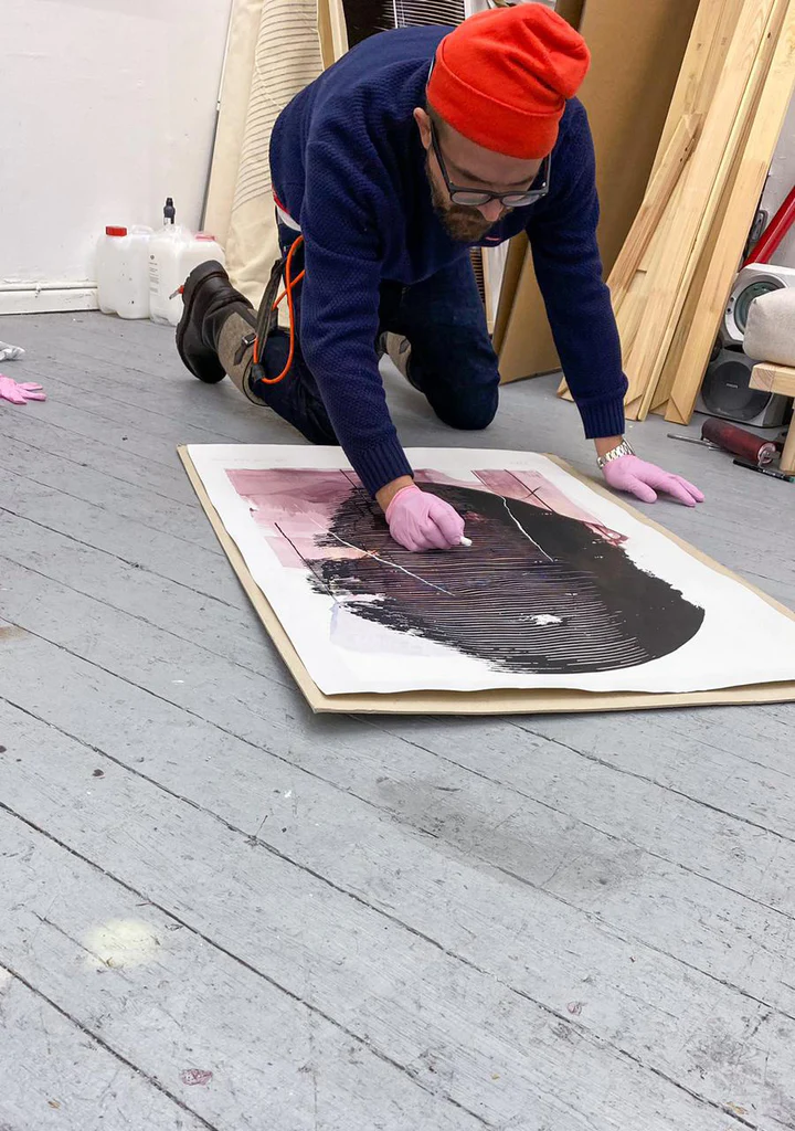
Marco Reichert (represented by CAI Gallery) is working in his studio, experimenting with chalk on top of his characteristic black structures.
There are literally thousands of tutorials on painting and drawing. For sculpture, installation, or maybe even video art—in short, less accessible art forms—you might consider digging deeper and scoping the internet for tutorials and courses. Think of platforms such as Skillshare, where you can learn specific crafts or skills from home.
Further, today, there are no rules regarding how you should create art. From this perspective, being a self-taught artist can even be an advantage instead of a disadvantage. It is entirely up to you to paint alla prima or use glazing, with a paintbrush or a palette knife. Even more, you can just search for your own technique and methodology. Doing things differently is not a bad thing; on the contrary.
Explore, experiment, and experience freely throughout steps two and three. These experiments will be your compass to achieve your personal vision, identity, and oeuvre (cf. infra; Step 4).
Step 2: Educate Yourself in Art (History)
Step two is another crucial step when it comes to your development as an artist, but also when it comes to your credibility as a self-taught artist. One of the main things people often question with self-taught artists is if you have a decent frame of reference regarding your knowledge of art and art history. But once again, there is no reason why you should not be able to become an art expert, even if you do not hold a master’s degree in the arts or art history.
Even more, it is also crucial to know art history to have a decent understanding of art today and by extent, the role, and importance of your art. It would be naive to believe you can make it in the art world without knowing art. I can guarantee you your knowledge and intelligence will be tested as you try to climb up the ladder. So, how and where can we educate ourselves?
First, I advise starting with art history by reading the academic reference publications they use as textbooks at university. In fact, you can approach this step as an actual education, in which I highly recommend taking notes along the way. Not to use to study for an exam but to create a personal summary of art history, taking notes that can be useful for your own practice.
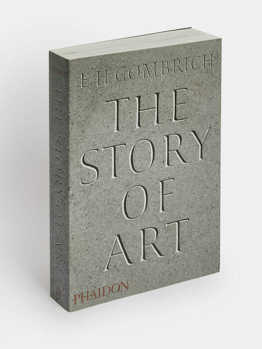
We start with general overviews of art history, encompassing the following publications that could be a great fit to educate yourself: A New History of Western Art — From Antiquity to the Present Day, The Story of Art, and The Art Book. These overview publications present the canon of art history. With every art movement or chapter, feel free to look at the notes to discover more specialized books on a specific era or artist. But to keep things simple first, the publications mentioned above are already pretty extensive and have a lot of information to take for now.
Next, we want to focus on our current era, from Modern Art to this day. The reference publications to read are Art Since 1900, Modern Art — A History from Impressionism to Today, and A History of Modern Art. These three are by far the most important reference publications on recent art history, and I would even advise, if possible, to read all three, whereas, with art history, one could be enough—but of course, the more, the better.
Now that we have a decent frame of reference regarding the canon of art, it is time to dig deeper and specialize ourselves in specific art movements, artists, and disciplines. Here, the selected publications depend on your interests and practice, but there are a few things I would like you to know about. Be careful with false information in self-published books. Anyone can write and publish a book these days. And even with small publishing houses, some very questionable art books are often being produced.
As a result, I would advise you to choose books from renowned art book publishers such as Taschen, Phaidon, Thames & Hudson, Skira, Prestel Publishing, Tate Publishing, Lund Humphries, or other famous art institutions acting as the publisher—think museums or universities. These publishing houses guarantee quality art research, trustworthy information, and authoritative authors and editors.
For instance, Phaidon has some terrific publications on almost any medium; think of Painting Today and Sculpture Today. Taschen’s basic art series is another excellent series of books on specific art movements and artists. The monographic publications by museums coinciding with a retrospective exhibition are also always a top-notch resource.
These are all examples of in-depth research and self-education regarding highly established art, but what about less established art? Some of the publishing houses have great publications about art today. Think of Phaidon’s series on new perspectives in art, with Vitamin P(ainting), Vitamin D(rawing), or Vitamin Ph(otography). But also the publications by galleries about the artists they represent and you might relate with.
This brings us to other sources to dig deeper and stay posted on contemporary art—think of renowned art platforms, art magazines, curatorial entities, and contemporary art museums. Even more in-depth and specialized information can be found in the academic literature on contemporary art. Whitechapel’s documents on contemporary art series is an excellent example of a publishing house compiling the most critical academic writings on a single issue or subject in contemporary art. And there are also academic writings that are indirectly related to art, like Foucault and Lacan.
But don’t be intimidated by the sheer depth of the world’s knowledge and information related to art. It is not necessary to become a true academic or Pictor Doctus to be successful. It is clear to say there are various levels of knowledge here, and I would say the first two are absolutely necessary; general art history and recent art history; followed by more specialized literature depending on your discipline, style, or interest.
Further, there are also some great ways to learn and stay posted on contemporary art that require less effort. Think of YouTube channels providing excellent information. But here, I must also add to be careful with what information, opinions, or advice you take as truth. Some excellent YouTube art channels really do their research and are factual, such as the Art Assignment and Great Art Explained, to name just a few, and some other channels are less trustworthy.
Or you could follow some renowned institutions, galleries, and platforms on social media—including YouTube, Instagram, and Facebook, or subscribe to their newsletter. Think of entities such as Artforum, Cura., the Museum of Modern Art, Gagosian, Thaddaeus Ropac, David Zwirner, or high-end art influencers such as Mary Lynn Buchanan and, of course, CAI (smiles).
Curiosity is everything. Follow your natural interests. Stay in the loop. Immerse yourself in art and art history. PS: For a more extensive take on art books for self-taught artists, feel free to read our article and guide the art books for self-taught artists next.
Step 3: Get To Know The Art World & Field
Step two will naturally bring you to step three, which is getting to know the art world and the field of artists today. At first, this step might feel less important than the previous steps. However, it is not. The third ‘E’ we emphasized in our last chapter—experience—is at the center. Because the best way to get to know the art world is by experiencing it.
You might think you know, more or less, the art world. You have visited some museums in the past, and you currently follow some galleries and other artists on social media online. Well, I am sorry to burst any bubbles here; this is not enough. Art and the art world are filled with subtle details that ultimately make a difference.
Both when it comes to creating the art, finishing it, and presenting it in an artistic context such as a gallery, but also everything related to art exhibitions—think of creating a series of works or how works relate to one another in a show, the title of a show, how they describe the works and their metadata, how to talk about them, how to install them, inspirations on how to frame or present them, and so on. You need to have your finger at the pulse of the art world. What is trending today in galleries? How do their works look and feel?
The only way to get to know these subtleties that, in the end, make a difference is by experiencing them firsthand. Here, my advice is not the visit museums, but art galleries. Art museums are great for getting to know art that is canonized or being canonized as we speak—so I believe art museums are significant to combine with our previous step.
However, with art galleries, we discover art fresh from the studio. Whereas the museums primarily show established artists, galleries show art by emerging artists, mid-career artists, and new works by established artists. Further, art galleries are crucial to make a career. So it is essential to get to know them to have a clear understanding of them before we can join them.
As with art publications, we need to be critical of which galleries we learn—because there are also numerous ‘bad’ art galleries that aren’t doing things the right way. Some red flags for galleries to avoid are paintings hung from cords, packed gallery walls in which they hang as many paintings as possible, or the absence of a curated gallery program—meaning they do not organize exhibitions but simply present the art in the gallery as products in a store.
Some critical indicators of decent galleries are a curated exhibition program, a professional and minimal display, a press release with every show, a long-standing history as an art gallery, participating in art fairs, and being accepted on renowned gallery marketplaces such as Artsy or a professional gallery website.
The galleries that do things the right way are, of course, the most renowned galleries in the world, the so-called mega-galleries. As a result, this is a great place to start discovering the unwritten rules and behavior of high-end art and art galleries. Some mega-galleries are Gagosian, Hauser & Wirth, Pace Gallery, David Zwirner, White Cube, Lisson Gallery, Thaddaeus Ropac, Perrotin, Lehman Maupin, Victoria Miro, Marian Goodman, and many more.
Installation view of “Allegorical Conditions” (2022) at CAI Gallery, BE.
However, these aren’t the galleries where we will have our first shows. Now that we have a clear idea of top-notch galleries, let’s find some emerging galleries that could be a possible match in the foreseeable future. Try to find galleries that work similarly compared to the mega-galleries but are, of course, a bit smaller. A great place to find these galleries is the artguide by Artforum. You can simply select one of the numerous art cities they present closest to you, see what’s on, and start gallery hopping.
You will be amazed at how inspiring it is to see the works of fellow artists who are starting to make a name for themselves. Learn with your eyes. Please pay attention to how they distinguish themselves. How do they create recognizability from artwork to artwork within the exhibition—or from exhibition to exhibition?
At this point, you can connect with the gallery directors, but I would advise you not to. Or at least, do not say you are an artist, not yet. First and foremost, arguably, you and your work are not ready to be tested by the critical eyes of a gallery director, even though you might think so—and with these solicitations, you only have one shot.
Secondly, gallery directors are being bombarded daily by artists who introduce them, begging for collaboration or an exhibition, which is very tiring and even annoying for the gallery director. As soon as you say you are an artist, the gallery director will feel you are there not for the art but for your benefit, asking them to invest in you—which is not polite to do on a first meeting. So, be interested in the gallery first, and maybe one day, when you are ready and on the initiative of the gallery director, you can start to talk about your artistic activities with greater chances for success.
Other great places to get to know art and the field of artists today is at art fairs, lectures, art festivals, and events—think of the Venice Biennale, Art Basel, and so on. Visiting the ‘primary’ art world does indeed require some effort when it comes to traveling, making time, and being able to pay for the trip, but experiencing the art world firsthand and getting to know its subtleties makes the difference in the end when it comes to your personal development, understanding, and future career steps, so it can not be ignored.
Step 4: Develop Your Oeuvre — Create A Coherent Body of Work
Now we arrive at step four; we come at a crucial point in the artist’s career where the work becomes mature and forms an oeuvre—meaning: a coherent body of work marked by a clear vision, visual recognizability, and an ongoing and intriguing development.
After a period of experimentation (step one), having a great frame of reference as a foundation to create your own vision and identity as an artist (step two), and being inspired by art today (step three), we arrive at the point where everything starts to come together, slowly, but surely. You have discovered a medium you feel comfortable with, and you have a vision with clear goals that you aim to achieve within your work. It is time to polish, fine-tune, and professionalize this artistic production and create the artworks you will call part of your oeuvre for infinity.
Consistency is key in art. A vital exercise to obtain a coherent body of work and a steady development that makes sense is to write down an artist statement in which you discuss your vision, objectives, philosophy, methodology, and technique. All the ingredients from the previous steps will result in an utmost personal synthesis of who you are as an artist, what your art is, and discusses. This artist statement or vision will be your compass to guide your development, guaranteeing continuity even though you will continue to experiment, develop, and improve.
This artist statement is not a text to send to galleries or put on your artist’s website. It is a personal tool and a compass for consistent and coherent self-development. Now we have established what defines you as an artist; it is time to do it radically. Discover how you can push your vision further and further in your artistic practice. By doing so, you will be able to distinguish yourself and become more recognizable.
Because let’s speak plainly, being an artist is arguably one of the most fun jobs. As a result, the art world is oversaturated with thousands of artists—more than galleries, collectors, and curators are looking for. So you must stand out, whether you are a self-taught artist or have a Ph.D. in the arts. Be consistent. Be personal. Be recognizable. Stand out. Stay true to yourself and your vision.
The importance of this consistency is often a topic of consternation. Galleries and collectors do not appreciate radical shifts in an artist’s development because all of a sudden, it seems like to artist they invested time or money in is suddenly doing something else entirely. However, this does not mean you must do the same thing repeatedly.
On the contrary, if you do not develop, your oeuvre will become stale and boring, and you will be disregarded as a one-trick pony. So here we encounter one of those subtleties in the art world we have discussed in our previous step; the play of balance between consistency and change—or rather, developing. The thing is, as long as you stay consistent or true to your initial vision—or your vision and focus change coherently over the years—then variety is always a good thing. Let’s explain this tricky topic with an example.
Luc Tuymans is one of the most important and consistent painters of his generation—yet, he is able to switch from painting holocaust scenes to a Micky Mouse mural, a still life, to depicting numbers. First and foremost, his vision remains the same throughout all these pictures. He examines the image theory in relation to painting, encompassing simulacra, the flood of images, history, and moral complexity. But what connects these various topics visually are his characteristic nervous brushstrokes and muted palette, creating consistency and recognizability yet enabling the Belgian artist to take any subject, motif, or topic.
Luc Tuymans, Gaskamer (Gas Chamber), 1986. Oil on canvas – 50 x 70 cm. Courtesy Zeno X Gallery, Antwerp.Luc Tuymans, Untitled (Still Life), 2002. Oil on canvas – 347 x 500 cm. Courtesy Zeno X Gallery / Photo: Pinault Collection
Numerous other artists are very versatile while remaining consistent. Think of Tracey Emin, who goes from installation to sculpture to figurative painting in a coherent manner using autobiographical elements and controversy as a foundation of her vision and artistic production. Or think of artists who dedicate their life to specific motifs and make them theirs, and examine them in numerous different ways, such as the polka dots and pumpkins of Yayoi Kusama or the cages, spiders, and spirals of Louise Bourgeois. And please pay attention to how these motifs are not random, but direct products of their vision and story.
Some artists can dedicate their entire life doing the same thing, purifying a single idea or technique—think of Mark Rothko or Carmen Herrera. And others even have a vision in which radical changes are part of their vision—creating consistency by the lack of it. Think of Maurizio Cattelan and Ryan Gander‘s intentional no-style style. Or what about Gerhard Richter, whose painterly oeuvre is marked by a never-ending quest for the possibilities of painting, ranging from photorealism to pure abstraction, minimal conceptual figuration, to hard-edge paintings?
Once again, the subtlety of these visions and the play of balance between consistency and development proves the importance of our previous steps. So try to understand the oeuvre of other artists in order to understand how you can create your own. Great starting points are a specific vision, philosophy, technique, or set of motifs.
Please write down your vision and pursue it radically in the studio. At this point, start to professionalize your studio practice. Use high-quality materials and finish every single artwork with the most excellent care. Every single work you create from here is to stay forever. The experiments become finished products, ready to be shown to the world. Time to start participating in the art world.
Step 5: Prepare Your Overall Artist Profile
In order to participate in the art world, we need to ensure that everything is correct, professional, and in line with the expected behavior of a serious artist—especially when being a self-taught artist. In this step, we will take care of every single aspect that you need to take care of to make sure your profile as an artist is appealing and professional.
By doing so, when the time comes to a collector or gallery director is interested in our work, they will see that everything is done the right way, increasing not only your credibility as a serious artist tremendously but also your chances to make things happen and making your career in the art world happen. I believe this is where a tremendous percentage of artists—self-taught or trained artists—fail and fall off the wagon, even when there is clear talent and potential.
So let’s go ahead and present an overview of what you need to take care of. But please note, try to stick with only the things we mention here. The way you present yourself as an artist online and to the world is all about being concise, formal, professional, and even a bit elusive. Anything else you would do that is not on this list can risk your credibility as an artist. So, how do we prepare our overall profile as an artist?
1. Documenting your art
First and foremost, we need professional images of our artwork. Photograph your images professionally. Have high-resolution files of your works cropped out, and possibly also a few installation or studio views of your works as objects in a room. Please note, do not simulate your works with apps in galleries or interiors. Clear up your living room or studio, rent a space, or take the opportunity when you have an exhibition to take high-end pictures. This will increase your credibility strongly. Document your artwork, writing down all metadata—meaning, title, year, medium, and dimensions. Create a catalog with what you have available to use for your future clients and galleries.
2. Artist resume
Up next, we will have to create an artist’s resume. It consists of all factual information and functions as a guide for galleries, collectors, and curators to know where you are at this moment in your career.
Your artist should include the year and country you were born, where you are based, training and education, relevant professional experience, your exhibition history, selected publications, press, awards, collections, and residencies. For a self-taught artist, I recommend you not to include being self-taught in your artist resume. Only write your education and training if applicable or relevant; otherwise, you can leave it blank.
Use this structure and look at the artist resumes of established artists or gallery websites. Follow the same form, structure, and professional approach. Don’t worry if you have little to write down on your artist resume. It will be our mission in the next step to improve and supplement the resume year by year. There is no shame in having just a few or even zero exhibitions so far; we all started somewhere. In fact, we have dedicated a complete article on how you can set up your artist resume with little to no experience.
3. Artist website
Your artist website is your online business card and portfolio. Once again, your artist’s website will need to communicate professionalism. As a result, you must go for a minimal and, above all, high-end design characteristic of the art world. Less is more. Use the websites of high-end established and emerging artists as an example. You should have a minimal homepage, a page with selected works showing only your very best works, a page with your artist’s resume and possibly a biographic text written in the third person or by an art critic, and a contact page. Anything else, such as a blog, a webshop, merchandise, et cetera, is an unnecessary risk to take. Trust us; the interested collector will email you for pricing and availability of your work. So no need to show prices online or have a webshop—but this is a different discussion for a different article.
4. Social media
When it comes to social media, once again, the most important thing is not to overdo it. Our general rule of thumb is to focus on the most powerful social media platform for artists today—Instagram. You would be surprised how many gallery directors and collectors find and contact new artists via Instagram. You can build a following online, which increases your credibility once more. YouTube is also a powerful platform, but for now, it is still somewhat frowned upon for artists to ‘vlog’ in the traditional art world, even though all significant art organizations are active on YouTube. Still, for now, I advise you to focus 100% on Instagram and remain professional with your posts.
Step 6: Make A Career Organically & Think Long-Term
At this point, you are all set. You have experimented and educated yourself, getting to know the subtleties and expected behavior in the art world that makes the difference, resulting in a mature and coherent body of artwork that is documented and accessible online via your website and social media. Now, it is time to make things happen!
We already mentioned Instagram as a great place to get discovered; however, there is more you can do to make a career as an artist. However, before we dive into the specific actions you can take, let’s discuss what you should avoid.
Aggressive self-promotion is hugely frowned upon. In the art world, you can not force things. So don’t go overboard on over-promoting yourself actively—don’t cold call galleries, magazines, collectors, and institutions. Do not approach your art as a commercial product to sell, promoting it with ads, flyers, discounts, and so on. Remain professional and never impose yourself as an artist on others. Instead, try to make a career organically, thinking long-term, by leaving breadcrumbs in the art world that eventually will make the galleries, collectors, and magazines come to you.
Participate in the art world, visiting exhibitions and galleries as discussed in step three—network organically by discussing art based on genuine interest instead of self-interest. Connect with other artists and be involved in the art scene where you want to prosper.
Portrait of Teodora Axente in her studio. Photo: TA (c)
Even if you are an introvert and not a master in networking, you can actively increase your chances of making a career in the art world by searching for opportunities in the art world. Think of open calls for exhibitions, art residencies, art contests, grants, a project-based open call for art in the public space, and so on. A great place to find these opportunities is via the platform Artenda.net to stay posted on the most exciting art opportunities for you.
It all comes down to being around and being well-prepared as an artist. Trust the process. When the art is good, your overall artist profile has been set up correctly, and you haven’t been imposing yourself as an artist but are involved naturally and organically, people will stumble across your work. And when they see your profile as an artist is appealing and professional, they will contact you—whether you are self-taught or not.
This is where the ball starts to roll. One exhibition—be it via an open call, a gallery invitation, or with fellow artists—will lead to another. If you would like to know more how you can take your career to the next step and go full-time as a self-taught artist, feel free to read our article 20 Ways Artists Earn Money next.
En el grabado de Alberto Durero titulado “ Melancolía I”, un personaje alado mira apesadumbrado un objeto de forma poliédrica que representa el ideal del que toda realidad sería un torpe reflejo. En otras obras de la época con el mismo tema, como el cuadro de Lucas Cranach de 1525, la forma ideal es una esfera. Pero la precisa identidad del poliedro de Durero ha sido objeto de controversia entre los estudiosos, sin que haya habido hasta ahora respuesta concluyente. Incluso en un libro muy reciente, “La Proporción Áurea” de Mario Livio (Ariel, Madrid 2006), la duda persiste.
El libro de Livio, que contiene interesantes aportaciones originales sobre tema tan estudiado, desmonta con sencillez y claridad muchas de las alambicadas especulaciones surgidas históricamente en torno al número de oro. Pero en cuanto al grabado de Durero, tras afirmar con seguridad que el poliedro es un romboedro truncado, se limita a citar opiniones de otros: “Los ángulos en la cara del sólido también han sido objeto de debate. Mientras muchos sugieren 72 grados, que lo relacionaría con la Proporción Áurea, el cristalógrafo C.H. MacGillavry llegó a la conclusión, basándose en el análisis de la perspectiva, de que los ángulos son de 80 grados”. A mí me parece que una diferencia de ocho grados entre estas posiciones necesita alguna explicación, y voy a tratar de darla en estas páginas.
La perspectiva lineal fue el gran descubrimiento que permitió a los artistas del Renacimiento representar las formas en el espacio de un modo riguroso. La que emplea Durero, siguiendo los pasos de Brunelleschi, Alberti o Piero della Francesca, es la perspectiva central, con un único punto de fuga. En el grabado aplica sus reglas al trazado del poliedro y de la edificación de la derecha, mientras la balanza y la escalera de mano son figuras casi imposibles, y los demás objetos están encajados de manera sólo aproximada.
romboedro truncado
romboedro truncado
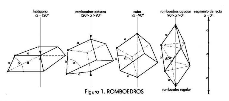
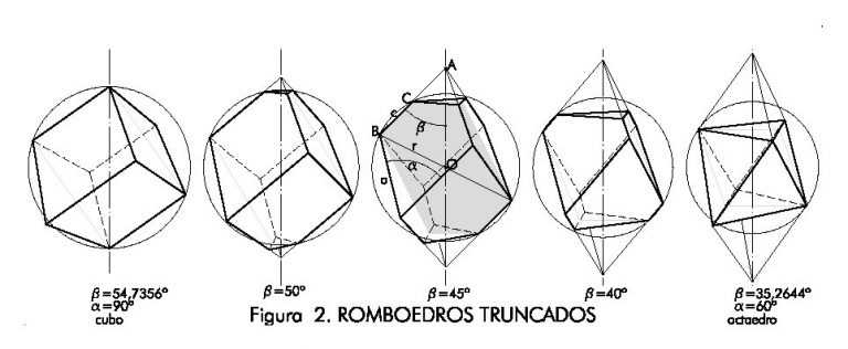
El bloque de piedra es, desde luego, un romboedro truncado.Pero, como se sabe, ésta no es una forma singular, sino la serie que se genera al estirar un cubo por dos vértices opuestos (fig. 1): al tirar de ellos, las caras cuadradas del cubo se convierten en rombos cada vez más alargados, y acaban fundiéndose en un segmento de recta. El ángulo agudo de los rombos, α, varía por tanto entre los 90º del cubo y los 0º del caso límite. Cuando vale 60º se tiene el llamado romboedro regular, cuyas caras se componen de dos triángulos equiláteros; con lo cual el sólido resulta ser la combinación de un octaedro y dos tetraedros regulares. En sentido contrario, el cubo se va achatando hasta degenerar en un hexágono plano para el valor α=120º. Al objeto de este trabajo, sólo interesa el otro tramo de la serie, el de los romboedros “agudos”.¿Y qué sentido tiene truncar dos vértices? Desde Platón y sus cinco poliedros regulares, y Arquímedes con los trece semi-irregulares, siempre se atribuyó la máxima perfección a la esfera y a las formas inscribibles en ella. Esta línea de pensamiento sigue vigente en el neoplatonismo renacentista, y está presente en la original propuesta de Durero de un romboedro truncado como forma ideal. Como la perfección del cubo se pierde en el romboedro, porque los dos vértices extremos se salen de la esfera que pasa por los otros seis (fig. 2), la inscriptibilidad se recobra cortándolas puntas “sobrantes”, con lo que todos los vértices vuelven a ser equidistantes del centro.
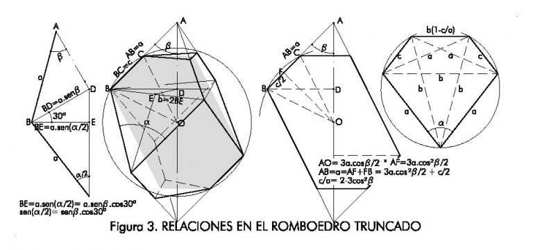
Así pues, a partir del cubo inicial los sucesivos romboedros van perdiendo una parte creciente de sus tercios extremos, que llegan a desaparecer completamente en el romboedro regular, reducido ahora a su octaedro central. Esta interesantísima secuencia de transformación del cubo en octaedro tiene lugar en el intervalo 90º≥α≥60º. Y, del mismo modo que el romboedro truncado se inscribe en la esfera, cada una de sus caras toca con sus vértices un círculo menor de la misma. Las dos bases son triángulos equiláteros. Y las seis caras laterales, pentagonales, tienen una propiedad interesante:dos de sus diagonales son siempre iguales a la diagonal menor del rombo, b, y las otras dos a la arista, a. (Fig. 3)
Del máximo interés para Durero, como luego veremos, es la sección del romboedro sombreada en la figura, que contiene dos aristas opuestas: el ángulo β que forman esas aristas con el eje principal está relacionado con el ángulo α por la fórmula
sen(α/2) = cos30ºsenβ[1]
Podemos también conocer la razón de la diagonal a la arista,b/a= 2sen(α/2), así como la posición del punto de truncadura, C, que es la intersección de la arista con la esfera circunscrita; la razón de la arista truncada a la completa sería : c/a= 2-3cos2β.
En la tabla siguiente figuran estos parámetros, calculados con las fórmulas anteriores para los extremos de la serie, el cubo y el octaedro,y para otros tres casos singulares intermedios.
Podemos también conocer la razón de la diagonal a la arista,b/a= 2sen(α/2), así como la posición del punto de truncadura, C, que es la intersección de la arista con la esfera circunscrita; la razón de la arista truncada a la completa sería : c/a= 2-3cos2β.En la tabla siguiente figuran estos parámetros, calculados con las fórmulas anterior es para los extremos de la serie, el cubo y el octaedro,y para otros tres casos singulares intermedios.
Mientras α varía en un intervalo de 30º, β recorre poco más de 19º entre sus dos valores extremos, que son ángulos complementarios. En el centro de este intervalo, β=45º, se encuentra el caso particular en que las aristas se truncan por su punto medio (c=a/2), y los lados de las caras triangulares miden también la mitad, b/2, de la diagonal menor del rombo.
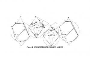
El protagonista de la tabla es desde luego el romboedro de 72º, que tantos partidarios tiene por su relación con el número Φ. Pero resulta que no es el único áureo: hay otro, del que quizá sea el primero en dar noticia, con α ≈79º. Los valores de β en uno y otro cuerpo son respectivamente 42,7434º y 47,2566º, una pareja de complementarios como los del cubo y el octaedro.Ocupan también por tanto posiciones simétricas en la serie de los romboedros truncados.
He dibujado los dos en la figura 4, anotando algunas de sus propiedades métricas relacionadas conΦ. La truncadura se sitúa en ambos con una partición áurea de la arista, pero puede verse que en el de 72º la simetría es más rica y compleja: todos los ángulos son múltiplos de 18º y las caras contienen dos puntas de una estrella decagonal.
El lector sabrá excusar la aridez de esta exposición, porque va a permitirnos luego un análisis más preciso. Este estudio de los romboedros truncados nos confirma que las propiedades áureas del de 72º justifican sobradamente la opinión de la mayoría de los investigadores: fue éste, desde luego, el elegido por Durero para representar la forma ideal. Esta opinión concuerda además con los datos históricos. En sus viajes a Italia, el alemán frecuentó a notables personalidades del humanismo renacentista, y recibió lecciones de geometría de Fra Luca Pacioli, el autor de “La Divina Proporción”. Si más tarde defendió insistentemente en sus escritos la importancia de la geometría y de las proporciones en el arte, no es de extrañar que quisiera mostrar en su grabado un cuerpo geométrico tan notable y tan estrechamente relacionado con el tema central de la obra de su maestro.
En realidad Durero, gran pintor y excepcional dibujante, no llegó a adquirir una sólida formación teórica en geometría: sus conocimientos proceden sobre todo de la tradición práctica de los oficios, como orfebre en el taller de su padre y luego como grabador en la imprenta de su paisano Wolgemut. Su fama de pintor le acompañaba cuando viajó a Italia, y a su vuelta a Nuremberg traía una aureola de intelectual y geómetra, conocedor de los secretos de la perspectiva. Pero leyendo su obra fundamental, Instrucciones para la Medida (Underweysung der Messung, 1525) se comprueba que la mayor parte de la geometría que maneja es la de los oficios, y que su conocimiento de la perspectiva se limita a unas nociones generales, incluso con algunos errores y contradicciones.
A pesar de esta limitación, Durero realizó un concienzudo estudio del poliedro. Empezaría seguramente por construirlo, siguiendo el antiguo procedimiento que él mismo recomienda en el libro IV de su Underweysung, el mismo que ya utilizara Arquímedes y que aún hoy divierte a nuestros escolares: dibujar el desarrollo de las caras del sólido y armarlo como un recortable. En el modelo estudiaría proporciones y ángulos, buscando el modo de ponerlo en perspectiva. Y descubriría que tal cosa es fácil a partir de la sección que hemos estudiado antes, que puede dibujarse fijando la longitud de la arista, y conociendo el valor de β, que puede medirse sobre el modelo. Dibujada pues la sección, con fijar un punto de fuga y otro de distancia la perspectiva surge casi por sí ensalmo.
Siguiendo el camino inverso, en la lámina que encabeza este texto he dibujado,sobre una copia exacta del grabado original de Durero, la construcción gráfica necesaria para restituir la perspectiva; es decir, para conocer la verdadera magnitud de los elementos que en ella aparecen fugados. Como la sección de partida está en posición frontal, el valor de βse puede calcular con bastante aproximación midiéndolos segmentos AM y BM,y de él puede deducirse el de α, aplicando la fórmula [1]:
tgβ= BM/AM= 1,0873, de donde β = 47,3942º y, según [1], α = 79,1993º
Así pues, la cruda realidad es que el ángulo α del poliedro del grabado no es 72º, sino un valor cercano a los 80º del análisis perspectivo de McGillavry. En la controversia sobre el ángulo, la balanza parece ahora inclinarse del lado del cristalógrafo, el único que, libre de prejuicios, se limitó a aplicar al grabado un método racional de análisis similar al que acabo de exponer. Pero yo creo que hay quedar un paso más: realmente, el valor al que más se acercan mis 79,1993º es el de los 78,9898º≈79º del segundo romboedro truncado áureo . MI error de medida es de sólo 0,21º=12’. Durero, creyendo que dibujaba el de 72º,estaba en verdad trazando el de 79º; cometió, pues, algún error que ha pasado inadvertido. ¿Cómo pudo ocurrir tal cosa?
El error resulta evidente al examinar con atención otro conocido dibujo suyo de la misma figura, anterior al grabado, que se conserva en la Biblioteca de Dresde (fig.5). Este dibujo contiene más información útil que el grabado mismo: la figura es simétrica especular de la del grabado, es decir, idéntica a la de la plancha matriz, que resulta luego reflejada en la reproducción en papel; y se apoya sobre una mesa cuyos bordes laterales fugan al mismo centro de perspectiva del poliedro, identificado con un ojo como era costumbre. Pues bien, el borde derecho de la mesa forma con la vertical precisamente el ángulo β del romboedro de 72º. La pendiente de esta recta debía haber sido la que se diera a la arista AB y a sus paralelas, señaladas con flechas sobre el dibujo. Y sin embargo, Durero las trazó perpendiculares a ella. ¿Por qué?
Para dibujar paralelas con una inclinación dada, en aquella época se solía construir un cartabón con el ángulo necesario, como el que he dibujado coincidiendo con los bordes frontal y derecho de la mesa, con el ángulo recto arriba. Como uno de ángulos agudos del cartabón debía serβ=42,7434º, el otro será necesariamente su complementario, β’=47,2566º. Ambos ángulos son muy parecidos, el cartabón era casi una escuadra: tomar un ángulo por el otro entra en lo posible. Y es lo que ocurrió, porque es evidente que el ángulo de AB con la vertical es β’ y no β.
Pero nosotros ahora sabemos que con el ángulo contrario se llega al romboedro de 79º, cuya truncadura, por el punto C, es mucho menor que la del de 72º. En ese momento descubrió Durero que la cosa iba mal, sin poder explicarse por qué, y que iría a peor si truncara en C. Dibujó pues a sentimiento la cara triangular superior bastante por debajo de ese punto, y subió también a ojo la base inferior para que aquello se pareciera al modelo que tenía delante. La figura así amañada parece correcta, pero el poliedro no se inscribe ya en la esfera. El lector puede compararlo con los de la figura 4, dibujados con la misma perspectiva y a igual escala.
Confieso que descubrir que la solución del enigma estaba en un error del propio Durero me resultó difícil de aceptar, como quizá ocurra también al lector, porque, al igual que la mayoría, con base en los datos históricos, hemos dado por supuesta la coherencia entre la teoría y la obra. Pero quien más cerca estuvo de la verdad fue quien se atuvo a la realidad geométrica de la figura, dejando al futuro la explicación que aquí ofrezco. Pero queda todavía un interrogante: ¿por qué incluyó Durero el poliedro en su grabado, sabiendo que su trazado era defectuoso? Porque, me atrevo a aventurar, no encontrando la causa de su error, su intención no fue representar alegóricamente la melancolía como estado de ánimo, sino expresar su personal melancolía por medio del alado personaje que contempla con tristeza la imperfecta figura, mientras a sus pies, olvidada, aparece la esfera perfecta.
Un romboedro truncado es un poliedro que se obtiene al truncar las aristas de un romboedro. Un romboedro es un poliedro compuesto por seis caras que son rombos congruentes. Estos rombos están dispuestos en pares, y cada par comparte una arista común. El romboedro truncado conserva esta estructura básica, pero se le han eliminado las partes puntiagudas de las aristas, creando nuevas caras planas.
El romboedro truncado tiene 14 caras, que consisten en 8 triángulos equiláteros y 6 cuadrados. Los triángulos equiláteros se forman al truncar las esquinas del romboedro original, mientras que los cuadrados se forman al truncar las aristas.
Este poliedro tiene 24 aristas y 12 vértices. Cada vértice está conectado a cuatro aristas y forma un triángulo equilátero con tres de los vértices adyacentes.
El romboedro truncado es un caso particular de los poliedros de Arquímedes y se considera uno de los sólidos de Platón. Tiene propiedades simétricas interesantes y se utiliza en diversos contextos matemáticos y de diseño.
There are many different types of mobile food businesses, so it is important to choose one that is right for you and your interests. Here are a few ideas to get you started: • Food truck: Food trucks are a great option for entrepreneurs who want to be their own boss and have the flexibility to set their own hours and work schedule. They can also be a relatively affordable way to start a food business, as you can often find used trucks for sale at a fraction of the cost of a new one. • Food cart: Food carts are another popular option for mobile food businesses. They are smaller and more portable than food trucks, which makes them ideal for setting up shop in smaller areas or at events. Food carts can also be a more affordable option than food trucks, as they require less space and equipment. • Food trailer: Food trailers are a hybrid of food trucks and food carts. They are larger than food carts, but smaller than food trucks, which makes them a good option for businesses that need more space to cook and prepare food. Food trailers can also be more expensive than food carts, but they offer more flexibility and features. • Kiosk: Food kiosks are a good option for businesses that want to set up shop in indoor locations, such as malls, stadiums, or airports. They are small and self-contained, which makes them easy to operate and maintain. Food kiosks can also be a more affordable option than other types of mobile food businesses.
No matter what type of mobile food business you choose, it is important to do your research and create a business plan. This will help you to identify your target market, develop a marketing strategy, and track your financial performance. Here are some additional tips for starting a successful mobile food business: • Choose a location that is popular with your target market. • Make sure your food is delicious and affordable. • Promote your business through social media and other marketing channels. • Provide excellent customer service. • Stay up-to-date on food safety regulations. With hard work and dedication, you can start a successful mobile food business that will provide you with a great source of income and satisfaction.
Choosing the right mobile food business depends on various factors such as your interests, skills, budget, target market, and location. Here are a few popular options to consider:
Food Truck: A food truck offers a versatile platform to serve a wide range of food options. It requires a larger initial investment and permits for parking and operation in specific areas. Food trucks are ideal for serving meals on-the-go and can cater to different events and locations.
Food Cart: Food carts are smaller than food trucks and typically offer a limited menu or specialty food items. They are more affordable to start and have greater flexibility in terms of location. Food carts are popular in crowded areas such as city centers, parks, and tourist attractions.
Concession Trailer: Concession trailers are mobile units that can be attached to a vehicle and towed to different locations. They offer more space than food carts but less than food trucks. Concession trailers are suitable for events, festivals, and fairs, and can serve a variety of food and beverages.
Pop-Up Stand: A pop-up stand is a temporary setup that can be easily assembled and disassembled. It allows you to set up in different locations, such as farmers’ markets, street fairs, or outside established businesses. Pop-up stands are cost-effective and provide an opportunity to test the market before investing in a larger venture.
Catering Service: If you enjoy providing food for events and parties, a catering service might be the right choice. Catering services can range from small-scale operations to large-scale event catering. It requires good organizational skills, a well-equipped kitchen, and the ability to deliver food to different locations.
Consider your personal preferences, the market demand in your area, and the resources you have available when choosing the right mobile food business for you. Conduct market research, create a business plan, and carefully evaluate the costs and logistics involved before making a decision.
Mobile food businesses come in various styles and sizes to serve a variety of purposes. It is important to consider their differentiating characteristics before choosing your primary food transport vehicle.
These are the main characteristics to review when deciding between a food truck vs food trailer or a food cart vs food truck:
Mobile Kitchen Size The size of your mobile kitchen will determine where you can park and what types of events you can attend. • Food Trailer – the largest in size, ranging from 8-53 feet long and 7-8 1/2 feet wide • Food Truck – usually ranges from 10-26 feet long and 7 feet wide • Food Cart – smallest in size, ranging 4-7 feet long and 2-6 feet wide
Kitchen Space and Storage Capacity The size of your interior kitchen space can have an impact on what you can bring with you and your staff size. • Food Trailer – large enough for full-sized restaurant equipment, cleaning supplies, and full cooking staff • Food Truck – reduced size may call for more dependence on countertop cooking equipment, space-saving storage solutions, and a staff of 1-3 cooks • Food Cart – limited space may call for very few small appliances and warmers and a staff of 1-2 employees
Mobile Kitchen Price Start to shape your budget by knowing what a mobile kitchen may cost you before you invest. • Food Trailer – ~$30,000-$50,000 • Food Truck – ~$50,000 – $250,000 • Food Cart – ~$5,000 – $20,000
Vehicle Mobility The way a mobile kitchen navigates can help determine which events and locations they best cater to. • Food Trailer – Needs to be towed from place to place, may be too large for certain parking locations • Food Truck – vehicle and kitchen in one, can be driven from place to place • Food Cart – Needs to be pushed by hand, attached to a bicycle, or towed from main kitchen to serving location
Mobile Kitchen Location and Event Type The type of locations and events a mobile kitchen is designed for can help you choose the right one for your business model. • Food Trailer – large events, seasonal fairs, wedding and concert venues • Food Truck – city street, fairs and carnivals, block parties, parks • Food Cart – city sidewalks, amusement parks, boardwalks
Mobile Kitchen Menu Capabilities The size and selections of your menu can be directly impacted by the size of your mobile kitchen • Food Trailer – can have a full menu, multi-course menu • Food Truck – narrowed to a few items that follow a similar theme or cuisine type • Food Cart – limited to one or two specialty items and some snacks
Purpose Choose a mobile kitchen that best helps you reach your target demographic. • Food Trailer – long-term parking, multi-day events • Food Truck – stop-and-go location hopping • Food Cart – foot traffic and walking distance coverage of a location The vehicle type you choose can ultimately impact your entire food truck business plan, so it is important to consider these factors early in the process. Ultimately, the best vehicle for your brand will come down to your goals and budget.
Food Truck Food trucks are one of the most popular mobile food vehicles in the United States. If you’re considering starting a food truck, check out some of the pros and cons before your buy.
What Is a Food Truck? A food truck is the combination of a motor vehicle and a kitchen. Food trucks are typically 16 feet long and 7 feet wide but can range in size from 10-26 feet long. This versatile vehicle is designed for street parking to serve pedestrians that may be passing by. Food is prepared and cooked in the vehicle and sold to individual customers from the window on the side of the truck.
Pros Here are some benefits of choosing a food truck for your business over a food trailer or food cart: • Kitchen does not need to be towed, making it extremely mobile and easy to take from one location to the next more lucrative location • Single unit means you don’t need a separate transport vehicle • Vehicle size easily fits down most city streets and in most parking spaces, providing a simple driving experience • Compact size means fewer appliances to clean than a standard kitchen • Mobility makes it perfect for stop-and-go services and provides access to spots all across town • Versatility of the space allows for a flexible menu and menu experimentation • Since food trucks are extremely popular, they have excellent resale value Cons Depending on your business model, there may be some downsides to choosing a food truck instead of a food trailer or food cart: • Automotive troubles mean your whole business stops until the issue is fixed • Highest upfront cost compared to other mobile food vehicles, usually $100,000 to $200,000 • Maintenance and upgrades can prove to be expensive if needed • A lot of paperwork, licensing, and permits are required, including zoning permits, health permits, signage permits, alarm permits, etc. • Limited kitchen space means a limited menu and staff • Only available in a limited number of size options • Built-in power generator can take up precious kitchen space • The more miles put on the truck, the more it depreciates in value To find out more information on purchasing a food truck, check out our how to buy a food truck buying guide.
Food Trailer If you’re looking for more space, a food trailer may be the right option for you. Keep reading to learn about the specifications, pros, and cons of food trailers to determine which mobile food vehicle is the best for your business.
What Is a Food Trailer? A food trailer is a mobile kitchen that you hitch onto a vehicle to tow from one location to the next. Kitchen trailers can vary greatly in size, ranging anywhere from 8-53 feet long and 7-8 1/2 feet wide. These ever-customizable vehicles are designed to cater to large crowds during multi-hour or even multi-day events like weddings and state fairs.
Pros The following are some benefits of choosing a food trailer over a food truck or food cart: • Kitchen can be towed by any vehicle, so business does not need to stop for vehicle maintenance • Since the kitchen trailer and transport vehicle are not connected, the trailer can be dropped off at an event and the vehicle can be used to run errands during the event • Generally less expensive than food trucks, and up to 1 1/2 feet wider for more space • Large size allows food business to cater large venues • Large internal blueprint provides ample space for full-sized equipment, ingredient storage, disposables, and cleaning supplies • Full kitchen means you can offer a multi-course menu, have a full staff, and serve several customers at once • Varying sizes allows you to find a food trailer in your budget and customized to your needs and specifications • Can be used as a secondary kitchen to expand on the space of an existing building or used as a primary kitchen during renovations/disaster relief • Mileage is not logged on the trailer, so you can continuously take it from location to location without worrying about depreciation in value caused by an increase in mileage Cons There are some downsides associated with concession trailers that are important to consider before making your purchase: • An external vehicle with a hitch is required to move the trailer, the vehicle also needs to be powerful enough to tow the trailer • Large size can make it difficult or impossible to maneuver down certain streets and can limit the number of parking locations available • Before moving the food trailer, it will need to be packed up and hitched back up to the transport vehicle • An external generator may be needed depending on the specifications of your trailer If you’re looking to cater wedding venues with your mobile food business or establish a booth at your local state fair, a concession trailer may be the right choice to expand your business beyond a brick-and-mortar location.
Food Cart If you’re just starting your food business or looking to target more foot traffic with your seasoned specialties, a food cart may be a great way to reach the most customers in your area. Learn more about the pros and cons of selecting a food cart for your business model by reading on.
What Is a Food Cart? A food cart is a compact mobile kitchen that can either be pushed by hand or towed with a car or bicycle. Food carts range in size from 4-7 feet long and 2-6 feet wide. The food server will generally serve from behind the cart since they are typically not enclosed structures. Most food carts only have one piece of cooking equipment and a warmer to hold food at temperature. Food carts are designed to attract foot traffic from nearby walking paths to serve an individual customer at a time.
Pros Explore the following benefits of a food cart to help you make your mobile food vehicle decision: • Highly affordable option for new business owners to get into the mobile food scene • Compact size is perfect for busy sidewalks to target specific walking paths during lunch rushes in major cities • Mobility allows you to bring food options to locations where large brick-and-mortar cannot go, such as parks, fairs, boardwalks • Does not need to be hitched to be transported, meaning that you can quickly readjust your location to target a more lucrative spot • Can help create a close relationship with locals because carts provide eye-level customer service • Space-saving size allows for simple and safe storage overnight and during off-seasons • Comes with a reputation of a niche menu, allowing your cart to be known for its signature selections in the neighborhood Cons The compact size of a food cart can also come with some drawbacks for your business.
• Lack of full-sized kitchen equipment limits the menu selections you are able to serve
• Limited storage space does not allow for the storage of many ingredients, to-go containers, or cleaning supplies
• Mobility of the carts is fully dependent on your own foot power, additional vehicle or bicycle may be needed to transport it further
• Stigma associated with the lack of cleanliness of food carts can keep potential customers away
A food cart can be a great vehicle to help you start a farmers market stand or serve refreshing summer treats on your local boardwalk.
Estudios de grabación y producción Podcast en Miami, FL.
Los podcast son un formato de contenidos muy popular en la actualidad, y es una herramienta para conquistar seguidores en las redes sociales, así como para ampliar la estrategia de marketing y convencer a las audiencias para que no nos pierdan de vista.
Por eso, RTVC Sistema de Medios Públicos de Colombia organiza el Festival Iberoamericano de Podcast ‘Al oído’, un evento completamente gratuito pensado para crear comunidad alrededor del podcast.
La idea es simple: ofrecer inspiración y apoyo, además de generar diálogos de la mano de grandes podcasters, productoras independientes, plataformas de distribución y medios de comunicación tradicionales para apoyar esta industria emergente.
Qué fue lo que hicieron los grandes podcasts iberoamericanos para crecer, cómo hacer un podcast, cómo lo están haciendo en la actualidad los medios tradicionales, y cuál es el presente de la industria del podcast en la región son algunas de las preguntas que se responderán durante el evento.
Como se trata de una industria emergente, es posible que la palabra podcast suene una campana pero no sea tan clara en el imaginario colectivo. Por eso, acá te aclaramos dos puntos importantes: qué son los podcast y porque hoy en día son importantes.
¿Qué es un podcast?
Los podcasts son una serie de contenidos grabados en audio y transmitidos en línea. Estos pueden ser grabados en diferentes formatos, como por ejemplo entrevistas o conversatorios sobre un tema específico.
La palabra podcast es cada vez más conocida, y es producto de la unión entre las palabras Pod (Personal on demand) y broadcast (transmisión). Su origen, de acuerdo al conocimiento alojado en la internet, se sitúa alrededor en 2004, cuando un ingeniero usó una especificación del formato RSS para incluir archivos adjuntos.
“Facilita la conexión con los dispositivos digitales. Su facilidad de consumo la ha impulsado: desde una aplicación o desde nuestra multiplataforma favorita (como Spotify, Deezer, etc) podemos descargarlos. Ya no implica una conexión permanente a wifi, por ejemplo, o como sucedía en la radio que siempre deberías poder acceder a alguna frecuencia. La temporalidad también es un factor que ha jugado a favor, pues no obliga a un horario específico sino que se puede escuchar en cualquier momento desde que esté descargada”, explicó Mario Castro, gestor cultural y productor de Radio Universidad del Rosario.
Tipos de Podcast
Como los podcast son contenidos de audio, la imaginación es el límite a la hora de hacerlos. Sin embargo, hay algunos tipos que pueden servir de referencia para trabajar en una idea o para innovar con los productos.
Muchos de ellos son similares a los programas tradicionales de radio, como por ejemplo los formatos de conversación entre los presentadores del podcast con invitados, o también pueden ser de entrevistas.
De la misma manera pueden ser programas diarios que ofrecen todos los días algún tipo de información específica sobre una temática en particular, o por ejemplo sobre noticias de algún campo de interés específico, como por ejemplo las astrología.
También se puede hacer a la vieja usanza de lobo solitario, donde el podcaster se enfrenta sólo a la audiencia y habla durante determinado tiempo de una temática relacionada con los intereses de su público. Recientemente también se han visto podcast muy sencillos que a manera de reality se concentran en contar la vida de una sola persona en su día a día.
Otros son conocidos por ser referentes para solucionar preguntas que surgen todo el tiempo estilo buscador de google o solucionador de enigmas en los foros virtuales. Otros cuentan historias y otros sirven para apoyar clases de los profesores.
En fin, la imaginación es el límite.
¿Por qué son importantes los podcast en la actualidad?
“Son importantes porque han democratizado la producción de contenidos de audio, además de que se han expandido y desarrollado nuevos formatos. Cualquier persona con un dispositivo digital, una grabadora, o casi con lo que tenga a la mano puede producirlos, claro con algo de conocimiento técnico pero nada tan especializado”, aseguró Castro.
De acuerdo con Mario, quien produce varios podcast, estos también han permitido que desde empresas grandes a pequeñas empresas, e incluso particulares, hayan encontrado en estos contenidos una forma sencilla y eficiente de promocionar sus productos. Se ha convertido en una herramienta de marketing poderosa.
Cómo ganar dinero con un podcast
Los podcast pueden ser una medio para ganar dinero de forma directa o indirecta.
De forma indirecta implica que el podcast es una herramienta por medio de la cual un podcaster se posiciona como experto en algún campo y dicho posicionamiento lo hace conocido y por tanto consultado, al punto de ser llamado como conferencista o pagado como consultor en su área de experticia.
Pero también existe la posibilidad de que una voz y un estilo se vuelven tan populares que marcas que estén buscando posicionarse quieran buscar al podcaster para ayudarles en esa misión a través de la creación de sus contenidos de audio. El “patrocinio” es una de estas formas para hacer dinero aquí.
Monetizar un canal de audio es otra manera de lograr lucrarse de las habilidades podcasters. Es como el modelo de los “Youtubers” pero con podcast. En este sentido, también se puede hacer a través de donaciones del público que, como agradecimiento al buen rato que genera uno de estos contenidos deciden voluntariamente ayudar a los productores de podcast.
Podcasts que todos deberíamos escuchar
Podcast hay por montones en la actualidad, pero aquí te van unos ejemplos de podcast de nuestra red de medios públicos que podrían ser la puerta al mundo maravilloso de los contenidos de audio en la actualidad.
¿Podcast profesional? ¿Por qué es importante hacer un Podcast Pro?
Esto es Podcast Pro
Es probable que pienses: “bueno, ¿y por qué tendría yo que esmerarme en hacer un podcast profesional? Esa es una buena pregunta, vamos a ello.
La esencia del podcast es comunicar. Por eso es necesario un podcast profesional
Si alguna vez has querido grabar un podcast es porque en el fondo querías comunicar algo. Piénsalo. Puede que no lo hicieras de manera consciente, pero cualquiera que se acerque al podcasting, del mismo modo que quien quiere escribir un libro o hacer una película, es porque tiene algo que decir.
El podcast es una manera excelente de comunicar. Básicamente es lo que ha hecho la radio toda la vida, pero sin limitaciones temporales, o los límites geográficos y, además, con la posibilidad de ser mucho más específico. Lo que pasa es que el podcast, como parte de Internet, sigue siendo un medio de comunicación y la comunicación tiene sus reglas. Parece algo obvio, pero no hay más que fijarse en los medios de comunicación generalistas y veremos que estas reglas se olvidan más a menudo de lo que pensamos. No seguir estas reglas puede impedir que nuestro mensaje, lo que queremos decir, llegue al escuchante. Seguramente me dirás que muchas veces hay que romper las reglas. Y es cierto. Todo tiene unas reglas, hasta el jazz tiene unas reglas, para romperlas, pero las tiene. Primero hay que saber cuáles son las reglas para poder romperlas después. Esa es una de las diferencias que marca el hacer un podcast pro.
La atención del escuchante es limitada, su tiempo es limitado
Hemos hablado de nosotros, como podcasters, como comunicadores. Pero también tenemos la otra parte: el escuchante, la audiencia. Aunque los escuchantes tengan diferentes perfiles, todos tienen algo en común: su atención es limitada. Acéptalo, todo el mundo tiene mejores cosas que hacer que escucharnos. No tienen tiempo y además hay mucha oferta de información y entretenimiento. Por lo general el escuchante de podcast suele estar haciendo otra cosa al tiempo que consume podcast. Es probable, que tú mismo estés escuchando este podcast y haciendo otra cosa al mismo tiempo. Y lo entiendo. Por ello los escuchantes tienen que seleccionar el contenido que más les guste o el que más les convenga en ese momento. Si nuestro podcast no es de calidad, las posibilidades de que elijan nuestro contenido serán mucho menores. Y si lo que quieres es comunicar, se trata de poder hacerlo al mayor número de personas posible, ¿no? Y para que te escuchen debes saber cómo mantener la atención de tu audiencia. Esta es otra de las razones por las que hacer un Podcast Pro.
Que nadie mate al mensajero, pero… se avecinan tiempos convulsos… más aún, sí. Lo puedes ver en el gráfico de interés sobre podcast. En los países mediterráneos y latinos, los medios de comunicación se están dando cuenta de la importancia del podcast. A principios de este siglo nadie sabía lo que era un blog y ahora todo el mundo quiere tener uno. Podemos suponer que pasará lo mismo con el podcast, dentro de poco todos querrán uno. De hecho ya está sucediendo en otros países. Sólo habrá una manera de competir con ellos: ofreciendo algo de mejor calidad y escogiendo un micronicho donde tú seas el experto. Ahí está la clave, la ultra especialización. Si no quieres ser arrasado por el tsunami de la comunicación que está por venir, necesitas hacer un podcast pro.
Así que ya lo sabes…
Si sientes la necesidad de comunicar, el podcast profesional es tu oportunidad.
Pero debes tener siempre en cuenta que la atención del oyente es limitada.
Y por si éramos pocos, los grandes medios de comunicación pronto se sumarán a la oleada del podcast.
En el vasto mundo de las artes visuales, los artistas se embarcan en un viaje de expresión creativa que a menudo los lleva a explorar una amplia gama de géneros y estilos. Aunque muchos artistas son versátiles y se aventuran más allá de los límites de un solo género, la historia del arte tiende a identificarlos con un género particular en el que han dejado una huella indeleble.
Antony van Dyck, conocido por su maestría en el retrato, es un ejemplo destacado de esta clasificación. Aunque también experimentó con otros géneros artísticos, como la pintura histórica y la religiosa, su renombre se cimentó en la habilidad magistral con la que retrataba a sus sujetos. Sus retratos son testimonios de la elegancia y la sofisticación de la alta sociedad de su época.
Alfred Sisley, por su parte, se ganó el reconocimiento como pintor paisajista. A lo largo de su carrera, inmortalizó la belleza de los paisajes naturales en Francia y el Reino Unido. Sus obras transmiten una conexión profunda con la naturaleza y la atmósfera única de cada lugar que retrataba.
Piet Mondrian, conocido como un pionero del arte abstracto, es otro artista cuyo nombre está estrechamente ligado a un género específico. Aunque su evolución artística lo llevó desde el impresionismo hasta el neoplasticismo, su contribución más influyente fue en la abstracción geométrica. Sus pinturas con líneas rectas y colores primarios son iconos del arte abstracto y han dejado una marca perdurable en la historia del arte.
Si bien estos artistas son conocidos por un género en particular, es importante recordar que su creatividad y visión trascendieron las etiquetas. A través de sus exploraciones artísticas, contribuyeron de manera significativa a la riqueza y diversidad del mundo de las artes visuales.
Géneros:
Arquitectura Autorretrato Bijinga Caligrafía Capricho Caricatura Cartel Comercial Desnudo Dibujo y boceto Digital Diseño En miniatura Escena de género Escultura Foto Grafiti Icono Ilustración Instalación Interior Joyería Libro-arte Mangaka Marina Mosaico Mural Naturaleza muerta Paisaje Paisaje nube Paisaje urbano Pastoral Performance Pintura abstracta Pintura alegórica Pintura de animales Pintura de aves y flores Pintura de batallas Pintura de flores Pintura de historia Pintura de vida silvestre Pintura figurativa Pintura literaria Pintura mitológica Pintura religiosa Pintura simbólica Pin-up Quadratura Retrato Shan shui Tapiz Trampantojo Tronie Urushi-e Utensilio Vanitas Vedutismo Video Yakusha-e
Movimientos artisticos: Explorando la Diversidad del Arte Mundial
Los historiadores del arte desempeñan un papel crucial en la comprensión y la apreciación del arte mundial. Utilizan diversos métodos de clasificación para organizar la vasta producción artística que abarca el tiempo y el espacio. Cada método de clasificación se basa en la idea de que ciertas obras de arte comparten cualidades específicas que las hacen significativas. Esta significación puede estar relacionada con aspectos formales, estilísticos, iconográficos, temáticos u otros elementos artísticos.
La agrupación de obras de arte en movimientos es una de las formas más comunes de organización en la historia del arte. Estos movimientos se definen por la percepción de que las obras de arte incluidas comparten una calidad particular que refleja el enfoque único de los artistas que las crearon. Estos movimientos pueden estar arraigados en criterios culturales, estéticos o incluso políticos.
En el contexto de las artes occidentales, los movimientos artísticos han sido una herramienta fundamental para entender la evolución del arte a lo largo del tiempo. Cada movimiento representa una época o un período en la que los artistas compartieron ideas y enfoques similares. Desde el Renacimiento hasta el Impresionismo y el Cubismo, estos movimientos nos permiten explorar la diversidad del arte occidental y cómo ha respondido a cambios culturales y sociales a lo largo de la historia.
Por otro lado, en las artes orientales, la clasificación se basa más en períodos definidos por eventos político-dinásticos. Esto refleja cómo las culturas orientales a menudo se han organizado en torno a dinastías gobernantes y cómo esto ha influido en la producción artística a lo largo de los siglos.
En última instancia, la organización del arte por movimientos o períodos no solo nos ayuda a comprender mejor las obras de arte en sí, sino que también arroja luz sobre el contexto más amplio en el que se crearon. Cada movimiento artístico es un testimonio de la creatividad humana y cómo los artistas han respondido a su tiempo y lugar en la historia.
Arte del Antiguo Egipto Periodo Dinástico Temprano Antiguo Reino Período de Transición 1 Medio Reino Segundo Período Intermedio Nuevo Reino Período de Amarna Tercer Período Intermedio Período Tardío Período Ptolemaico Período Romano Arte de la Antigua Grecia Período Geométrico Período Arcaico Período Clásico Período Helenístico Arte Medieval Arte Bizantino Arte Prerrománico Arte Románico Arte Gótico Arte Medieval Arte Copto Arte del Renacimiento Proto Renacimiento Bajo Renacimiento Alto Renacimiento Manierismo (Final del Alto Renacimiento) Renacimiento del Norte Arte Moderno Naturalismo Simbolismo Impresionismo Arte Naíf (Primitivismo) Artes and Crafts Tonalismo Neoimpresionismo Posimpresionismo Nuevo Realismo (Realismo Americano) Expresionismo Realismo Social Arte Nuevo Sezession Esteticismo Cubismo Arte Abstracto Suprematismo Vanguardismo Futurismo Dadaísmo Constructivismo De Stijl (Neoplasticismo) Pintura Metafísica Modernidad Realismo Mágico Rayonismo Art Decó Sincromismo Vorticismo Surrealismo Purismo Precisionismo Renacimiento de Harlem (Movimiento del Nuevo Negro) Las Artes Incoherentes Indigenismo Regionalismo Realismo Social Pictorialismo Nuevo Medievialismo Muralismo Neorromanticismo Existencialismo Letrismo Joven Polonia Expresionismo Abstracto Pintura Espacial de la India Orfismo (Simultanismo) Informalismo Tachisme Haute Pâte (Pintura de la Materia) Cubo-Futurismo Neo-Concretismo Accionismo Vienés Performance Neosurrealismo Transautomatismo Sots Art Abstracción Pospictórica Abstract Illusionism Arte Feminista Modernismo Fiber Art Realismo Analítico Arte Postal Nueva Objetividad (Neue Sachlichkeit) Arte Marginal (Art Brut) Art Singulier Arte Concreto Neoexpresionismo Neodadaísmo Neofiguración Arte Cinético Espacialismo Arte Povera Arte Disidente Soviético Op Art Arte Pop Nuevo Realismo Nueva Generación de Escultura Realismo Clásico Arte Contemporáneo Arte Conceptual Excesivismo Minimalismo Posminimalismo Luz y Espacio Arte Ambiental Junk Art Kitsch CyberArt Arte Relacional Arte Funk Fotorrealismo (Superrealismo, Hiperrealismo) Arte del Póster Realista Neoconceptualismo Realismo Contemporáneo P&D (Patrón y Decoración) Nueva Pintura de Imágenes Transavantgarde Pittura Colta Arte Confesional Nueva Pintura Europea Neo-Pop Art Neominimalismo (Neo-Geo) Maximalismo Neo-Ortodoxismo Arte Urbano Arte Lowbrow Stuckismo Pintura Provisional (Nuevo Casualismo) Arte Fantástico Arte en Internet (Net Art) Arte Futurotecnológico Arte de la Red Arte Digital Arte de los Nuevos Medios Arte Postcolonial Crítica Institucional Postinternet Arte Contemporáneo Movimiento de Arte Chicano Movimiento de las Artes Negras Arte de China Dinastía Tang Cinco Dinastías y Diez Reinos (907-960) Dinastía Song del Norte (960-1126) Dinastía Song del Sur (1127-1279) Dinastía Yuan Dinastía Ming Dinastía Qing República de China Movimiento de la Nueva Cultura República Popular de China (1949-presente) Nuevo Arte de la Tinta Arte Coreano Dinastía Joseon Arte Informal Coreano Dansaekhwa (Pintura Monocromática Coreana) Arte de Japón Muromachi period (1392–1573) Azuchi-Momoyama period (1573–1603) Período Edo 23 Meiji Period (1868–1912) Era Taishō Era Shōwa Ero-guro Arte islámico Abbasid Period (750–1258) Ilkhanid Period (1256–1353) Timurid Period (c.1370–1507) Ottoman Period (before 1600) Süleyman the Magnificent Period (1520–1566) Mughal Period (after 1600) Ottoman Period (after 1600) Safavid Period (before 1600) Safavid and Qajar Periods (after 1600) Native Art Native Art Yoruba Art Arte folclórico Arte precolombino Post-classic (c.900-1580)