The Spanish Moss Sanctuary by Paloma Teppa at Art Basel Miami Beach
The Spanish Moss Sanctuary by Paloma Teppa at Art Basel Miami Beach
Presented by Plant The Future Miami Art Week, December 2024
Miami, FL – Plant The Future, a biophilic art and design studio based in Miami, is thrilled to announce its collaboration with Art Basel Miami Beach to present The Spanish Moss Sanctuary, a live plant art installation created by co-founder, creative director, and lead artist Paloma Teppa. This serene and immersive experience offers visitors a tranquil retreat from the bustling energy of Art Basel Miami Beach, inviting them to reconnect with the natural world.
On display at Art Basel Miami Beach through December 8, The Spanish Moss Sanctuary features a series of mid- to large-scale, multi-tiered floating gardens crafted from live Spanish moss. These gardens will hang elegantly from the ceiling, visible as visitors descend the escalator between the second and first floors of the Miami Beach Convention Center. The installation’s soft, ethereal presence creates a visual meditation, offering guests a moment of peaceful reflection.
The floating gardens will be complemented by organic-shaped ceramic seating resembling river stones, located on the show floor. This combination of elements creates a harmonious visual representation of nature, blurring the lines between art and the natural world, and inviting visitors to experience a deeper connection to the environment.
The Spanish Moss Sanctuary aims to foster a sense of calm and reflection through biophilic design. Teppa’s work highlights the spiritual connection between humans and nature, offering a moment of introspection amidst the high-energy surroundings of the fair.
“Through my work with plants, I create opportunities for humans to reconnect with the natural environment, and thus with the essence of nature itself,” explains Paloma Teppa. “In doing so, we can all become a little more conscious of how entwined we are in the interworking of Mother Earth. All living beings—humans, animals, and plants—we are all children of the same mother.”
Visit The Spanish Moss Sanctuary in the North Wing of the exhibition floor at Miami Beach Convention Center during Art Basel Miami Beach. The installation will be open daily through December 8.
About Plant The Future Founded by Paloma Teppa, Plant The Future is a biophilic art and design studio based in Miami. The studio specializes in creating living art installations that merge nature, art, and design. By incorporating plants into architectural and design spaces, Plant The Future seeks to promote a deeper connection to nature and foster wellness, beauty, and sustainability in the built environment.
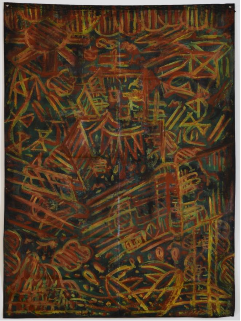
The Collective 62 Presents Disturbances in the Field Curated by Michelle Weinberg
MIAMI ART WEEK
The Collective 62 Presents Disturbances in the Field Curated by Michelle Weinberg
MIAMI ART WEEK
Miami, FL – [Insert Date] – The Collective 62 is proud to announce the opening of Disturbances in the Field, an exciting group exhibition curated by Michelle Weinberg, featuring a selection of works from nine innovative contemporary artists. The exhibition opens during Miami Art Week 2024, showcasing works that explore themes of sampling, glitches, noise, static, feedback, forking paths, and rogue signals.
The opening reception will take place on Sunday, December 1, 2024, from 11:00 AM to 2:00 PM at The Collective 62, located at 901 NW 62nd St, Miami, FL 33150. The exhibition will be on view through Saturday, January 18, 2025.
Participating Artists:
Daniel Arturo Almeida
Dimitry
Saïd Chamy
Karen Combs
Marina Font
Ai Kijima
Alex Nuñez
Hettler.Tüllmann
Michelle Weinberg
Natalie Zlamalova
Disturbances in the Field assembles the diverse works of these nine artists, whose practices embrace the improvisatory and chaotic forces that often shape our environments. Each artist’s process involves harnessing or responding to disruptions such as glitches, noise, and feedback, creating pieces that explore the ways these disturbances inform perception, identity, and our relationship to the world around us.
The exhibition invites viewers to reflect on the improvisational energies that disrupt systems and expectations, offering an immersive experience of visual stimuli that are at once unpredictable and deeply engaging. By embracing such uncharted pathways, the artists create new spaces where meaning can emerge from chaos, making the exhibition a true reflection of the dynamic, ever-evolving forces at play in contemporary art.
Exhibition Details:
What:Disturbances in the Field – Organized by Michelle Weinberg
When: Opening Reception on Sunday, December 1, 2024, from 11:00 AM – 2:00 PM
Join us for the opening reception of Disturbances in the Field and experience a unique exploration of disruption, creativity, and improvisation in contemporary art. This exhibition is a must-see during Miami Art Week 2024.
Miami art Week
Art Matters/Art Basel Season curated by Milagros Bello
Mia Curatorial Projects Presents Art Matters
Miami art Week
Mia Curatorial Projects Presents Art Matters/Art Basel Season Curated by Milagros Bello
Mia Curatorial Projects is proud to present Art Matters/Art Basel Season, an exciting group exhibition curated by Milagros Bello, during Miami Art Week 2024. This exclusive exhibition will feature a dynamic selection of contemporary works from renowned artists, including Eliana Barbosa, Magaly Barnola Otaola, Eumelia Castro, Ricardo Carbonell, Sergio Cesario, Francisco Ceron, Meg Cogburn, Matt Jacobs, Karina Matheus, Clark Medley, Rafael Montilla, and many others.
The opening reception will be held this Sunday, December 1st, from 11:30 AM to 4:00 PM at the Mia Curatorial Projects space, located at 6945 NE 3rd Ave, Miami, FL 33138 in the Little River District. The exhibition is free to attend and open to all art enthusiasts and collectors. Free street parking is available for guests.
Art Matters/Art Basel Season explores a broad spectrum of themes through a diverse array of mediums, from painting and sculpture to photography and mixed media. With this exhibition, Bello invites viewers to reflect on the ever-evolving conversation between contemporary art and its cultural context. The exhibition features an impressive group of artists whose works challenge conventions, expand boundaries, and explore the intersection of personal narrative and universal truths.
Exhibition Details:
What:Art Matters/Art Basel Season – Curated by Milagros Bello
When: Opening Reception on Sunday, December 1st, 11:30 AM – 4:00 PM
Where: Mia Curatorial Projects, 6945 NE 3rd Ave, Miami, FL 33138, Little River District
Parking: Free street parking available
Join us for a captivating afternoon of art, conversation, and celebration during one of the most anticipated weeks in the global art calendar. Art Matters/Art Basel Season is a must-see exhibition for collectors, curators, and art lovers alike.
“God Made Bob, Bob Made Rock”: A Solo Installation by Robert Lorie at Primary’s Outdoor Sculpture Garden
Miami-based artist Robert Lorie presents his latest solo installation, God Made Bob, Bob Made Rock, an evocative exhibition that will be unveiled during Miami Art Week. This immersive installation, exploring the intersection of identity, culture, and creativity, will be on view at Primary’s outdoor sculpture garden at 7410 NW Miami Court, Miami, FL 33150. The exhibition opens at 5:00 PM and will be on display through March 2025.
God Made Bob, Bob Made Rock invites viewers into Lorie’s unique conceptual space where the influence of music, personal history, and urban life converge. Through innovative materials and striking visuals, Lorie challenges traditional ideas of art-making, utilizing sculpture, sound, and interactive elements to create a multisensory experience that resonates deeply with audiences.
In addition to Lorie’s solo installation, Blank Space, a group exhibition will also be held at Primary. This show features a dynamic selection of works by artists including Srijon Chowdhury, Robert Crumb, Dustin Emory, David-Jeremiah, Graham Krenz, Elberto Muller, Angela Anh Nguyen, Luna Palazzolo-Daboul, Santiago Alexis Rubino, Paula Santomé, Philip Smith, and Wade Tullier. The exhibition explores diverse themes through various mediums, highlighting the collective creativity and varied perspectives of these contemporary artists. Blank Space will be on view through January 18, 2025.
Event Details:
What:God Made Bob, Bob Made Rock – Solo Installation by Robert Lorie
When: Opens at 5:00 PM, on view through March 2025
Join us for a memorable evening celebrating both individual and collective creativity during Miami Art Week. Robert Lorie’s installation and Blank Space offer a unique opportunity to engage with innovative works from some of today’s most exciting contemporary artists.
Colour Senses Project: A Group Show by International Artists during Miami Art Week
The highly anticipated Colour Senses Project will open its doors during Miami Art Week, showcasing a curated group exhibition that celebrates the dynamic intersection of color, perception, and artistic expression. Hosted at 3414 NW 7th Ave., Miami, FL 33127, the event will take place on [insert date] from 6:00 PM to 10:00 PM.
This immersive group show features international artists who have come together to explore the sensory power of color. Through diverse mediums and innovative techniques, the artists aim to engage viewers in a multisensory experience that challenges the boundaries of visual art. From vibrant abstracts to evocative portraits, each piece invites contemplation on the emotional and psychological effects of color in our lives.
As a key event during Miami Art Week, the Colour Senses Project offers a unique opportunity for art lovers, collectors, and industry professionals to engage with global perspectives and emerging trends. The exhibition emphasizes inclusivity, diversity, and the universal impact of color as a tool for communication and connection.
Event Details:
What:Colour Senses Project – A Group Show by International Artists
When: Saturday November 30 2024, 6:00 PM – 10:00 PM
Where: 3414 NW 7th Ave., Miami, FL 33127
Join us for an unforgettable evening of art, conversation, and celebration of creativity during one of the world’s most exciting cultural events. The Colour Senses Project promises to be a highlight of Miami Art Week.
Disturbances in the Field assembles the diverse works of nine artists whose processes involve sampling, glitches, noise, static, feedback, forking paths and rogue signals to effectively hitch a ride on the improvisatory forces and wayward pathways that present themselves in contemporary life.
Participating Artists:
Daniel Arturo Almeida Dimitry Saïd Chamy Karen Combs Marina Font Ai Kijima Alex Nuñez Hettler.Tüllmann Michelle Weinberg Natalie Zlamalova
COLLECTIVE 62 827 nw 62 Liberty City, Fl 33150 +1 305-586-0252 [email protected]
LES COULEURS DOWNTOWN MIAMI ART WEEK: UNVEILING CREATIVITY VIP Preview & Exhibition | December 2-7, 2024
Downtown Miami, FL – Les Couleurs Art Gallery is proud to present the highly anticipated Downtown Miami Art Week, returning for its second year, from December 2 through December 7, 2024. This vibrant weeklong celebration of art and creativity will showcase the works of both emerging and established artists, offering a unique opportunity for art lovers, collectors, curators, and the public to experience and engage with exceptional pieces of contemporary art.
Opening Night VIP Preview The festivities will kick off with an exclusive VIP Preview on Monday, December 2nd, from 2 PM to 9 PM at Les Couleurs Art Gallery, located at 223 E Flagler St, Miami, FL 33131. The event is set to welcome approximately 800 distinguished guests, including art collectors, influencers, and industry professionals, eager to celebrate the latest in contemporary art. The gallery will be transformed into a dynamic space for artistic exchange, providing an unparalleled platform for artists to connect with potential buyers, curators, and collaborators.
Exhibition Hours & Public Access Throughout the week, Downtown Miami Art Week will remain open to the public from December 3 to 6, with exhibitions available for viewing from 3 PM to 6 PM daily. The event will culminate with a Closing Night Celebration on Saturday, December 7th, from 7 PM to 10 PM, honoring the creativity and talent displayed throughout the week.
Participating Artists This year’s event will feature an impressive lineup of local and international artists, including:
Valeriia Popova
Dalliants
Emily Pearl
Turo Rodon
Marina Merz
Sadie Goodwin
DJ Laoshi
Kseniya Nelasova
Israel SLEP ONE
Leyla Jdm
Josef Rataj
William Villanueva
Priscilla Rachel
Marta Alexandrovna
Emilia Batista
Rose Jaranya
Annalisa Scarlino
Sofi Santana
Halle Bryant
Grace Courbis
Moises Eljach
Mariana Ortiz
Kristina Kendrick
Arqui Oskar
Khan
Amal Amgaad
Brenda Presil
Thai Le
Keren Mesa
Anna Sanderson
Nathalie Pelisson
Exhibition Location & Parking Information All events will take place at Les Couleurs Art Gallery, located at 223 E Flagler St, Miami, FL 33131. Parking is available at 190 NE Third St, Miami, FL 33132.
Dress Code To enhance the elegance of the event, guests are encouraged to wear attire in elegant red, blue, or white. Black is optional but also acceptable.
A Week of Art, Culture, and Connections Downtown Miami Art Week offers more than just an exhibition—it’s a celebration of artistic expression and cultural exchange in the heart of one of the most dynamic cities in the world. Artists will have the opportunity to showcase their works to an engaged audience, gain exposure, and expand their networks within Miami’s thriving art community. Collectors and art lovers will experience a curated collection of unique pieces across diverse mediums and styles.
For Media Inquiries & Press Passes Please contact: [Your Contact Information]
About Les Couleurs Art Gallery Les Couleurs is an innovative art gallery that fosters artistic exploration and cultural exchange, focusing on emerging talent and contemporary art forms. Located in the heart of Downtown Miami, Les Couleurs offers a dynamic space for exhibitions, events, and creative collaborations. The gallery is dedicated to providing artists with a platform to share their work and engage with the global art community.
Join us this December for a celebration of art, culture, and creativity in the heart of Downtown Miami. Don’t miss out on the opportunity to experience the best of contemporary art at Les Couleurs Downtown Miami Art Week.
CHROMA 2024: Activating Art, Identity, and Connection in the Miami Design District
Miami Art Week: Opening Reception and Activations Schedule
Lucid Design District is excited to announce the return of CHROMA 2024, a dynamic group exhibition during Miami Art Week, running concurrently with Art Basel Miami Beach. This year’s exhibition brings together 20 national and international artists, offering a vibrant mix of multidisciplinary artworks and engaging live activations.
CHROMA 2024: Miami Art Week Exhibition at Lucid Design District
Opening Reception: Tuesday, December 3, 2024 | 4:00 – 7:00 pm | Free with RSVP
“CHROMA 2024, inspired by the purity and intensity of color, aims to highlight that art and society are not merely black and white,” says Payal Tak, owner of Lucid Design District and a participating artist. “Like the vibrant murals and performances within this exhibition, we are enriched by our differences and unified through shared experiences. This exhibition aligns perfectly with Miami’s public art legacy, offering a space for artistic excellence and meaningful dialogue.”
Curated by Graciela Montich, CHROMA 2024 Celebrates 20 Exhibiting Artists
Curated by Graciela Montich, CHROMA 2024 features a diverse lineup of 20 national and international artists whose work spans sculpture, mixed media, wall art, and wearable art. Visitors are encouraged to engage with the artists and immerse themselves in the creative processes that bring CHROMA 2024 to life.
The exhibiting artists include Alejandra Stier (Argentina), Andres Lopez Del Castillo (Colombia), Carina Adur (Argentina), Dariana Arias (Washington D.C.), Emilie Gosselin (Canada), Graciela Durand Pauli (Argentina), Graciela Montich (Argentina), Heather Lynn (Washington D.C.), Jeannie B. Cidel (Miami), Kevin M. Fletcher (Miami), Maria Boneo (Argentina), Mónica Avayou (Miami), Nelson Delgado (Houston), Nimi Trehan (Potomac), Paula Izzo (Brazil), Payal Tak (Miami), Raquel Chomer (Argentina), Robert Frankel (Chicago), Sandra de Souza-Peixoto (Miami), and Simi Bhandari (Germantown).
New Artist Activations for CHROMA 2024
CHROMA 2024 introduces three exciting new artist activations that explore the themes of identity, connection, and shared humanity:
Kevin M. Fletcher – “Echoes of Unity” Outdoor Mural
Mural Creation: Friday, November 29 – Monday, December 2, 2024
Opening Reception: Mural at 85% completion, with Fletcher adding final touches during the event
Completion: Wednesday, December 4 – Friday, December 6, 2024
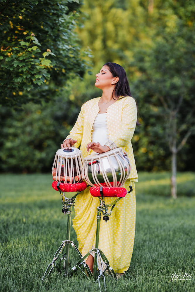
Navya Nataraj – TheTablaQueen
Live Tabla Performance: Tuesday, December 3, 2024 | 5:30 pm – 7:00 pm
[Pictured below from top/l to r: Kevin M. Fletcher, Navya Nataraj aka TheTableQueen; KUBE Man (Rafael Montilla.]
About Lucid Design District
Established in 2021 as a studio and exhibition space for founder Payal Tak’s personal artwork, Lucid Design District will officially open to the public during Art Basel Miami Beach (Miami Art Week) 2022. The gallery is located on Miami Design District’s “art corner” (10-12 NE 41 St. at Miami Ave.) next to Museum Garage and across the street from the Institute of Contemporary Art, Miami. The idea of Lucid Design District was born from Ms. Tak’s desire to connect with the community through collaborative art exchanges. She envisions hosting regular exhibitions, educational art talks, and artist networking events. The 3700-sf space is also an ideal environment for design-focused networking events and features a large reception or performance area; 8 curio-style ‘idea spaces’ for solo artist showcases or breakout sessions; a full-size kitchen; and 75’ long outdoor seating or parking area with lights; and a large wall for art installations.
“My goal is to make available a commercial platform for artists whose voices need to be heard. Lucid shares its walls with the objective to illuminate the viewers mind and allow artistic creations to become a force for good in the society.” ~ Payal Tak
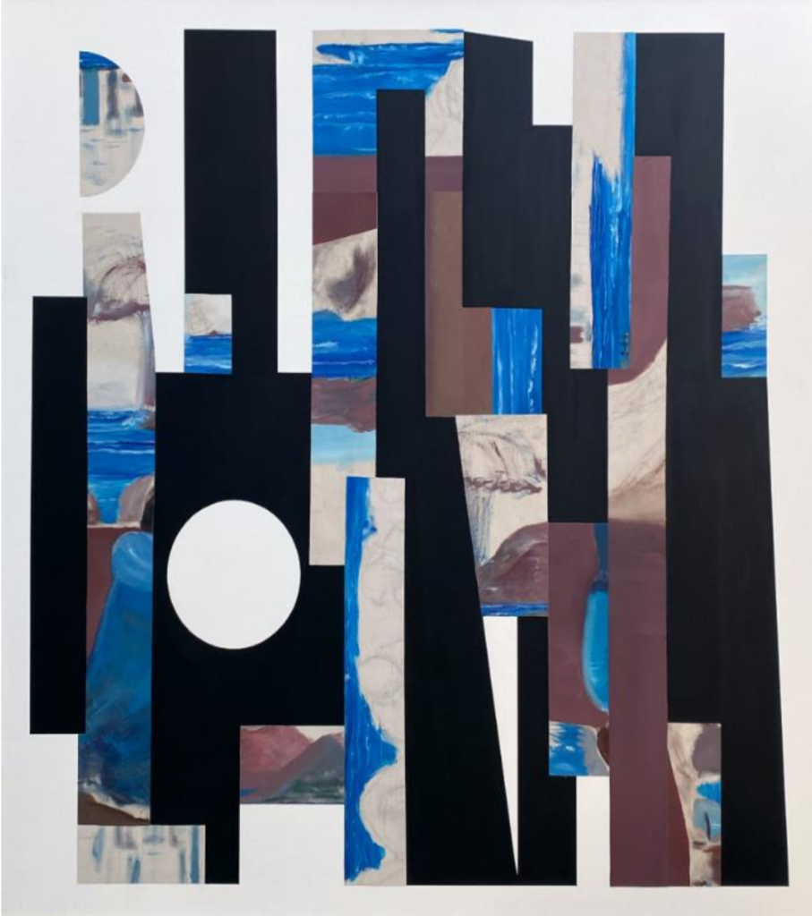
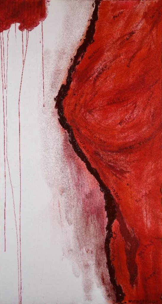
Primer Premio: Samara Colina, Pese a todo, la alegría del encuentro, 2023 (México)
Un recuento breve de la Trienal de Tijuana: 2 Internacional Pictórica
Roberto Rosique
Una historia que comenzó en 2018, impulsada por la insistencia del pintor Álvar Blancarte, el compromiso de la directora del Centro Cultural Tijuana, Dra. Vianka R. Santana, y la invitación que nos hiciera a mí y al Dr. Heriberto Yépez para desarrollar un proyecto expositivo y de concurso enfocado en el campo expandido de la pintura. El resultado fue un modelo que promueve laliberación del formato, el tema y las técnicas, con el objetivo de fomentar la libertad creativa de los participantes. La única directriz es mantener un vínculo con lo pictórico, entendido como un recurso universal que puede encontrarse en todo lo que nos constituye, desde lo plástico, visual,objetual y conceptual. Asimismo, se definió una modalidad de premiación alejada de lo tradicional. El proyecto se desarrollaría en dos etapas. La primera consiste en la selección de los artistasque participarán en la exposición representativa de la Trienal, a cargo del curador general, quien realiza la selección de acuerdo con los criterios establecidos en las bases de la convocatoria. La segunda etapa abarca la selección y premiación, llevada a cabo mediante un innovador sistema tripartito. En esta fase, un curador invitado específicamente para este propósito selecciona 10 de las obras finalistas, de entre las cuales podrían elegirse las ganadoras; además, los artistas seleccionados emiten un voto único para reconocer la obra que consideren más destacada. Por último, la comunidad participa a través de una plataforma virtual institucional, emitiendo su voto. Todo el proceso se realiza bajo la supervisión de un notario público, quien garantiza la legalidad del evento.
Los resultados de esa primera edición (2021), cuya selección general estuvo a cargo de la curadora venezolana Carmen Hernández, incluyeron 145 obras de 16 países. A través del sistema de votación tripartita, se otorgó el primer premio a la argentina Belén Basombrio por su obra En blanco. Pintura en el campo expandido, de la serie Del silencio a la denuncia. Asimismo, se concedieron dos menciones honoríficas: una al mexicano Salvador Díaz, por La pelea, de la serie Panorámicos, y otra a la venezolana Sofía Saavedra, por Línea fronteriza. Los premios consistieron en $1,000,000 MXN para el primer lugar y $250,000 MXN para cada una de las menciones.
Primera mención de honor. Enrique Rubio (México) Woolander, 2023Segunda mención de honor María Orozco (México) Después de 10 años, entre el mar y mi afecto, nos volvimos a encontrar, 2023
La segunda edición de la Trienal (2024), cuya selección de 86 obras de artistas provenientes de 14 países estuvo a cargo de la curadora brasileña Leonor Amarante una curadora respetada por su imparcialidad y amplia experiencia comprobada en el campo contemporáneo del arte, nos ofrece —como bien declara—una dilatada cartografía de una geografía creativa abierta e integradora. Esta selección cumple con las expectativas de la Trienal y amplía nuevamente el espectro de lo plástico, no desde la tradición, sino respaldado por la solidez del discurso y la justificación conceptual propuesta por cada artista, lo que eleva sus obras al rango contemporáneo y las hace merecedoras de su participación.
El comité curatorial considera esta decisión pertinente, ya que el espíritu de la Trienal se basa en la libertad y la democracia, lo que se refleja en esta muestra plural, donde es posible apreciar una variedad de géneros, con cada obra destacando por sus aportaciones, todas ellas sustentadas en lo pictórico.
Las decisiones del jurado ternario fueron completamente autónomas, y como institución confiamos plenamente en sus juicios, libres de cualquier coerción. En cuanto al curador invitado para la fase final de premiación, el Dr. Humberto Chávez Mayol, investigador, teórico, crítico, docente en artes y creador conceptual con amplia trayectoria y reconocimientos, fue para nosotros un respaldo clave. Sobre su selección de obras, explicó:
“Las piezas fueron analizadas desde su construcción y calidad sintáctica, susentido semántico, y los factores pragmáticos planteados en cada propuesta.He procurado mantener el espíritu conceptual del proyecto, valorando ladiversidad de manifestaciones y siguiendo el enfoque de una pictorialidadexpandida. Se eligieron piezas orientadas hacia la re-objetualización, lainstalación y la integración de nuevas tecnologías”
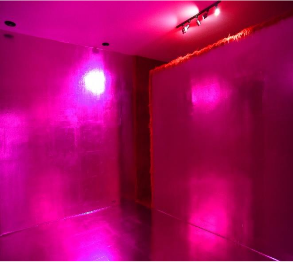
Regina Silveiro (Brasil) Tranpa. Vídeo-animação em loop.Renato Pera (Brasil) Gore Somnambulism (Pink Room / Red Room) Instalación in situ, 2024.
En cuanto al voto libre de los artistas seleccionados (de los cuales participó el 60 % en esta ocasión), sus decisiones fueron determinantes e indiscutibles para la adjudicación de los premios. El reconocimiento que otorgan con su voto demuestra que la obra cumple con los criterios establecidos para su participación y que, según su valoración, resultaban meritorias. De manera similar, el voto libre de la comunidad, previamente analizado y validado por un programa de seguridad y control implementado por la empresa contratada, garantiza la autenticidad del resultado. Según lo estipulado en las bases de la convocatoria, si al menos dos de las tres votaciones coinciden, la obra con mayor número de votos será declarada ganadora, y de manera decreciente se otorgarán las menciones honoríficas. De acuerdo con este criterio, los resultados finales fueron los siguientes: El primer premio fue otorgado a la obra “Pese a todo, la alegría delencuentro” de Samara Colina, con 3 votos coincidentes: 549 votos del público, 3 votos de los artistas participantes y 1 voto del curador invitado para la fase final. El Segundo Premio (Primera Mención Honorífica) fue para “Woolander” de Enrique Rubio, que también obtuvo 3 votos coincidentes, aunque con menor apoyo del público (56 votos), 1 voto de los artistas participantes y 1 del curador. El Tercer Premio (Segunda Mención Honorífica) fue para “Después de 10 años, entre el mar y mi afecto, nos volvimos a encontrar” de María Orozco, con 2 votos coincidentes: 1 del curador y 332 votos del público. Aunque esta obra obtuvo un mayor número de votos del público, no recibió el respaldo de los artistas seleccionados.
Rafael Montilla (USA/México) La puerta del cosmos, 2023 / instalaciónSusana González-Revilla (Panamá) Sagrado femenino persistente, 2022-23
El resultado es claro y contundente según los números obtenidos, lo que reafirma que en el arte, las subjetividades juegan un papel crucial en las decisiones. Aunque cada votante asume la responsabilidad de su elección, a la institución solo le corresponde reconocer la honestidad de los juicios emitidos. Del mismo modo, el voto libre del público fue considerado por la institución como un acto legítimo, pero bajo el principio de equidad, siendo validado a través del programa establecido. Este garantizó que cada persona emitiera un único voto, identificado por su correo electrónico, y descartó aquellos que no cumplieran con las normas.
Xoque Grup (USA) Art in Motion, 2023Solís Apollón (México) A-Presencia, 2023
La libertad implícita en todo proceso de creación conforma el espíritu autónomo del arte, un acuerdo sino tácito, si entendido y declarado abiertamente, por lo menos en el arte contemporáneo; un convenio que parece justificar la osadía de construirlo validando el soporte con toda la implicación que el término tiene, admitiendo el proceso no únicamente como ritual constructivo sino como fin, aceptando el concepto como justificación cognitiva y/o apuesta estética; oportunidades que hace que el ejercicio creativo circule por igual en una dirección o la deriva, se alíe a todo lo que el autor considere pertinente, se emulsione en la inter o transdisciplina todo ello sin esperar la autorización de aquel que lo ha mantenido direccionado; ese espíritu emancipado invita también a que quien lo consume lo valide o lo rechace o que aquel que lo observe lo acepte como tal, lo etiquete y que también desde su particular criterio lo interprete; opiniones, todas que tienen sus fortalezas y debilidades pero que reflejan, sin duda, nuevos tiempos en el cual la correspondencia, el sentido de equidad, el respeto al disentir del otro son indicativos de maneras diferentes de ver, entender y aceptar la vida, en donde, por supuesto, el arte debe ser participe relevante.
Esta apuesta por fomentar oportunidades menos restrictivas para que las creaciones adquieran también otros sentidos fue una preocupación constante para quienes construíamos el espíritu de la trienal, una inquietud que debía reflejarse con hechos; de ahí que el riesgo tomado al proponerlo desde lo pictórico, el respetar las libertades creativas y evaluativas, no fue tal, pues siempre estuvo claro que se asumían como posturas articulantes, que darían que hablar pero también que pensar sobre el valor de la emancipación en el arte, de la que no hay justificación para su ausencia.
R. Trompaz (Brasil) SSEG, 2024Jose Patricio (Brasil) Memento Mori, 2024
Hoy que estamos aprendiendo a mirar la vida desde polos distintos como consecuencia de acciones negligentes que, desde el poder desmedido y riqueza inconmensurable centrada en unos pocos, contravienen las leyes naturales y trastocan la vida sin una señal de remordimiento; nos hemos visto forzados a modificar estándares con tal de atenuar y desaparecer calamidades, estamos obligados a reaprender el valor de la responsabilidad, la que en esta era postcovid se tendrá que asumir sin objeciones, si es que realmente queremos una mejor forma de vida. Son tiempos para pensarnos en la diferencia, reconocernos en el otro y asumirnos en el compromiso que como declaración de principio sea invariable y nos confronte si se incumple, es momento de seguir de la mano con la responsabilidad como medida incuestionable para enmendar equívocos y ser justos, y el arte, estoy seguro, no tiene por qué desestimar estos escenarios, de ahí que no podría ser más oportuno este momento de transformaciones inevitables derivadas de la pandemia para generar espacios de intercambio y expectativas, favorecer el pensamiento crítico y cambiar el paradigma de lo plástico por la libertad en el abordaje de lo pictórico sin restricciones.
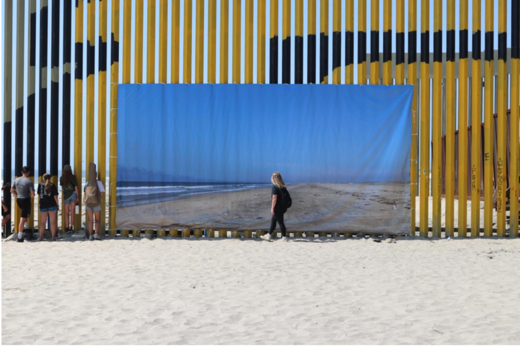
Scott Henry Hopkins, (USA) En muro invisible / fotografía/ intervención del muro divisorio Tijuana/San Diego ca.
Yuan Gong (London UK)
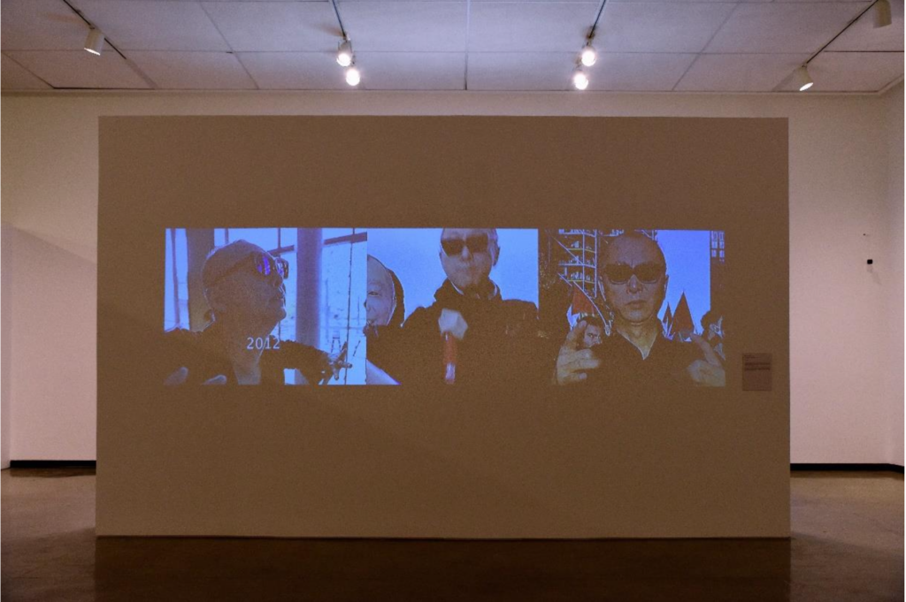
Soft Sculptur, 2024. Video
Daniel Ruanova (México)
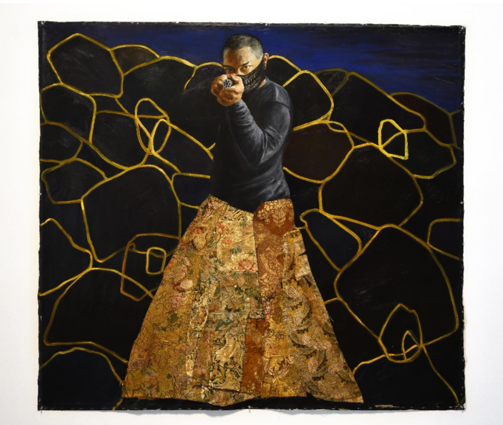
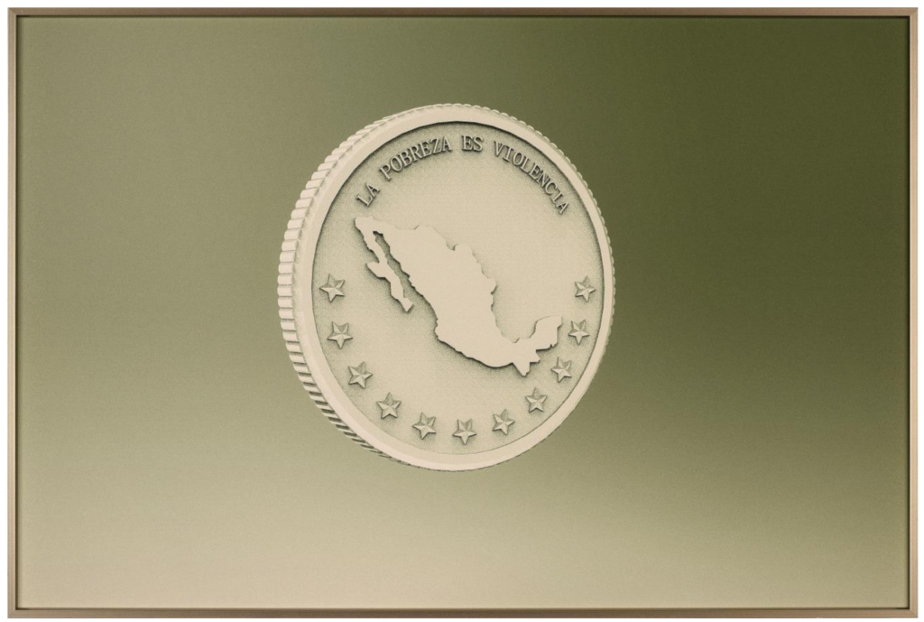
Heráldica para una Sociedad Políticamente incipiente, 2023Eduardo Santillán Caicedo (.Quito, Ecuador) Autodefensa, 2023Christian Becerra (México)
La pobreza es violencia, 2023
1 Roberto Rosique. Nace en Cárdenas, Tabasco, México, en 1956. Radica en Tijuana, B. C., desde 1986. Médico General, con Especialidad en Pediatría y Subespecialidad en Oftalmología Pediátrica, es a su vez artista plástico-visual, curador, escritor y crítico de arte. Es Maestro Fundador de la Facultad de Artes de la Universidad Autónoma de Baja California (2003). Docente de la misma institución, en la actualidad es el coordinador general de la Trienal de Tijuana. 2 Internacional Pictórica, Secretaría de Cultura / Cecut.
Rafael Montilla (USA/México) La puerta del cosmos, 2023 / instalación
Galleries at Art Basel Miami 2024
Galleries # 1 Mira Madrid 303 Gallery 47 Canal A A Gentil Carioca Miguel Abreu Gallery Acquavella Galleries Afriart Gallery Alexandre Gallery Almeida & Dale Galeria de Arte Altman Siegel Ames Yavuz Antenna Space Galeria Raquel Arnaud Alfonso Artiaco Edel Assanti B Bank Barro von Bartha Gallery Baton* Nicelle Beauchene Gallery 80M2 Livia Benavides Ruth Benzacar Galeria de Arte Berggruen Gallery Berry Campbell Blum Peter Blum Gallery Marianne Boesky Gallery Tanya Bonakdar Gallery Bortolami Luciana Brito Galeria Broadway Ben Brown Fine Arts Galerie Buchholz C Canada Cardi Gallery Casa Triângulo Casas Riegner David Castillo Central Fine Galeria Pedro Cera Chapter NY James Cohan Sadie Coles HQ Commonwealth and Council Company Gallery Galleria Continua Paula Cooper Gallery Pilar Corrias Crèvecœur Cristea Roberts Gallery Galerie Chantal Crousel D DAN Galeria Thomas Dane Gallery DC Moore Gallery Tibor de Nagy MASSIMODECARLO Jeffrey Deitch Document E Anat Ebgi Andrew Edlin Gallery galerie frank elbaz Derek Eller Gallery Thomas Erben Gallery Larkin Erdmann Galeria Estação F Daniel Faria Gallery Eric Firestone Gallery Konrad Fischer Galerie Peter Freeman, Inc. Stephen Friedman Gallery James Fuentes G Gaga Gagosian Gavlak Gemini G.E.L. François Ghebaly Gladstone Gallery Gomide&Co Galería Elvira González Goodman Gallery Marian Goodman Gallery Gray Garth Greenan Gallery Greene Naftali Galerie Karsten Greve Cristina Guerra Contemporary Art H Hales Gallery Hauser & Wirth Galerie Max Hetzler Hirschl & Adler Modern Rhona Hoffman Gallery Edwynn Houk Gallery Xavier Hufkens Gallery Hyundai I Ingleby Gallery Instituto de visión Isla Flotante J Alison Jacques rodolphe janssen Jenkins Johnson Gallery K Kalfayan Galleries Casey Kaplan Jan Kaps Karma Kasmin kaufmann repetto Sean Kelly Kerlin Gallery Anton Kern Gallery Galerie Peter Kilchmann Tina Kim Gallery Michael Kohn Gallery David Kordansky Gallery Andrew Kreps Gallery kurimanzutto L Pearl Lam Galleries* Leeahn Gallery* Lehmann Maupin Tanya Leighton Galerie Lelong & Co. Lévy Gorvy Dayan Josh Lilley Lisson Gallery Luhring Augustine M Magenta Plains Mai 36 Galerie Maisterravalbuena Jorge Mara – La Ruche Matthew Marks Gallery Martos Gallery Barbara Mathes Gallery Mayoral Mazzoleni Miles McEnery Gallery Anthony Meier Mendes Wood DM Mennour Mignoni Millan Victoria Miro Mnuchin Gallery Modern Art The Modern Institute moniquemeloche mor charpentier N Galerie nächst St. Stephan Rosemarie Schwarzwälder Galerie Nagel Draxler Edward Tyler Nahem Helly Nahmad Gallery Nanzuka neugerriemschneider Nicodim Gallery Night Gallery Carolina Nitsch David Nolan Gallery Galerie Nordenhake Gallery Wendi Norris* O Galerie Nathalie Obadia OMR Galleria Lorcan O’Neill Roma Ortuzar Projects P P.P.O.W Pace Gallery Pace Prints Paragon Parker Gallery Parrasch Heijnen Gallery Franklin Parrasch Gallery Patron Peres Projects Perrotin Petzel Galerie Jérôme Poggi Polígrafa Obra Gràfica Proyectos Monclova R Almine Rech Regen Projects Rele Gallery Roberts Projects Nara Roesler ROH Projects Thaddaeus Ropac Meredith Rosen Gallery Michael Rosenfeld Gallery Lia Rumma S SCAI The Bathhouse Esther Schipper Schoelkopf Gallery Galerie Thomas Schulte Marc Selwyn Fine Art Jack Shainman Gallery Susan Sheehan Gallery Sies + Höke Sikkema Jenkins & Co. Jessica Silverman Simões de Assis Skarstedt Fredric Snitzer Gallery Société Sperone Westwater Sprüth Magers Galleria Christian Stein STPI Luisa Strina Galería Sur T Timothy Taylor Templon Galerie Barbara Thumm Tilton Gallery Tornabuoni Art Travesía Cuatro Two Palms U Rachel Uffner Gallery V Van de Weghe Van Doren Waxter Tim Van Laere Gallery Various Small Fires Nicola Vassell Vedovi Gallery Venus Over Manhattan Vermelho Vielmetter Los Angeles W Waddington Custot Galleri Nicolai Wallner Wentrup Michael Werner Gallery White Cube Y Yares Art Z David Zwirner


")
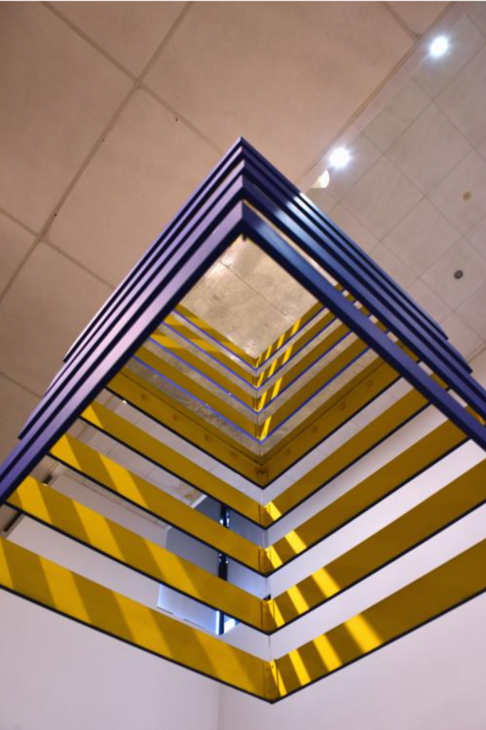
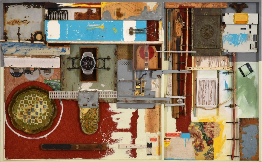
 La puerta del cosmos, 2023 / instalación")
