HOMAGE TO THE SQUARE: ALBERS’ INFLUENCE ON GEOMETRIC ABSTRACTION
Essay by Emily Lenz
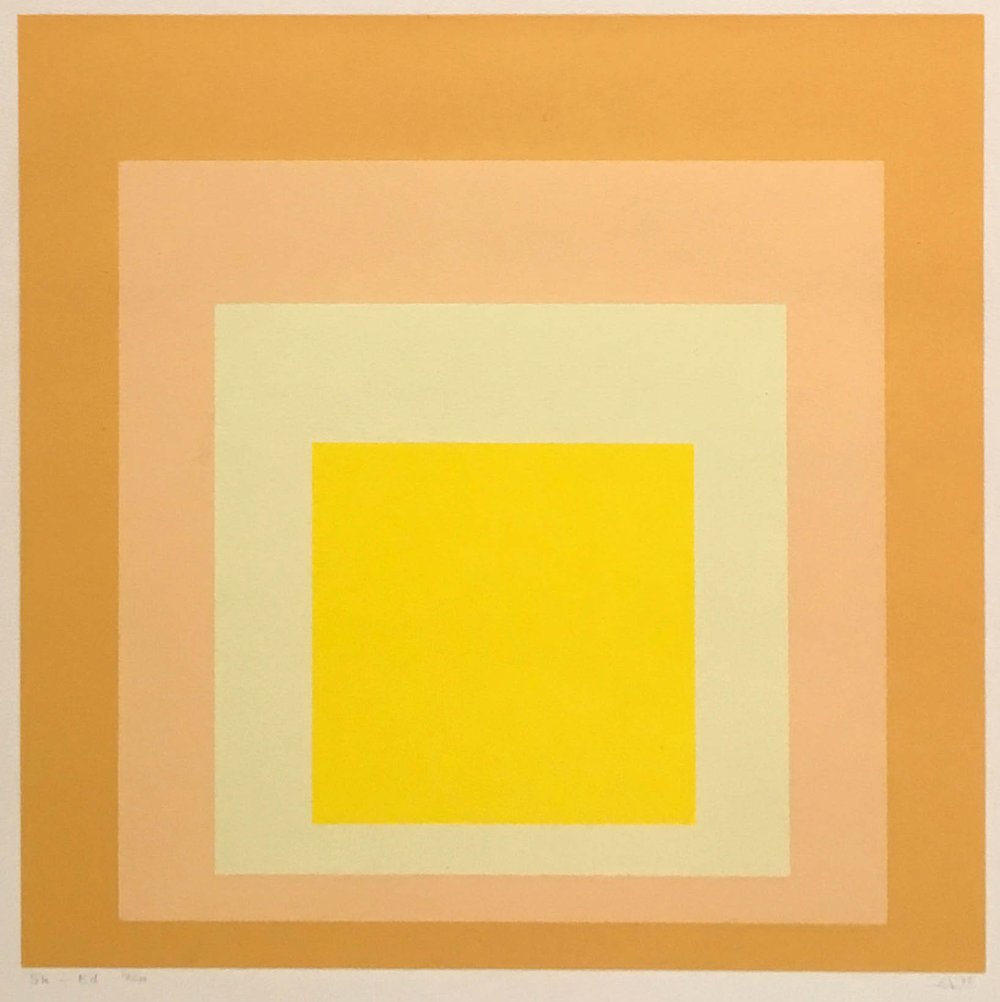
By 1950 Josef Albers (1888-1976) settled on an arrangement of concentric squares to investigate the interaction of colors in his series Homage to the Square. Albers saw the nested squares as pure containers of color that standardized the experiments he continued for 25 years. Albers defined his color theories in Interaction of Color in 1963. The book reproduced the courses he taught at the Yale School of Art. The book’s purpose was to establish an understanding of color’s relativity and instability in its interaction with other colors. Albers’ wrote in his introduction, “In order to use color effectively it is necessary to recognize that color deceives continually.”
Albers’ teaching impacted his own students, particularly Richard Anuszkiewicz and Julian Stanczak, and his paintings and book reached many young artists, including Paul Reed in DC, Al Loving in Detroit, and Tadasky in Tokyo. Across the styles of Op, Hard Edge, Color Field, and Constructions in our exhibition, we demonstrate how geometric artists of the 1960s were impacted by Albers and Homage to a Square.
Until the 20th century, the square was an unusual canvas shape in painting. The horizontal rectangle depicted landscapes and the vertical rectangle was used for figuration. For Albers, squares were neutral shapes that offered simple borders between colors. Depending on Albers’ color selection, his squares project, recede, or blend together under certain lighting and distance. In Interaction of Color, Albers laid out how artists could intuitively understand why we see what we do. The square format also allowed artists to play with symmetry- either with complex arrangements that required an equally divided canvas (like Richard Anuszkiewicz’s Quiet Center) or a bold arrangement of color blocks that have movement (like Karl Benjamin’s #36 and Bill Komodore’s Meander). Our exhibition presents three ways artists used the square: to emphasize color interactions; to explore the tension of symmetry; and to put Albers’ exercises into three dimensions in plastic constructions and shaped canvases.
COLOR EFFECT
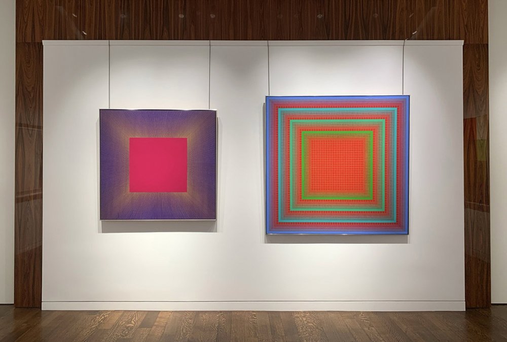
Artists Richard Anuszkiewicz (1930-2020), Julian Stanczak (1928-2017), Tadasky (b.1935), and Francis Celentano (1928-2016) were impacted by Josef Albers’ studies in color relativity and his use of a single form as his subject. In the 1960s Anuszkiewicz worked with a limited palette of red, green, and blue. These contrasting colors in matched intensity led his work to buzz, making him the leader of the American Op Art movement. In Anuszkiewicz’s Quiet Center (1962) a solid field of red appears as three different colors due to thin lines of olive green, kelly green, and periwinkle blue. The thin lines themselves form a diamond projecting out of a centered square. After seeing one of Albers’ paintings in reproduction, Tadasky (b.1935) came to America to paint geometric shapes, a style considered taboo in Japanese art schools. While Tadasky is known for his concentric circles, the square is always present in the canvas’s boundaries. Tadasky considered the circle in the square to be a universal composition. In D-101 (1966), concentric squares of orange and two shades of blue border concentric circles in the same colors. Francis Celentano (1928-2016) began a deliberate exploration of color using Albers’ methodical approach in 1965 after his inclusion in MoMA’s exhibition The Responsive Eye. He settled on stripes of floating color shifts that both project and move across the canvas, achieved by spraying two pigment in alternating density along one stripe. In Celentano’s Alpha Diamond Study (1969), the rotated square canvas appears solid in its shape while the blue color at the center bulges forward into the viewer’s space. Washington Color School artist Paul Reed (1919-2015) was influenced by the effect of implied transparency seen in Interaction of Color. Reed painted four series (Inside Out, Intersection, Coherence, and Interchange) in 1966 using the stripe as a neutral form to examine transparency through actual overlaid colors. Reed’s method was technically possible because of new water-based plastic paints, which dried quickly and could be stained into raw canvas. The lattice composition of Intersection VII (1966) provided an efficient framework to examine the many points of crossing between two sets of stripes, the vertical colors warmer than their horizontal companion.
TENSION IN SYMMETRY
The nested squares in the Homage to the Square paintings are slightly orientated to the bottom of the canvas. This small adjustment to the symmetry heightens the color effects of projection and recession and demonstrates how to use the viewer’s desire for symmetry to create dynamic movement in a painting.
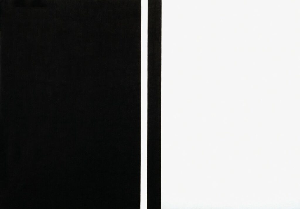
Karl Benjamin (1925-2012) and Frederick Hammersley (1919-2009) were California Abstract Classicists, a group that made hard edged paintings with geometric simplicity, linear precision, and purity of form and color. The Abstract Classicists aimed for tension between the shapes to create excitement rather than depth. Both Hammersley and Benjamin used square canvases to emphasize the balance of symmetry. In Benjamin’s #36 (1964), blocky lines of deep green and blue of equal intensity seem interwoven, making it difficult to determine which color projects or dominates – an experience that energizes the painting. In Hammersley’s Sanforized, #1 (1967), the artist divides the canvas into a 7 x 7 grid with ten black squares at its center. First the black squares hover above the white field then with further looking the white begins to project instead. The underlying grid gives a clear symmetry to Sanforized while the high contrast of black and white activates a dynamic response in the viewer.
Bill Komodore (1932-2012) and Ralph Iwamoto (1927-2013) are New York artists whose styles align with the bold compositions of the California Abstract Classicists. In Meander (1967), Komodore borders a field of white with a thick black meander. The small white squares along the painting’s edge seem to jump to the center, filling the painting with action. Iwamoto made geometric shaped canvases in subdued colors accented by vibrant ones in the 1960s. In 1970 he started using square canvases divided into four quadrants, each with its own flat shapes of high–keyed color for a punchy effect. Iwamoto called these works QuarOctagons: four octagons set in a square. He used this format for three years in distinct series. In Structure #2 (1971), mirrored white squares compete diagonally with orange and purple quadrants for dominance, accentuated by borders of black and gray. Iwamoto continued to the octagon in all of his paintings through 1987.
ALBERS IN 3-D
Josef Albers made beautiful stained glass works at the Bauhaus and was an excellent printmaker, but never applied his color theory to sculpture. Albers’ seriality and color relativity were expanded into plastic constructions and shaped canvases by Leroy Lamis (1925-2010), Mon Levinson (1926-2014), and Al Loving (1935-2005).
Leroy Lamis started his career working in metal and glass prisms in the Constructivist style. The Constructivists opposed color as an optical surface but Lamis found in Plexiglas a material that could be embedded in color and therefore in keeping with Constructivist theories. Lamis created a three dimensional approach to Albers’ color theory over the course of his 230 constructions made from 1962 to 1973. The variety he achieved using eight colors of Plexiglas, as well as clear and white, came from the layering and reflection of the plastic cubes. The brilliance of the blue in Construction No. 221 (1973) results from the artist placing the color in the middle of a clear construction. The blue cube’s location between 3 outer and 5 inner cubes of clear Plexi allows light to shine through the construction to highlight the color while the internal structure provides the lines of nested cubes without blocking the light further. Lamis brought a new dimension to optical color mixing with his use of plastic.
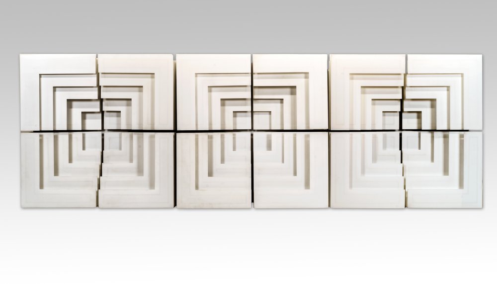
Mon Levinson began working in plastics in the early 1960s as a way to avoid the brushstroke and highlight the forms. In the late 1960s Levinson simplified his compositions and used formal geometry to emphasize light and shadow. Spacer Variations 3 (1968) is a Plexi wall relief of 12 interchangeable components. Each quadrant of nested white corners attaches to a back panel so the four pieces can be re-arranged as desired. In this work, Levinson used a fixed white shape that in its placement next to its neighbors could project or recede, replicating in a way Albers’ exercises in color relativity using light and shadow.
Al Loving settled on the cube motif as his subject by 1967, inspired by Homage to the Square. Loving turned Albers’ nested squares into a crystalline structure, playing with the tension between flatness and spatial illusionism in a shaped canvas. His cube soon became a more complex form as he opened one side into a triangle to hold more color as seen in Septehedron L-B-1 (1970). He called this shape a Septehedron as the form’s inner structure implied a seven sided volume. Loving exhibited these both singularly or grouped. In Loving’s 1969 Whitney Museum exhibition, one wall had 91 Septehedrons organized into 7 rows of colors. Within each row, each canvas adjusted slightly in color intensity from its neighbors adding a pulse to the complex arrangement. This repetition of a shape to such an extreme is another nod to Albers’ seriality.
Josef Albers modeled for future artists how to be both an artist and a teacher. Beyond his continued exploration of color in a methodical approach, he also showed a deliberate and clear way to share information with students and viewers. Many of the artists in our exhibition shared this commitment and had long careers as working artists and art professors: Karl Benjamin, Francis Celentano, Leroy Lamis, Paul Reed, and Julian Stanczak.

