Home Blog Page 9

Women of PACPalm Beach Modern + Contemporary (PBM+C)Women of PAC

Palm Beach Modern + Contemporary (PBM+C)
Palm Beach Modern + Contemporary (PBM+C) presented by Art Miami

Palm Beach Modern + Contemporary (PBM+C) presented by Art Miami, returns in just two weeks for its highly anticipated ninth edition with an exclusive, invitation-only VIP Preview on Thursday, March 19, benefiting the Ann Norton Sculpture Gardens, followed by public days through Sunday, March 22, 2026, at the Palm Beach County Convention Center.

Recognized as a premier destination for both serious and budding collectors, the 2026 edition of PBM+C delivers a curated show of investment-quality works from world-class galleries, featuring exceptional blue-chip contemporary, modern, classical modern, post-war, and pop artworks, alongside today’s most compelling contemporary voices offering something for every level of collector!

Participating Galleries
ADAMAR FINE ARTS Miami | ADELSON GALLERIES Palm Beach | A GREAT GALLERY Miami | ALDO CASTILLO GALLERY Naples | ANALOG CONTEMPORARY Philadelphia | ARIEL JAKOB GALLERY Paris | ART STUDIO SLABAK Miami | ART UNIFIED Venice | ARTVICE Bern | ASCASO GALLERY Miami | AVANT GALLERY Miami | BOCCARA GALLERY New York | BOZLU ART Istanbul | C FINE ART New York | CST GALLERY Naples | DANIELE COMELLI ART GALLERY Genova | DEAN BORGHI FINE ART New York | D FINE ART GALLERY Miami | DUQUE ARANGO GALERIA Medellin | EDWARD SPITZ GALLERY Rome | ETHAN COHEN GALLERY New York | GALERIA CORTINA Barcelona | GALLERY GOT Paris | GALLERY MAKOWSKI Lille | GAMA GALLERY Turkey | HAVELTON ARTS Colorado | KEDRIA ARTS Pontiac | KLEIN Manchester | KUBIX CONTEMPORARY ART Miami | LATIN ART CORE Miami | LAURENT MARTHALER CONTEMPORARY Montreux | LIQUID ART SYSTEM Capri | MASTERWORKS FINE ART GALLERY Palo Alto | MATTHEW SWIFT GALLERY Gloucester | MIDO GALLERY Medellin | NISTICOVICH GALLERY Tel Aviv | OLIVER COLE GALLERY Miami | PARK AVENUE CONTEMPORARY ART New Smyrna Beach | PERSEUS GALLERY New York | PRIVEEKOLLEKTIE CONTEMPORARY ART | DESIGN Heusden aan de Maas | REBECCA HOSSACK ART GALLERY London | RYAN GREEN GALLERY Calgary | SOBERING GALERIE Paris | STEIDEL CONTEMPORARY Lake Worth Beach | TAGLIALATELLA GALLERIES New York | THE BONNIER GALLERY Miami | UNIQUITY ART GALLERY Cape Town | VERTU FINE ART Boca Raton | VOGELSANG GALLERY Brussels | WALTER WICKISER GALLERY New York | YVEL Tel Aviv.

Special Exhibitions

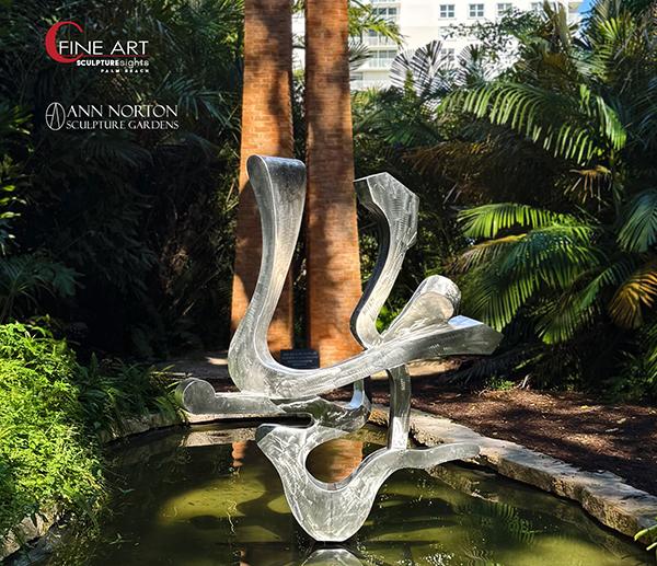
PBM+C VIP Preview Beneficiary, Ann Norton Sculpture Gardens, will once again serve as a satellite venue for the fair and will showcase an exciting exhibition by 2026 Artist in Residence Kevin Barrett, Organic Abstractions, curated by PBM+C Exhibitor, Cheryl Sokolow of C Fine Art. The selected works underscore the artist’s expansive range of scale, process, and aesthetic across a variety of fabricated materials including bronze, stainless steel, and aluminum.

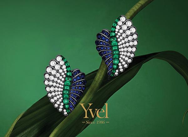
Yvel, the Official Jeweler of PBM+C, Presents Art to Wear, Where Jewelry Becomes Wearable Artistry. Yvel’s Art to Wear collection redefines jewelry as a true form of wearable art, seamlessly blending innovation and creativity. Breaking traditional boundaries, each piece is designed not just as an accessory but as an artistic expression—bold, unique, and inspired by the belief that art extends beyond galleries into everyday life.
VIP Preview:
Thursday, March 19 | 5PM – 9PM
Benefiting the Ann Norton Sculpture Gardens


Public Hours:
Fri, March 20 | 11AM – 6PM
Sat, March 21 | 11AM – 6PM
Sun, March 22 | 11AM – 6PM 


Palm Beach County Convention Center
650 Okeechobee Blvd, West Palm Beach, FL 33401


Parking
Valet available.
Public parking at the Convention Center Parking Garage
Additional parking garages are available across the street at The Square


Courtesy Trolley
Provided to/from Ann Norton Sculpture Gardens Friday – Sunday, 11am – 4pm


Brightline
Less Traffic. More Art. Go Brightline to Palm Beach Modern + Contemporary & skip the traffic! City to City in just 30 minutes. MIA to FLL to WPB. Once you arrive, Brightline’s new mobility service can get you from the station to the event and back so you can be car-free & carefree. #BrightlinePlus. www.gobrightline.com/train-tickets


WWW.ARTPBFAIR.COM

Varvara Stepanova

Varvara Stepanova
Varvara Stepanova

Varvara Stepanova (1894–1958): Constructivism, Labor, and the Politics of Form

Varvara Fyodorovna Stepanova (Варва́ра Фёдоровна Степа́нова) stands as one of the most intellectually rigorous and politically committed figures of the Russian avant-garde. Born into a peasant family in 1894, she traversed a remarkable trajectory—from provincial origins to the epicenter of revolutionary cultural production—ultimately becoming a foundational architect of Constructivism alongside her lifelong partner and collaborator, Alexander Rodchenko. If Constructivism sought to dismantle the autonomy of art and reforge it as an instrument of social transformation, Stepanova was among its most lucid theorists and disciplined practitioners.

Education, Early Formation, and the Cubo-Futurist Moment

Stepanova received formal training at the Kazan Art School, where she met Rodchenko. Their partnership—intellectual as much as personal—would become one of the most generative collaborations in twentieth-century art. In pre-revolutionary Moscow, she moved within the same creative milieu as Wassily Kandinsky, among others. The shared apartment anecdote—Rodchenko, Kandinsky, and Stepanova under one roof—captures not merely bohemian proximity but a crucible of competing modernisms: Kandinsky’s spiritual abstraction, Rodchenko’s analytic materialism, and Stepanova’s emerging synthesis of form and function.

Before fully embracing Constructivism, Stepanova engaged with Cubo-Futurism, producing dynamic compositions and artist’s books that fractured pictorial space into rhythmic geometries. These works already reveal her preoccupation with movement, industrial dynamism, and the destabilization of traditional representation. Yet unlike many avant-gardists, she did not remain in the realm of experimental form for its own sake. The Revolution of 1917 provided a historical mandate: art must leave the easel and enter life.

Constructivism and the Refusal of the “Autonomous” Artwork

Constructivism, articulated in dialogue with figures such as Vladimir Tatlin and theorized in polemical debates across Moscow’s artistic institutions, rejected the romantic conception of the artist as solitary genius. Instead, it positioned the artist as a worker among workers—a constructor of visual culture within a new socialist society. Stepanova was not peripheral to this shift; she was central to its operationalization.

Her move from painting to applied design was neither capitulation nor compromise. It was ideological clarity. Textile design, clothing prototypes, stage design, photomontage, and graphic work for journals such as LEF became the laboratories through which she tested Constructivist principles. The grid, the diagonal, and bold chromatic contrasts were not aesthetic ornaments but structuring devices aligned with industrial reproducibility and collective use.

Textile Design and the Social Body

Perhaps nowhere is Stepanova’s revolutionary commitment more visible than in her textile and clothing designs of the early 1920s. Working with state-supported textile factories, she developed patterns that translated avant-garde geometry into mass-produced fabrics. The aim was explicit: to dissolve the boundary between high art and everyday life. Clothing was reconceived as utilitarian, standardized, and emancipatory—freeing women from restrictive bourgeois fashion and aligning the body with modern labor.

Her sportswear designs in particular articulate a new vision of the socialist body: active, rational, gender-progressive. In these works, form follows function with uncompromising clarity. Ornament gives way to structure; decoration becomes systemic. The female body is neither fetishized nor concealed but integrated into the rhythms of collective production.

Emancipation, Labor, and the Revolutionary Woman

The Russian Revolution opened unprecedented possibilities for women’s participation in political and cultural life. Stepanova exemplified this transformation. As an artist working within state-supported institutions—an exceptional circumstance in global art history at the time—she contributed to visual programs that aligned with broader legislative reforms: equal labor rights, the eight-hour workday, wage negotiation, and juridical equality between men and women.

Importantly, her contribution to women’s emancipation was not rhetorical but material. By designing functional garments and accessible textiles, she restructured the visual economy of daily life. Her work supported the ideological claim that gender equality must be embedded in the material conditions of production and representation. In this sense, she was not merely an artist of the Revolution; she was a designer of its social fabric.

Photomontage, Typography, and Visual Communism

Stepanova’s graphic design and photomontage further consolidated what might be termed a visual communism: an aesthetic language of diagonals, sans-serif typography, stark contrasts, and dynamic asymmetry that continues to shape global design. Working closely with Rodchenko, she participated in the development of a visual rhetoric that merged agitation and clarity. The page became a site of construction—images and text engineered for maximum ideological legibility.

Her approach was distinct from that of contemporaries such as El Lissitzky. Where Lissitzky often maintained a quasi-architectural transcendence, Stepanova insisted on immediacy and functionality. Her compositions rarely indulge in metaphysical speculation; they operate as directives, instructions, prototypes.

Legacy and Reassessment

With the rise of Socialist Realism in the 1930s, the experimental fervor of the avant-garde receded under state orthodoxy. Like many of her peers, Stepanova’s radical formal experiments were curtailed. Yet her impact persists—not only in museum retrospectives but in the very grammar of contemporary design: modular grids, bold typographic interventions, and the conviction that visual form carries ideological weight.

From a curatorial perspective, Stepanova demands a reframing of modernism’s canon. Too often overshadowed by Rodchenko in Western narratives, she must be recognized not as adjunct but as co-author of Constructivist methodology. Her career complicates the dichotomy between fine art and applied art, revealing that the most radical gesture of the early Soviet avant-garde was not the invention of abstraction but its insertion into the structures of everyday life.

Varvara Stepanova’s project was nothing less than the reengineering of perception in service of collective emancipation. In her hands, geometry became politics; fabric became manifesto; and design became destiny.

Karen Rifas’s solo exhibition

Karen Rifas’s solo exhibition

Today Friday, March 6, 2026 | 6-9pm

Movement and Form in

Karen Rifas’s paper. color. lines.

Join us, Friday, March 6 from 6-9pm for a First Friday Reception in the company of Karen Rifas’s solo exhibition, paper. color. lines. The evening’s programming will feature a special dance performance inspired by the flow of the works on view with Jorge Dasiel, Sun Jennifer Park, and Mary Helene Spring choreographed by Dale Andree starting promptly at 6:45pm. 

About the Exhibition

paper. color. lines.

LnS Gallery is pleased to present paper. color. lines., an exhibition of acrylic-on-paper paintings by Karen Rifas, produced over more than a decade of sustained practice and inquiry into geometry, structure, and color.

A grounding figure in Miami’s artistic history, Rifas has maintained an active presence since the 1980s. This exhibition highlights the evolution of her acrylic-on-paper works across a pivotal decade in her long career, marking a near-exclusive shift toward painting.

Paper—a medium that admits neither erasure nor disguise—has long been associated with material honesty. For Rifas, it becomes not a preparatory surface but a site of investigation. Through chromatic tension, shifting scales, and a keen sense of balance, she composes fully resolved works within a draftsman’s arena, where the white space of the paper is animated—or quieted—by its kaleidoscopic counterparts.

About the Performance

Sun Jennifer Park is a choreographer, dancer, and scholar who holds a PhD in Philosophy of Dance from Hanyang University in Seoul. Her work explores the relationship between physical movement and the human spirit, bridging intellectual inquiry and embodied practice.

Jorge Dasiel Rosales is a Cuban dancer with more than a decade of experience in Latin and contemporary dance, as well as acrobatics. He has been evaluated in contemporary dance by Cuba’s National Council of the Performing Arts.

Mary Helene Spring holds an MFA in Dance from NYU’s Tisch School of the Arts and a BA in Dance from Mount Holyoke College. Her artistic development has been deeply influenced by her collaboration with Dale Andree.

Director Dale Andree has been dancing, choreographing, and teaching in Miami for over forty years. Long connected to the artistic spaces shaped by Karen Rifas, he approaches this project as an exploration of humanity through abstract form.

LnS GALLERY

2610 SW 28th Lane, Miami FL 33133

305 781 6164

[email protected]

WWW.LNSGALLERY.COM


HOURS

Tuesday-Friday 11:00am-6:00pm

Saturday 12:00-5:00pm

Sunday and Monday by appointment

An Evening of Live Jazz, Fine Drinks, and Special Guest Laurence Gartel

Live Jazz
Live Jazz

An Evening of Live Jazz, Fine Drinks, and Special Guest Laurence Gartel

This month, Art & Music at the Wall returns with a vibrant evening where live jazz, digital art, and conversation converge. Taking place in Miami on Friday, March 6, the event will feature a special appearance by Laurence Gartel—widely recognized as the “Father of Digital Art” and one of the early pioneers who helped shape the movement long before it entered the mainstream. Gartel will share reflections on his creative journey, the evolution of digital expression, and the stories behind his iconic works.

The evening continues with live jazz by AN QU4TET, an ensemble formed by four students from the Frost School of Music, rooted in the tradition of improvisation and spontaneous creation. Guests will also enjoy curated artworks, fine drinks provided by Bar Tulio’s, and an intimate gallery atmosphere designed for collectors, creatives, and cultural enthusiasts alike.

Friday, March 6, 2026
7:00 PM – 10:00 PM
The Wall Art Gallery
50 NW 27th Street, Miami, FL 33127

Admission is free; a suggested ticket via Eventbrite supports Artistic Voices’ nonprofit mission to foster and expand access to academic music. Contributions are welcome even if you cannot attend.

Get ticket to support Artistic Voices

The Meaning of Gold Artifacts in Pre-Columbian Cultures

by STELLA SARMIENTO

The Meaning of Gold Artifacts in Pre-Columbian Cultures

by STELLA SARMIENTO

Through the years of studying Pre-Columbian and Pre-Hispanic Cultures, I find fascinating how all they created in GOLD, were designed as an interpretation of their everyday lives and believes. Each piece is important not only for its Artistic value but for the intrinsic content that led to the creation of each piece.
Symbols were of great importance in the Cultures, and they represented all that surrounded them: Nature, Animals, Objects, Humans, their Heavens, Life and Death, these were given symbols that were then captured in their extraordinary works of Gold.

GOLD was considered as the “Secret Glint” an interplay of LIGHT and SHADE, an exchange of ENERGY a relationship between the GOLD and the SUN, being the SUN a god in many of the Cultures.
They associate the GOLD with the SUN due to the similarity of the GOLD Color with the SUN, converting it in the Sacred Metal.
GOLD also determined:
SOCIAL or RELIGIOUS Levels, GOLD was worn mostly but not uniquely by the SHAMANS who were the Religious highest levels and most important members of the Societies.
It also had a connotation of Protection and Reverence and so it is, that in our Latin American Countries even today, people wear gold in high carat content not only as an adornment but also as a protector from EVIL, following the laws of our Ancient Cultures.

“Goldsmiths” were associated with MAGIC, though they transformed the METAL from Profane to a SACRED State.
Their techniques in the transformation of GOLD were very primitive, but some of those primitive steps are still used today with some modern added technology.
Let’s look at some samples of their Creations with the Meaning and Interpretation of each piece:

This is the representation of a Shaman with many added symbols:
The Top part of the Crown has been designed with SPIRALS (which represent ETERNAL Life – Life after Death).
To the right and Left of the FACE you will se in a schematic shape the profile of a BIRD on each side (BIRDS were one of the most important symbols in Pre-Columbian Cultures as they represented Good Fortune: They believed that they would always bring Good News in their returning FLIGHTS).
On top of the Head is a BIRD in 3D design.
He is playing the Flute the instrument of the wind (the connector with the sacred spiritual world).

The Jaguar with Spirals (left Picture) – JAGUARS were worshiped as gods.

Represented with the CURLED Tail, a shape that was depicted in many other designs as on the picture on the right, where the schematic Human Figure of the TOLIMA Cultures has the 4 extremities in the center of the figure and the tail of the JAGUAR in two directions on the bottom of the design.

Women Sitting Down with Birds
This Quimbaya Culture Design has a couple of important symbols:
The woman is holding on her hands 4 BIRDS which represent GOOD Fortune.
On her nose and from the BIRDS detach NOSE ORNAMENTS which were used for many different reasons: to disguise the wearers’ face during the rituals and as an adornment as well.

Thousands of Nose Ornaments were designed

         WOMEN played a very important role in the Cultures

They were highly respected due to the capability of procreation and in many cases, they occupied governmental positions, they were unique to the stamping of fabrics with mineral colors.

         Pre-Columbian Jewelry Designs

Cultures created MAGNIFICENT Jewelry Designs, pieces that remain in the Museums of Pre-Columbian Cultures around the World.

Sitios Web de Arte que Realmente Funcionan

Build Your Art Career in Three Simple Steps

Sitios Web de Arte que Realmente Funcionan (y Cómo Hacer que el Tuyo También Lo Haga)

El internet lo cambió todo. En cuestión de minutos, puedes visitar millones de lugares, conectarte con personas de todo el mundo y acceder a información que antes requería semanas de investigación. Para los artistas, esto es una revolución. Ahora tienes acceso al mundo del arte como nunca antes, y el mundo del arte tiene acceso a ti. Pero, ¿cómo aprovechar al máximo esta oportunidad? La respuesta está en los sitios web de arte que realmente funcionan.

¿Qué Hace que un Sitio Web de Arte Sea Bueno?

Un buen sitio web de arte no es solo una galería en línea. Es tu tarjeta de presentación digital, tu vitrina global y tu herramienta de conexión. Los mejores sitios no solo muestran tu trabajo, sino que también te ayudan a informarte, exponerte, hacer conexiones y avanzar en tu carrera. Aquí te cuento cómo lograrlo.

Ejemplos de Sitios que Marcan la Diferencia

  1. Sitios de Recursos para Artistas
    Imagina un lugar donde los artistas pueden encontrar todo lo que necesitan: desde proveedores de materiales hasta oportunidades de exposición. Sitios como sculptor.org son un ejemplo perfecto. Ofrecen enlaces a herramientas, técnicas, recursos legales, fundiciones, concursos y hasta trabajos. Además, ayudan a los artistas a mejorar su presencia en línea, algo que muchos no saben hacer por sí mismos.
    • ¿Lo mejor? Estos sitios no solo informan, sino que también generan negocios. Artistas reportan más tráfico a sus páginas y, en algunos casos, incluso consiguen comisiones gracias a estos enlaces.
  2. Comunidades en Línea
    Sitios como artistresource.org (aunque ya no está activo) demostraron el poder de las comunidades locales en línea. Este sitio conectaba a artistas del Área de la Bahía de San Francisco, ofreciendo información sobre clases, eventos, espacios para colgar arte y hasta oportunidades laborales.
    • ¿La clave? Un boletín semanal con información actualizada sobre exposiciones, talleres y eventos. Los artistas podían mantenerse informados sin siquiera visitar el sitio.
    • Aunque era un proyecto sin fines de lucro mantenido por voluntarios, logró impactar a miles de artistas y estudiantes de arte.
  3. Gigantes del Arte en Línea
    Luego están los pesos pesados, como artnet.com. Este sitio es el Amazon del mundo del arte. Con enlaces a cientos de galerías, una revista en línea, una base de datos de subastas y hasta horóscopos para artistas, Artnet lo tiene todo.
    • ¿Lo más impresionante? Su base de datos de subastas, con casi 2 millones de registros de ventas de obras de arte. Si quieres saber cuánto vale una pieza de un artista, aquí es donde buscas.
    • Además, ofrece servicios para artistas individuales, permitiéndoles crear páginas web con su obra, biografía y información de contacto. ¿El costo? Desde $1000 al año. ¿El beneficio? Exposición global.

Cómo Hacer que tu Sitio Web Funcione

Si estás pensando en crear tu propio sitio web (o mejorar el que ya tienes), aquí tienes algunos consejos infalibles:

  1. Mantén la Simplicidad
    Nada mata el interés más rápido que un sitio web lento y sobrecargado. Evita gráficos pesados, textos largos y animaciones innecesarias. La gente quiere ver tu arte, no esperar a que se cargue una página.
  2. Actualiza Constantemente
    Un sitio web estático es un sitio web muerto. Asegúrate de añadir nuevo contenido regularmente: nuevas obras, exposiciones, noticias, etc. Si los visitantes ven siempre lo mismo, dejarán de volver.
  3. Sé Específico con tus Servicios
    ¿Ofreces talleres? ¿Aceptas comisiones? ¿Vendes obras directamente? Sea lo que sea, asegúrate de que esté claro en tu sitio. Y no olvides hacer que el proceso de pago sea fácil y seguro.
  4. Mantén las Tarifas Razonables
    Si decides cobrar por servicios o membresías, asegúrate de que los precios sean accesibles. La gente es reacia a gastar grandes cantidades en línea, especialmente si no te conoce.
  5. Incluye un CV o Resumen
    Tu sitio web debe tener una sección dedicada a tu trayectoria. Incluye exposiciones, premios, publicaciones y cualquier logro relevante. Y si puedes, añade un CV visual con imágenes de tus obras más importantes y una breve explicación de por qué son especiales.

El Futuro de los Sitios Web de Arte

El internet sigue evolucionando, y con él, las oportunidades para los artistas. Los sitios web ya no son solo vitrinas; son comunidadesherramientas de investigación y plataformas de venta. Ya sea que te unas a un sitio existente o crees el tuyo propio, la clave está en aprovechar estas herramientas para conectar con el mundo.

Así que, ¿qué estás esperando? Actualiza tu sitio web, únete a una comunidad en línea o explora nuevas plataformas. El mundo del arte está en línea, y tú deberías estar ahí también. 🎨✨

PD: Si necesitas inspiración, visita sitios como artnet.com o busca comunidades locales de artistas. Y recuerda: un buen sitio web no es un lujo, es una necesidad. ¡A por ello!

Cómo leer el arte abstracto sin sentirte perdido

Cómo leer el arte abstracto sin sentirte perdido

Cómo leer el arte abstracto sin sentirte perdido

¿Alguna vez te has quedado parado frente a un cuadro abstracto pensando que todos los demás entienden algo que tú no ves? Esa sensación de que hay un código oculto que deberías descifrar es, paradójicamente, el mayor obstáculo para disfrutar el arte abstracto. Y la buena noticia es que ese código no existe.

El mito más grande del arte abstracto

El error más común es pensar que el arte abstracto es aleatorio o no significa nada. En realidad, cada trazo, cada elección de color y cada decisión compositiva es intencional. Los artistas abstractos usan elementos visuales —línea, color, forma, textura— como su vocabulario para comunicar ideas y emociones que las palabras no pueden expresar.

El secreto que las galerías raramente te cuentan: no hay una única manera correcta de interpretar una obra abstracta. La ansiedad surge de creer que hay algo que “estás fallando en ver.” La realidad es que el arte abstracto habla directamente a tus sentidos y emociones, saltándose el pensamiento analítico.

Las tres preguntas que abren cualquier pintura

Cuando te acerques a una obra abstracta, empieza con estas tres preguntas simples:

  1. ¿Qué veo? — Describe lo que tienes delante sin juzgarlo.
  2. ¿Qué siento? — ¿Tensión, calma, energía, melancolía?
  3. ¿A qué me recuerda? — No importa si la asociación parece absurda.

No lo pienses demasiado. Tus primeras reacciones suelen ser las más valiosas.

El color como lenguaje emocional

Tu cerebro ya lee el color emocionalmente, aunque no lo sepas conscientemente:

  • El rojo puede sentirse agresivo, apasionado o cálido.
  • El azul puede evocar calma, frío o melancolía.
  • El amarillo suele sentirse enérgico u optimista.

Los artistas abstractos usan estas asociaciones de forma deliberada. Cuando Mark Rothko pinta grandes lienzos rojos, está creando un entorno emocional, no simplemente llenando un espacio. El contexto también importa: un rojo junto a negro puede sentirse violento; rodeado de amarillo, festivo. Los artistas comprenden cómo los colores interactúan para moldear la experiencia emocional del espectador.

Lo que formas, líneas y texturas te están diciendo

Las formas comunican antes de que puedas racionalizarlas:

  • Las formas angulares se sienten agresivas o dinámicas.
  • Las formas curvas se sienten suaves y fluidas.

Wassily Kandinsky creía que los triángulos eran agresivos, los círculos pacíficos y los cuadrados estables. La calidad de la línea también revela energía: las líneas ásperas sugieren tensión; las líneas suaves comunican calma. Como la caligrafía, los trazos abstractos muestran el estado de ánimo y la intención del artista.

La textura también importa. Una pintura con impasto grueso —pintura aplicada densamente— se siente intensa y física. Las superficies lisas evocan calma. Los goteos rítmicos de Pollock se sienten caóticos y llenos de energía corporal. Los veladuras delgadas de Rothko parecen brillar desde dentro.

La composición: adónde van tus ojos y por qué

La composición da forma a tu experiencia de la obra:

  • La simetría crea calma y orden.
  • La asimetría crea tensión e inestabilidad.

Presta atención a tres cosas: dónde va primero tu mirada, cómo se mueve por el cuadro y dónde descansa. El tamaño también cuenta: una obra grande puede sentirse envolvente e inmersiva; una pequeña, íntima y personal.

Tres métodos prácticos que realmente funcionan

Cuando no sabes por dónde empezar, prueba alguno de estos enfoques:

El método del clima — Si esta pintura fuera un fenómeno meteorológico, ¿cuál sería? ¿Una tormenta eléctrica? ¿Una lluvia suave? ¿Un día despejado de verano?

El método de la música — Si tuviera un sonido, ¿sería jazz improvisado, música clásica ordenada o electrónica caótica?

El método del movimiento — ¿Cómo respondería tu cuerpo si tuvieras que bailar con esta obra? ¿Lento y fluido, o brusco y agresivo?

Estos enfoques no son trucos ingeniosos: te ayudan a acceder a significados emocionales que el análisis racional bloquea.

Cuando no reconoces absolutamente nada

La abstracción pura funciona como la música: nadie te pregunta qué “significa” una sinfonía; la experimentas. Concentra tu atención en las relaciones:

  • ¿Cómo interactúan los colores entre sí?
  • ¿Cómo se relacionan las formas?
  • ¿La composición se siente estática o en movimiento?

El significado surge de esas relaciones, no de objetos reconocibles.

¿Sirve de algo conocer la historia del arte?

El contexto enriquece la experiencia, pero no es obligatorio. Saber que Piet Mondrian buscaba armonía espiritual añade profundidad a sus composiciones de líneas negras y colores primarios. Conocer que los expresionistas abstractos norteamericanos estaban respondiendo al trauma de la Segunda Guerra Mundial explica cierta violencia emocional en sus obras. Pero incluso sin ese conocimiento, la intensidad emocional de un Franz Kline o un de Kooning se percibe de forma inmediata.

El ejercicio que cambia todo: cinco minutos con una sola obra

La mayoría de los visitantes de museos pasan menos de 30 segundos frente a una obra. El arte abstracto se revela lentamente. Practica esto: elige una sola pintura y pasa al menos cinco minutos con ella. Los detalles emergen, las relaciones se clarifican y tu respuesta emocional se profundiza de maneras que la mirada rápida nunca permite.

El título: ¿guía o trampa?

Los títulos pueden orientar tu interpretación… o deliberadamente eludirla. Son una pieza de información, no la respuesta definitiva. Algunos artistas titulan sus obras de forma descriptiva; otros usan números o palabras neutras precisamente para no dirigir tu lectura. Úsalos como punto de partida, no como límite.

Tipos de abstracción: no todo funciona igual

La abstracción no es monolítica. Diferentes tipos piden formas distintas de mirar:

  • Abstracción geométrica → presta atención a las relaciones formales y matemáticas.
  • Pintura de campos de color → entrégate a la inmersión meditativa.
  • Abstracción gestual → busca energía y emoción en el trazo.
  • Pintura de acción → imagina el movimiento físico del artista al crear.

La abstracción contemporánea frecuentemente explora cultura digital, teoría, política e identidad personal — capas que pueden enriquecer la lectura sin ser imprescindibles para la experiencia directa.

El permiso que nadie te había dado

No te preocupes por “entenderlo correctamente.” El arte abstracto admite múltiples interpretaciones, y tu respuesta forma parte del significado de la obra. No eres un receptor pasivo de un mensaje codificado: eres un participante activo en la creación de sentido.

La próxima vez que estés frente a una obra abstracta que no “entiendes,” recuerda: no estás buscando la respuesta correcta. Estás teniendo una conversación.

¿Cuál es tu mayor desafío cuando te enfrentas al arte abstracto? La respuesta a esa pregunta ya te está diciendo algo sobre cómo miras el mundo.

SAVE THE DATE: EXHIBITIONS On Saturday, March 7

SAVE THE DATE: EXHIBITIONS On Saturday, March 7

Saturday, March 7 — Art Guide by Neighborhood

Allapattah

Andrew Reed Gallery | Opening Reception
Ruined Lust — Solo exhibition by David Barnes, presenting new paintings by the Rhode Island–based artist.
6 – 8 PM
800 NW 22nd St, Miami, FL 33127

Edge Zones Gallery | Artist Talk
A House of Small Altars — MaiYap in conversation moderated by Sophie Bonet; an exhibition rooted in the lived experiences of the Chinese Panamanian artist and centered on how care survives.
5 PM
3317 NW 7th Ave Cir., Miami, FL 33127

Gato Gordo Gallery | Opening Reception
We The People: America 250 — Exhibition celebrating the voices of young artists reflecting on America’s 250th anniversary through art.
11 AM – 1 PM
4600 NW 7th Ave, Miami, FL 33127

Mindy Solomon Gallery | Opening Reception
I Have No Body I Am Somebody — Jack Kabangu
Cuerpos cósmicos, between the earth and the skies / entre los cielos y la tierra — Natalia Arbelaez and Daniela Gomez Paz
Stars in Your Eyes — Sydnie Jimenez
6 – 8:30 PM
848 NW 22nd Street, Miami, FL 33127


Downtown Miami

Miami-Dade Public Library | Community Photo Event
Photo Book Speed Date — Josh Aronson and EXILE Projects invite readers to bring their favorite art photobook for a collective portrait project. Free RSVP.
2 – 5 PM
101 W Flagler St, Miami, FL 33130


Little Havana

Aluna Art Foundation | Closing Reception + Art Talk
Join Alba Triana for a conversation about her exhibition The Music of Things, followed by the closing reception.
6 – 9 PM
1444 SW 7th Street, Miami, FL 33135


Little River

Stanek Gallery | Closing Day
Readymade Sunshine — Final day to view the exhibition presented during Little Haiti / Little River Art Days.
12 – 5 PM
8375 NE 2nd Ave, Miami, FL 33138


Kendall

MDC Kendall Campus Gallery | Art Talk
Weaving Landscapes of Memory — curated by Rina Gitlin. Lisu Vega in conversation with Dainy Tapia.
12 PM
11011 SW 104th St, Room M-123, Miami, FL 33176


North Miami

MOCA North Miami | Art Talk
Conversations at MOCA: Diana Eusebio — Diana Eusebio, Christina Day, and Porfirio Gutierrez, moderated by Kandy G. Lopez.
7 PM
770 NE 125th St., North Miami, FL 33161


Doral / Miami Springs / Medley

MIFA | Open Studios & Guided Viewing
Inside the Studios — MIFA Resident Access
MIFA Dialogues: Between Breaths — Guided viewing and Q&A with Brigitte Balbinot, moderated by Olga Garcia-Mayoral.
11 AM – 4 PM (Dialogue at 1 PM)
5900 NW 74th Ave, Miami, FL 33166


Coral Springs

Coral Springs Museum of Art | Workshop
Uncorked: Paint ‘n Sip — Guided painting session inspired by Vincent van Gogh’s Green Wheat Fields, Auvers (1890). Registration required.
5 – 7 PM
2855A Coral Springs Drive, Coral Springs, FL 33065


Other Events (Weekend Highlights)

Deering Contemporary Exhibition (Artist Talk)
Artist talk with participants of Here We Gather… What We Need, We Already Have.
March 8, 2 – 4 PM
16701 SW 72nd Ave, Miami, FL 33157

Carnaval on The Mile
Local art, live music, and food.
March 7–8
Miracle Mile, Coral Gables, FL

Diana Bortnik Charity Art Exhibition
Personal exhibition supporting a children’s nonprofit.
March 8
Miami, FL

Under The Red Thread

Under The Red Thread

Under The Red Thread

Join us at the Contemporary Art Modern Project next Sunday, March 8th from 12-3 PM, for the opening of Under The Red Thread, an immersive fiber exhibition that brings together artists whose practices engage thread and textile as tools of storytelling, connection, and resistance curated in collaboration with artist  and founder Aurora Molina from Red Thread Art Studio Miami. 

Under The Red Tent opens with a special brunch in celebration of International Women’s day and will be on view through Sunday, April 26th. Make sure to come by and view the inspiring textile narratives created by the 20 participating artists: Aida Tejada, Angela Bolaños, Anna Biondo, Aurora Molina, Bella Cardim, Cynthia Passavanti, Debora Rosental, Eva Llarena, Fernanda Froes, Flavia Fortuna, Flor Godward, Juliana Torres, Katia Bandeira de Mello, Marine Fonteyne, Mila Hajjar, Mirele Volkart, Paola Mondolfi, Robertha Blatt, Sarah Laing and Susanne Schirato. Visit us for a morning filled with art and celebrate our community of women with special bites from Rodilla and drinks from the Sipistry. 

Under The Red Thread

RACHEL ADAMS CURATOR TALK

RACHEL ADAMS CURATOR TALK

RACHEL ADAMS
CURATOR TALK
Thursday, March 12th at 7PM
117 N Sycamore, Santa Ana, CA 92701

DETAILS BELOW ON:
CURATOR TALK WITH RACHEL ADAMS
SXSW WORLD PREMIERE – BEYOND THE DUPLEX PLANET
MARCH ARTISTS-IN-RESIDENCE VISITS
CARLOS VIANI EXHIBITION REVIEW IN LA TIMES
FREE DRAWING WORKSHOP SERIES / GRADES 8-11
FIRST SATURDAY ARTWALK / CONTINUING EXHIBITIONS & PROJECTS
A LOOK BACK – FRIEZE ART WEEK 2020
SCHEDULE A CLASS VISIT TO GCAC

Grand Central Art Center, in collaboration with the Orange County Center for Contemporary Art (OCCCA), invites you to join us on Thursday, March 12th at 7:00pm at OCCCA for a curatorial talk by Rachel Adams, Chief Curator and Director of Programs at the Bemis Center for Contemporary Art.
This event marks the first program in a curatorial lecture series that brings together industry professionals from diverse institutions to share insight into their curatorial processes and research, while highlighting ongoing projects, exhibitions, and programs.
ABOUT RACHEL ADAMS
Rachel Adams has served as Chief Curator and Director of Programs at the Bemis Center for Contemporary Art since 2018. Previously, she held curatorial positions at the University at Buffalo Art Galleries, Disjecta Contemporary Art Center (now Oregon Contemporary), and Arthouse at the Jones Center (now The Contemporary Austin). She holds an MA in Exhibition and Museum Studies rom the San Francisco Art Institute and a BFA from the School of the Art Institute of Chicago. Adams’s practice is centered on fostering meaningful relationships with artists and advancing projects at the intersections of photography, installation, sound, performance, video, new media, and architecture. At Bemis, she has organized exhibitions including From the Great Lakes to the Great Plains: The Visible Current of Climate Change; Synchronicities; Carmen Winant: The last safe abortion; Jennifer Ling Datchuk: Eat Bitterness; Raven Halfmoon: Flags of Our Mothers (co-curated); Paul Stephen Benjamin: Black of Night; Maya Dunietz: Root of Two; Paul Mpagi Sepuya: Drop Scene; and Claudia Wieser: Generations (co-curated), among many others. She also directs programming for LOW END, the Bemis Center’s Mellon Foundation–supported sound venue, which has presented a wide range of experimental performers. Forthcoming exhibitions include projects with Miatta Kawinzi and Ezra Masch.
Adams has worked with artists such as Ekene Ijeoma, Amie Siegel, Ragnar Kjartansson, Stephanie Syjuco, Kambui Olujimi, Jordan Weber, and Julia Rose Sutherland. Her writing has appeared in numerous catalogues and in publications including Afterimage, artforum.com, Art Papers, and Modern Painters. An alumna of the 2016 ICI Curatorial Intensive and the Artis Curatorial Research Trip to Israel, she has lectured widely at universities and arts institutions across the United States.
ABOUT BEMIS CENTER FOR CONTEMPORARY ARTS
Bemis Center for Contemporary Arts supports artists by fostering experimentation, dialogue, and the creation of new work, while connecting

Page 9 of 277
1 7 8 9 10 11 277