TEATRO AVANTE
ADRIENNE ARSHT CENTER FOR THE PERFORMING ARTS
MIAMI-DADE COUNTY AUDITORIUM at WESTCHESTER CULTURAL ARTS CENTER
MIAMI DADE COLLEGE’s KOUBEK CENTER
THE ROXY THEATRE GROUP
se enorgullecen en presentar el
39 FESTIVAL INTERNACIONAL DE TEATRO HISPANO DE MIAMI
del 04 al 28 de septiembre de 2025 – Miami y Key Biscayne, Florida, U.S.A.
El aclamado Festival Internacional de Teatro Hispano (FITH) de Miami, presentado por Teatro Avante, Adrienne Arsht Center for the Performing Arts, Miami-Dade County Auditorium at the Westchester Cultural Arts Center, Miami Dade College’s Koubek Center y The Roxy Theatre Group, celebrará su trigésima novena edición con la participación de distinguidas compañías de teatro de América Latina, España y Estados Unidos.
► El Festival durará cuatro semanas, con funciones de jueves o viernes a domingo.
►El Festival se llevará a cabo en Miami y Key Biscayne.
► El Festival se presentará en el Westchester Cultural Arts Center del 04 al 21 de septiembre, en el Carnival Studio Theater del Adrienne Arsht Center del 11 al 28 de septiembre, en el Koubek Center Theatre del 05 al 21 de septiembre, y en el Key Biscayne Community Center el 20 de septiembre.
►El Festival constará de 9 espectáculos de 6 países: Argentina, Chile, España, Estados Unidos, Venezuela-USA y México. Las obras se representarán en español, una con supertítulos en inglés.
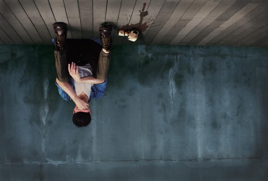
►El Festival abrirá en el Westchester Cultural Arts Center el jueves 4 de septiembre a las 8:30 p.m. con Las delicadas lágrimas de la luna menguante (Venezuela-USA),
►El Festival abrirá en el Koubek Center del Miami Dade College el viernes 5 de septiembre, a las 8:30 p.m. con Viento Blanco (Argentina).
►El Festival abrirá en el Adrienne Arsht Center for the Performing Arts – Carnival Studio Theater el jueves 11 de septiembre a las 8:30 pm con El brote (Argentina).
►El Programa Educativo del Festival, bajo la dirección de Beatriz J. Rizk, Ph.D., incluye talleres para niños y un coloquio inmediatamente después de cada estreno.
►El Festival celebrará el popular Día Internacional del Niño el sábado 20 de septiembre a las 5:00 p.m. en el Key Biscayne Community Center y el domingo 21 de septiembre de 2:00 a 6:00 p.m. en el Koubek Center del Miami Dade College.
►El Festival entregará el Premio a Una Vida de Dedicación a las Artes Escénicas a la Consultora Artística Internacional cubanoamericana Olga Garay-English, cofundadora del Festival Internacional de Teatro Hispano de Miami. La entrega se realizará el jueves 25 de septiembre, en el Carnival Studio Theater. Garay es la actual codirectora de la Iniciativa Nacional de Teatro Latinx (NLTI), además de haber sido la directora ejecutiva del Departamento de Asuntos Culturales de Los Ángeles, entre otros cargos que han permitido desarrollar una invaluable labor por el teatro nacional e internacional.
►El afiche del Día Internacional del Niño fue creado por Hayley Isabella González González, valiente luchadora de 7 años, de la Live Like Bella Childhood Cancer Foundation, quien nos regala su ingenio y creatividad para acompañar gráficamente este día tan importante en la programación del festival.
PROGRAMA
Jueves, viernes y sábado 4, 5 y 6 de septiembre | 8:30 pm
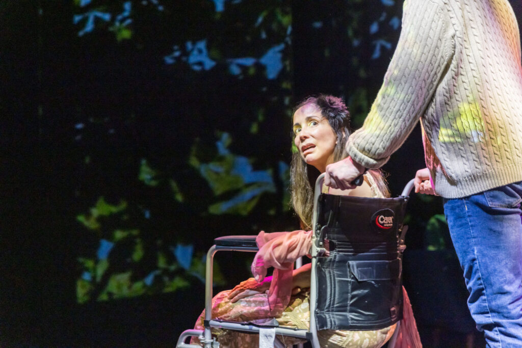
WATER PEOPLE THEATER, VENEZUELA – UNITED STATES
LAS DELICADAS LÁGRIMAS DE LA LUNA MENGUANTE
Escrita por Rebeca Alemán y dirigida por Iraida Tapias.
Inspirada en hechos reales, Las Delicadas Lágrimas de la Luna Menguante, explora las continuas violaciones a los derechos humanos que enfrentan los periodistas por decir la verdad. Paulina, una periodista comprometida y defensora de las víctimas de feminicidio y de las comunidades indígenas, despierta de un coma de cuatro meses tras un brutal ataque. Para lograr justicia, debe recuperar su memoria y revelar la verdad.
Entradas: 305.226.0030
www.roxyshows.com
Westchester Cultural Arts Center
7930 S.W. 40th Street (Tropical Park), Miami 33155
Estacionamiento gratis.
Viernes y sábado 5 & 6 de septiembre | 8:30 pm
Domingo 07 de septiembre | 5:00 pm
TEATRO FUTURO, Buenos Aires, ARGENTINA
VIENTO BLANCO
Escrita por Santiago Loza, protagonizada por Mariano Saborido y dirigida por Juanse Rausch y Valeria Lois.
Mario mantiene con su madre un hostal en un recóndito pueblo del sur. En otra época Mario supo tener un amigo. Hay un regreso, una despedida y el deseo de Mario de huir para siempre. Entre el mar helado, ardores, cánticos y mucho viento. Viento Blanco es una suerte de invocación en cuyo recorrido hay erotismo clerical, chinos, animales de mar frío, algo de humor y también una tenue melancolía.
Entradas: 305.237.7750
www.koubekcenter.org
Koubek Center Theatre
2705 S.W. 3rd Street, Miami, FL 33135
Estacionamiento valet gratis
Jueves, viernes & sábado 11, 12 & 13 de septiembre | 8:30 pm
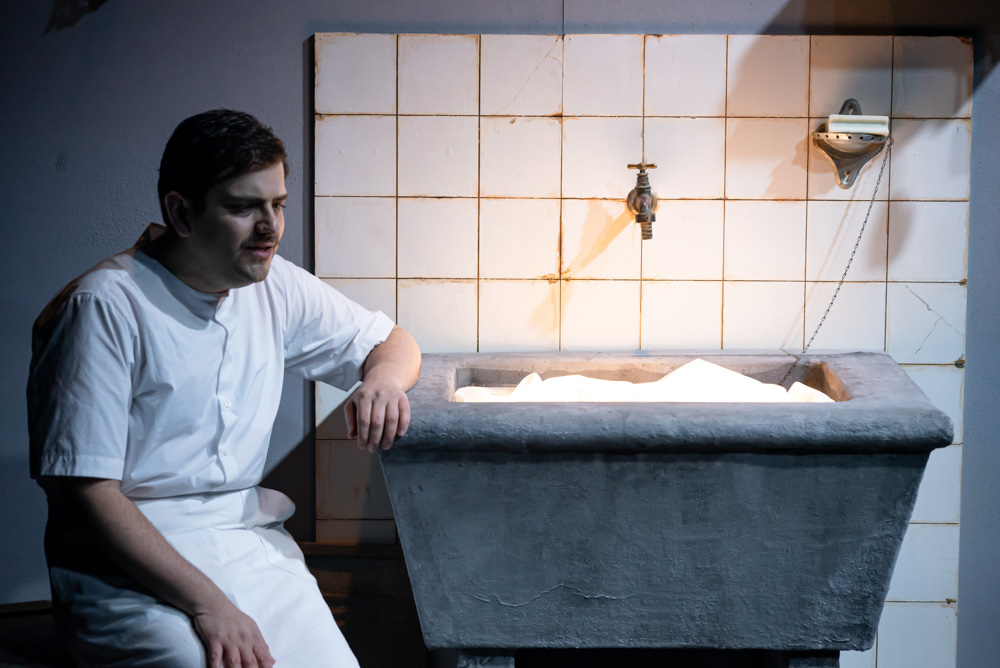
COMPAÑÍA CRIOLLA, Buenos Aires, ARGENTINA
EL BROTE
Escrito y dirigido por Emiliano Dionisi
A un actor se le comienzan a desdibujar los límites entre la ficción y la realidad y ahora desconfía de quien escribe los acontecimientos de su vida ¿Qué clase de personaje somos en esta historia? El Brote fue estrenado el 13 de febrero de 2023 en el Teatro del Pueblo de la Ciudad de Buenos Aires, Argentina, con una gran recepción por parte de la crítica y el público que le ha valido un reconocimiento nacional e internacional.
Entradas: 305.949-6722
www.arshtcenter.org
Adrienne Arsht Center Carnival Studio Theater
1300 Biscayne Boulevard, Miami, FL 33132
Parking: www.arshtcenter.org/parking
Viernes & sábado, 12 y 13 de septiembre | 8:30 pm
Domingo 14 de septiembre | 5:00 pm
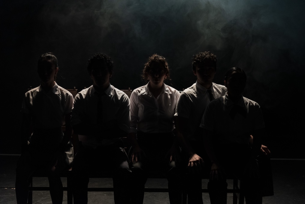
LOS TRISTES TIGRES, Ciudad de México, MEXICO
LOS QUE SOBRAN
Escrita y dirigida por Adrián Vázquez
Alejandro es un tipo poco común, padece un trastorno de inestabilidad emocional; Sofía, su hermana, es la líder del grupo. Edith, es buena para las peleas y defiende a sus amigos. Emilio es un desmadre. Y Camila es como la mascota del grupo, la intelectual. Los que sobran es la historia de estos cinco jóvenes, que se hicieron amigos en la adolescencia y, el tiempo y la experiencia, los volvieron compañeros de vida. Es una historia de amistad, de juventud, de humor, de rebeldía, coraje, pasión, violencia, crueldad… Es una historia de supervivencia y amor en un país como el que nos tocó vivir. Escrita y Dirigida por Adrián Vázquez galardonado con múltiples premios por su obra “ Wences y Lala”
Entradas: 305.226.0030
www.roxyshows.com
Westchester Cultural Arts Center
7930 S.W. 40th Street (Tropical Park), Miami 33155
Estacionamiento gratis.
LA TIRANA PRODUCCIONES, Cádiz, ESPAÑA
PALABODA
Un espectáculo creado por La Tirana Producciones e interpretado por Susana Rosado y Jay García
Divertida comedia en la que se cuenta la entrañable historia de Begoñita y Juanmanué, quienes tendrán que ponerse de acuerdo para la ansiada boda que tanto espera ella y de la que tanto huye él. Ella quiere una boda como Dios manda; él no quiere ponerse zapatos porque le aprietan; ella lleva velo porque la estiliza; él no quiere anillo porque se le hinchan los dedos; ella quiere convite con tarta, baile y champán; él quiere que termine pronto para irse a pescar… PALABODA es un divertimento, un rato de risas garantizadas.
Entradas: 305.949-6722
www.arshtcenter.org
Adrienne Arsht Center Carnival Studio Theater
1300 Biscayne Boulevard, Miami, FL 33132
Parking: www.arshtcenter.org/parking
Viernes & sábado, 19 y 20 de septiembre | 8:30 pm
Domingo 21 de septiembre | 5:00 pm
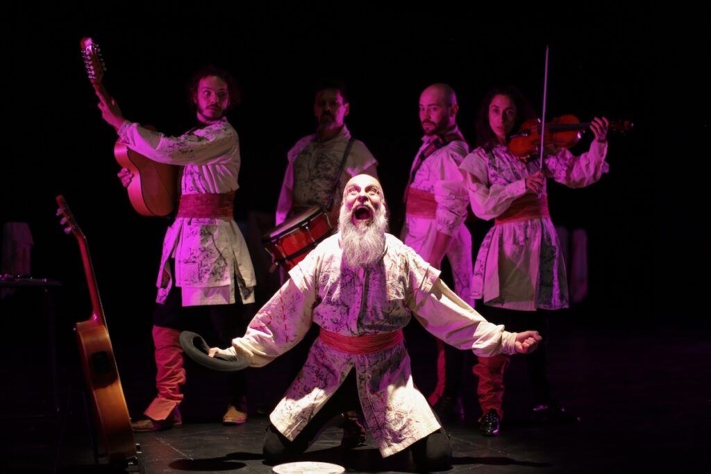
TRYO TEATRO BANDA, Santiago de Chile, CHILE
MAGALLANES
Escrita por Francisco Sánchez y Tryo Teatro Banda. Dirigida por Francisco Sánchez y Co dirigida por Eduardo Irrazábal.
Tryo Teatro Banda, recordando a los antiguos juglares medievales, enristra sus instrumentos como violín, tiple, acordeón, bajo eléctrico y percusión, y al son de su música y sus voces, prácticamente sin más escenografía que el despliegue del cuerpo y la imaginación, nos cuenta esta historia apasionante que incluye el primer encuentro entre navegantes extranjeros y los habitantes del sur del mundo.
Viernes & sábado, 19 y 20 de septiembre | 8:30 pm
Domingo 21 de septiembre | 5:00 pm
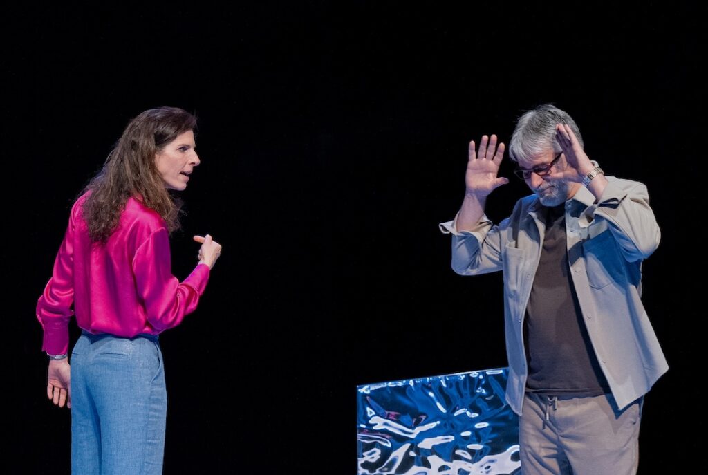
LA BELLOCH TEATRO, Madrid, ESPAÑA
PROTOCOLO
Escrita y dirigida por Abel González Melo
Una pareja atravesada por un conflicto ético, medioambiental, económico y político. Un estremecedor mapa humano donde el deber cívico choca con la intimidad. Una emocionante experiencia escénica que protagonizan dos primeras figuras del teatro español.
Entradas: 305.226.0030
www.roxyshows.com
Westchester Cultural Arts Center
7930 S.W. 40th Street (Tropical Park), Miami 33155
Estacionamiento gratis.
Domingo 21 de septiembre | 2:00 a 6:00 pm
DÍA INTERNACIONAL DEL NIÑO
COMPAÑÍA FUGAZ, Buenos Aires, ARGENTINA
COMICÓPICOS
Espectáculo creado por Osqui Guzmán y Leticia González de Lellis.
Comicópicos son dos divertidos artistas de variedades. A partir de juegos, escenas y canciones, sacan de la galera historias disparatadas, momentos cómicos y de interacción con el público de todas las edades. Brillo, talento y emoción garantizadas. Los Comicópicos dicen: “nuestras actuaciones son como la vida misma, no tienen guion escrito”. Prepárense para vivir esta divertida experiencia de improv para toda la familia!!!!
Leticia González de Lellis y OsquiGuzmán, integrantes de esta compañía, se dedican al teatro para la familia hace más de 20 años y han actuado y creado programas para la televisión dedicados a la infancia.
2:00 – 3:00 pm | Pintura facial, personaje en zancos y distribución de meriendas.
2:30 –5:00 pm | Juegos de Feria
3:00 – 5:00 pm | Talleres: Pintura, Títeres, Danza y Percusión
3:00 & 5:00 pm | Espectáculo: Comicópicos – Buenos Aires, ARGENTINA
Entradas: 305.237.7750
www.koubekcenter.org
Koubek Center Theatre
2705 S.W. 3rd Street, Miami, FL 33135
Estacionamiento valet gratis
Jueves, viernes & sábado 25, 26 & 27 de septiembre |
8:30 pm Domingo 28 de septiembre | 5:00 pm
TEATRO AVANTE | Miami, UNITED STATES
LEAR
Dramaturgia y Dirección de Neher Jacqueline Briceño, inspirada en “El Rey Lear” de William Shakespeare (Estreno Mundial)
La caída del poder patriarcal y el derrumbe de una familia a través de un viaje por la memoria fragmentada de Lear, enmarcan esta perspectiva contemporánea del clásico Shakesperiano, donde las confrontaciones internas padre/hijas y las consecuencias del poder toman la palabra. Entre ellos, una figura joven —el bufón, el eco, el puente— irrumpe con verdades que ya no pueden callarse porque en Lear el tiempo no avanza, se repite, se disuelve, se abre como una herida que transforma la memoria del viejo gobernante en un campo de batalla.
Entradas: 305.949-6722
www.arshtcenter.org
Adrienne Arsht Center Carnival Studio Theater
1300 Biscayne Boulevard, Miami, FL 33132
Parking: www.arshtcenter.org/parking
TEATROS-ENTRADAS-ESTACIONAMIENTOS
ADRIENNE ARSHT CENTER FOR THE PERFORMING ARTS – CARNIVAL STUDIO THEATER
1300 Biscayne Boulevard, Miami
www.arshtcenter.org
Entradas: $34.00
$29.00 – Personas mayores de 65 años, estudiantes y personas especiales (No incluye 17% handling fee)
305.949.6722 / www.arshtcenter.org
Estacionamiento: www.arshtcenter.org/parking
305.949.6722.
WESTCHESTER CULTURAL ARTS CENTER
7930 S.W. 40th Street (Tropical Park), Miami – 33155
305.226.0030 – www.roxyshows.com Entradas: $30.00
$25.00 – Personas mayores de 65 años, estudiantes y personas especiales
Estacionamiento gratis.
KOUBEK CENTER THEATRE
2705 SW 3rd St., Miami, FL, 33135
305.237.7750 / www.koubekcenter.org
Entradas: $30.00
$25.00 – Personas mayores de 65 años, estudiantes y personas especiales
Estacionamiento valet gratis.
(Día Internacional del Niño, 21 de julio)
Reservaciones: 305.237.7750
www.koubekcenter.org
KEY BISCAYNE COMMUNITY CENTER
10 Village Green Way, Key Biscayne – 33149
305.365-8900 / www.keybiscayne.fl.gov
Admisión y estacionamiento gratis
Teatro Avante participa en los programas de extensión a la comunidad Golden Ticket y Culture Shock Miami (www.CultureShockMiami.com) del Miami-Dade County Cultural Affairs Council. Las salas donde se presenta el Festival Internacional de Teatro Hispano de Miami son accesibles en sillas de ruedas. Una de las obras se presentará en español con supertítulos en inglés. Para solicitar materiales en formatos accesibles, intérpretes de lenguaje por señas o adaptaciones para las discapacidades, favor escribir a [email protected] por lo menos cinco días antes del evento. Usuarios de TTY también pueden llamar al 711 (Florida Relay Service).
AGRADECEMOS EL APOYO DE NUESTRO PATROCINADORES
MIAMI-DADE COUNTY DEPARTMENT OF CULTURAL AFFAIRS, THE CULTURAL AFFAIRS COUNCIL, THE MAYOR AND THE MIAMI- DADE COUNTY BOARD OF COUNTY COMMISSIONERS, ADRIENNE ARSHT CENTER FOR THE PERFORMING ARTS OF MIAMI-
DADE COUNTY, MIAMI-DADE COUNTY AUDITORIUM AT WESTCHESTER CULTURAL ARTS CENTER, MIAMI DADE COLLEGE’s KOUBEK CENTER, THE ROXY THEATRE GROUP, SOUTH ARTS, NATIONAL LATINX THEATER INITIATIVE, MARRIOTT MIAMI BISCAYNE BAY, KEY BISCAYNE COMMUNITY FOUNDATION, THE VILLAGE OF KEY BISCAYNE, KEY BISCAYNE COMMUNITY CENTER, CONECTA MIAMI ARTS, BACARDÍ, TOY, UNITED ALIENS ARTISTS FOUNDATION, GLOBAL DREAMS USA, NUPRESS OF MIAMI, LIVE LIKE BELLA CHILDHOOD CANCER FOUNDATION, ARTS & BUSINESS COUNCIL OF MIAMI
PATROCINADORES PUBLICITARIOS
UNIVISION23, UNIVISION RADIO, MIX 98.3, AMOR 107.5, UNIVISION DEPORTES, DIARIO LAS AMERICAS, THE MIAMI HERALD/EL NUEVO HERALD, I’M NOT YOUR BORING NEWSPAPER, THE ISLANDER NEWS.
EL FESTIVAL INTERNACIONAL DE TEATRO HISPANO DE MIAMI HA OBTENIDO CINCO PRESTIGIOSOS PREMIOS INTERNACIONALES:
FEDERICO GARCÍA LORCA, OLLANTAY y FIT DE CÁDIZ–ATAHUALPA DEL CIOPPO de ESPAÑA, KUSILLO de BOLIVIA y UCSUR del PERÚ
POR SU CONTRIBUCIÓN AL DESARROLLO DEL TEATRO HISPANO EN AMÉRICA.