Home Blog Page 29

Albert Bierstadt. He Painted the Mountains Like No One Else

Albert Bierstadt
Albert Bierstadt

Albert Bierstadt. He Painted the Mountains Like No One Else

Born in 1830 in Solingen, Germany, Albert Bierstadt would become one of the most influential landscape painters of the 19th century and a defining visual voice of the American West. When he was only three years old, his family emigrated to the United States, a move that would shape both his life and his art. It was in America that Bierstadt encountered the vast, untamed wilderness that would become the central subject of his work.

From Europe to the New World

Although raised in the United States, Bierstadt returned to Europe to pursue formal artistic training. He studied at the Düsseldorf School, where he absorbed a disciplined, highly detailed approach to painting, along with a taste for dramatic composition and theatrical lighting. This European academic foundation would later distinguish his work from many of his contemporaries.

When Bierstadt returned to America, he applied this refined technique to landscapes of unprecedented scale. The result was something new: American nature rendered with Old World precision and Romantic grandeur.

Albert Bierstadt

The American West as Vision

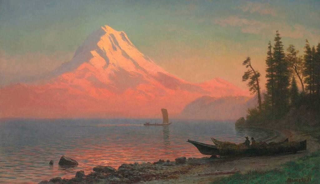
As a prominent member of the Hudson River School, Bierstadt became famous for his monumental views of the American West. His paintings depict towering mountain ranges, sweeping valleys, and luminous skies, often bathed in an almost supernatural light. These were not simple records of geography; they were visions of a land both real and idealized.

Beginning in 1859, Bierstadt undertook a series of extensive expeditions across the continent. With sketchbook in hand, he traveled through the Rocky Mountains, Yosemite Valley, the Sierra Nevada, Oregon, and the Columbia River region. These journeys allowed him to study the landscape firsthand and provided the raw material for the large-scale studio paintings that would later captivate audiences.

Light, Scale, and Spectacle

Bierstadt was known for his immense canvases and his masterful control of light. Glowing sunsets, mist-filled valleys, and radiant mountain peaks dominate his compositions. His work is often associated with luminism, a style characterized by serene surfaces, careful detail, and atmospheric light.

He was also a savvy self-promoter. Bierstadt frequently presented his paintings as theatrical events, unveiling them to the public in specially arranged exhibitions. Viewers paid admission to stand before his canvases, experiencing the American wilderness as something sublime and almost spiritual.

A Life of Travel and Devotion

Beyond the American West, Bierstadt also traveled to Canada and the Bahamas, notably while caring for his ailing wife. Even during these personal trials, he continued to paint, maintaining an unwavering commitment to his artistic vision.

He lived for periods in San Francisco and later New York, remaining deeply engaged with the art world while devoting his life to depicting the majesty of nature. Although his popularity declined toward the end of his life as artistic tastes shifted, his dedication never wavered.

Legacy of a Visionary

Albert Bierstadt died in 1902, leaving behind a vast body of work that forever shaped how the American landscape was imagined. His paintings did more than document nature — they transformed it into vision, elevating mountains, valleys, and skies into symbols of national identity and natural wonder.

A prolific artist and a charter member of the Boone and Crockett Club, one of North America’s earliest conservation organizations, Bierstadt also played a role in fostering appreciation for the preservation of natural landscapes. His images helped inspire public interest in places like Yosemite, contributing indirectly to the conservation movement.

Today, Bierstadt is remembered not just as a painter of scenery, but as an artist who captured the American West at a moment when it still felt boundless — luminous, monumental, and forever on the edge of myth.

Hasui Kawase. Every Evening, He Held Back the Sun

Hasui Kawase
Hasui Kawase

Hasui Kawase. Every Evening, He Held Back the Sun

Every evening, in his prints, the sun does not disappear abruptly.
It lingers.
And Hasui lets it.

Born in Tokyo in 1883 into a family of merchants, Hasui Kawase grew up surrounded by the quiet rhythms of everyday Japan. From an early age, he showed a sensitivity to landscape and atmosphere, drawn not to spectacle, but to the subtle poetry of place — a temple at dusk, a road after snowfall, a shoreline as daylight fades.

Trained in both traditional Japanese art and Western painting techniques, Hasui developed a visual language that bridged eras. This dual education would become central to his career, allowing him to modernize woodblock printing without abandoning its spiritual roots.

The Shin-hanga Revolution

A turning point came in 1918, when Hasui met the visionary publisher Watanabe Shōzaburō. Together, they helped define and elevate the shin-hanga movement — a revival of traditional woodblock printing adapted to modern sensibilities and international audiences.

While shin-hanga embraced collaboration between artist, carver, printer, and publisher, Hasui’s personal vision stood apart. His works were not loud declarations of modernity; instead, they were whispers, filled with atmosphere, restraint, and emotional depth.

Hasui Kawase

Light, Silence, and the Human Absence

Over the course of his life, Hasui created more than 600 landscape prints. Many are notably empty of people, yet deeply human in feeling. Snowfall muffles sound. Evening light lingers longer than expected. Rain turns streets into mirrors. In Hasui’s hands, nature is not a backdrop — it is the main subject, alive with mood and memory.

He was, above all, a master of light. Twilight, moonlight, snowfall, and fading sunsets recur throughout his work. These moments are transitional, suspended between day and night, movement and stillness. It is in these pauses that Hasui found his voice.

His prints do not rush. They seem to hold back time, as if allowing the viewer one final breath before night fully arrives.

A National Treasure

In 1956, Hasui Kawase was officially recognized by the Japanese government as a Living National Treasure, honoring his role in preserving and elevating the art of woodblock printing. The title acknowledged not only his technical mastery, but his profound contribution to Japan’s cultural memory.

By the time of his death in 1957, Hasui had left behind a body of work defined by gentleness, precision, and emotional clarity. His landscapes do not shout; they resonate. They invite contemplation, offering a vision of Japan — and of time itself — quietly settling into rest.

A World Falling Asleep

Hasui Kawase did not paint dramatic moments. He painted what happens after — when footsteps fade, when light softens, when the world exhales. His unique gaze captured the beauty of endings that are not final, but tender.

Hasui Kawase

Morozumi Osamu. The Singular Vision

Morozumi Osamu
Morozumi Osamu

Morozumi Osamu. The Singular Vision of a Japanese Printmaking Master

In the rich and ever-evolving landscape of Japanese printmaking, Morozumi Osamu (両角修) stands as a figure of quiet innovation. Born in 1948 in Nagano Prefecture, Morozumi is among the first generation of Japanese artists to emerge in the aftermath of World War II — a time of reconstruction, reflection, and artistic redefinition. Alongside contemporaries such as Kawachi Seiko, Morozumi helped shape the postwar legacy of Japanese woodblock printmaking with a voice that is both deeply traditional and unmistakably his own.

Though he would later be recognized internationally for his contributions to hanga (Japanese printmaking), Morozumi’s journey began in the realm of sculpture. At Tama Art University, he studied under the renowned Fukita Fumiaki, whose influence would resonate throughout his career. It was during these formative years that Morozumi began to carve his own path — quite literally. In 1972, before even completing his formal education, he was awarded the Young Talent Award by the Japanese Print Association and took first prize at the Nichido Grand Print Exhibition, signaling the arrival of a remarkable new voice in Japanese art.

Sculpting Shadows in Monochrome

Since the early 1970s, Morozumi has dedicated himself to an original technique that bridges his background in sculpture with the aesthetic discipline of woodblock printing. Using nails of varying sizes to perforate the woodblock, he creates intricate, monochrome prints that shimmer with light and shadow. These aren’t merely images — they are meditations. The resulting works possess a quiet drama, a sculptural density, and a rhythmic tension between form and void.

Unlike many artists who title their works as a guide for interpretation, Morozumi typically leaves his prints untitled and numbered, inviting viewers into a more personal, contemplative space. His work resists easy categorization — at once minimalist and organic, architectural and mysterious. They evoke not so much a narrative as a sensation — of wind through trees, the hush of sacred spaces, the weight of stillness.

A Global Imprint

Morozumi’s artistic vision has resonated far beyond Japan’s borders. Since 1975, his work has been exhibited internationally and has appeared in major texts on contemporary Japanese printmaking, including Gendai hanga zukan and publications by Lawrence Smith, the former curator of Japanese art at the British Museum. His prints, often modest in size but immense in presence, have found homes in galleries and private collections around the world.

A Gaze That Sees Beyond Borders

While the title Japanese Gaze on Nepal may suggest geographic observation, Morozumi’s true gaze is inward, timeless, and transcultural. His work doesn’t depict Nepal, or any specific place; rather, it echoes the meditative landscapes of the soul — places where silence speaks, and light carves meaning from darkness.

In a world saturated with color, noise, and speed, Morozumi Osamu’s monochrome visions offer a retreat — a chance to look, really look, into the subtlety of things. Through wood and nail, shadow and form, he reminds us that sometimes, the most profound revelations lie in what is left unsaid.

Frits Thaulow: When Water Becomes a Living Mirror

Frits Thaulow
Frits Thaulow Water Mill 1892

When Water Becomes a Living Mirror: The Art of Frits Thaulow

Frits Thaulow reminds us that art, at its best, does more than depict the world — it awakens it.

Among the masters of Impressionism, Frits Thaulow (1847–1906) holds a distinctive place — not only for his technical brilliance but for his rare gift of rendering water as something almost alive. His paintings transform rivers, canals, and reflective surfaces into living mirrors, capturing not just their physical presence but their emotional resonance.

A Nordic Eye with Global Reach

Born in Norway and classically trained at the Academy of Fine Arts in Copenhagen and later in Karlsruhe, Germany, Thaulow began his artistic journey deeply rooted in the Nordic landscape tradition. Early in his career, he immersed himself in the coastal beauty of Skagen, Denmark, where light and sky interact in uniquely northern ways. This period laid the foundation for his lifelong fascination with natural light and atmospheric movement.

Impressionism with Depth

Though associated with Impressionism, Thaulow’s work diverges from its Parisian core. Where Monet focused on fleeting light and loose forms, Thaulow sought structure, clarity, and texture, particularly in his treatment of water. His rivers flow, ripple, shimmer, and reflect — yet never blur into abstraction. In Thaulow’s world, water is both a surface and a depth, a mirror and a movement.

The French Years

After moving to France in 1892, Thaulow’s style matured into something uniquely his own. He traveled and painted across the French countryside, settling in quiet towns where he found inspiration in everyday scenes — stone bridges, quiet mills, tree-lined canals. His canvases from this period feel intimate yet grand, infused with an emotional sensitivity that transcends geography.

Thaulow wasn’t just painting places — he was capturing states of being. A tranquil stream under bare trees, a frozen riverbank, or a canal glimmering at dusk — all radiate a silent intensity, a sense that nature itself is aware.

Recognition and Legacy

Celebrated during his lifetime, Thaulow was awarded numerous honors, most notably the Légion d’honneur, France’s highest cultural distinction. Yet his legacy stretches far beyond medals. He remains a key figure in Norwegian art history and a touchstone for painters of water and light around the world.

Even today, viewers stand before his works and wonder: How can still water feel so alive?
The answer lies in Thaulow’s ability to blend observation with emotion — to see nature not just as it is, but as it feels.

Marketing en Redes Sociales para Artistas en 2026

Marketing en Redes Sociales para Artistas en 2026

Marketing en Redes Sociales para Artistas en 2026: Más que Publicar Imágenes

En 2026, el arte ya no se muestra solo en galerías. Vive, respira y se vende en redes sociales. Para artistas visuales, las plataformas digitales se han convertido en herramientas esenciales no solo para mostrar obra, sino para construir marcas personales, conectar con audiencias globales y generar ingresos reales.

Pero el simple hecho de publicar imágenes ya no es suficiente. El éxito requiere estrategia, autenticidad y visión a largo plazo.

Del portafolio a la narrativa: redes que conectan

Las redes sociales —especialmente Instagram, TikTok y Pinterest— siguen siendo los espacios dominantes para artistas visuales. Pero hoy, la clave no es solo exhibir una obra terminada, sino invitar al público al proceso creativo, compartir la historia detrás de cada pieza, y construir una identidad artística coherente.

Estudios recientes muestran que los artistas que desarrollan una narrativa visual fuerte y auténtica logran no solo mayor engagement, sino conexiones más duraderas con sus seguidores.

La autenticidad no es opcional

La audiencia digital actual valora la transparencia. Mostrar imperfecciones, etapas del proceso, errores y decisiones creativas humaniza al artista y fortalece el vínculo con la comunidad. Esta autenticidad, más que una estética pulida, es lo que impulsa el crecimiento orgánico en 2026.

Las métricas más valiosas ya no son solo seguidores o “likes”, sino interacción genuina: comentarios, mensajes, guardados, reacciones, y recomendaciones de persona a persona.

El campo de batalla del algoritmo: constancia con estrategia

Aunque los algoritmos de plataformas cambian constantemente, ciertos principios se mantienen:

  • Publicar con regularidad, sin saturar
  • Diversificar formatos: reels, carruseles, lives, historias
  • Incluir llamadas a la acción (CTA): desde “guarda esto” hasta “comenta tu opinión”
  • Usar palabras clave y hashtags relevantes, tanto en captions como en alt text (sí, Instagram lo permite)
  • Aprovechar momentos relevantes y tendencias, sin perder la coherencia artística

Un error común es publicar sin objetivo. Hoy, los artistas exitosos planifican su contenido: equilibran publicaciones de producto terminado, proceso creativo, estilo de vida artístico, inspiración, y educación para su audiencia.

Construcción de comunidad > promoción directa

La venta de arte en redes sociales es una consecuencia de crear una comunidad, no el objetivo inmediato. Las audiencias no quieren ver solo promociones; quieren conectar emocionalmente con el artista. En este sentido, la interacción —responder comentarios, agradecer menciones, compartir aportes de seguidores— es tan importante como el contenido mismo.

De seguidor a coleccionista: el embudo artístico

El recorrido del seguidor hacia la compra es sutil y emocional. En 2026, los artistas visuales más exitosos entienden que cada publicación debe:

  1. Atraer con valor visual o narrativo
  2. Nutrir con contenido que educa, entretiene o inspira
  3. Convertir cuando la conexión emocional es fuerte (ya sea comprando una obra, encargando una pieza o compartiendo tu perfil)

Este embudo no ocurre en una sola red. Cada plataforma cumple un rol distinto:

  • Instagram es vitrina + storytelling
  • TikTok es descubrimiento + entretenimiento
  • Pinterest es búsqueda visual + inspiración a largo plazo
  • YouTube (en algunos casos) permite profundizar en el proceso creativo o vida del artista

El campo invisible: metadatos y optimización

Aunque Instagram y TikTok no manejan “metadatos” como Amazon, sí existen elementos clave que cumplen esa función:

  • Nombre de perfil y biografía optimizados con palabras clave
  • Descripciones (captions) claras, humanas y con intención
  • Hashtags funcionales, no solo decorativos
  • Texto alternativo (alt text) para accesibilidad y visibilidad

Cada uno de estos detalles ayuda al algoritmo a entender quién eres y a quién debería mostrarle tu contenido.

La paradoja del artista conectado

Finalmente, en 2026 el reto no es solo crecer, sino sostener una presencia digital que no te agote como creador. La visibilidad es importante, pero no puede venir a costa de tu salud mental o de tu práctica artística.

La clave está en encontrar tu ritmo, automatizar lo necesario, colaborar con otros artistas y plataformas, y recordar que tu valor no se mide en seguidores, sino en impacto y conexión.

El marketing en redes sociales para artistas en 2026 no se trata solo de vender, sino de crear relaciones, compartir procesos, y construir identidad visual en comunidad. El mundo del arte ha cambiado. Y ahora más que nunca, ser artista también implica ser narrador, estratega y ser humano visible.

Max Brandrett

max brandrett
Max Brandrett

Max Brandrett: Britain’s Most Notorious Art Forger

Max Brandrett is a British artist best known not for original works, but for his uncanny ability to replicate the styles of history’s greatest painters. Dubbed “Britain’s No. 1 art forger,” Brandrett’s life has been a blend of artistic brilliance, deception, and self-reflection.

Born in 1948, Brandrett began forging artwork in his youth, driven by a mix of artistic passion and financial necessity. Over the years, he created convincing imitations of Caravaggio, Vermeer, Rembrandt, and other Old Masters. His fakes were so expertly done that many passed through auction houses and art dealers, fooling even experienced experts.

Despite several brushes with the law, Brandrett’s forgeries were often sold not as malicious scams but as curiosities — sometimes with full disclosure, other times not. In recent years, he has spoken publicly and humorously about his past, including at the Cambridge Union, where he discussed the blurred lines between imitation, creativity, and fraud.

Brandrett’s story has been featured in Vice, the BBC, and national newspapers, and he has become a kind of folk hero for those fascinated by the contradictions of the art world. He now paints openly under his real name and has exhibited replica works and original pieces under the theme of art’s value, perception, and deception.

He tells his amazing rags-to-riches life story to millions through podcasts, personal appearances, in print and in interviews – from a childhood in Barnardo’s homes, to running away and joining the circus, hoodwinking the art world with his paintings and drawings, mixing with the great and the good (and the not so good), and giving away tens of thousands of pounds in charitable donations. 

Max Brandrett

“That idea of starting over is fundamental.” Waltercio Caldas

Waltércio Caldas
Waltércio Caldas

That idea of starting over is fundamental.” Waltercio Caldas

Moma.org

“I would like to produce an object with the maximum presence and the maximum absence,” Waltercio Caldas said in 1990.1
 At the time, Caldas had been pursuing this goal for 30 years, producing drawingsprints, and sculptures that occupy the flickering space between there and not there. In his varied practice, wire sculptures outline forms in space, glass objects mimic the surface tension of water, and the blank page of a work on paper is at least as important as the marks applied to it.

Raised in a modern home designed by his architect father in Rio de Janeiro, Caldas committed to art at an early age. He completed academic training at the School of Fine Arts before pursuing a more theoretical and experimental course at Rio’s Museum of Modern Art (newly completed in 1955) with the celebrated Concrete painter Ivan Serpa. In 1967, when he was 21, Caldas destroyed every drawing he had made and started over. “This act left a lasting impression on me, and it is still present in my mind whenever I need to make a decision,” the artist recalled in 2016. “That idea of starting over is fundamental.”

From then on, Caldas approached the making of each artwork as a discrete act of creation. “Art objects are—or should be—inaugural objects,” he has insisted, “and despite being connected by a subjective series of an artist’s choices, each new object changes the pattern of the artist’s work dramatically.”

 While he has disavowed the development of a single theme across his work, his pursuit of novelty is an ongoing commitment. End (Fim), from 1973, explores this cherished contradiction, featuring six rows of seven stickers printed with the word FIM—“END” in English—in a neat grid on a piece of photo paper. Crucially, the sticker that would complete the grid is missing at lower right, leaving the work open-ended. Here the artist shows us how conclusions can be renewals, too.

Caldas remained in Brazil during much of the period between 1964 and 1985, when a military dictatorship ruled the country. He channeled his antiauthoritarian political convictions into his editorial collaborations on the magazines Malasartes (1975–76) and A Parte do Fogo (1980) with fellow artists Cildo MeirelesJosé ResendeCarlos Zilio, and the critic Ronaldo Brito. In these provocative albeit short-lived publications, the contributors defended art’s place within the public sphere, which the dictatorship sought to curtail and foreclose. Meanwhile, Caldas continued making enigmatic, polished artworks that did not immediately reveal this turbulent context. While highly conceptual, Caldas’s resolutely physical objects garnered comparisons to New York Minimalism, a connection Caldas resisted. “To me, the ‘reduction to essentials’, a concept often used by Minimalists, sounds like a useful procedure only for a society of excess,” Caldas once remarked. “We never deal (at least in the art and culture of Brazil) with the idea of excess. Here, we have to produce both the artwork and the condition for the artwork at the same time.”

Instead of merely reflecting the historical conditions of his time, Caldas occupied himself with reflection itself. In the 1970s, he began to incorporate mirrors into his sculptures to draw attention to the machinations and seduction of illusion. The appealing red button affixed to Mirror of Light (1974), for example, disrupts our perception of finding a trustworthy image of the world in its reflection. References to the 17th-century Spanish painter Velázquez—a master of mirrors, mimesis, and social critique—appear throughout Caldas’s work. The sculpture Painted Iron, for example, takes its structure from Velázquez’s 1618 Christ in the House of Martha and Mary, while the artist’s book O Livro Velazquez features blurred reproductions of paintings with their figures removed.     

“Some people…question art’s utility of purpose, saying things like ‘art doesn’t change the world,’” Caldas has said. “But you see, art doesn’t have to do that; it’s enough for art to change language, expectations, people. That in itself is a real achievement.”

“Me gustaría crear un objeto capaz de contener la máxima presencia y la máxima ausencia”, dijo Waltercio Caldas en 1990.
 Por aquel entonces, Caldas llevaba treinta años persiguiendo ese objetivo, produciendo dibujosgrabados y esculturas que ocupaban el oscilante espacio entre estar y no estar ahí. En su variada producción, las esculturas de alambre dibujan formas en el espacio, los objetos de cristal imitan la tensión de la superficie del agua y la zona en blanco en una obra sobre papel es tan importante como las marcas que se le imprimen encima.

Caldas creció en Río de Janeiro, en una casa moderna diseñada por su padre arquitecto, y desde muy joven se volcó al arte. Primero completó su formación académica en la Escuela de Bellas Artes y luego se inclinó por un curso más teórico y experimental en el Museo de Arte Moderno de Río, recientemente acabado en 1955, con el célebre pintor de arte concreto Ivan Serpa. En 1967, cuando tenía veintiún años, Caldas destruyó todos los dibujos que había hecho y volvió a empezar. “Este hecho me marcó para siempre y sigue presente en mi memoria cada vez que tengo que tomar una decisión”, recordaba el artista en 2016. “La idea de volver a empezar es fundamental”.
  
Desde entonces, Caldas se planteó la realización de cada pieza de arte como una creación individual. “Los objetos de arte son —o deberían ser— objetos inaugurales”, ha insistido, “y a pesar de estar interconectados por una subjetiva serie de decisiones del artista, cada nuevo objeto cambia radicalmente el patrón de trabajo del artista”.
 Aunque se ha negado a desarrollar un único tema a lo largo de toda su carrera, su empeño en la novedad ha sido un compromiso constante. End (Fim), de 1973, plantea esta preciada contradicción al presentar seis filas de siete etiquetas impresas con la palabra “FIM” —“FIN” en español— que forman una prolija cuadrícula sobre un trozo de papel fotográfico. Pero, significativamente, falta la etiqueta que completaría la cuadrícula en la parte inferior derecha, lo que deja la obra abierta. Así, el artista nos muestra cómo las conclusiones también se pueden ver como renovaciones.      

Caldas permaneció en Brasil la mayor parte del periodo comprendido entre 1964 y 1985, época en la que la dictadura militar gobernaba el país. Canalizó sus convicciones políticas antiautoritarias en colaboraciones en las revistas Malasartes (1975–76) y A Parte do Fogo (1980), junto a los artistas Cildo MeirelesJosé ResendeCarlos Zilio y el crítico Ronaldo Brito. En estas publicaciones, de carácter provocador, aunque de corta vida, los colaboradores defendían la importancia del arte en la esfera pública, cosa que la dictadura intentaba restringir y prohibir. Mientras, Caldas continuó creando obras enigmáticas y refinadas que no revelaban de inmediato aquel turbulento contexto. Si bien eran muy conceptuales, a los objetos resueltamente físicos de Caldas se los comparó con el minimalismo neoyorquino, una referencia a la que Caldas se resistía. “En mi opinión, la «reducción a lo esencial», ese concepto que suelen utilizar los minimalistas, parece un procedimiento útil sólo en una sociedad caracterizada por los excesos”, comentó Caldas en una ocasión. “Jamás lidiamos (al menos en el arte y la cultura brasileña) con la idea de exceso. Aquí tenemos que producir la obra de arte y las condiciones para la obra de arte al mismo tiempo”.
  
En lugar de limitarse a reflejar las condiciones históricas de su época, Caldas se preocupó por el propio fenómeno del reflejo. En la década de 1970, empezó a incorporar espejos a las esculturas para llamar la atención sobre la manipulación y lo seductor de las ilusiones. El atractivo botón rojo colocado en Mirror of Light (1974), por ejemplo, perturba nuestra sensación de haber encontrado una imagen fidedigna del mundo gracias a su reflejo. A lo largo de toda la obra de Caldas se pueden ver referencias al pintor español del siglo XVII Velázquez —experto en espejismos, mimetismos y crítica social. La escultura Painted Iron, por ejemplo, está inspirada en la pieza de Velázquez Cristo en casa de Marta y María de 1618, mientras que el libro de artista O Livro Velazquez contiene borrosas reproducciones de cuadros a los que se les han quitado las figuras.     

“Algunas personas… cuestionan la utilidad del arte diciendo cosas como «el arte no cambia el mundo» —ha comentado Caldas— Pero mire, el arte no tiene que hacer eso; basta con que modifique el lenguaje, las expectativas, a las personas. Eso ya es un verdadero logro”.

Elise Chagas, Mellon-Marron Research Consortium Fellow, Department of Drawings and Prints and the Cisneros Institute, 2022

Elise Chagas, becaria del Consorcio de Investigación Mellon-Marron, Departamento de Dibujos y Grabados, y del Instituto de Investigación Patricia Phelps de Cisneros, 2022

Source: https://www.moma.org/artists/7615-waltercio-caldas

Galería La Cometa: arte colombiano en el mundo

Galería La Cometa
Galería La Cometa

Galería La Cometa: Arte Colombiano desde Bogotá al Mundo

Durante un recorrido por la feria Estampa, la galería La Cometa se destacó como uno de los espacios más notables, gracias a su propuesta de arte latinoamericano y una conversación cercana con Esteban Jaramillo, parte de la familia fundadora del proyecto.

Un Proyecto con Raíces y Visión Internacional

Esteban Jaramillo explica que Galería La Cometa fue fundada en 1986 y hoy se encuentra en una etapa de expansión.
“La galería principal está en Bogotá, en el tradicional Barrio Chico”, cuenta. “La galería principal está en Bogotá, en el tradicional Barrio Chico”, comenta. “También tenemos sedes en Medellín, Madrid y recientemente abrimos La Cometa Miami. Mi padre, fundador y director, continúa al frente, y ahora, como segunda generación, mis hermanos y yo estamos dando un vuelco más internacional al proyecto”.

Primera Participación en Estampa con su Espacio en Madrid

Este 2023 marcó la primera participación de La Cometa en Estampa, a través de su nueva sede madrileña, inaugurada en abril.
“Tenía referencias muy positivas de colegas galeristas”, comenta Jaramillo. “Estampa ha cambiado mucho. Originalmente estaba más enfocada en la serigrafía, pero hoy es un espacio mucho más abierto y dinámico”.

Estampa vs. ARCO: Diferentes Públicos, Diferentes Objetivos

Esteban distingue claramente entre ambas ferias: “ARCO es la feria principal de España, con un reconocimiento internacional muy amplio. Estampa, en cambio, es más local; muchas de las galerías participantes son españolas. Pero tiene un valor clave: conecta con un público interesado en obras de arte con precios más accesibles, lo cual responde a una nueva dinámica de coleccionismo”.

También mencionó haber recibido buenas referencias sobre Art Madrid, otra feria con enfoque contemporáneo.

La Cometa: Una Plataforma para el Arte Latinoamericano

Más allá de su presencia en ferias, Galería La Cometa reafirma su compromiso con el arte latinoamericano, abriendo espacios que conectan la escena colombiana con mercados internacionales. Su participación en eventos como Estampa refuerza la idea de que el arte puede ser accesible sin perder profundidad, y que las galerías pueden jugar un papel vital en tender puentes entre regiones, estéticas y públicos.

La Cometa Miami

1015 NW 23rd Street, Unit 2. 33127

La Cometa Bogotá

Carrera 10 No. 94 A – 25

La Cometa Madrid

Calle San Lorenzo 11

La Cometa Medellín

Calle 10A # 37 – 40

Artistas y sus países:

  1. Adam Goldstein – Colombia
  2. Adrián Gaitán – Colombia
  3. Alejandro Ospina – Colombia
  4. Alejandro Sánchez – Colombia
  5. Ana González – Colombia
  6. Camilo Restrepo – Colombia
  7. Carlos Castro – Colombia
  8. Daniel Nyström – Suecia
  9. Fernando Pinto – Colombia
  10. Gabriela Pinilla – Colombia
  11. Glenda León – Cuba
  12. Johan Samboni – Colombia
  13. Juan Cárdenas – Colombia
  14. Juan Delgado – Colombia
  15. Juan Jaramillo – Colombia
  16. Justyna Kisielewicz – Polonia
  17. Liliana García – Colombia
  18. Luisa Pastor – España
  19. Miguel Ángel Rojas – Colombia
  20. Ricardo Cárdenas – Colombia
  21. Vanessa Gómez C. – Colombia

Save the date: Made in Miami

Made in Miami
Save the date: Made in Miami

Save the date

Made in Miami
December 2, 2025 – January 23, 2026
Opening Reception: Tuesday, December 2, 2025, 6–9 PM
Miami Beach Visual Arts Gallery
1602A Washington Avenue
Miami Beach, FL 33139

Free and open to the public

Miami Beach Visual Arts Gallery is pleased to present Made in Miami, a group exhibition celebrating the vibrant and diverse community of artists shaping Miami’s contemporary cultural landscape. On view from December 2, 2025, through January 23, 2026, the exhibition brings together ten Miami-based artists whose practices span installation, painting, experimental media, feminist perspectives, and critical explorations of place and culture.

Featuring the work of Dudley Alexis, Laura Magdalena Alfonso, Alex Berlin, Paulette Harrington, Rhea Leonard, Nina Ellery Oliveira, Nathalia Padilla, Devora Perez, Sterling Rook, and Ana Vergara, Made in Miami highlights the city as both a site of inspiration and a space for experimentation, dialogue, and exchange. Together, these artists reflect the creative energy, plurality of voices, and evolving narratives that define Miami today.

Several participating artists are current MFA students, alongside FIU alumni, underscoring the city’s role as a dynamic incubator for emerging and established artistic practices. The exhibition offers a collective portrait of Miami as a place where personal histories, social concerns, and cultural identities intersect through contemporary art.

The opening reception on Tuesday, December 2, from 6 to 9 PM, invites the public to engage directly with the artists and their work, celebrating the collaborative spirit that continues to fuel Miami’s thriving art scene.

Made in Miami is made possible with the support of the City of Miami Beach Department of Tourism and Cultural Development, the Office of Cultural Affairs, and the Miami Beach Mayor and City Commissioners.

The exhibition will remain on view through January 23, 2026, at Miami Beach Visual Arts Gallery, 1602A Washington Avenue, Miami Beach, FL 33139.

Your Name & Your Art Style Speak for Your Brand

La Marca Personal: El Pilar del Mercadeo para el Artista Visual

Your Name & Your Art Style Speak for Your Brand

In the crowded landscape of contemporary art, where thousands of creators vie for attention across galleries, social media, and digital platforms, two elements rise above the noise: your name and your art style. These aren’t just labels or aesthetic choices—they’re the foundation of your artistic identity, the bridge between your creative vision and your audience’s perception.

Your name carries weight. It’s the first thing collectors remember, the signature that authenticates your work, the search term that leads viewers to your portfolio. But a name alone is just a word. It’s when your name becomes synonymous with a distinct visual language—a recognizable style, a particular approach to color, form, or subject matter—that it transforms into a brand.

The Power of Recognition

Think of the artists whose work you can identify without seeing a signature: Frida Kahlo’s bold self-portraits with their surrealist undertones. Jean-Michel Basquiat’s raw, graffiti-inspired compositions. Yayoi Kusama’s infinite polka dots. These artists didn’t just create beautiful work—they developed visual languages so distinctive that their names and styles became inseparable.

This recognition doesn’t happen by accident. It emerges from commitment to a creative vision and the courage to refine it over time. When your style becomes your signature, every piece you create reinforces your brand. Viewers begin to anticipate what they’ll experience when they encounter your work, and that anticipation builds loyalty, interest, and value.

Authenticity as Your North Star

The most powerful artistic brands aren’t manufactured—they’re authentic expressions of who the artist truly is. Your style should emerge from your experiences, your obsessions, your way of seeing the world. It should feel inevitable, not forced.

This doesn’t mean you can’t evolve or experiment—growth is essential to any creative practice. But there’s a difference between natural evolution within your artistic DNA and chasing trends to gain followers. Audiences can sense the difference. Authenticity resonates on a deeper level than imitation ever could.

Your name attached to authentic work builds trust. Over time, that trust translates into a reputation—the kind that opens doors to exhibitions, commissions, and opportunities aligned with your creative goals.

Consistency Creates Clarity

Consistency doesn’t mean repetition—it means maintaining a coherent visual thread that runs through your body of work, even as individual pieces vary. This could be a consistent approach to composition, a recurring color palette, a particular technique, or a thematic focus that anchors your practice.

When people see multiple pieces of your work, they should be able to draw connections. This consistency helps viewers understand your artistic perspective and makes your work more memorable. In practical terms, it makes your portfolio stronger, your exhibitions more cohesive, and your presence in the art world more defined.

Your name becomes the umbrella under which this consistent vision lives. Each time someone encounters your work—whether in a gallery, on Instagram, or in a publication—that encounter reinforces the association between your name and your distinctive approach.

Your Style as Communication

Art is communication, and your style is your dialect. It conveys not just what you create, but how you think, what you value, and what you want viewers to feel. A minimalist approach might communicate restraint and contemplation. Bold, gestural work might express energy and emotion. Intricate detail might reflect patience and obsession.

This visual communication extends your reach beyond words. Someone who doesn’t speak your language can still understand your work. Someone who has never met you can still feel your presence in your art. Your style becomes your voice in rooms you’ll never physically enter—in conversations you’ll never directly join.

Building Legacy Through Consistency

The artists we remember across decades and centuries are those who developed a strong point of view and committed to it. Their names endure because their styles created lasting impact. This isn’t about overnight success—it’s about building a body of work that adds up to something greater than the sum of its parts.

Every piece you create with your authentic style becomes another thread in the tapestry of your artistic legacy. Over months and years, those threads weave together to create a recognizable pattern. Your name becomes shorthand for that pattern, that approach, that unique way of making sense of the world through art.

Practical Steps Forward

Understanding the importance of name and style is one thing; actively building that brand is another. Start by examining your existing body of work. What themes recur? What techniques feel most natural? Where do you find yourself returning again and again?

Don’t be afraid to narrow your focus. Specialists often build stronger brands than generalists. If you try to be everything to everyone, you risk becoming nothing to anyone. Find the intersection between what excites you creatively and what sets you apart from other artists.

Document your work consistently and professionally. Build an online presence that reflects your style—not just in the art you share, but in how you share it. Your website, your social media, your artist statements should all reinforce the same visual and conceptual identity.

Network within the art community, but do so authentically. Show up as yourself, with your unique perspective. The right opportunities will align with your voice—not with a version of yourself designed to please others.

Page 29 of 275
1 27 28 29 30 31 275

Recent Posts