Home Blog Page 270

Rafael Montilla’s Solo show “Thought my eyes”

Rafael Montilla’s Solo exhibition “Thought my eyes”

Today Nov. 24th 7:00 pm
Galeria Adelmo 1165 SW 6th St, Miami, 33130
Free Parking Phone: (305) 549-7200

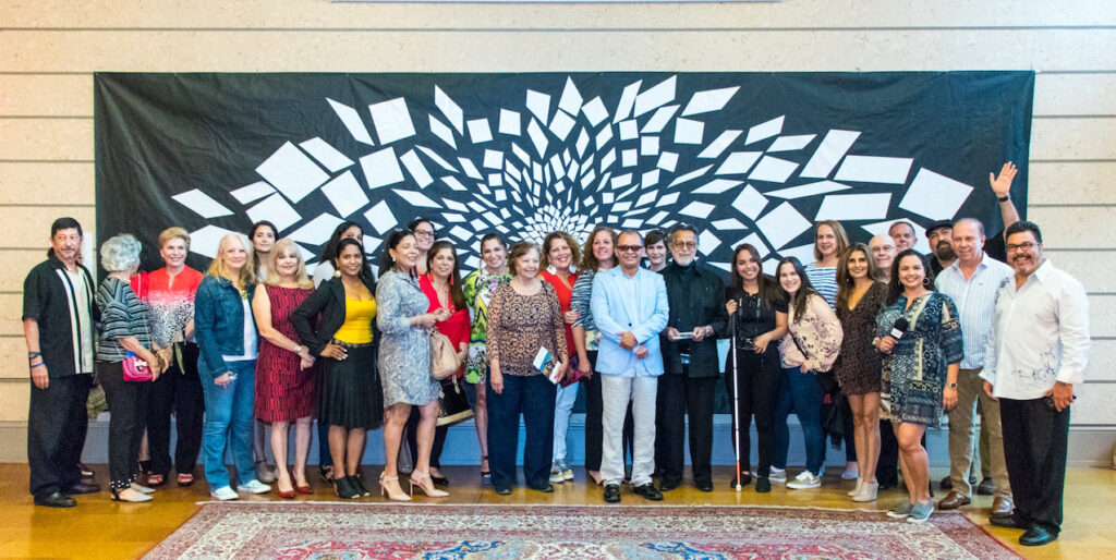
Galeria Adelmo is proud to present a retrospective exhibition “Thought my eyes” by Miami-based visual artist Rafa Montilla. The exhibition will open with an artists reception on Friday, November 24 from 7:00 p.m. at 10:00 p.m. and will be open until December 28. 2017
Rafael Montilla, Venezuelan artist with a long career, after having lived some years in India, UK and Trinidad, decided to settle in Miami, a city where he has been living for 17 years.
Rafael Montilla is an experienced photographer who remains in love with the city of Miami and, above all, with its tropical landscape and vibrant architecture.
Agusto 19th 2016 proclaimed “Rafael Montilla’s Day”, a distinction awarded by the city of Miami in virtue of his successful career and love for that city, which he reinterprets with his visual illusions and volumetrics.

“He has been experimenting in the last months with the fractionation of the photographic image, establishing games and visual illusions when printing them on virtual volumes.” Montilla digitally works the forms in order to accentuate the idea of  depth and, at the same time, grant new edges to the perception of the image, the landscape is now dynamic, voluble, full of tensions, the materials with which they experiment contribute to accentuate this experience of contemporary photography. ” Katherine Chacon curator

Photography and sculpture, manifestations of the visual arts, through which Rafael Montilla expresses himself, are circumscribed in these principles of correspondence, undoubtedly that this artist shares this idea of ​​coincidence between art and poetry, which we notice when he says: "My photos are poems in colors and lines." "I capture the art of nature and reproduce it as poems." José Gregorio Noroño Art Critic
"RAFAEL MANTILLA is an artist of the image that gets lost of sight. Just take a look at his photo sculpture to see how his current cubism transforms the visual arts as the Cubists did with the plastic arts at the beginning of the 20th century. He covers his eyes with his hands to carve games and illusions in and out of cubes of multiple perspectives in emerging North American art. " Carlos Sánchez Fuenmayor Curator and Art Critic.
“The images of photographer Rafael Montilla produce a seductive effect to the look. That seduction with the added hook of the beloved city, induces to explore photography’s analogical essence, and encourages finding the message that appears on the tip of the iceberg of the image that floats on the photographic surface of what it means to mean ". Víctor Fuenmayor Art Critic

Montilla has exhibited in galleries in Miami, Weston, Toronto, Madrid and other alternative spaces of art in this city. He is one of the most active urban artists in Miami. He has been invited to place his installation of “Kubes in action” during the week of Art Basel in Miami 2017, in Spectrum Miami Tent. His work has been featured in Miami Diario newspaper, Ciudad Weston newspaper and Doral Times newspaper, Nagarimagazine.com, MujerLatinaUSA.com, Crear Ambiente Magazine – Quito, Ecuador and La Nota Latina magazine. Curators and arts critic such as Katherine Chacon, Victor Fuenmayor, Jose Gregorio Noroño, Carlos Sanchez Fuenmayor have written about his artwork.
Galeria Adelmo located in the Little Havana district opened in April of 2010. Its primary goal is to represent and promote the artworks of local established or emerging artists from South Florida and other areas of the country and also from the rest of the Americas.

Galeria Adelmo 1165 SW Sixth Street, Miami, Florida 33130. Phone: (305) 549 7200

Website: www.rafaelmontillaart.com

Instagram: www.instagram.com/rafaelmontillaart/

Facebook: www.facebook.com/rafaelmontillaart

ART MAGAZINES

El Big Bang de Rafael Montilla Por: Eduardo Planchart Licea

ART MAGAZINES


CONTEMPORARY ART MAGAZINES
American Art Collector
American Fine Art Magazine
artcritical
Art & Antiques
ArtDistricts Florida
Artforum
Art Hive Magazine
Art in America

Miami art Magazine

ARTILLERY
Los Angeles based printed art magazine, published six times a year. Featuring a very good online version, be sure to check it out, there’s a lot to see and read about. Our intrepid art writers visit galleries every week to bring you two incisive recommendations every Thursday. Join us in our dogged pursuit of the best art in Los Angeles. Subscription Details.

Art-Collecting.com
ARTnews
The Art Newspaper
Art Papers – Atlanta, GA
ARTPULSE
ArtReview
artscope
Visual Art Source – Southern California
The Brooklyn Rail – Brooklyn, NY
CULTURED
FABRIK – Los Angeles
FIND Art Magazine – Southern California
Fine Art Connoisseur
HAPPENING

Hi-Fructose
Is a quarterly print art magazine, founded by artists, Attaboy and Annie Owens in 2005. Hi-Fructose focuses squarely on the art which transcends genre and trend, assuring readers thorough coverage and content that is informative and original. Hi-Fructose showcases an amalgamation of new contemporary, emerging as well distinguished artists, with a spotlight on awe inspiring spectacles from round the world. Each beautifully designed, full color issue is printed on high quality paper. Hi-Fructose goes beyond the comfort zone of the “alternative” norm to deliver a diverse cross section of the most influential, genre bending art of our time as well as breaking new and amazing talents. Subsription Details.

JUXTAPOZ
Native American Art
New American Paintings
OCULA
SLEEK
Southwest Art
Southwest Contemporary
SURFACE
Vellum Magazine
Wag Mag – Brooklyn, NY
Western Art Collector


PHOTOGRAPHY MAGAZINES
Aperture Magazine
Aperture, is a not-for-profit foundation, connects the photo community and its audiences with the most inspiring work, the sharpest ideas, and with each other-in print, in person, and online. Created in 1952 by photographers and writers as “common ground for the advancement of photography,” Aperture today is a multi-platform publisher and center for the photo community. Several level of membership and subscriptions are available. Print + Digital Edition. Includes the print and digital editions, a copy of Walker Evans from the Aperture Masters of Photography series, and a subscription to The PhotoBook Review. Subsription Details.

Black & White
Blind Spot Magazine
LensWork
photograph
The Photo Review
Prefix Photo Magazine

INTERNATIONAL ART MAGAZINES
Aesthetica Magazine – England
APOLLO International Art Magazine
Art Collector – Australia and New Zealand
Arte e Critica – Italy
BeauxArts – France
Berlin Art Link – Germany
Canadian Art – Canada
Canvas – Middle East and Arab World
Crash – France
CURA Italy
ELEPHANT – England
eyeline – Australia
Flash Art – Italy
frieze – France
KALEIDOSCOPE – Italy
Latamuda – Spain
Le Quotidien de l’Art – France
Mousse Magazine – Italy

INTERNATIONAL ART MAGAZINES – LATIN AMERICA
Arte al Día
ArtNexus
ART Oncuba – Cuban art
Latin American Art

INTERNATIONAL MAGAZINES – CHINA AND ASIA
Art+ Magazine – Philippine Art
ArtAsiaPacific – Hong Kong
ArtReview Asia – Asian Art
Arts of Asia
LEAP – China
FOCUS Online Art Magazine


ARTIST TECHNIQUE MAGAZINES
art ltd.
Artists’ Magazine
International Artist
Pastel Journal
PleinAir
Sculpture Magazine
Watercolor Artist
 

Digital and Online Art Magazines

artdaily.com
artnet news
Artists Network
Artweek
Hyperallergic
MutualArt.com
Whitehot Magazine

NEO-CONCRETE MOVEMENT

Kubes in Action, Mono-ha artwork in Miami, FL

CONCRETISM ART MOVEMENT | NEO CONCRETISM ART MOVEMENT DOCUMENTARY Important note: due to copyright limitations in Europe all the images inside any video are for indicative art purpose only, it does not necessarily done by the artist himself the video is talking about or the art movement a video talks about. sorry if it might seem to be a misleading. I will try to append at the end of any video the reference link so in case the artworks needed to be seen by viewer it would be easy to find.

With the construction of the country’s new utopian capital, Brasilia and the formation of the São Paulo Biennial, young Brazilian artists were inspired to create art that drew on contemporary theories of cybernetics, gestalt psychology and the optical experiments of international artists like Bridget Riley and Victor Vasarely.

Lygia Clark, Lygia Pape, Am’lcar de Castro, Franz Weissmann, Reynaldo Jardim, Sergio de Camargo, Theon Spanudis and Ferreira Gullar were unhappy with the dogmatic approach of the concrete group, so published the neo-concrete manifesto in 1959. In 1960 Hélio Oiticica joined the group and his groundbreaking series of red and yellow painted hanging wood constructions effectively liberated colour into three-dimensional space.

The Neo-Concrete Movement (1959–61) was a Brazilian art movement, which developed from Rio de Janeiro’s Grupo Frente, a coalition of artists working in Concrete Art. Neoconcrete artists rejected the pure rationalist approach of concrete art and embraced a more phenomenological and less scientific art. Ferreira Gullar inspired Neo-Concrete philosophy through his essay “Theory of the Non-Object” (1959) and wrote the “Neo-concrete Manifesto” (1959) which outlines what Neo-Concrete art should be. Lygia Clark, Hélio Oiticica, and Lygia Pape were among the primary leaders of this movement. After World War One, Europe witnessed a boom of art movements based upon rationalism such as De Stijl and Bauhaus. Artists believed humanity would be able to achieve progress through its ability to reason. In Latin America, ideas of rationalist and non-objective art took root in the early 1950s in reaction to the muralism controversy. Governments such as the Mexican government utilized muralists to create propaganda. Under repressive Latin American governments, artists rebelled against the idea of aiding the political regime through figurative art; therefore geometric abstraction and concretism ushered in an art that did not connote anything political or have really any meaning at all. Concrete Art was able to flourish beneath these repressive regimes because it held no political messages or incendiary material. In Brazil, ideas of rationalist art and geometric abstraction arose in the early 1950s following the establishment of a democratic republic in 1946. The period from 1946 to 1964 is known as the Second Brazilian Republic. Groups such as Ruptura in Sao Paulo and Grupo Frente in Rio de Janeiro rose. Specifically Ruptura followed the ideal of pure mathematical art which does not connote meaning outside of what it is. The Neo-Concrete Art Movement arose when Grupo Frente realized that Concretism was “naive and somewhat colonialist” and an “overly rational conception of abstract structure.” In 1961 as the political tides began to turn, the Neo-Concrete artists disbanded no longer content to limit themselves to this one philosophy. Lygia Clark and Hélio Oiticica, leaders of the Neo-Concrete movement, put their energy into Conceptual Art. Art historians often refer to Neo-Concretism as the precursor to Conceptual Art because of the foundation of “abstruse metaphysics.” On April 1, 1964, a military coup removed Joao Goulart and established a military government in Brazil until 1985. The increase of violence called for a new kind of art that had the potential to carry meaning and deconstruct traditional thought even further. This came in the form of Conceptual Art. Brazilian poet and writer Gullar wrote the Neo-Concrete Manifesto in 1959 and described a work of art as “something which amounts to more than the sum of its constituent elements; something which analysis may break down into various elements but which can only be understood phenomenologically.” In contrast to the Concrete Art movement, Gullar was calling for an art that was not based upon rationalism or in pursuit of pure form. He sought works of art that became active once the viewer was involved. Neo-concrete art must disassemble the limitations of the object and “express complex human realities.”.

What Is Nonrepresentational Art?

By Beth Gersh-Nesic

Nonrepresentational art is often used as another way to refer to abstract art, but there is a distinct difference between the two. Fundamentally, nonrepresentational art is work that does not represent or depict a being, place, or thing.

If representational art is a picture of something, for instance, nonrepresentational art is the complete opposite: Rather than directly portray something recognizable, the artist will use form, shape, color, and line—essential elements in visual art—to express emotion, feeling, or some other concept.

It’s also called “complete abstraction” or nonfigurative art. Nonobjective art is related and often viewed as a subcategory of nonrepresentational art.

Nonrepresentational Art Versus Abstraction

The terms “nonrepresentational art” and “abstract art” are often used to refer to the same style of painting. However, when an artist works in abstraction, they are distorting the view of a known thing, person, or place. For example, a landscape can easily be abstracted, and Picasso often abstracted people and instruments.

Nonrepresentational art, on the other hand, does not begin with a “thing” or subject from which a distinctive abstract view is formed. Instead, it is “nothing” but what the artist intended it to be and what the viewer interprets it as. It could be splashes of paint as we see in Jackson Pollock’s work. It may also be the color-blocked squares that are frequent in Mark Rothko’s paintings.

The Meaning Is Subjective

The beauty of nonrepresentational work is that it is up to us to give it meaning through our own interpretation. Sure, if you look at the title of some piece of art you may get a glimpse into what the artist meant, but quite often that’s just as obscure as the painting itself.

It is quite the opposite of looking at a still life of a teapot and knowing that it is a teapot. Similarly, an abstract artist may use a Cubist approach to break down the geometry of the teapot, but you may still be able to see a teapot. If a nonrepresentational artist, on the other hand, was thinking of a teapot while painting a canvas, you’d never know it.

While this subjective point of view to nonrepresentational art offers freedom of interpretation to the viewer, it is also what bothers some people about the style. They want the art to be about something, so when they see seemingly random lines or perfectly shaded geometric shapes, it challenges what they’re used to.

Examples of Nonrepresentational Art

Dutch painter Piet Mondrian (1872–1944) is a perfect example of a nonrepresentational artist, and most people look to his work when defining this style. Mondrian labeled his work as “neoplasticism,” and he was a leader in De Stijl, a distinct Dutch complete abstraction movement.

Mondrian’s work, such as “Tableau I” (1921), is flat; it is often a canvas filled with rectangles painted in primary colors and separated by thick, amazingly straight black lines. On the surface, it has no rhyme or reason, but it is captivating and inspiring nonetheless. The appeal is in the structural perfection combined with the asymmetrical balance, creating a juxtaposition of simple complexity.

Confusion With Nonrepresentational Art

Here’s where the confusion with abstract and nonrepresentational art really comes into play: Many artists in the Abstract Expressionist movement were technically not painting abstracts. They were, in fact, painting nonrepresentational art.

If you look through the work of Jackson Pollock (1912–1956), Mark Rothko (1903–1970), and Frank Stella (b. 1936), you will see shapes, lines, and colors, but no defined subjects. There are times in Pollock’s work in which your eye grabs onto something, though that’s simply your interpretation. Stella has some works that are indeed abstractions, yet most are nonrepresentational.

These abstract expressionist painters are often not depicting anything; they are composing with no preconceived notions of the natural world. Compare their work to Paul Klee (1879–1940) or Joan Miró (1893–1983) and you will see the difference between abstraction and nonrepresentational art.

ABSTRACCIÓN GEOMÉTRICA

rafael montilla
rafael montilla

ABSTRACCIÓN GEOMÉTRICA

La abstracción geométrica es una forma de arte abstracto basada en el uso de formas geométricas que a veces, aunque no siempre, se colocan en un espacio no ilusionista y se combinan en composiciones no objetivas (no representativas). Aunque el género fue popularizado por artistas de vanguardia a principios del siglo XX, motivos similares se han utilizado en el arte desde la antigüedad.

La abstracción geométrica se ha denominado un capítulo del arte abstracto desarrollado desde la década de 1920, y se basa en el uso de formas geométricas simples combinadas en composiciones subjetivas en espacios irreales. Surge como una reacción a la subjetividad excesiva de los artistas plásticos de épocas anteriores en un intento de distanciarse de lo puramente emocional. El discurso crítico de estos artistas se complementa con una exaltación exacerbada de las dos dimensiones frente al esfuerzo de la mayoría de los movimientos anteriores para tratar de representar una realidad tridimensional.

Wassily Kandinsky fue su principal precursor y el maestro más influyente en una generación de artistas abstractos. Kasimir Malévich y Piet Mondrian también se encuentran entre sus impulsores y en ambos también se puede apreciar la influencia de las culturas antiguas que utilizaron la geometría como expresión artística y decorativa. Es el caso de las cerámicas y mosaicos que se conservan del arte islámico, obligados por el precepto religioso a evitar la representación de la figura humana. También las culturas clásicas de la antigua Grecia y la Roma imperial, en las que los elementos decorativos se usaban profusamente sin referencias reconocibles en la realidad.

El expresionismo abstracto, que son creadores de representantes como Jackson Pollock, Franz Kline, Clyfford Still y Wols, representa exactamente lo contrario de la abstracción geométrica.

Los principios del abstraccionismo geométrico son:

Abolición de la tercera dimensión;
Independencia de los valores emocionales, contrario a lo que dice Vasili Kandinskij, la pintura no debe expresar sentimientos;
Los medios de expresión son la línea y el color;
La forma ideal es el rectángulo porque en él la línea es recta sin la ambigüedad de la curva;
Uso de colores primarios: amarillo, azul, rojo.

Historia
La abstracción geométrica está presente en muchas culturas a lo largo de la historia tanto como motivos decorativos como como piezas de arte en sí. El arte islámico, en su prohibición de representar figuras religiosas, es un excelente ejemplo de este arte basado en patrones geométricos, que existió siglos antes del movimiento en Europa y de muchas maneras influyó en esta escuela occidental. Alineados y utilizados a menudo en la arquitectura de las civilizaciones islámicas que abarcan del siglo VII al siglo XX, se utilizaron patrones geométricos para conectar visualmente la espiritualidad con la ciencia y el arte, los cuales fueron clave para el pensamiento islámico de la época.

En 1917, la revista De Stijl nació en los Países Bajos y, junto con ella, el movimiento artístico de neoplasticismo de varios artistas, incluido Piet Mondrian (1872 – 1944). Su abstraccionismo es de tipo geométrico basado en la creación de formas puras y bidimensionales.

La línea divisoria hacia el arte abstracto se llama abstracción geométrica que se abarca al abarcar ambas posiciones artísticas. Esto probablemente se remonta al influyente y cosmopolita grupo de artistas Abstraction-Création, fundado en Francia en 1931 por Georges Vantongerloo, entre otros, con muchos miembros muy prominentes. El nombre del grupo describe la amplia gama de movimientos artísticos representados en él. “Creación” significa la creación de una obra de arte de la nada, más precisamente sin un punto de partida material: la posición del arte concreto posterior. Con el fin de reunir a tantos artistas “progresistas” como sea posible en este grupo, se hicieron intentos para difuminar las líneas divisorias existentes, pero (hasta hoy) no se logró completamente sin términos distintivos:

En el arte norteamericano desde 1945 equivale a mirar varios movimientos artísticos (y sus ramificaciones globales) en la tradición de la abstracción geométrica, por ejemplo, la abstracción post-pictórica, Hard Edge, Color Field Painting y minimalismo.

Análisis académico
A lo largo del discurso histórico del arte del siglo XX, los críticos y los artistas que trabajan dentro de las tensiones reductivas o puras de la abstracción a menudo han sugerido que la abstracción geométrica representa la altura de una práctica artística no objetiva, que necesariamente enfatiza o llama la atención sobre la plasticidad raíz y dos. dimensionalidad de la pintura como medio artístico. Por lo tanto, se ha sugerido que la abstracción geométrica podría funcionar como una solución a los problemas relacionados con la necesidad de que la pintura modernista rechace las prácticas ilusionistas del pasado al tiempo que aborda la naturaleza inherentemente bidimensional del plano de la imagen, así como el funcionamiento del lienzo como su soporte. . Wassily Kandinsky, uno de los precursores de la pintura pura no objetiva, fue uno de los primeros artistas modernos en explorar este enfoque geométrico en su obra abstracta. Otros ejemplos de abstraccionistas pioneros como Kasimir Malevich y Piet Mondrian también han adoptado este enfoque hacia la pintura abstracta. La pintura de Mondrian “Composición No. 10” (1939–1942) define claramente su enfoque radical pero clásico para la construcción de líneas horizontales y verticales, como escribió Mondrian, “construido con conciencia, pero no con cálculo, dirigido por una alta intuición, y traído a la armonía y al ritmo “.

Así como hay geometrías bidimensionales y tridimensionales, la escultura abstracta del siglo XX no fue menos afectada que la pintura por las tendencias geométricas. Georges Vantongerloo y Max Bill, por ejemplo, son quizás más conocidos por su escultura geométrica, aunque ambos también eran pintores; y, de hecho, los ideales de la abstracción geométrica encuentran una expresión casi perfecta en su titulación (por ejemplo, “Construcción en la esfera” de Vantongerloo) y en los pronunciamientos (por ejemplo, la declaración de Bill de que “soy de la opinión de que es posible desarrollar un arte en gran medida sobre la base del pensamiento matemático “.) La pintura abstracta expresionista, tal como la practican artistas como Jackson Pollock, Franz Kline, Clyfford Still y Wols, representa lo opuesto a la abstracción geométrica.

Relación con la música
El arte abstracto también se ha comparado históricamente con la música en su capacidad de transmitir sentimientos e ideas emocionales o expresivas sin depender de referencias objetivas reconocibles que ya existen en la realidad. Wassily Kandinsky ha discutido esta conexión entre la música y la pintura, así como también cómo la práctica de la composición clásica ha influido en su trabajo, en su ensayo seminal sobre lo espiritual en el arte.

Rafael Montilla or “The obsession of the kube”

Rafael Montilla BIG BANG

Rafael Montilla or “The obsession of the kube”
By Rolando Peña

Without any doubt, Miami is a very particular city full of surprises, good and bad, but it always maintaining that feeling of its distances, its beaches and a very curious fauna. Being a person who has never driven cars, I walk and that in Miami is an odyssey.
People see you as a weirdo, which in my case is normal. Walking through the city as usual, I observe its streets, its buildings, its people. In Wynwood, I go to the galleries, to the museums, to the cafes, etc. and realize the amount of Graffiti that covers the walls of this area. I must confess, in general they seem very bad to me.
New York was my city from the 60’s until the mid 80’s, where I made a very interesting career as a multifaceted artist. Among them, I worked with Andy Warhol in the Factory and gave art workshops in different areas of the city, one of them at the East Village with Jean Michel Basquiat, Keith Haring and other graffiti artists of the moment. I lived the good graffiti period of the 80’s in New York.
I say this because among so many graffitis and such visual chaos happening in certain parts of this city, I was particularly struck by certain urban interventions, some white cubes, to be more specific. In a silent but forceful way, these white cubes hung from the walls, from the fences of some unexpected place such as at the exit of a motorway, next to a traffic light or usually in some place of convergence, always subject to the bipolarity of the sun and the rains of Miami.
One day, a group of artist friends and I we had to intervene a truck with slogans about the very sad situation in Venezuela today. In the middle of the action, someone with eyes of illuminated character was watching me. My big surprise was to learn that this character was the one who made the cubes that had caught my attention, so I told him about it and I told him that they were different and had a particular aesthetic sense.

Rolando Peña


That’s how I met Rafael Montilla, the author of the cubes he calls “Kubes in action.” We met on several occasions and we talked about art.
When last year I opened my exhibition “Big Bang” in the Arts Connection Foundation Gallery, Rafael came several times and told me that he was putting together some works inspired by my exhibition. I told him that I would like to see what he was doing and he took me to a space where he had mounted his version of the Big Bang. The truth is that I was surprised by his audacity and I told him that it seemed very good to me how he had solved the aesthetics of the work. But that is not all. Now Rafael have called me to explain that the piece that he showed me will be exhibited at the Coral Gables Museum, inspired by my version of the Big Bang. He has also proposed me that I write a text for a publication that he will be doing. Faced with such boldness, faith and courage, I had no choice but to say yes and I wrote this brief introduction to his work.
I consider Rafael to be an excellent artist with a very particular work. I see in him a lot of talent, a lot of energy accompanied by an impeccable organization. I congratulate him and wish him many successes, which I am sure he will have.


Rolando Peña

Miami
June 28, 2018

Varvara Stepanova

Varvara Stepanova
Varvara Stepanova

Varvara Stepanova

Rusia, 1894–1958

  • Constructivismo
  • Revolución rusa

Varvara Fiódorovna Stepánova (Варва́ра Фёдоровна Степа́нова) fue una artista rusa que se convirtió en uno de los pilares del constructivismo, movimiento que promovió junto a su compañero y colaborador Alexander Rodchenko.

De familia campesina, pudo tener una buena educación en la Escuela de Arte de Kazán. Allí conoció a Rodchenko y desde entonces colaboraron codo con codo para buscar un arte nuevo.

Antes de la Revolución Rusa, vivió con Rodchenko y Kandinsky en un mismo apartamento. Imaginar la creatividad de estos tres jóvenes que acabarían revolucionando el arte cada uno a su manera.

Durante la revolución abanderó la vanguardia rusa y fue un ejemplo de la lucha por la emancipación de la 

mujer. Apoyada por el estado- algo inusual- ayudó con su arte a tomar medidas importantes para mejorar el estatus social de la mujer (legislaciones en materia de costumbres, derecho de las mujeres a la jornada de 8 horas, a negociar salarios), en definitiva, unos derechos políticos idénticos a los hombres.

Stepánova, antes de militar en el constructivismo, había diseñado obras «cubofuturistas» y varios libros y cuando el movimiento se convirtió en la principal vanguardia, no sólo rusa sino mundial, se convirtió en una de las principales diseñadoras del comunismo visual, una estética que aún se puede apreciar hoy en día.

(CC) Miguel Calvo Santos, 28-10-2017

RAFAEL MONTILLA O “LA OBSESIÓN DEL KUBO”

Rafael Montilla BIG BANG

RAFAEL MONTILLA O “LA OBSESIÓN DEL KUBO”
POR ROLANDO PEÑA


Sin duda que Miami es una ciudad muy particular y llena de sorpresas, buenas y malas, pero siempre mantiene esa sensación de sus distancias, de sus playas y de una fauna muy curiosa.

Jamás he manejado automóviles, por lo tanto camino y eso en Miami es una odisea. Te ven como un bicho raro, lo cual en mi caso es normal. Caminando por la ciudad como es de costumbre, observo sus calles, edificios, su gente. En Wynwood voy a las galerías, museos, cafés, etc. También me percato de la cantidad de Graffitis que cubren las paredes de esta zona. Debo confesar, que en general me parecen de muy mala factura.

Viví en Nueva York desde los años 60 hasta mediado de los 80, donde realicé una carrera como artista muy interesante y de muchas facetas. Entre ellas, trabajé con Andy Warhol en la Factory y di talleres de arte en diferentes lugares de la ciudad. Di varios workshops en el East Village donde Jean Michel Basquiat, Keith Haring y otros grafiteros del momento asistieron. Me tocó vivir la época del buen grafitti de los años 80 de Nueva York.

Cuento esto porque en medio tantos graffitis y tanto caos visual que existe en ciertas partes de esta ciudad, me llamaban particularmente la atención ciertas intervenciones urbanas, más específicamente unos cubos blancos. De una manera silenciosa pero contundente, estos cubos blancos colgaban de las paredes, de los muros de algún lugar inesperado tales como a la salida de una autopista, al lado de algún semáforo o por lo general en algún lugar de convergencia, sometiéndose siempre a la bipolaridad del sol y de las lluvias de Miami.

Un día me tocó con un grupo de amigos artistas intervenir un camión con consignas sobre la muy lamentable situación actual de Venezuela. En medio de la intervención, un personaje con ojos de iluminado me observaba. Mi gran sorpresa fue constatar que este personaje era quien hacía los cubos que me habían llamado la atención, así que se lo comenté y le dije que eran diferentes y tenían un sentido estético particular. De esa forma fué como conocí a Rafael Montilla, el autor de los cubos que él denomina

“Kubes in action”. Nos vimos en varias ocasiones y hablamos de arte.

Cuando el año pasado inauguré mi exposición “Big Bang” en la Galería Arts Connection Foundation, él vino varias veces y me comentó que estaba armando unas obras inspiradas en mi muestra. Le dije que me gustaría ver lo que hacía y me llevó a un espacio donde había montado su versión del Big Bang. La verdad me sorprendió por lo audaz y le dije que me pareció muy bien cómo había resuelto la estética de la obra.

Pero eso no es todo. Ahora Rafael me llama y me explica que va a exponer en Coral Gables Museum la pieza que me mostró, inspirada en mi versión del Big Bang y además me propone que le escriba un texto para una publicación que él va a realizar.

Ante tanta audacia, fe y coraje, no me quedó otra que decirle que si y le escribí esta breve introducción a su trabajo.

Considero que Rafael es un excelente artista con una obra muy particular. Veo en él mucho talento, mucha energía acompañado de una organización impecable. Lo felicito y le deseo muchos éxitos, que estoy seguro, los tendrá.

Rolando Peña

Miami

Junio 28, 2018

List of Mediums

Painting
(these don’t necessarily have to be done on canvas-explore other surfaces)
Oil
Acrylic
Watercolor
Gouache
Tempera
Fresco painting
Murals

 Drawing

(these don’t necessarily have to be done on paper-explore other surfaces)

Charcoal

Graphite

Pencil

Conte crayons

Pen and Ink

India Ink (with brush)

Chalk

Chalk pastels

Oil pastels

Color pencils

Markers


Printing

Screen-printing

Mono-printing

Block printing

Etching

Lithography

Spraypaint

Airbrush


Sculpture

Pottery

Ceramics

Terracotta

Wood carving

Balsa wood

Found objects

Assemblage

Installation art

Earth Art

Jewelry

Mosaics

Polymer clay

Paper

Plaster

PVC piping

Resin

Glass

Stained glass

Blown glass

Metal

Silver

Nickel

Copper

Wires

Aluminum foil

Bronze

Fiberglass

Wax

Stone

Soap

Marble

Concrete

Gelatine

Styrofoam

Relief sculpture

Ready-mades


Textiles

weaving

macramé

fashion design

batik

marbeling

stamping


Photography/Film/ Technology

Black and white

Digital

Photoshop

Graphic design

Video art

Animation

Clay animation

Stop motion photography


Other

Mixed media

Collage

Paper cutting

scrimshaw

fimo

gold leafing

glues

transparencies

Henryk Stazewski

Henryk Stazewski
Henryk Stazewski

(Polish, 1894–1988)

Henryk Stazewski born 1894 [- 1988]

Polish abstract painter and maker of reliefs, born in Warsaw. Studied at the Warsaw School of Fine Arts 1913-20, and was afterwards strongly influenced by Cubism. Participated in the New Art exhibition in Vilno in 1923 organised by Strzeminski and Kajruksztis, and joined the Blok group of Cubists, Suprematists and Constructivists that resulted. Editor-in-chief of the first five issues of the periodical Blok 1924. From 1926 adopted an abstract style influenced by Dutch Neo-Plasticism and Russian Constructivism. Spent much of the period 1929-34 in Paris, where he took an active part in the groups Cercle et Carré and Abstraction-Création with Arp, Mondrian, Vantongerloo and others; also helped to collect works by avant-garde artists to establish a new museum of abstract art at Lodz. First one-man exhibition with Karol Krynski at the Instytut Propagandy Sztuki, Warsaw, 1933. Was unable to paint during the German Occupation 1939-45, and all but a few of his early works were destroyed. After the war painted figurative compositions and nudes, then in 1955 turned again to a geometrical abstract style. Began to make reliefs in 1957, at first mainly in white, or black and white, then from 1967 in colour, many of them with movable parts. Lives in Warsaw.

Stażewski was a foremost representative of the Constructivist movement, as well as the co-creator of the Geometric Abstract art movement, and a member of the Cercle et Carré group of abstract painters based in Paris.

 Henryk Stazewski
Henryk Stazewski
 Henryk Stazewski
White-Black Relief No. 6 1962 Henryk Stazewski 1894-1988 Purchased 1963 http://www.tate.org.uk/art/work/T00576
Page 270 of 277
1 268 269 270 271 272 277