Home Blog Page 180

What does it take to run a gallery today?

What does it take to run a gallery today? by Brian Boucher

‘It’s important to listen to artists’: A roundtable on current gallery models

To understand young galleries’ priorities today, Brian Boucher spoke with Hua Xiaochan of Hua International; Isabella Ritter and Katharina Schendl of LambdaLambdaLambda; and Kendra Jayne Patrick

by Brian Boucher

The world has officially entered a post-pandemic era. The Chinese government discontinued its Covid lockdowns 6 months ago, and US President Joe Biden lifted the COVID-19 state of emergency this month. Dealers have returned to a more customary schedule of exhibitions and art fairs, and, for many, sales are steady: According to The Art Market Report 2023 published by Art Basel and UBS, the market has grown to higher than its pre-pandemic level, partly driven by a 7% increase in dealer sales.

One intriguing finding from the report was that despite challenging factors including rising rents, an increasing number of galleries have locations in more than one country. While in 2021, almost 95% of dealers operated from only one location, a year later, just 71% fit that description. Art Basel recently convened a Zoom roundtable among the founders of three young galleries who reflect this trend to find out what drove them to begin a business in uneven times, what their greatest challenges are, and how they came to have their distinctive footprints.

Hua Xiaochan. Photograph by Vincent Wechselberger.

Founded in 2020 by dealer Hua Xiaochan and her husband Klaus Dierkes, Hua International simultaneously opened spaces in Berlin and Beijing. The gallery currently has a roster of just two but organizes shows with international artists.

LambdaLambdaLambda was founded Austrian duo Isabella Ritter and Katharina Schendl in 2015 in Pristina, Kosovo, becoming the city’s first international contemporary art gallery. They also show regularly at La Maison de Rendez-Vous, a shared space in Brussels they established with Misako & Rosen (Tokyo) and Park View / Paul Soto (Los Angeles), and opened a second, larger Pristina space in 2022.

Kendra Jayne Patrick’s gallery began as an itinerant space in New York in 2017 before establishing a permanent location in Bern, Switzerland. She was one of the first dealers without a long-term space to show at Art Basel when the fair changed its requirements for participation.

Left: Isabella Ritter and Katharina Schendl. Photograph by Tina Herzl. Right: Kendra Jayne Patrick in Bern, 2023. Photograph by Ernst Fischer.

Art Basel: You’re all young galleries that started in the last 8 years. By all accounts, it’s an increasingly difficult environment. What drove you to start a business in these times, and how are you faring as we enter a post-pandemic moment?

Isabella Ritter: Is there ever a good moment to start a gallery? We didn’t think about whether it was a good moment, but rather just went for it.

Katharina Schendel: The art scene in Kosovo was also vibrant and interesting to us.

Hua Xiaochan: We are a pandemic baby; we opened in September 2020. I had worked as an artist and at a gallery, and I was thinking, ‘What am I going to do to continue my concepts?’ We found great places in Berlin and Beijing. That led to the decision.

Isabella Ritter: It must have been difficult in China because [Covid lockdowns were] so much stricter.

Hua Xiaochan: The first year and a half, it was better than Europe. There weren’t lockdowns and we were able to make sales and open exhibitions. Last year was a disaster. The Chinese part of our business saved our ass a little bit. People couldn’t travel, so they had time and money to spend.

Kendra Jayne Patrick: I started a gallery for the reasons a lot of people do: because you have something to say. I wouldn’t say my gallery focuses on political art per se, but I choose artists who are plugged in to what is going on and have opinions. It’s quite a turbulent time in terms of the economy of the art world but an important time to be listening to artists, to what they want to express about our 21st-century experience.

Can you each talk about how you curate your program? How do artists come to join the gallery? Do you emphasize a varied program, or one that is more focused?

Isabella Ritter: We show local artists, though our idea was always not to be ghettoized. We are interested in artists with idiosyncratic practices, and have kind of a wild mix between local artists and those from elsewhere.

Katharina Schendel: In terms of age, we also represent the estate of an artist who was 80 when he died, and the youngest artist we represent is in his 20s.

Hua Xiaochan: I work with a super-young generation – my generation – born after 1990 and now in their 20s and 30s, and I’m looking for even younger artists. Curators and artists introduce artists to me. My program is still small because of the pandemic, because I think it’s important to meet in person, but now I can fly to meet artists. I use Instagram for research and I visit museum shows. We are working to build up a program that is not just comprised of young artists.

Kendra Jayne Patrick: I do a lot of Instagram research but at this stage there are more introductions from collectors and other gallerists, and opportunities to meet someone interesting. As for how the program comes together, even when I’m showing older artists, I think of the art that I show from a post-Internet perspective, being from a generation who are always thinking of themselves via the internet.

LambdaLambdaLambda2, Prishtina. Photograph by Leart Rama.

Where are your collectors from in terms of generation and geography? What is the balance between how you develop your collector base through online presentations, in your home cities, and at art fairs?

Kendra Jayne Patrick: That’s an interesting question for a lot of reasons. I came to the art world without a war chest or long-term family relationships in the art world, so collecting collectors for me has been a strange path. I started my program in 2018 but I began making shows in established art galleries. For example, [New York dealer] Stefania Bortolami said, ‘Why don’t you do a show in my viewing room?’ Other galleries were quite generous. Their generosity allowed me to build relationships.

Hua Xiaochan: Most of my Chinese collectors are under 30 years old. Most are well educated and they have very avant-garde tastes. European collectors are very slow, Chinese collectors are very fast. Some of our Chinese collectors buy from every exhibition – they want to grow with you.

Isabella Ritter: Since we are now in our 8th year, we have done fairs in all sorts of places, so we have quite a global collectorship. We have some experience with Asian, American, South American, and Australian collectors, and it’s interesting to see the difference in culture and buying behavior. In Europe, it’s more of an ‘Old World’ idea. People take their time. If you don’t do anything to disturb the relationship, people support you. It just takes a while. But I should add that a big portion of our collectors are institutions and they are slower than any European collector!

What are your greatest challenges in this moment?

Hua Xiaochan: The greatest challenge is to balance everything. We have been open only 3 years and we already have two locations. We need to build up a better and stronger program as soon as possible. If you get more artists and exhibitions, you get more investment. I also need to build my team. Because I have two locations, I need two teams.

Isabella Ritter: It’s a little like this for us as well. Who do you show where? How do you time exhibitions with art fair schedules? We have already reduced our art fair participation because preparation takes so much time, or the projects are too big for a fair so it makes sense to do it as an exhibition.

Kendra Jayne Patrick: For me, too, balance is a challenge. I cut my teeth in New York and now I’m here in Switzerland, which has made me only more committed to making shows in both settings. Having cross-cultural and international conversations is really important to me. I’m trying to stay lean. It feels like being nimble is the only way to survive – being open to doing things differently, in a setting you wouldn’t have considered.

Installation view of Qualeasha Wood’s artworks in Kendra Jayne Patrick’s booth at Art Basel Miami Beach 2021.

You all have interesting stories to tell in terms of place. Why did each of you think it was necessary to have your distinctive footprint?

Isabella Ritter: It’s quite evident that in Kosovo there is no art market happening, so for us it was important to be in a more central place, to show the artists we work with to a bigger audience than at an art fair.

Hua Xiaochan: Since I’m Chinese, I chose Beijing, but also Berlin, where I live. They are both capital cities. Also, both are much more open-minded to culture. There is much potential. But the two cities were never connected; there was no gallery that bridged both cities.

Kendra Jayne Patrick: My partner is Swiss, and we were in New York and the pandemic hit and we were like, ‘We’re going to Switzerland.’ I do remember agonizing a bit in 2021 when things opened up. I was ready for a permanent location but wasn’t sure where. I considered Basel, but Bern makes sense. The Swiss can be down on Bern in the same way that New Yorkers can be down on Washington, DC. It’s slow but it’s beautiful. As for my space, there is something a bit cozy about it, which feels important to me. I want visitors to feel excited to talk and share about art.

La importancia de cometer errores y fallas en el proceso de la creación

Black Square by Kazimir_Malevich
Black Square is an iconic painting by Kazimir Malevich.

La Importancia de Cometer Errores y Fallar: Aprendizaje y Ventajas del Ensayo y Error en el Proceso Creativo

Cometer errores y fallas es una parte natural del proceso creativo. De hecho, es a menudo a través de nuestros errores que aprendemos y crecemos como artistas. Cuando cometemos un error, somos forzados a pensar de manera crítica sobre nuestro trabajo y a encontrar nuevas formas de mejorarlo. Esto puede ser un proceso difícil, pero también es muy gratificante.

Si eres un artista, no tengas miedo de cometer errores. De hecho, alójate en ellos. Son una parte natural del proceso creativo y pueden ayudarte a aprender y crecer como artista.

Hay muchas ventajas en cometer errores y fallas. En primer lugar, nos ayuda a desarrollar nuestra creatividad. Cuando estamos abiertos a cometer errores, estamos más dispuestos a experimentar con nuevas ideas y técnicas. Esto puede llevar a la creación de obras de arte más originales e innovadoras. En segundo lugar, los errores nos ayudan a aprender y crecer como artistas. Cuando identificamos nuestros errores, podemos identificar las áreas en las que necesitamos mejorar. Esto nos permite desarrollar nuestras habilidades y mejorar nuestra obra de arte. Finalmente, los errores pueden ayudarnos a desarrollar nuestra confianza. Cuando aprendemos a superar nuestros errores, nos sentimos más seguros de nuestras habilidades como artistas. Esto nos permite ser más creativos y expresivos en nuestro trabajo.

En el vasto lienzo de la creatividad, cada trazo y pincelada representa un viaje de autodescubrimiento y expresión única. En este emocionante recorrido, los errores y las fallas, lejos de ser meros obstáculos, se revelan como valiosos tesoros que iluminan el camino hacia la maestría y la innovación. El proceso de creación, en cualquier medio de expresión, se nutre y florece a través del ensayo y error, creando un espacio fértil donde los tropiezos se transforman en escalones hacia el éxito.

El miedo al error es un compañero constante en el viaje creativo. Sin embargo, es crucial reconocer que los errores no son destinos finales, sino puntos de partida. Cada obra maestra nace de múltiples intentos, de tentativas audaces que exploran nuevos territorios de la imaginación. El ensayo y error no solo permite corregir los deslices iniciales, sino que despierta la mente a posibilidades previamente inexploradas.

Una de las grandes ventajas del ensayo y error es su potencial para acelerar el aprendizaje. A través de la acción y la corrección, se interiorizan valiosas lecciones que perduran más profundamente que cualquier teoría. Los errores ofrecen una oportunidad única para abrazar el proceso de mejora continua, puliendo habilidades y nutriendo la intuición. En la danza de la creación, cada error es un paso hacia la perfección.

El ensayo y error también forja resiliencia y agudiza la intuición. La capacidad de enfrentar errores con una mente abierta y la disposición de experimentar con audacia dan lugar a una profunda comprensión de las fortalezas personales y los desafíos por superar. La intuición, moldeada por la experiencia de errar y rectificar, se convierte en una guía confiable y un faro en el proceso creativo.

La innovación y la originalidad florecen en el terreno fértil del ensayo y error. A menudo, son los accidentes y los errores aparentes los que dan origen a soluciones innovadoras y resultados sorprendentes. En la mezcla de colores incorrecta puede yacer el matiz perfecto, y en la palabra mal escrita puede encontrarse una expresión única y conmovedora. La disposición de abrazar lo desconocido y experimentar sin restricciones es lo que desbloquea el potencial para romper barreras creativas.

En última instancia, la importancia de cometer errores y fallar reside en su capacidad para nutrir el crecimiento personal y artístico. Cada caída es una oportunidad para levantarse más fuerte y sabio, cada error es un escalón hacia la excelencia. Abrazar el ensayo y error como un amigo y un aliado en el viaje creativo transforma los obstáculos en oportunidades y convierte el lienzo de la autocrítica en un espacio de autenticidad y florecimiento.

El ensayo y error se erige como un pilar fundamental en el proceso de creación artística en cualquier medio. Los errores no son meros obstáculos, sino destinos emocionantes en el camino hacia la maestría y la innovación. La valentía de abrazar el ensayo y error desbloquea una puerta a la mejora continua, la intuición afilada y la maravilla de lo inesperado. En cada error, en cada intento, reside la posibilidad de una expresión más auténtica y una creación más profunda.

Aquí hay algunos consejos para aprender de tus errores:

No tengas miedo de experimentar. La mejor manera de aprender es haciendo. Así que no tengas miedo de probar cosas nuevas y ver qué funciona.
No te rindas. Es normal cometer errores, pero no te rindas. Sigue intentando y eventualmente encontrarás tu camino.
Pide ayuda. Si te sientes atascado, no dudes en pedir ayuda a otros artistas. Ellos pueden darte consejos y sugerencias que pueden ayudarte a mejorar tu obra de arte.
Los errores son una parte natural del proceso creativo. No los tengas miedo. Alójate en ellos y aprende de ellos. Te ayudarán a desarrollar tus habilidades como artista y a crear obras de arte más originales e innovadoras.

Carmelo Arden Quin

Carmelo Arden Quin

Madi International Carmelo Arden Quin

b. 1913, Rivera, Uruguay
d. 2010, Savigny-sur-Orge, France

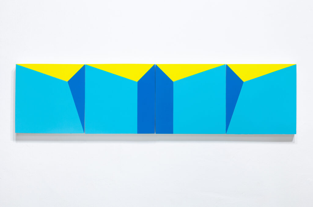
The elements of sculpture, volumes and vacuums, interrelate in a variety of ways, forming a rich and playful range of plastic positions, all of this within geometry and non-figurativism. They are present in their own nature, without realist remnants. They are ludic, since one can choose positions in one’s own way and give it any desired form. There is no need to express, represent, or symbolize. The artistic object must be pure. Carmelo Arden Quin

Painter, sculptor, and poet. He studied painting in Santana do Livramento, Brazil. In 1935 he is drawn by the work of Joaquín Torres García. He settles in Buenos Aires in 1937 and studies Philosophy and Literature at the University. In 1944 he publishes, together with Gyula Kosice and Tomas Maldonado, among others, Arturo. Revista de Artes Abstractas which marks the start of the non-figurative movement in Argentina. A year later he co-founds the “Arte Concreto-Invención” group, and in 1946 the Madí movement. In 1950 he creates the Centre Madí Paris and in 1954 founds in Argentina, along with Aldo Pellegrini, the group Arte Nuevo, consisting of artists of non-figurative tendencies. Quin makes his first geometric non-figurative work in 1935 and in 1936, transgressing the academic framework configuration, he creates his first non-orthogonal paintings. In the 40s Quin produces articulated and mobile sculptures, polygonal framed painting-objects. Later in Paris, he makes use of collage and decoupage (emptying). In 1971, he returns to painting with black lines with bulky forms called Formes galbées (Turned forms). Among his most important solo exhibitions are: Galerie Charley Chevalier (Paris, 1973) “Retrospective 1936-1985”; Galerie des Ponchettes (Nice, 1985); Arte y Tecnología Foundation (Madrid, 1997); Durban Segnini Gallery (Miami, 2006); “A Celebration of Geometric Art, MADÍ Homage to Carmelo Arden Quin”, Leepa Rattner Museum of Art (Tarpon Springs, Florida, 2006). His works are present in different museums and collections including, among others: The Museum of Geometric and MADÍ Art (Dallas, Texas, USA); Musée d’Art Moderne (Saint-Étienne, France); Museu MADÍ de Sobral (Ceará, Brasil); Museo de Arte Latinoamericano de Buenos Aires (Argentina); Daros-Latinamerica Collection (Zurich, Switzerland); Ella Fontanals-Cisneros Collection (Miami, USA); Patricia Phelps de Cisneros Collection (Caracas, Venezuela).

Leon Tovar Gallery represents the Estate of Carmelo Arden Quin.

The art of Carmelo Arden Quin is a confounding mixture of Constructivist geometry and Dada-like zeal, a heady combination that surfaces in the playful and fluid abstractions that constitute his best-known work. Fundamental to the development of his instantly recognizable aesthetic was Arden Quin’s early fascination with the teachings of the great proselytizer of “Constructive Universalism,” Joaquín Torres-García, whom he met shortly after latter’s return to Montevideo in the mid-1930s. The Uruguayan master had been in Europe, where he was co-founder of the Cercle et Carré [Circle and Square] journal alongside Michel Seuphor, and debated the possibilities of abstract art with the likes of Piet Mondrian and Theo van Doesburg. Not only for Arden Quin, but for many artists in the Rio de la Plata, Torres-García’s role in introducing contemporary European art to Uruguay, his theory-laden radio broadcasts, and his own artwork, were groundbreaking awakenings to avant-garde practice. From Torres-García, Arden Quin took an interest in the “golden ratio”[3]—a mystical proportion used to create harmonious compositions—and was fascinated by the former’s transformable wooden “toys.” The articulated movement of these toys proved an important touchstone for Arden Quin’s later preoccupation with movement, and therefore with the ludic—or playful—as well.[4]

In 1944, Arden Quin and several others published the first and only issue of the journal Arturo, which featured manifesto-like texts and avant-garde poetry. Arden Quin’s contribution to the journal was a brief, untitled essay that outlined the pathway for a new type of art. Though emphasizing the freedom of imagination offered by Surrealism, Arden Quin argued that such an approach alone would not allow for the aesthetic progress he hoped to incite. He therefore proclaimed the necessity of a cool, scientific rationality to organize and assimilate these imaginative flights into new forms for new times. This process the artist called Invention.[5] “At best, automatism stirs the imagination,” Arden Quin wrote. “But imagination must immediately be put in check by keen artistic awareness and even cold calculations, patiently devised and applied. That will automatically lead to aesthetic creation . . . imagination, in all its contradictions, will surface; consciousness will then organize it and clear away all representative, naturalist images (even dreams) and all symbols (even the unconscious).”[6]

Among Arden Quin’s collaborators in this short-lived magazine were Tomás Maldonado, Edgar Bayley, Gyula Kosice, Torres-García, Vicente Huidobro, Lidy Prati, and Rhod Rothfuss among others. The latter’s essay interrogating and dismissing the traditional rectilinear picture plane provided a theoretical backbone for the experiments with shaped canvases embarked on by this circle of artists.[7] Arden Quin later reiterated the creative potential to be found in the non-orthogonal pictorial support in a 1945 lecture titled “The Mobile,” invoking Torres-García’s toys as well as the Italian Futurist call for dynamic painting.[8]

The mid-1940s was marked by a fracture within the loosely defined group of artists who convened around Arturo. In the coming years, two factions would spring from the journal’s collaborators—Madi (Arden Quin, Kosice, Rothfuss, and Martin Blaszko) and the Asociación Arte Concreto-Invención (Maldonado, Bayley, Enio Iommi, and Manuel Espinosa, among others). While the Madi group would not last long as a cohesive unit, their frequent issuing of proclamations and manifestos, as well as the use of exhibition models incorporating music, dancing, and poetry, has earned the group recognition as among the earliest avant-garde movements in Latin America.[9]

The Madi group officially formed in 1946 with the launch of their manifesto and the opening of their debut exhibition. The manifesto contained explicitly listed directives regarding the requirements of Madi production in each artistic medium, from Madi architecture to Madi theater. In adherence with these specifications, sculptures were to be as follows:

…three-dimensional, without color. Overall form and solid shapes with a delimited range and motion (articulation, rotation, shifting, etc.).

The requirements for painting were equally explicit:

…color and two-dimensionality. Uneven and irregular frame, flat surface, and curved or concave surface. Articulated surfaces with lineal, rotating, and changing movement.

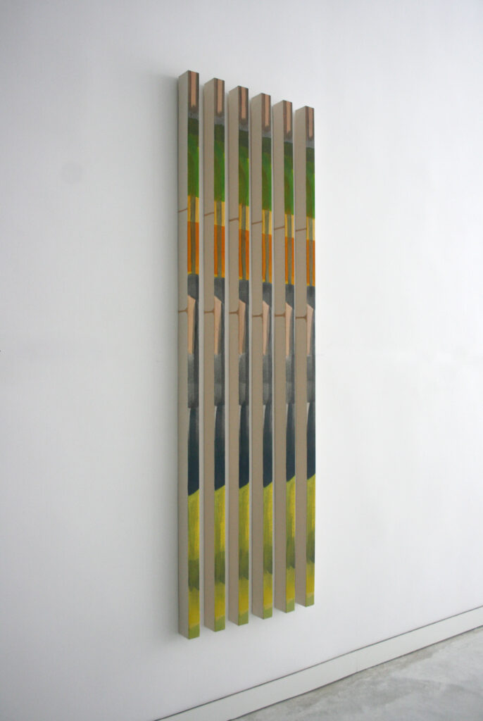
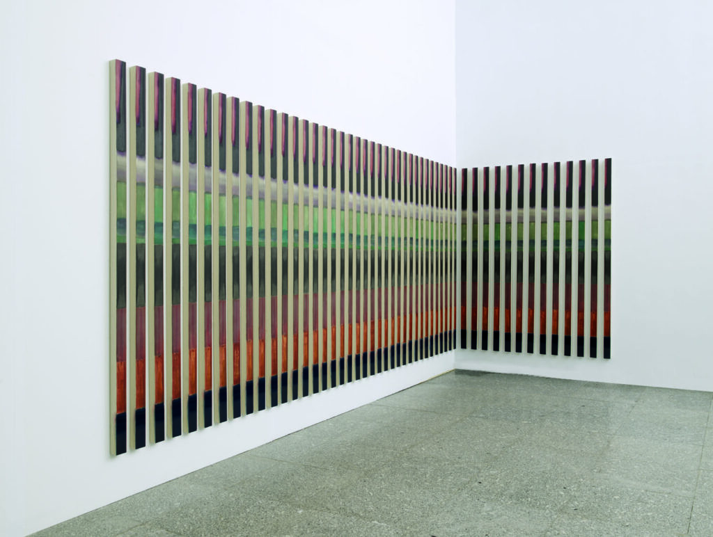
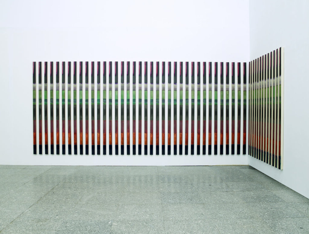
Arden Quin’s subsequent body of work is characterized by a consistent engagement with these pre-conditions for art-making. His shaped paintings eschew any right angles in favor of the obtuse and acute, while the artist and his colleagues developed a number of innovative forms all in the name of a ludic instability: hanging mobiles; groups of movable paintings known as “coplanals”; sculptures with rearrangeable components. This especially fruitful period also saw Arden Quin’s conception of an undulating format of painting known as the “Forme Galbée.” While these paintings are stationary, their surfaces roll from concave to convex and back again in a manner conveying the sensation of motion, heightened by the optical play that occurs between the painted compositions and the undulations of the support. Arden Quin later revisited this format with new attention and vigor during the 1970s. 

In 1948, following a schism within the Madi group, Arden Quin relocated to France where he would later continue to promote his strand of the movement, all the while incorporating new elements into the Madi arsenal. While Arden Quin would maintain production of irregularly shaped canvases and playful sculptures, the artist’s creativity was also fueled by his study of Georges Vantongerloo’s artwork and his bourgeoning friendship with Francis Picabia. Inspired by the former’s monochrome palette, Arden Quin likewise experimented with a reduction of his own during this period, creating what has been referred to as his “White Forms.” Reflecting on a visit to Vantongerloo’s studio, Arden Quin stated: “ . . . I hadn’t understood Mondrian, or Malevich, and even less so the Malevich of White on White. It was by observing the work of Vantongerloo that, for the first time, I was aware of that problem. Currently, with the creation of the MADI scientific movement I have blankness as an artistic basis for this new experience. For me, blank space isn’t a relationship like it is for Mondrian, nor the way emptiness is for Vantongerloo, but rather art’s essence, function, and creation.”[10]

In the mid-1950s, Arden Quin briefly returned to Buenos Aires, cofounding the Agrupación Arte Nuevo before ultimately returning to France, where, from 1958 to 1971, collage and decoupage were the artist’s medium of choice.[11] During this time, Arden Quin also dedicated himself to literary endeavors. In 1960, he cofounded with Godo Iommi a poetry group known as La Phalène, and in 1963, he inaugurated Ailleurs, a literary journal that ran until 1968. As Arden Quin’s career progressed, he incorporated new materials—plastics and metals—and maintained a strong case for the expansive possibilities of painting and sculpture until the end of his life.  

The work of Carmelo Arden Quin has been included in such groundbreaking exhibitions as Latin American Artists of the Twentieth Century, Plaza de Armas, Seville (Traveled to: Centre Pompidou, Paris; Josef-Haubrich Kunsthalle, Cologne; Museum of Modern Art, New York); La Escuela del Sur: El Taller Torres García y su legado, Museo Nacional Centro de Arte Reina Sofía, Madrid (Traveled to: Archer M. Huntington Art Gallery, Austin; Museo de Monterry, Mexico; Art Museum of the Americas, Washington, DC; Bronx Museum of Art, New York; Museo Rufino Tamayo, Mexico City); Arte MADI, Museo Nacional Centro de Arte Reina Sofía, Madrid (Traveled to: Museo de Arte Extremeño e Iberoamericano, Badajoz); Beyond Geometry: Experiments in Form 1940s–70s, Los Angeles County Museum of Art (Traveled to: Miami Art Museum); Inverted Utopias, Museum of Fine Arts, Houston; A Tale of Two Worlds, Museum für Moderne Kunst, Frankfurt (Traveled to: Museo de Arte Moderno de Buenos Aires); Sur moderno: Journeys of Abstraction, Museum of Modern Art, New York. His artwork may be found in the Daros Latin American Collection, Zurich; Harvard Art Museums, Cambridge, MA; Los Angeles County Museum of Art; Museum of Fine Arts, Houston; Museum of Modern Art, New York; Patricia Phelps de Cisneros Collection, Caracas and New York; and the Tate Americas Foundation

[1] Claudia Laudanno, “Carmelo Arden Quin: Aestheticism and Asceticism of a Madi,” Art en Colombia 93; ArtNexus 47 (2003): 60–65. This text is reproduced in Geometric Abstraction in Latin America: Anthological Texts Arte en Colombia/ArtNexus (Bogota: ArtNexus, 2013), 69–70.

[2] Ibid., 68–70.

[3] Shelley Goodman, When Art Jumped Out of its Cage (Dallas, TX: MADI Museum and Gallery, 2004), 45–48. See also Gabriel Perez-Barreiro, “Buenos Aires: Breaking the Frame” in The Geometry of Hope: Latin American Abstract Art from the Patricia Phelps de Cisneros Collection, exh. cat. (Austin, TX: The Blanton Museum, 2007), 36.

[4] Laudanno, “Carmelo Arden Quin,” 69. See also, Shelley Goodman, When Art Jumped Out of its Cage, 48, and Santiago B. Olmo, “The Madi Art Labyrinth: Museo Nacional Centro de Arte Reina Sofia, Madrid,” Arte en Colombia 72; ArtNexus 26 (1997): 119–121. This text is reproduced in Geometric Abstraction in Latin America, 36.

[5] María Amalia García, “Arturo Magazine and the Manifold Power of the Avant-Garde,” in Arturo, facsimile (Buenos Aires: Fundación Espigas, 2018), 33–34.

[6i] Carmelo Arden Quin, untitled text, Arturo, facsimile (Buenos Aires: Fundación Espigas), 49.

[7] Cristina Rossi, “Invention and Movement,” in Kinesthesia: Latin American Kinetic Art, 1954–1969, exh. cat. (Palm Springs, CA: Palm Springs Art Museum, 2017), 66.

[8] Laudanno, “Carmelo Arden Quin,” 68, 69.

[9] Perez-Barreiro, “Buenos Aires: Breaking the Frame,” 36.

[10] Quoted in Rossi, “Invention and Movement,” 76.

[11] Alexandre de la Salle, “Quelques expositions d’Arden Quin et de Madi entre 1958 et 2008,” in Carmelo Arden Quin (Cagnes-sur-mer, France: Editions L’image et la parole, 2008), 259.

Selected Solo and Two-Person Exhibitions
2018 Carmelo Arden Quin: La Utopía Modernista, Simões de Assis Galería, São Paulo
Carmelo Arden Quin: Invention, Leon Tovar Gallery, New York
2017 Carmelo Arden Quin: Obras 1940–2010, Vermeer Galería de Arte, Buenos
Aires
2014 Arden Quin: Retrospective Exhibition 1938–2009, Durban Segnini Gallery, Miami
Carmelo Arden Quin: A invencão lúdica: Décadas de 1940–2000, Simões de Assis Galería,
Curitiba, Brazil
2013 Carmelo Arden Quin: Paintings, Collages, Mobiles, 1930s to 1970s, Sicardi Gallery, Houston
Arden Quin: La Invención Lúdica, Museo Provincial de Bellas Artes Franklin Rawson, San
Juan, Argentina
2012 Carmelo Arden Quin, Galería del Paseo, Punta del Este, Uruguay
2010 Carmelo Arden Quin/La Vanguardia Rioplatense, Spanish Cultural Center, Montevideo
2007 Carmelo Arden Quin, Drouart Gallery, Paris
Coplanales 1946–2007, Fondo Nacional de las Artes, Buenos Aires
2005 Carmelo Arden Quin: MADI pinturas | objetos, Museo de Arte Contemporáneo,
Universidad Nacional del Litoral, Santa Fe, Argentina
2001 Confrontaciones: Carmelo Arden Quin y Enio Iommi, Galería Del Infinito, Buenos Aires
2000 Arden Quin en Argentina, Museo de Arte Contemporaneo Latinoamericano, La Plata,
Argentina
1999 Franka Berndt Gallery, Paris
1998 Carmelo Arden Quin. Pinturas y objetos 1945–1995, Galería Ruth Benzacar, Buenos Aires
1997 Arden Quin, Fundación Arte y Tecnología, Madrid
1995 Continuidad MADI, Centoira Gallery, Buenos Aires
1994 Arden Quin: Oeuvres, 1934–1994, Esplanade Gallery, School of Fine Arts, Metz, France
1992 Arden Quin et Madi, Galerie Alexandre de la Salle, Saint-Paul de Vence, France
1990 Arden Quin: Recent Works, Keller Gallery, Paris
1989 Carmelo Arden Quin: Collages 1950–1960, Galerie Down-Town, Paris
Arden Quin: 1936–1952, Galerie Alexandre de la Salle, Saint-Paul-de-Vence, France
1988 Arden Quin: Formes Galbées, Galerie Alexandre de la Salle, Saint-Paul-de-Vence, France
Franka Berndt Gallery, Paris
1987 Arden Quin, Galerie Alexandre de la Salle, Saint-Paul-de-Vence, France
Arden Quin, Galerie Down-Town, Paris
1986 Cincron Centro Culturale Arte Contemporanea, Brescia, Italy
1985 Arden Quin: 1936–1985, Galerie des Ponchettes, Musées de Nice, France
Galerie Alexandre de la Salle, Saint-Paul-de-Vence, France
1983 Hommage de Carmelo Arden Quin à l’Occasion de son 70ème Anniversaire, L’Espace LatinoAméricain, Paris
Galerie Alexandre de la Salle, Saint-Paul-de-Vence, France
1981 Galerie Alexandre de la Salle, Saint-Paul-de-Vence, France
1979 Galerie 30, Paris
Galeria-Association Lieu 5, Vieux Nice, France
1978 Retrospective, Galerie Alexandre de la Salle, Saint-Paul-de-Vence, France
1977 Arden Quin, Oeuvres 1942–1977, Galerie Quincampoix, Paris
1973 Arden Quin, Collages, Découpages, Galerie Charley Chevalier, Paris
1954 Exhibition of collages and cut outs, home of Dr. E. Rolla, Buenos Aires

Selected Group Exhibitions
2019 Outlines, Leon Tovar Gallery, New York
2017 Making Art Concrete: Works from Argentina and Brazil in the Colección Patricia Phelps de
Cisneros, J. Paul Getty Museum, Los Angeles
2016 Homenaje a los 70 años Madi, Vermeer Galería de Arte, Buenos Aires
2014 Radical Geometry: Modern Art of South America From the Patricia Phelps de Cisneros
Collection, Royal Academy of Arts, Lodon
2012 Cor e Forma III, Simões de Assis Galeria, Curitiba, Brazil
2011 International Contemporary Masters, Abigail Galéria, Budapest
América Fría: La Abstracción Geométrica en Latinoamérica (1934–1973), Fundaciòn Juan
March, Madrid
MADI Internacional: Argentina, Brasil, Uruguay, Palais de Glace, Palacio Nacional de las
Artes, Buenos Aires
Conscience polygonale, Château de Carros, Nice, France
Geometrie di luce, Palazzo della Vicaria, Trapani, Italy
MADI: Carmelo Arden Quin and Co., Musée d’art et d’histoire de Cholet, France
2010 MADI Internacional, Laura Haber Art Gallery, Buenos Aires
2008 Mouvement MADI International, Maison de l’Amérique Latine, Paris
2007 Madi noir et blanc, Paris-Mauberge, France
Espace MADI, Galerie des Wantiers, Valenciennes, France
The Geometry of Hope: Latin American Abstract Art from the Patricia Phelps de Cisneros
Collection, Blanton Museum of Art, The University of Texas, Austin (Traveled to: Grey
Art Gallery, New York University)
2005 Madi Art, Optic and Kinetic Exhibition, Durban Segnini Gallery, Miami
L’oeil moteur: Art optique et cinétique, 1950–1975, Musée d’Art Moderne et
Contemporain de Strasbourg, France
2004 7 International Madi Artists, Durban Segnini Gallery, Miami
Inverted Utopias, Museum of Fine Arts, Houston
Beyond Geometry: Experiments in Form 1940s–70s, Los Angeles County Museum of Art
(Traveled to: Miami Art Museum)
2003 Movimiento MADI Internacional, Museo de Arte Contemporáneo Latinoamericano, La
Plata, Argentina (Traveled to: Centro Cultural Borges, Buenos Aires)
Arte Abstracto Argentino—Arte Concreto Invención, Fundación Proa, Buenos Aires
2002 Festival Kassak et MADI aujourd’hui, Galéria Z, Mesaké Múzeum, Bratislava, Umenia
Gallery, Slovakia
2001 Geometric Abstraction: Latin American Art from the Patricia Phelps de Cisneros Collection, Fogg
Art Museum at Harvard Univertiy, Cambridge, MA
ARTE Madi Freie Geometri, Emilia Suciu Gallery, Ettlingen, Germany
MADI: Outside the Box, Polk Museum of Art, Lakeland, FL
Abstract Art from the Rio de la Plata: Buenos Aires and Montevideo, The Americas Society,
New York
2000 Arte MADI, Palazzo Reale di Portici, Naples, Italy
Art Concret, Espace de ‘Art Concret, Mouans-Sartou, France
1997 Arte MADI, Museo Nacional Centro de Arte Reina Sofía, Madrid (Traveled to:
Museo Extremeño e Iberoamericano de Arte Contemporáneo, Badajoz, Spain)
Bienal de Mercosur, Porto Alegre, Brazil
1996 MADI Internacional: 50 Años Después, Ibercaja Bank, Zaragoza, Spain
1995 Arte MADI, anterioridad y continuidad, Museo Torres García, Montevideo
1994 Art from Argentina, 1920–1994, Museum of Modern Art, Oxford (Traveled to: Royal
College of Art, London; and the Centro Cultural Borges, Buenos Aires)
1992 Abstraction géometrique, Galerie Alexandre de la Salle, Saint-Paul de Vence, France
Latin American Artists of the 20th Century, Antigua Estacion de Armas in Seville, Spain
(Traveled to: Centre Georges Pompidou, Paris; Ludwig Museum, Josef-HaubrichKunsthalle, Cologne, Germany; Musem of Modern Art, New York)
1991 Arte Concreto Invención, Arte Madi, Haus für Konstrucktive und Konkrete Kunst, Zurich:
(Traveled to: Galerie Lahumière, Paris, with a condensed presentation at Rachel Adler
Gallery, New York)
La Escuela del Sur: El Taller Torres García y su legado, Museo Nacional Centro de Arte
Reina Sofía, Madrid (Traveled to: Archer M. Huntington Art Gallery, Austin, TX; Museo
de Monterry, Mexico; Art Museum of the Americas, Washington, DC; the Bronx
Museum of Art, New York; Museo Rufino Tamayo, Mexico City)
1990 Ambivalences, Galerie Alexandre de la Salle, Saint-Paul de Vence, France
Art Construit, Galerie Convergence, Paris
1989 Art in Latin America: The Modern Era, 1820–1980, Hayward Gallery, London (Traveled to:
Palacio de Velasquez, Madrid)
1987 9 artistas del Espacio Latinoamericano de París, Del Retiro Galería de Arte, Buenos Aires
Abstraction Geometrique, Galerie Alexandre de la Salle, Saint-Paul-de-Vence, France
1985 Madi group show, Cultural Affairs Committee of UNESCO, Paris, France.
1984 Face á la Machine, L’Espace Latino-Américan, Paris
I Havana Biennial
Madi Maintenant: Sortie du Rectangle, Galerie Alexandre de la Salle, Saint-Paul-de-Vence,
France
Madi group show, Il Salotto Gallery, Como, Italy
Madi group show, Luisella d’Alessandro Gallery, Turin, Italy
MADI group show, Galerie Alexandre de la Salle, Nice, France
1982 Mouvances, MADI, Espace Donguy, Paris
Group show, Galerie Alexandre de la Salle, Saint-Paul-de-Vence, France
1981 20 Artistes Latino-Américains, Hotel de Ville, Arcueil, France
1980 Vanguardias de la década del 40. Arte concreto invención-arte MADI-perceptismo, Museo
Sivori, Buenos Aires
1976 Homenaje a la Vanguardia Argentina: Decada del 40, Galería Arte Nuevo, Buenos Aires
1968 Group show, Alexandre de la Salle Gallery, Place Godeau, Vence, France
1967 Exhibition of Madí poems and books, Librairie David, l’Odeon, Paris
1964 50 años de “Collages,” Papiers Collés, Musée d’Art et d’Industrie, Saint-Étienne Museum,
France
1962 Del arte concreto a la nueva tendencia, Museo de Arte Moderno, Buenos Aires
1961 150 años de arte argentino, Museo Nacional de Bellas Artes, Buenos Aires
1959 Pientres et Sculpteurs Argentins en France, Centre Culturel Artistique du Comité FranceAmérique, Paris
1958 Panorama de la Escultura Non Figurativa Argentina, Asociación Estímulo de Bellas Artes,
Buenos Aires
1956 XI Salon des Réalités Nouvelles, Paris
Pintura y Escultura non Figurativa, Museo de Artes Plasticas Sivori, Buenos Aires
1955 X Salon des Réalités Nouvelles, Paris
Salón de Arte Nuevo non Figurativo, Galería Van Riel, Buenos Aires
1954 IX Salon des Réalités Nouvelles, Paris
1953 Madi group show, Galerie de l’Odeon, Paris
VIII Salon des Réalités Nouvelles, Paris
1952 VII Salon des Réalités Nouvelles, Paris
Primera Exposición Internacional de Arte, Galería Cuatro Puntos, Caracas
Diagonale, Denise René Gallery, Paris
1951 VI Salon des Réalités Nouvelles, Paris
Espace-Lumière, Galérie Suzanne Michel, Paris
1950 Madí group show, Colette Allendy Gallery, Paris; the show is reinstalled at the V Salon
des Réalités Nouvelles, Paris
1949 1ère Exposition des Artistes d’Amerique Latine a Paris, Maison de l’Amérique Latine, Paris,
France.
IV Salon des Réalités Nouvelles, Paris
Segundo Salón de Arte No Figurativo, Abstracto, Concreto, Madi, Madinemsor, Galería Van
Riel, Buenos Aires
1948 Exposición de Pintura Argentina, Centro Cultural y Deportivo Israelita, Ramos
Mejía, Provincia de Buenos Aires
Exposición Arte Madí, house of Martín Blaszko, Buenos Aires
III Salon des Réalités Nouvelles, Paris
Nuevas Realidades, Arte Abstracto Concreto, Galería Van Riel, Buenos Aires
1947 Primera Muestra de Arte Nuevo (Joven Pintura Argentia), Salón Kraft, Buenos Aires
Segunda Muestra de Arte Nuevo, Galeria Payer, Buenos Aires
1946 Primera Exposición del Grupo MADI, French Institute of Higher Education, Galería Van
Riel, Buenos Aires
Segunda Exposición de Arte MADI, Escuela Libre de Artes Plásticas Altamira, Buenos Aires
Tercera Exposición de Arte MADI, Bohemian Club, Galerías Pacífico, Buenos Aires
Primera Exposición Internacional de Arte MADI, Ateneo of Montevideo
1945 Primera Exposición de Arte Concreto Invención, at the home of Dr. Enrique Pichon-Rivière,
Buenos Aires
Segunda Exposición Arte Concreto Invención, at the studio of Grete Stern, Buenos Aires
1944 Group show with works by Arden Quin, Tomas Maldonado, Lidy Prati, and Oscar
Nuñez, Galería Conte, Buenos Aires
1936 Exposición a favor de los republicanos españoles, Ateneo of Montevideo

Selected Collections
Blanton Museum of Art, University of Texas, Austin
Centre National des Arts Plastiques, Puteaux, France
Daros Latin America Collection, Zurich
Harvard Art Museums, Cambridge, MA
Los Angeles County Museum of Art
Museum of Fine Arts, Houston
Museum of Modern Art, New York
Patricia Phelps de Cisneros Collection, Caracas
Tate Americas Foundation

Source:
https://www.leontovargallery.com/carmelo-arden-quin
https://durbansegnini.com/artists/carmelo-arden-quin/

Concretism Art: the Beauty of Pure Form, Line and Color

Carlos Evangelista, master of abstraction

Concretism Art: the Beauty of Pure Forms, Lines and Colors

Concretism, an influential art movement that emerged in the 20th century, celebrates the purity of form and color in its most elemental state. As a response to the chaos and uncertainties of the post-war world, Concretism sought to create artworks that were free from representational or narrative content, focusing solely on the essential elements of visual art.

Inspired by geometric abstraction and the principles of constructivism, Concretism artists embraced a rigorous approach to composition, utilizing geometric shapes, lines, and colors with precision and clarity. Their creations were characterized by strict adherence to mathematical principles, often resulting in artworks that appeared harmonious and balanced to the eye.

One of the key tenets of Concretism was the rejection of illusionism and the desire to present the viewer with a pure visual experience. By eliminating any references to the external world, Concretism aimed to evoke a sense of universality and timelessness, inviting the viewer to engage with the artwork on a purely visual and emotional level.

Artists within the Concretism movement sought to explore the interplay of colors, shapes, and forms, using them as the primary means of expression. Through precise arrangement and juxtaposition, they created vibrant and dynamic compositions that conveyed a sense of rhythm and movement.

One of the pioneers of Concretism was Theo van Doesburg, who co-founded the influential De Stijl movement. Van Doesburg’s work exemplified the movement’s principles of geometric abstraction and pure color. Other notable artists associated with Concretism include Max Bill, Josef Albers, and Camille Graeser, among others.

Concretism’s impact extended beyond traditional painting to encompass other forms of artistic expression, such as sculpture, architecture, and graphic design. Its influence can still be seen in contemporary art and design, where the celebration of pure form and color continues to resonate with artists and viewers alike.

Concretism art remains a fascinating exploration of the inherent beauty found in pure form and color. By stripping away representational content, Concretism artists invited viewers to embark on a journey of visual discovery and emotional resonance. The movement’s commitment to precision and universal expression continues to inspire artists to this day, celebrating the enduring power of geometric abstraction and the allure of pure visual harmony.

Concretism art is characterized by several distinct features that set it apart as a significant movement in the realm of abstract art. These characteristics include:

  • Geometric Abstraction: Concretism art is grounded in geometric abstraction, where artists employ simple and precise geometric shapes such as squares, circles, triangles, and rectangles as the fundamental building blocks of their compositions. These shapes are often used in a precise and systematic manner, adhering to mathematical principles.
  • Non-Representational: Concretism artworks are non-representational, meaning they do not seek to depict recognizable objects or subjects from the external world. Instead, they focus on pure form, color, and the relationships between geometric elements to create a visual experience divorced from figurative references.
  • Rational and Logical: Concretism artists approach their work with a sense of rationality and logic. The compositions are meticulously planned and executed, adhering to mathematical precision and orderly arrangements. The art is often the result of a rigorous and intellectual process.
  • Flat and Clean Surfaces: Concretism art typically features flat and clean surfaces, devoid of texture or visible brushstrokes. This emphasis on smooth and non-textured surfaces contributes to the purity and objectivity of the artwork.
  • Primary Colors: Concretism artists often employ a restricted palette of primary colors (red, blue, and yellow) along with black and white. These colors are used in their pure form, without mixing or shading, to create bold and visually striking compositions.
  • Emphasis on Objectivity: Concretism seeks to present the viewer with an objective visual experience, devoid of emotional or narrative content. The artworks aim to engage the viewer’s intellect and perception, encouraging them to contemplate the pure elements of form and color.
  • Universality and Timelessness: By eliminating representational elements and focusing on geometric abstraction, Concretism art aspires to achieve universality and timelessness. The artworks are intended to transcend specific cultural or historical contexts, resonating with viewers across different times and places.
  • Relationship with Constructivism: Concretism art shares connections with the Constructivist movement, which also emphasized geometric abstraction and objectivity. However, Concretism developed as a response to the strict formalism of Constructivism, seeking to introduce a more intuitive and expressive approach to abstraction.

Concretism art is defined by its commitment to geometric abstraction, non-representational forms, rationality, and objectivity. Through the precision and harmony of its compositions, Concretism invites viewers to explore the intrinsic beauty of form and color, celebrating the essence of visual art.

Workshop | Gratitude Constellations through Mixed Media

Workshop | Gratitude Constellations through Mixed Media

Workshop | Gratitude Constellations through Mixed Media

When and where

Date and time

Thursday, August 17 · 6 – 7:30pm EDT

Arts Warehouse 313 Northeast 3rd Street Delray Beach, FL 33444

Phone: (561) 330-9614

Gratitude Constellations in Art: Honoring Ancestral Gifts Through Mixed Media Creativity
Embarking on a journey that intertwines the past, present, and future, we invite you to join us in a groundbreaking workshop that delves into the realm of gratitude and creativity. “Gratitude Constellations in Art: Honoring Our Ancestors’ Gifts” is a fresh and innovative event that beckons participants to explore their personal histories, connect with their ancestral roots, and express their appreciation through the medium of art.


A Fusion of Mediums, A Celebration of History
This brand-new and distinct workshop aims to guide participants through a transformative creative process using mixed media materials and reflective practices. By seamlessly blending artistry and introspection, attendees will have the unique opportunity to craft an artwork that is not only visually captivating but deeply meaningful. The workshop is designed to help participants draw inspiration from their own history, dreams, and ancestral lineage, thereby embarking on a voyage of self-discovery and artistic expression.


Navigating the Workshop
The “Gratitude Constellations in Art” workshop is structured to provide a comprehensive exploration of various themes and techniques:
. Honoring Ancestral Gifts: Delve into the depths of your generational tree, acknowledging the diverse and invaluable contributions of your ancestors that extend beyond your immediate family. This reflective exercise encourages a profound sense of gratitude for the countless gifts that have been passed down through the ages.
. Weaving a Bigger Tapestry: Engage in a process that connects you to a larger, interconnected sense of self and community. As you craft your artwork, you’ll discover how your personal narrative is intricately woven into the broader fabric of humanity.
. Art as a Medium of Expression: Explore the power of art as a means of expressing awareness and gratitude. Through creative techniques and mixed media materials, you’ll find an avenue to convey your emotions, thoughts, and appreciation in a visual language.


Guided Process: From Introspection to Creation
The workshop’s journey is thoughtfully crafted to guide participants through a sequence of engaging steps:
. Somatic Connection: Begin with somatic exercises, utilizing breathing and visualization techniques to establish a grounded and focused mindset. This step encourages a harmonious connection between mind and body, allowing for a deeper engagement with the creative process.
. Reflection and Collage: Reflect upon your personal history and heritage. Prepare collage pieces and draft a visual narrative for your canvas. This process invites you to reinterpret your experiences and memories, creating a visual representation that resonates with your journey.
. Mixed Media Mastery: Utilize the provided materials – acrylic paints, color pencils, glue or matte medium, scissors, and a variety of printed media – to bring your artistic vision to life. The combination of these materials enables you to experiment, innovate, and create a piece that authentically captures your sentiments.


Preparing for the Workshop
To fully immerse yourself in this enriching experience, we kindly ask attendees to bring:
• A canvas, preferably 16″ x 16″ or larger, which will serve as the foundation for your artistic endeavor.
• Optional paper keepsakes or photos that hold personal significance and can be incorporated into your artwork.


Provided Materials
In addition to your contributions, we will supply a range of high-quality materials, including acrylic paints, color pencils, glue or matte medium, scissors, and an assortment of magazines, books, and newspapers. These tools will enable you to explore various textures, colors, and styles as you craft your unique masterpiece.


Weaving Gratitude into Artistry
“Gratitude Constellations in Art: Honoring Our Ancestors’ Gifts” is more than just a workshop; it’s an invitation to weave gratitude into the fabric of your artistic expression. Through a harmonious fusion of introspection and creative exploration, you’ll emerge with a tangible representation of your appreciation and a deeper connection to your own story.
Join us in this exceptional workshop as we celebrate the past, infuse it with the present, and shape the future through the vibrant tapestry of art. Unearth your ancestral gifts, channel your creative spirit, and let your gratitude shine on canvas. Together, let’s honor the journey that brought us here and the legacy that continues to inspire us.

This workshop will be offered once a month, with the next session September 19th.

Other dates will be live one month in advanced:

October 25th

November 16th** Please note, Refunds will be processed only if requested 72+ hours prior to scheduled workshop date/time. No refund will be given if requested less than seventy two (72) hours until scheduled workshop time for any reason. Only one ticket transfer will be allowed per person per workshop type, and will only occur if requested outside of the 72 hour mark of the registered workshop. To request a refund and cancel your ticket, please call 561-330-9614**

Instructor Bio: Fiorella Velarde M.Ed

Leading with love and laughter: Human. Mother. Friend. Creator. Alchemist

Fiorella Velarde holds an M.S Education Psychology, M.S Education and Instructional Designer. Executive Coach Certified PCC, Certified Death Doula Practitioner.

“At my core, I’m passionate about humans thriving through practicing emotional intelligence, neuroscience based strategies, contemplative and art practices. I’m driven by the certainty that every living being deserves to enjoy love, joy and inclusion.So I go on my hectic day, learning, caring, mentoring, facilitating and connecting with hearts alike to spread out emotional intelligence (EQ) in the Latin American region (and anywhere possible) in my role of Regional Director for Six Seconds LATAM., the largest emotional community network in over 174 countries (and counting). I’m also a certified ICF PCC Coach with Better Up, where I am immensely happy to coach senior leaders from a variety of industries and backgrounds.”

Ig & FB @fiorellavelarde.eqcoach

How can artists use color psychology?

Primary Colors: blue, red, yellow

How can artists use color psychology?

Color psychology refers to the study of how colors can affect human emotions, behaviors, and perceptions. Artists can leverage color psychology in their work to create powerful and impactful artworks that evoke specific emotions and responses from viewers. Here are some ways artists can use color psychology

Conveying Emotions: Different colors evoke different emotional responses. For example, warm colors like red and orange can elicit feelings of passion and energy, while cool colors like blue and green can evoke a sense of calm and tranquility. By strategically selecting and using colors, artists can effectively convey specific emotions and moods in their artwork.

Setting the Mood: Colors can set the overall mood and atmosphere of an artwork. Bright and vibrant colors create a sense of excitement and energy, while muted and subdued tones can evoke a feeling of melancholy or introspection. Artists can use color to establish the desired mood and ambiance in their compositions.

Creating Visual Hierarchy: Colors can be used to establish a visual hierarchy in an artwork, guiding the viewer’s eye to specific focal points or elements. Bright and contrasting colors naturally draw attention, making them ideal for highlighting important aspects of the composition.

Symbolism and Cultural Context: Colors often carry cultural or symbolic meanings. Artists can use colors symbolically to reinforce themes or convey specific messages. For instance, red may symbolize love or passion in one culture, while it may signify luck or celebration in another. Understanding these cultural associations allows artists to add layers of meaning to their artwork.

Establishing Identity: Colors can play a crucial role in shaping the identity of a brand, character, or concept. In illustration and character design, for example, specific color choices can reflect personality traits or characteristics of the subject being depicted.

Creating Harmony and Contrast: Artists can use color psychology to achieve harmony or contrast in their compositions. Complementary colors, which are opposite each other on the color wheel, create visual contrast and make elements stand out. Analogous colors, which are adjacent on the color wheel, create harmony and a sense of unity.

Visual Perception and Illusions: Colors can be used to manipulate visual perception and create optical illusions. For instance, artists can use warm colors to make objects appear closer and cool colors to create a sense of depth and distance. Understanding color interactions can help artists create compelling visual effects.

Incorporating color psychology into their artistic process allows artists to enhance the emotional impact of their work and create deeper connections with their audience. By considering how colors can influence perception and emotions, artists can craft artworks that resonate more powerfully with viewers, convey intended messages, and create meaningful and memorable experiences.

Yellow

Yellow
Yellow

Primary Color Yellow – A Dynamic Symphony of Simplicity and Harmony

Embracing Radiance: The Luminous Intrigue of Primary Color Yellow

In the vast canvas of artistic expression, the color yellow stands as a celestial marvel, radiating warmth and splendor like the midday sun. As an art critic, I find myself irresistibly drawn to the enchanting allure of this primary hue. Yellow, with its luminous brilliance, dares to evoke emotions that range from unbridled joy to profound contemplation, weaving a tapestry of fascination that transcends the boundaries of mere pigment.

Like a sunflower stretching towards the heavens, yellow captures the essence of optimism and hope. It imbues the artwork with an effervescent spirit, illuminating even the darkest corners of a composition with a celestial glow. Whether subtly woven into the background or boldly claiming the spotlight, this resplendent color possesses an uncanny ability to command attention, drawing the viewer into its embrace.

In the hands of a master artist, yellow becomes a veritable alchemist, capable of transforming the mundane into the extraordinary. It is the gentle brushstroke that imbues a landscape with the essence of a golden dawn, a luminous promise of new beginnings. It is the fiery streak that ignites the imagination, setting ablaze a canvas with creative fervor. Its versatility is unparalleled, seamlessly transitioning from the serene calm of a sun-kissed meadow to the electrifying intensity of a swirling sunburst.

Yet, yellow’s true magic lies in its emotional resonance. Like a beacon of happiness, it awakens memories of sunlit strolls and carefree laughter. It whispers of sunsets drenched in honeyed hues, igniting a sense of nostalgia and serenity. In its warmer shades, yellow symbolizes friendship, sparking the warmth of camaraderie within the hearts of those who behold it. In its cooler tones, it resonates with the intellectual realms, stimulating contemplation and sparking curiosity.

The masterful use of yellow evokes a delicate balance, for its brilliance can easily overwhelm when wielded carelessly. But in the hands of a skillful artist, yellow breathes life into a composition, creating a visual symphony that dances with light and shadows. It is a color that demands respect, never to be underestimated, for its vivacity can transform a canvas into a living, breathing entity.

Yellow, the ever-present companion of the sun, is a color that transcends cultures and time. Its allure has inspired the creative minds of artists throughout history, leaving an indelible mark on the annals of artistic achievements. From the ethereal glow of Van Gogh’s sunflowers to the mesmerizing radiance of Rothko’s abstracts, yellow weaves an enduring legacy of artistic brilliance.

The color yellow is an incandescent gem in the artist’s palette, a timeless beacon of radiance and hope. Its ability to stir the soul, evoke memories, and ignite the imagination is a testament to the power of color in the hands of a visionary artist. With each stroke, yellow embraces us with its luminous intrigue, inviting us to explore the vast spectrum of emotions it holds within its golden embrace.

Yellow is a vibrant and luminous hue that exudes a radiant energy and holds a special place in the world of art and color theory. As one of the three primary colors, along with red and blue, yellow plays a fundamental role in creating a diverse spectrum of colors and serves as a foundational element in artistic expression.

Emotional Impact:
Yellow is often associated with positivity, joy, and optimism. Its bright and cheerful nature evokes feelings of happiness, warmth, and energy. Yellow has the power to uplift the spirit and create a sense of optimism and hope.

Symbolism and Meanings:
Yellow carries various symbolic meanings across different cultures and contexts. It is frequently associated with the sun, representing light, life, and growth. Yellow is also linked to qualities like creativity, intellect, and enlightenment.

Psychological Effects:
Studies have shown that yellow can have psychological effects on individuals. It is believed to stimulate mental activity and boost feelings of happiness and energy. However, excessive exposure to yellow can be overwhelming and may lead to feelings of anxiety or agitation.

Complementary and Contrasting Colors:
In color theory, yellow is considered complementary to purple. When placed side by side, these colors create a striking contrast that enhances their individual impact. This complementary relationship is frequently used by artists to create dynamic and visually engaging compositions.

Variations and Tones:
Yellow offers a wide range of shades and tones, from the soft and delicate pastel yellows to the bold and intense shades of golden and sunflower yellow. Each variation of yellow carries its own unique mood and atmosphere, providing artists with a versatile palette to explore and express a wide range of emotions.

Cultural Significance:
Yellow has significant cultural and historical importance in various traditions and artistic styles. It has been used in art across different periods and cultures, from the golden halos in religious paintings to the use of yellow in Asian art, where it is associated with good fortune and prosperity.

Use in Art History:
Artists throughout history have harnessed the power of yellow to create expressive and evocative artworks. From the vibrant yellows used in the Impressionist paintings of Vincent van Gogh to the bold and symbolic use of yellow by artists like Wassily Kandinsky, yellow has been employed to convey a sense of energy, emotion, and luminosity in their works.

Yellow is a dynamic and emotive hue that holds both symbolic and psychological significance. Its ability to evoke feelings of joy, warmth, and optimism makes it a valuable tool in artistic expression. Whether used to depict the radiance of the sun, capture the essence of happiness, or add visual contrast to a composition, yellow continues to inspire artists and captivate viewers with its vibrant and luminous allure.

Rare Painted Cross is the Oldest of 30 Medieval, Renaissance, and Baroque Paintings

The Gandolfi Vannini Family in their Key Biscayne, Miami home: (l to r) Manuel age 13 (class of ‘28 Belen); Federico Gandolfi Vannini, owner of Frascione Arte (Florence, Italy); Joseph age 7; Margherita age 9; Pietro age 11 (class of ‘30 Belen).

Rare Painted Cross is the Oldest of 30 Medieval, Renaissance, and Baroque Paintings to Travel from Italy to Miami Art Exhibition

A “Painted Cross” dating back to ca. 1295 may be one of the earliest surviving crucifix paintings from medieval Umbria to be exhibited in the United States.  This remarkable piece, along with 30 other works from the 13th – 17th centuries, will make their journey from Italy to a South Florida art exhibition.“Faith, Beauty, and Devotion: Medieval, Renaissance, and Baroque Paintings” will open to the public on Saturday, September 16, 2023 at the Olga M. & Carlos A. Saladrigas Art Gallery at Belen Jesuit Preparatory School.

“It is extremely rare to find a surviving work from the late 13th century – a sort of ‘miracle,’ in fact,” as explained in the catalog that will be on sale at the exhibition. “Moreover, in this instance, the Umbrian master once identified as Rinaldo di Ranuccio by Roberto Longhi (one of the greatest Italian art historians of the first half of the 20th century) tried his hand at an exceedingly rare – perhaps even unique up to the present moment – iconography, depicting St. Francis and St. Clare alongside the arms of the cross.”

St. Clare, canonized in 1255, is shown to the left of Jesus’s body and St. Francis, Patron Saint of Assisi, canonized in 1228, to the right. (A young St. John and the Virgin are to the left and right of Jesus’ hands, respectively.)

Painted Cross ca. 1295, Umbrian-Marches Master, tempera, gold and silver on panel, 63x46.8”
Painted Cross ca. 1295, Umbrian-Marches Master, tempera, gold and silver on panel, 63×46.8”

Ahead of its Time

This rare painting marks the dawn of a “modern” style at a time in Italy when Byzantine influences were prevalent. It is considered ahead of its time since the artist pursued spatiality and depth at the end of the 13th century without possessing the basic mathematical knowledge of perspective used a hundred years later during the Renaissance.

A Form of Silent Speech

The symbology is the most important part of the composition as it was intended to speak to a humble, often illiterate audience which could understand, through the painting, the meaning of love, forgiveness, sacrifice, devotion, sorrow, and salvation.

“Painted Cross is a very rare painting that was made for a church in Umbria [a region where each year, approximately 6 million pilgrims make their way to visit St. Francis’ tomb in Assisi]. It represents a transition in Medieval art in the time of Giotto and Cimabue. Florence and Umbria were the main regions,” comments Federico Gandolfi Vannini, owner of Frascione Arte, which is presenting the Faith, Beauty,  and Devotion exhibition in partnership with Belen Jesuit Preparatory School. “The beauty of the piece functions to communicate the divine message to worshippers.”

“Painted Cross” was acquired by Frascione Arte from a private collection in Switzerland and has been recently loaned to La Galería Nacional, Museo Diocesano Spoleto, and the Accademia Gallery, which also houses Michelangelo’s David. The painting measures 63” x 47.2” (unframed) and the medium is tempera on panel. 

Continuing His Grandfather’s Journey:  Federico Gandolfi Vannini, Owner of Frascione Art 

Federico Gandolfi Vannini grew up surrounded by masterpieces by Goya, Caravaggio, and Titian while visiting his grandfather Vittorio Frascione, an accomplished antiquarian and art collector. Vittorio’s passion for high-quality works began with his father Enrico in the late 19th century. Federico initially studied law at the University of Florence, but while traveling extensively during his first year of university,  he became captivated by different cultures and history for a few years.  It was then that his journey as an antique dealer began. After running an antique emporium in Texas, Federico returned to Florence to study Art History.  In 2008, Federico opened Frascione Arte on the historic Via Maggio. Federico’s goal is to continue his grandfather’s journey and present with new energy four generations of a family’s passion and commitment to the art world. Today, he continues this journey alongside his wife Daisy, who serves as Frascione Arte’s Cultural Director.

Daisy Diaz was born in Miami to Cuban American parents. Her father’s passion for antiquities ignited Daisy’s lifelong commitment to the arts. After graduating from Boston College, she set out to complete a master’s degree in industrial design in Florence, which led to a career at Lungarno Alberghi (the Salvatore Ferragamo family’s hospitality and interior design group). Soon after, she formed her own distribution company. Daisy’s unwavering appreciation of the arts would lead her to meet Federico and, for more than a decade, the couple has expanded their private collection.

Since 2020, Federico and Daisy have lived in Miami while continuing to run Frascione Arte. They hope to make a lasting impact on South Florida’s arts and culture scene.

“Faith, Beauty, and Devotion” offers a unique opportunity to explore three significant periods in art history — Medieval, Renaissance, and the Baroque eras — through a captivating collection of 30 sacred and secular paintings by Italian and Flemish Masters. Most paintings have never been seen in the United States.

Other noteworthy highlights of the exhibition include tempera and gold on panel works by Nicolò di Pietro (Siena, ca. 1420) and Francesco di Zanino and Zanino di Pietro (Venetian School, 15th c.); tempera on gold leaf on parchment work by Pacino di Bonaguida (Florence, ca. 1340,); tempera on panel works by Ludovico Urbani; oil on panel portraits by Giuliano Bugiardini and Ridolfo del Ghirlandaio (Florence); oil on canvas works by Jacopo Tintoretto (Venice, 16th c.), Louis Finson (Bruges, ca. 1607), Guercino (Bologna, ca. 1640), Circle of Caravaggio (Milan, 17th c.), and Francesco Botti (Florence, Baroque). Visit the full list of paintings at:  https://www.belenjesuit.org/exhibition.

The Gandolfi Vannini Family in their Key Biscayne, Miami home: (l to r) Manuel age 13 (class of ‘28 Belen); Federico Gandolfi Vannini, owner of Frascione Arte (Florence, Italy); Joseph age 7; Margherita age 9; Pietro age 11 (class of ‘30 Belen).

Faith, Beauty, and Devotion: Medieval, Renaissance, Baroque Paintings
September 16 – December 10, 2023, Art Basel Miami
Gallery Hours: Monday to Friday, 9:00 am – 3:30 pm by appointment. Other hours by request.
Olga M. & Carlos A. Saladrigas Art Gallery
at Belen Jesuit Preparatory School
500 SW 127 Ave.
Miami, FL 33184
Website: https://www.belenjesuit.org/exhibition
[email protected]
(786) 621-4624
Public Opening on Sat Sept 16th
The exhibition is free, though donations are welcomed to support future exhibitions. Sponsorship opportunities are also available.

About Belen Jesuit Preparatory School

The Society of Jesus is both a missionary and a teaching Roman Catholic religious order since Pope Paul III founded it at the request of Saint Ignatius of Loyola in 1540.  The motto of the Society, “Ad Majorem Dei Gloriam,” indicates its goal to help all men and women to live according to Christ’s example of love and service. The Jesuits dedicated themselves to spreading the Gospel in mission lands and to the apostolate of education very early in their history. 

The Jesuits founded Belen Jesuit Preparatory School in 1854 in Havana, Cuba.  In 1961, when the new political regime confiscated Belen and all private schools, the school was re-established in Miami that same year and has grown over the last five decades. Currently, the enrollment is nearly 1,400 male students in grades 6 to 12 and over seven thousand alumni. The Ignatian Center for the Arts includes the 665-seat, state-of-the-art Ophelia & Juan Js. Roca Theater and the 3,200 square-foot Olga M. & Carlos A. Saladrigas Art Gallery. The Saladrigas Gallery displays several professionally curated exhibits annually, a young artists exhibit, a Belen community art show, and numerous other projects.

Visu Contemporary Sculpture and Repetition

Karen Rifas 3819 Visu Contemporary

Visu Contemporary to present Sculpture and Repetition in Painting an exhibit featuring works by Alfredo Álvares Plágaro, Karen Rifas and Hendrik Zimmer.

Visu Contemporary is delighted to announce its upcoming exhibit, Sculpture and Repetition in Painting — featuring the remarkable works of three distinguished artists: Alfredo Álvares Plágaro, Karen Rifas and Hendrik Zimmer. The exhibit will be on display at the gallery from August 19th to September 16th, 2023, with an opening reception on Saturday, August 19th from 6-8pm.
By incorporating repetition and sculptural elements into paintings, artists introduce texture and depth, while playing to our senses of physicality. The importance of the original form is lost and we are drawn to multifarious reiterations. Kusama, LeWitt, Warhol, among many other artists have used repetition and sculpture within their works to great effect. Sculpture and Repetition in Painting offers a unique opportunity for art enthusiasts and collectors to immerse themselves in a diverse display of contemporary artworks which explore and push the edges of artistic expression. 


Alfredo Álvarez Plágaro is an acclaimed artist known for his Identical Paintings series he began in 1989, which includes works with multiple repetitions of the same motif, painted in exactly the same manner. In the late ‘90s he held, Two Identical Exhibitions parallel shows, with identical works in two Madrid locations. Plágaro eludes the compulsion toward originality, stating, “repetition has become the most important motive of my artistic will.” Plagaro’s paintings bear a distinct influence of sculpture with their captivating three-dimensionality, which intrinsically accompanies his process.

Karen-Rifas-IMG-3948-Visu-Contemporary

Karen Rifas uses a precise palette of contrasting hues to transform spatial perception, creating sculptural forms which draw viewers into her works. Rifa’s distinctive geometric abstractions, dedication to form and hand painting places her among other great female artists such as Lee Carmen Herrera and Zilia Sanchez.

Hendrik Zimmer found his way to painting after studying with the renowned sculptor Tobias Rehberger. Zimmer’s practice revolves around the exploration of materiality and the creative process, which he describes as one where the works emerge as paintings through sculpture.” Zimmer’s unique large-scale woodcuts feature precise geometric forms and saturated colors, inviting viewers to fill the spaces and gaps with their own interpretations. His unique artistic process, where sculptures transform into paintings, unveils a harmonious integration of two distinct art forms.

Visu Contemporary is an artist first gallery where emphasis is placed on quality and presentation. VISU Contemporary’s mission is to contribute to the art history canon by presenting provocative and inclusive exhibitions, projects, installations, collaborations and performances with the goal of making each exhibition a must-see, while inspiring curiosity and intrigue from every visitor.

For more information about Sculpture and Repetition in Painting and other upcoming exhibits at Visu Contemporary, please visit www.visugallery.com 

Sculpture and Repetition in Painting 

Aug 19-Sep 16, 2023 – opening reception Saturday, August 19th – 6-9pm

VISU CONTEMPORARY

2160 Park Avenue, Miami Beach 

Operating Hours
Aug 19-Sep 16, 2023: Wednesday through Saturday, 12pm-5pm

Schedule an appointment: [email protected]

Color theory

Midnight and Noon VIII, 1964
Josef Albers (1888-1976) Midnight and Noon VIII, 1964

Color theory

Color theory is the study of how colors interact with each other. It is a complex and fascinating subject, and it has been used by artists and designers for centuries to create beautiful and effective works of art.

There are three main components of color theory: hue, saturation, and value. Hue is the name of a color, such as red, blue, or green. Saturation is the intensity of a color, and it is determined by the amount of white that is mixed with it. Value is the lightness or darkness of a color, and it is determined by the amount of black that is mixed with it.

The relationships between colors can be described in many different ways. One common way is to use the color wheel. The color wheel is a circular diagram that shows the relationships between the primary, secondary, and tertiary colors. Primary colors are the colors that cannot be created by mixing other colors. They are red, yellow, and blue. Secondary colors are created by mixing two primary colors together. They are orange, green, and purple. Tertiary colors are created by mixing a primary color with a secondary color.

There are many different ways to use color theory in art. One common way is to use complementary colors. Complementary colors are colors that are opposite each other on the color wheel. When complementary colors are placed next to each other, they create a strong contrast. This contrast can be used to create a sense of excitement or drama in a work of art.

Another common way to use color theory in art is to use analogous colors. Analogous colors are colors that are next to each other on the color wheel. When analogous colors are placed next to each other, they create a sense of harmony and unity. This harmony can be used to create a sense of calm or serenity in a work of art.

Color theory is a complex and fascinating subject, but it is also a very practical one. By understanding the principles of color theory, artists and designers can create works of art that are both visually appealing and emotionally resonant.

In addition to the color wheel, there are many other tools and techniques that can be used to understand and apply color theory. These include color harmony charts, color fan decks, and color psychology studies. By using these tools, artists and designers can develop a deeper understanding of the power of color and how it can be used to create effective works of art.

I hope this unique text about color theory has been informative and thought-provoking. If you are interested in learning more about color theory, I encourage you to do some additional research. There are many great resources available online and in libraries.

Page 180 of 277
1 178 179 180 181 182 277