Home Blog Page 95

Unlocking Your Vision: A Guide to Paints for Artists

The Dance of Light and Hue: Professor Anya Hurlbert's Exploration of Colour Perception

Unlocking Your Vision: A Guide to Paints for Artists

Art Supply  Paints: Acrylics, watercolors, oils, craft paints, and specialty finishes.

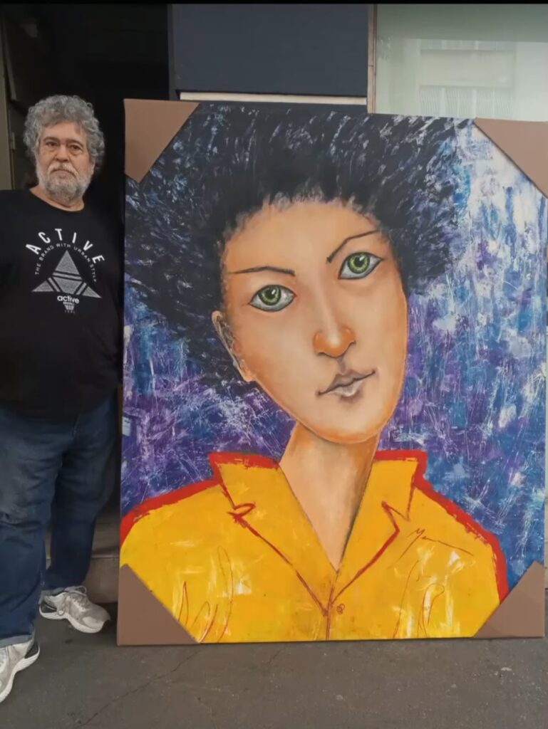
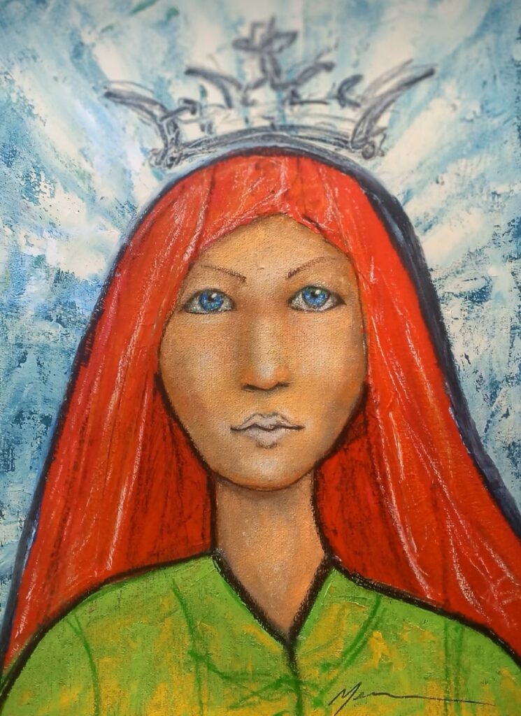
The world of paint offers an incredible spectrum of possibilities, each medium bringing its own unique characteristics, challenges, and expressive potential to the artist’s palette. Understanding these differences is key to choosing the right material for your vision. From the quick-drying versatility of acrylics to the luminous depth of oils, let’s explore some of the most common types of paints and specialty finishes.

Acrylics: The Modern Workhorse

Acrylic paints are a modern marvel, celebrated for their versatility and rapid drying time. Made from pigment suspended in an acrylic polymer emulsion, they can be thinned with water to mimic the transparency of watercolors or applied thickly to achieve impasto textures akin to oils. Their quick drying nature allows for fast layering, but also means you have to work relatively quickly. Acrylics are incredibly durable and flexible once dry, adhering to a wide range of surfaces like canvas, wood, paper, and even fabric. They’re also known for their vibrant, lightfast colors and easy cleanup with soap and water.

Watercolors: Lightness and Transparency

Watercolors are all about luminosity and transparency. Composed of finely ground pigment mixed with a binder (typically gum arabic), they are reactivated and thinned with water. The magic of watercolor lies in its ability to create delicate washes, subtle gradients, and luminous glazes where the white of the paper often plays a crucial role as the lightest tone. They dry quickly and are known for their portability, making them popular for sketching and plein air painting. Mastering watercolor involves understanding water control and layering, as mistakes can be harder to correct due to their transparent nature.

Oils: Richness and Depth

Oil paints are perhaps the most revered medium in art history, known for their rich colors, luxurious texture, and extended drying time. Pigments are bound with a drying oil, most commonly linseed oil. This slow drying allows artists ample time for blending, layering, and manipulating the paint on the canvas, enabling incredibly subtle transitions, deep glazes, and expressive impasto. Oil paints offer exceptional color saturation and permanence. While they require solvents for cleanup and can be a slower process, the depth and luminosity achieved with oils are often unmatched, making them a favorite for portraiture, landscapes, and traditional techniques.

Craft Paints and Specialty Finishes: Beyond Fine Art

Beyond the traditional fine art mediums, a vast array of craft paints and specialty finishes cater to specific decorative or functional purposes. These are generally acrylic-based but formulated for ease of use and adhesion to diverse surfaces.

  • Craft Paints: Often found in tubes or bottles, these are designed for general crafting on wood, ceramic, fabric, and paper. They are typically opaque, fast-drying, and durable, making them ideal for DIY projects, stenciling, and decorative applications.
  • Fabric Paints: Formulated with a binder that allows the paint to remain flexible and adhere to textiles without cracking or flaking after washing.
  • Glass and Ceramic Paints: Designed to adhere to non-porous surfaces, often requiring heat-setting to become permanent and dishwasher safe.
  • Metallic and Iridescent Paints: Contain fine metallic or interference pigments that create shimmering, reflective effects.
  • Glow-in-the-Dark Paints: Contain phosphorescent pigments that absorb light and then emit it in darkness.
  • Texture Pastes and Gels: These are not paints themselves but mediums mixed with paints or applied directly to create various textures, from gritty sand effects to smooth, sculptural impasto.

Choosing the right paint for your project depends entirely on your artistic goals, the surface you’re working on, and the effect you wish to achieve. Experimenting with different types will undoubtedly expand your creative toolkit and help you discover new ways to bring your visions to life.

JORGE MENA; Un idealizador de broncíneos cuerpos

JORGE MENA

Un idealizador de broncíneos cuerpos

Por Julio César Briceño Andrade.

Jorge Mena y yo compartimos una anécdota singular. Ambos fuimos rechazados en el III Salón Nacional de Jóvenes Artistas del año 1985. Como forma de protesta ante esta decisión, organizamos una colectiva que denominamos “Estética de la Ética”, la cual se exhibió en la Galería El Muro de La Castellana y en la Galería G de Las Mercedes, ambas en Caracas. Aunque mi nombre no figura en el catálogo por haber llegado tarde a la convocatoria, la muestra incluyó obras de un grupo significativo de artistas, todos ellos rechazados del Salón: Arturo Carrión, Humberto Cazorla, Frank Cisnero, Maruja Contreras, Iván Dávila, María Egea, Susana Goldin, Elizabeth González, Juan Loyola, JORGE MENA, Consuelo Méndez, Nelson Montezuma, Ismael Mundaray, Gazniella Pagazani, Salvador Rodríguez, Gloria Rojas, Carlos Sánchez Vezas y Julio César Briceño.

Ligia De Briceño
Mi esposa Ligia De Briceño, junto a la Obra en bronce Los Trabajadores van al Banco y de fondo las dos obras de Juan Loyola expuestas en la Galería el Muro de Caracas en la exposición La Estética de la Ética (1985)

Es importante destacar que Frank Cisnero, Jorge Mena e Ismael Mundaray asumieron la vocería del grupo ante los medios de comunicación, denunciando lo que percibían como un intento por parte de un sector de la cultura de imponer una tendencia artística específica en ese momento. Lo verdaderamente llamativo de esta historia es que, cuarenta años después, muchos de los artistas aceptados en aquel Salón ya no ejercen el arte, mientras que la mayoría de los rechazados de nuestro grupo sí logramos alcanzar nuestro sueño artístico.

La protesta más contundente de aquel entonces la protagonizó el indomable Juan Loyola. El día de la inauguración del III Salón Nacional de Jóvenes Artistas, en el Museo de Arte Contemporáneo de Caracas, y ante la presencia de la directora del museo, Sofía Imber, y del Ministro de Cultura, José Antonio Abreu, Loyola derramó tres latas de pintura —amarilla, azul y roja— en el suelo. Acto seguido, se lanzó al piso y se revolcó en la pintura, vociferando críticas. Luego se levantó y salió caminando, dejando un rastro de color por el piso hasta que fue detenido. En nuestra colectiva de la Galería El Muro, Juan Loyola exhibió dos cuadros que incorporaban los retazos de su camisa manchada, los cuales, casualmente, sirvieron de fondo a una de mis propias obras, titulada “Los trabajadores van al banco”, una forma de protesta por el colapso bancario que afectó a Venezuela en esos años.

Esa fue la primera vez que me encontré con Mena, un joven robusto, de cabello largo, bigotes y una pequeña barba. Desde entonces, nuestros caminos se fueron reencontrando en cada una de sus exposiciones individuales, pues admiro profundamente la forma en que imagina los cuerpos y la tenacidad con la que, personalmente, funde y termina sus obras en bronce. Sé por otros colegas que él domina el proceso de principio a fin, lo que le confiere todo mi respeto.

Jorge Mena y Julio César Briceño Andrade

Coincidimos notablemente en su exposición individual “CUERPOS PSÍQUICOS” (1992) en la Galería UNO de Las Mercedes. Al observar esas esculturas, interpreté esos “cuerpos psíquicos” como una manifestación de crecimiento personal y espiritual. Los percibí como humanoides imaginarios en alta tensión, quizás en un intento por superar patrones emocionales y mentales en su propio desarrollo. De aquella muestra, la obra “Alicia” captó mi atención de manera especial, donde percibí un ser hermafrodita de cuerpo firme y una gracia femenina singular.

Luego, en 1997, me sorprendieron gratamente las obras de su individual “OFRENDA”, en la misma Galería UNO. En esa muestra, sentí un homenaje profundo a la mujer, interpretada con una fuerza creativa más delicada y cuerpos más femeninos. Mena idealizaba a la mujer latinoamericana, sin duda su fuente de inspiración, logrando en sus figuras una conexión palpable con lo divino. Como bien expresa la curadora Milagros Bello en su cuidadoso análisis del catálogo: “Mena retoma el sentido trascendente que signaron los clásicos al cuerpo: esteticismo sutil en los efluvios composicionales y en los movimientos, graciosos y de fuerza potente (terribilitá) en la devoradora sensualidad de las curvas, serenidad mística en las entregas y ofrendas”. De esa exposición, la obra “Akita” me cautivó por su entrega total a la mirada del espectador.

En 2002, nos volvimos a encontrar en la Galería Dimaca de Los Palos Grandes para su exposición individual “PIEL”. En esta muestra, Mena representaba simbólicamente su concepto de la mujer ideal, una figura sin fronteras entre el mundo interior y exterior, sin desconexiones entre el cuerpo y el espíritu, y sin las inquietudes habituales entre el bien y el mal. Como escribió el maestro Oswaldo Vigas en el catálogo: “…cuán difícil es disociar estas figuras del símbolo de la sexualidad más salvaje que se esconde en el seno del alma masculina”. En esa muestra, la obra “Roraima” se erigía como la Reina de aquel mundo onírico donde Mena era el Rey.

Después de “PIEL”, las circunstancias se volvieron más complejas, aparecieron los retratos imaginarios, y desde entonces, Jorge y yo solo nos vemos virtualmente a través de las redes sociales. (Julio César Briceño – Escultor)

opa projects Presents “Out of LA : Contemporary Voices”

opa projects Presents “Out of LA : Contemporary Voices” — A Tribute to Resilience in the Los Angeles Art Scene
ED RUSHA Fast From

opa projects Presents “Out of LA : Contemporary Voices” — A Tribute to Resilience in the Los Angeles Art Scene

Exhibition Dates: July 10 – September 26, 2025 Opening Reception: Wednesday, July 10, 6–9 PM Location: opa projects, 7622 NW 4 CT St, Miami, FL 33127

opa projects is proud to present Out of LA : Contemporary Voices, a powerful group exhibition spotlighting the contemporary art scene of Los Angeles in the wake of the devastating wildfires that struck Southern California in January 2025. Running from July 10 through September 26, the exhibition features the work of eight LA-based artists, some of whom were directly affected by the fires.

Through painting, sculpture, and mixed media, Out of LA : Contemporary Voices explores themes of survival, regeneration, and cultural vibrancy amidst destruction. Among the featured artists is Cleon Peterson, who tragically lost both his home and studio during the fires. The exhibition also includes seminal works by Ed Ruscha, Kenny Scharf, Kour Pour, Emily Ferguson, Nicolas Shake, Jessica Taylor Bellamy, and Zoe Walsh — voices that together form a diverse and vital portrait of Los Angeles’ artistic

“This exhibition is both a tribute and a call to attention,” says gallery director Billy

Tartour. “We want to honor the strength and resilience of artists whose lives and

practices were deeply impacted, and to highlight the cultural force that continues to

rise from the ashes of crisis.”

opa projects, known for its commitment to emerging and established contemporary voices, aims to foster dialogue between art communities across coasts. Out of LA : Contemporary Voices marks a significant moment of solidarity between Miami and Los Angeles, both cities shaped by creative risk-taking and environmental vulnerability.

A portion of proceeds from the exhibition will be donated to recovery funds supporting artists affected by the California wildfires.

opa projects

+1 516 807 5419 – [email protected]

7622 NE 4 CT, Little River, 33138 Miami

opaprojects.com

instagram.com/opa.projects

La Elección del Lienzo: La Base Perfecta para Tu Visión Artística

Elección del Lienzo
Elección del Lienzo

La Elección del Lienzo: La Base Perfecta para Tu Visión Artística

Seleccionar el lienzo adecuado es una decisión fundamental que puede influir drásticamente en el resultado final de tu pintura. No se trata solo de tamaño, sino de la textura, el tipo de imprimación y la estructura, especialmente cuando consideramos estilos tan diversos como el figurativo, el abstracto, las obras con mucha textura, el hard-edge o el color field. Cada estilo tiene exigencias particulares que el lienzo debe satisfacer.

Pintura Figurativa: Detalles y Sutileza

Para la pintura figurativa, donde la precisión, el detalle y la representación fiel son clave, la elección del lienzo es crucial.

  • Superficie: Generalmente, se prefieren lienzos con una trama de algodón o lino de grano fino a medio. Una textura demasiado pronunciada puede interferir con los detalles delicados de rostros, anatomías o elementos realistas.
  • Imprimación: Una imprimación suave y uniforme (gesso) es ideal, ya que permite que el pincel se deslice sin esfuerzo, facilitando las transiciones suaves, el sfumato y la aplicación de capas finas y detalladas.
  • Tensión: Un lienzo bien tensado es esencial para evitar distorsiones que puedan afectar la precisión del dibujo subyacente.

Pintura Abstracta: Libertad y Expresión

La abstracción ofrece mayor libertad, pero la elección del lienzo sigue siendo importante para apoyar la expresión.

  • Superficie: Puedes optar por lienzos de grano medio a grueso, que pueden añadir un interés táctil intrínseco a la obra, o incluso superficies más lisas si buscas una fluidez de color sin interrupciones.
  • Resistencia: Para técnicas con mucha aplicación de pintura, gestos enérgicos o capas gruesas, un lienzo robusto y bien estirado es fundamental para soportar el peso y la manipulación sin ceder.
  • Tamaño: La abstracción a menudo se beneficia de grandes formatos que permiten al artista trabajar con todo el cuerpo, pero lienzos pequeños pueden invitar a una abstracción íntima y concentrada.

Pintura con Textura (Impasto, Medios Mixtos): Resistencia y Adherencia

Cuando la textura es un elemento principal, el lienzo debe ser un aliado.

  • Soporte Fuerte: Es vital elegir un lienzo con un bastidor grueso y resistente que pueda soportar el peso de las capas de pintura densa, pastas de modelar o elementos de medios mixtos sin deformarse con el tiempo.
  • Trama Visible/Robusta: Una trama más abierta o gruesa en el lienzo de lino o algodón puede proporcionar una base excelente para que los materiales se adhieran, creando una interacción textural interesante.
  • Imprimación Robusta: Una imprimación con buena adherencia es crucial para que las capas pesadas no se agrieten ni se desprendan.

Hard-Edge y Color Field: Suavidad y Superficie Impecable

Estos estilos exigen una superficie casi perfecta para lograr sus efectos característicos.

  • Hard-Edge:
    • Superficie: Elige lienzos de grano muy fino o extra-fino, o incluso paneles de madera o MDF. La clave es una superficie lo más lisa posible para permitir líneas nítidas y bordes definidos sin que la textura del lienzo cause irregularidades.
    • Imprimación: Una imprimación multicapa, lijada entre capas, para obtener una superficie perfectamente lisa y no absorbente que evite que la pintura se “corra” bajo las cintas de enmascarar o difumine los bordes.
  • Color Field:
    • Superficie: Similar al hard-edge, una superficie muy lisa o de grano extremadamente fino es preferible para permitir una aplicación de color uniforme y sin interrupciones, donde el color en sí mismo es el protagonista.
    • Absorción: Dependiendo de la técnica (veladuras, tinción), la absorbencia de la imprimación puede variar, pero la uniformidad de la superficie es lo más importante para evitar marcas de pincel indeseadas o manchas.

En última instancia, el lienzo es el primer punto de contacto entre tu visión y la realidad material de la obra. Elegirlo con intención, considerando el estilo, la técnica y el efecto deseado, es el primer paso para asegurar que tu pintura no solo se vea bien, sino que esté construida sobre una base sólida y adecuada para su propósito artístico.

Categorías populares de artículos de arte en las tiendas

Pinturas: Acrílicos, acuarelas, óleos, pinturas para manualidades y acabados especiales.
Lienzos y papel: Desde lienzos en miniatura hasta grandes rollos de lienzo; además de cuadernos de bocetos, acuarelas y blocs para técnicas mixtas.
Instrumentos de dibujo: Lápices, carboncillo, pasteles al óleo, rotuladores, bolígrafos pigmentados y estuches de caligrafía.
Pinceles y accesorios: Varios tipos de pinceles, paletas, medios acrílicos, barnices, caballetes y bastidores.

El Lenguaje Silencioso del Lienzo: Fundamentos de la Composición Pictórica

Balance
Balance

El Lenguaje Silencioso del Lienzo: Fundamentos de la Composición Pictórica

La composición es el andamiaje invisible sobre el que se construye toda pintura cautivadora. No se trata solo de dónde colocas los elementos, sino de cómo los organizas para guiar el ojo del espectador, crear armonía, tensión y, en última instancia, comunicar tu visión. Comprender los principios básicos de la composición es como aprender la gramática de un lenguaje visual. Aquí exploramos algunas de las herramientas fundamentales que todo artista debería dominar.

El Equilibrio: Peso Visual y Armonía

El equilibrio es un principio compositivo esencial que distribuye el “peso visual” de los elementos en una obra de arte para crear una sensación de estabilidad y armonía. Este peso visual no se refiere al peso físico, sino a la capacidad de un objeto, color, forma o línea de atraer la atención del ojo. Un buen equilibrio asegura que ninguna parte de la composición domine de manera abrumadora o se sienta demasiado vacía.

Existen dos tipos principales de equilibrio: el equilibrio simétrico y el equilibrio asimétrico. El equilibrio simétrico, como se mencionó con la regla de la simetría, implica una distribución igual de elementos a ambos lados de un eje central, evocando formalidad y quietud. Por otro lado, el equilibrio asimétrico logra la estabilidad a través de la tensión y el contraste, donde elementos de diferente tamaño, forma o color se distribuyen de manera desigual, pero su peso visual compensa, creando una composición más dinámica y a menudo más interesante para el ojo. Dominar el equilibrio permite al artista guiar la mirada del espectador de forma fluida y mantener la coherencia visual de la obra.

La Regla de los Tercios: Simplicidad y Dinamismo

Quizás el concepto compositivo más accesible, la Regla de los Tercios es una poderosa herramienta para crear un interés visual equilibrado sin recurrir a la simetría central estática. Imagina tu lienzo dividido en nueve secciones iguales por dos líneas horizontales y dos verticales equidistantes.

La clave de esta regla es colocar los elementos más importantes de tu pintura –puntos focales, líneas principales, o elementos clave de tu narrativa– a lo largo de estas líneas, y especialmente en sus intersecciones. Esto genera un equilibrio más dinámico y natural que simplemente centrar el sujeto. Un horizonte en el tercio superior o inferior, o un rostro en una de las intersecciones, puede transformar una imagen plana en una escena vibrante que invita al ojo a explorar.

La Simetría: Orden, Equilibrio y Reflexión

La simetría en la composición se refiere a la correspondencia exacta en tamaño, forma y posición de las partes en lados opuestos de una línea divisoria (eje). Puede ser:

  • Simetría Axial (o Bilateral): Cuando la imagen se refleja perfectamente a lo largo de un eje central, como un rostro humano o una arquitectura clásica. Transmite una sensación de orden, formalidad, estabilidad y equilibrio. Puede evocar calma o solemnidad.
  • Simetría Radial: Cuando los elementos se organizan alrededor de un punto central, como los radios de una rueda o los pétalos de una flor. Implica movimiento circular o un enfoque centrípeto.

Aunque la simetría perfecta puede a veces resultar estática o predecible, su uso consciente puede ser increíblemente efectivo para crear un impacto visual fuerte y una sensación de armonía inquebrantable. A menudo, se utiliza una casi simetría o una simetría rota para añadir interés sin perder el sentido de equilibrio.

La Composición Triangular: Estabilidad y Tensión Dinámica

La composición triangular es una técnica que utiliza formas triangulares (implícitas o explícitas) dentro de la estructura de la pintura para crear estabilidad, jerarquía y a veces tensión. Al disponer los elementos clave de una escena de manera que formen un triángulo (o varios), se logra:

  • Estabilidad y Solidez: Una base ancha y un vértice superior (como una pirámide) confieren una sensación de permanencia y arraigo. Los maestros del Renacimiento, como Leonardo da Vinci, la usaban frecuentemente para dar monumentalidad a sus figuras.
  • Dinamismo y Dirección: Un triángulo invertido o inclinado puede introducir tensión o movimiento. La dirección de las líneas del triángulo puede guiar la mirada del espectador a través de la obra.
  • Puntos Focales: Los vértices del triángulo a menudo actúan como puntos naturales de interés o dirigen la atención hacia ellos.

La forma triangular, subyacente o visible, es una de las estructuras compositivas más poderosas por su capacidad inherente de sugerir tanto quietud como energía.

La Proporción Áurea: La Belleza Matemática de la Naturaleza

La Proporción Áurea (también conocida como la proporción divina, sección áurea o número phi, aproximadamente 1.618) es un principio matemático que ha fascinado a artistas y pensadores desde la antigüedad. Se encuentra en la naturaleza (espirales de conchas, patrones de hojas) y ha sido empleada en el arte y la arquitectura para crear composiciones que se perciben como inherentemente armoniosas y estéticamente agradables.

Para aplicarla:

  • Rectángulo Áureo: Un rectángulo en el que la proporción del lado largo al corto es la proporción áurea. Al eliminar un cuadrado del extremo, el rectángulo restante es otro rectángulo áureo.
  • Espiral Áurea: Generada por una serie de rectángulos áureos que se van reduciendo, creando una espiral que se curva hacia un punto focal.

Aunque su aplicación no siempre es consciente o estricta en todas las obras, la Proporción Áurea sugiere una forma orgánica y “perfecta” de organizar el espacio, dirigiendo naturalmente el ojo del espectador hacia un punto de interés y creando una sensación de equilibrio y fluidez que resuena profundamente con nuestra percepción de la belleza.

Dominar la composición es un viaje continuo. Experimenta con estas reglas, rompe algunas cuando el arte lo exija y, sobre todo, deja que guíen tu intención para crear pinturas que no solo sean vistas, sino que se sientan y se entiendan en un nivel más profundo.

Rhode Island School of Design

Rhode Island School of Design

Rhode Island School of Design

RISD is a nonprofit college and museum founded in 1877 in the city of Providence, RI. Today 2,518 students from 57 countries engage in 44 full-time bachelor’s and master’s degree programs, supported by a committed faculty and worldwide network of more than 33,000 alumni.

By cultivating expansive and elastic thinking, RISD equips artists, designers and scholars to generate and challenge the ideas that shape our world.

President Crystal Williams

Leadership

Guided by President Crystal Williams, our leadership furthers the reach and champions the transformational power of creative education.

Crystal Williams believes that education, art and design, and commitments to equity and justice are essential to transforming our society. Williams has more than two decades of higher education experience. She is an institutional catalyst, helping to envision, define and achieve greater outcomes for students, faculty and staff. As a faculty member, she has focused on advancing artistic inquiry and engagement. As a leader, she ensures through her work that institutions are more effective, mission-aligned and diverse, equitable and inclusive.

RISD is a college and museum located in Providence, Rhode Island.

1 401 454-6100

20 Washington Place 
Fourth floor 
Providence, RI 02903

[email protected]

History and Tradition

As one of the first independent colleges of art and design in the US—incorporated on March 22, 1877 as both a school and museum—Rhode Island School of Design has always stood out as something of a maverick.

By the time RISD began offering full bachelor’s degree programs in the 1930s, our reputation for vision and leadership in advanced studio-based education had already begun to grow.

Started by a group of women well before any woman had the right to vote in the US, RISD has always embraced art and design’s capacity to stoke curiosity and spur progress.

Mission and Values

The mission of Rhode Island School of Design, through its college and museum, is to educate its students and the public in the creation and appreciation of works of art and design, to discover and transmit knowledge and to make lasting contributions to a global society through critical thinking, scholarship and innovation.

Land Acknowledgement

Rhode Island School of Design is built on what is now called College Hill, part of the ancestral homelands of the Narragansett Indian Tribe. Indigenous people from many tribes and nations—near and far—live, study and work in Providence today. The amplification of Native voices and histories is crucial to rectifying the many violent legacies of colonialism, and we gratefully acknowledge the ongoing critical contributions of Indigenous people across our state, region and nation.

Our values

We value the material practices of artists and designers as principal modes of engagement with the wider world.

We value the necessary and crucial contribution of deep disciplinary understanding to effective interdisciplinary practice.

We value collaborative interplay across design, fine arts and the liberal arts to cultivate deep literacies, to shape cumulative understanding, to transform thought and to expand making practices.

We value experimental, contextual and culturally diverse methods of creative practice and rigorous scholarship as essential ways of creating knowledge and engaging with complexity and uncertainty.

We value enlightened engagement with emerging and evolving technologies, along with critical reflection on the interests those technologies serve and the impact they have on diverse peoples, communities and the planet.

We value a classroom, studio and campus environment that advances principles of social equity and inclusion, environmental and climate justice, and equal access to resources and opportunities.

We value the development of lifelong skills that integrate the physical, emotional and mental well-being of our entire community.

We value the careful stewardship of our human, financial and physical resources.

We value our role as a place-based institution with a commitment to furthering progress in Providence and Rhode Island through mutually beneficial engagement with the community.

Social Equity and Inclusion

At RISD, our commitment to social equity and inclusion is embedded in our mission, structure, policies and strategic plan. In identifying institutional strengths and challenges, we help enhance a sense of belonging on campus—for all community members. Learn more below about our SEI vision and how we live it in practice.

Since launching our first Social Equity and Inclusion (SEI) Action Plan in 2017, RISD has built upon a series of core values inspired by student activity and input across our community. Among others, these include:

  • embedding social equity and inclusion in all institutional structures and processes.
  • fostering a campus culture that welcomes difference, promotes student agency and enables collective community building.
  • increasing diversity among students, faculty and staff.
  • making RISD more accessible across a diverse range of social groups.
  • ensuring equal access for all students to the supports they need for academic success.

Ensuring RISD’s commitment to social equity and inclusion, in principle and practice, is a cross-collaborative, community-wide effort. We realize this commitment through contributions by institutional leadership, faculty across all disciplines, and a network administrative offices that put key initiatives into action, as well as uphold our values in how we engage our community and the world. And critical to our collective work toward a truly equitable, inclusive RISD is the input, activity and creative contributions of our students and alumni, and their work toward a more just institution and world.

Founding RISD: women lead the way

A radical experiment

Helen Adelia Rowe Metcalf

RISD was founded and nurtured by a small group of women well before any woman in America gained the right to vote. That year Helen Adelia Rowe Metcalf urged 34 members of the Rhode Island Women’s Centennial Commission to invest their group’s surplus funding of $1,675—which they had raised for RI’s contribution to the Philadelphia Centennial Exhibition in 1876—in founding a school of art and design (instead of building a public fountain, one of the other options on the table).

The idea behind the college was driven by the desire to support the state’s thriving textiles and jewelry industries in particular, with the first courses of study offered at RISD addressing two main areas: Freehand Drawing and Painting and Mechanical Drawing and Design.

Under Metcalf’s able leadership, the women who founded RISD embarked on a radical experiment that set a precedent for its ongoing commitment to challenging expectations.

Forwarding the family legacy

Eliza Metcalf Radeke
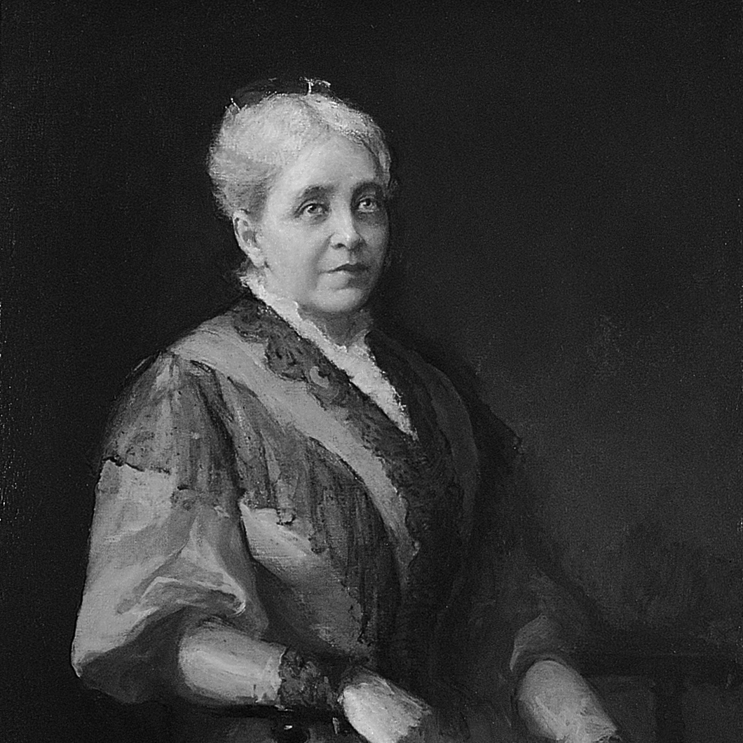
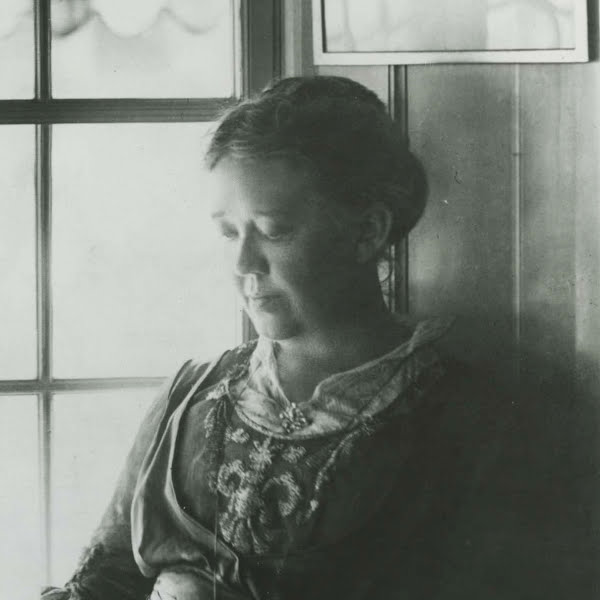
In pouring her time, energy, vision and funds into running the institution and ensuring its survival, Metcalf was joined by her daughter Eliza Radeke (pictured), who from 1913–31 was the first woman to serve as RISD’s president.

An avid and eclectic collector, Radeke worked closely with artists, dealers and museum directors to develop the RISD Museum’s extensive collection and funded the construction of the gallery that connects Pendleton House to the 1926 museum building named in her honor.

Radeke was then succeeded by her niece Helen Metcalf Danforth, who was president from 1931–47 before serving RISD’s first Board of Trustees chair from 1947–65. It was during her tenure that RISD earned the right to grant college degrees (as opposed to certificates) in 1932 and became a fully accredited college in 1949.

“Still We Rise”: Addonis Parker’s Powerful Solo Exhibition Opens at The ARC in Celebration of Juneteenth

Still We Rise
Still We Rise

“Still We Rise”: Addonis Parker’s Powerful Solo Exhibition Opens at The ARC in Celebration of Juneteenth

OPA-LOCKA, FL The Ten North Group is proud to announce the opening reception of “Still We Rise: The Art of Addonis Parker,” a compelling solo exhibition by Miami-based artist Addonis Parker. This powerful show, celebrating themes of art, identity, and resilience, will launch tonight, Friday, June 13, 2025, from 6:00 PM to 10:00 PM EDT at The ARC (Arts & Recreation Center), located at 675 Ali Baba Avenue, Opa-locka, FL 33054.

Presented by Ten North Group, this vibrant exhibition arrives just ahead of Juneteenth, a fitting tribute to the spirit of freedom and perseverance. Through his signature powerful visuals and dynamic storytelling, Addonis Parker invites viewers on an evocative journey through themes deeply rooted in the African American experience. His work — ranging from iconic large-scale murals that command attention in public spaces to intricate and deeply personal canvas paintings — is directly inspired by Maya Angelou’s unforgettable poem, “Still I Rise.”

Parker’s art serves as both a reflection and a celebration of identity, resistance, heritage, and resilience. Visitors to “Still We Rise” will have the opportunity to experience firsthand the emotional depth and masterful technique that define his unique artistic voice.

This opening reception promises to be an inspiring evening, fostering community engagement and providing a platform for vital cultural dialogue.

Event Details: What: Still We Rise: The Art of Addonis Parker – Opening Reception When: Friday, June 13, 2025, from 6:00 PM – 10:00 PM EDT Where: The ARC (Arts & Recreation Center), 675 Ali Baba Avenue, Opa-locka, FL 33054 Admission: Free and open to the public.

The Scandal of the Art World: The Mystery of Frida Kahlo’s Missing Masterpieces

Vanished- The Scandal of Frida Kahlo’s Lost Works

A Shadow Falls Over Casa Azul: The Scandal of Missing Frida Kahlo Masterpieces

A bombshell revelation has shaken the art world, with allegations surfacing that a significant number of works by iconic Mexican artist Frida Kahlo have vanished from the very institutions tasked with preserving her legacy. Hilda Trujillo Soto, who served as director of the Diego Rivera Anahuacalli and Frida Kahlo museums in Mexico City for nearly two decades, has publicly claimed that at least two oil paintings, eight drawings, and several pages from Kahlo’s intimate diary are missing from the Casa Azul collection.

Masterpieces Misplaced- Uncovering the Scandal Behind Frida Kahlo’s Lost Art

The allegations, detailed by Trujillo Soto in an extensive blog post, paint a disturbing picture of potential mismanagement and negligence. She claims that evidence of these disappearances, brought to the attention of museum trustees as early as 2009 and again in 2013, was seemingly ignored. Some of these allegedly missing works, she suggests, have even appeared in U.S. galleries and auction houses, despite strict Mexican laws prohibiting the permanent export of works by Kahlo and Diego Rivera without specific permits.

Frida Kahlo’s Vanishing Act- Artworks Missing, Questions Mounting

Among the most poignant losses are pages from Kahlo’s diary, a deeply personal chronicle of her later life, her declining health, and her profound relationship with Diego Rivera. Six specific folios from March 1953 were reportedly found missing when Trujillo Soto compared the original diary to its 1994 facsimile. The diary’s spontaneous drawings and cathartic writings are not just artistic artifacts; they are a crucial part of Mexico’s cultural heritage. Further concerns have been raised about other potentially missing pages, including one drawing allegedly valued at $10 million, which was controversially claimed to have been burned at a party as part of a failed NFT project in 2022.

Lost & Priceless- The Frida Kahlo Works That Disappeared Without a Trace

The institutions overseeing the museums, including the Bank of Mexico trust, have responded by stating that Trujillo Soto never filed formal complaints during her tenure, and have even suggested her contract was terminated due to administrative irregularities. However, these claims have gained significant traction among art experts, with German art historian Helga Prignitz-Poda, a leading Kahlo specialist, confirming long-standing knowledge of missing works. Linda Downs, former executive director of the College Art Association, also corroborated awareness of missing notebooks and sketches from the Casa Azul archive as far back as 2014.

Stolen Beauty? The Enigma of Frida Kahlo’s Missing Artworks

This scandal emerges at a particularly sensitive time, as the museum finalizes loan agreements for major upcoming Kahlo exhibitions at the Museum of Fine Arts, Houston, and London’s Tate Modern. The allegations cast a long shadow over the provenance and security of invaluable cultural treasures.

Missing Fridas- The Untold Story of Lost Masterpieces and Museum Missteps

The alleged disappearance of these works raises critical questions about accountability, the protection of national artistic heritage, and the ethics of the international art market. As investigations continue and the art world grapples with these revelations, the hope remains that clarity will emerge, and any missing pieces of Frida Kahlo’s extraordinary legacy can be rightfully returned to their intended home.

Where Are Frida’s Masterpieces? Inside the Disappearance of Priceless Art

Exploring Innovation and Inclusion at the Museum of Contemporary Art North Miami (MOCA)

MOCA Museum Miami
MOCA Museum Miami

Exploring Innovation and Inclusion at the Museum of Contemporary Art North Miami (MOCA)
By AMM

Tucked in the heart of North Miami, the Museum of Contemporary Art (MOCA) stands as a beacon of creativity, dialogue, and cultural exchange. Located at 770 NE 125th Street, MOCA North Miami has become a vital platform for both emerging and established contemporary artists, reflecting the rich diversity and dynamic spirit of South Florida and beyond.

Under the visionary leadership of Executive Director Chana Sheldon, MOCA continues to build on its reputation as a forward-thinking institution committed to accessibility, community engagement, and thought-provoking exhibitions. With a focus on inclusivity and experimentation, the museum has played a pivotal role in the careers of numerous contemporary artists while serving as a creative and educational hub for the local community.

A Legacy of Artistic Excellence

Originally established in 1981 and formally incorporated as a museum in 1996, MOCA North Miami has carved out a unique place in the international art world. Its programming is distinguished by bold curatorial choices that highlight underrepresented voices and challenge conventional narratives in contemporary art. From site-specific installations to multimedia presentations, the museum fosters an environment where artistic boundaries are pushed and critical discourse is encouraged.

Recent and Notable Exhibitions

MOCA’s exhibitions frequently explore the intersection of identity, culture, and social justice, often spotlighting artists from the African diaspora, Latin America, and the Caribbean. Past highlights have included solo presentations from artists such as AfriCOBRA co-founder Wadsworth Jarrell, as well as thematic group shows examining urgent topics ranging from climate change to migration.

A Hub for Education and Community

True to its mission of accessibility, MOCA offers a robust education department that serves thousands of students and families annually. Through art classes, workshops, summer camps, and public programming, the museum empowers young artists and fosters lifelong learning. Its popular Jazz at MOCA concert series, held monthly and free to the public, further underscores the museum’s commitment to making the arts an integral part of everyday life in North Miami.

Looking Forward

With free admission for North Miami residents and a growing international profile, MOCA is not only a destination for contemporary art lovers but also a key player in shaping the cultural landscape of South Florida. As it continues to expand its reach and impact under Chana Sheldon’s direction, the museum remains rooted in its mission: to make contemporary art accessible, relevant, and transformative for all.


Visit MOCA North Miami
📍 770 NE 125th St, North Miami, FL 33161
📞 (305) 893-6211
🌐 https://mocanomi.org

Open to the public with a range of exhibitions, events, and educational opportunities—MOCA North Miami invites you to explore the continuum of contemporary creativity.

Conquering Art Basel During Miami Art Week: Essential Tips for Artists and Enthusiasts

Miami+Art+Week
Miami+Art+Week

Unlocking Miami Art Week: Your Guide to Strategic Engagement 2025

Miami Art Week, anchored by Art Basel Miami Beach, transforms our city into a global art epicenter each December. For artists, it’s an unparalleled opportunity – a bustling nexus of creativity, commerce, and connection. As an artist coach, I often get asked for advice on navigating this intense period. While the sheer scale can be daunting, understanding its dynamics is key to making it work for you.

First, let’s clarify the landscape. Art Basel Miami Beach is the pinnacle, showcasing museum-quality and cutting-edge works from established galleries. While inspiring, it might not be the direct pathway for emerging artists seeking representation. However, its orbit includes at least twenty “satellite” fairs, each with its unique focus and personality. These are often where you’ll discover galleries more actively seeking new talent. Beyond the fairs, dozens of special events, parties, tours, and public art happenings permeate the entire city. Miami Art Week, held in December, remains the most significant annual art fair event in the United States.

Second, and crucially, understand that these fairs are primarily about commerce. Galleries invest significant resources to be there, with their main objective being to sell art and connect with collectors. While gallerists observe the broader scene, they’re not actively scouting for new artists in their booths; they’re there to champion and sell the artists they already represent.

However, this doesn’t diminish the immense value for every artist in visiting the fairs. It’s an invaluable chance to research hundreds of gallery programs in one concentrated location, observe trends, and – most importantly – network and connect with other artists and arts professionals in a less formal setting.

Elevating Your Presence: The Power of Miami Art Week and Art Miami Magazine 2025

This is where strategic promotion becomes vital. Beyond simply attending, consider how platforms like Miami Art Week and Art Miami Magazine can elevate your visibility:

  • Pre-Fair Exposure: Getting featured in Art Miami Magazine before or during the week can be a game-changer. Collectors, curators, and gallerists often consult these publications to identify artists and trends of interest. A well-placed feature can direct attention to your work, creating a buzz that extends beyond a fleeting booth visit.
  • Targeted Reach: Both Miami Art Week (as a collective marketing entity for the entire event) and Art Miami Magazine speak directly to the audience you want to reach – serious collectors, curators, and industry insiders. Promoting your artwork through these channels ensures your work is seen by the right eyes, even if you don’t have a booth at one of the leading fairs.
  • Building Your Narrative: A feature that allows you to articulate your artistic vision, process, and themes compellingly, supplementing the visual experience of your work. It provides context that can deepen a viewer’s connection to the content.

By strategically leveraging the reach of Miami Art Week’s overall promotion and seeking features in publications like Art Miami Magazine, artists can transform a visit into a powerful platform for exposure, dialogue, and career advancement. It’s about being seen and understood within the dynamic tapestry of one of the world’s most important art events.

Conquering Art Basel During Miami Art Week: Essential Tips for Artists and Enthusiasts

Art Basel Miami, and the constellation of satellite fairs that orbit it, transforms Miami into the epicenter of the art world each December. It’s an exhilarating, often overwhelming, experience. To help you navigate this intense week and make the most of it, here are ten refined tips:


1. Pronunciation Matters: It’s “Bah-zel,” Not “Bay-sil”

Let’s get this straight from the start: it’s Basel like the city in Switzerland, not the herb. The Miami fair is an offshoot of the original Basel event, so referring to it as Art Basel Miami or Art Basel Miami Beach is always a good idea. Knowing the correct pronunciation will save you from an awkward correction by an “experienced” visitor!


2. Plan Your Attack: Time is Your Most Precious Commodity

You simply can’t see everything. Success at the fairs hinges on meticulous planning. Research which galleries are exhibiting, note the days and hours for each fair, and map out your daily itinerary. Prioritize the fairs most important to you for the early part of your trip. Group fairs that are geographically clustered to minimize travel time, and remember to factor in transit. Evenings are for networking; seize every opportunity to meet and connect with other artists and art professionals.


3. Ground Your Expectations: It’s a Marathon, Not a Sprint

Manage your expectations from the outset. It’s highly probable you’ll return home with nothing tangible to show for your efforts beyond a hefty credit card bill. Don’t anticipate immediate, life-altering breakthroughs. Your career is a marathon. Every person you meet and every experience you have contributes to the bigger picture. Focus on soaking in the art, learning, and making genuine connections, rather than fixating on instant results.


4. Brace for Impact: Emotional Reactions Are Normal

Your first Miami Art Week can be a whirlwind of emotions. It might be exhilarating, or it might trigger feelings of depression (“Is my art good enough?”), frustration (“I missed that party!”), or even anger (“Is this commercialism really the art world?”). These reactions are entirely normal. Acknowledge them, let them pass, and refocus on the art.


5. Booth Etiquette: Never Solicit Gallerists Directly

This is crucial: Do not approach a gallerist or gallery staff in their booth to pitch your work. Avoid handing out cards or announcing you’re an artist unless they specifically ask. Their primary focus is sales and engaging with potential buyers. If a natural conversation arises and they’re not busy, that’s different. But as a general rule, direct solicitation in the booth is a major faux pas.


6. Document Everything: Your Memory Will Fail You

You’ll see thousands of artworks and countless galleries. Take notes! Carry a small notepad and pen, or use your phone, to jot down the names of galleries and artists that pique your interest. This will be invaluable for follow-up research once you’re back home.


7. Embrace Serendipity: Go Where You’re Invited

Much of the magic happens outside the official venues. Say “yes” to invitations for drinks, parties, or even breakfast. These more relaxed environments are where you’ll genuinely connect with fellow artists, collectors, and gallerists who are less stressed and more open to conversation. Be friendly, be open, and follow where the week takes you.


8. Stay Alert: Beware of Creeps and Fakers

As the fairs grow, so does the presence of unscrupulous individuals. Be aware, be safe, and trust your judgment. Avoid being alone with strangers, and be wary of anyone promising opportunities that seem too good to be true. Legitimate offers will still be there for you to follow up on after the fairs conclude.


9. The Follow-Up: Your Post-Fair Homework

Once you’re home, the real work begins. Research every gallery that interested you; most have submission guidelines (or policies against them) clearly stated on their websites. Explore artists you admire to see where they exhibit, and check those galleries’ submission policies too. Connect on social media with anyone you genuinely connected with. If someone mentioned an opportunity, follow up professionally.


10. Be a Gracious Guest: Respect Miami

Remember that Miami is home to many. While the fairs bring revenue, respect the local community and environment. Be a considerate guest throughout your stay. A positive impression ensures a welcome return for an even more productive experience next year!

Page 95 of 277
1 93 94 95 96 97 277