Written by Joely Rogers
It’s only the start of 2020. We’re still gaining our footing in this brand-new year. In fact, the whole decade is stretched before us like a blank canvas or a scene not yet photographed.
That can be both exciting and a bit nerve-wracking for creative people!
As artists and photographers, we inherently understand the power of color to calm our minds and lift our spirits. Color experts get it, too. Last fall, many of them chose their “2020 colors of the year” with sensitivity to our collective desire for optimism as we enter a new era.
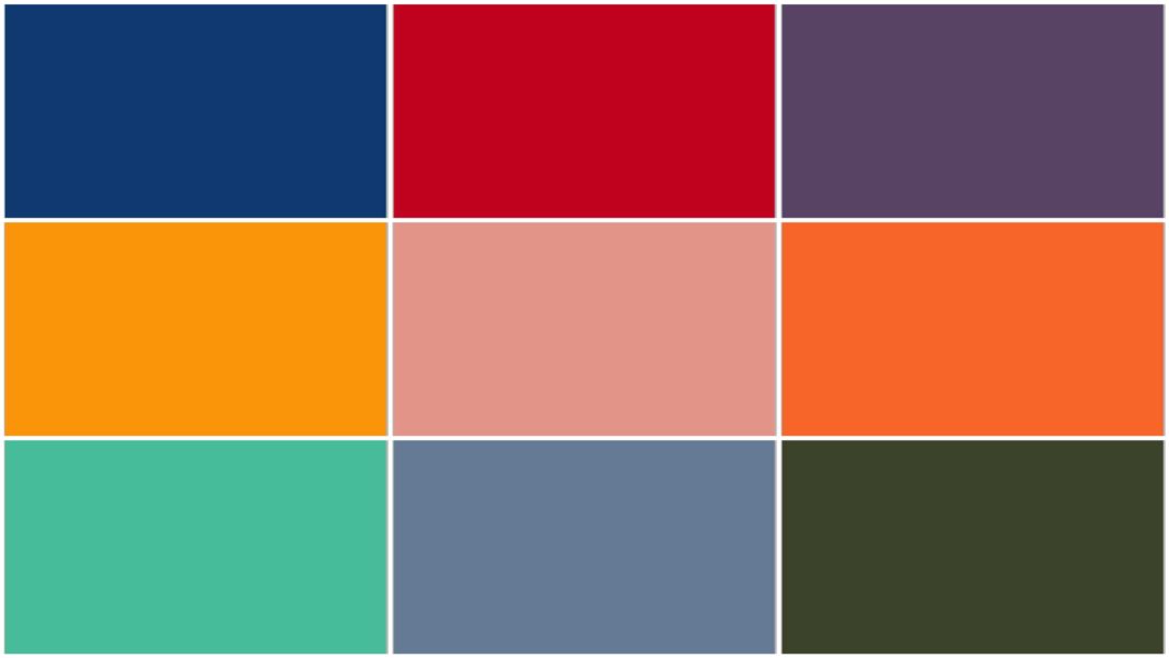
Perhaps the most well-known color trend forecaster, Pantone Color Institute, selected Classic Blue as the Color of the Year for 2020. Leatrice Eiseman, Pantone’s Executive Director, told TIME magazine: “It’s a reassuring blue, full of calm and confidence.”
Sounds like just what we need as we face an unfolding future. In fact, if we were to flashback to 1999 and all the anxiety of Y2K, we’d fine that Pantone’s 2000 Color of the Year was another member of the restful, reliable blue family: Cerulean.
A palette of possibilities.
Ah, but Classic Blue is not alone in the 2020 color trends. Pantone selected 11 other colors for spring/summer 2020 that reflect our hope to balance stability with creative possibility. Pantone’s curated collection includes vibrant colors (Orange Peel, Biscay Green), softer tones (Sunlight, Coral Pink) and neutrals (Ash, Brilliant White).
Color curators galore.
Pantone isn’t the only company who designed their own predictions for “Color Trends 2020”. When we compared the palettes picked by Sherwin Williams, Benjamin Moore, Behr and Crescent, we found some commonalities. We also found inspiration, which led us to bring some of these beautiful colors to our frames.
I’ll highlight a few of our favorite color groupings, and the Frame Destination frames that play off these 2020 color trends.

Metal Frame Nielsen Profile 117V in Galactic Blue
Shades of blue.
Pantone was joined by others who named various blues among their 2020 color trends. Witness Sherwin-Williams’ jewel tones; Benjamin Moore’s periwinkle, blue-green and sapphire; Behr’s softly bright blue; and Crescent’s peaceful blue. Frame Destination contributes to to this bluesy palette with these new frame options:
Wood Frame Profile 792 in Sky Blue
Wood Frame Profile 311 in Blue
Canvas Floater Frame F797 in Sky Blue
16×20 Rustic Blue Picture Frame
Metal Frame Nielsen Profile 97 in Florentine Cobalt
Metal Frame Nielsen Profile 117V in Galactic Blue

Wood Frame Profile 792 in Mint Julep
Greens and in-betweens.
Shades of mint and aqua were well represented among the 2020 color trends. Take, for example, Pantone’s refreshing take on turquoise; Sherwin-Williams’ “Mint to Be” and “Restful” green; Benjamin Moore’s forest and jade; Behr’s earthy and coastal greens; and Crescent’s rich “Williamsburg Green.” Now for our takes on this spectrum:
Wood Frame Profile 792 in French Teal
Wood Frame Profile 792 in Mint Julep
Canvas Floater Frame F797 in the above shades
Metal Frame Nielsen Profile 117V in Turquoise or Cyber Green

Canvas Floater Frame F797 in Alabama Red
Warming it up.
Interestingly, two forecasters chose rosy pinks as their main “Color of the Year.” For Sherwin-Williams it’s the apricot-inspired “Romance,” while Benjamin Moore’s version is called “First Light.” The slightly darker “Bubble Shell” is among Behr’s top 15 trending colors in 2020. On the orange/brown spectrum, the color trend-setters have specified assorted shades of pumpkin, coral, brick and cinnamon. To all these, Frame Destination answers with:
Wood Frame Profile 792 in Petticoat Pink
Wood Frame Profile 792 in Bourbon Orange
Wood Frame Profile 792 in Alabama Red
Canvas Floater Frame F797 in the above shades
There’s a mat for that.
To give you more choices for creative combinations, Frame Destination offers over 250 different mat types and colors, so you’re sure to find a color to complement your every artistic endeavor. Included in this lineup is one of the largest online selections of Select 4Ply mat colors—72 and counting. We invite you to peruse this wide array of mat boards or the Crescent 4-Ply Mat Boards, including “Flag Blue,” a twin to Pantone’s 2020 pick, and pretty much every color under the sun.
Here’s just a few Crescent Select 4-Ply mat colors we offer that match the 2020 color trends:

Color us inspired.
Are you ready to seize this fresh new decade and color it your way? Of course you are! If we can be helpful on your journey into 2020 and beyond, just reach out — we’re here for you.
Source: https://www.framedestination.com/blog/resources/colors-of-2020-a-roundup-of-trends


