Home Blog Page 98

Postcards From the Artist

Laetitia Adam-Rabel Revised

Postcards From the Artist

THE CAMP GALLERY

791–793 NE 125 St., Miami, FL 33161

EXHIBITION DATES

May 23 – June 27, 2025

The Contemporary Art Modern Project (CAMP)
is pleased to present Postcards From the Artist, a group exhibition featuring American artist Milton Bowens, Haitian-American artist Laetitia Adam-Rabel, and Nigerian artist Oluwatomisin Olabode.

Through mixed media, painting, and figurative work, each artist responds to the lived and inherited histories that shape their creative voices.

  • Bowens draws from archival materials to trace the ongoing impact of African American history on the present.
  • Adam-Rabel explores personal identity through the lens of race, womanhood, and ancestry.
  • Olabode challenges surface-level perception through stylized, confrontational portraiture.

Together, their works act as visual dispatches—postcards from experience—marking the complexities of memory, culture, and the human condition.

The CAMP Gallery is open Tuesday–Saturday, from 11 AM to 5 PM.
Private tours can be scheduled by emailing [email protected] or calling 786-953-8807.

The Artist’s Hand Extended: A Look at Paint Brushes

Artist Paint Brushes

The Artist’s Hand Extended: A Look at Paint Brushes

The humble paintbrush, seemingly simple in its construction, is an indispensable extension of the artist’s hand and vision. From delicate details to broad expressive strokes, the choice of brush profoundly impacts the final artwork. Understanding the anatomy and variety of artist paint brushes is key to unlocking their full potential.

At its core, a paintbrush consists of three main parts: the handle, the ferrule, and the bristles (or hairs). The handle, typically made of wood or acrylic, provides grip and balance. The ferrule, usually metal, securely fastens the bristles to the handle. It’s the bristles, however, that truly define the brush’s character and suitability for different painting techniques and media.

Natural vs. Synthetic Bristles:

Historically, brushes were primarily made with natural hairs sourced from various animals. Common types include:

  • Hog Bristle: Stiff and resilient, ideal for moving thick paints like oils and acrylics with texture. They leave visible brushstrokes.
  • Sable: Known for their softness, springiness, and ability to hold a good amount of paint, sable brushes are prized for detail work and smooth blending, particularly in watercolor and oil.
  • Ox Hair: Softer than hog bristle but with more snap than sable, good for both detail and broader strokes in oil and acrylic.
  • Squirrel Hair: Exceptionally soft and absorbent, often used for watercolor washes.

The 20th century saw the rise of synthetic bristles, typically made from nylon or polyester. These offer several advantages:

  • Durability: Generally more resistant to wear and tear than natural hairs, especially when used with acrylics.
  • Affordability: Often less expensive than natural hair brushes.
  • Variety of Stiffness: Synthetics can be engineered to mimic the properties of various natural hairs, from soft and supple to stiff and springy.
  • Suitability for Acrylics: Synthetic fibers don’t swell and lose their shape as easily as some natural hairs when used with water-based paints like acrylics.

Brush Shapes and Their Uses:

Beyond the material of the bristles, the shape of the brush head dictates the kind of mark it will make:

  • Round: Features a pointed tip, excellent for detail work, outlining, and fine lines.
  • Flat: Square or rectangular head with sharp edges, useful for broad strokes, washes, and creating sharp lines when used on its edge.
  • Filbert: An oval or “cat’s tongue” shape, a versatile brush that can create both broad strokes and softer edges.
  • Angular: Bristles are cut at an angle, useful for creating precise lines and angled strokes.
  • Fan: Bristles are spread out like a fan, ideal for blending, creating textured effects like foliage or hair, and applying washes.

Choosing the right brush is a crucial part of the artistic process. Experimenting with different types and shapes will allow you to discover which tools best facilitate your individual style and the demands of your chosen medium.

What types of paint do you primarily work with, and what are some of your go-to brushes? Perhaps you’ve encountered challenges with certain brushes or have favorites you rely on? Let’s talk about your personal experience with these essential tools.

The Silent Music of Form: Harnessing Rhythm in Compelling Painting

The Silent Music of Form: Harnessing Rhythm in Compelling Painting

The Silent Music of Form: Harnessing Rhythm in Compelling Painting

Beyond subject matter and color, a powerful yet often subliminal force shapes a captivating painting: rhythm. Just as rhythm propels music, visual rhythm guides the viewer’s eye, creates a sense of movement, and imbues a work with energy and harmony. Understanding and employing rhythmic elements can elevate a painting from merely representational to deeply engaging.

Visual rhythm in painting arises from the repetition and variation of visual elements – lines, shapes, colors, values, and textures. These elements, when orchestrated thoughtfully, create patterns that the eye naturally follows, leading the viewer through the composition.

Types of Visual Rhythm:

  • Regular Rhythm: Achieved through the consistent repetition of an element. Think of the evenly spaced columns in a classical architectural painting or the repeated shapes in a patterned textile. This can create a sense of order, stability, or even predictability.
  • Alternating Rhythm: Occurs when two or more elements are repeated in a sequence, like the alternating light and dark squares of a checkerboard or the ebb and flow of waves. This introduces more visual interest than a purely regular rhythm.
  • Flowing Rhythm: Characterized by the repetition of curved lines, organic shapes, or a sense of continuous movement. Consider the swirling brushstrokes in a Van Gogh landscape or the undulating folds of drapery in a Baroque portrait. This type of rhythm often evokes a feeling of dynamism and fluidity.
  • Progressive Rhythm: Involves a gradual change in an element each time it repeats. This could be a shape that gets larger or smaller, a color that becomes lighter or darker, or a texture that becomes more or less dense. Progressive rhythms create a sense of movement and can lead the eye towards a focal point.
  • Unexpected or Irregular Rhythm: Breaks from predictable patterns, introducing variations or interruptions. This can create visual tension, surprise, and a sense of the unexpected. Think of the scattered leaves in a forest floor painting or the seemingly random placement of figures in a bustling street scene.

Creating Compelling Paintings Through Rhythm:

How can you consciously harness the power of rhythm in your own work?

  • Identify Rhythmic Possibilities in Your Subject: Observe how lines, shapes, and forms repeat and vary in the world around you. The branches of a tree, the rooftops of a city, the folds of fabric – all possess inherent rhythms.
  • Emphasize or Exaggerate Existing Rhythms: You can choose to highlight the natural rhythms of your subject or even amplify them for expressive effect.
  • Introduce Rhythms Intentionally: Even in abstract work, you can create compelling rhythms through the deliberate repetition and variation of your chosen visual elements.
  • Use Rhythm to Guide the Viewer’s Eye: Strategic placement of rhythmic elements can direct the viewer’s gaze through the composition, leading them to areas of interest or creating a sense of overall flow.
  • Vary the Tempo: Just like in music, the “tempo” of your visual rhythm can affect the mood of your painting. A fast, irregular rhythm might convey energy and excitement, while a slow, regular rhythm could evoke calm or solemnity.

Coincidence of Sound, by Kerry Phillips

Coincidence of Sound, by Kerry Phillips

Coincidence of Sound, by Kerry Phillips

Join us Friday, June 6, from 6-9pm for the opening reception of ℂ𝕠𝕚𝕟𝕔𝕚𝕕𝕖𝕟𝕔𝕖 𝕠𝕗 𝕊𝕠𝕦𝕟𝕕, a premiere solo exhibition by Kerry Phillips at LnS, hosted in the company of the artist.

2610 SW 28th Lane
Miami FL 33133

Phillips (@tontalovesme) approaches her practice in two distinct ways: either with a clear initial concept that guides the development of the work, or through a process of pure intuition—allowing materials and instinct to dictate direction without a predetermined outcome. This exhibition is rooted in exploring the intuitive power of play and surprise, where the result is as unexpected and delightful to the artist as it is to the viewer.

Grounding the presentation is a magnanimous site-specific installation encapsulating the power of shared narratives, the inherent storytelling capacity of objects, transformation, and the challenge of assumption. For Phillips, making is often a compulsive act—even in the absence of a clear direction. In its entirety, the show is centered on this meditative, labor-intensive processes; it may be an attempt to process grief, make sense of a chaotic world, or restore value to objects deemed broken or obsolete. ℂ𝕠𝕚𝕟𝕔𝕚𝕕𝕖𝕟𝕔𝕖 𝕠𝕗 𝕊𝕠𝕦𝕟𝕕 searches within these themes, reaching for a forgotten world resting just at the edge of memory.

📸 Installation shot of site-specific installation, featured as part of ℂ𝕠𝕚𝕟𝕔𝕚𝕕𝕖𝕟𝕔𝕖 𝕠𝕗 𝕊𝕠𝕦𝕟𝕕 by Kerry Phillips.

Kerry Phillips

Kerry Phillips (b. 1974 Denton, TX) is an installation artist whose artwork borders on performance and social practice. Phillips’ work with found objects is intuitive, often site-specific, and steeped in remembrance and storytelling. She uses common objects in unexpected ways, working collaboratively with viewer-participants to reveal an exchange of value, the importance and limitations of memory, and the vitality of play.

Phillips earned a BFA from Florida International University (2000), an MFA from University of Arizona (2003), and has participated in numerous solo and group exhibitions, including at the Orlando Museum of Art, Locust Projects, Pérez Art Museum Miami, Museum of Contemporary Art North Miami, Boca Raton Museum of Art, the Deering Estate’s Spring Contemporary, and Bridge Red Projects. In August 2023, Phillip’s will inaugurate her first solo exhibition with The Bass Museum in Miami Beach titled Between the miraculous & the mundane. She forms part of the permanent collections of the Orlando Museum of Art, and The Girls’ Club.

Artist Paint Brushes

Artist Paint Brushes

Artist Paint Brushes

Describes the different types of brushes for acrylics and what each paintbrush can do.

Da Vinci Filbert Brush

The paintbrush will be your magic wand for weaving colors across the canvas. Artist paint brushes become beloved tools the more you use them! As you paint, you will become increasingly familiar with the way the brushes handle the paint and what they can accomplish for you. Pretty soon the paintbrush will become a part of you that you intuitively know how to maneuver.

If you’re just starting out in acrylics, it can be a bit overwhelming standing in the paintbrush aisle at the art store, with a vast sea of artist paint brushes spread out before you. The wide selection even makes me dizzy sometimes!

No fear – the Art is Fun Paintbrush Guide is here! This page will tell you everything you need to know in order to select the right paintbrushes to suit your needs.

Paintbrushes for acrylics come in many different shapes and sizes. The shapes and sizes of the brushes you choose to work with will depend mainly on how large you want to work, and how detailed you want to get. Take a look:

Paint Brush Shapes

There are 8 main types of artist paint brushes that are used with acrylics, shown above. Each one is specially intended for different uses. Before we get into the particular uses of each paintbrush, let’s get a quick low-down of the different parts of the brush:

Get to know your paintbrush

A paintbrush is made of 4 main parts:

Parts of a Paintbrush
  • bristles – also known as hairs. can be natural, synthetic, or combination of both
  • ferrule – the silvery bit that connects the bristles with the handle
  • crimp – the part of the ferrule that secures it to the handle
  • handle – usually made of wood or acrylic

Easy enough! So now that you know the lingo, let’s find out what each brush is meant for!

Acrylic Paint Brushes

Round Brush

Round or pointed tip.

Good for: sketching, outlining, detailed work, controlled washes, filling in small areas. creates thin to thick lines – thin at the tip, becoming wider the more its pressed down.. use with thinned paint rather than thick paint. 

Pointed Round Brush

 Narrower than the round paintbrush. has sharply pointed tip.

Good for: fine details and lines, delicate areas, spotting and retouching. 

Flat Artist Paint Brush

Square end, with medium to long hairs.

Good for: bold strokes, washes, filling wide spaces, impasto. can use edge for fine lines, straight edges and stripes. long haired flat brushes are ideal for varnishing.

Bright Artist Paint Brush

Flat with edges curved inward at tip, with shortish hairs.

Good for: short controlled strokes. thick, heavy color. better for working up close rather than holding the brush at a distance from the canvas.

Filbert Artist Paint Brush

Flat and oval-shaped end with medium to long hairs.

Good for: blending, soft rounded edges like flower petals. this brush is sort of a combination of the rounds (because they can be used for detail) and flat (because they can cover more space than round).

Fan Artist Paint Brush

Flat, spread hairs.

good for: natural hairs are good for smoothing, blending, and feathering. synthetic hairs are better for textural effects, clouds, and leaves on trees. for acrylics, use strong and sturdy one, otherwise the hairs will clump when paint is added.                      

Angular Flat Artist Paint Brush

Flat with angled hairs at end.

Good for: curved strokes and filling corners. can reach small areas with tip. also can be used to cover lots of space, similar to flat brushes.

Detail Round Artist Paint Brush

Round, hairs shorter in length. shorter handle.

Good for: details and short strokes. holds more color than you might think!

“Growing Up Traveling” by Photographer Jamie Johnson

Leica Store Miami to Host "Growing Up Traveling" Gallery Opening & Artist Talk with Acclaimed Photographer Jamie Johnson.

Leica Store Miami to Host “Growing Up Traveling” Gallery Opening & Artist Talk with Acclaimed Photographer Jamie Johnson.

Event Details: What: “Growing Up Traveling” Gallery Opening & Artist Talk with Jamie Johnson

When: Thursday, June 12, 2025, at 7:00 PM

Where: Leica Store Miami, 372 Miracle Mile, Coral Gables, Florida, 33134, United States

Artist: Jamie Johnson Admission: Free and open to the public. Light refreshments will be served.

Leica Store Miami is honored to announce the opening of “Growing Up Traveling,” a captivating solo exhibition by internationally renowned photographer Jamie Johnson. The gallery opening and artist talk will take place on Thursday, June 12, 2025, at 7:00 PM at Leica Store Miami, located at 372 Miracle Mile, Coral Gables, Florida, 33134. This event is free and open to the public, and light refreshments will be served. All ages are welcome.

Jamie Johnson, a Brooklyn-born, NYC and SF-raised photographer now living in France, has dedicated her career to documenting children and childhood across the globe. Her profound passion for “faces of the next generation” has led her on extensive journeys from Laos to Cuba, the Amazon to Mongolia, revealing a universal thread in the experiences of children worldwide. Johnson’s unique ability to connect with her young subjects often blossoms into lifelong friendships with their families, allowing her to intimately examine diverse lifestyles, cultures, and traditions.

The exhibition will feature powerful images from Johnson’s acclaimed monograph, “Growing Up Traveling,” which was released in September 2020 by Kehrer Verlag and garnered multiple awards for best photo book. This compelling series specifically focuses on the Irish Traveller community, a nomadic indigenous ethnic minority who have lived in Ireland for centuries, often facing significant racism and stereotypes.

“I have spent many years traveling back and forth to Ireland to document these incredible children,” says Johnson. “The experience I had photographing the grit and beauty that is the everyday life of a Traveller child is one that inspires me every day. Their deep respect for family and cultural values is refreshing, one that can be quite difficult to find in an age with the convenience of social media.”

Johnson’s work aims to shed light on the resilience and dreams of these children, emphasizing that “a child is an innocent, happy, precious part of the world that should be loved and accepted and encouraged no matter where or how they live.”

Her photographs have been exhibited internationally in Los Angeles, New York, and Paris, and are held in the permanent collections of several American museums. Johnson’s second monograph, “The Female Spirit,” was recently published by Peanut Press.

Attendees will have a unique opportunity to hear directly from Jamie Johnson about her photographic process, her experiences documenting children globally, and the powerful narratives behind the “Growing Up Traveling” series.

For more information about Jamie Johnson and her work, please visit https://www.jamiejohnsonphotography.com or follow her on Instagram: @jamiejohnsonphotography.

Toledo Museum of Art

Toledo Museum of Art

Toledo Museum of Art

The Toledo Museum of Art is a beloved cultural institution in Toledo, Ohio and a global leader in the museum field. We believe that art transforms people’s lives and invites them to see differently.

At TMA, we live our values so that we can authentically execute our vision and achieve our mission.

Mission 

Through our collection and programs, we strive to integrate art into the lives of people.

Vision 

The Toledo Museum of Art will become the model art museum in the United States for its commitment to quality and its culture of belonging.

Values 

Community: We exist to serve our community with and through the highest quality art.

Diversity: Diverse ideas emerge from a diverse team and engage diverse audiences.

Innovation: We seek to innovate for our community and for our field.

Trust: We steward our collection in the public trust and must guard the confidence placed in us.

People & Culture

At TMA, we believe It is important for organizations to proactively create and maintain a strong culture and cultivate a positive environment that values open communication, transparency, fairness, and employee well-being. We do not only seek to be the model museum, we seek to inspire industries everywhere to embark on this journey of creating strong cultures that promote belonging.

Reinstallation

We are undergoing our first full gallery reinstallation in over 40 years, preserving historic spaces while reimagining the visitor experience. The redesigned galleries will present a more inclusive, connected history of art, featuring innovative displays, technological enhancements, and essential facility upgrades. Learn more about this transformative project and what’s to come.

History

The Toledo Museum of Art was established in 1901 to share the transformative power of art with the community. More than 30,000 artworks are housed in architecturally significant buildings on our 37-acre campus. Innovative and extensive education programs offer a variety of multi-sensory experiences for every visitor. Thanks to the generous spirit of the museum’s founders and the continued support of members, we remain a privately endowed, non-profit institution. Our collection is open to the public, free of charge. 

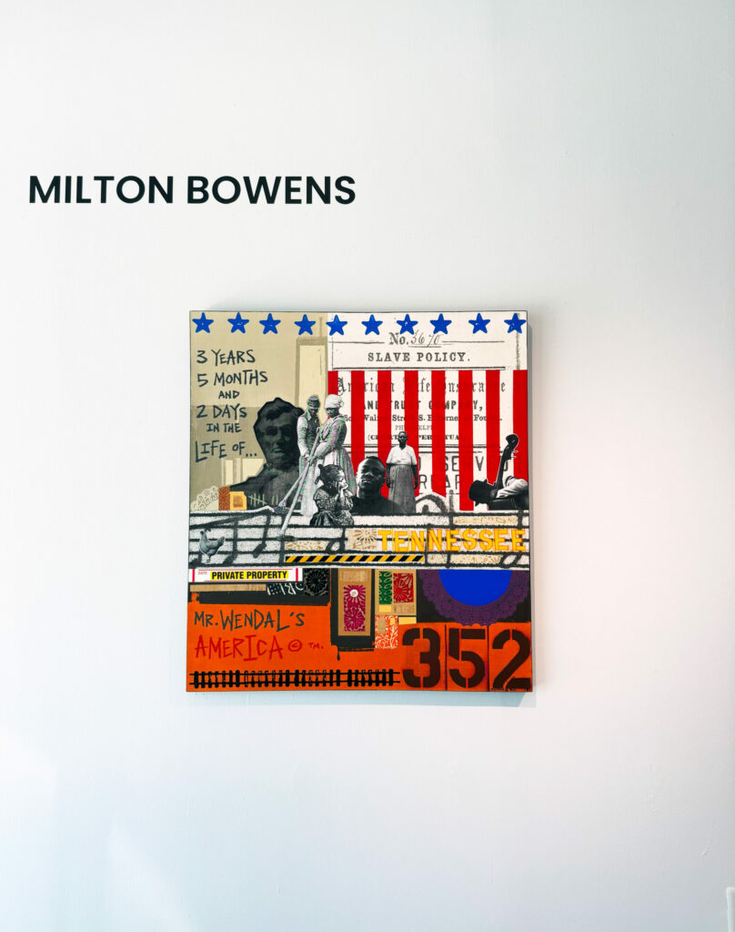
Artists have long used instructions and rule-based systems to produce their work, from thirteenth century Islamic geometric tiles to twentieth century avant-garde movements. Infinite Images: The Art of Algorithms reveals how some contemporary artists use mathematical principles, chance, and automation to design and work with generative systems. In generative art, the artist creates a system to produce the artwork—perhaps written instructions for others to follow or a computer program. In the process they give up some control over the end result. The artist creates the rules, and the system generates the outcomes. This approach, whether analog or digital, enables the artist to experiment with multiple variations within a set of defined constraints, often yielding unexpected results.

At a time when our world is increasingly shaped by algorithms and artificial intelligence (AI)-generated media, this exhibition takes us back to computer art’s beginnings in the 1960s and takes a closer look at the recent wave of generative art that has emerged over the last decade. Whether generated with simple algorithms rooted in fundamental mathematical functions or complex custom computer software, the digital artworks assembled here expose the foundational processes that underlie computer-generated imagery. Along the way, we explore what distinguishes computer-generated art from other media.

We hope this exhibition gives you an accessible entry point into understanding and appreciating the many ways artists use generative systems and how this process challenges long-held beliefs about creativity, authorship, craft, and the perceived superiority of the physical art object.

Infinite Images artists include Anni Albers, Josef Albers, Max Bill, Dmitri Cherniak, Sofia Crespo, Deafbeef, Entangled Others, Tyler Hobbs, Larva Labs, Sol LeWitt, Zach Lieberman, LoVid, William Mapan, Sarah Meyohas, Vera Molnar, Operator, Quayola, Sam Spratt, Snowfro, Casey Reas, Anna Ridler, Monica Rizzoli, Jared Tarbell, and Emily Xie.

Infinite Images: The Art of Algorithms is organized by the Toledo Museum of Art and curated by Julia Kaganskiy, an independent curator specializing in digital art and new media.

The exhibition design and visual identity for Infinite Images are led by Richard The and Studio TheGreenEyl.

Exhibition Artists:

Anni Albers

Josef Albers

Max Bill

Dmitri Cherniak

Sofia Crespo & Anna Ridler

0xDEAFBEEF

Entangled Others

Matt Hall, Larva Labs

Tyler Hobbs

Sol LeWitt

Zachary Lieberman

LoVid

William Mapan

Sarah Meyohas

Vera Molnár

Operator

Quayola

Casey REAS

Monica Rizzoli

Snowfro

Sam Spratt

Jared Tarbell

John Watkinson, Larva Labs

Emily Xie

TUNNEL Presents: “Memoria Perdida” – A Solo Exhibition by Lisu Vega

TUNNEL Presents: “Memoria Perdida” – A Solo Exhibition by Lisu Vega

TUNNEL Presents: “Memoria Perdida” – A Solo Exhibition by Lisu Vega

Opening Reception – Thursday, June 5, 2025 | 6 – 9 PM
TUNNEL | 300 SW 12th Ave, Miami, FL

Miami, FLTUNNEL is proud to present “Memoria Perdida,” a powerful solo exhibition by multidisciplinary artist Lisu Vega, opening on Thursday, June 5, 2025, with a public reception from 6:00 to 9:00 PM.

Born in Miami and raised in Maracaibo, Venezuela, Vega draws from her bi-cultural heritage to explore themes of migration, memory, identity, and sustainability. Her latest body of work spans a rich variety of media, including engraving, photography, fiber art, sculpture, installation, and fashion art, blending personal narrative with social commentary.

“Memoria Perdida” offers an intimate look at Vega’s evolving artistic language and material experimentation, deeply rooted in both place and memory. Attendees will have the opportunity to meet the artist and experience her work in the distinctive atmosphere of TUNNEL, a space dedicated to bold, contemporary voices.

The event is free and open to the public.

The Colorful Divide: Synthetic Organic vs. Inorganic Pigments in Painting

Keiichi Tanaami: Memory Collage

The Colorful Divide: Synthetic Organic vs. Inorganic Pigments in Painting

When choosing colors for your palette, you’re not just selecting a hue; you’re engaging with the vast and varied world of pigments. These tiny particles are the very essence of color in paint, and they broadly fall into two categories: synthetic organic and inorganic. Understanding the differences between them can significantly impact your artistic choices and the longevity of your work.

Inorganic Pigments: Earthy Stability

Inorganic pigments are typically derived from minerals and metal salts. Think of the ancient earth pigments – ochres, siennas, and umbers – which have been used by artists for millennia. Modern inorganic pigments include titanium white, cadmium yellows and reds, and cobalt blues.

Key characteristics of inorganic pigments often include:

  • Opacity: They tend to be more opaque, offering greater covering power.
  • Lightfastness: Generally, they exhibit excellent lightfastness, meaning they resist fading over time when exposed to light.
  • Chemical Stability: They are often more chemically stable and less reactive with solvents and binders.
  • Cost-Effectiveness: Many inorganic pigments are more economical to produce.
  • Color Range: While offering a wide range, their colors can sometimes be less vibrant or intense compared to their organic counterparts.

Historically, inorganic pigments formed the backbone of the artist’s palette. Their reliability and permanence made them essential for works intended to last.

Synthetic Organic Pigments: Vibrant Hues

Synthetic organic pigments, on the other hand, are carbon-based molecules that are artificially created. The rise of the chemical industry in the late 19th and 20th centuries led to an explosion of these vibrant new colors, such as phthalo blues and greens, quinacridone reds and violets, and azo yellows and oranges.

Key characteristics of synthetic organic pigments often include:

  • Transparency (often): Many organic pigments are more transparent, allowing for layering and glazing techniques.
  • Color Intensity: They are known for their bright, saturated, and intense colors.
  • Tinting Strength: They often have a high tinting strength, meaning a small amount can significantly alter a mixture.
  • Lightfastness (variable): While many modern synthetic organic pigments offer good lightfastness, it can vary more widely across different colors compared to inorganic pigments.
  • Cost: They can sometimes be more expensive to produce due to complex chemical processes.

The advent of synthetic organic pigments dramatically expanded the artist’s palette, offering previously unavailable brilliance and color saturation.

Choosing Your Pigments

The decision of whether to use synthetic organic or inorganic pigments often comes down to the specific needs of your artwork. Do you prioritize opacity and historical permanence? Inorganic might be your focus. Are you seeking intense, transparent colors for layering? Synthetic organics could be the answer. Many artists, of course, utilize a blend of both to achieve their desired effects.

As you develop your artistic practice, experimenting with both types of pigments will deepen your understanding of their unique qualities and how they can best serve your creative vision.

Sources:

https://www.britannica.com/technology/pigment

https://www.marketsandmarkets.com/Market-Reports/organic-pigments-market-1076.html

https://sunsikell.wordpress.com/2010/01/18/pigment-varieties-part-ii/

The Artist’s Signature: Rhythm in Form and Light

The Artist's Signature: Rhythm in Form and Light

The Artist’s Signature: Rhythm in Form and Light

The concept of rhythm extends beyond a singular beat; it encompasses a multitude of stylistic expressions in painting, particularly through the interplay of form and light. An artist’s unique approach to these rhythmic elements often becomes a defining characteristic of their style. Let’s explore how different approaches to form rhythm and light rhythm contribute to the distinct visual language of various artists and movements.

The Rhythm of Form:

How an artist articulates form – the contours, the volumes, the shapes – establishes a powerful rhythmic foundation.

  • Linear Rhythms: Artists like Botticelli emphasize linear rhythms. The flowing outlines of figures and drapery create elegant, sinuous patterns that guide the eye. The repetition of these graceful curves establishes a distinct visual cadence.
  • Volumetric Rhythms: In contrast, artists like Michelangelo sculpt form through strong contrasts of light and shadow, emphasizing the three-dimensional volume. The rhythmic interplay here lies in the swelling and receding of these forms, creating a sense of powerful, sculptural movement.
  • Geometric Rhythms: Cubist painters like Picasso and Braque fractured and reassembled forms into geometric shapes, creating a rhythmic structure based on the repetition and variation of angles, lines, and planes. The eye dances across the canvas, piecing together the fragmented reality.
  • Organic Rhythms: Artists such as Georgia O’Keeffe employ organic, flowing forms, often repeating and echoing curves and swells found in nature. The rhythm here is softer, more sensual, guiding the eye through smooth transitions and echoing shapes.

The Rhythm of Light:

The way an artist manipulates light – its intensity, its direction, its transitions – also establishes a distinct visual rhythm.

  • Chiaroscuro Rhythms: Masters like Rembrandt utilized dramatic contrasts of light and shadow (chiaroscuro) to create a rhythmic push and pull. The sudden shifts from intense illumination to deep darkness guide the viewer’s focus and evoke a sense of drama.
  • Broken Light Rhythms: Impressionists like Monet captured the fleeting effects of light through short, broken brushstrokes. The rhythm here is one of dappled light and shadow, creating a shimmering, vibrant surface where light itself becomes a dynamic, repeating element.
  • Subtle Gradations: Artists like Leonardo da Vinci employed sfumato, the gentle blending of light and shadow, creating soft, almost imperceptible transitions. The rhythm of light here is more gradual, contributing to a sense of ethereal softness and atmospheric perspective.
  • Flat, Patterned Light: In some stylistic approaches, light is less about modeling form and more about creating patterns. Think of Art Deco or certain folk art traditions where light and shadow might be simplified into distinct, repeating shapes, contributing to an overall decorative rhythm.

An artist’s unique style often emerges from the specific way they synthesize these rhythmic approaches to form and light. For example, a painter might combine strong volumetric rhythms with the broken light of impressionism to create a dynamic and textured portrayal of a figure.

Consider the work of artists you admire. How do they employ the rhythms of form and light? What makes their visual cadence unique? Understanding these stylistic choices can not only deepen your appreciation of their work but also inform the development of your own artistic voice.

Page 98 of 277
1 96 97 98 99 100 277