Home Blog Page 195

Arte Concreto

A Different Corner, 2018 Painting Acrylic and graphite on raw hide over wood panel
A Different Corner, 2018

¿Qué es Arte Concreto?
«Arte concreto». El término se ha vuelto histórico, pero el contenido es tan relevante como lo fue a principios del siglo XX.»
Se ha denominado arte concreto a aquellas expresiones artísticas basadas en la línea, el punto, el color y el material como lenguaje; independiente de la reproducción de objetos reconocibles, es decir, del figurativismo; donde el énfasis está en la construcción de la obra en sí misma, en lugar de en su contenido o significado subjetivo.
Podría decirse que fue una evolución del arte geométrico que se había desarrollado en Europa, en el siglo XIX, influido por los avances en la geometría y la matemática.
La denominación “concreto” o “concretista” se consolida en Suiza, en el período de la posguerra (1945) por artistas que trabajaban en la corriente de la abstracción geométrica Nace como oposición al arte abstracto, desechando los vestigios simbólicos que este puede traer a causa de su origen en la abstracción de la representación del mundo.
Se desarrolla paralelamente con el informalismo. Con Richard Paul Lohse y Zdenek Sykora, se cultiva una pintura de abstracción geométrica, del tipo “borde duro”.
La relación entre abstracción y arte concreto queda patente en la exposición de la Galería René Drouin de París de 1945, ya que se trata de la primera exposición importante de arte abstracto, y su título fue precisamente “Art Concret”.

Richard Paul Lohse, 1949 Diffusion of two groups of colour

En este arte se excluye todo tipo de ilusionismo; allí los materiales son ellos mismos, no simulan nada, por lo tanto la obra y los elementos constitutivos se presentan tal cual son.

Zdenek Sykora (1988)
Con predominio de elementos geométricos sencillos (círculos, cuadrados, triángulos) y creación de tensiones, la expresión plástica se basa más en la línea y la superficie.
La forma tiene más importancia que el color.
El arte concreto intenta abandonar cualquier aspecto característico nacional o regional y se aleja de cualquier connotación lírica o simbólica; y, negando las corrientes artísticas subjetivistas, rechaza el sensualismo como expresión de sentimientos.
El objetivo del arte concreto es ser universalmente claro, producto no de la mente irracional, como mostraba el surrealismo, sino de la mente racional y consciente de un artista, libre del ilusionismo y de simbolismos. El arte concreto debe ser una entidad en sí más que un vehículo para ideas espirituales o políticas.
Por lo tanto, esta forma de expresión artística, debe ser libre de cualquier asociación simbólica con la realidad. Los artistas argumentan que las líneas y los colores son concretos por sí mismos y que la pintura concreta no tiene otro significado que ella misma.
El arte concreto trabaja con superficies, sonidos, silencios, encuadres escenográficos, crea un lenguaje autónomo, que no necesita mantener relación con los temas tradicionales o figurativistas.
El arte concreto es heredero de las investigaciones del grupo De Stijl (El estilo), de Piet Mondrian y Theo Van Doesburg, que busca la pureza y el rigor formal en el orden armónico del universo.

Piet Mondrian, 1927

Mondrian (1943)

Theo Van Doesburg lo describió como un movimiento artístico con fuerte énfasis en la abstracción; utilizando las formas geométricas y el análisis de los elementos plásticos, sin un modelo objetivo de estructura.
Y había señalado que, para ser universal, el arte debe abandonar la subjetividad y encontrar la inspiración impersonal únicamente en los elementos con los que se construye: línea, plano y color.
Ese mismo año funda un grupo llamado “Arte concreto”, junto con otros cuatro artistas: Heinz Mack, Yaacov Agam, Pol Bury y Jesús Rafael Soto.
Afirmaba que “lo concreto es la intencionalidad pictórica, visual, impactante, retórica, mientras que lo abstracto será todo aquello que rodeará los planos que se entrecruzarán entre espectadores y sus ojos recibirán aquello que el artista asumió en el momento de su realización, utilizando colores planos, donde predomina la forma sobre el color”.
Ya sea pintura, dibujo o multimedia, arte concreto es un tipo de arte que no depende de referencias visuales de la vida real, más bien utiliza formas, colores y líneas, de manera que pueden capturar un sentimiento o emoción en lugar de crear una semejanza literal.
El “Manifiesto del Arte Concreta” publicado en la primera y única edición de la revista Art Concret, lanzó las bases conceptuales de este movimiento. En el mismo declaraban:

  1. El arte es universal;
  2. La obra de arte debe estar completamente concebida y moldeada por la ejecución de espíritu. No recibe datos de la naturaleza formal, o sensualidad, o el sentimentalismo. Queremos excluir lirismo, dramatismo, simbolismo, etc.;
  3. La pantalla debe ser completamente construida con elementos puramente visuales, sus planos y colores. Un elemento pictórico no tiene sentido diferente de “sí mismo” en la pantalla la consecuencia es “él mismo”;
  4. La construcción de la pantalla, también controlable visualmente;
  5. La técnica debe ser mecánica, anti-impresionista;
  6. Esfuerzo de claridad absoluta.
    El arte concreto influyó en otros movimientos artísticos como el minimalismo y el arte cinético, y se considera una de las corrientes artísticas más importantes y originales del siglo XX.

Cuando en 1930, Theo Van Doesburg emite el manifiesto denominado “Arte
Concreto”, lo lanza en repuesta a la formación de la asociación “Cercle et Carré”.
Cercle et Carré o Círculo y Cuadrado, fue un movimiento artístico que se inicia en
París en 1929; fundado por Joaquín Torres García y Michell Seuphor, su objetivo era
promover la abstracción geométrica. Realizaron una exposición colectiva en la
Galería 23, en Paris (1930) con 43 artistas, entre los cuales figuraban Kandinsky,
Mondrian y Vantongerloo.
Surge la motivación de los artistas y se conforman tres movimientos que serían el
mencionado Cercle et Carré (1929); Art Concret (1930) y Abstraction Creation
(1931) unidos con el fin de proyectarse como una fuerza internacional, para así
enfrentar la hostilidad del público y plantear un debate estético al Surrealismo,
generalmente caracterizado por el constructivismo, con el que discrepan
frontalmente.
Realizan dos exposiciones que serán decisivas para la solidificación de estos
movimientos.

El término “arte concreto” es creado por Theo Van Doesburg en Europa, aunque
posteriormente fue adoptado por el movimiento que surgió en Brasil y Argentina en
la década de 1940.
Es importante destacar que el arte concreto en Brasil y Argentina tenía
características propias, distintas de las del movimiento original en Europa. Los
artistas sudamericanos se enfocaron en la creación de obras de arte concretas que
pudieran interactuar con el espectador y producir una experiencia espacial y
sensorial, además de utilizar materiales y técnicas locales en la producción de sus
obras, lo que les proporcionó una identidad propia dentro del movimiento. En
consecuencia, el arte concreto se convirtió en un movimiento importante en la
historia del arte latinoamericano del siglo XX.
No se puede soslayar el lugar significativo que tiene Theo Van Doesburg como uno
de los más importantes creadores del neoplasticismo. Es así que reviste importancia
hacer una breve semblanza de su vida y obra.
Nace en Utrecht, en 1883, como Christian Emil Marie Küpper; después, este
arquitecto, pintor y teórico de arte, adoptaría el seudónimo de Theo Van Doesburg.
Tras unos inicios figurativos se centró, influido por Kandisky, en una forma de
abstracción geométrica y gracias a su amistad con Mondrian, funda el grupo y la
revista “De Stijl” (“El Estilo”).
El movimiento, surgido en la segunda década del siglo XX, supuso un cambio
profundo en la manera de entender y realizar el arte en general, no solo en la
pintura, sino también en la escultura, la arquitectura, el diseño de muebles y el
diseño gráfico.
Colaboró también en proyectos arquitectónicos y escribió textos teóricos, tal como
Principios fundamentales de las nuevas artes plásticas, (1925), además de llevar a
cabo un importante papel de difusión de los principales centros artísticos.
Su posterior evolución lo convierte en punto de referencia clave para los grupos
abstractos de los años treinta y a él se debe el proyecto del grupo Abstracción-
Creación.

Theo Van Doesburg

Retrocediendo en la historia se puede encontrar que, en 1918, luego de la Primera
Guerra Mundial, surge el “Manifiesto Dadá”, o dadaísmo. El Dadaísmo declara la
intención de destruir todos los códigos y sistemas establecidos en el mundo del arte.
Se presenta como un movimiento antiartístico, antiliterario y antipoético, ya que
cuestiona la existencia del arte, la literatura y la poesía.
Ese mismo año, Theo van Doesburg y otros artistas y pintores, como Piet Mondrian,
se oponen y publican el “Manifiesto del Neoplasticismo, totalmente antagónico al
dadaísta, alegando que si los dadaístas querían destruir el arte, ellos querían su
renovación total.
El manifiesto señalaba que el arte resultante no debe ser referencial en la medida en
que sus componentes no deban referirse, o aludir a, las entidades que normalmente
se encuentran en el mundo natural y visible
Frente a la irracionalidad y el azar, oponían una razón ordenadora, capaz de crear un
estilo de formas simples y claras, caracterizado por el uso de colores primarios, que
fuese aplicable a todas las manifestaciones plásticas.

Es así como el empeño de Van Doesburg se enfoca en la defensa de una utopía, a la
vez racionalista y humanista, plasmada sobre todo en sus proyectos de decoración de
interiores, en los que se integraban pintura y arquitectura.
En 1924, se publica los “Principios de Arte Neoplástico”, en la Bauhaus; esta es una
institución antiacadémica y un centro pedagógico y experimental de las artes,
considerada como la primera escuela de diseño del mundo, que funda las bases para
el diseño moderno.

Ese mismo año Van Doesburg dio diversas conferencias en Europa y se rebeló
contra la insistencia programática de Mondrian en la utilización exclusiva de líneas
verticales y horizontales. Es así que realiza su primera “Contraposición”, en donde
introduce las diagonales y da comienzo a una nueva dirección del neoplasticismo,
que se conoce como elementarismo.

Composición en gris

Counter composition XIII (1926)

Mondrian consideraría prácticamente “una herejía” esta actitud de Van Doesburg y
éste se distancia del grupo De Stijl. Gracias a ello se convierte, a principios de los
años treinta, en la fuerza impulsora del nuevo grupo abstracto parisino llamado
Abstracción-Creación.
Theo Van Doesburg llevó a cabo proyectos de decoración de interiores,
generalmente en colaboración con otros artistas, en donde las continuidades o
también las rupturas cromáticas modulan los espacios y los intensifican, para así
integrarlos en una unidad color-arquitectura indisociable en lo visual.
En 1923 realizó, entre otros proyectos, el vestíbulo de la Universidad de Amsterdam.
En 1928, la decoración para el Café L’Aubette de Estrasburgo, realizada con la
colaboración de Hans Arp y Sophie Täuber.

Café L’Aubette

Allí concibió la articulación de paredes y techos a través de grandes bajorrelieves,
resaltando un estupendo juego de diagonales, que promovía enlaces entre las
distintas superficies; de este modo logra establecer una continuidad entre los
diversos espacios de las salas.

El trabajo de Van Doesburg se extendió durante los años treinta a partir de la obra
del grupo De Stijl, en torno al pintor suizo Max Bill (1908-1994) y de los futuristas
y Kandisky.
Otro de los grandes impulsores del arte concreto fue Max Bill (1908-1994); un
arquitecto, pintor, escultor, diseñador gráfico, tipográfico e industrial, publicista y
educador suizo. Estudió en la Escuela Superior de las Artes de Zurich y en la
Bauhaus de Dessau. Fue el primer rector de la escuela HfG de Ulm y formó parte del
grupo Abstraction-Création desde 1932 hasta 1937.
La obra e ideas de Max Bill tuvieron trascendencia, al punto que organizó la primera
exposición internacional (1944), y dio sus frutos en el norte de Italia, Francia y en
Colombia, en los años 1940 y 1950; a través de la obra de grupos como
“Movimiento d’arte concreta” (MAC) y “Espace”. También fue llevado a la práctica
por el grupo “ Abstraction-Création ” y, en años posteriores, en Uruguay y en
México.

Max Bill. Radazione Duplicate (1921)

Otros artistas de esta tendencia fueron Naum Gabo (1890-1977) y Auguste Herbin
(1882-1960).

Naum Gabo Pintura Madí A-3, 1946-

Auguste Herbin Composición (1940)

Entre las características generales del Art Concret están:

  • Rechazo de toda relación con lo natural, lo objetivo y lo simbólico.
  • Utiliza la representación de ideas abstractas en una nueva realidad de carácter
    universal y constante.
  • La expresión plástica se basa, principalmente, en la línea y la superficie,
    relegando al color a un segundo plano.
  • Empleo de elementos geométricos sencillos (círculos, cuadrados, triángulos) y
    creación de tensiones.
  • La forma tiene más importancia que el color.
  • Composiciones geométricas formando estructuras que recuerdan construcciones o
    arquitecturas.
  • Emplea colores planos creando efectos cromáticos de espacio y vibración
    plástica.
    En otras palabras, el arte concreto es una modalidad de la abstracción que, mediante
    el empleo de formas geométricas y el análisis de los elementos plásticos, descarta
    toda referencia a un modelo, a la vez que se propone desarrollar un sistema objetivo
    de composición.
    En él, la expresión plástica se basa, principalmente, en la línea y la superficie,
    relegando al color a un segundo plano. Empleo de elementos geométricos sencillos
    (círculos, cuadrados, triángulos) y creación de tensiones. La forma tiene más
    importancia que el color.
    “La obra de arte no debe recibir nada procedente de las propiedades formales de la
    naturaleza o de la sensualidad o sentimentalismo, puesto que un elemento pictórico
    no tiene más significado que él mismo, y, por lo tanto, el cuadro no tiene otro
    significado diferente”.(Van Doesburg)

ART CONCRET (Max Bill)

En este arte se excluye todo tipo de ilusionismo; la obra y los elementos de los que
consta se presentan estrictamente en cuanto a lo que son, sin cualidades virtuales.
Los materiales no simulan nada que no sean ellos mismos. El eslogan “materiales
reales, espacio real” se emplea con frecuencia en relación a esta forma artística.
En resumidas cuentas, en palabras de unos de los artistas destacados de este
apartado, Max Bill, sostiene que “la pintura concreta elimina toda presentación
naturalista, aprovecha los elementos fundamentales de la pintura, el color y la forma
de la superficie”. Es decir, su esencia es la libertad de cualquier modelo natural: la
pura creación.
A la muerte de Van Doesburg, acaecida en 1931, sus ideas son retomadas a finales
de los años 30 por los artistas suizos: Max Bill y Jean Arp, quienes publican varias
obras y realizan importantes exposiciones de pintura, escultura y artes aplicadas.

Max Bill

Jean Arp

Algunas diferencias entre Arte Concreto y Arte Abstracto.
En un sentido general, el «arte abstracto» con frecuencia incluye la «abstracción de
formas en la naturaleza», pero el «arte concreto» dimana directamente de la mente
«y, por consiguiente, es más» cerebral «que el arte abstracto en general,
El arte concreto a menudo está compuesto de características visuales básicas como
planos, colores y formas.
El sentimiento tiende a estar ausente del arte concreto La mano del artista puede ser
difícil de detectar en obras de arte concreto.
El arte concreto puede parecer, en algunos casos, haber sido realizado por una
máquina.
El arte concreto a menudo tiene una referencia visual fundamental a la geometría,
mientras que el arte abstracto, más general, puede encontrar su base en
componentes del mundo natural.
Según el manifiesto de Theo Van Doesburg: “el arte concreto no debe recibir nada
de la naturaleza, propiedades formales o de la sensualidad o el sentimentalismo.
Queremos excluir el lirismo, el dramatismo, el simbolismo, etc”. “En el arte
concreto, una ecuación matemática puede servir como punto de partida. El arte
concreto puede incluir pintura y escultura”.
La pintura debe estar completamente construida con elementos puramente plásticos,
es decir, superficies y colores. Un elemento pictórico no tiene ningún significado
más allá de «sí mismo»; como consecuencia, una pintura no tiene otro significado
que no sea “sí mismo”.
La construcción de una pintura, así como la de sus elementos, debe ser simple y
visualmente controlable.
La técnica de pintura debe ser mecánica, es decir, exacta, antiimpresionista.
Un esfuerzo hacia la claridad absoluta es obligatorio.

Algunas citas
Theo van Doesburg: “La obra de arte debe estar Totalmente diseñada en la mente
antes de ejecutarse. No debe contener nada de las condiciones formales de la
naturaleza, los sentidos y los sentimientos. Queremos desactivar el lirismo, el
drama, simbolismo, etc. La imagen debe Construirse exclusivamente de elementos
plásticos, a partir de superficies y colores. Un elemento de imagen no tiene otro
significado que él mismo”.
“El color es la sustancia básica de la pintura; sólo significa en sí mismo. Pintar es un
medio para realizar visualmente la idea: cada imagen es un pensamiento en color.
Antes de que el trabajo se traduzca en materia, está completamente en conciencia.
Es necesario que la realización tenga una perfección técnica igual a la del diseño
intelectual. Trabajamos con las magnitudes de las matemáticas (euclidianas o no
euclidianas) y la ciencia, es decir, con los medios del pensamiento”. «La pintura es
un medio para realizar visualmente la idea».
Richard Paul Lohse: “El número reemplaza al individuo, los temas asumen la
función expresiva del elemento” “La tarea crucial es activar el proceso lógico-
sistemático de tal manera que emerja una formulación artística dinámica y los
principios de orden emergen como un medio para clasificar esta intención”.
Y refiriéndose al objetivo del arte concreto, Max Bill formula, en 1949, en su
introducción al catálogo de la exposición Arte concreto de Zurich:
«… el objetivo del arte concreto es desarrollar objetos para uso intelectual, así como
el hombre crea objetos para el uso material. El arte concreto en su consecuencia
final es la expresión pura de la medida armónica y la ley. Organiza sistemas y da
vida a estas reglas con medios artísticos «.
Bases de la Pintura Concreta, antecedentes teóricos
En 1930, en el primer número de Cercle et Carré, Michel Seuphor definió el papel
del artista abstracto. Se señalaba que éste debía “establecerse, sobre los cimientos de
un arte simple, severo y sin adornos.

El historiador del arte Werner Haftmann indaga la trayectoria y la propuesta de
Seuphor y la vincula a la síntesis del constructivismo ruso y el neoplasticismo
holandés en la Bauhaus, donde la pintura abandonó la artificialidad de la
representación de autenticidad tecnológica y se mezcló con la arquitectura y la
ingeniería.
Algunos artistas como Victor Vasarély, Jean Dewasne, Mario Negro y Richard
Mortensen, sólo llegaron a la pintura después de estudiar ciencias. Sin embargo,
todos los avances teóricos buscan la justificación en la práctica pasada, y en este
caso las proporciones matemáticas expresadas en forma abstracta deben identificarse
en las varias formas de arte utilizadas durante milenios. Es por eso que Hartmann
sostenía que “la eliminación de las imágenes representativas y el uso abierto de la
geometría pura no significaban un rechazo radical y definitivo del gran arte del
pasado”.
Theo Van Doesburg proclamó el concepto de Arte Concreto en 1924, y en 1930 fue
introducido en el programa ese mismo año por el grupo de arte Art concret. Se
preveía que, en el caso ideal, el arte puramente concreto debería basarse en
parámetros puramente matemáticos y geométricos.
El arte concreto no es abstracto en el sentido literal de la palabra, ya que no abstrae
la realidad material, sino que materializa los principios espirituales ideales.
Asimismo concreto no tiene ningún significado simbólico propio; más bien, genera
construcciones puramente geométricas y especulativas para el maestro.
El artista y escultor suizo Max Bill, se expresó en 1949 de la siguiente manera: “El
arte concreto se impone la tarea de crear valores espirituales que estén listos para ser
consumidos de la misma manera que una persona crea objetos materiales. Las obras
de arte concreto en su etapa final de desempeño son el estándar más puro de medida
y orden de armonía. Organiza sistemas y utiliza medios artísticos para dar vida a
este orden”.
El arte concreto difiere del abstraccionismo y del constructivismo principalmente
porque se desarrolla al estudiar las leyes de las matemáticas y el pensamiento
científico (en primer lugar, la armonía de las figuras geométricas), concentrándose

en la interacción de la forma y el color en el dibujo y en los estudios de las
posibilidades. de transferencia de color.
De acuerdo con las ideas de los artistas de esta dirección, la obra de arte primero
tiene que «madurar» por completo en la imaginación del maestro, y solo entonces se
traslada al lienzo.
No puede tener influencia de la naturaleza, los sentimientos o la razón; los
acontecimientos momentáneos o el simbolismo, no deben afectar el proceso de
creación.
La imagen debe ser creada únicamente a partir de elementos plásticos formales y
ninguno de estos elementos de la imagen debe tener un significado independiente.
Cómo se fue desarrollando y difundiendo el Arte Concreto
Algunos de los integrantes del grupo Abstraction-Création, que reunía todas las
tendencias modernistas, llevaron la idea del arte de inspiración matemática y el
término «Arte Concreto» a otros países cuando se mudaron a otros lugares. Figura
importante es Joaquín Torres García, uruguayo, creador del universalismo
constructivo y del Taller Torres García, uno de los principales movimientos
artísticos de su país. quien regresó a Sudamérica en 1934 y fue mentor de artistas.
Algunos de ellos fundaron el grupo Arte Concreto Invención en Buenos Aires en
1945.
Otro fue el diseñador Max Bill, que había estudiado en la Bauhaus en 1927-1929.
Después de regresar a Suiza, ayudó a organizar el grupo Allianz para defender los
ideales del arte concreto. En 1944 organizó la primera exposición internacional en
Basilea y al mismo tiempo fundó abstract-konkret, el boletín mensual de la Gallerie
des Eaux Vives en Zurich.
En 1951, Groupe Espace se fundó en Francia para armonizar la pintura, la escultura
y la arquitectura como una sola disciplina. Esto reunió a escultores y arquitectos con
artistas antiguos como Sonia Delaunay y Jean Gorin y los recién emergentes Jean
Dewasne y Victor Vasarély. Su manifiesto se publicó en L’Architecture
d’Aujourd’hui ese año y se colocó en las calles de París, defendiendo la presencia

fundamental de las artes plásticas en todos los aspectos de la vida para el desarrollo
armonioso de todas las actividades humanas. Se extendió al lado de la política
práctica, habiendo elegido como presidente honorario al Ministro de Reconstrucción
y Desarrollo Urbano, Eugène Claudius-Petit.
El arte concreto, a través del tiempo se fue distanciando y marcando diferencias
entre arte geométrico y abstracción, surgiendo el arte óptico, arte programático y
arte cinético. Asimismo amplió su influencia hacia la escultura y la fotografía.
La justificación de esto fue teorizada en América del Sur en el Manifiesto Neo-
Concreto de 1959, escrito por un grupo de artistas en Río de Janeiro que incluía a
Lygia Clark, Hélio Oiticica y Lygia Pape.
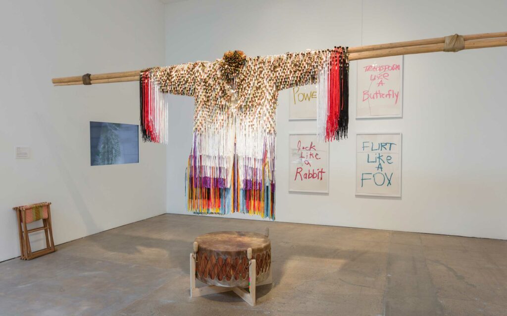
Lygia Clark fue una artista brasileña, cofundadora del Movimiento Neoconcreto,
comprometida con redefinir la relación entre el arte y el ser humano a nivel
conceptual y sensorial. Realizó pinturas, esculturas, instalaciones y acciones
sensoriales vinculadas al arte y a la psicoterapia.
Junto con Hélio Oiticica funda el Movimiento Neoconcreto, que promulgaba un arte subjetivo y orgánico, donde el espectador tenía un rol fundamental manipulando objetos móviles tridimensionales y modificando su apariencia. Se proponían abolir el rol tradicional del objeto frente al espectador contemplativo, lo que sería el inicio de su trabajo posterior orientado como apoyo terapéutico al psicoanálisis.
En 1969 participó en un simposio de arte sensorial en Los Ángeles. En 1972 fue invitada a impartir un curso sobre comunicación gestual en La Sorbona. Sus clases eran experiencias colectivas que manipulaban los sentidos. Trabajaba con grandes grupos de estudiantes, con los que buscaba por medio de ejercicios la liberación a través de la expresión.
La propuesta consistía en revivir experiencias grabadas a nivel sensorial de las primeras etapas de la vida, despertando a través de los objetos la energía sensorial voluntariamente reprimida. Utilizando los objetos como herramienta de autoconocimiento y comunicación interpersonal. La textura, temperatura, peso y sonoridad de los objetos en el uso guiado por la artista, provocaba en cada participante diferentes conexiones internas.

Los últimos años los dedicó a este tipo de terapia y su trabajo en el área del psicoanálisis es invaluable.
Son numerosas las exposiciones de su obra así como las experiencias sensoriales que se continúan realizando a través de su legado. En 2014 el MoMA realizó una gran exposición retrospectiva de su obra y en 2020 el Museo Guggenheim Bilbao organizó una exhibición sobre su trabajo entre 1948-1958.

Lista de algunos de los artistas más destacados y no destacados que trabajaron el
arte concreto en Argentina:
Alfredo Hlito
Tomás Maldonado
Raúl Lozza
Juan Melé
Lidy Prati
Enio Iommi
Claudio Girola
Virgilio Villalba
Antonio Fernández
Muro
Martha Boto
Gyula Kosice
Julio Le Parc
Gregorio Vardanega
Kenneth Kemble
Ricardo Carpani
Juan Carlos Distéfano
Osvaldo Borda
Francisco Sobrino
Miguel Ángel Vidal
Eduardo Mac Entyre
Eduardo Jonquières
Alberto Molenberg
Matilde Marín
Pablo Suárez
Rubén Santantonín
Ary Brizzi
Josefina Miguens
Rosa Skific
Martín Blaszko
Anatole Jakovsky
Rogelio Polesello
Luis Tomasello
Martha Peluffo
Marta Minujín
Alfredo Portillos
León Ferrari
Ernesto Deira
Kenneth Noland
Guillermo Kuitca
Norberto Gómez
Horacio García Rossi
Eduardo Stupía
Rogelio Polesello
Pablo Siquier
Tulio de Sagastizábal
Enio Iommi
Remo Bianchedi
Guillermo Roux
Rubén Naranjo
Elsa Soibelman
Eduardo Rodríguez
Juan Batlle Planas
Marta Chilindron
Diego Bianchi
Miguel Ángel Ríos
Fabián Marcaccio

Trabajaron con una variedad de medios, desde la pintura y la escultura hasta la instalación y el arte cinético. Muchos de ellos también estuvieron involucrados en la formación de grupos y colectivos de arte, como el Grupo de Arte Moderno de

Buenos Aires (GAMBA) y el Grupo de Arte Concreto-Invención, que jugaron un papel fundamental en la promoción y el desarrollo del arte concreto en Argentina y en toda América Latina.
También en Brasil hubo destacada actuación de los artistas en el arte concreto, entre los principales se encuentran:
Lygia Clark
Hélio Oiticica
Lygia Pape
Geraldo de Barros
Waldemar Cordeiro
Hermelindo Fiaminghi
Willys de Castro
Almir Mavignier
Ivan Serpa
Sérgio Camargo
Lothar Charoux
Amilcar de Castro
Abraham Palatnik
Franz Weissmann
Judith Lauand
Luiz Sacilotto
Carlos Cruz-Diez
Mira Schendel
Tomie Ohtake
Kazmer Féjer
Carlos Fajardo
Regina Silveira
César Paternosto
José Resende
Tunga
Eduardo Sued
Leon Ferrari
Anna Bella Geiger
Antônio Dias
Gego
José Roberto Aguilar
Carlos Zilio
Iole de Freitas
Waltercio Caldas
José Bechara
Artur Lescher
Julio Le Parc
Carmela Gross
Sergio Lucena
Raymundo Colares
Paulo Monteiro
Carlos Vergara
Paulo Roberto Leal
Fábio Miguez
Décio Vieira

Lista de artistas destacados y no destacados que trabajaron en el arte concreto en Europa:

Max Bill (Suiza)
Georges Vantongerloo (Bélgica)
Josef Albers (Alemania)
Hans Arp (Alemania)
Richard Paul Lohse (Suiza)
Camille Graeser (Suiza)
Victor Vasarely (Hungría/Francia)
Auguste Herbin (Francia)
Sophie Taeuber-Arp (Suiza)
Piet Mondrian (Países Bajos)
Theo van Doesburg (Países Bajos)
Michel Seuphor (Bélgica)
François Morellet (Francia)
Vera Molnar (Hungría/Francia)
Julio Le Parc (Argentina/Francia)


Gruppo T (Italia)
Giovanni Anceschi
Davide Boriani
Gianni Colombo
Gabriele De Vecchi
Grazia Varisco

Gruppo N (Italia)
Ennio Chiggio
Alberto Biasi
Toni Costa
Edoardo Landi
Manfredo Massironi

Gruppo Zero (Alemania/Italia)
Heinz Mack
Otto Piene
Günther Uecker
Lucio FontanaYves Klein

Gruppo Enne (Italia)
Enrico Castellani
Agostino Bonalumi
Piero Manzoni
Dadamaino
Grazia Varisco

Gruppo 7 (Países Bajos)
Willem Hussem
Jan Henderikse Armando
Henk Peeters
Jan Schoonhoven


Hay que tener en cuenta que estas listas no son absolutas y que hay muchos otros artistas que han participado y aún participan en el trabajo del arte concreto en el mundo. Cada uno de ellos ha hecho una contribución significativa al movimiento, ya sea a través de su responsabilidad individual, su participación en colectivos o su trabajo en proyectos colaborativos

Artistas Del Arte concreto

Why Oil Paint Is So Expensive

Concrete Art Theo van Doesburg

Why Oil Paint Is So Expensive

Oil paint is simple. At its most basic, it’s just a mixture of oil and pigment. But depending on the color and quality, a liter of this paint could cost you between $285 and $1,000. So what is it that makes this paint so special, and why is it so expensive? Oil paint has been used for hundreds of years. It’s made from a drying oil, like flaxseed, and pigment, sometimes with fillers and thickeners added. When mixed and crushed, these ingredients bind and thicken to form a permanent paint. While the rise of oil paint is associated with the Renaissance, paintings using poppy-seed oil have been dated as far back as seventh-century Afghanistan. But there’s one key reason this paint hasn’t ever been cheap: Pigments cost a lot of money.

Tegen Hager-Suart: So in a good oil paint, you’re gonna be looking for a high pigment loading and a good-quality pigment in that high pigment loading. So it doesn’t matter if you have loads of pigment if it’s a bad-quality pigment. You’re looking for lightfastness so it doesn’t fade, and tests on lightfastness that have been going on for generations, in fact, for some pigments, so you’re not gonna create a masterpiece and then 50 years down the line it’s completely washed out. [Narrator] The highest-quality oil paint can be up to 75% pigment, and throughout history, the most sought-after pigments have been worth far more than their weight in gold. And that’s because they take a lot of work to discover and to make. The favorite imperial color in Roman times, Tyrian purple, was a bright pigment made from the glands of sea snails, and it could take 12,000 snails to make just 2 grams of the color.

Indian yellow was originally made from the urine of cows fed only on mango leaves, and in the 16th to 19th centuries, mummy brown was actually made with the ground-up remains of Egyptian mummies, and while the color was perfect for some flesh tones, we quickly ran out of mummies to use. Hager-Suart: Pigments do dramatically change the cost, and in professional levels, you’ll have series, so you’ll have probably a series one, well, up to series seven. The higher the number, the more expensive it is. And that’s due to the pigments, how difficult they are to obtain, where they come from, and also how in-demand they are as a product in the real world. [Narrator] Possibly the most valuable, though, was ultramarine, literally meaning “beyond the sea,” as it had to be mined in Afghanistan. It was made from lapis lazuli, which in its purest pigment form can still cost up to $30,000 per kilo. The gemstone was used to make the pigment until a synthetic version was created in 1826, and the vibrant blue was valued so highly in the Renaissance that it was generally reserved for painting the robes of the Virgin Mary.

Synthetic versions of many of these pigments have now been created, and while this means many are cheaper, some can still be difficult to produce. Cobalt blue, for example, has to be made by heating its components to 1,200 degrees Celsius. And once you have these pigments, they’re tricky to work with. Winsor & Newton has been making oil paints for almost 200 years, and its factory in France produces over 5 million liters of paint each year. Dominique Murzeau: In fact, produce paint is like cooking. So here you have mixing, so we are mixing components like pigments and other additives like oil. We are then milling. So it depends. We’re using different type of machines So we’re using granite, ceramic, or steel. Then we are testing, OK, so testing the viscosity of the grain and, of course, the color.

Hager-Suart: The whole process is so select. So for every single pigment, you need to handle it in a particular way. So it will need a particular amount of oil with it, and that ratio changes for every pigment. And you’re going to need to grind it to a particular fineness, and actually even with the same pigment the milling and the grinding will affect the color you have. So if you overgrind you might end up with something duller, or with another color if you grind it very fine; you might end up with a purple rather than a blue. [Narrator] The research and testing for these colors can take months or even years to get right. Small samples of each color are made in a lab to measure consistency and lightfastness. Above all else, the quality of oil paint needs to be reliable, as professional artists need to guarantee that what they’re working on now will last for hundreds of years.

And despite comparatively new paints like acrylic, oil still remains an artist favorite. Hager-Suart: We’ve still got works that are still beautiful and relevant from the 15th century. And it’s also, it’s durable, and it has this ability to layer, where you can scrape back, you can keep working, you can work on a piece for years and keep on redoing it, and it gives every piece this history. And, you know, the materials themselves are expensive. They’re reliable. They’re gorgeous. I mean, they come out of the painting at you..

For centuries, oil paint has been a favourite of artists because of its unmatched richness and its unequivocal luminosity, a true classic. The history of oil pigments is an interesting one, and can be called weird too. How mankind came to create pigments is an intriguing read.

Did you know they do not make the colour ‘mummy brown’ anymore as they ran out of mummies to make mummy brown pigment! Yes, you read it correctly. Many names that you read are given to the colours because of what they were historically made from. ‘Madder red’ was made from ox blood and cow manure.

That’s mad stuff!

Making oil paint is similar to cooking. It starts with blending the grinned pigment and oil in a huge batter mixer into a paste, then the paste is smooth out multiple times through a mill. The rollers further coat the pigment particles in oil as it is thickening the paint. There are three kinds of rollers: Steel, Granite, and Aluminium. When the process is complete the paint is stored into paint tubes ready for market.

The entire procedure of making oil paints is individually customized to a specific fineness, which could either be coarser or fine. The mixing of oil ratio and grinding can influence the hue of the colour. It would require an exact oil amount per pigment requirement. If you mix more or less oil, or grind it too much, there is chance that you may not achieve your shade of colour. You may end up with a purple instead of a blue. Research and testing of each colour take a lot of time, sometimes even months, based on its consistency and lightfast.

Mixing pigment with a drying oil like linseed (similar to flax-seed) fillers and thickeners added to this mixture is an important factor in making quality paints. When processed properly, these mixed compounds become a durable long-lasting paint colour.

Commonly used flax plant-based linseed oil, alkane series uses a petroleum solvent (hexane) extraction to capitalize on the yield, therefore not edible. Must only be used as an additive to paints or as a paint thinner or extender.

Walnut oil mediums are a healthier choice than harsh solvents base mediums, like linseed oil, stand oil and solvents. Walnut Oil paint and medium are solvent free, an Eco-friendly green product that can be used like linseed oil or stand oil, and also clean your brushes without solvents. M Graham Paints maintains that the medium can be used to remove “colour from artists’ tools as effectively as odourless paint thinners” while not affecting the natural essential oils of the brush.

Their Walnut Oil and Walnut Alkyd medium resist yellowing and cracking, compared to linseed oil (due to its high linolenic acid content), beside being more brittle. The bonus, Walnut Alkyd medium dries faster than the traditional safflower and poppy seed oils.

The quality of pigment also impacts the lightfastness (resistance to fading) of the paints. A litre of pigment could cost anywhere between $250 to $1,100 depends on the efforts applied in discovering the pigment, the purity of the pigment and production of quality control of a colour sets the cost of a pigment. Artists quality paint, you buy the best quality pigment, highest pigment load, and not cheap fillers to accomplish the optimum results.
Professional artists look for lightfastness. Research on lightfastness has been ongoing throughout the ages, especially for certain pigments. Nobody wants to create a masterpiece that will be washed out 50 years down the road. Professional artists need a guarantee that what they’re buying must be dependable, reliable and durable for years to come. Investors need a return on their investments not depreciate due to poor materials.

The paintings discovered in the caves of Bamiyan, in Afghanistan, belonging to the 7th century are first oil paintings known to humans. In Europe, first recorded oil painting was as early as in the 11th century and gained popularity during the Renaissance. These paintings were made from linseed oil, a drying oil, and pigment, when crushed and mixed they bind together to form a permanent paint.

It is the pigments that make oil paints expensive. Good paint is loaded with good quality pigment; highest quality oil paints are loaded with as much as 75% of pigment. Most sought-after pigments have been difficult to discover and produce, making them worth more than their weight in gold.

Trivia – the symbol of status of the Roman Royalty, Tyrian purple was a dye extracted from the glands of thousands of shellfish left in the sun to be baked. 10,000 shellfish were crushed to get 1 gram of dye making it worth more than its weight in gold. Cleopatra was such a fan of the Tyrian purple everything in her palace was purple, while Caesar was so captivated by its richness nobody else was allowed to wear.

‘The Starry Night’ by Van Gogh is one of the most recognized paintings in the history of Western art culture. The ultramarine sky and the Indian yellow stars and Moon make it strikingly beautiful and priceless too. Hailed as Van Gogh’s magnum opus, had it not been for oil paint it could have been lost to us. More than hundred years we can visualize what he saw from the window of his sanatorium room. Thousands of such classical masterpieces would have been long gone and lost in time had it not been for the lightfastness of oil paints. This clearly makes oil paints worth every penny.

Another property that makes oil paints an artist’s best friend is the fact that they are slow to dry. This means the artist can blend colours and change the structure of his work for a longer period, than with any other mediums. Artists have the ‘edit’ option available to them because oil paints dry by oxidation and not evaporation. At the same time, it has its limitations, then they must set it aside for drying time. Depending on the thickness of the layer, it usually takes approximately 1 to 2 weeks for the paint to get dry to touch, allowing you to add layers and/or defining detail work.


Until synthetic pigments were invented, creating paints from organic pigments was a master’s task. Ultramarine blue, unknown to Europe until 15th century, swept the European art scene like a typhoon was so expensive that it is believed Michelangelo left his painting ‘The Entombment’ unfinished as he could not afford to buy more ultramarine blue. Made from a semi-precious stone Lapis Lazuli, it was considered as precious as gold.


Ultramarine blue, signifying “beyond the ocean,” found in the mountains of Afghanistan. It was produced using lapis lazuli, which in its most flawless shade can cost up to $30,000 per kilo. It was utilized to produce oil paint until a synthetic version was made in 1826. This royal blue shade was so exceptional in the Renaissance that it was just used to paint the robes of the Virgin Mary. To know more about the different pigments, read our blog ‘Pigments: From Caves to Canvas’ on how different pigments were made.
The history of pigments is so rich; and rare which made them expensive. But with the advent of synthetic pigments, oil paints are not rendering artists debt ridden anymore. 20th century has seen huge changes in the composition of oil paint and its manufacturing. From the use of granite ball and buhrstone wheel to grind the pigment to sand mills and high dispersion mixers, the biggest advancement has been the easy availability of paints due to the changes thanks to the industrial era that help revolutionize the pigment industry. Traditionally our ancestors would only grind the pigment and the customer had to do the mixing, today you can purchase ready made, squeeze straight out of tube paints to use.
Though chemical synthesized versions of many pigment colours have made them cheaper, there are still many hues that are difficult to produce and thus, expensive. Like the original Cobalt, famously called ‘the divine colour’ by Vincent Van Gogh, is still one of the most expensive paints as the pigment is processed by sintering and heating aluminium (alumina) with cobalt (II) oxide at 1200 degree Celsius. The process of manufacturing is the key reason why some oil paints from the same brand are sold at different price point. Every pigment colour has its own special composition and method, and each one is created keeping a specific goal in mind.


Some manufacturers have developed a cobalt blue hue, meaning more than one pigment.


• An example, Winsor & Newton Artisan Water Mixable Oil Cobalt blue hue uses combined modified linseed oil with a pigment mixture of Indanthrone (PB60), a complex silicate of sodium and (PB29) aluminium with sulfur to create a similar Cobalt blue hue.


• Student Winton Oil uses Cobalt blue PB28 with more linseed filler, to cut the cost.


• Winsor & Newton Professional Artists Oil Cobalt blue uses Oxides of Cobalt and Aluminum (PB28) with linseed and Safflower oil binder to boost the colour clarity.


• M Graham hopped to use Oxides of Cobalt and Aluminum (PB28) with an Alkali Redefine Walnut Oil, a vehicle that has less of a tendency of yellowing with time, keeping its durability intact.
Oil mediums like safflower or poppy oil has less of a tendency of yellowing with time, but produces a weaker and more fragile films, while it helps the oil paint layer to dry faster. The Cobalt blue does naturally incorporate Safflower oil in its pigment structure, which is why it naturally dries faster than other pigments and sometime cause wrinkles while drying and eventually irons itself out… This is another factor artist’s must be aware of, the natural pigment characteristic that affect your painting process.


As each pigment needs to be grinned to a certain fineness to make it fine or coarse. The measure of oil added also changes the shade. Higher the pigment content; deeper the shade, higher the oil content; lighter the shade. The higher the oil properties also diminishes the viscosity of the colour.


Each brand has their own unique texture, while some will be buttery and easy to spread others will be grainy or viscid. It is for the artist to decide what works best for them. Winsor and Newton have been making oil paints for more than 200 years and they produce more than 100 shades every year. Sennelier, established in 1887, take pride in being the choice of masters like Picasso and Matisse. Made by using safflower oil instead of linseed oil, they give satin finish and prevent yellowing; they have become the ‘Reference’ brand. Bob Ross oil paints are not high on pigment load but have great consistency for Ross’ wet-on-wet technique. Regardless of your brand, oil paints are still every artist’s favourite medium. Whenever you want to be expressive with brush strokes, it always helps to use the best.


Shop for the best at King’s Framing & Art Gallery where there is every shade for every expression. Shop for Bob Ross Oil paints, Lukas Studio Oil paints M Graham professional oil paint, Sennelier Oil paint sticks & sets, Winsor & Newton tube oil paints & sets at great prices only on King’s Framing & Art Gallery. 

Source: https://www.kingsframingandartgallery.com/blog/post/why-oil-paints-so-expensive

Geometric Shapes

Constructivism art Rafael Montilla

Geometric Shapes Paintings

Geometric shapes have been used in art for centuries, and they continue to inspire and fascinate artists today. In the world of painting, geometric shapes are often used to create abstract compositions that explore form, color, and space.

One of the most famous artists who worked extensively with geometric shapes was Russian painter Kazimir Malevich. In 1915, Malevich created his iconic “Black Square” painting, which features a perfect square painted in black on a white background. This simple composition was a radical departure from traditional painting, and it marked the beginning of the Russian avant-garde movement. Malevich continued to explore geometric shapes in his subsequent works, creating complex abstract compositions that are still admired today.

Other artists have also used geometric shapes in their paintings, including Piet Mondrian, Josef Albers, and Frank Stella. Mondrian, a Dutch artist, was known for his abstract compositions that used primary colors and simple geometric shapes like squares and rectangles. Albers, a German artist, created his “Homage to the Square” series of paintings, which featured nested squares in different colors. Stella, an American artist, used geometric shapes to create dynamic compositions that play with light and shadow.

Contemporary artists also continue to experiment with geometric shapes in their paintings. Some artists use geometric shapes to create optical illusions, while others use them to explore themes like identity, memory, and spirituality. Many artists also combine geometric shapes with other elements like color, texture, and line to create complex and visually stunning compositions.

Overall, geometric shapes continue to be an important element in the world of painting. They offer artists a versatile tool for exploring form, color, and space, and they can be used to create both simple and complex compositions that engage and inspire viewers.

Beyond identity politics, the art of Jeffrey Gibson

A Different Corner, 2018 Painting Acrylic and graphite on raw hide over wood panel
A Different Corner, 2018

Beyond identity politics, the art of Jeffrey Gibson

Amy Zion

The artist effortlessly weaves Native American heritage into geometric abstraction

To visit  Jeffrey Gibson, I headed upstate. As New York City receded into the distance, I retraced the route the artist took back in 2012, when he moved his studio from Brooklyn to Hudson and began teaching art at Bard College. A couple of weeks before we met, the first leg of Gibson’s major touring exhibition, ‘Like a Hammer’, had closed at the Denver Art Museum. The show is a major milestone for the artist and focuses on works produced since 2011, when his practice started to incorporate references to his Native American heritage. Thus, conversations with Gibson almost inevitably begin by addressing the Great Identity Problem: that by asserting someone’s identity you might qualify them unnecessarily (for example, ‘the female prosecutor from Arizona’) or reductively. And that by asking someone to self-identify, you simultaneously grant them agency and create a framework that cannot be challenged. Yet Gibson, who is all too familiar with these issues, professes a strikingly open attitude to the subject. 

Courtesy of the artist and Roberts Projects, Los Angeles, California. Photo by Jessica Goehring

His background and subjectivity are arguably more multilayered than most. The artist has ties to Mississippi and Oklahoma, where his Choctaw and Cherokee forebears are from, but as the son of a civil engineer in the US Army, he grew up in Germany and Korea. He went to school in England and married a man from Norway – his is a kaleidoscopic perspective of the world that is evident in the way he approaches art making. ‘This kind of movement through different forms of identity has made me grow and see the world in a very broad way,’ he says. That translates in his work as a wide range of references, techniques, and histories smashed together. In each piece, the idea of authenticity and purity is further challenged.

Today, Gibson lives and works in Claverack, near Hudson, New York. As I drove north, I looked out for an old schoolhouse. Around the back, an assistant greeted me and led me into its former gymnasium, where I found the artist finishing a couple of emails and a few headphone-sporting collaborators working silently on a new series of the elaborately beaded punching-bag sculptures for which Gibson is best known. These works and others like them, as well as paintings and tables covered with multicolored supplies, were spread out over the floor, which still bears the markings of overlapping sport arenas. 

Peeking out from Gibson’s sleeve was a whimsical tattoo of a childhood drawing of his that was found tucked into the bible of his Baptist minister grandfather. As we spoke, the backdrop of the studio came into focus. Behind him was a finished sculpture based on papal garments and the ghost shirts worn during the 19th-century Native American Ghost Dances (which are related to Mormon undergarments, Gibson explained). Its sleeves were adorned with Native American jingles and its details related to the artist and activist Sister Corita Kent, as well as elements from Gibson’s dreams and more personal iconography, such as song lyrics from his youth.

Jeffrey Gibson, LIKE A HAMMER, 2016. Courtesy of the artist and Roberts Project, Los Angeles, California. Photo by Eric Swanson.

Despite his range of references, Gibson says he hates the word ‘eclectic’. He prefers to characterize his approach in terms of anthropophagia, a concept initially developed by the Brazilian poet Oswald de Andrade, which sees the absorption (or ‘cannibalism’) of other cultures as a source of strength. Jingles were originally made from rolled-up tobacco lids but, today, they are mass-produced in Taiwan expressly for the purpose of decoration. ‘That is a foreign material that clearly has been reinvented and become part of another culture […] What a powerful ability that is to claim something and use it exactly for what you need it,’ he says. For the artist, having different worlds collide in this manner is creative strategy for breaking apart reified historical metanarratives. It is also a way to confound ideas of identity – that any one culture has ever been totally separate from one another, or that appropriation has only ever occurred in one direction: by the colonizer from the colonized. 

‘Like a Hammer’, which is touring to the Mississippi Museum of Art, the Seattle Art Museum, and the Madison Museum of Contemporary Art, highlights a fundamental turning point in Gibson’s work. Prior to 2011, the artist was producing more classic, albeit innovative, abstract painting. The shift followed a period when Gibson was ready to call it quits as an artist. While trying to figure out what to do next, he received a grant to travel to Winnipeg in Canada, South Dakota, Oregon, and Oklahoma, to meet with traditional artists who were making things for their communities. Gibson felt their sense of conviction was absent in his world in Brooklyn: ‘When I came back I decided, “You need to stop trying to perform what you think an artist is supposed to be doing and focus on what you want to do, what you want to say.”’

Courtesy of the artist and Roberts Projects, Los Angeles, California. Photo Peter Mauney.

Around the same time, he began making what he calls ‘rawhide paintings’, inspired by the parfleche bags produced from animal skin by nomadic tribes in the Great Plains. Traditionally, the rawhide would be laid flat, painted in geometric designs, and then folded over to form bags. Gibson tells me that they were painted by women, who would have treated their brushes or painting tools as ceremonial objects. ‘They might have been saying a prayer [while they worked] and made it for a specific person,’ he says. Yet the glossy pages of an auction catalogue in which he used to see them conveyed none of that content. 

The works Gibson is showing at Art Basel Miami Beach are an extension of this series. The irregularly shaped diptych canvases are framed together and named after songs from the artist’s high-school years, a period when Gibson was coming to terms with his sexuality, amid the Aids crisis. Stretched from skin, each canvas preserves a clean, taped-off border, revealing the organic material supporting the hard-edge abstract motifs. Gibson’s work comes after the more conceptual approaches by Indigenous artists such as James Luna and Edgar Heap of Birds, who created a bridge, to use Gibson’s term, from more traditional Indigenous, or at least separated, art spheres into the framework and context of contemporary art. Gibson’s work, with its references to multiple cultures, techniques, and narratives, owes its nimbleness, in part, to the efforts of these predecessors.

Discussing his Native American influences, Gibson muses on their relationship to Modernist painting and the history of geometric abstraction, which was so key in shaping his own early practice. ‘Why has no one ever done an exhibition comparing these histories?’ he asks. ‘To have had this conversation as part of my education would have benefited me tremendously.’ As he says this I realize Gibson has been letting this conversation evolve within his own work. The language of hard-edge abstraction and traditional parfleche-bag designs and materials do not simply come together in his latest works – their conflation is like a chemical reaction that wildly reshapes the format of the support and its frame. This is perhaps why one can’t sum up an artist’s identity through labels and hyphen. Great work never fails to confound preconceived ideas. 

Amy Zion is a curator and writer based in New York City. 

Jeffrey Gibson’s work will be shown by Roberts Projects in the Nova sector of the 2018 edition of Art Basel Miami Beach. Discover more artists and galleries participating in this year’s Nova sector.

Jeffrey Gibson, A LOVE SUPREME (detail), 2017. Courtesy of the artist and Roberts Project, Los Angeles, California. Photo by Peter Mauney. Filmmakers Cristobal Leon and Joaquin Cociña turn Chile’s darkest hour into a stop-motion fairy taleInspired by the brutal history of Colonia Dignidad, the film is a must-see at Art Basel Miami Beach

A Different Corner, 2018 Painting Acrylic and graphite on raw hide over wood panel
A Different Corner, 2018
Enjoy the Silence, 2018 Roberts Projects Painting Acrylic and graphite on raw hide over wood panel
Enjoy the Silence, 2018g Acrylic and graphite on raw hide over wood panel
Unfinished Sympathy, 2018

The Pepperoni Pizza Project: Red Edition

The Pepperoni Pizza Project: Red Edition

The Pepperoni Pizza Project: Red Edition

Fridge Art Fair is pleased to present “The Pepperoni Pizza Project: Red Edition.” In a time of renewed passion for the arts, the color Red best represents art’s healing power and ardor.

Returning to the Lower East Side’s fabled Gallery OneTwentyEight, this year’s fair will also collaborate with both the nearby 2B&2C @ 9B9 Artspace and Two Boots Williamsburg.

Exhibition highlights at Gallery OneTwentyEight – aka as “Deep Dish” — include an eclectic range of works in varied media by Chris Cobb, Michelle Hill, Victor Pedelty, Phoenix Roberts, Dayle GinsburgPeter Stefanides, ART BreakOUT and Fridge Fair founder Eric Ginsburg.

For this year’s ninth edition, Matt Sullivan, esteemed musician and director of 2B&2C, has joined the Fridge creative team. Featured at 2B&2C – aka “Thin Crust” — will be a selection of artworks by Matt’s longtime collaborative partner and husband, the late ecosystem-painter, sculptor, and teacher, Ken Cro-Ken (1957-2020). Other highlights at 2B&2C include: the opening of Ken Cro-Ken Memorial Gardens, multi-media performances and Fridge pop-ups.

Two Boots Williamsburg – aka “The Brooklyn Slice” – will present a vibrant range of art by artists – both emerging and established – representing Brooklyn’s distinct creative, countercultural flavor. Exhibiting artists include: Optimo Primo, Sam Diaz, Shayne Bovell, Ben Wilson and Samantha Sabatino. There will, also, be a performance by SoulProduct and friends.

Gallery OneTwentyEight, located at 128 Rivington Street and 2B&2C, housed at 9 Avenue B, will hold their grand openings on Wednesday, May 17 from 6-9pm. Fair hours at both Lower East Side spaces will be from Thursday, May 18 to Saturday, May 20, 2-9pm and Sunday, the 21st , 12-6pm. Two Boots Williamsburg will open on May 18, 4-10pm and will continue through the 21st from 4-10pm daily.

Since its inception in May 2013, Fridge Art Fair has presented concurrent with Frieze (yes, the name is a play on that week in New York City!) and Art Basel in Miami. We have lived up to our tagline, “Can you fit into the Fridge?” by accepting numerous and diverse exhibitors in spaces from tiny to huge that were either affordable or donated to us.

Admission is free, but as a 501c3 not-for-profit, we accept tax deductible donations from the public.

Artists

Unfinished Sympathy, 2018

Geometric abstract art artists

John McLaughlin (1898-1976)
Frederick Hammersley (1919-2009)
Bill Komodore (1932-2012)
Margaret Wenstrup (1930-2008)
Josef Albers (1888-1976)
Anni Albers (1899-1994)
Richard Anuszkiewicz (1930-2020)
Ed Mieczkowski (1929-2017)
Julian Stanczak (1928-2017)
Francis Hewitt (1936-1992)
Charles Hinman (b. 1932)
Al Loving (1935-2005)
Reginald Neal (1909-1992)
Ralph Iwamoto (1927-2013)
Tadasky (b. 1935)
Paul Reed (1919-2015)
Francis Celentano (1928-2016)
Paul Reed (1919-2015)
Karl Benjamin (1925-2012)
Howard Mehring (1931-1978)
Mon Levinson (1926-2014)
Leroy Lamis (1925-2010)

Geometric abstraction

Horacio Garcia Rossi
Luc Peire
Nino (Antonio Calogero) Calos
Hans Jörg Glattfelder
Winfred Gaul
Dadamaino
Grazia Varisco
Aurélie Nemours
Franco Costalonga
Claudio Rotta Loria
Alberto Biasi
Toni Costa
Edoardo Landi
Agostino Bonalumi
Jorrit Tornquist
Marcello Morandini
Roberto Crippa
Sandro de Alexandris
Arturo Bonfanti
Roberto Crippa
Sandro de Alexandris
Sol LeWitt
Piero Dorazio
Arnaldo Pomodoro

Günter Fruhtrunk

Winfred Gaul

Ulrich Erben

Imi Knoebel

Günter Umberg

Wolfram Ullrich

Vinyl Wraps for Food Trucks

Vinyl Wraps for Food Trucks

Are you looking for a better way to make your food truck design stand out from the crowd? Are you looking for a cost-effective advertising solution that will help drum up more business wherever you go? Food truck wraps provide the ideal design solution for getting people excited about tasting your food. All of our food truck graphics are specifically designed to meet the needs of each unique business in order to ensure that each business’ advertising is being properly geared toward their target market. Get in touch with us today to learn more about our food truck graphics.

taco food truck vinyl wrap

What is a Food Truck Wrap?

Food truck wrap graphics are a large decal that can be applied to the exterior of the truck in order to display the business’ branding and menu to people passing by. Not only can food truck graphics help improve the overall design and feel of a food truck but they also make it extremely easy for potential customers to know exactly what kind of food is being served, even from a distance. Food truck graphics can be completely customized with any design elements, colours, images, or messaging you can dream up and can be removed at any time without damaging the underlying paint. This means that you can easily change up the food truck graphics for your menu or business branding as often and as many times as you need. Get in touch with us to learn more about food truck graphics.

vibrant food truck wrap

Benefits of Food Truck Graphics

Food truck wraps are specifically designed to help create business recognition and repeat customers through mobile advertising. Since food trucks are often moving from one location to the next, using food truck graphics will allow you to create a mobile billboard design that will be potentially seen by thousands of people every day. A well-designed food truck wrap will not only create a professional appearance but also a recognizable look and appeal that customers will come to know.

All custom food truck wraps are make using the highest quality materials—3M and Avery cast vinyl—and are coated in a special UV layer for added protection against dings, scratches, and sun damage. Our custom food truck graphics are also printed using the latest printing equipment in the industry and are only installed by our team of highly trained professionals, so you can rest assured that you will be receiving the best food truck graphics possible. Get in touch with us to learn more about the benefits of food truck graphics.

Food Truck Graphics Design from Wrap Guys

Whether you are wanting to learn more about the average price of a great food truck wrap graphics or you are wanting to discuss your food truck wrap design ideas, we would love to chat with you. Our team of professional graphic design artists can help you create the perfect graphics for your food truck, incorporating any colours, messaging, images, or branding elements that you want into the design. Get in touch with us today to learn more about how we can help you create the perfect food truck graphics and design for your business.

Steven Pressfield

Steven Pressfield
Steven Pressfield

If you’re an aspiring writer or artist,
I’ve got good news and bad news…

First the bad news

1. THERE IS AN ENEMY

The playing field that you, the aspiring artist, stand upon is not level. It is stacked against you.

2. YOU ARE THE ENEMY

Resistance (self-sabotage, procrastination, fear, arrogance, self-doubt) is inside you. No one inflicts it on you from outside. You bring it with you from birth.

3. RESISTANCE WILL KILL YOU

If you don’t believe me, look around at friends and family who have talent and ambition in spades … but are drinking, doping, abusing themselves and their loved ones, wasting their lives because they can’t get out of their own way and do the work they were put on this planet to do. Trust me: you will NEVER, NEVER achieve your dreams until you learn to recognize, confront, and overcome that voice in your head that is your own Resistance.

4. YOU ARE NOT ALONE

You’re not “wrong” if your head is your own worst enemy. You’re not “weak.” You’re not “sick.” Everybody experiences Resistance.

Resistance is an objective force of nature, as immutable as gravity.

5. RESISTANCE CAN BE BEATEN

There’s no magic bullet. No hack, no trick, no tip, no class, no degree.

But you, armed with the right knowledge and resolution, can acquire the self-motivation, self-discipline, and self-belief necessary to become a focused, mentally-tough working pro.

6. YOU’VE COME TO THE RIGHT PLACE

Whatever brought you to this site—luck, chance, maybe reading or hearing about The War of Art—doesn’t matter. Welcome! You have found an ongoing resource to help you fight and win the inner war of the writer, the artist, and the entrepreneur.

TWO MANTRAS FOR YOUNG WRITERS

From my (fictional) 96-year-old literary agent, Marty Fabrikant, as quoted in The Knowledge:

1. Talent is bullsh*t

“I’ve seen a million writers with talent. It means nothing. You need guts, you need stick-to-it-iveness. It’s work, you gotta work, do the freakin’ work. That’s why you’re gonna make it, son. You work. No one can take that away from you.”

2. The work is everything

“And I’ll tell you something else. Appreciate these days. These days when you’re broke and struggling, they’re the best days of your life. You’re gonna break through, my boy, and when you do, you’ll look back on this time and think this is when I was really an artist, when everything was pure and I had nothing but the dream and the work. Enjoy it now. Pay attention. These are the good days. Be grateful for them.”

GLOSSARY OF ART TERMS

GLOSSARY OF ART TERMS

GLOSSARY OF ART TERMS

Acrylic Gesso

A primer which dries with a coarser texture (or ‘tooth’) than regular acrylic primer. Acrylic gesso can be sanded down if desired. It is made from a mixture of chalk and pigment (usually titanium white), bound in a 100% acrylic emulsion binder. It can be used as a ground for both acrylic and oil painting.

Acrylic Ink

High-fluidity acrylic colour, made from pigment suspended in an acrylic based vehicle. It is usually sold in glass bottles, often with a pipette. Acrylic ink can be used in stamping, pen and wash, airbrush and drawing and painting. It is not re-wettable and is permanent and non-clogging.

Acrylic Painting Block

A stack of paper that has been specially prepared for acrylic painting (usually sprayed with acrylic primer), and glue bound on all 4 sides. A gap in the glue will be found on the corner or part of a side of the block, so that when the painting is finished and dry the top sheet can be separated from the block by running a clean palette knife around the underside of the sheet. A block is a lightweight support for acrylic painting that will not buckle during the painting process as the glue binding will keep the sheets taut and flat.

Alla Prima

A painting approach that involves completing a painting in one session. Usually refers to oil painting, the alternative is to complete an oil painting in layers waiting for each to be touch-dry before applying the next, so involves the fat-over-lean principle. Alla prima, meaning all at once, does not require observance of the fat-over-lean principle, as it is essentially one layer.

ASTM

ASTM is the International Standard for testing and material qualities. On the labels of oil paints the ASTM rating will refer to the permanence of colours.

Binder

In acrylic painting, the binder is an acrylic polymer which pigment particles are suspended in to make paint. The binder is also known as the vehicle or emulsion.

Bloom

Patches of cloudiness that can appear on the surface of varnished paintings if they have been kept in damp conditions. It occurs when moisture is trapped underneath the surface of the varnish or when the painting that has been varnished has not fully dried.

Canvas

A woven material used for centuries for painting. Usually made of cotton or linen. Can be stretched over strong wooden stretcher bars, glued onto a board or panel or used unstretched. Although acrylic can be painted on raw canvas, most artists prime the cloth with a ground that allows control over the absorbency, texture and colour of the surface.

Canvas Board

Canvas glued on to a hard board (thin MDF or compressed board). A rigid surface for oil and acrylic painting. Canvas board usually has shear edges (i.e. the canvas does not wrap around to the back, unlike a canvas panel).

Canvas Pad

A pad of unstretched, primed canvas sheets glued at one side ready for oil painting. Also available in blocks glued on four sides.

Canvas Paper

Pads or sheets of paper that are textured and coated to have the appearance and feel similar to primed canvas. Used instead of canvas for economy and convenience.

Canvas Panel

A piece of board or wooden panel on to which a piece of primed canvas has been glued to the front and wrapped around to the back.

Canvas Pliers

A tool which helps to stretch canvas tightly around a frame in order to make a satisfactory surface on which to paint. Canvas is usually fixed to the frame using staples on the reverse of the frame, or tacks on the side of the frame.

Canvas Sheets

Sheets of rectangular or square pieces of primed canvas that can be glued to a board to make a panel, or painted on as they are.

Colour Shaper

A tool with a silicon or rubber tip and a wooden handle similar to a paint brush. Colour shapers can be used to draw into wet paint and create lines and textures, and are useful for closely scraping away small areas of paint.

Colour Strength /Saturation

Another term used to define colour strength is saturation. Colour strength can refer to the ratio of pigment to binder as well as the natural characteristics of the pigment, and is descriptive of how vibrant / brilliant / clean the colour appears.

Complementary Colours

They can be found directly opposite one another on a colour wheel. Because they are diametrically opposed they cause the appearance of one another to intensify when painted unmixed side by side. When mixed together they are capable of producing neutral greys.

Composition

The arrangement of shapes, colours and lines across your picture surface, sometimes referred to as a design.

Cotton Duck

A heavy plain woven fabric that is a popular material for artist canvas as it is relatively low cost in comparison to linen. Cotton duck is most commonly available in 10oz or 12oz weights.

Crackle Paste

When applied to a rigid support with a thickness of at least 3-4 mm, crackle paste will form cracks as it dries, which gives work an aged appearance or can be used for special effects showing through colours from underneath. It can be applied on its own or mixed with colour. The thicker the application the deeper the cracks. When dry, oil or acrylic paint can also be applied over the top of the paste.

Curing

The second stage of drying of acrylic paint. Acrylic paints dry when all the water found in the paint has evaporated, leaving the dried paint (pigment mixed into acrylic polymer). As the moisture leaves the paint film, the remaining tiny polymer spheres move closer together, causing the paint film to contract slightly. The pressure that is created by these spheres pushing against one another causes a capillary force which pushes the last of the moisture out of the paint film, until the polymer sphere start to deform and make bonds between one another. This results in the paint coalescing and forming a continuous paint film. Curing times will vary across brands so it is worth checking the manufacturer’s information if this is of particular concern.

Dry Brush Technique

The application of paint with very little water content in it using a dry brush. Applying paint in this way is also known as scumbling. The results can have a powdery appearance.

Easel

Wooden or aluminium support which holds your support in place as you paint on it. H or A Frame easels are designed for indoor painting, are sturdier and can hold larger supports. They are usually less compact and more difficult to move around. Radial easels are also for indoor painting but tend to hold a smaller size of support. They are more compact and easier to stack. For outdoor painting tripod field easels are available in wood and metal. These are lightweight, compact and easy to carry.

Emulsion

An emulsion is any mixture that doesn’t separate. In art this can be a cold wax medium or an acrylic polymer (acrylic paint).

Ferrule

The metal collar into which the hairs of a brush are bound. This can be crimped once, twice or three times to the brush handle.

Flag

In brush making terminology, the flag refers to the natural split found at the end of hog hairs. This improves the liquid holding capacity of the brush.

Flat Colour

A uniform application of paint, i.e. without any texture or undulation in tone.

Flow Release / Flow Medium

Reduces visible brushmarks and increases the fluidity of acrylic paint. The go-to medium if you want to create stains and washes on a porous or non-porous surface. Flow release breaks the surface tension of water, so allows fluid acrylic to spread rather than bead up. Many brands are very concentrated and you just need a drop, so they recommend making a bottle of water with diluted flow release to use. Some brands, like Jackson’s are already diluted so you use a full amount – so be sure to read the instructions on the label.

Fluorescent Colours

Bright glowing colours that absorb invisible ultraviolet light and reflect more light than they receive. By their nature the pigments are fugitive, both the fluorescent effect and colour will fade over time and should not be used for work intended to be permanent.

Fluid Acrylic

Fluid acrylic is made of pigment suspended in a polymer emulsion with a more fluid consistency than heavy body acrylic. It is not diluted with water and colours will be as stable and luminous as the equivalent in a heavy body range. Fluid acrylic is easily thinned for spraying as well as suitable for brushing and staining and can be modified with acrylic mediums.

Fugitive Colour

Fugitive colour refers to pigment that may fade or discolour when exposed to environmental conditions such as sunlight, heat or water. Fugitive colours will be indicated with a low lightfastness or permanence rating.

Gel (acrylic)

Acrylic gels are available in a range of consistencies and sheen. They are effectively acrylic paint without the pigment and can be used to increase transparency, extend colour and increase viscosity of paint. They can also be applied on their own to create transparent impasto effects on your surface. Gels tend to retard the drying time of paint and can also be used as a water, chemical and UV resistant adhesive in collage.

Gelli Plates

A printmaking matrix for a monoprinting technique that is especially effective when used with Open Acrylics.

Gesso

Pronounced with a soft g like gypsy or George. From the Italian for gypsum, a major component. This thick white liquid is primarily used as a ground for painting but can also be used to build up areas for carving on frames and is used underneath gilding. It can be coloured. Gesso for gilding is often coloured red. You can buy ready-made black “acrylic gesso”.

Gesso is made with calcium carbonate (also called whiting, chalk and gypsum) in a binder. It is painted on the canvas, paper or wood panel surface to create a ground on which to paint. Sometimes white pigment (usually titanium, sometimes zinc) is added to make the gesso very white.

Genuine gesso (also called true gesso) uses animal skin glue (hide glue or rabbit skin glue also called “size”) as the binder and the artist often makes the gesso him/herself, using a double boiler to melt the glue powder and adding the whiting. Rabbit skin glue is now also available ready made and just needs to be warmed.
One recipe for traditional gesso: 3 parts size, 1 part chalk (whiting), 1 part pigment powder. It is a rather lengthy, messy, smelly process of soaking, heating in a double boiler and mixing.

“Acrylic gesso” is more correctly called “acrylic primer” and should not really be called gesso. It uses an acrylic polymer as the binder for the chalky powder. It is made up of upwards of 14 ingredients. You can also buy ready-made black acrylic primer.

Genuine gesso is less flexible than the “acrylic gesso” and is usually painted on a non-flexible surface such as a wood panel rather than on stretched canvas, so that it will not crack. For paints that need an especially porous surface, like egg tempera, genuine gesso is usually preferred to the acrylic gesso/primer.

The acrylic primer varies a lot in quality and poor quality products can provide a less absorbent ground than is often preferred. Good quality acrylic primer is a very good product for oil painting and acrylic painting. It does both steps of the surface preparation in one- it both sizes (seals) the surface and gives a ground for painting. It can also vary in absorbency, with some products called “acrylic gesso” rather than “acrylic primer” being more absorbent and chalky and particularly suited to applications which require an absorbent surface.

Acrylic primer differs in thickness, opacity and grittiness of surface texture, depending on the manufacturer. It is usually too thick to use straight out of the bucket and should be diluted with water until it is the consistency of heavy cream. Most primers have instructions that advise you apply three thin coats rather than one thick coat. A very thick coat may crack as it dries. The first coat is often scrubbed into the weave of the raw canvas in circular motions to be sure that it is well sealed. The first coat will soak into the canvas or panel and act as its own sizing (sealer). Then subsequent coats are applied in alternating directions across the canvas. To get a very smooth surface you may wish to sand with sandpaper between coats. Some acrylic gessos are designed to have a harder surface specifically so they may be sanded smooth, but as they are less flexible they may crack on a movable surface such as stretched canvas, so should only be used on rigid surfaces.

For oil painting it is especially important that the oil never reaches the substrate as it will rot the canvas, paper or wood. Traditionally oil painters seal the surface with rabbit skin glue and then prime the surface with gesso (glue with chalk). Using these two layers assures that none of the oil will seep through. Some artists who use ready-made stretched canvases will apply an additional layer of acrylic primer to the surface to ensure that it is well sealed.

For painting on paper you may wish to prime both sides of the paper (one after the other dries) as the paper will curl when it is wetted by the primer. Painting the other side then un-curls it. For oil paint on paper you may want at least three coats.

Priming your painting surface is part of properly creating a painting. The underlying structure is very important to the longevity of the painting as well as to the appearance. Primer creates a surface that is sealed just enough to prevent the paint seeping through to the substrate (canvas, paper, wood), but is absorbent enough to hold onto the paint. If you were to paint on an unusual surface like a rubber toy, the paint might not adhere properly. But if you prime the surface with acrylic gesso/primer first, then your paint will go on properly and stay on. The primer is stickier than paint and will glue the chalk to your substrate and create a better surface to paint on.

While the gesso/primer is wet it may leach colour up from the substrate and cause discoloration to the whiteness of the gesso. The glues in plywood, the resins in wood panels and in stretcher bars may be water-extractable. Sealing the wood or canvas first with a sealant medium such as Golden Acrylic’s GAC 100 will prevent Support Induced Discoloration (SID). Sealing (sizing) with rabbit skin glue does the same thing if you are using genuine gesso. Then prime as normal.

Some artists prefer that the substrate shows through underneath the paint and so they use a clear primer. This is usually an acrylic matte medium. This is a thick white liquid that dries clear so you can see the canvas. The texture is very different to gesso since it does not have the chalk powder in it, the surface is smooth and not as absorbent.

Be warned that priming can be a messy business. Gesso/acrylic primer dries quickly on brushes and can stain clothes. Be sure to use drop cloths and wash everything as soon as possible.

Many artists use the word gesso as a verb meaning “to prime” as in “I will be spending the day gessoing canvases in the studio”.

Some artists mix gesso in with their paint as a painting material.

Glaze

An application of transparent colour over already dry paint. In acrylic painting all clear acrylic mediums can be used to increase the transparency, flow and suitability of your colour mixes for glazing techniques.

Gloss

A surface that is shiny when dry is said to be gloss. Some oil paints appear more gloss than others depending on the size of pigment particles and their concentration in the oil binder. Gloss can be increased by using a medium when painting (most mediums, with the exception of those designed to thicken paint, such as beeswax, appear gloss when dry). A popular oil painting medium to use that will increase gloss is a mixture of linseed oil and retouching varnish, diluted with solvent.

Ground

A term often used to describe a prepared surface ready for oil painting. The word ‘ground’ could refer to anything from a primed piece of canvas to an aluminium sheet.
A painting ground is the surface onto which you paint. It can be anything.
It is usually on top of a sealant/sizing layer of the surface.
To be structurally sound it should be compatible with both the underlying support and the paint that is going onto it. Just a reminder that an artist concerned with the permanence of his/her paintings should be as concerned with the proper preparation of the foundation layers of the painting that are perhaps not visible (the support, the size and the ground) as the layers they do see (the paint, mediums and varnish).
The ground is required both to give a suitable surface texture and also to give an opaque colour, to cover the canvas or panel colour with white or a tinted ground, or occasionally a dark colour.

Acrylic primer (less correctly called acrylic gesso) is an example of a ground that is also a size. It does both jobs, sealing the substrate and providing a good surface on which to paint oils or acrylics. Genuine gesso is a painting ground for oil paint and egg tempera in particular, but any paint can be used on it. An oil ground is oil paint painted on top of a sizing over the entire surface to prepare the surface for painting with oil colours. So using an oil primer means you cannot paint on that ground with acrylics as the ground will repel the paint.

Painting with soft pastels requires a ground with a tooth to pick up and hold the pigment particles. This toothy pastel ground can be painted onto paper, canvas or panels, or surfaces can be purchased with the ground already applied to them.

To create an absorbent paper-like surface on canvas or panels for painting with watercolours, Absorbent Ground can be used. It is painted onto sized or primed canvas or panels. It is the ground, not the size and the substrate must be sealed first.

Heavy Body

Heavy body acrylic paint has a buttery consistency. When used straight from the pot or tube impasto effects can be achieved and brush marks will retain in the paint. The consistency and characteristics can be manipulated with the use of acrylic mediums.

Hue

A hue is the actual appearance of a colour, i.e. you might describe a river to have a greenish brown hue. But it is also put at the end of the name of colours found in paint ranges where the colour is made from a mixture of pigments that have been combined to replicate a genuine pigment. Paint makers will do this to offer a less expensive alternative to the genuine pigment. Mixing with ‘hue’ colours may result in noticeably different results to the mixes achieved with the genuine versions of the same colours.

Impasto

A term to describe paint that has been applied thickly to a support. Oil paint applied straight from a tube in impasto marks will take a very long time to dry. The drying time can be reduced by combining the paint with a thickening medium such as beeswax or an alkyd impasto alternative.

Imprimatura

In italian ‘imprimatura’ means ‘the first layer’. In painting it refers to a thin transparent layer of colour that is laid on to a ground evenly in order to colour it. The layer is thinned with solvent or with a fast drying medium. It is then left to dry before the actual painting of the picture begins. Many artists will leave patches of the imprimatura layer showing through in their work. It is an alternative preparation to a tinted or coloured ground, where the primer is mixed with a colour prior to application to a support.

Interference

Intereference colour paint is dual-colour and possesses reflective properties and visible interplay with light. The result of this is that a certain colour will appear at a certain angle, and its complementary will appear at another angle. This causes a shimmering quality. Interference colours are very transparent and work well in glazing techniques.

Interlocking

Interlocking describes the way the hairs are arranged in a good brush. The hairs are interlocked in the ferrule so that as they protrude out from the ferrule the natural curve of each hair helps to form a brush head shape that will maximise the liquid holding capacity of the brush, as well as keep a fine point or sharp square or curved edge.

Iridescent

Iridescent colours have a pearlescent or metallic like quality. The finest metal coated mica particles give the paint its unique metallic sheen.

Lightfastness/Permanence

Refers to the stability of a pigment when exposed to prolonged periods of ultra violet, found in natural sunlight. It is measured using the Blue Wool Scale in the UK, and ASTM in America. Permanence takes into consideration the effects of other elements on the stability and appearance of pigments, including humidity, light, heat, water, acidity, alkali levels etc. The permanence of a paint will be indicated on the label using a rating system determined by the manufacturer and explained in the manufacturer’s colour chart or on their website.

Linen

A natural fabric made from long threads woven together which is stronger and more elastic than cotton duck. It is usually darker than cotton duck and can be stretched on a frame, glued on to a board or panel or painted on unstretched. Linen needs to be sized with rabbit skin glue or an acrylic substitute prior to painting with oils. Linens are available in a range of weights (the heavier the weight the tougher the fabric will be) as well as a range of weaves, from fine to coarse. Which you choose will impact on the overall look of your painting.

Mahl Stick

Mahlstick is from the Dutch for ‘painter’s stick’. A stick made from wood or aluminium with a leather bound cushion at one end. A mahl stick is designed to keep your hand steady when painting intricate passages. Rest the stick against one edge of your canvas and hold in place while resting your painting hand against the stick in the position you want to paint in. A mahl stick is helpful in ensuring that you do not smudge drying paint as you work.

The Mahl Stick is a classic tool that hasn’t changed much over the years because it doesn’t need to. It performs the function of a ‘bridge’ over your drawing or painting on which you can steady your hand to perform accurate work. It is the difference between writing with the heel of your palm on the table or writing with your whole hand in the air. The bracing action gives you control but you don’t smudge or smear your artwork because your hand doesn’t rest on the work. The mahl stick we have at Jackson’s is a sturdy metal rod almost a metre long with a padded end. The stick is made of lightweight but sturdy aluminium and the suede covered cork end has a bit of friction so it won’t slip around easily. It unscrews into 2 parts for portability and storage.

The usual way that artists use it is to hold the mahl stick with your non-dominate hand, propping the padded end of the stick on the table if drawing flat or on the edge of the canvas, easel or wall if painting vertically, or on a dry part of your painting – and positioning the rod above the area that you need to reach. Then brace the heel of the hand that is holding the pencil or paintbrush on the rod, lower it to the height you need and make your marks. You can adjust the stick during the drawing and painting if you need to get closer or further away. With practise you can control the end of the mahl stick with just two fingers and so still hold a palette as well with your non-painting hand.

Tip: If you cannot find a suitable position for the resting end because the work is raised above the surface so the end of the stick will be too low you can build an instant raised structure with a tub of paint or tin of soup or the like to act as the other side of your ‘bridge’.

Mass Tone

How the colour of a paint looks when it is squeezed from a tube into a condensed ‘blob’.

Matt

Also spelled ‘matte’. A complete lack of shine on the surface, the opposite of gloss.

Medium

An additive that is mixed with paint in order to extend the colour or alter some of its properties such as consistency, texture, transparency and drying time.

Mica Flake

Mica is the sparly flakes of mineral that glitter in granite. These flakes are used in iridescent acrylic paints and mediums. Mica flakes of all different degrees of coarseness are used in acrylic paints and mediums.

Milling or Mulling

Milling is the process of dispersing the pigments into the binder (in oil painting this is usually linseed oil, but could also be safflower, poppy or walnut oil). It is usually done with a glass muller on a slab.

Monochrome

The use of only one colour in a painting, which is likely to appear in a range of differing tonal values.

Motif

A feature within a composition.

Mottler

A wide flat brush that can evenly apply paint or varnish.

Moulding Paste

Moulding (or molding) paste is a white opaque acrylic paste that can be used to build surface layers and create texture on a painting surface. It can be tinted with acrylic colour or applied on its own, left to dry and then painted afterwards. It dries hard yet flexible.

Open Acrylic

Open acrylics are slow drying acrylic paints which allow for painting approaches that were previously only possible in oil paint.

Open Time

The length of time in which it is possible for a brush to move applied paint around on a surface before it dries. Also used for the time a gilding size (adhesive) stays sticky for metal leaf application.

Palette

Can refer to a surface on to which you mix your colours, or the selection of colours an artist has chosen for their painting, e.g. ‘the painting had a palette of mauves and greens’. Suitable painting palettes for acrylic paint are usually made from plastic. They come in a variety of shapes and sizes. Some are designed to be held as the artist is painting and will have a thumb hole, others are designed to be placed on a table.

Palette Knife

Palette Knives are also known as painting knives and are used by painters to mix colour and apply paint to a support. They are usually made from plastic or forged stainless steel. They are easy to wipe clean with a rag which means it is easy to keep colour mixes clean as well. As a painting tool it is ideal for impasto technique and also for applying colour in a flat and uniform layer.

Panel

A rigid painting surface for acrylics, oils, encaustic, pastels or watercolours. Made from solid wood, plywood, mdf, compressed card or aluminium. They are often braced to prevent warping both during the priming and painting period and over time. May also be wood with canvas or paper adhered to the front. Especially useful for encaustic or oil painting where a rigid surface helps prevent cracking of the paint surface over time.

Paper

Watercolour Papers

Watercolour paper has a “hard size” on top of the paper that allows the water to penetrate and the pigment to remain on the surface. This gives the painting its brilliance and also allows for corrections.

Watercolour paper comes in different textures. ‘Hot Press’ (HP) is the smoothest, it is also a bit less absorbent as it has been compressed to a harder surface. ‘Not’ (also called cold pressed) has a medium textured surface and is the most popular finish, it is especially good for beginners. ‘Rough’ is highly textured paper and is the most absorbent. Botanical artists often prefer hot pressed paper as the smoothness allows them to be very accurate in their rendering.
The weights of the papers range from 90 lb to 400 lb. The heavier the weight of the watercolour paper the less the paper will buckle when wet. For lighter weight papers (140lb and below) the paper is usually stretched (wetted and laid out on a board and taped down with gum-strip tape, or you can use a specially designed paper stretcher device like the Keba Artmate).
Watercolour papers can vary in whiteness from bright white to a creamy off-white and are available in tinted colours.

Watercolour papers come in sheets, pads, rolls, and blocks. Blocks are pads of pre-stretched paper that are glued on all four sides except for a small space on one side. This allows for painting without stretching and when the painting is dry you can remove the top painted sheet by running a butter knife around the edge from the gap in the side.

Drawing Papers

Cartridge paper is a high quality type of heavy paper used for illustration and drawing. It comes in a variety of smooth textures. It is available in loose sheets, pads (glued or spiral), hardbound and softbound sketchbooks and rolls.
Bristol paper is a strong and durable, all-purpose drawing paper. It has a very hard surface that is heavily sized, polished, and compressed. It is also used for airbrushing.
Other papers that are suitable for drawing include the very popular Stonehenge paper.

Pastel Papers

Pastel paper is used for soft and hard pastels and charcoal. It is usually coloured paper, with the colour chosen being very important as it will be a major component of the finished work. It comes in a few different textures, all with some amount of tooth or weave that will catch hold of the pastel particles. Ingres is a laid paper with a mesh imprint from a screen. Random texture gets its surface from a cloth matt imprint, similar to Not texture watercolour paper. There are a few types with toothy textures from ground cork or sand that are similar to sandpaper. A few come with the colour screenprinted on and some are waterproof for working the pastels with water. Paper for oil pastels is hard and white and usually comes in a pad with glassine paper interleaving to protect it from smudging.

Oil and Acrylic Painting Papers

These medium to heavyweight papers are usually canvas textured and primed for painting with either oil or acrylic. Most of the papers prepared for acrylic paint are universally primed to accept both oil and acrylic. Paper must be sealed completely if painting with oil paints because the oil will separate out if the paper is absorbent and form a halo of oil around the colours and it will also rot the paper over time. Although acrylic paint can be used on any paper, acrylic painting paper is usually designed to mimic canvas or it is very heavyweight. Oil and acrylic painting papers are especially useful for taking to classes or using in the field and are an economical choice for making a study or sketch prior to the major work on canvas.
You can also get sheets of primed actual canvas (as opposed to the canvas-textured paper) in pads.

Fine Art Digital Papers

Inkjet papers that allow high quality reproductions of your artwork or prints of your digitally designed original prints come in a wide variety of textures and weights. They are coated to accept inkjet inks. They can be sprayed with an inkjet fixative to prevent smudging if that is a problem. They are archival. Sheets of primed canvas designed to go through your inkjet printer are also available.

Paste (acrylic)

A thick, white opaque medium that can be tinted with acrylic colour or used on its own on to a support to build up texture and impasto marks. There are a number of different acrylic pastes available with a variety of consistencies and textures/characteristics.

Pastels

Working with pastels is usually called pastel painting. It is a way for artists to paint directly with pigment without the intermediary of a brush. Blending can be done with the finger, blending tools or a brush. Pastels come as oil pastels, soft pastels and hard pastels. Health concerns about breathing in dust from the soft chalk pastels have caused some pastel artists to switch to oil pastels.

An oil pastel has the pigment bound with non-drying oil and wax. Quite different results can be achieved using a variety of techniques. For example: oil pastels dissolved with solvents look very different to ones used lightly over the surface of a textured paper. Some wax or oil pastels are also water-soluble. Some artists use fixative to protect the work as the colour remains somewhat smudge-able but mounting and framing behind glass is usually sufficient protection from smudging.

soft pastel is made to be as soft as possible without falling apart or breaking too easily. The surfaces used with soft pastels usually need to have a tooth to hold the powdery colour onto the surface. Because colours are mixed on the surface and not mixed on a palette beforehand pastels usually come in a huge range of tints and shades of colours. Finished paintings should be sprayed with a fixative for longevity as the soft colour may not adhere completely to the surface (especially if many layers are built up) and framed with a mount and glass to protect the work, though some artists do not like the look of fixative and simply frame the work. Soft pastels can be used dry or with water and also come in a pencil format that is tidier to use.

Hard pastels are usually square and are often called carre crayons. They have been baked at a higher temperature and their hardness allows finer lines to be made with their edges. Like all artist materials the quality of a pastel is measured by the amount and quality of pigment and the higher quality pastels have little or no filler and the minimum amount of binder required to hold the pastel together.

Every artist develops a preference for a particular brand, often based on colour choice or level of softness or hardness. A beginner would be wise to buy a colour in each brand and as they need to replace each colour buy the brand they have come to like best. Pastel painting is usually done on pastel paper, which comes in a variety of colours and textures, though there is a textured ground for pastels by Golden Acrylics that can be painted on primed wood or canvas so that those surfaces can hold the pigment from soft pastels.

Permanence

Permanence takes into consideration all factors that may influence the stability and appearance of pigments, including exposure to UV rays, humidity, heat, water, acidity, alkali levels etc. The permanence of a paint will be indicated on the label using a rating system determined by the manufacturer and explained in the manufacturer’s colour chart or on their website. Some manufacturers say permanence when they mean lightfastness (which only considers UV), so it’s worth double checking if this is of particular concern.

Pigment

Pigments don’t just give paint its colour. They will also alter how the paint behaves as you work. Tinting strength, opacity, granulation and other handling properties are all a result of the pigments used in a paint, and when different brands produce even the most familiar colours to numerous varying recipes, it’s best not to rely on titles alone.
Pigment numbers are grouped into 9 categories, each prefixed with a code that will help you
decode how your colours are made. These codes are PR, PO, PY, PG, PB, PV, PBr, PBk and PW, and refer to red, orange, yellow, green, blue, violet, brown, black and white respectively.

Some pigments will crop up again and again across a colour chart; PBr7 represents the natural iron oxide used to produce raw and burnt umbers and siennas. Others will appear in variations, either denoted by a colon and a secondary figure such as PW6:1 for buff titanium derived from PW6 titanium white, or listed in brackets after as in PV23 (RS), a Red Shade of the Dioxazine Violet pigment. It can be useful to look at the paints you use most often and make a list of your preferred pigments, especially when considering purchasing from new brands.

While there are plenty of good reasons for a manufacturer to mix pigments, painters will often prefer to use colours with one pigment when possible. Single pigment paints are more predictable in mixes and tints, whereas a paint made from multiple colour components might create unexpected combinations on your palette. Still, mixes can be beneficial. They are commonly used in the production of hues, convenient replacements for dangerous or expensive pigments and are often the only form in which defunct historical colours can be found.

Pigment Load

Pigment load refers to the ratio of pigment to binder in a paint.

Plein Air

To paint out of doors in front of the subject. Famous artists who painted en plein air include Pisarro and Renoir.

Pochade

A pochade box will open up to hold a small painting panel in place, and can also transport tubes of paint, medium, brushes and a palette. They are most commonly used for painting en plein air. The pochade box will usually have space for carrying wet panels in them without smudging one another, and will fix on to a tripod to position at the right height for painting.

Polymer Medium

Extends colour and increases transparency and gloss as well as increasing film integrity. It is particularly useful in making acrylic glazes.

Primary Colours

The traditional primary colours for painting are Red, Yellow and Blue. They are used because they can produce the largest range of colours around the spectrum. Other triads, such as Cyan, Yellow and Magenta are also used, producing gamuts of different intensities. A split primary palette will include warm and cool versions of each colour.

Primer

A surfacing material used to coat a support to get it ready for paint application. Acrylic primer is made from calcium carbonate suspended in an acrylic binder. It can be applied directly to a support without the need for a prior application application of size. To create a very smooth surface apply 2- 3 coats and allow to dry fully and lightly sand between applications. Gesso is a more absorbent variety of primer. Multiple coats of acrylic gesso will increase the absorbency of the surface, and light sanding between layers will optimise the smoothness.

Acrylic primer varies a lot in quality and poor quality products can provide a less absorbent ground than is often preferred. Good quality acrylic primer (can contain upwards of 14 ingredients) is a very good product for both oil painting and acrylic painting. It does both steps of the surface preparation in one- it both sizes (seals) the surface and gives a ground for painting.

Priming Brush

Usually a flat wide brush, made with synthetic or hog hair. For an even application, load the brush and apply whilst holding it at around 45 degrees to the support. Brush the primer on in all directions to make the coverage even. Allow each layer to dry fully before applying the next layer.

Printmaking in Acrylic

Acrylic printmaking inks will dry more quickly than oil based inks, which can work to both one’s advantage as well as disadvantage. Acrylic paint can be used in relief and screen printing with the aid of special printmaking mediums – without these the paint may dry too quickly and will not have the best consistency for successful printmaking.

Print Rack

A Print Rack or Print Browser is used for storage or display of works on paper. Useful at art fairs for buyers to browse through the work these can be table top of floor-standing displays. Often the work is placed in a poly bag with a stiff card for protection and the work on paper is flipped through like at a record shop.

Pumice Gel (acrylic)

Pumice gel is available in a variety of textures, from fine to extra coarse. When dry this opaque white gel dries to a concrete like surface, mottled with craters, just like pumice stone. The fine pumice gel is particularly useful as a drawing ground. As with other white opaque acrylic mediums, pumice gel can be tinted with acrylic colour or applied on its own.

Rabbit Skin Glue

A strong glue made from animal parts, that is an ingredient in genuine gesso, is used for sealing (sizing) panels and canvas before priming and is used as sizing for papers. It stiffens canvas in preparation for gesso primer in oil painting. Also called hide glue.

For preparing canvas and panels the usual method is to soak the pellets or powder overnight, the next day heat in a double boiler and brush onto the canvas while still warm (do not overheat as the glue will be weak). Two coats are preferred to seal the canvas well, the first being scrubbed into the canvas to get well into the weave. Discard any left over as it does not re-heat well. Then prime the surface as normal.

Retarder

A clear acrylic medium that will slow the drying time of acrylic paint.

Scaling Up/Down

The process of transferring a composition from one surface to another. To scale up is to transfer and enlarge the image, and to scale down is to transfer and reduce the image. To do this a grid is placed over the top of the original composition. The same number of squares are drawn on to the surface you are transferring to. The artist will then carefully match the drawing in each square to the original. A projector can also be used to scale up or down without the need for a grid.

Scumbling

Applying opaque or semi opaque colour over the top of already painted areas, in a ‘broken brushmark’, i.e., the scumbled mark will be uneven and only cover some of layer of paint underneath. Scumbling will add depth and texture to your painting.

Sfumato

Painting thin glazes to give a misty effect to areas of a painting. For example sfumato might help to push some mountains on the horizon in a landscape painting further into the distance.

Sight-Size

To paint or draw at the exact scale that you see the subject. Holding a pencil or paintbrush up at arms length against the subject helps to establish at what size you actually see the elements of your composition, and compare lengths and sizes with one another.

Sinking In (oil painting)

When paint is absorbed by the surface it has been applied to and the colours appear less saturated than when they were first applied. This can sometimes cause some areas of the painting to appear more shiny and colour filled than others, as often there are inconsistencies in the absorbency of a surface, which affects the varying degrees of ‘sinking in’ on a surface.

Snap/Spring

The speed at which the hairs of a brush will ‘snap’ back into place if held away from its natural position from the ferrule. Many artists look for good snap in their brushes as it means the brush will make sharper, more vibrant looking brush marks.

Spray Acrylic

Spray paint enables you to apply acrylic colour in thin and even layers. As the paint is dispersed in tiny droplets it tends to dry more quickly than if applied with a brush (within minutes). Colours are easy to blend with one another. Professional acrylic sprays will have low pressure handling, this means that the artist has a greater degree of control over the paint application.

Stay Wet Palette

Stay wet palettes are usually made of plastic and are lined with a sheet of paper that feels a bit like greaseproof paper, which helps keep the paint wet for longer. Keeping the lid on the palette will also reduce the amount of air getting to the paint to help keep it wet for longer. Refill packs of the paper to line the palette are available.

Stretched/Unstretched Canvas

A piece of linen, hessian or cotton duck that has been tightly wrapped around a frame made of wood or aluminium and fixed at the back.Sizing and priming the stretched canvas will increase the tension in the stretch. This creates a vibrant, drum like surface to paint on. Stretched linen and cotton duck canvases can be bought ready made. They are available unprimed or primed with acrylic or oil primer. Unstretched canvas can be purchased from and by the roll, ready to be stretched on to a frame at home or worked on unstretched.

Stretcher Bars

Stretcher bars will assemble to make a frame onto which canvas can be stretched over. They are available in pairs and made of wood or aluminium.

Support

A general term for a surface ready to be painted on. A support can be anything from a canvas to a wooden panel.

Synthetic Brushes

Synthetic brushes often replicate the characteristics of traditional, natural hair painting brushes, such as those made from hog or sable. They are known to be resilient and easier to clean (as the hairs are less absorbent than natural hair). Not all synthetic hair is the same and so characteristics vary across brands.

Tacks

Tacks are a similar shape to drawing pins and are made of metal, and are used to fix canvas to the sides of a stretcher bar. Staples are generally considered to be more successful at keeping canvas fixed to the stretcher, but tacks are often still used to add a traditional aesthetic to the overall look of the support.

Tar Gel

A colourless and clear gel that when poured has a stringy consistency. Tar gel is great for pouring over a surface as it will continuously flow, and you can control the thickness of application by how you pour. The gel can be applied clear or can be coloured with fluid acrylic paint.

Tinting Strength

The power of one colour to overpower another colour when mixed together.

Toning a Canvas

Painting on a white canvas can cause you to paint in colours lighter or brighter than you intend that you need to then adjust after you have more of the white covered. To avoid this some artists apply a middle value on the whole canvas before they start, this toning of the canvas also prevents unwanted bits of white canvas showing through your brushwork and you can leave bits of the tone colour showing for added liveliness.

Tooth

Tooth in acrylic painting usually refers to how coarse a surface feels when dry. Often used to describe the surface quality of gesso, primer and acrylic pastes and mediums.

Transparency / Opacity

The measure of how much light is able to pass through an applied paint and interact with the surface beneath. Transparent paints appear more luminous on a white support because they allow a larger proportion of light to hit the surface they’re laying on, like a filter placed over a light bulb. Opaque paints block this reflection from occurring, and can be used to cover layers of colour underneath. Transparent paints are better suited to glazing techniques, though these can still be achieved with opaque colours if diluted sufficiently or mixed with a suitable medium.

UnderTone

The appearance of a paint when it is spread across a surface in a thin film.

Underpainting

The initial layer of painting, usually executed in a minimal number of colours to establish areas of tone and ‘map out’ the composition on the support.

Value

This term means ‘tone’ in visual art. ‘The value of the object’ is a description of how light or dark the object is. The lightest value is white and the darkest value is black.

Varnish for Acrylic

Acrylic varnishes offer a protective coating to a finished painting, keeping it safe from dust and surface damage (scratches etc.). Some varnishes also have UV light resistors which will prevent colour fade. We recommend applying an isolation coat over your painting prior to varnishing – a soft gloss gel medium would be ideal for this. This will allow for the varnish to be removed in future, if necessary, with no damage risk to the painting itself. Always ensure that you varnish work in a dust and dirt free environment, and remove any dust or dirt from the surface of your work prior to varnishing. Varnish can be applied with a spray or a brush.

Varnishing Brush

A varnishing brush should be kept in good condition and have clean, soft hairs. A square ended brush will make it easier to achieve an even application. A synthetic mottler is a good choice of brush for applying varnish. Several thin layers are better than one thick one. Lean your painting image side down against a wall during the drying process to ensure that dust does not settle on the surface.

Velatura

Applying a glaze with a semi-opaque paint. A trace of the painting underneath will show through the layer of velatura which acts as a veil.

Weave

The weave of a canvas can be completely smooth or very prominent, depending on how it was made. It will have an effect on how your painting looks. Artists who like to explore textures in their work might prefer a coarser weave, whereas artists who paint very fine detail may prefer a finer grain. The set of threads that are aligned lengthways in fabric is known as the warp, and the weft is the set of threads that weave in and out of the warp. In painting it is important that the warp and weft are similar so that when the canvas is stretched it will do so uniformly, without inconsistencies such as wrinkling. This is particularly worth noting if you are working with a linen that was not purchased from an art supplier.

Brooke Frank

Brooke Frank
Brooke Frank

Miami Visual Artist Studios

Brooke Frank

Artist Studio: 
290 NW 73rd Street
Miami FL 33150
Accessibility: ADA Compliant
Free street parking

BIOGRAPHY

Brooke Frank was born in Myrtle Beach, South Carolina and lives and works in Fort Lauderdale, Florida. Frank received an MFA in Studio Art from the University of Texas at Austin (2019) and a BFA in Studio Art from Florida Atlantic University (2015). She was part of a two-person exhibition at FAR Gallery in Fort Lauderdale, Florida, called “Making Sense” and selected solo exhibitions include “Channels” at IS Projects in Fort Lauderdale, Florida (2016) and “Wrapped: New Work” at the Jaffe Center for Book Arts at FAU in Boca Raton, Florida (2016), selected group exhibitions include “ZOONOTIC HEX” at Field Projects in New York, NY, “Inner Out” a virtual exhibition at Moonmist in Houston, Texas (2020), and “Real and Imagined Spaces: Brooke Burnside, Brooke Frank, and André Fuqua” through the Visual Arts Center at the University of Texas at Austin in Austin, Texas (2021). Frank received residencies at IS Projects in Fort Lauderdale, Florida, Art Farm in Marquette, Nebraska, and the Jaffe Center for Book Arts in Boca Raton, Florida.

She is an emerging artist living and working in South Florida. She graduated Magna Cum Laude with her BFA in painting from Florida Atlantic University, and spent most of her undergraduate degree as a student assistant at the Jaffe Center for Book Arts. This spring, in addition to her residency, she is working professionally in technical theatre, specializing in scenic artistry and prop making.

The work she’ll be completing at the Jaffe Center revolves around the manipulation of pages from National Geographic magazines, notorious for their simplification of images and ideas to their most palatable details. The objective is to revive, retain, and record only that which is vital to the convection of genuine content.

Her work mimics the processes of natural forces like erosion, decay, and sublimation as they occur in seemingly controlled environments, in order to substantiate abstract and poetic thinking. Ultimately, every work seeks to interpret its catalysts––however banal, morbid, or cynical––as things to live for and through.

EDUCATION:

2019 University of Texas at Austin (UT), Master of Fine Arts, Painting

2015 Florida Atlantic University (FAU), Bachelor of Fine Arts, Studio Art, Painting


RESIDENCIES & AWARDS:

2016 Artist in Residence, IS Projects, Ft. Lauderdale, FL

2016 Artist in Residence, Art Farm, Marquette, NE

2016 Spring Artist in Residence, Helen M. Salzberg AIR Program, Jaffe Center for Book Arts, FAU, Boca Raton, FL

2016 Spring/Summer Fellowship, Girls’ Club Collection, Ft. Lauderdale, FL

2015 Rothenberger Fellowship, Florida Atlantic University, Boca Raton, FL

2014 Studio Assistantship at the Arrowmont School of Arts and Craft, Gatlinburg, TN

2013 Delray Art League Prize for Painting, Florida Atlantic University, Boca Raton, FL

2012 Rothenberger Endowed Scholarship for the Humanities (Drawing), Florida Atlantic University, Boca Raton, FL


SOLO & TWO-PERSON EXHIBITIONS

2021 Making Sense, FAR Gallery, Ft. Lauderdale, FL (Two-Person)

2016 Channels, IS Projects, Ft. Lauderdale, FL

2016 Wrapped: New Work, Jaffe Center for Book Arts, FAU, Boca Raton, FL

2016 Open AIR Studio, Jaffe Center for Book Arts, FAU, Boca Raton, FL


EXHIBITIONS

2023 BluPrnt, Bridge Red Studios, Curated by Robert Chambers, Miami, FL

2023 Art Hollywood, Organized by Harumi Abe and Jesus Petroccini, Historical Society at the Hammerstein House, Hollywood, FL

2022 Faculty Exhibition, Gallery 217, Nova Southeastern University, Fort Lauderdale, FL

2022 Exposed, Art and Culture Center/Hollywood, Hollywood, FL

2022 BookBound: The Art of Books and Printmaking, Curated by Meaghan Kent, Art and Culture Center/Hollywood, Hollywood, FL

2022 ZOONOTIC HEX, Curated by Jacob Rhodes and Kristen Racaniello, Field Projects, New York, NY

2021 Real and Imagined Spaces: Brooke Burnside, Brooke Frank, and André Fuqua, Curated by Donato Loia, Visual Arts Center, Austin, TX

2021 Expanding Printmaking: South Florida Artist-Run Presses, Curated by Carol Prusa and Joseph Velasquez, Ritter Art Gallery, FAU, Boca Raton, FL

2020 Inner Out, Curated by Ariel René Jackson, Moonmist, Houston, TX (digital)

2020 In Union, Remotely, The Shaker Museum Mount Lebanon, Mount Lebanon, NY (digital)

2020 Willing the Season, Curated by Jessica Cannon, FAR x WIDE, Brooklyn, NY (digital)

2019 Hero Ready, Visual Arts Center, UT, Austin, TX

2018 Another Green World, Curated by Gilles Heno Coe, Visual Arts Center, UT, Austin, TX

2018 subjective perspective, The Dude Ranch, Austin, TX

2017 Eleven Strangers and a White Wall, Fieldworks Gallery, Visual Arts Center, UT, Austin, TX

2016 (With The Cabbage Palm) Ft. Lauderdale Small Press Fair, ArtsUp!, Ft. Lauderdale, FL

2016 (With The Cabbage Palm) Opening night projection) Florida Dreaming, curated by Erica Ando, FAU, Boca Raton, FL

2016 Flip Out: Artists’ Sketchbooks, Girls’ Club, Ft. Lauderdale, FL

2016 Dialogues: Revisited, Jaffe Center for Book Arts, FAU, Boca Raton, FL

2016 Maker Meet: Fine Art Edition, Social House, Lake Worth, FL

2015 Art Fallout, Girls’ Club, Ft. Lauderdale, FL

2015 Human for Real, Social House, Lake Worth, FL

2015 Chromis: Bachelor of Fine Arts Exhibition, Ritter Art Gallery, FAU, Boca Raton, FL

2015 Student Juried Exhibition, Ritter Art Gallery, FAU, Boca Raton, FL

2015 Art Open House, FAU Visual Arts Center, Boca Raton, FL

2014 Featured Artist, Art Fallout at the Girls Club, Ft. Lauderdale, FL

2014 FAU Arts Day, FAU Visual Arts Center, Boca Raton, FL

2014 Student Juried Exhibition, Ritter Art Gallery, FAU, Boca Raton, FL

2013 Lake Worth 100 Mail Art, Lake Worth Museum, Lake Worth, FL

2013 Festival of the Arts, FAU Visual Arts Center, Boca Raton, FL

2013 Art Journaling, Jaffe Center for Book Arts, FAU, Boca Raton, FL

2013 Student Juried Exhibition, Ritter Art Gallery, FAU, Boca Raton, FL


PUBLICATIONS AS EDITOR

2019 Bat City Review, Issue 15, (print and web)

2017 The Crescent: Vol. 1, (print)

2016 The Cabbage Palm, (print)

2016 Flip Out: Open Up, (print)


PRESS

2021 Meet Brooke Frank | Artist, Shoutout Miami, Miami, FL

2019 Hero Ready, MFA Thesis Catalog, Essay by Sofia Retta, Austin, TX (print)

PROFESSIONAL EXPERIENCE

2021 – Present, Adjunct, Florida Atlantic University, Boca Raton, FL

2020 – Present, Adjunct, Nova Southeastern University, Ft. Lauderdale, FL

2019 – 2020, Lecturer, University of Texas at Austin, Austin, TX

2017 – 2019 Teaching Assistant, University or Texas at Austin, Austin, TX

2016 – 2017 Curatorial Assistant, University Galleries, Florida Atlantic University, Boca Raton, FL

2016 – 2017 Gallery Coordinator, IS Projects, Ft. Lauderdale, FL, October

2014 – 2015 Studio Assistant to Dorothy Simpson Krause

2012 – 2015 Student Assistant at the Jaffe Center for Book Arts, Wimberly Library, FAU,


SPEAKING

2021 Conversation with Brooke Frank and Amalia Mermingas, FAR Gallery, Ft. Lauderdale, FL

2020 Panel Discussion: Inner Out, Moonmist via Zoom, Houston, TX

2018 Gallery Walkthrough: Another Green World, Visual Arts Center, UT, Austin, TX

2018 Panel Discussion: Another Green World, Visual Arts Center, UT, Austin, TX

2016 Panel Discussion: Now What? Recent FAU grads discuss various tracks in the South Florida art landscape, Florida Atlantic University, Boca Raton, FL (April 20th)


SELECTED WORKSHOPS

2021 Simple Bindings, Small Press Fair ’21 at South Regional/Broward College Library, Pembroke Pines, FL

2021 Leather Travel Journal, IS Projects, Ft. Lauderdale, FL

2020 Guest Artist: Sketchbooks, The Art Local via Zoom, Austin, TX

2016 Workshop Series: Sketchbook Club: Habits, IS Projects, Ft. Lauderdale, FL

2016 Texture, Rubbings bound in a simple book, ages 4 – 12, Norton Museum of Art, West Palm Beach, FL

2016 Collage and Bookbinding, SunServe LGBTQIA+ Youth Group, Girls’ Club, Ft. Lauderdale, FL

2016 Commit to Sketchbooks, Jaffe Center for Book Arts, Boca Raton, FL

2015 Sewn Boards Binding, Jerry’s Artarama, Deerfield Beach, FL

2015 Papier-Mâché, Armory Art Center’s Spring Break Camp, West Palm Beach, FL

[email protected]

Page 195 of 278
1 193 194 195 196 197 278