Andy Warhol and the Revolution of Silkscreen Printing
When Andy Warhol began using silkscreen printing in 1962, he didn’t just adopt a new technique—he fundamentally altered what art could be and mean in the modern world. This commercial reproduction method, typically associated with printing posters and fabric designs, became in Warhol’s hands a radical artistic statement about authenticity, mass production, and the nature of image-making in consumer culture. His silkscreens of Campbell’s Soup Cans, Marilyn Monroe, and countless other subjects didn’t just depict American culture; they embodied its logic of endless reproduction and mechanical repetition.
The Mechanics of Meaning
Silkscreen printing, also known as serigraphy, is a stencil-based process where ink is pushed through a fine mesh screen onto paper or canvas. Areas blocked by the stencil remain blank, while open areas allow ink to pass through, creating the image. Warhol’s adoption of this technique was revolutionary precisely because it was so ordinary—a method used for printing t-shirts, posters, and commercial signage, not for creating fine art.
The process begins with a photographic image, which Warhol would select from newspapers, magazines, publicity stills, or his own Polaroids. This photograph would be transferred onto the silkscreen mesh using a light-sensitive emulsion. Once prepared, the screen could be used repeatedly to print the same image multiple times, with each impression slightly different depending on ink application, pressure, and registration. Warhol often employed assistants to do much of the physical printing, further distancing himself from the romantic notion of the artist’s hand directly creating each unique work.
This mechanical reproduction stood in stark contrast to the dominant artistic movement of the time: Abstract Expressionism. Artists like Jackson Pollock and Mark Rothko emphasized the singular gesture, the unrepeatable moment of creation, the artist’s direct physical engagement with the canvas. Their paintings were meant to be one-of-a-kind objects, bearing the trace of individual genius and emotional authenticity. Warhol’s silkscreens rejected all of this. They were unapologetically reproducible, mechanically executed, and emotionally flat. Where Abstract Expressionism sought depth, Warhol offered surface. Where they valued uniqueness, he embraced repetition.
Repetition as Revelation
The genius of Warhol’s silkscreen work lies in how repetition transforms meaning. His 1962 work “32 Campbell’s Soup Cans” presents each variety of soup the company offered at the time, arranged in rows like products on a supermarket shelf. The repetition is both numbing and revelatory. Look at one canvas, and you see a soup can. Look at all thirty-two, and you begin to see something else: the grid structure of consumer choice, the illusion of variety within standardization, the way capitalism offers the appearance of abundance while delivering endless versions of the same thing.
This effect intensifies in works like “100 Cans” (1962) or “200 One Dollar Bills” (1962), where the sheer quantity of repeated images creates a visual rhythm that hypnotizes and disturbs. The repetition drains the objects of their individual meaning while simultaneously making their status as images—as representations rather than things—impossible to ignore. A single dollar bill signifies money, value, exchange. Two hundred dollar bills become pattern, decoration, an abstract meditation on currency itself.
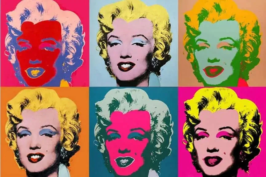
Warhol’s most powerful use of repetition came in his celebrity portraits and Disaster series. The “Marilyn Diptych” (1962), created shortly after Marilyn Monroe’s death, presents fifty silkscreened images of the actress based on a publicity still from the film “Niagara.” On the left panel, twenty-five Marilyns appear in vibrant color—hot pink, yellow, red, turquoise. On the right, twenty-five more Marilyns appear in black and white, progressively fading and degrading as the ink becomes uneven and the images lose definition.
The work captures something profound about how celebrity functions in mass media culture. Monroe is multiplied, reproduced, commodified—her face becomes a product that can be endlessly replicated and consumed. But the repetition also empties the image of meaning. Which Marilyn is the “real” one? The bright, colorful versions that match her Hollywood glamour? Or the fading, ghostly ones that suggest mortality and the person behind the image? The diptych format evokes religious altarpieces, but instead of depicting saints, Warhol presents a secular martyr to fame, a woman consumed by her own image.
The Disaster Series: When Repetition Meets Horror
Perhaps Warhol’s most unsettling use of silkscreen printing came in his Disaster series of the early 1960s. These works depicted car crashes, electric chairs, race riots, and other scenes of violence and death, sourced from newspaper photographs and repeated multiple times across large canvases. In “Silver Car Crash (Double Disaster)” (1963), the image of a mangled car and ejected body is silkscreened twice on the left side of the canvas, while the right side remains blank silver.
The repetition creates a disturbing psychological effect. When we encounter a single image of a car crash in a newspaper, we react with shock, empathy, horror. But seeing the same image repeated transforms our response. The second viewing is less shocking than the first. The third less than the second. By the time we’ve seen the image multiple times, something has changed—the horror hasn’t disappeared, but it’s been joined by a kind of numbness, a desensitization that Warhol understood as characteristic of modern media consumption.
This was Warhol’s dark insight about mass media: that repetition doesn’t intensify meaning but drains it. The more we see images of violence and tragedy, the less we feel them. The television news cycles through disasters, each one briefly shocking before being replaced by the next. Warhol’s silkscreens make this process visible, forcing us to confront how mechanical reproduction affects not just images but our emotional relationship to them.
The blank silver spaces in many Disaster paintings amplify this effect. They suggest both the void of death and the emptiness of media spectacle—the way tragedy gets consumed and discarded, leaving nothing behind but blank space waiting for the next catastrophe to fill it. The silver also evokes television screens, connecting these works to the medium through which most Americans increasingly encountered images of violence and death.
Color, Variation, and the Myth of the Original
One of the most fascinating aspects of Warhol’s silkscreen practice is how he used color. Because each print involved separate screens for different colors, and because the registration of these screens was often imperfect, each impression contained subtle variations. Warhol embraced these “imperfections,” recognizing that they undermined the concept of a single, definitive version of the work.
His portraits of Jackie Kennedy, Elizabeth Taylor, Elvis Presley, and other celebrities exist in multiple versions with different color combinations. “Shot Sage Blue Marilyn” (1964) presents Monroe’s face in unnatural hues—pink skin, yellow hair, red lips, turquoise eye shadow. These colors have nothing to do with realistic representation; they’re chosen for their visual impact, for how they make the image pop. The artificiality is the point. Just as celebrity itself is a constructed image, Warhol’s portraits use artificial colors to emphasize their own artificiality.
This multiplication of versions raised uncomfortable questions about authenticity and value in art. When there are multiple “original” Warhol Marilyns in different colors, which one is the real artwork? Is a version with blue background more authentic than one with red? The questions expose the art market’s investment in uniqueness and originality as somewhat arbitrary. If collectors pay millions for a Warhol silkscreen, they’re not paying for a unique object in the traditional sense—multiple versions exist—but for a particular iteration of an endlessly reproducible image.
Warhol made this tension explicit when he began creating “do-it-yourself” versions of paintings in the 1960s, providing collectors with paint-by-numbers-style kits to complete themselves. He also famously quipped, “I think somebody should be able to do all my paintings for me,” and later, when asked if a painting was really his work, responded, “I don’t know. I probably painted it.” These statements weren’t flippant but philosophical, questioning the very concept of artistic authorship that had defined fine art for centuries.
The Factory System: Industrializing Art Production
Warhol’s use of silkscreen printing was inseparable from how he organized his studio, which he pointedly called The Factory. The name invoked industrial production rather than artistic creation, and Warhol ran it accordingly. Assistants—Gerard Malanga was particularly important in the early years—would prepare screens, mix inks, and pull prints, often with minimal direction from Warhol himself.
This collaborative, assembly-line approach scandalized critics who believed that art required the direct, personal involvement of the artist. Wasn’t Warhol just signing off on work made by others? But this missed the conceptual sophistication of what Warhol was doing. By removing his own hand from the process, he was making a statement about art in the age of mechanical reproduction, a concept articulated by philosopher Walter Benjamin in his famous 1935 essay.
Benjamin had argued that mechanical reproduction destroyed the “aura” of artworks—their sense of unique presence and authenticity. Warhol took this insight and ran with it, suggesting that the loss of aura wasn’t something to mourn but a new condition to explore. If images could be endlessly reproduced, if artistic production could be industrialized, if authorship could be collective rather than individual, what did this mean for art? Rather than resisting these developments in the name of traditional artistic values, Warhol embraced them as the defining conditions of contemporary culture.
The Factory’s social scene—filled with socialites, drag queens, musicians, drug users, and various hangers-on—also fed into the work. Warhol understood that the drama and personalities surrounding art production were themselves part of the artistic statement. The Factory was performance art, social sculpture, and business operation all at once. The silkscreens produced there emerged from and reflected this chaotic, collaborative environment.
From Soup Cans to Commissioned Portraits
Warhol’s silkscreen practice evolved significantly over his career. The early 1960s works focused on consumer products and appropriated media images. By the mid-1960s, he was creating commissioned portraits of wealthy patrons and celebrities, a practice that would become increasingly central to his work. These portrait commissions followed a set process: Warhol would photograph the subject with a Polaroid camera, select the most flattering image, and translate it into a silkscreen print, typically in vibrant, unnatural colors.
Critics accused Warhol of selling out, of prostituting his technique for commercial gain. But again, this misunderstood his project. Warhol’s portrait business was entirely consistent with his critique of art and commerce. By openly functioning as a commercial artist—charging hefty fees, flattering his subjects, producing multiple versions in different colors—he was demonstrating that high art and commercial art had collapsed into each other. The society portraits he created in the 1970s and 1980s weren’t a betrayal of his earlier, supposedly more “critical” work; they were an extension of it.
These later portraits also showcased the silkscreen technique’s particular affordances. The process flattened and simplified facial features, removed texture and detail, and created a kind of glossy, iconic surface that made everyone look vaguely glamorous. In Warhol’s hands, socialites, business executives, and celebrities all received the same treatment—transformed into colorful, flat, reproducible images that emphasized surface appearance over psychological depth. This was portraiture stripped of interiority, focused entirely on image, which was precisely Warhol’s point about celebrity and identity in mass media culture.
Technical Innovation and Artistic Evolution
Throughout his career, Warhol continued to experiment with the silkscreen process, finding new ways to exploit its possibilities. He combined silkscreen with hand-painting, allowing gestural marks to coexist with mechanical reproduction. He printed on unconventional surfaces—metallic wallpaper for his Cow Wallpaper series, which literalized the idea of art as decoration. He created enormous silkscreens like “Mao” (1973), where the Chinese leader’s face is enlarged to intimidating proportions and repeated in multiple color variations, turning political iconography into pop art.
The “Oxidation Paintings” or “Piss Paintings” of 1978 pushed the boundaries further. These works involved urinating on canvases covered in metallic copper paint, causing chemical reactions that created abstract patterns. While not traditional silkscreens, they shared Warhol’s interest in mechanical and bodily processes, and he sometimes incorporated silkscreened images into these pieces. The works were both juvenile and profound—using the most basic bodily function to create art while also exploring abstract expressionist ideas about gesture and spontaneity through deliberately degrading processes.
His “Reversals” series of 1979-1980 took existing silkscreen images and reversed their colors, creating negative versions of famous works. This simple technical variation generated entirely new visual effects while also commenting on how minor changes in reproduction can create different works—a meditation on the relationship between original and copy that had preoccupied Warhol from the beginning.
Legacy: The Silkscreen’s Continued Influence
Warhol’s elevation of silkscreen printing fundamentally changed what was possible in contemporary art. Artists from Sigmar Polke to Robert Rauschenberg to contemporary practitioners like Kehinde Wiley have used the technique, each building on Warhol’s innovations. The method’s association with commercial reproduction—once seen as a liability—became an asset, allowing artists to engage directly with media culture, advertising, and mass-produced imagery.
More broadly, Warhol’s silkscreen practice normalized appropriation as an artistic strategy. By the 1980s, artists like Richard Prince and Sherrie Levine were re-photographing advertisements and existing artworks, creating “original” works entirely from appropriated material. This would have been unthinkable before Warhol demonstrated that borrowing images and mechanical reproduction could be legitimate artistic practices. The debates about originality, authorship, and value that his silkscreens provoked remain central to contemporary art, particularly in our digital age where images circulate and get reproduced with unprecedented ease.
Street artists and graffiti writers adopted silkscreen techniques for creating multiple versions of their work, democratizing image production in ways that aligned with Warhol’s vision. The technique’s accessibility—requiring relatively inexpensive equipment and materials—meant that artists outside traditional art institutions could use it, further breaking down barriers between high and low culture that Warhol had attacked.
The Mirror of Mass Culture
Ultimately, Warhol’s silkscreen printing was more than a technique—it was a philosophy, a critique, and a celebration of contemporary life. By using a commercial reproduction method to create fine art, he collapsed the distinction between the two. By repeating images until they became abstract patterns, he revealed how mass media numbs us to meaning. By removing his own hand from the process, he questioned Romantic notions of genius and authenticity. By embracing mechanical reproduction, he showed that the age of the unique artwork had given way to something else—an era where images circulate endlessly, where everyone has their fifteen minutes of fame, where the distinction between original and copy has become increasingly meaningless.
His silkscreens don’t resolve these tensions—they present them, making us look at consumer culture, celebrity, violence, and death through a process that mirrors how these things actually function in modern media. The technique’s flatness, its repetition, its mechanical quality, its capacity for variation within reproduction—all of these aren’t limitations but perfect formal expressions of the culture Warhol was depicting.
When we look at a Warhol silkscreen today, we’re not just seeing a portrait of Marilyn Monroe or a Campbell’s Soup Can. We’re seeing the logic of mass reproduction made visible, the transformation of everything into endlessly reproducible images, the saturation of our visual environment with the same pictures repeated until they lose and gain new meanings. We’re seeing the world that Warhol recognized was emerging in the 1960s and that has only become more pronounced in our digital age of memes, viral images, and infinite reproducibility.
In choosing silkscreen printing as his primary technique, Warhol didn’t just find a efficient way to make art. He found a method whose very nature embodied his vision of contemporary culture—mechanical, reproducible, commercial, flat, endlessly repetitive, and strangely beautiful. The technique was the message, and the message was that in the age of mass media and consumer capitalism, we’re all living in a world of reproductions, images, surfaces, and repetitions. Warhol simply made us look at it.

